Design systems, extracted.
Search curated design systems pulled from premium templates or create one from URL. Open any style for colors, type, spacing, components, and a DESIGN.md or tokens.json your agent can use.
Quickly navigate through the dashboard with your keyboard using the command menu.

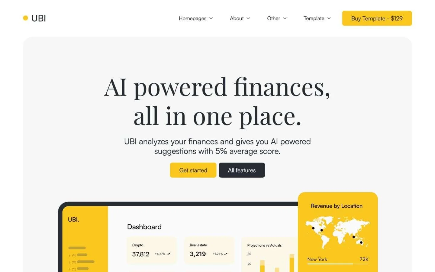
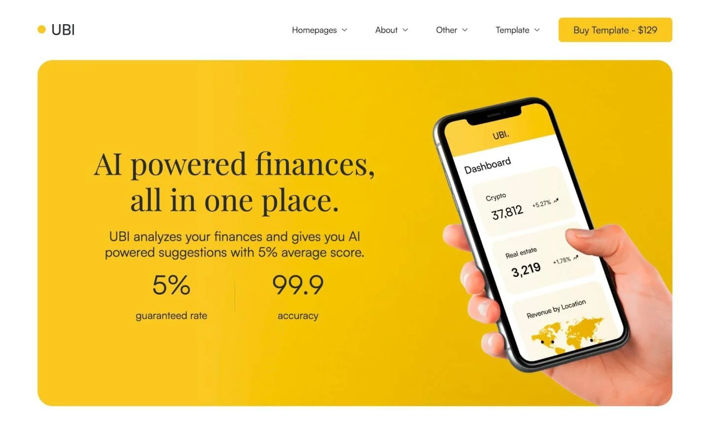
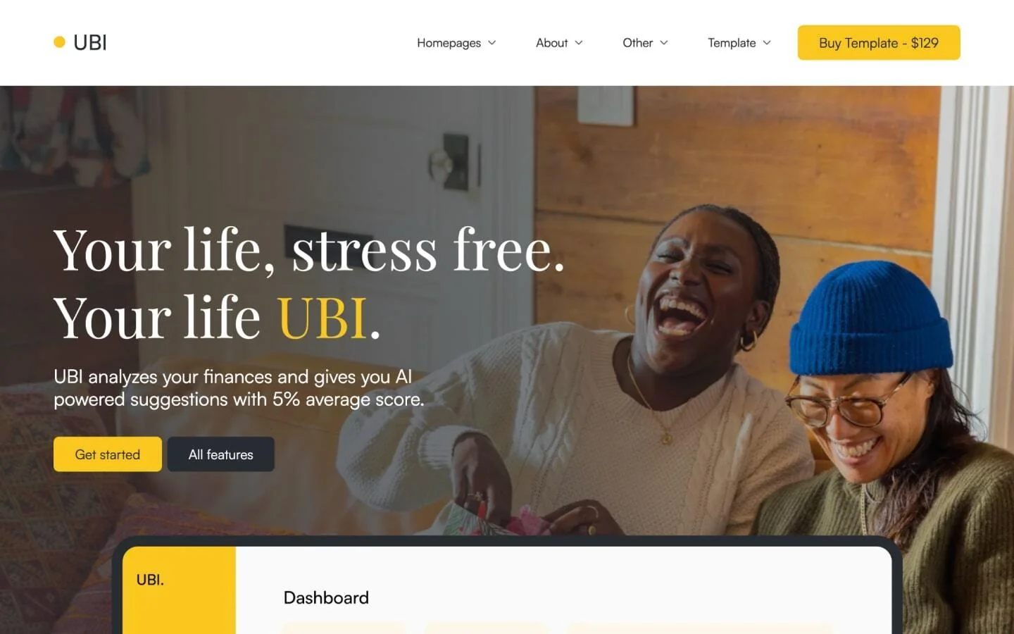
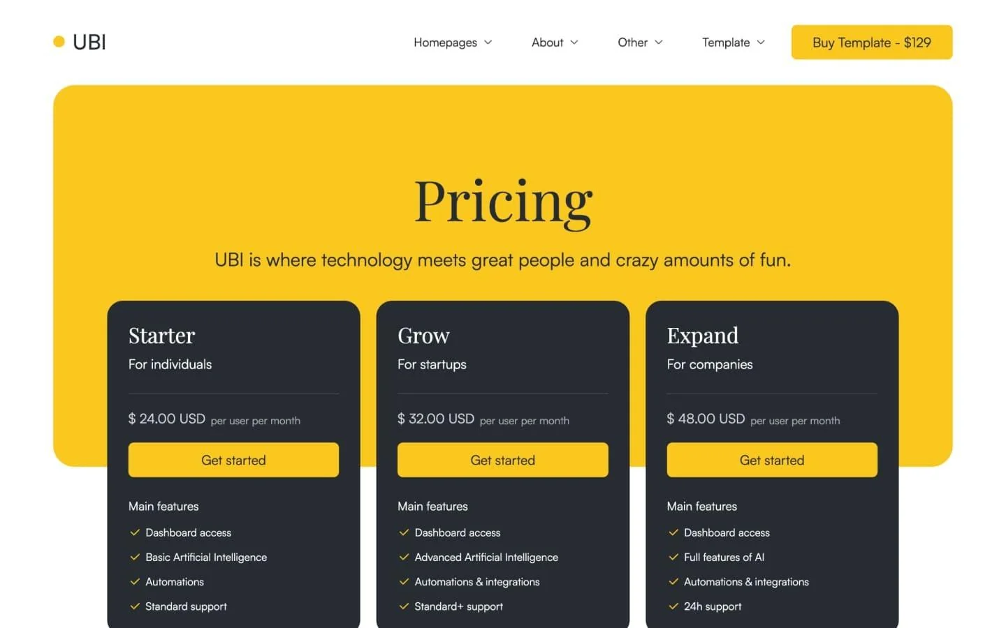
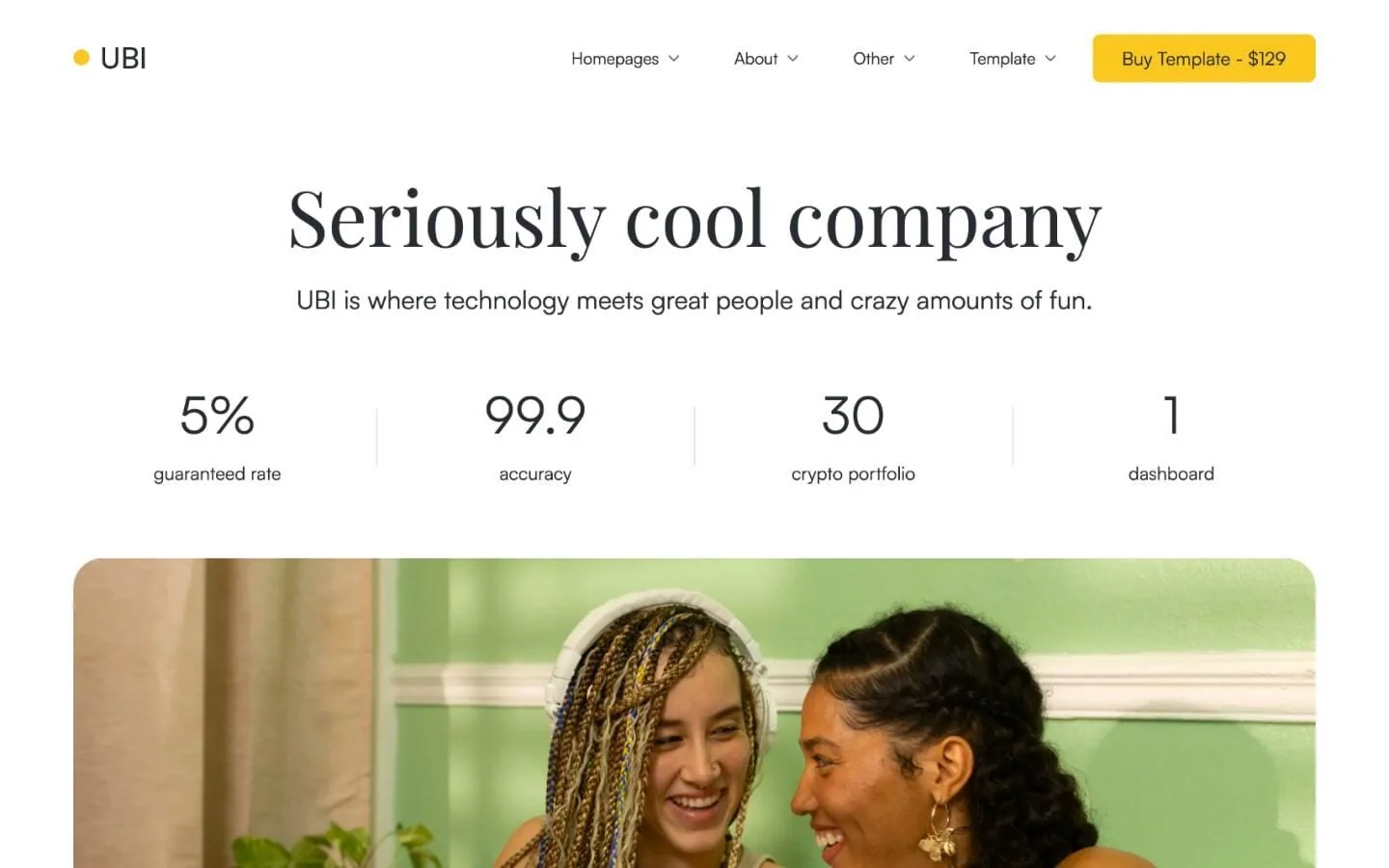
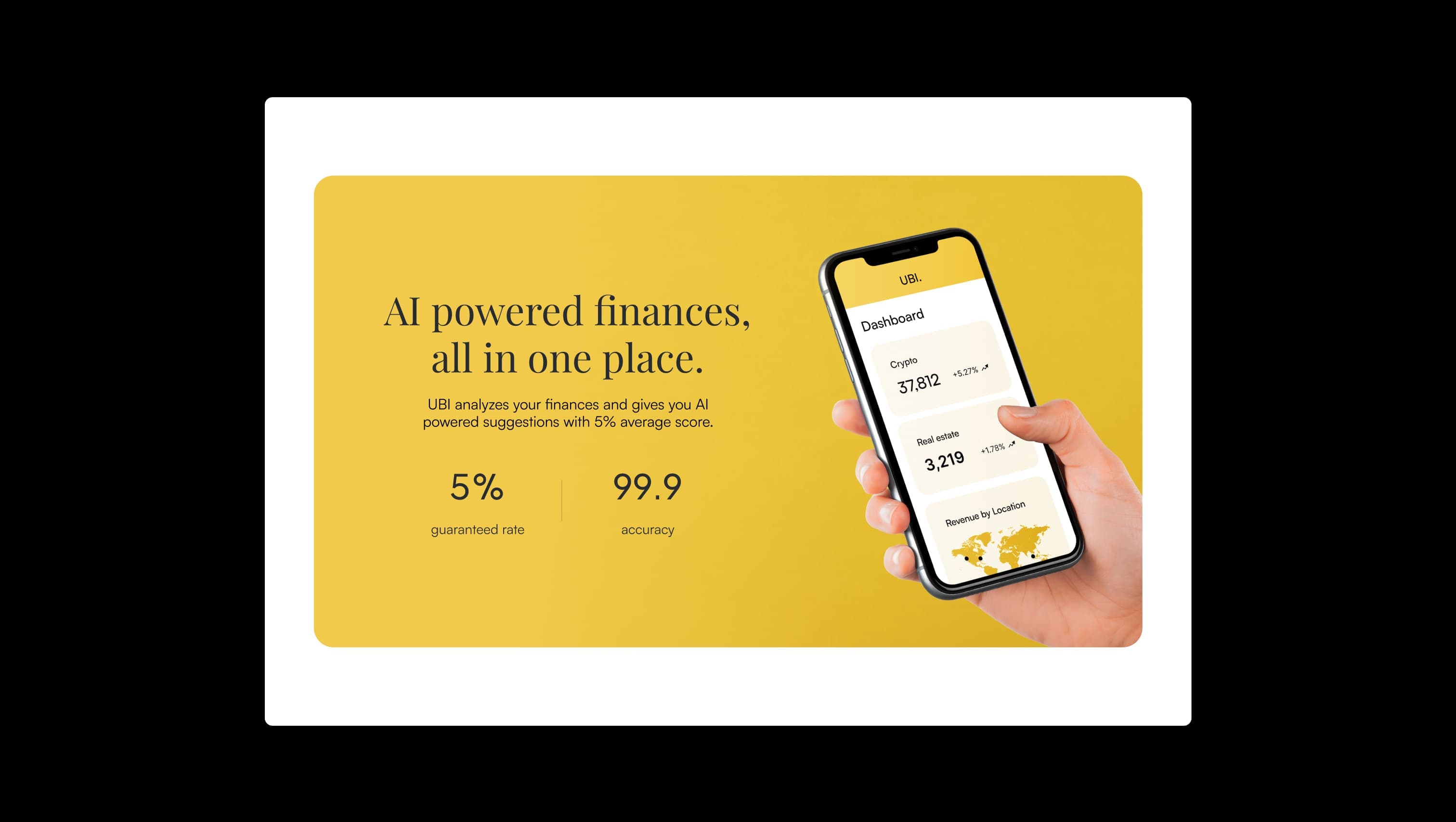
UBI is a warm, optimistic finance template that pairs the editorial elegance of Playfair Display headlines with the calm geometry of Satoshi body copy. The page rests on soft cream and cool grey canvases, then bursts into a saturated marigold accent that signals every primary action and feature surface — a single, confident hue that does the work of a whole palette. The overall mood is friendly fintech: rounded-rectangle cards at 24–32px radii, generous 120px section padding, and pill-shaped tab navigation. Headlines feel literary and human, while charts and dashboards stay quiet beneath them. Dark ink and light cream provide the only contrast partners the marigold needs.
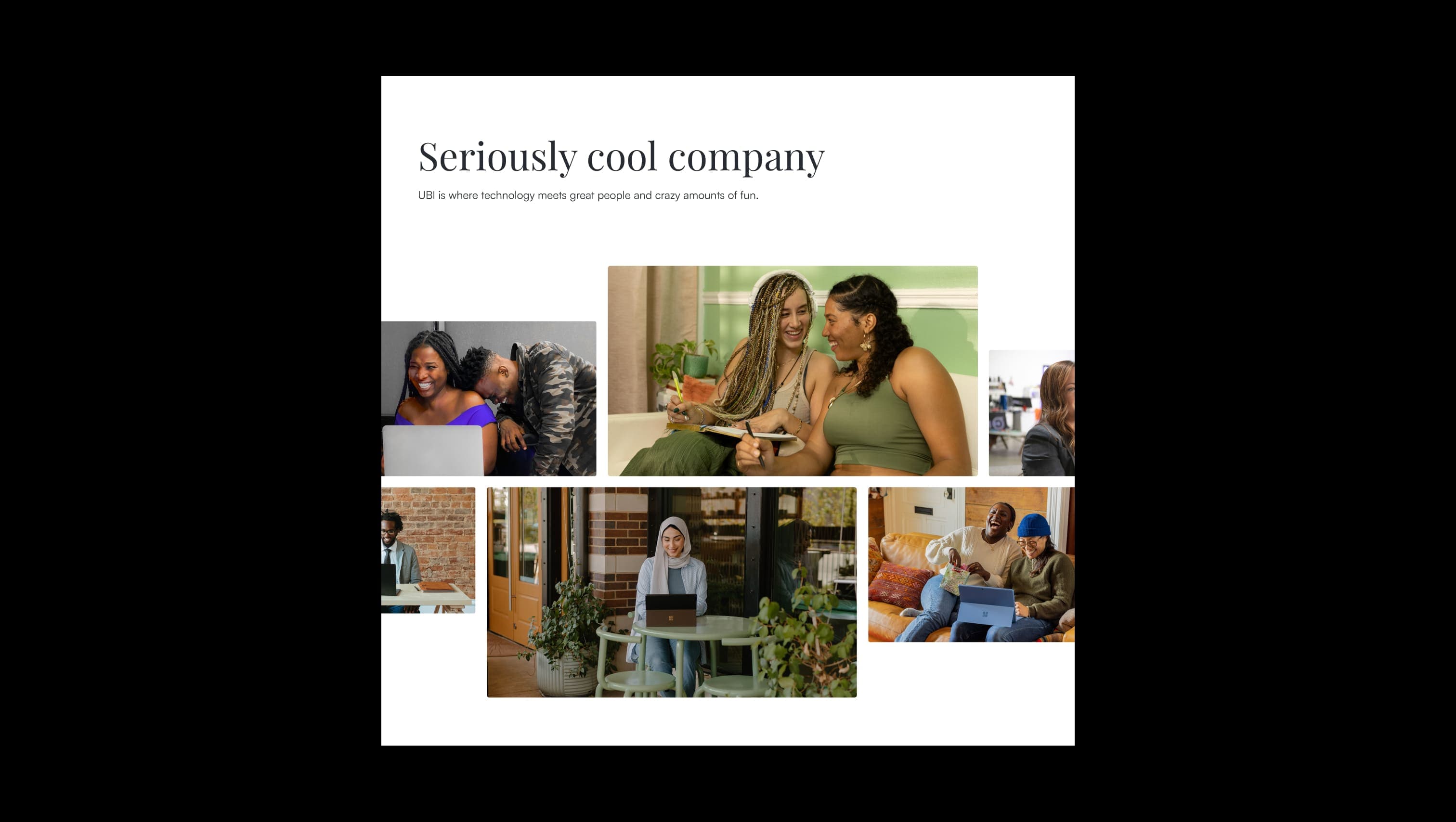
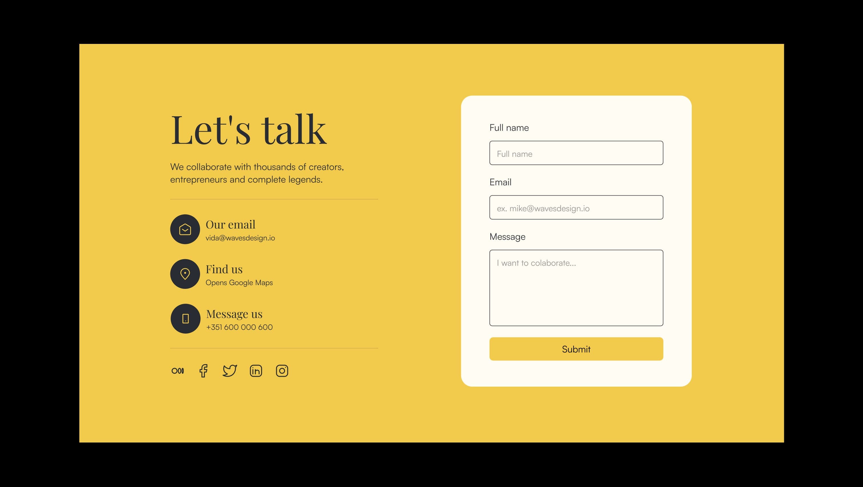
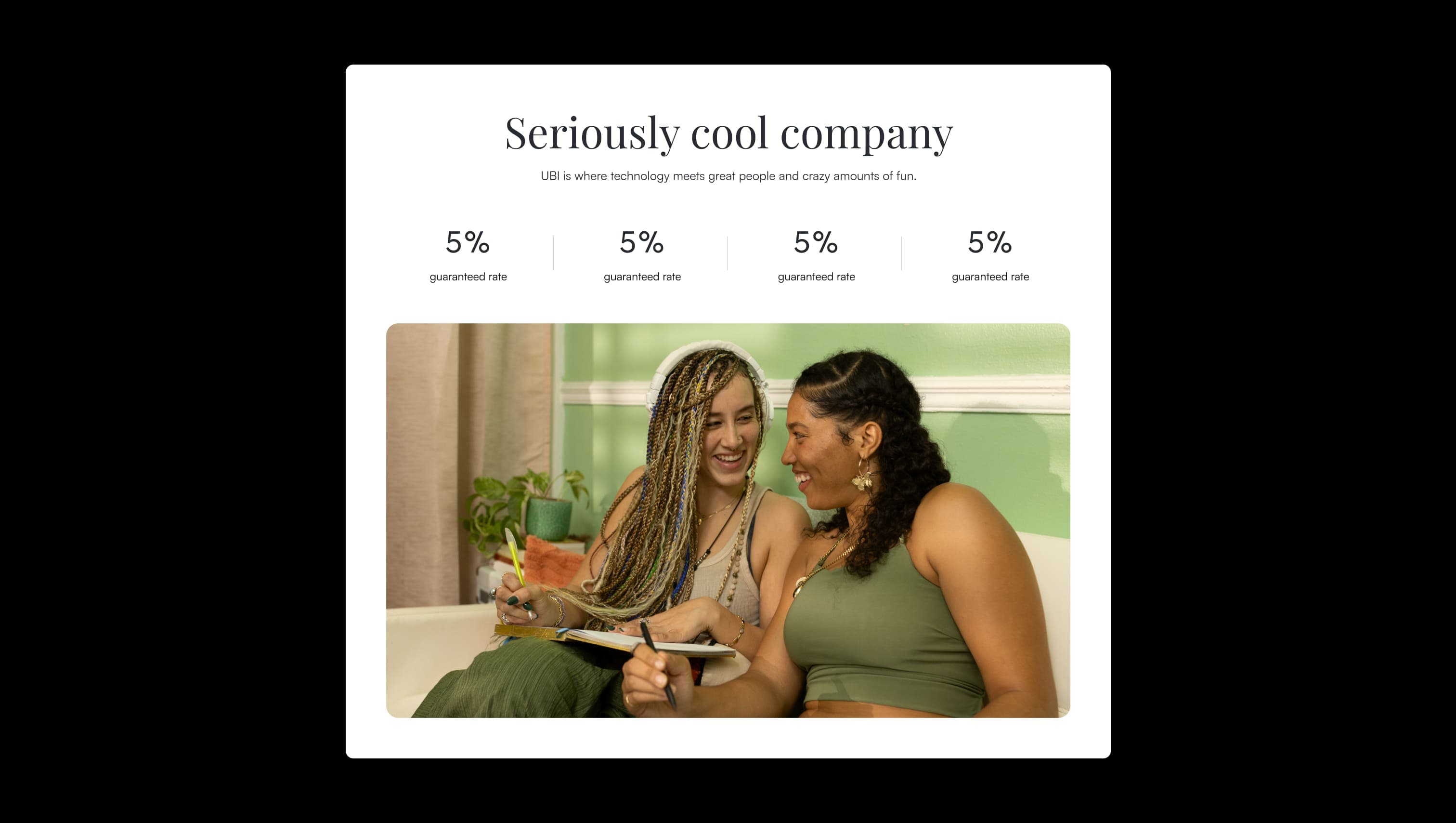
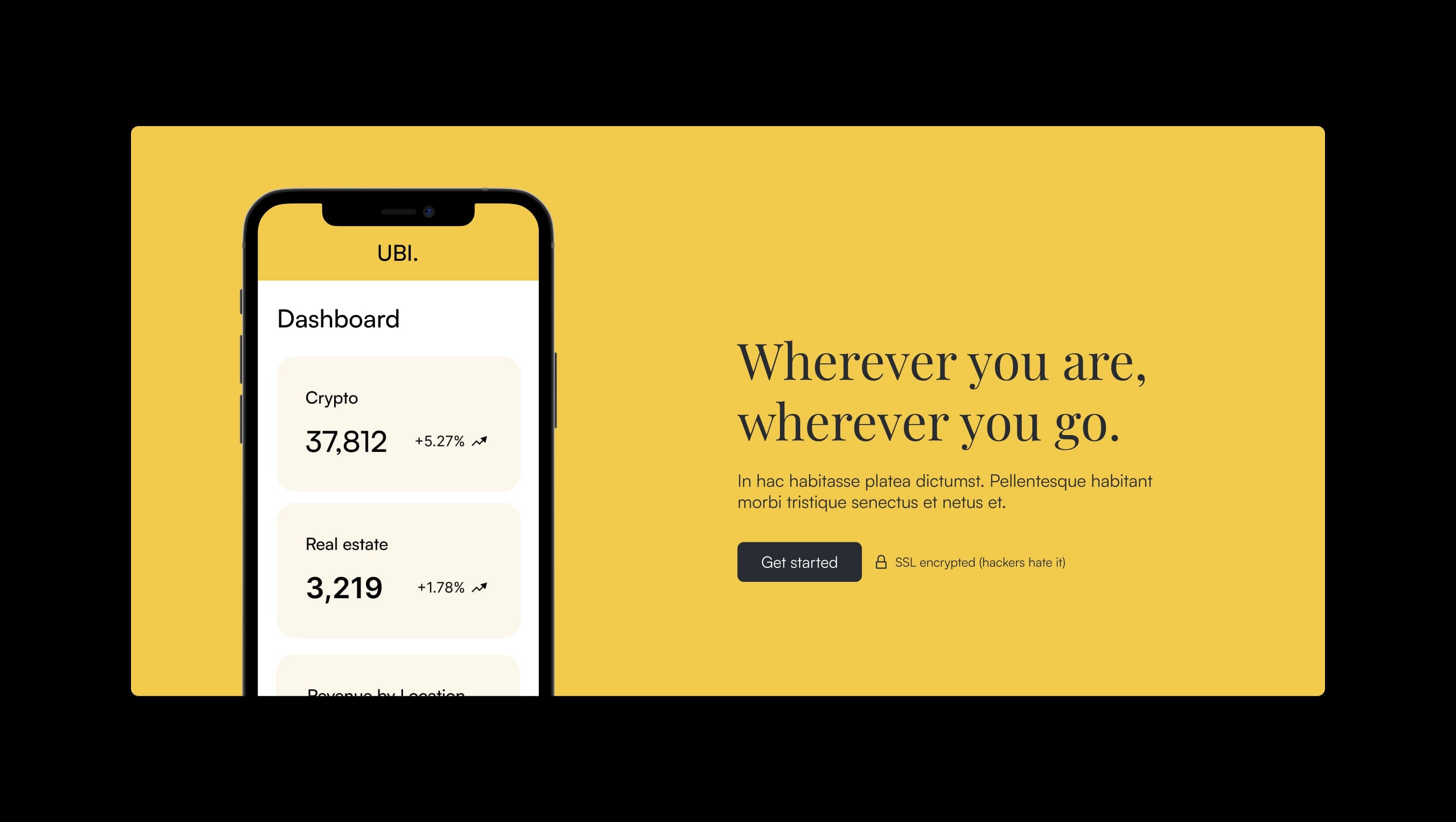
A handful of real sections that ship with this template. Click any card to preview, or explore them all under the Sections tab.
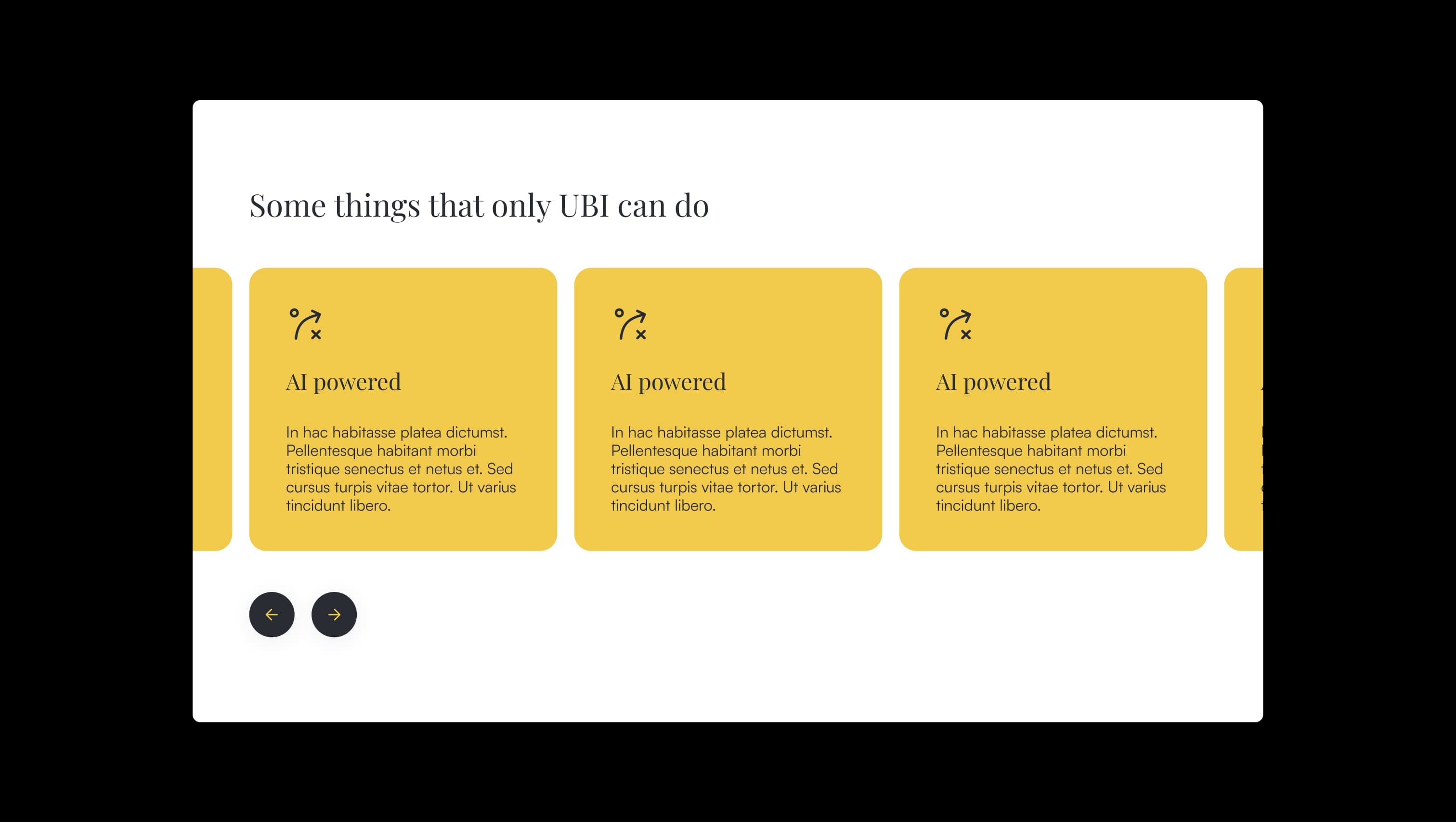
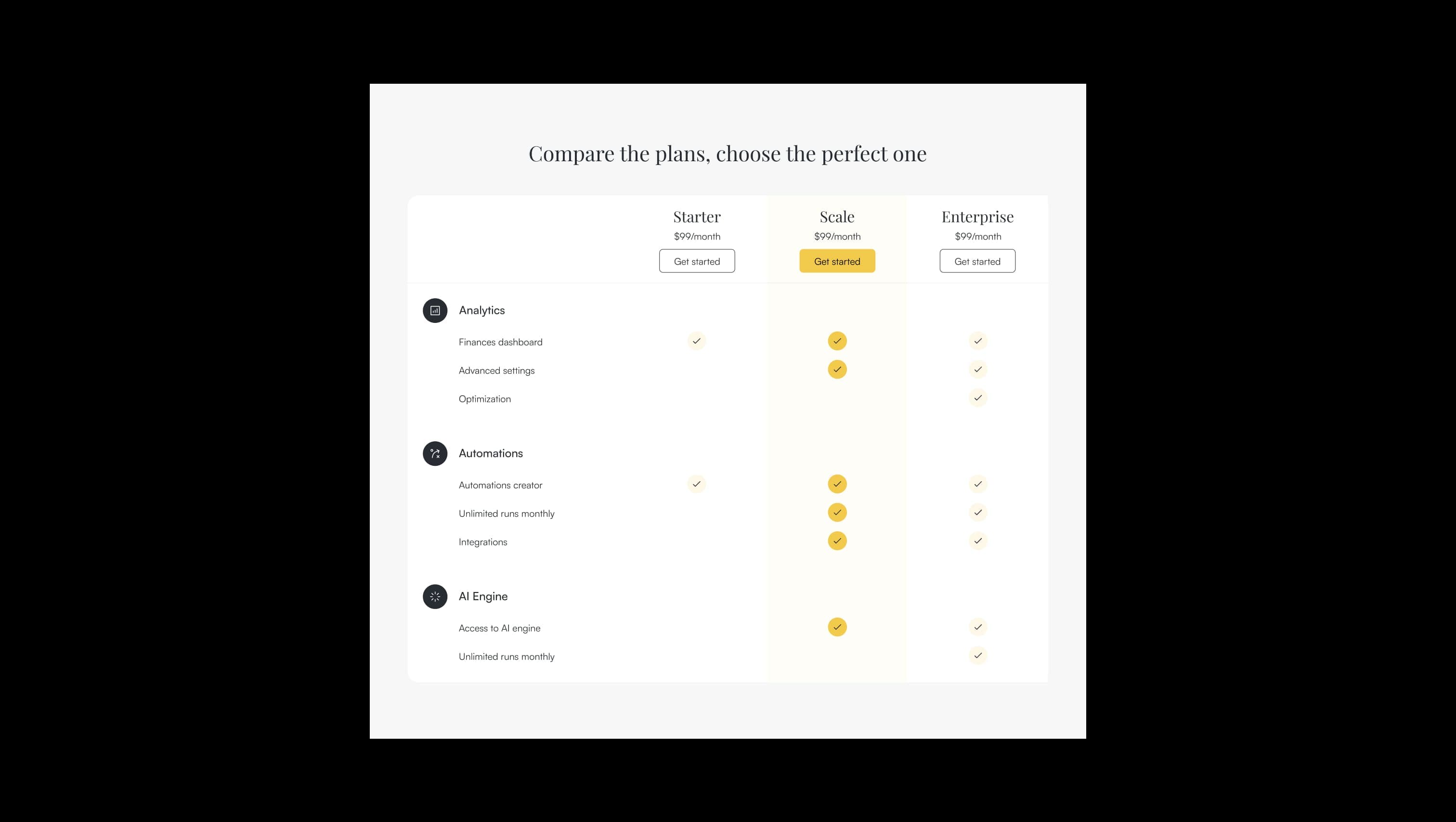
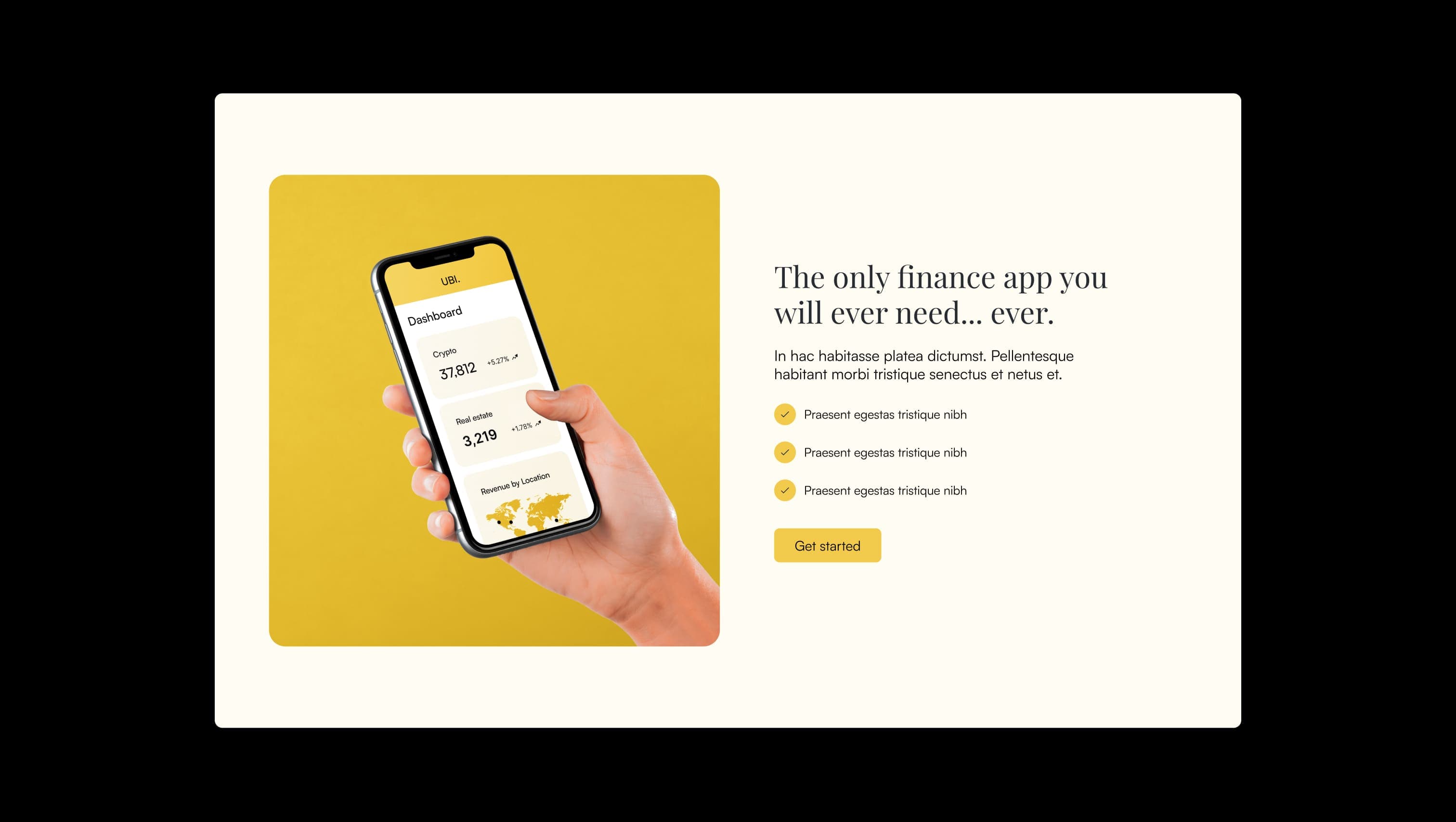
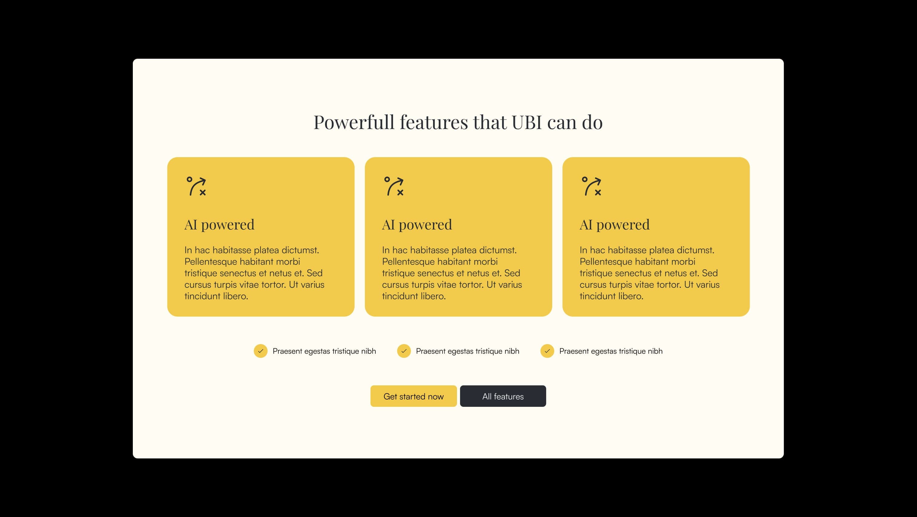
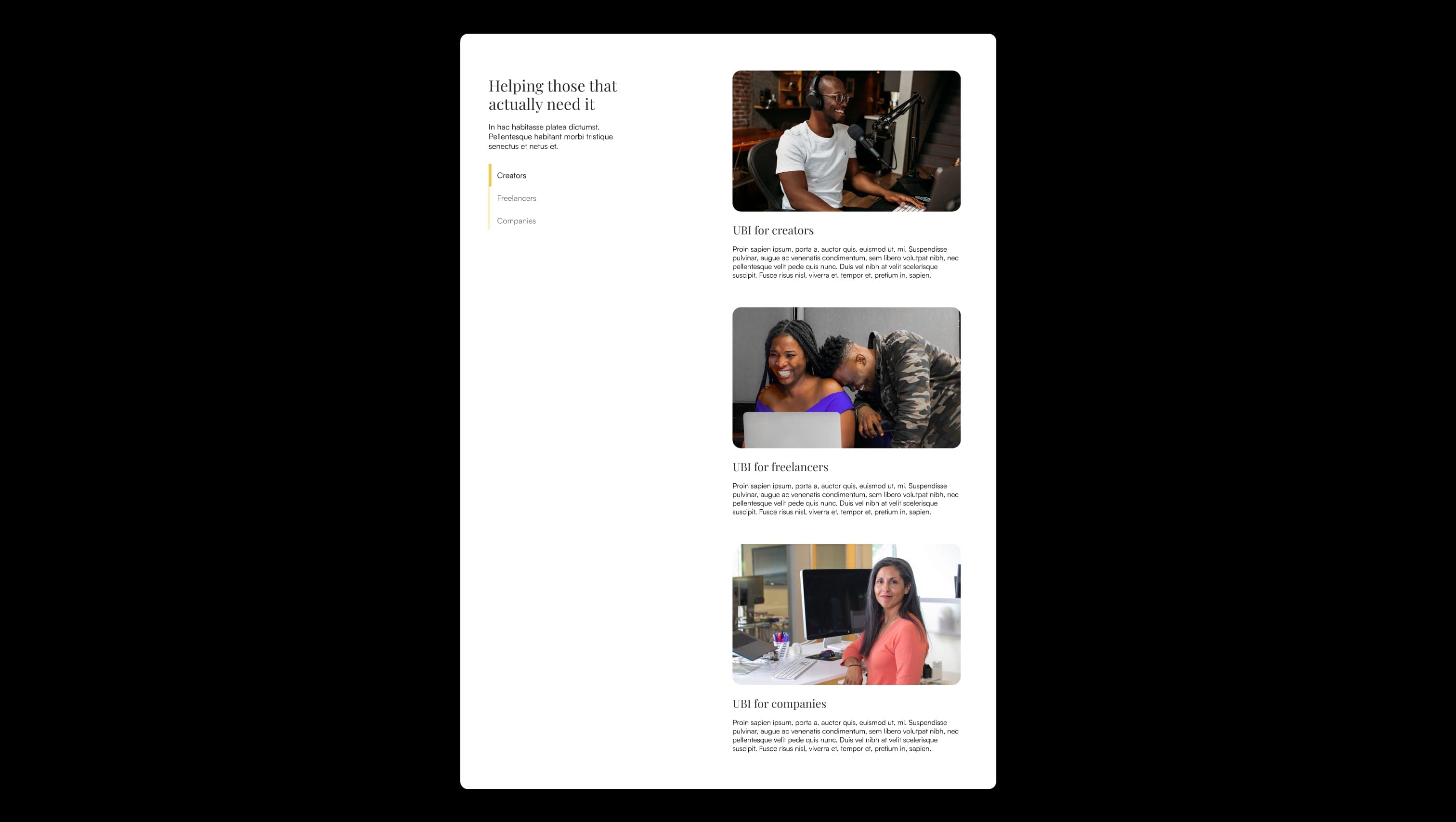
Cool neutral surface. FAQ panels, alternating section backgrounds.
Default page canvas. Body background, navbar, primary tiles.
Light canvas. Tinted page sections, lifted tiles inside dark surfaces.
Secondary text. Captions, meta info, sticky-nav inactive links.
Deep ink hover. Pressed state for dark buttons.
Primary text & dark surface. Headlines, body copy, dark sections, secondary buttons.
Accent hover. Lifted state for primary buttons.
Brand accent. Primary CTAs, feature blocks, hero panels, highlight spans.
The quick brown fox jumps
Body, UI, navigation, buttons.
The quick brown fox jumps
Display & headings. Sets the literary, optimistic tone.
spacious1400px120px56px24px4px8px12px16px24px32px40px48px56px64px80px100px120px148px180px200px220pxpill90pxcards24pxsmall8pxcircle9999pxpanels16pxbuttons8pxtab-link80pxhero-panel32pxStep from canvas (level 1) to lifted (level 2) to inset depth (level 3), then invert into the dark levels for full-bleed sections. Hex codes and roles live in the Colors section above; this ladder shows the layering only.
# Design System Guide
> Unlock the template to access the full design system.
## Brand voice
A short paragraph describing the brand voice, mood, and visual
principles that anchor the system. Tone, cadence, and intent.
## Colors
| Token | Hex | Role |
| ------------ | -------- | ------------------------------------- |
| canvas-1 | #xxxxxx | Page background, large surfaces |
| canvas-2 | #xxxxxx | Lifted surfaces, cards |
| canvas-3 | #xxxxxx | Inset wells, depressed states |
| ink-1 | #xxxxxx | Primary body text |
| ink-2 | #xxxxxx | Secondary text, labels |
| ink-3 | #xxxxxx | Tertiary text, hints |
| accent-1 | #xxxxxx | Primary brand accent |
| accent-2 | #xxxxxx | Secondary accent |
| state-ok | #xxxxxx | Success, confirmations |
| state-warn | #xxxxxx | Warnings |
| state-err | #xxxxxx | Errors, destructive actions |
## Typography
- **Display** — heading scale, used for hero text and section titles.
- **Body** — primary reading text, optimized for paragraphs.
- **Mono** — code, data, and tabular numerals.
```
display: 32px / 40px / 48px / 64px / 80px
body: 14px / 16px / 18px
mono: 12px / 14px
```
## Spacing & shape
Base unit: 4px. Scale: 4, 8, 12, 16, 24, 32, 48, 64, 96, 128.
Radii: sm (4px), md (8px), lg (12px), xl (20px), full (9999px).
## Surfaces
Layered elevation from canvas → lifted → inset. Surfaces invert in
dark sections for full-bleed contrast.
## Do's and don'ts
- Do use accent-1 sparingly for primary CTAs only.
- Do maintain at least 4.5:1 contrast on body text.
- Don't mix display and body in the same line.
- Don't use state colors for branding.
## Agent prompt guide
Prompts for AI design tools that respect this system.
Includes example prompts for sections, components, and layouts.
# ...
Unlock the full style guide