Design systems, extracted.
Paste any URL to create a design system from it. Open any style for colors, type, spacing, components, and a DESIGN.md or tokens.json your agent can use.
Quickly navigate through the dashboard with your keyboard using the command menu.
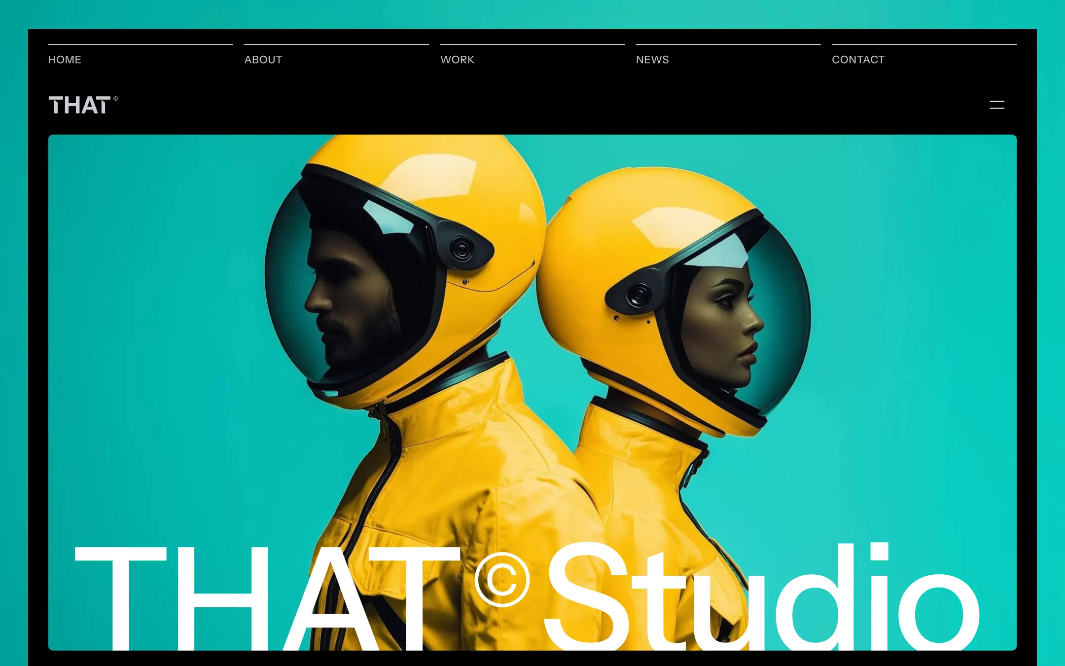
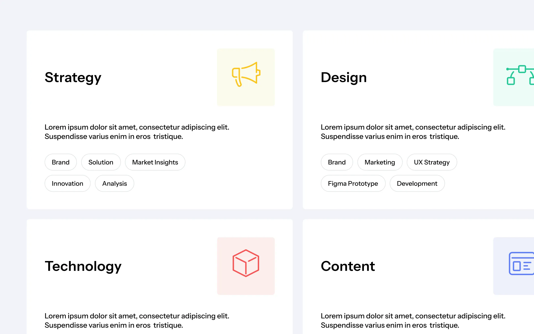
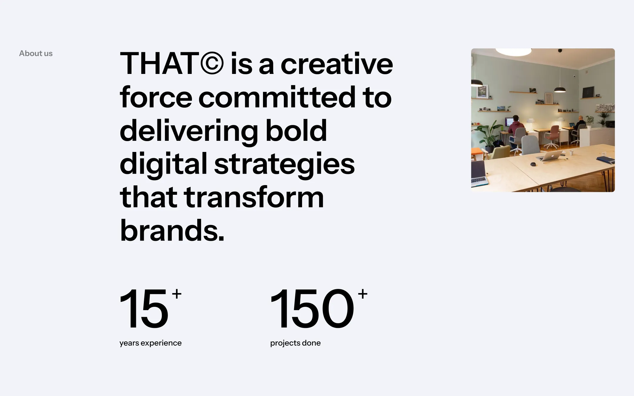
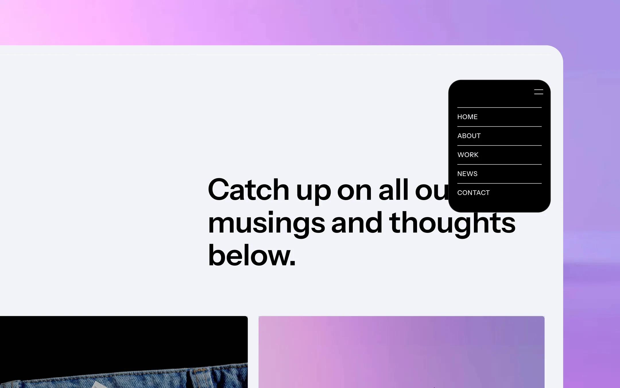
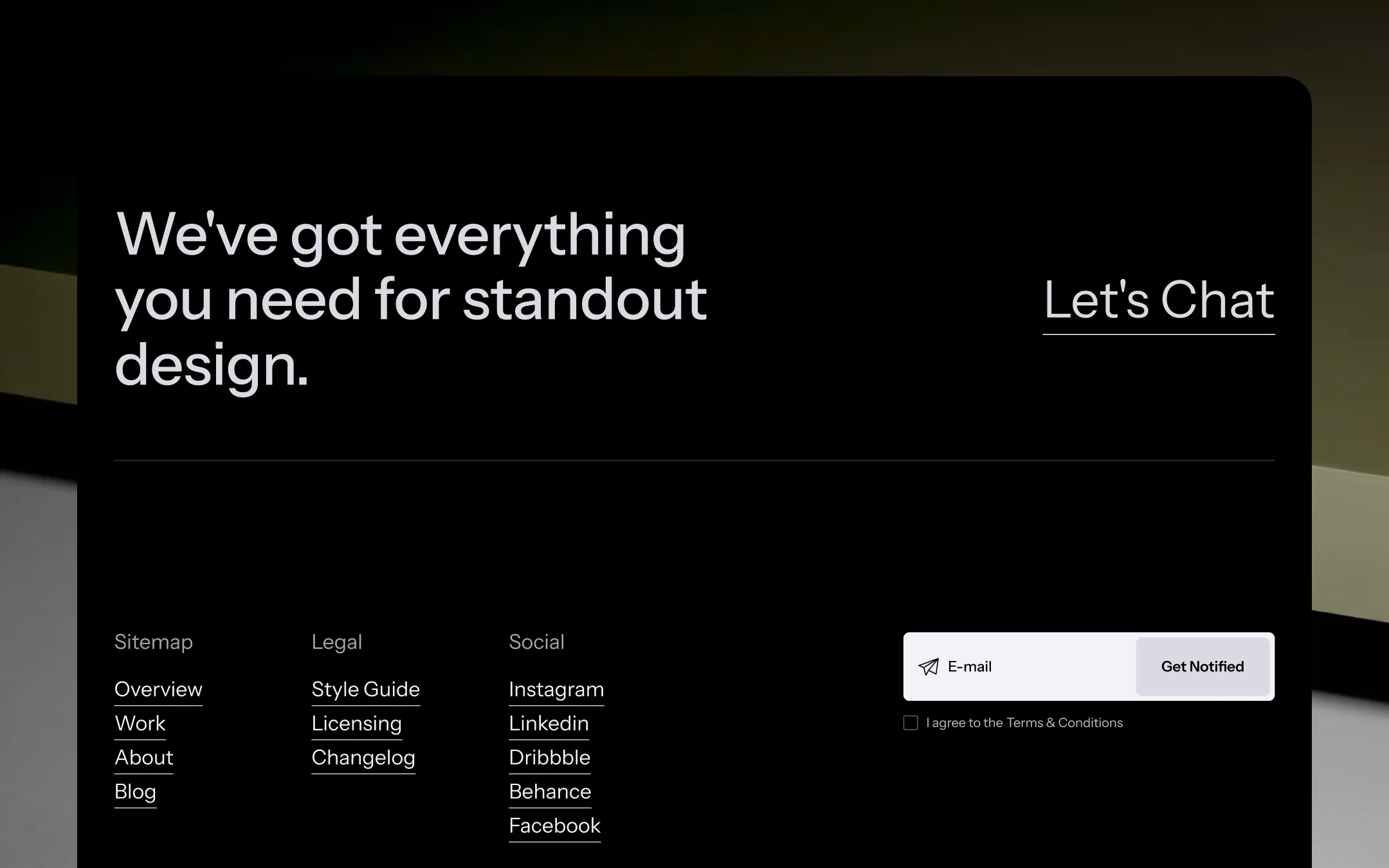
THAT© is a maximalist-but-disciplined agency system built for studios that refuse a single look. Jet-black intro sections explode into oversized, negative-tracked display type, then give way to airy off-white and lavender-gray canvases where pricing tables, team cards, and work grids sit on hairline dividers instead of shadows. Electric teal and voltage yellow are deployed sparingly as full-bleed hero backdrops and single-icon accents, so the loud color moments read as intentional punctuation rather than noise. Structurally the template is a toolkit: three homepage variants, three work-grid styles, three blog layouts, and dedicated case-study and post templates all share the same geometric language — 7–8px radii, uppercase display headlines, sticky work cards, and a black footer CTA grid that closes every page with the same confident "Let's Chat" invitation.
Structural hairline. Divides pricing columns, service lists, and card footers without shadow.
Elevated card surface. Presentation tiles, pricing plans, team cards, and blog thumbnails.
Primary light canvas. Default background for content sections, subscribe fields, and badge chips.
Hover & alt surface. Secondary-button hover states and lightly tinted panel backgrounds.
Primary ink & dark surfaces. Nav bar, intro hero, footer, and primary button fills across every page.
Inverse body text. Paragraph copy and nav labels set over black sections, plus muted field backgrounds.
Secondary pop accent. Technology-service icon tile and occasional tag chips breaking the neutral rhythm.
High-impact highlight. Service icon fills, badge accents, and hero-suit color blocking.
Signature brand hue. Full-bleed hero backdrops that announce the studio's energy on the main homepage variant.
The quick brown fox jumps
Sole interface and display typeface — carries navigation, body copy, and the oversized uppercase hero headlines.
spacious1600px150px40px24px4px8px12px16px20px24px32px40px60px80px100px150pxcards7pxpills100pxbuttons8pxsection-corner90pxnavigation-dropdown30pxStep from canvas (level 1) to lifted (level 2) to inset depth (level 3), then invert into the dark levels for full-bleed sections. Hex codes and roles live in the Colors section above; this ladder shows the layering only.
# Design System Guide

> Unlock the template to access the full design system.

## Brand voice

A short paragraph describing the brand voice, mood, and visual
principles that anchor the system. Tone, cadence, and intent.

## Colors

| Token        | Hex      | Role                                  |
| ------------ | -------- | ------------------------------------- |
| canvas-1     | #xxxxxx  | Page background, large surfaces       |
| canvas-2     | #xxxxxx  | Lifted surfaces, cards                |
| canvas-3     | #xxxxxx  | Inset wells, depressed states         |
| ink-1        | #xxxxxx  | Primary body text                     |
| ink-2        | #xxxxxx  | Secondary text, labels                |
| ink-3        | #xxxxxx  | Tertiary text, hints                  |
| accent-1     | #xxxxxx  | Primary brand accent                  |
| accent-2     | #xxxxxx  | Secondary accent                      |
| state-ok     | #xxxxxx  | Success, confirmations                |
| state-warn   | #xxxxxx  | Warnings                              |
| state-err    | #xxxxxx  | Errors, destructive actions           |

## Typography

- **Display** — heading scale, used for hero text and section titles.
- **Body** — primary reading text, optimized for paragraphs.
- **Mono** — code, data, and tabular numerals.

```
display: 32px / 40px / 48px / 64px / 80px
body:    14px / 16px / 18px
mono:    12px / 14px
```

## Spacing & shape

Base unit: 4px. Scale: 4, 8, 12, 16, 24, 32, 48, 64, 96, 128.
Radii: sm (4px), md (8px), lg (12px), xl (20px), full (9999px).

## Surfaces

Layered elevation from canvas → lifted → inset. Surfaces invert in
dark sections for full-bleed contrast.

## Do's and don'ts

- Do use accent-1 sparingly for primary CTAs only.
- Do maintain at least 4.5:1 contrast on body text.
- Don't mix display and body in the same line.
- Don't use state colors for branding.

## Agent prompt guide

Prompts for AI design tools that respect this system.
Includes example prompts for sections, components, and layouts.

# ...
Unlock the full style guide