Design systems, extracted.
Search curated design systems pulled from premium templates or create one from URL. Open any style for colors, type, spacing, components, and a DESIGN.md or tokens.json your agent can use.
Quickly navigate through the dashboard with your keyboard using the command menu.
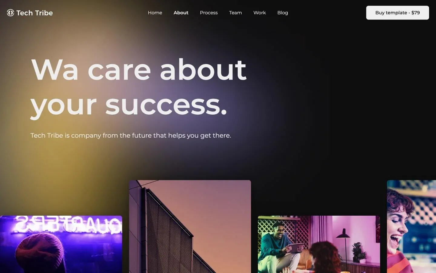

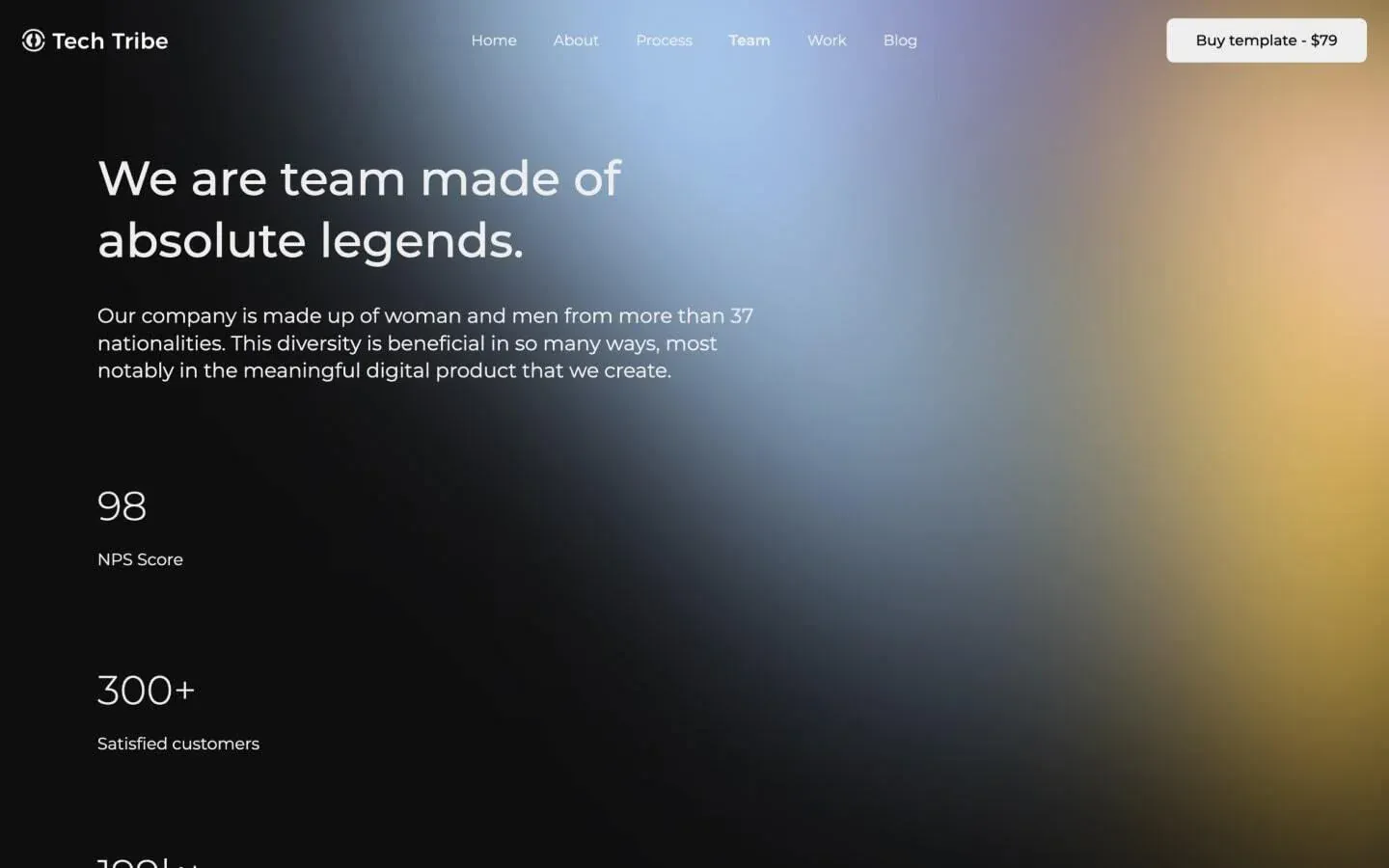
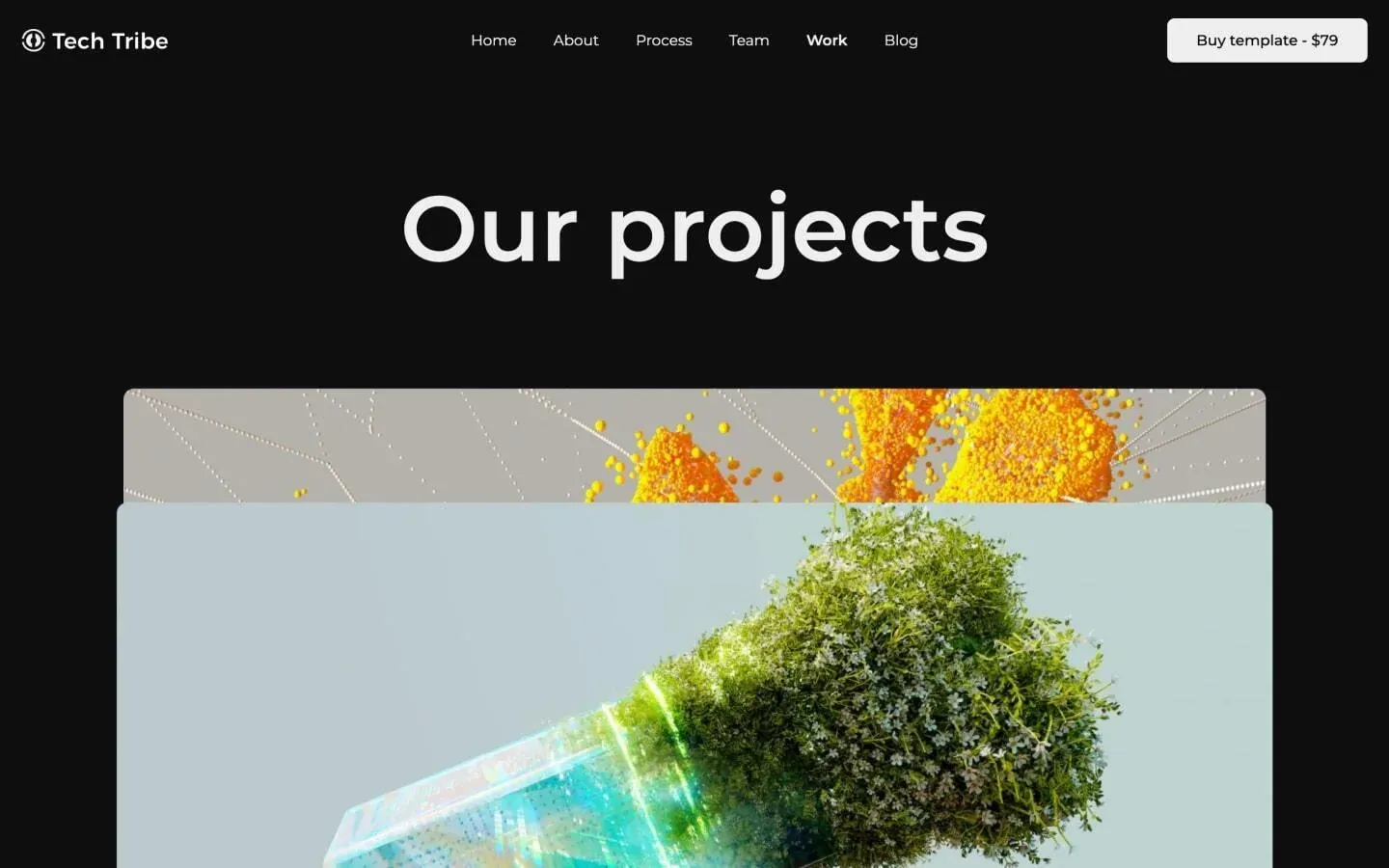
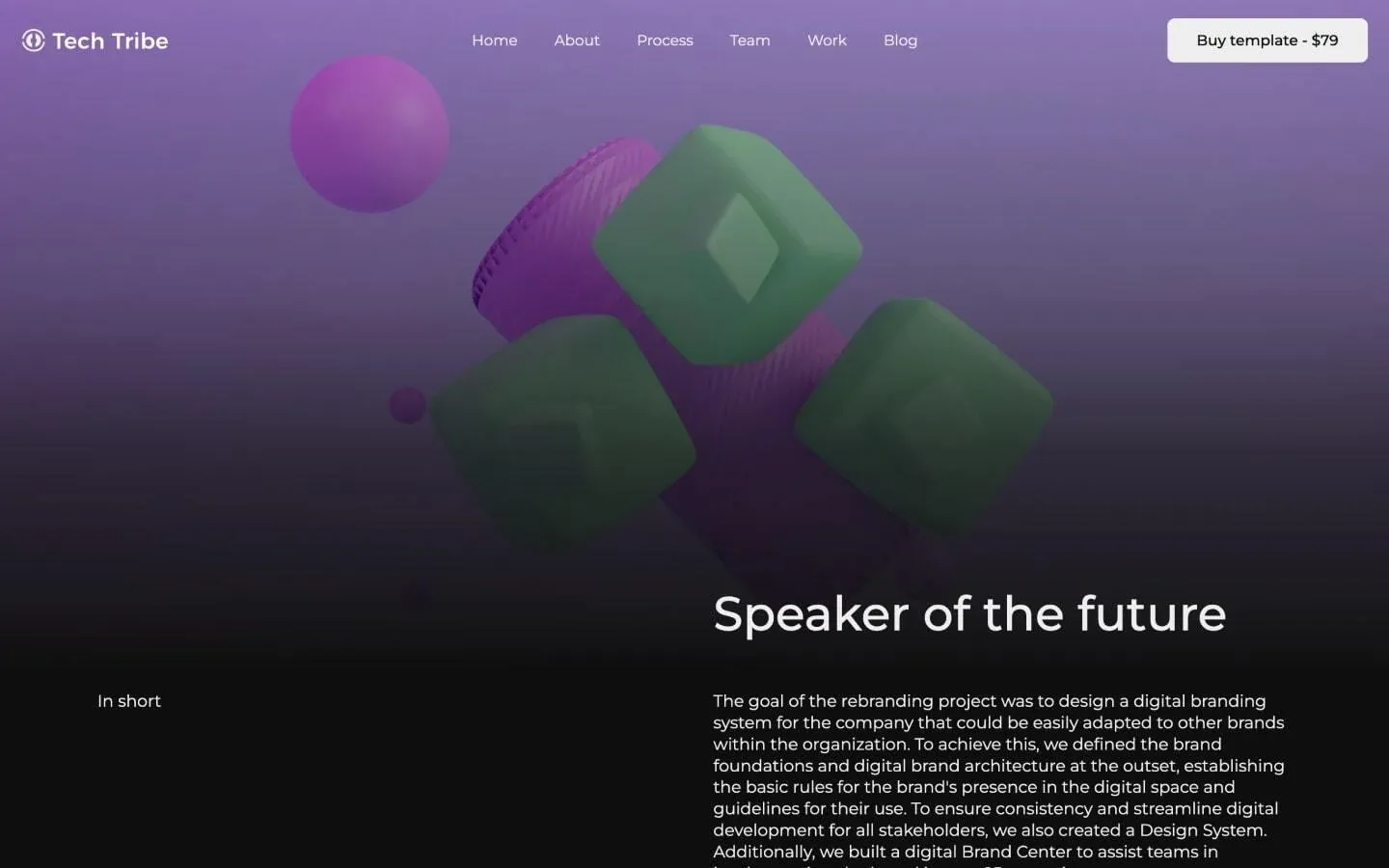
Tech Tribe is a midnight-mode agency template that paints its near-black canvas with soft, diffused aurora gradients — bruised purples, tarnished golds, and steel blues that bleed across the page like distant nebulae. The brand voice is confident and forward-looking, but the surface treatment is restrained: a single near-white ink, a single near-black field, and one elevated charcoal for cards that quietly lift content out of the dark. Typography carries the entire personality. Oversized Montserrat display headlines in a light-to-regular weight stretch wide across the hero, paired with comfortable 18px body copy at 130% line-height. The accent moments — animated scroll text — borrow a magenta-to-violet gradient, but those are reserved flourishes against an otherwise monochrome system.
Form field fill. Background of text inputs and text areas in the dark form blocks.
Elevated card surface. Used for testimonial cards, team cards, navigation tiles, and pricing slider frames.
Primary page canvas. The base black behind every section, hero gradient, and footer mask.
Secondary deep surface. Background for the template hero and other near-black panels needing slight separation.
Hairline border. Outlines inputs and subtle dividers between dark surfaces.
Primary text & ink. Headlines, body copy, button fills, and the warm footer wash.
Gradient peak highlight. The brightest pink wash that lights the center of animated text reveals.
Mid gradient bloom. The luminous magenta core of the scrolling-text gradient and aurora highlights.
Footer aurora warm tone. The amber bloom inside the radial gradient on the light footer panel.
Deep gradient anchor. The dark violet endpoint of scroll-text and ambient hero gradients.
The quick brown fox jumps
Single typeface for the entire site — display, headings, body, UI.
spacious1348px80px32px24px4px8px12px16px24px32px40px64px80px100px120px140px180pxpill96pxcards16pxinputs4pxbuttons8pxteam-cards18pxfooter-mask24pxmoving-cards24pxStep from canvas (level 1) to lifted (level 2) to inset depth (level 3), then invert into the dark levels for full-bleed sections. Hex codes and roles live in the Colors section above; this ladder shows the layering only.
# Design System Guide

> Unlock the template to access the full design system.

## Brand voice

A short paragraph describing the brand voice, mood, and visual
principles that anchor the system. Tone, cadence, and intent.

## Colors

| Token        | Hex      | Role                                  |
| ------------ | -------- | ------------------------------------- |
| canvas-1     | #xxxxxx  | Page background, large surfaces       |
| canvas-2     | #xxxxxx  | Lifted surfaces, cards                |
| canvas-3     | #xxxxxx  | Inset wells, depressed states         |
| ink-1        | #xxxxxx  | Primary body text                     |
| ink-2        | #xxxxxx  | Secondary text, labels                |
| ink-3        | #xxxxxx  | Tertiary text, hints                  |
| accent-1     | #xxxxxx  | Primary brand accent                  |
| accent-2     | #xxxxxx  | Secondary accent                      |
| state-ok     | #xxxxxx  | Success, confirmations                |
| state-warn   | #xxxxxx  | Warnings                              |
| state-err    | #xxxxxx  | Errors, destructive actions           |

## Typography

- **Display** — heading scale, used for hero text and section titles.
- **Body** — primary reading text, optimized for paragraphs.
- **Mono** — code, data, and tabular numerals.

```
display: 32px / 40px / 48px / 64px / 80px
body:    14px / 16px / 18px
mono:    12px / 14px
```

## Spacing & shape

Base unit: 4px. Scale: 4, 8, 12, 16, 24, 32, 48, 64, 96, 128.
Radii: sm (4px), md (8px), lg (12px), xl (20px), full (9999px).

## Surfaces

Layered elevation from canvas → lifted → inset. Surfaces invert in
dark sections for full-bleed contrast.

## Do's and don'ts

- Do use accent-1 sparingly for primary CTAs only.
- Do maintain at least 4.5:1 contrast on body text.
- Don't mix display and body in the same line.
- Don't use state colors for branding.

## Agent prompt guide

Prompts for AI design tools that respect this system.
Includes example prompts for sections, components, and layouts.

# ...
Unlock the full style guide