Design systems, extracted.
Paste any URL to create a design system from it. Open any style for colors, type, spacing, components, and a DESIGN.md or tokens.json your agent can use.
Quickly navigate through the dashboard with your keyboard using the command menu.

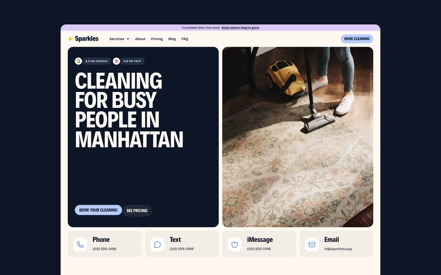
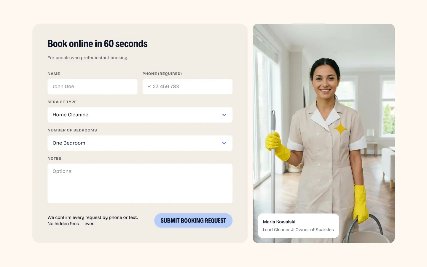
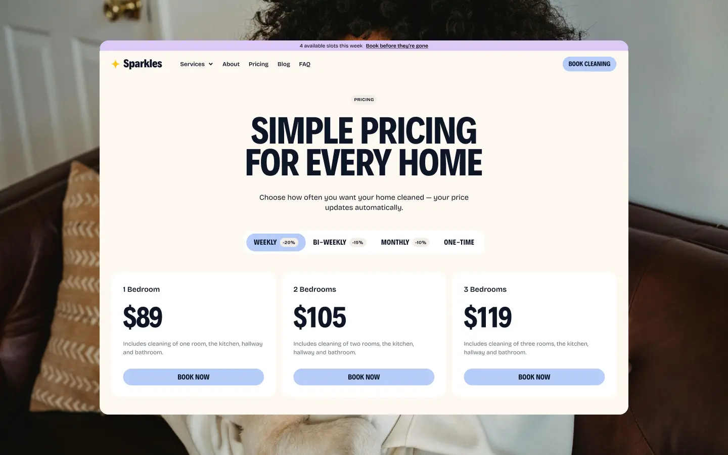
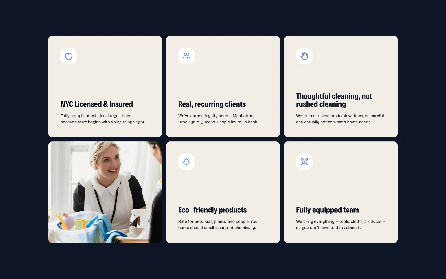
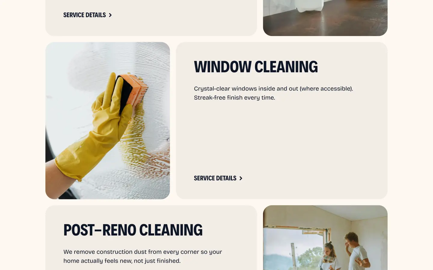
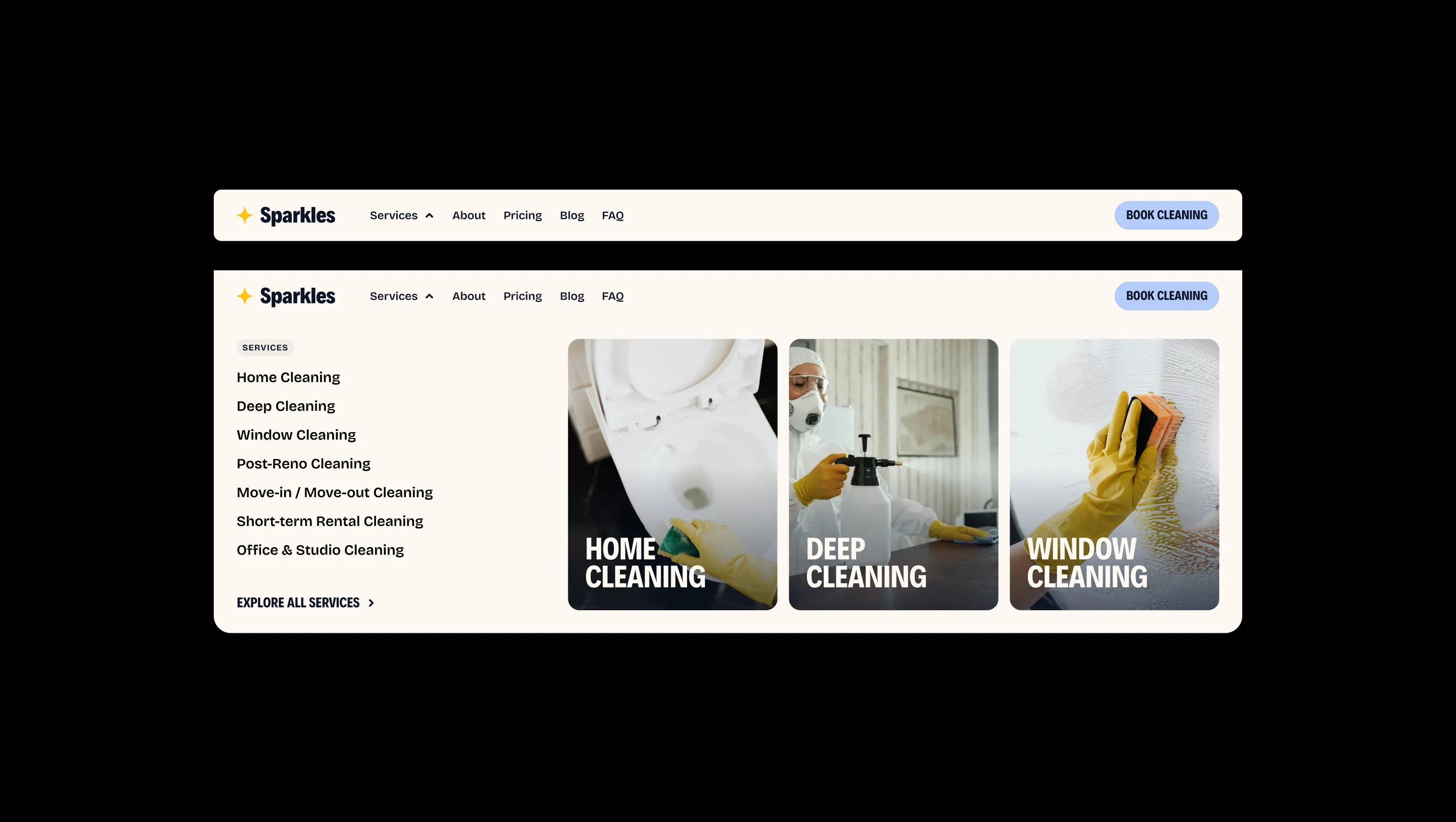
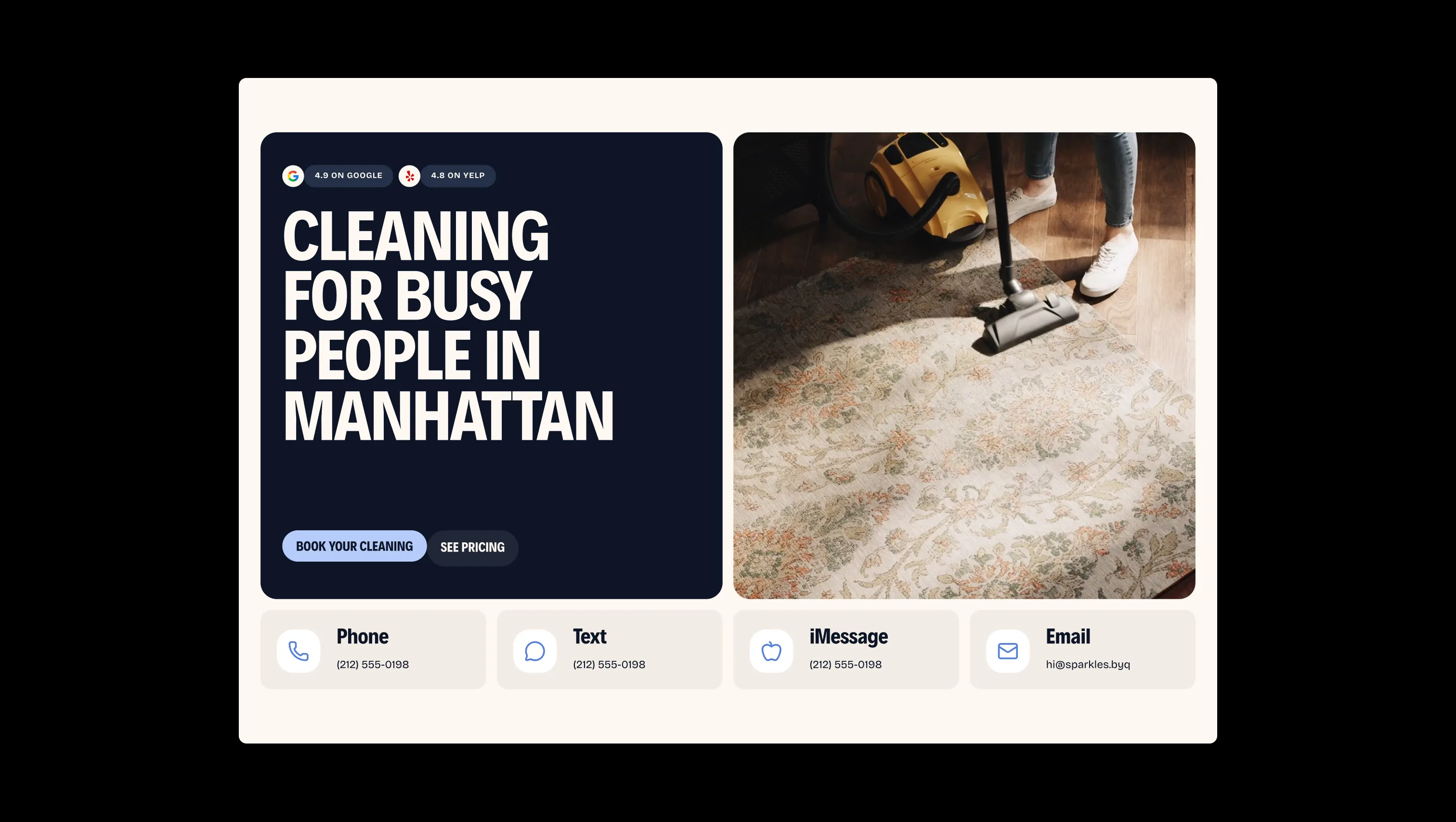
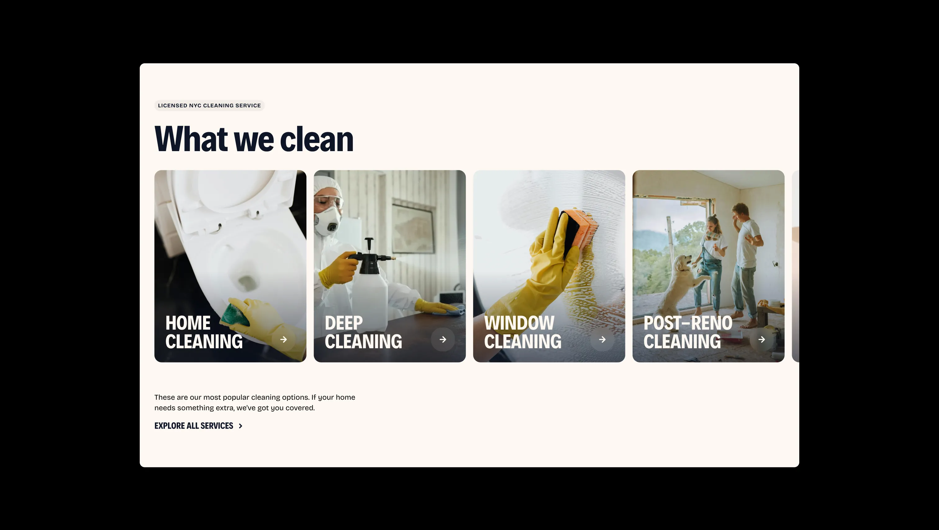
Sparkles is a warm, approachable cleaning service template built for modern urban home-care brands. Its palette balances a rich navy hero block against creamy off-white pages, punctuated by a soft periwinkle-blue button system and a honeyed yellow star mark — creating an atmosphere of professional trust without clinical coldness. Typographically, the template pairs the compressed, bold geometric display face Decalotype Fix with the rounded, variable-weight Bricolage Grotesque for body copy. Headlines are set in full uppercase at extreme sizes with tight leading, giving sections a confident editorial punch, while body text stays comfortable and readable. Layouts favor generous card-based grids with large rounded corners throughout, and the booking flow leans on a split-panel composition — form on the left, human face on the right — to project warmth and accountability.
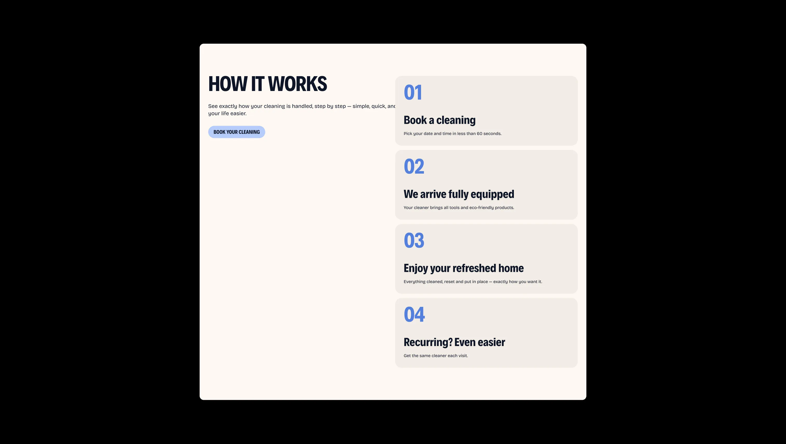
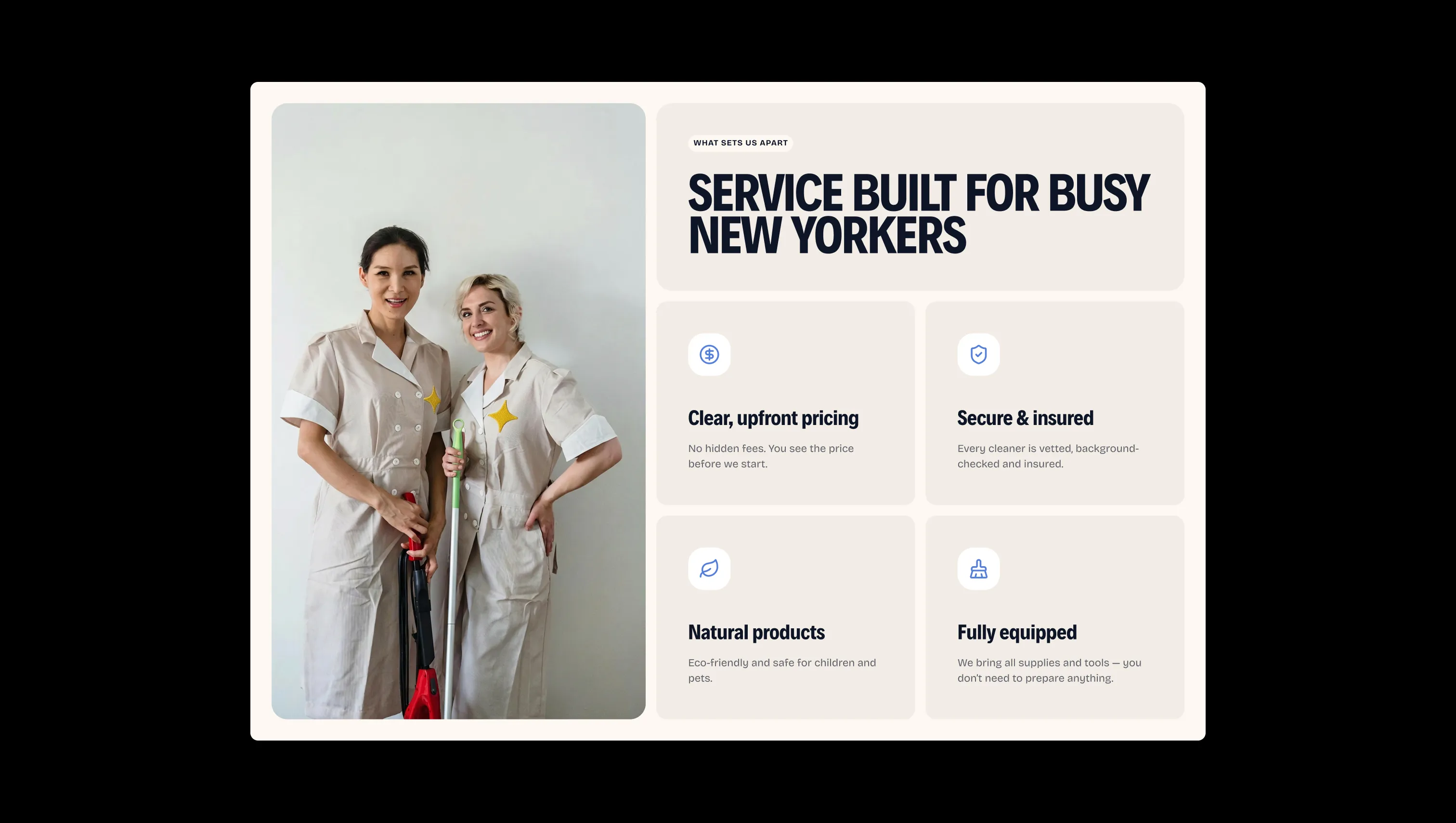
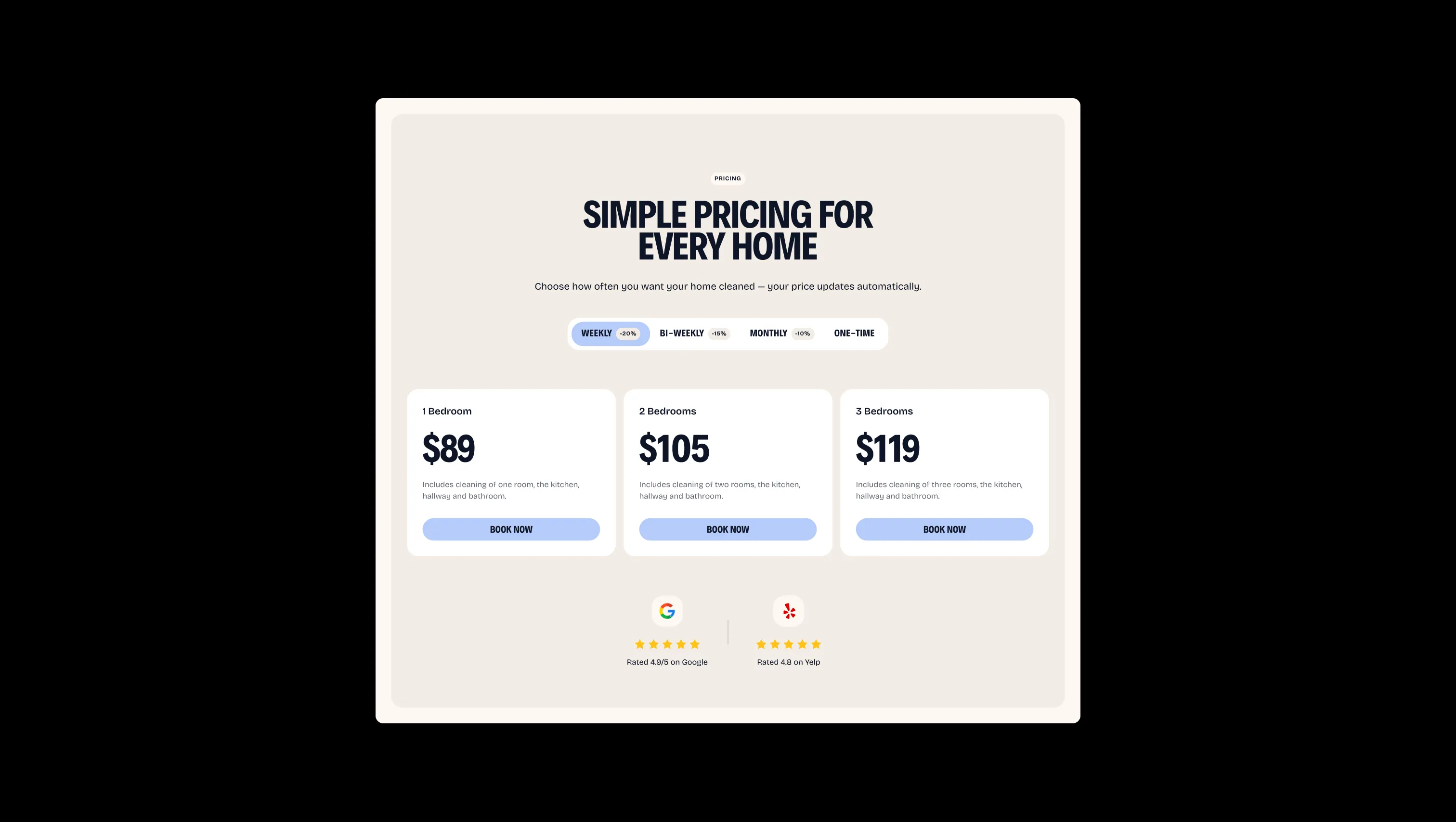
A handful of real sections that ship with this template. Click any card to preview, or explore them all under the Sections tab.
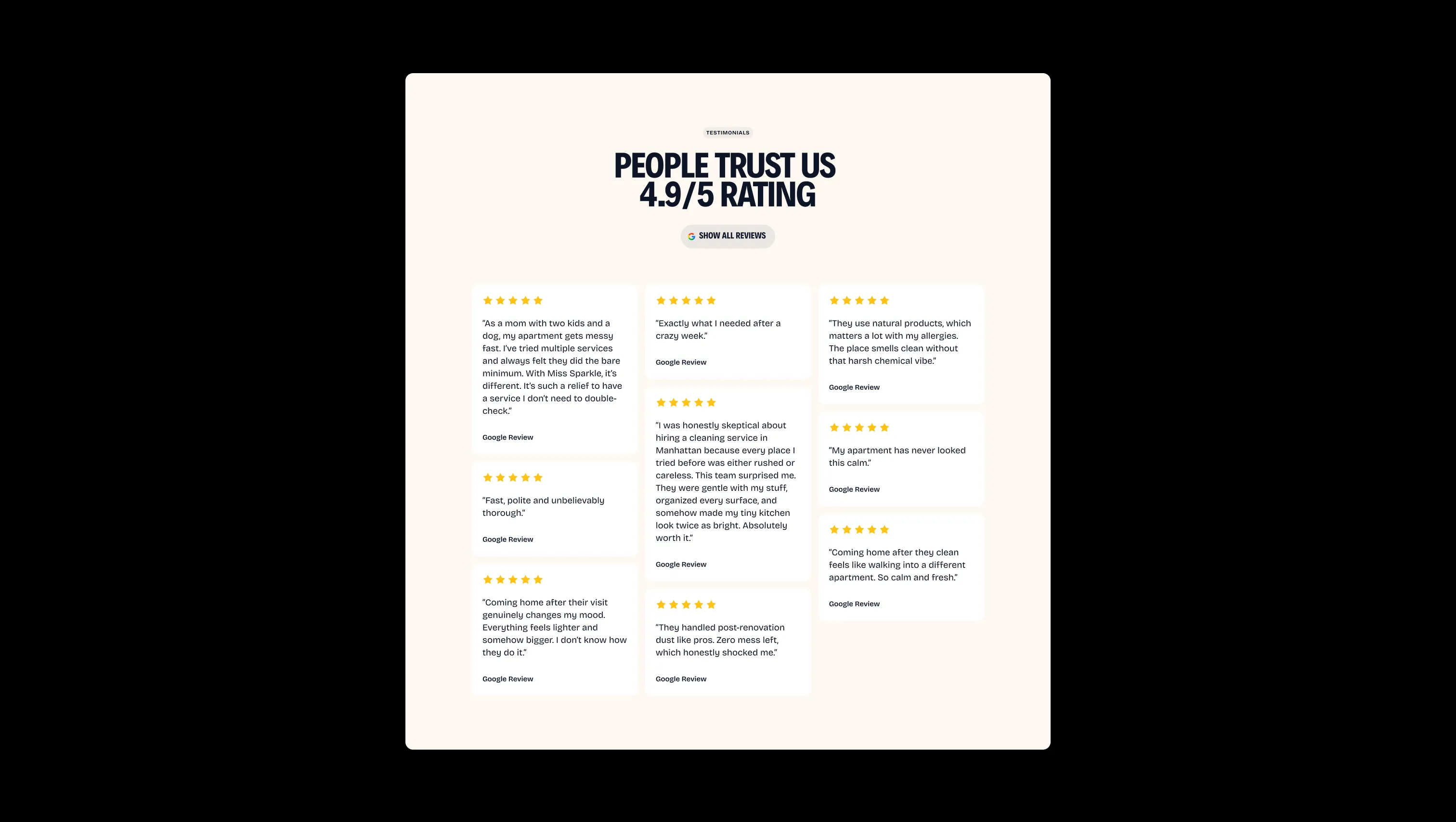
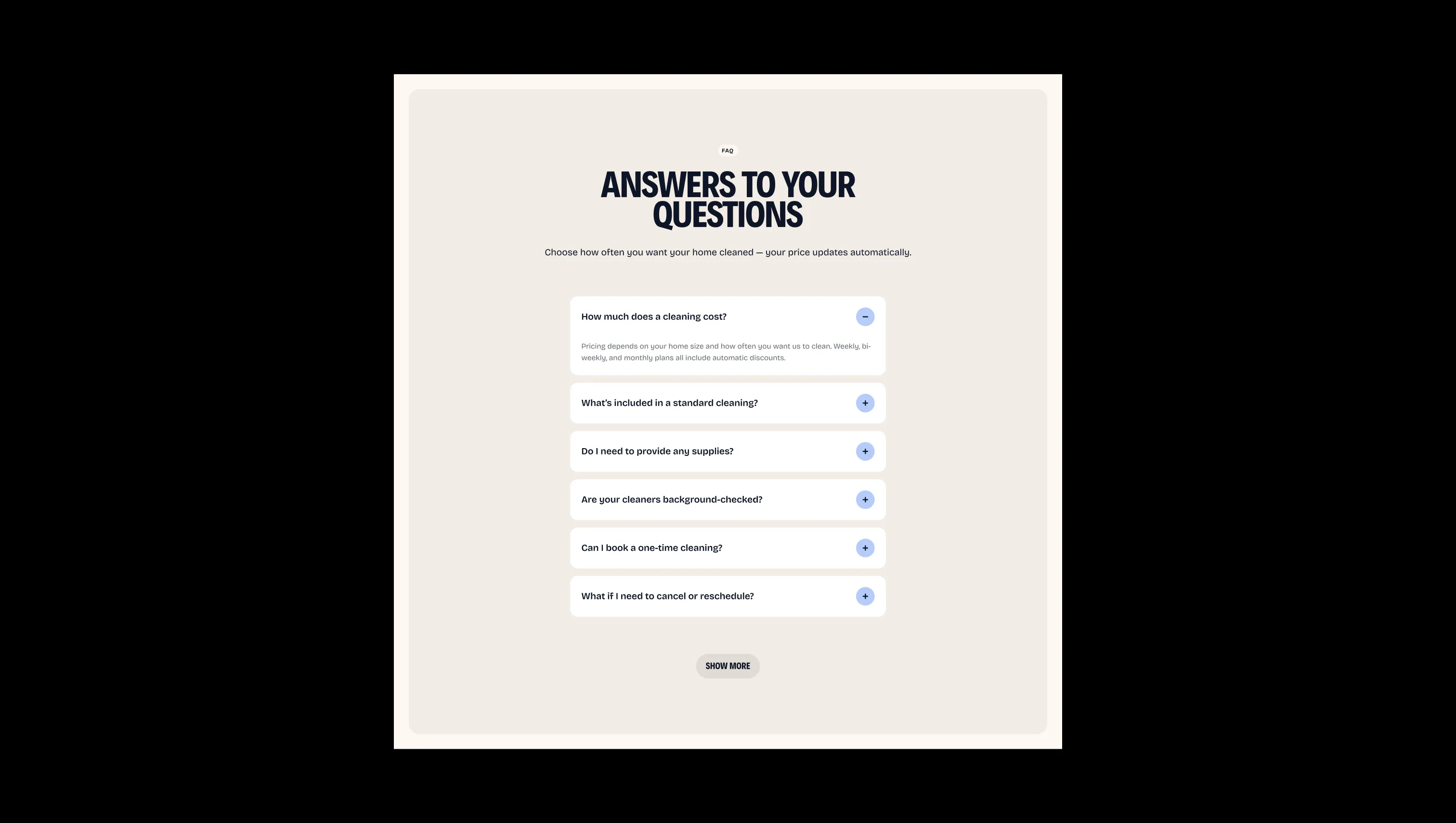
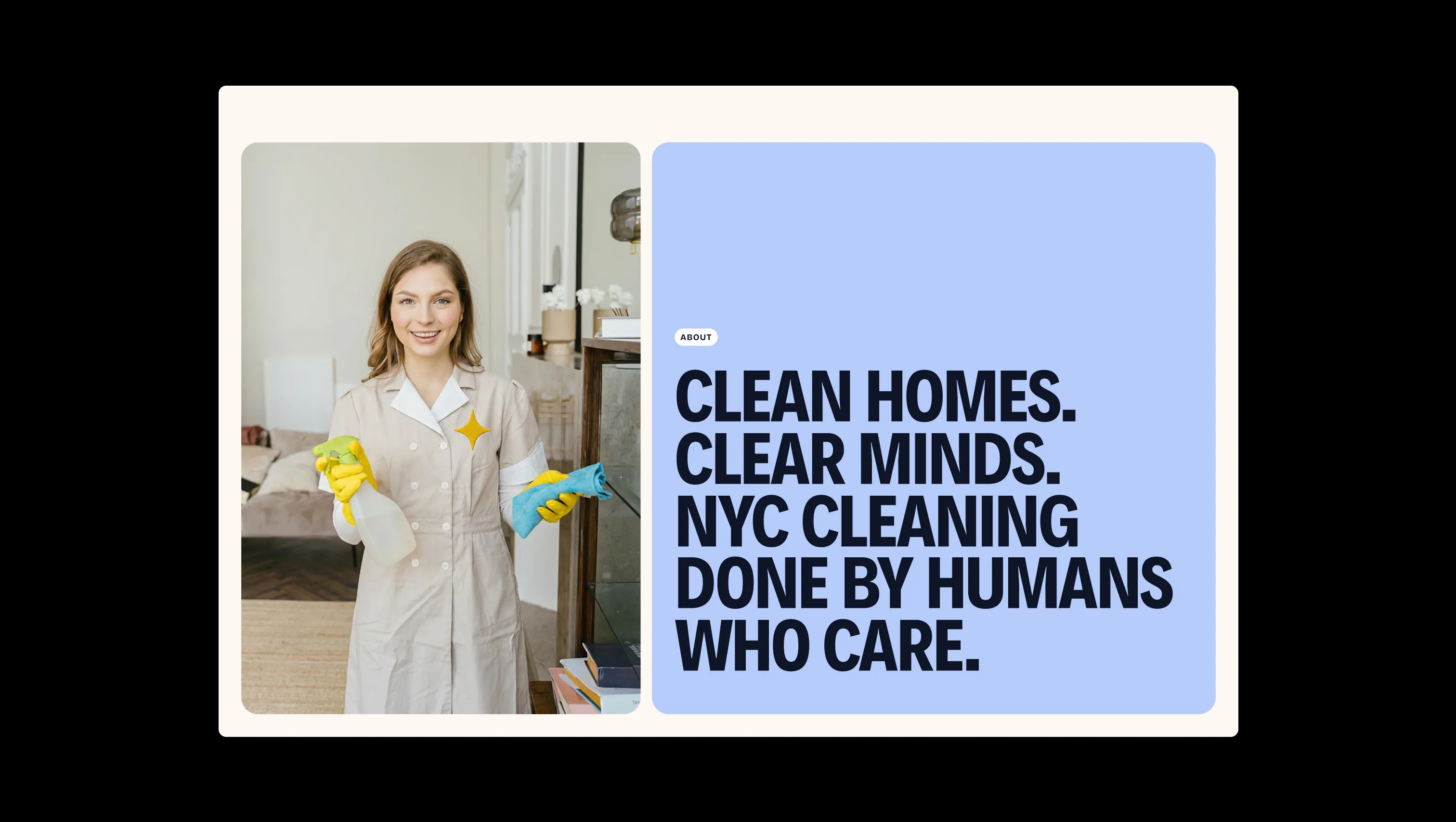

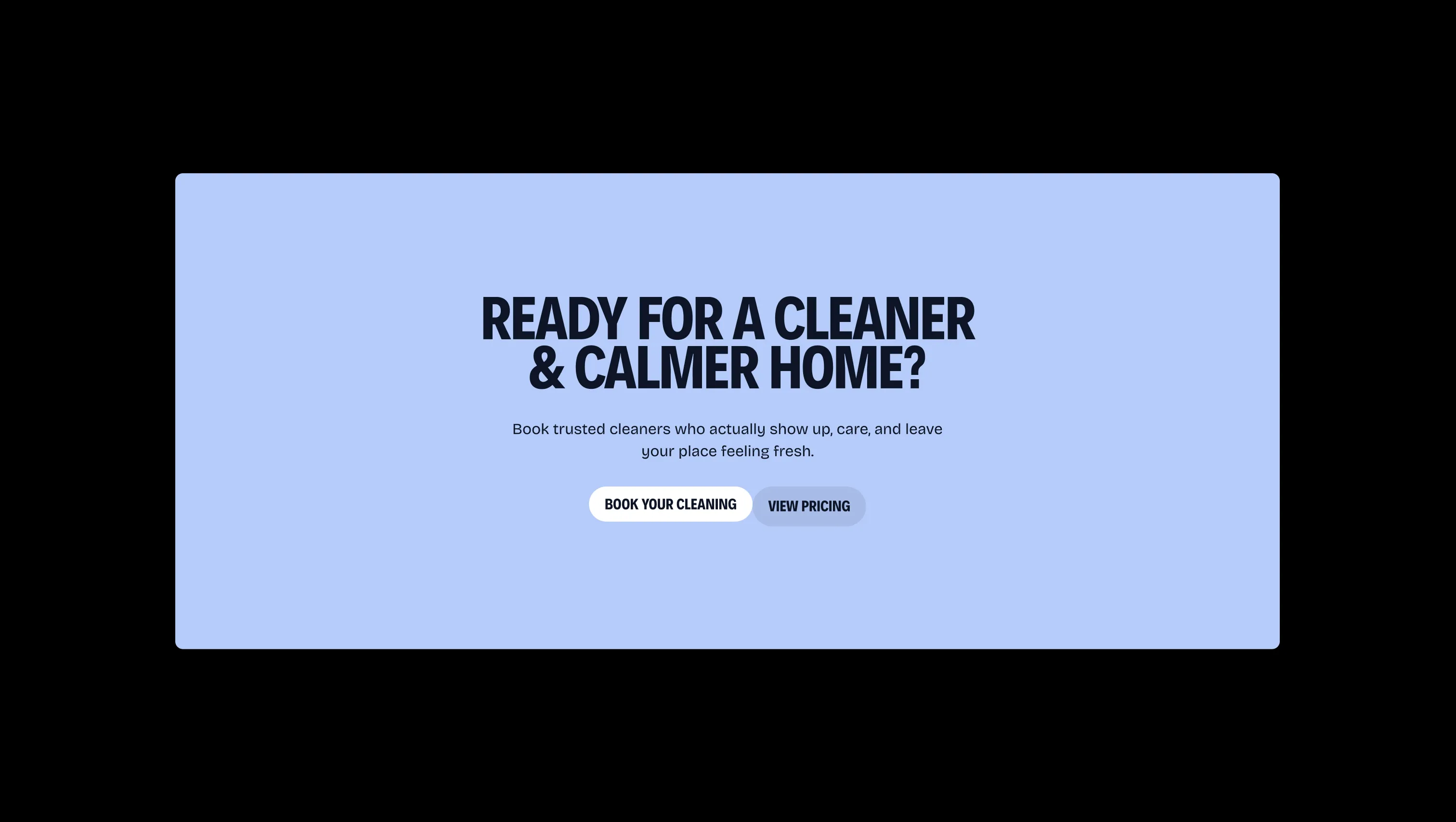

Elevated card surface. Pricing cards, form inputs, add-on items, and any component requiring a crisp white lift above parchment.
Page canvas & navbar fill. The base surface for all light-mode sections, headers, footers, and content backgrounds.
Lifted depth surface. Used for feature cards, footer container, form block backgrounds, and inset review cards.
Secondary body text & muted labels. Descriptive copy, pricing subtitles, and footer legal link color.
Primary ink & dark hero surface. Hero left panel fill, headline text, and button hover states that demand maximum contrast.
Brand logo mark & star accent. The four-point star glyph in the nav logo and any on-brand decorative star motif.
Soft accent & about-hero fill. Applied to the about page hero content panel and as a secondary decorative accent tint.
Primary button fill & CTA banner. Default state for all primary pill buttons, active pricing tabs, and the main CTA section background.
Icon accent & dark-blue link tint. Used for inline icon fills and the dark-blue ink token applied to form icons and decorative elements.
Form error state. Border and message color for invalid or required field validation feedback.
The quick brown fox jumps
Display headings, section headlines, button labels, and navigation dropdown service titles. Always uppercase and tightly tracked.
The quick brown fox jumps
Body copy, labels, captions, form field text, nav links, and all paragraph content. Set in normal weight for reading comfort.
comfortable1800px80px32px24px4px8px12px16px20px24px32px48px64px80px120px160pxtags16pxcards24pxlarge24pxsmall8pxinputs8pxbuttons32pxdefault16pxbuttons-circle24pxStep from canvas (level 1) to lifted (level 2) to inset depth (level 3), then invert into the dark levels for full-bleed sections. Hex codes and roles live in the Colors section above; this ladder shows the layering only.
# Design System Guide

> Unlock the template to access the full design system.

## Brand voice

A short paragraph describing the brand voice, mood, and visual
principles that anchor the system. Tone, cadence, and intent.

## Colors

| Token        | Hex      | Role                                  |
| ------------ | -------- | ------------------------------------- |
| canvas-1     | #xxxxxx  | Page background, large surfaces       |
| canvas-2     | #xxxxxx  | Lifted surfaces, cards                |
| canvas-3     | #xxxxxx  | Inset wells, depressed states         |
| ink-1        | #xxxxxx  | Primary body text                     |
| ink-2        | #xxxxxx  | Secondary text, labels                |
| ink-3        | #xxxxxx  | Tertiary text, hints                  |
| accent-1     | #xxxxxx  | Primary brand accent                  |
| accent-2     | #xxxxxx  | Secondary accent                      |
| state-ok     | #xxxxxx  | Success, confirmations                |
| state-warn   | #xxxxxx  | Warnings                              |
| state-err    | #xxxxxx  | Errors, destructive actions           |

## Typography

- **Display** — heading scale, used for hero text and section titles.
- **Body** — primary reading text, optimized for paragraphs.
- **Mono** — code, data, and tabular numerals.

```
display: 32px / 40px / 48px / 64px / 80px
body:    14px / 16px / 18px
mono:    12px / 14px
```

## Spacing & shape

Base unit: 4px. Scale: 4, 8, 12, 16, 24, 32, 48, 64, 96, 128.
Radii: sm (4px), md (8px), lg (12px), xl (20px), full (9999px).

## Surfaces

Layered elevation from canvas → lifted → inset. Surfaces invert in
dark sections for full-bleed contrast.

## Do's and don'ts

- Do use accent-1 sparingly for primary CTAs only.
- Do maintain at least 4.5:1 contrast on body text.
- Don't mix display and body in the same line.
- Don't use state colors for branding.

## Agent prompt guide

Prompts for AI design tools that respect this system.
Includes example prompts for sections, components, and layouts.

# ...
Unlock the full style guide