Design systems, extracted.
Search curated design systems pulled from premium templates or create one from URL. Open any style for colors, type, spacing, components, and a DESIGN.md or tokens.json your agent can use.
Quickly navigate through the dashboard with your keyboard using the command menu.

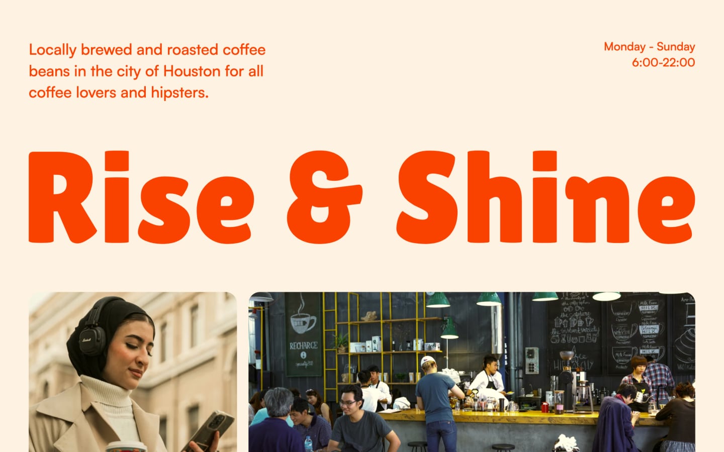
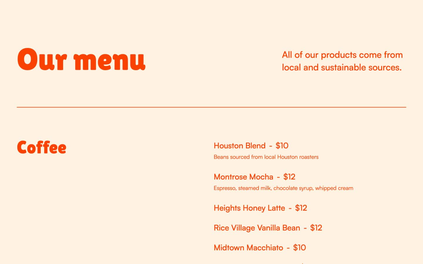
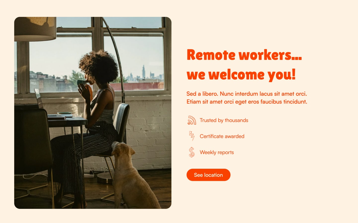
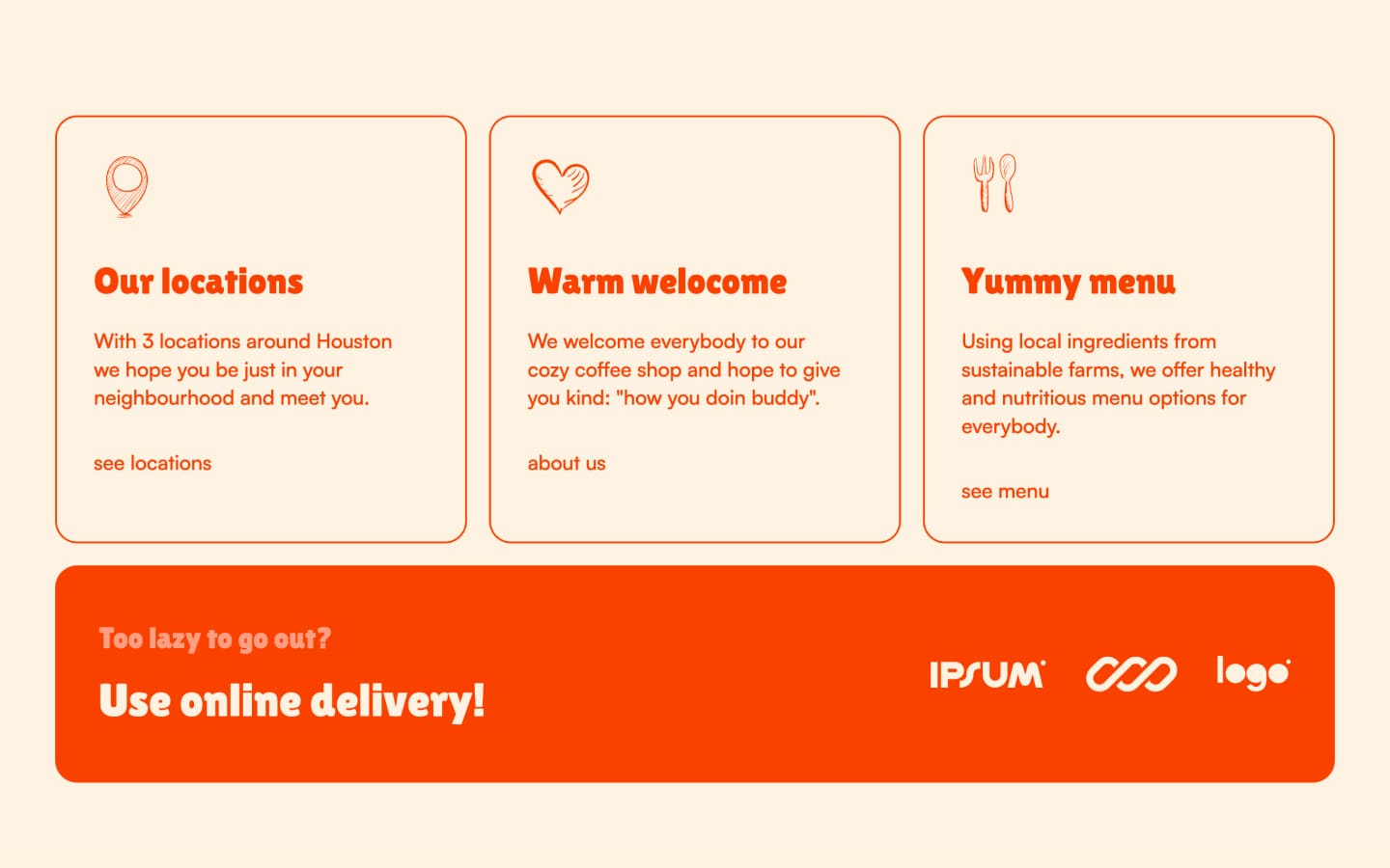
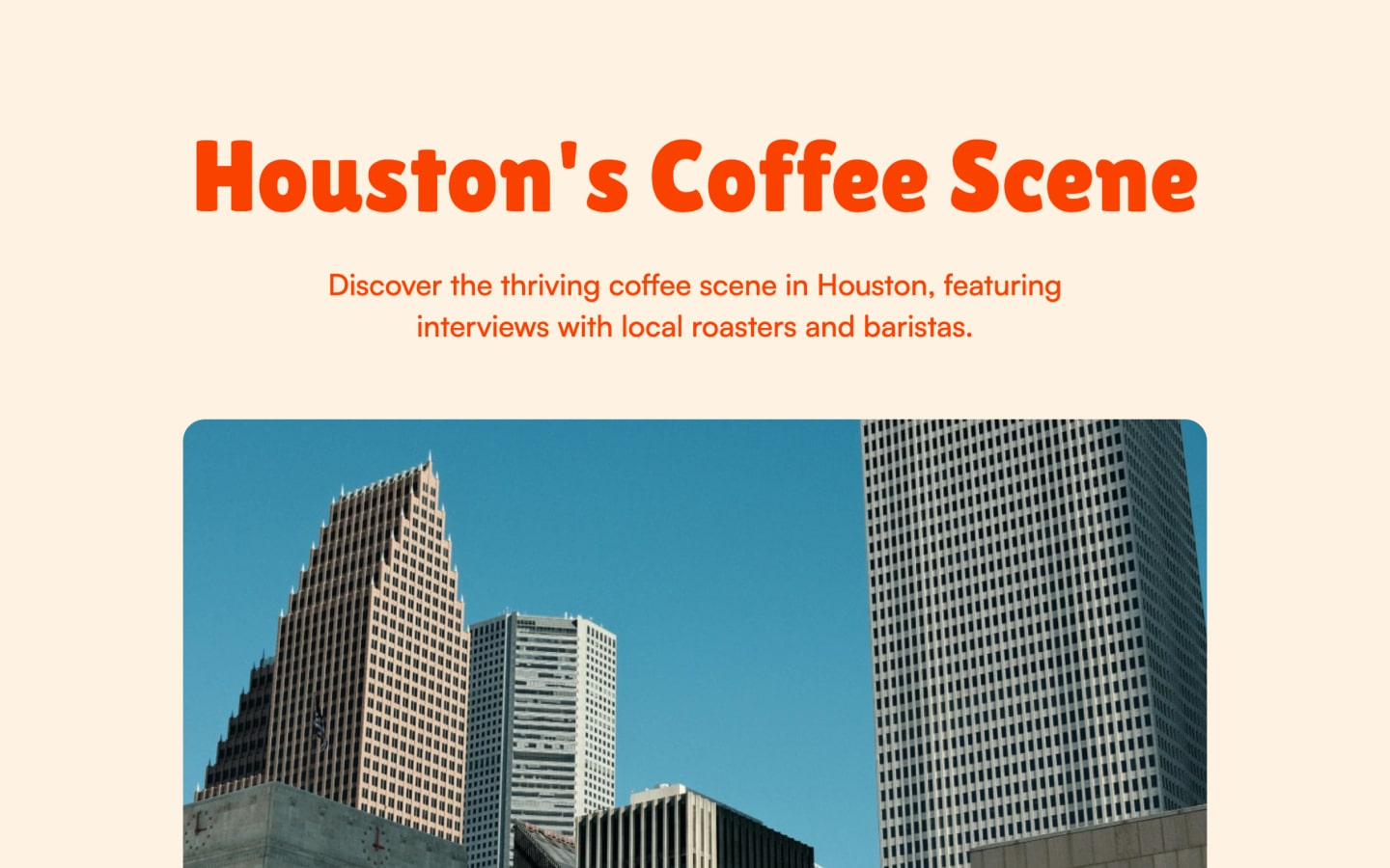
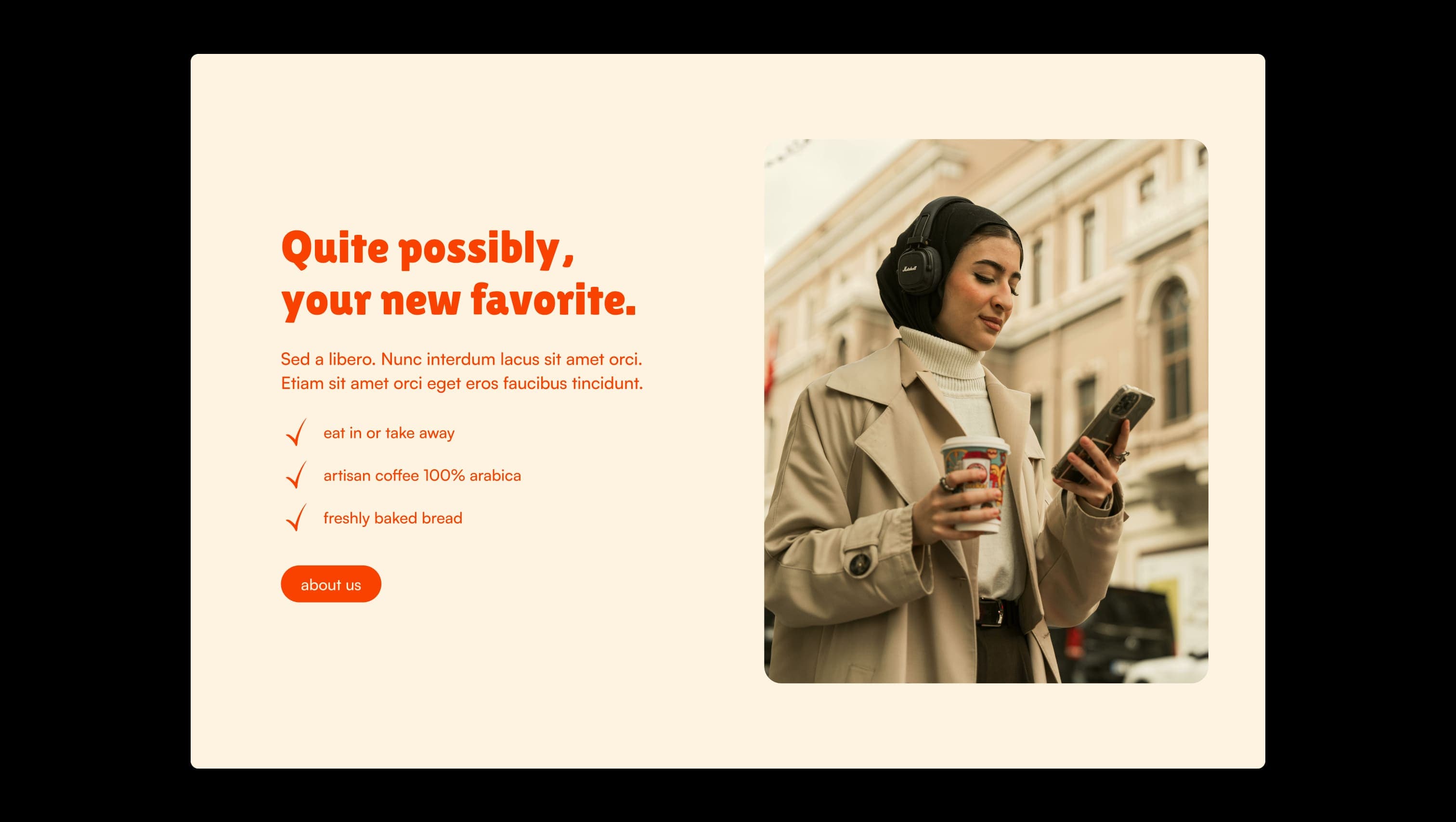
Rise N Shine is a warm, hand-poured ode to neighborhood coffee culture — all soft cream canvases, blazing tangerine ink, and chunky rounded display type that feels like it was painted on a chalkboard at sunrise. The whole system runs on a two-color promise: a buttery off-white sits behind everything, while a single saturated orange does the heavy lifting for text, buttons, borders, dividers, and oversized headlines. The energy is friendly and confident — pillowy Lilita One headlines hit hard against airy Satoshi body copy, generous 120px section gaps let images breathe, and pill-shaped CTAs and 24px rounded photo crops give every block a soft, hospitable silhouette. It is a template that smells like espresso and feels like a flannel shirt: handcrafted, local, and unapologetically cheerful.
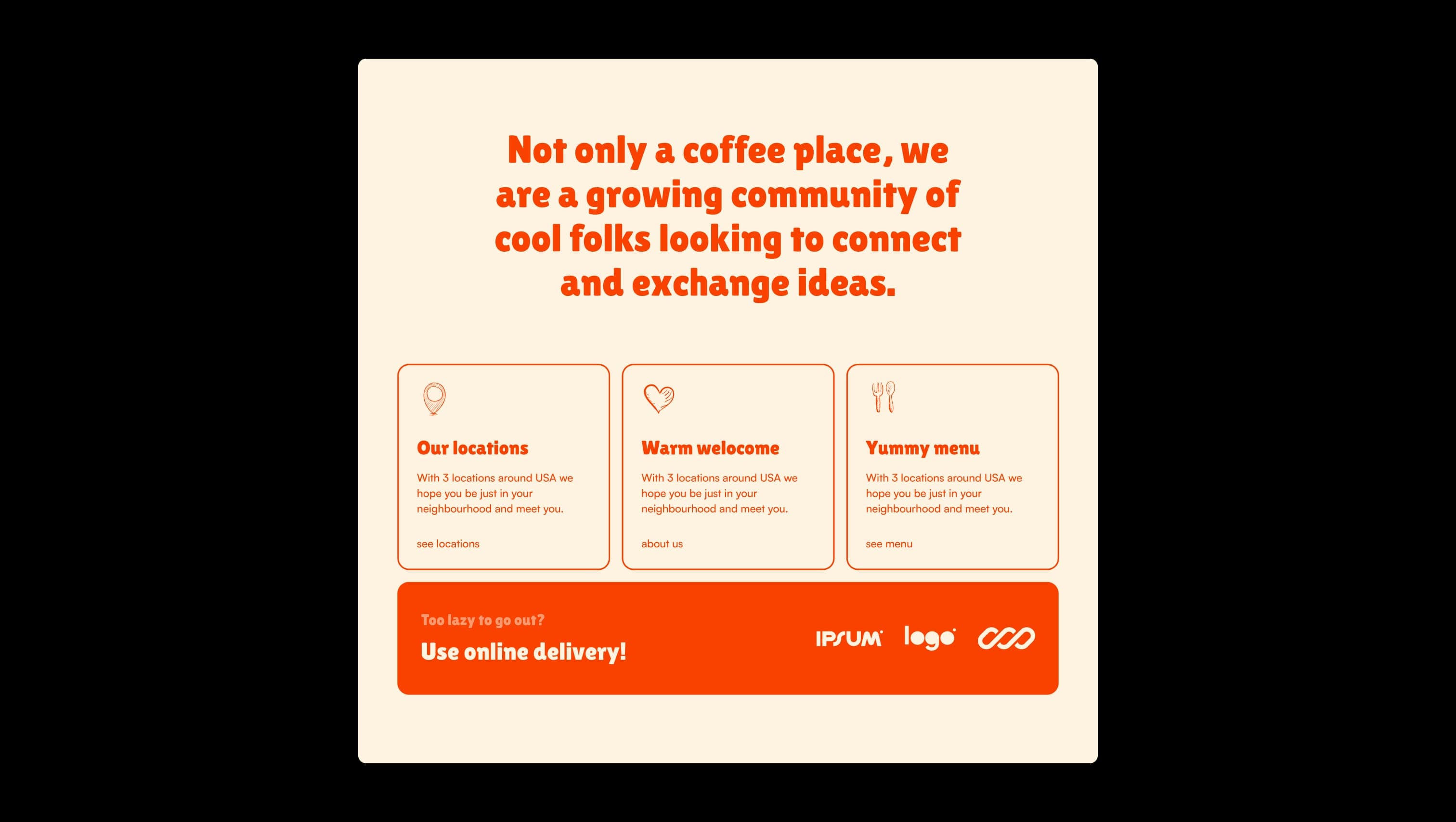
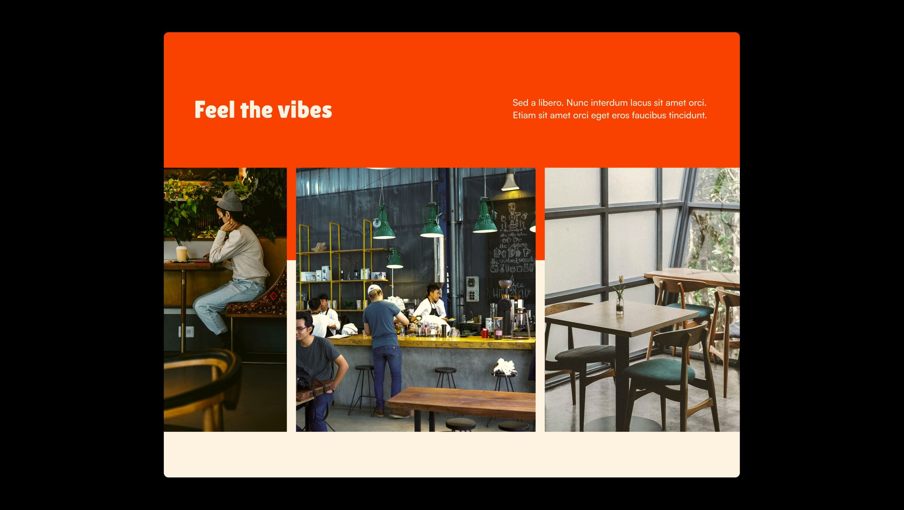
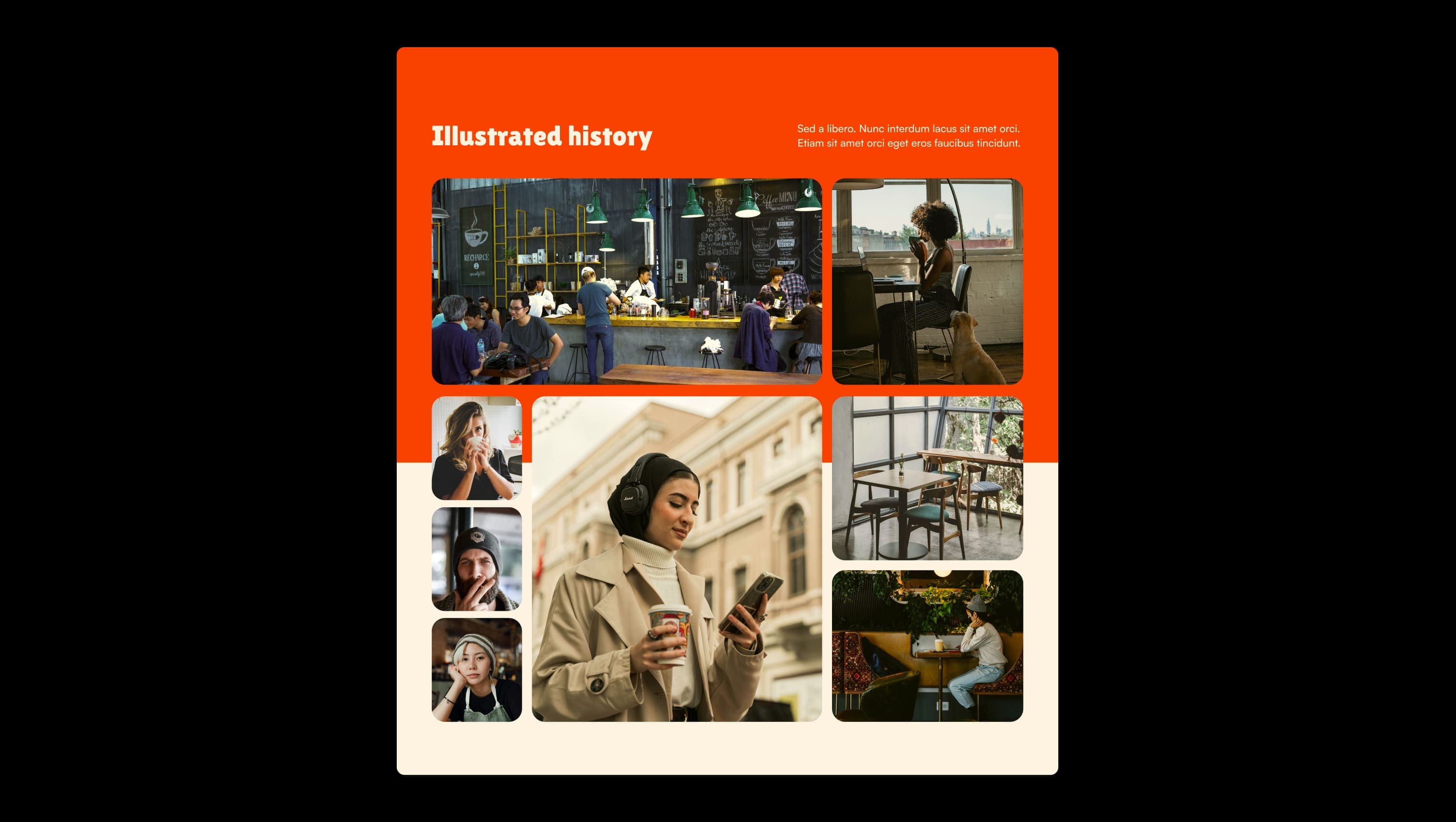
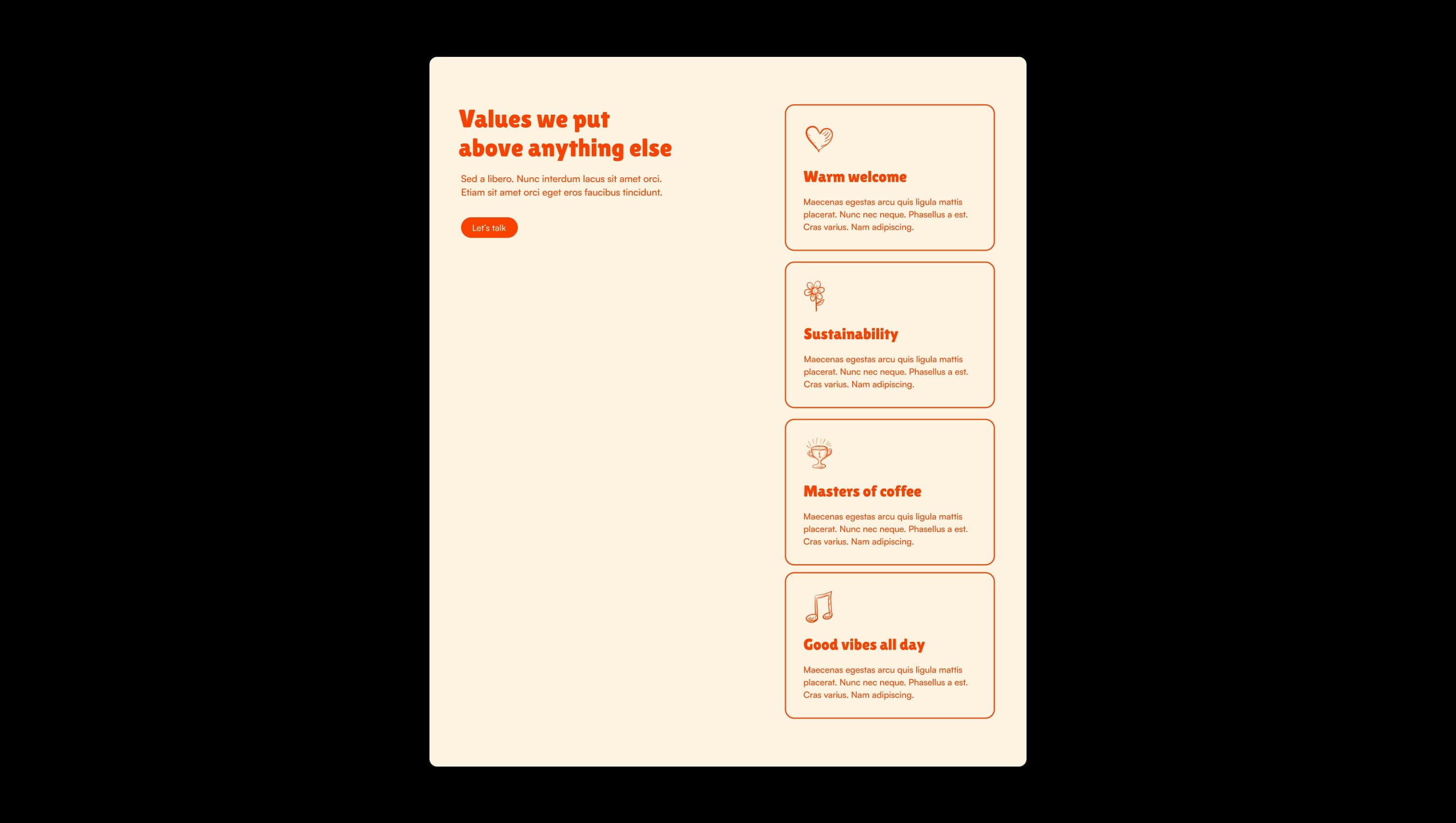
A handful of real sections that ship with this template. Click any card to preview, or explore them all under the Sections tab.
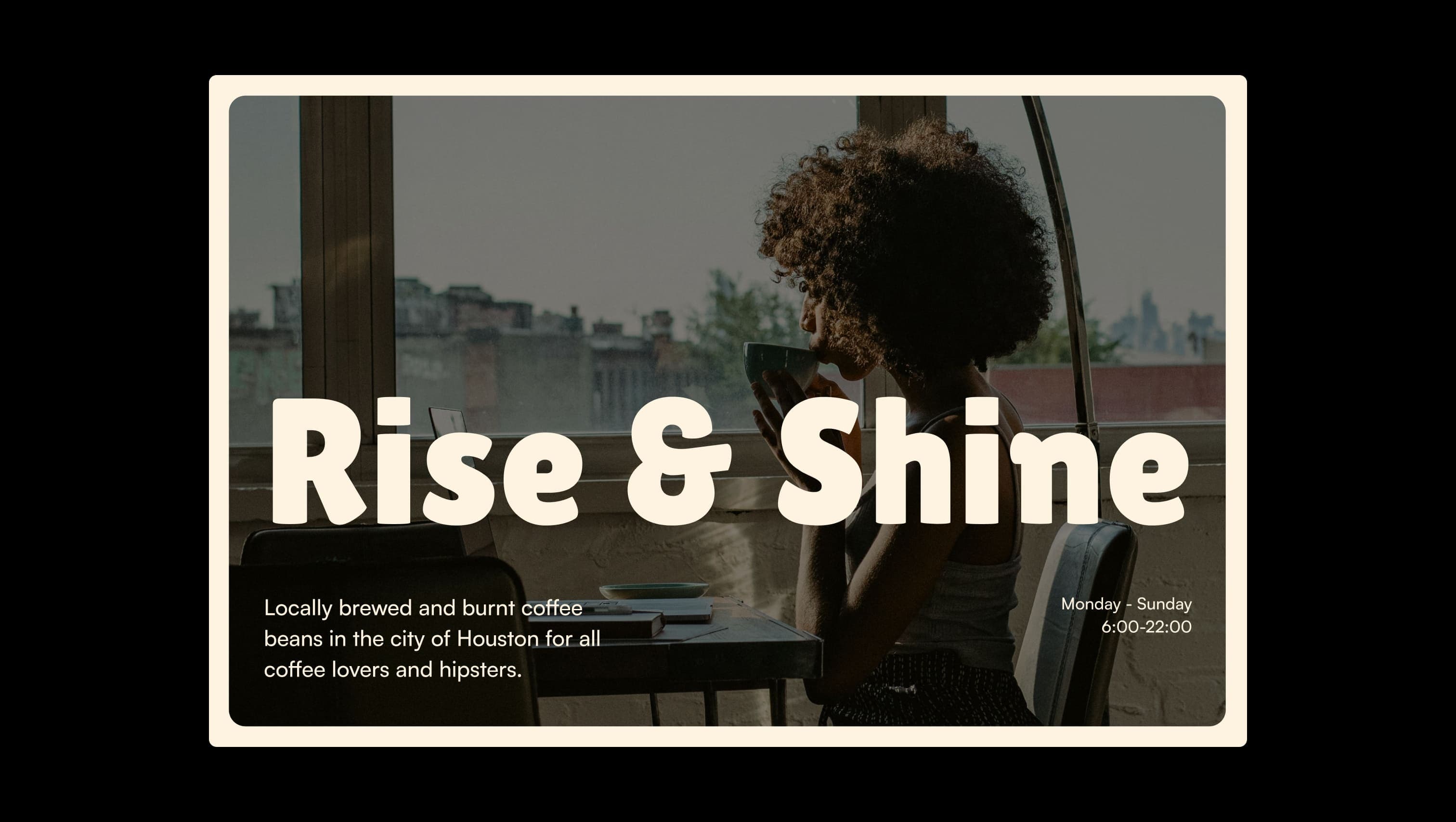
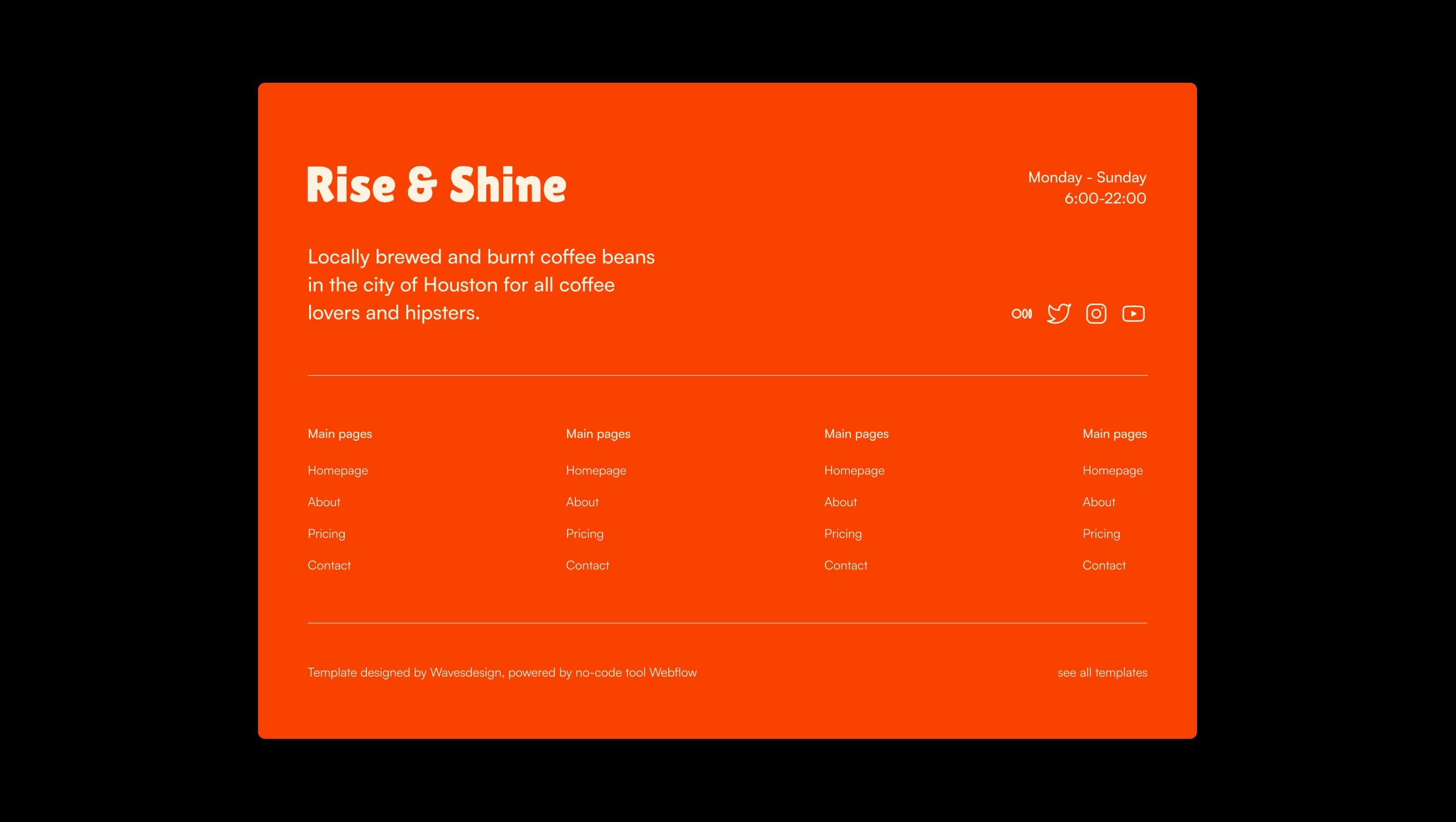
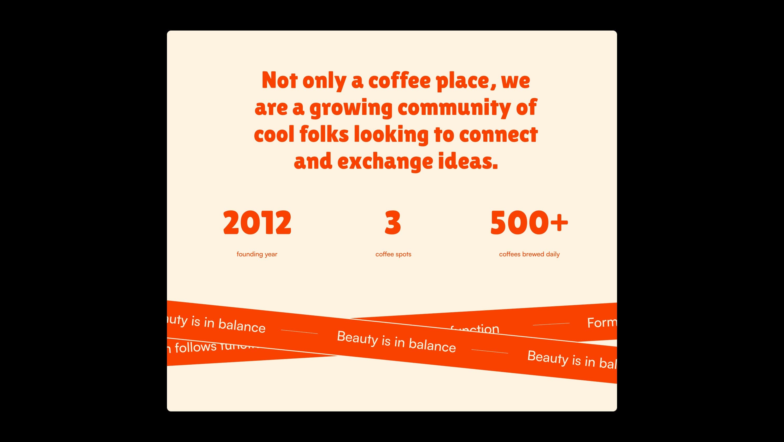
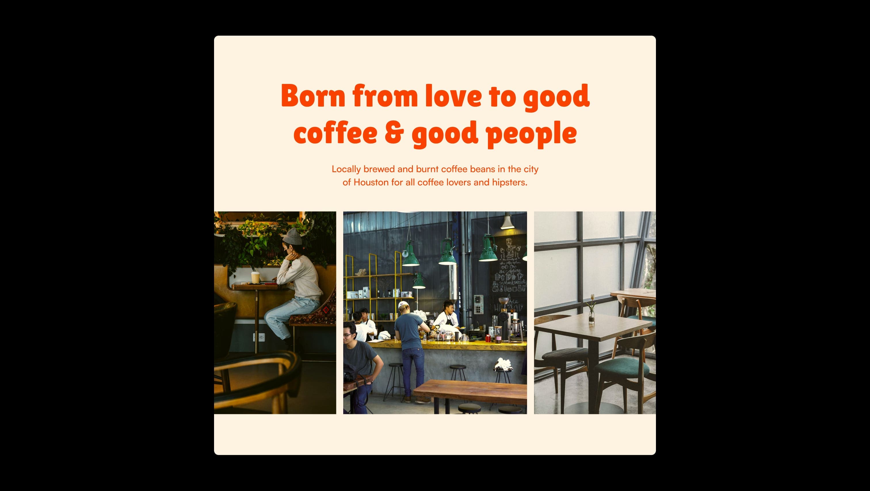
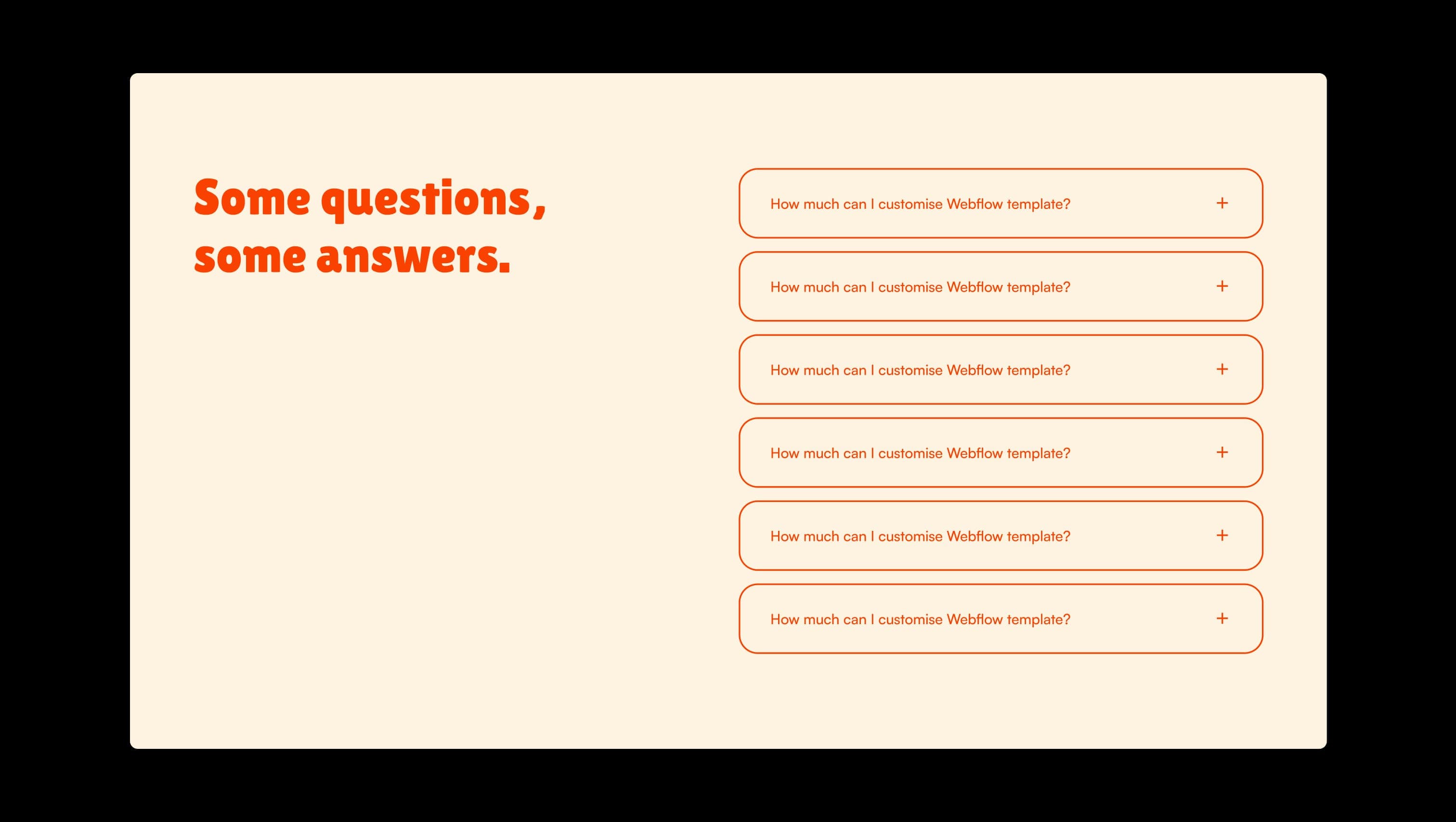
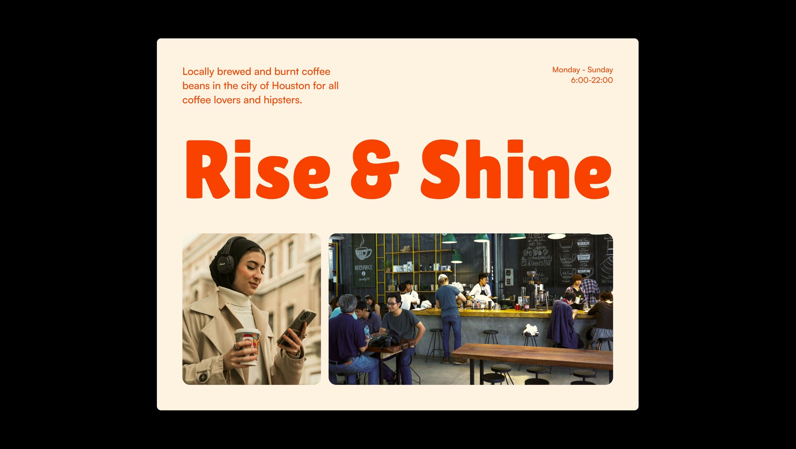
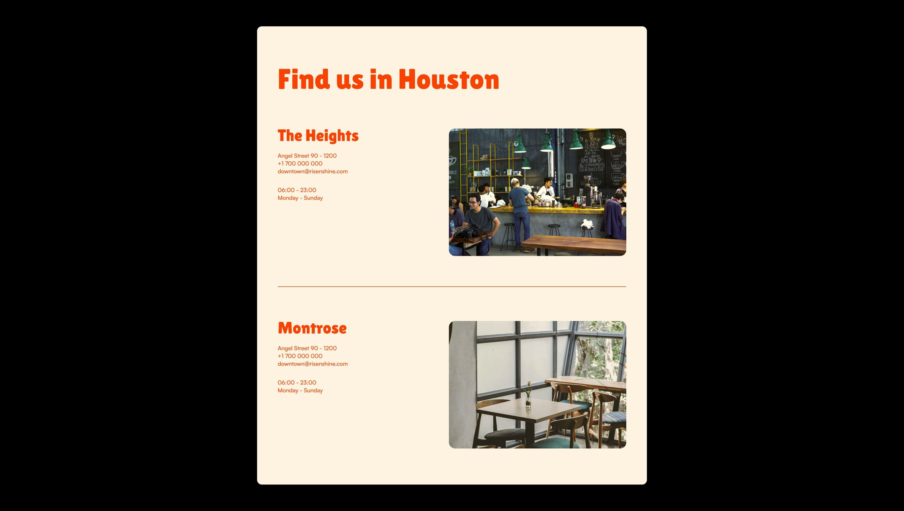
Primary canvas. Page background, button text on orange, footer reverse text, and divider strokes inside dark sections.
Pure white. Used sparingly for ecommerce checkout block headers that need to read against the cream canvas.
Form input underline. Reserved exclusively for the unfocused border of contact text fields.
Photographic overlay. A 50% black scrim laid over hero photography to lift cream-colored text.
Brand ink and signature accent. Drives all body text, headlines, button fills, borders, and gallery section backgrounds.
Hover state for primary CTAs. A half-shade brighter than the brand orange to signal interactivity.
Tinted utility wash. Used for the cart pill in the navbar — a 13% transparent layer of the brand color over cream.
Validation focus. Highlights checkout text fields when focused or in an error state.
The quick brown fox jumps
Display & headline face. Chunky, rounded, single-weight slab-meets-poster type used for every H1–H3, oversized numbers, menu pills, and testimonial quotes.
The quick brown fox jumps
Body & UI face. Clean geometric grotesque used for body copy, navigation links, captions, form fields, and footer text.
spacious1440px120px64px24px4px8px12px16px20px24px32px40px64px80px100px120pxcards24pxsmall12pxcircle9999pxbuttons60pxmenu-pill172pxnavigation70pxStep from canvas (level 1) to lifted (level 2) to inset depth (level 3), then invert into the dark levels for full-bleed sections. Hex codes and roles live in the Colors section above; this ladder shows the layering only.
# Design System Guide

> Unlock the template to access the full design system.

## Brand voice

A short paragraph describing the brand voice, mood, and visual
principles that anchor the system. Tone, cadence, and intent.

## Colors

| Token        | Hex      | Role                                  |
| ------------ | -------- | ------------------------------------- |
| canvas-1     | #xxxxxx  | Page background, large surfaces       |
| canvas-2     | #xxxxxx  | Lifted surfaces, cards                |
| canvas-3     | #xxxxxx  | Inset wells, depressed states         |
| ink-1        | #xxxxxx  | Primary body text                     |
| ink-2        | #xxxxxx  | Secondary text, labels                |
| ink-3        | #xxxxxx  | Tertiary text, hints                  |
| accent-1     | #xxxxxx  | Primary brand accent                  |
| accent-2     | #xxxxxx  | Secondary accent                      |
| state-ok     | #xxxxxx  | Success, confirmations                |
| state-warn   | #xxxxxx  | Warnings                              |
| state-err    | #xxxxxx  | Errors, destructive actions           |

## Typography

- **Display** — heading scale, used for hero text and section titles.
- **Body** — primary reading text, optimized for paragraphs.
- **Mono** — code, data, and tabular numerals.

```
display: 32px / 40px / 48px / 64px / 80px
body:    14px / 16px / 18px
mono:    12px / 14px
```

## Spacing & shape

Base unit: 4px. Scale: 4, 8, 12, 16, 24, 32, 48, 64, 96, 128.
Radii: sm (4px), md (8px), lg (12px), xl (20px), full (9999px).

## Surfaces

Layered elevation from canvas → lifted → inset. Surfaces invert in
dark sections for full-bleed contrast.

## Do's and don'ts

- Do use accent-1 sparingly for primary CTAs only.
- Do maintain at least 4.5:1 contrast on body text.
- Don't mix display and body in the same line.
- Don't use state colors for branding.

## Agent prompt guide

Prompts for AI design tools that respect this system.
Includes example prompts for sections, components, and layouts.

# ...
Unlock the full style guide