Design systems, extracted.
Paste any URL to create a design system from it. Open any style for colors, type, spacing, components, and a DESIGN.md or tokens.json your agent can use.
Quickly navigate through the dashboard with your keyboard using the command menu.

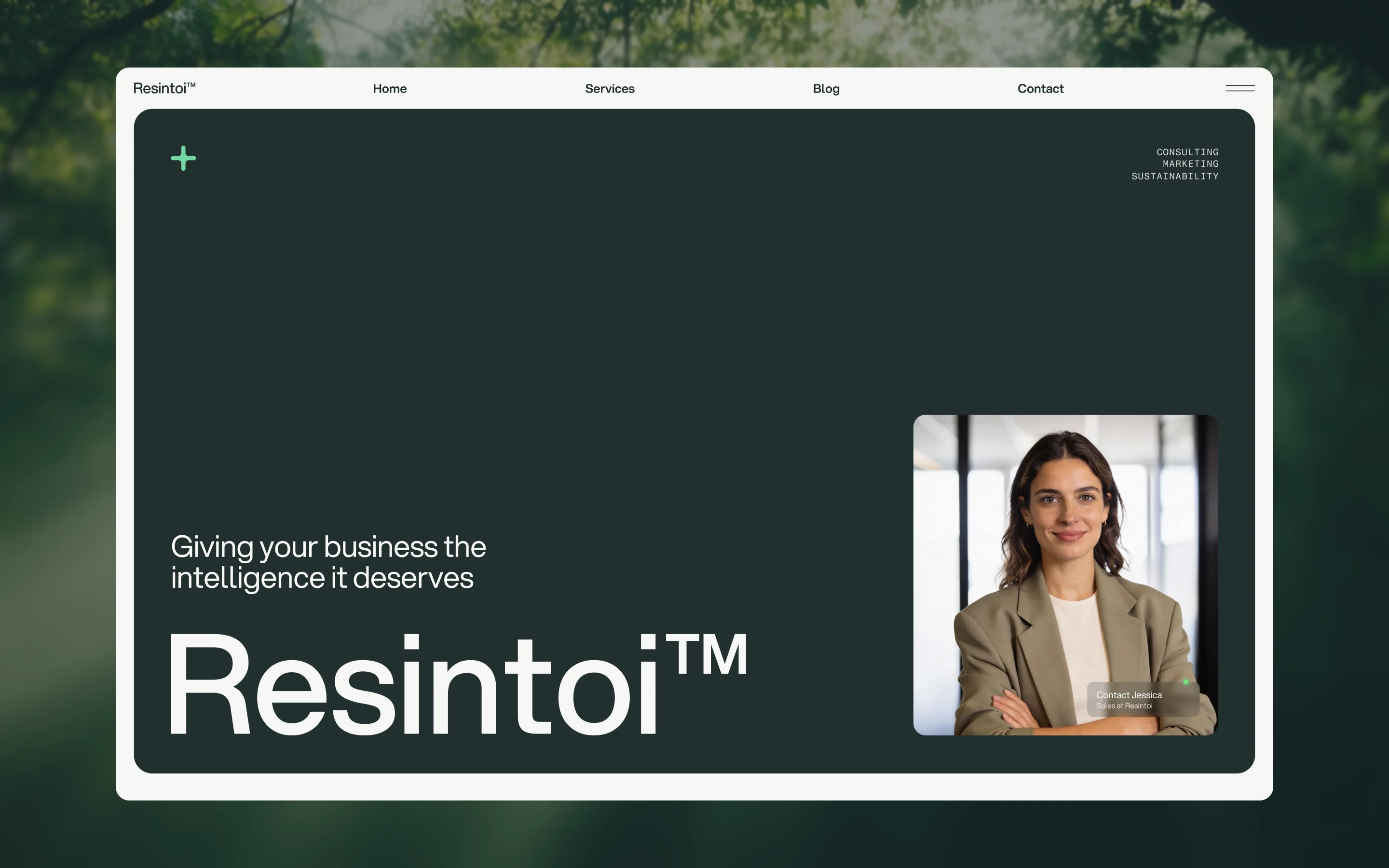
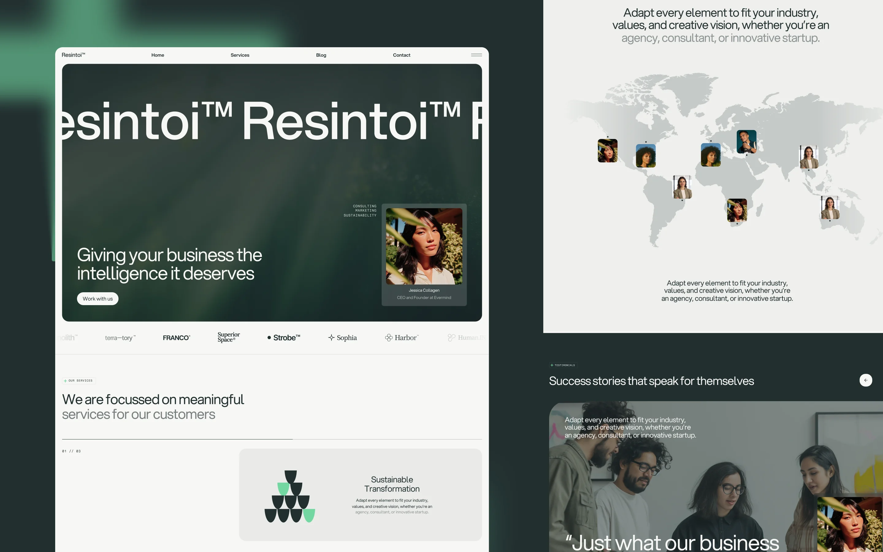

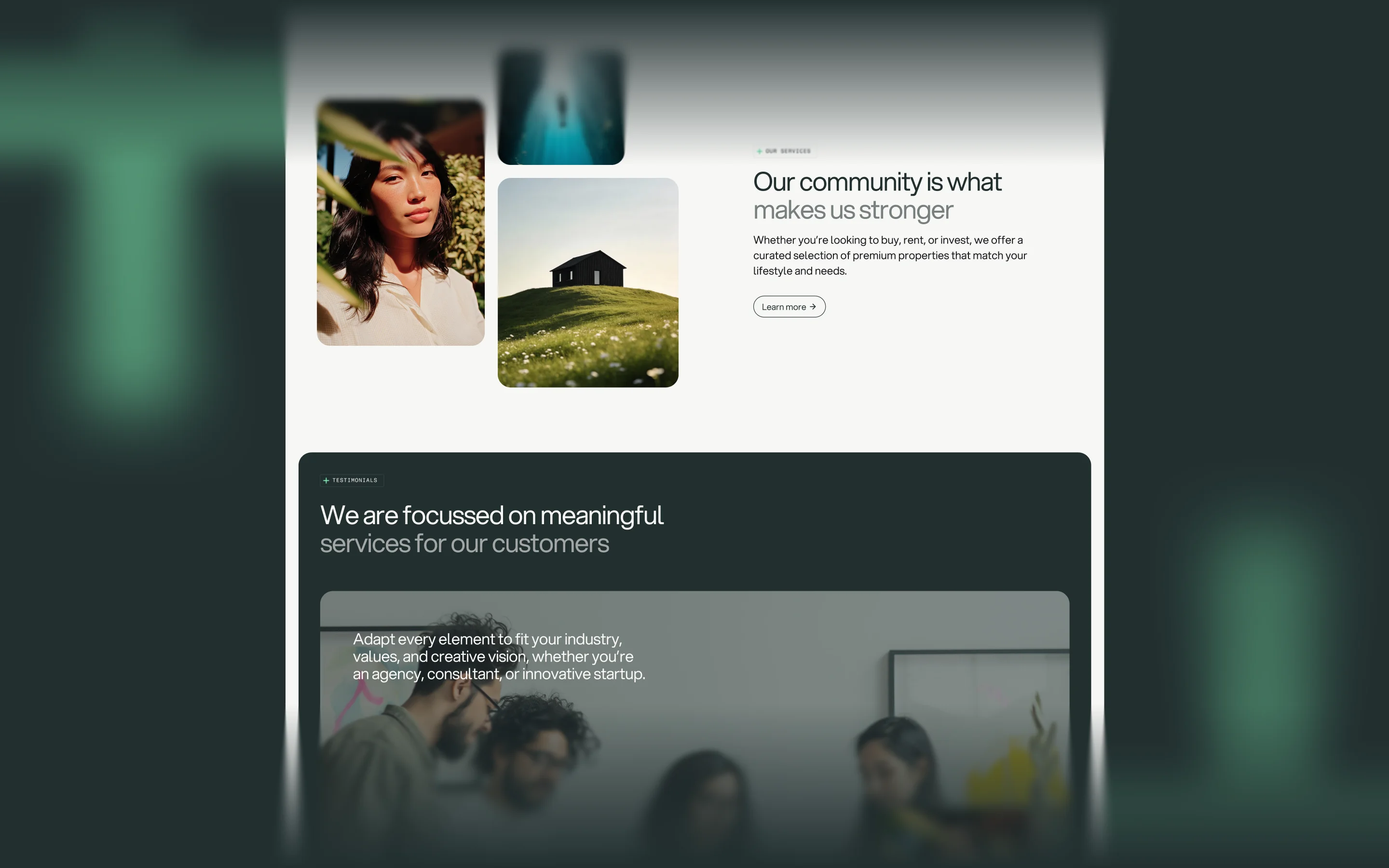
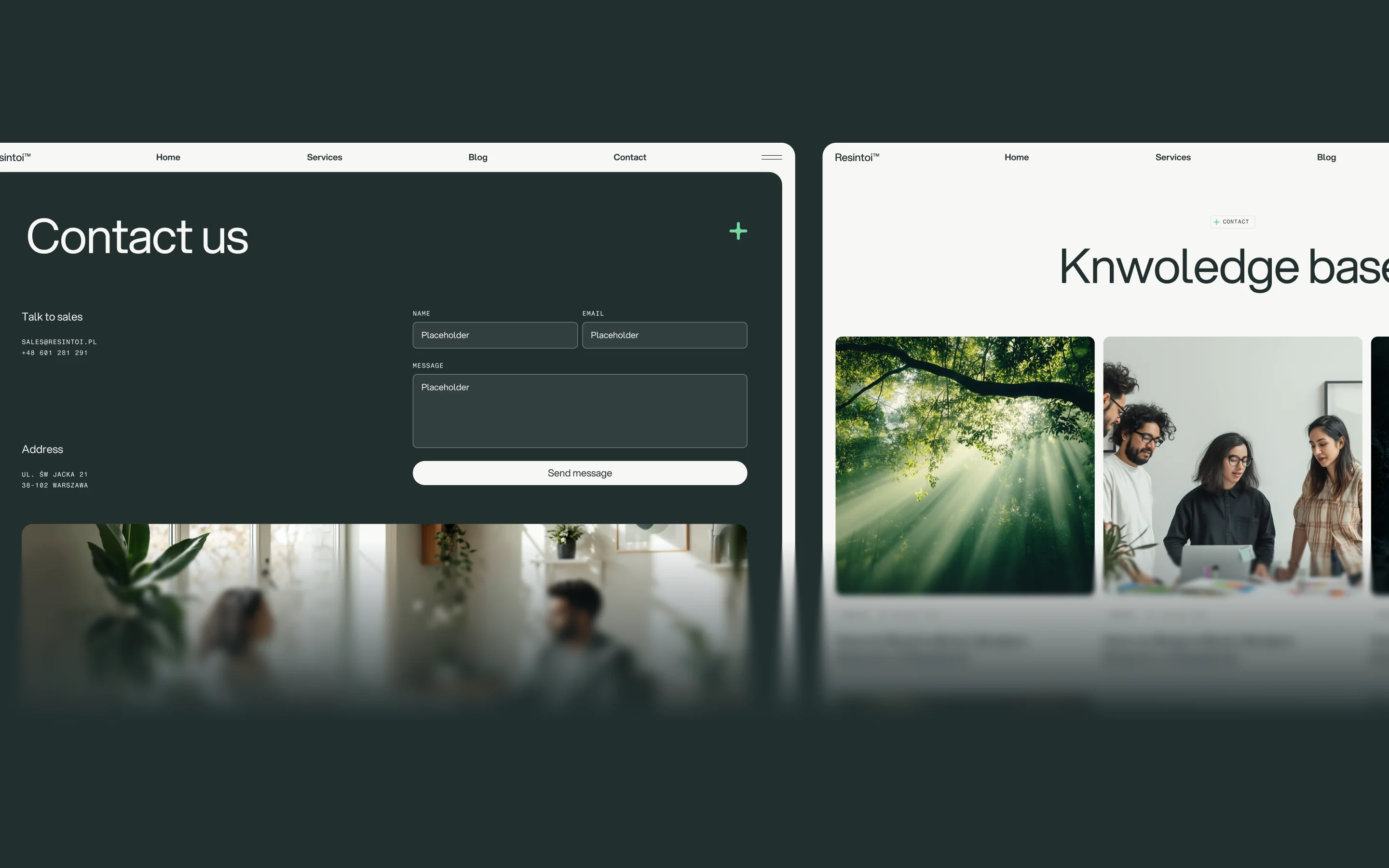
Resintoi™ is a sustainability-focused consultancy template built around a confident, earthy duality: a warm off-white canvas for editorial clarity, and a deep forest-green dark surface for immersive hero and testimonial sections. The palette draws from the natural world — mossy dark tones, chalky neutrals, and a single electric mint accent — evoking both environmental credibility and forward-thinking intelligence. The typography is anchored by Aspekta, a geometric sans-serif used across headings, body, and buttons, paired with Fragment Mono exclusively for uppercase labels and micro-metadata — creating a sophisticated editorial rhythm between organic warmth and technical precision. GSAP-powered entrance animations (translate3d + opacity fades) give every section a deliberate, unhurried arrival, reinforcing the brand's ethos of measured, meaningful action.
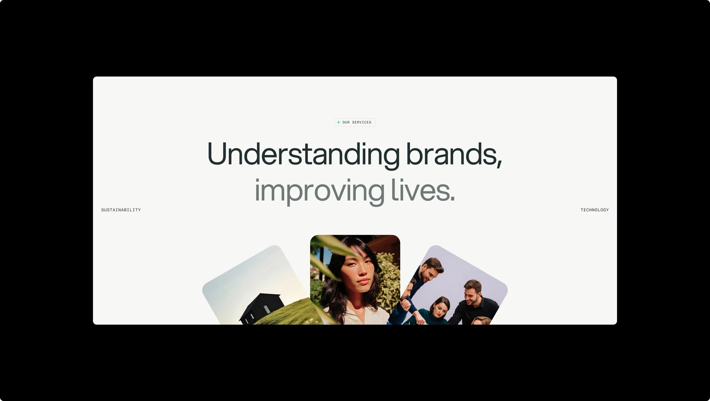
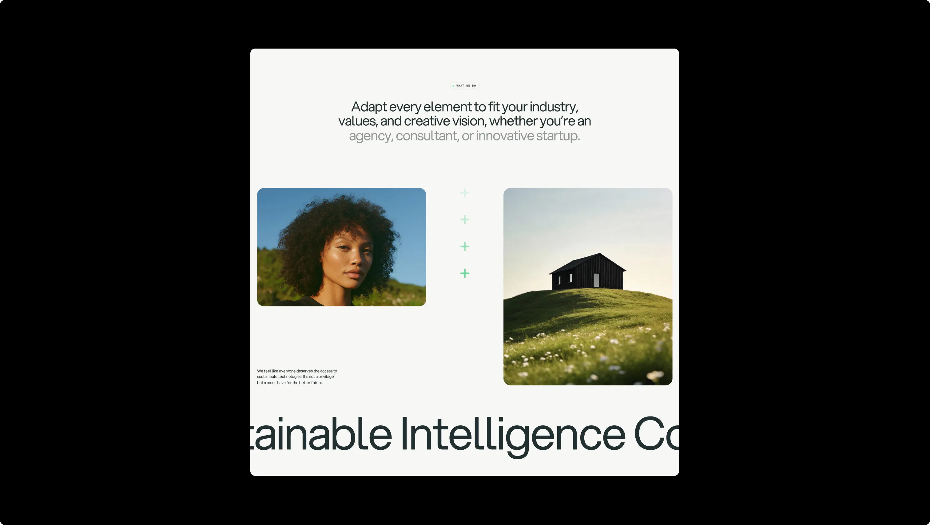
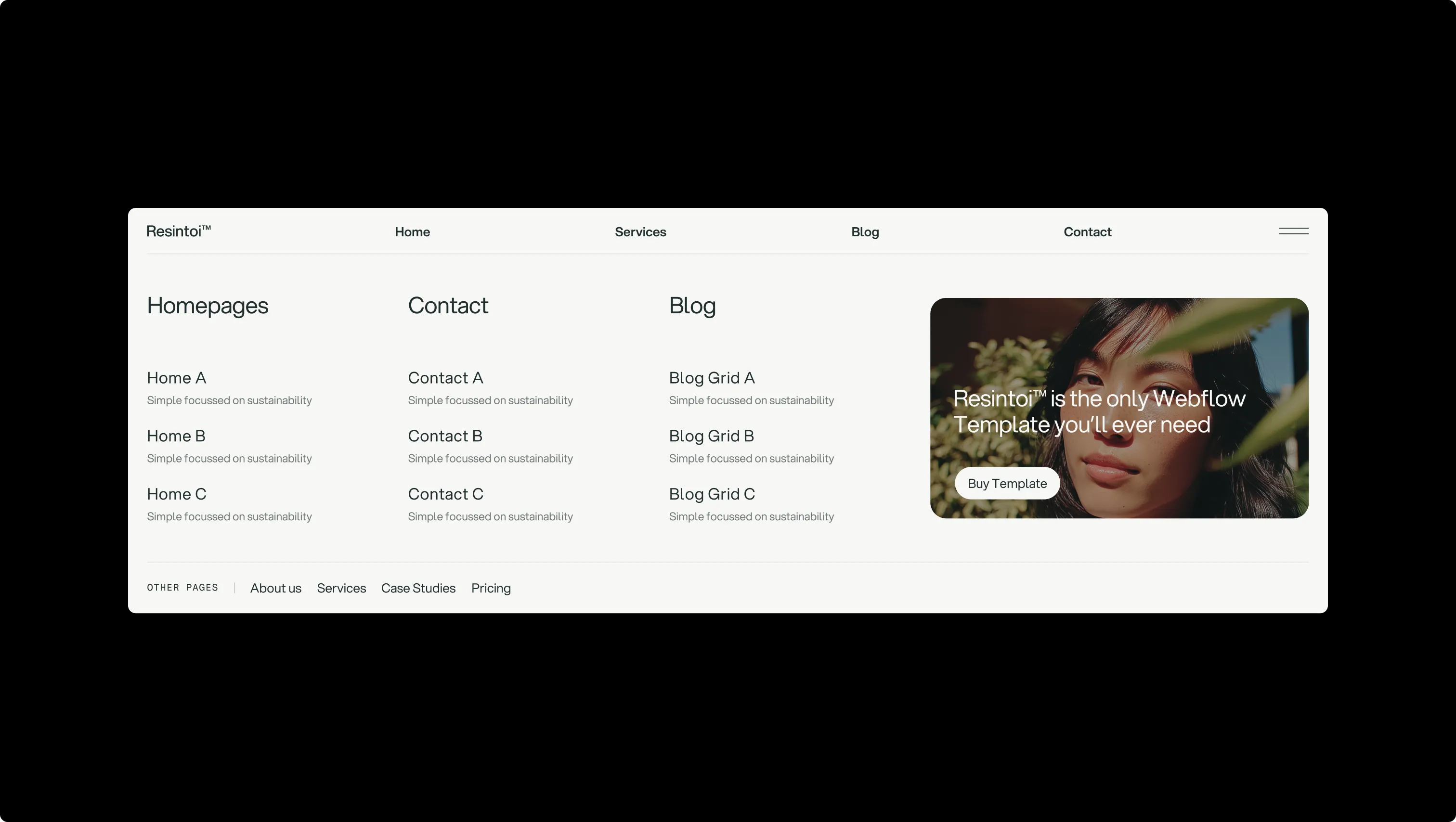
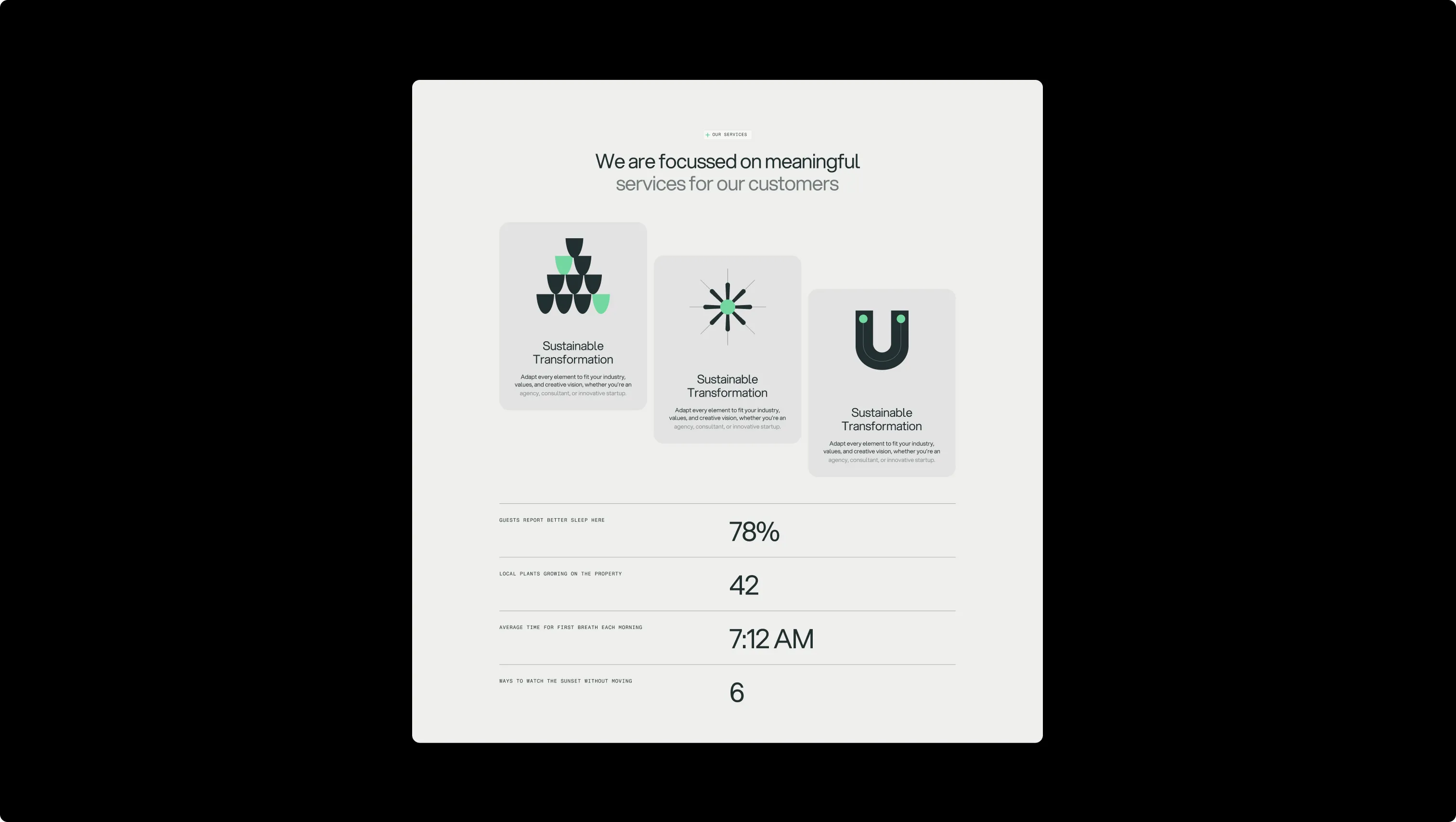
A handful of real sections that ship with this template. Click any card to preview, or explore them all under the Sections tab.
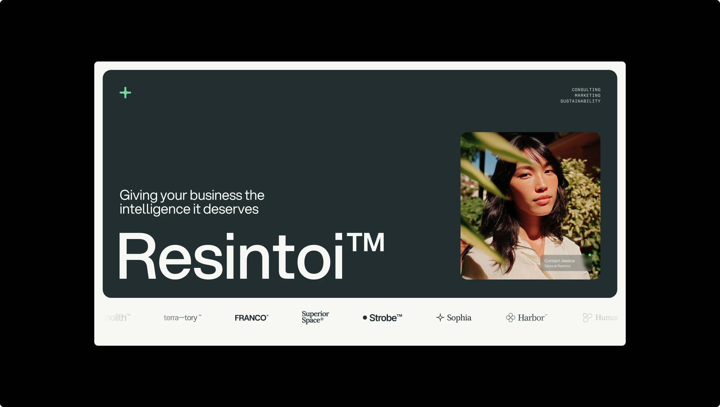
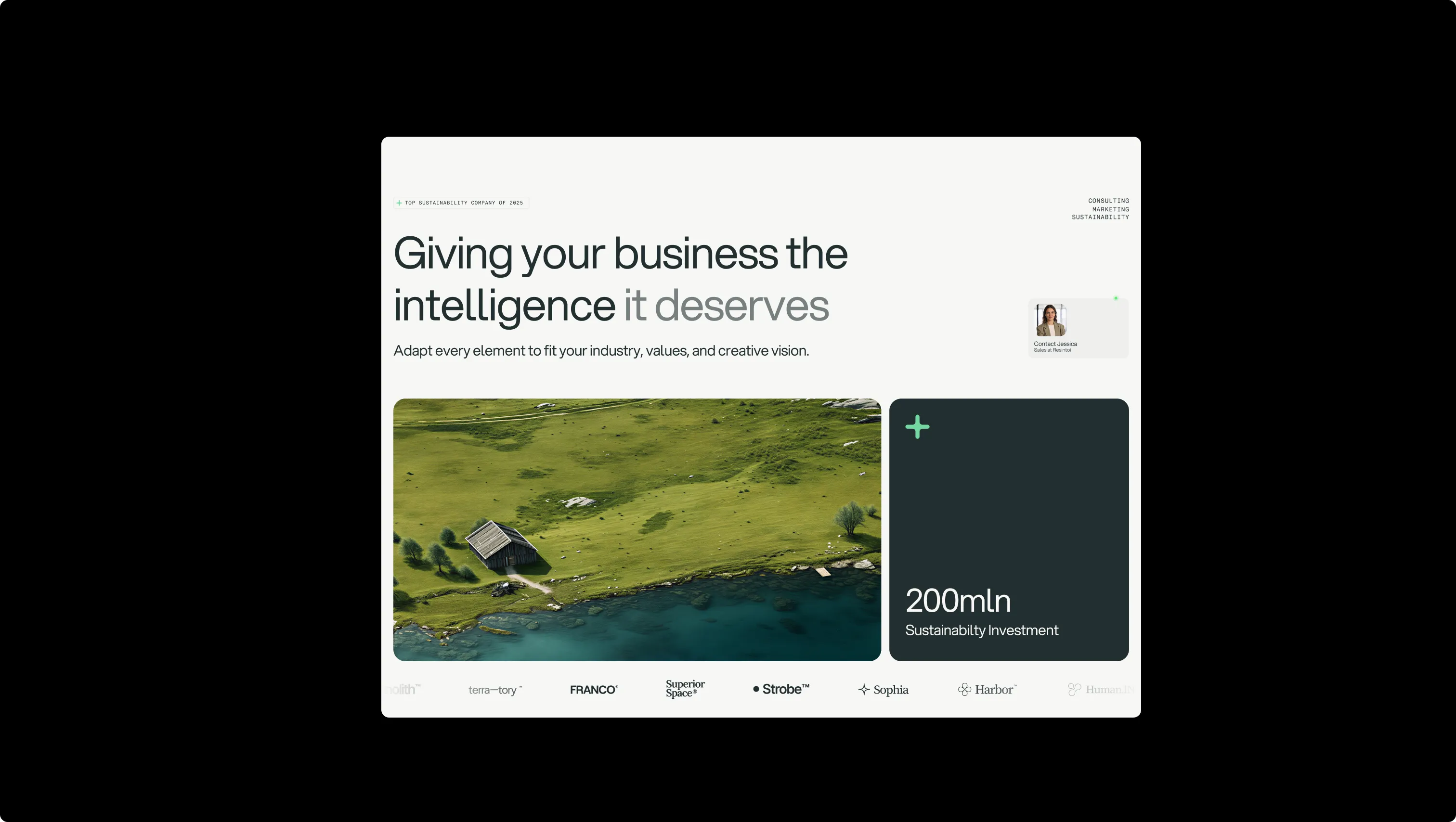
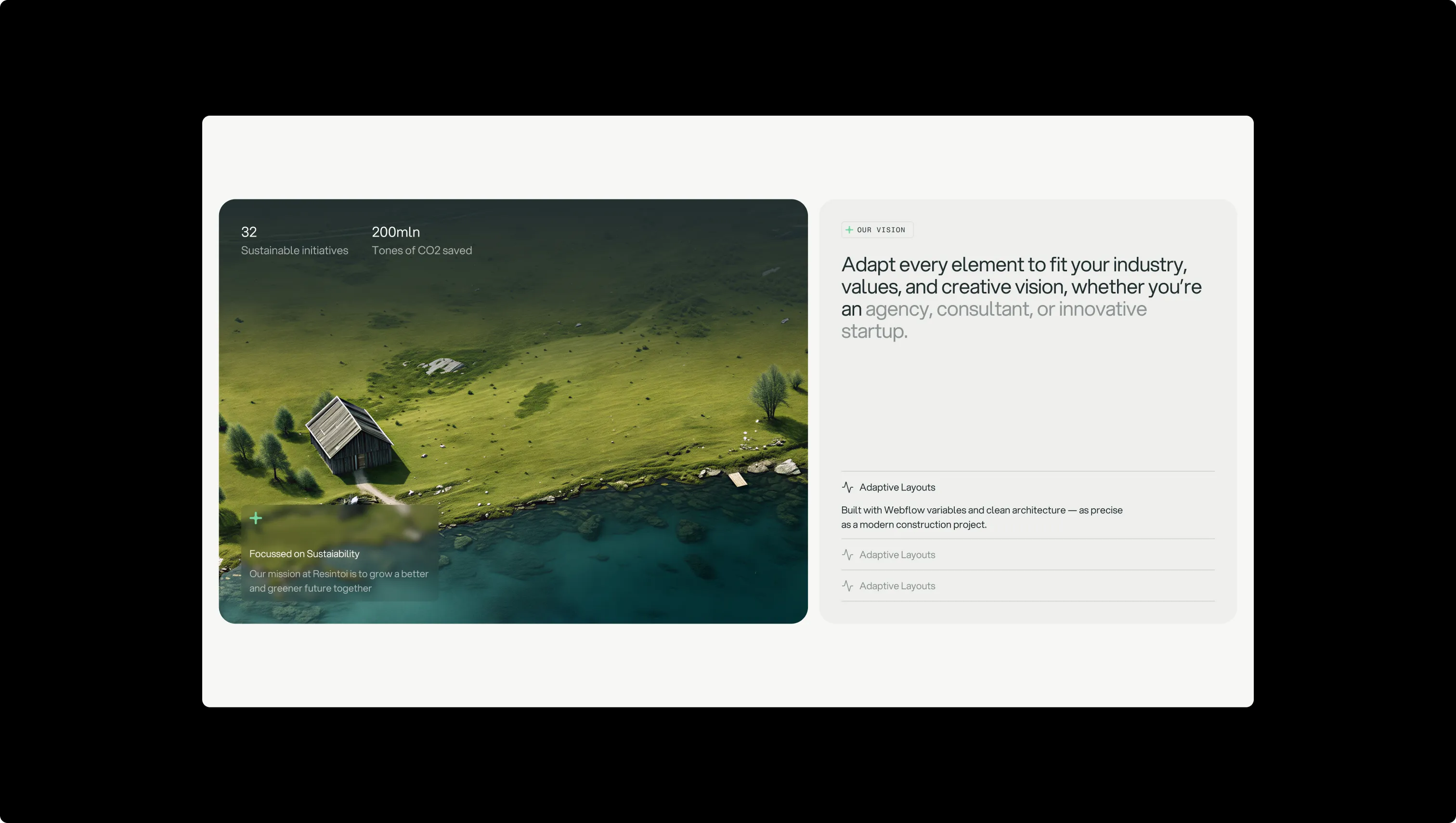
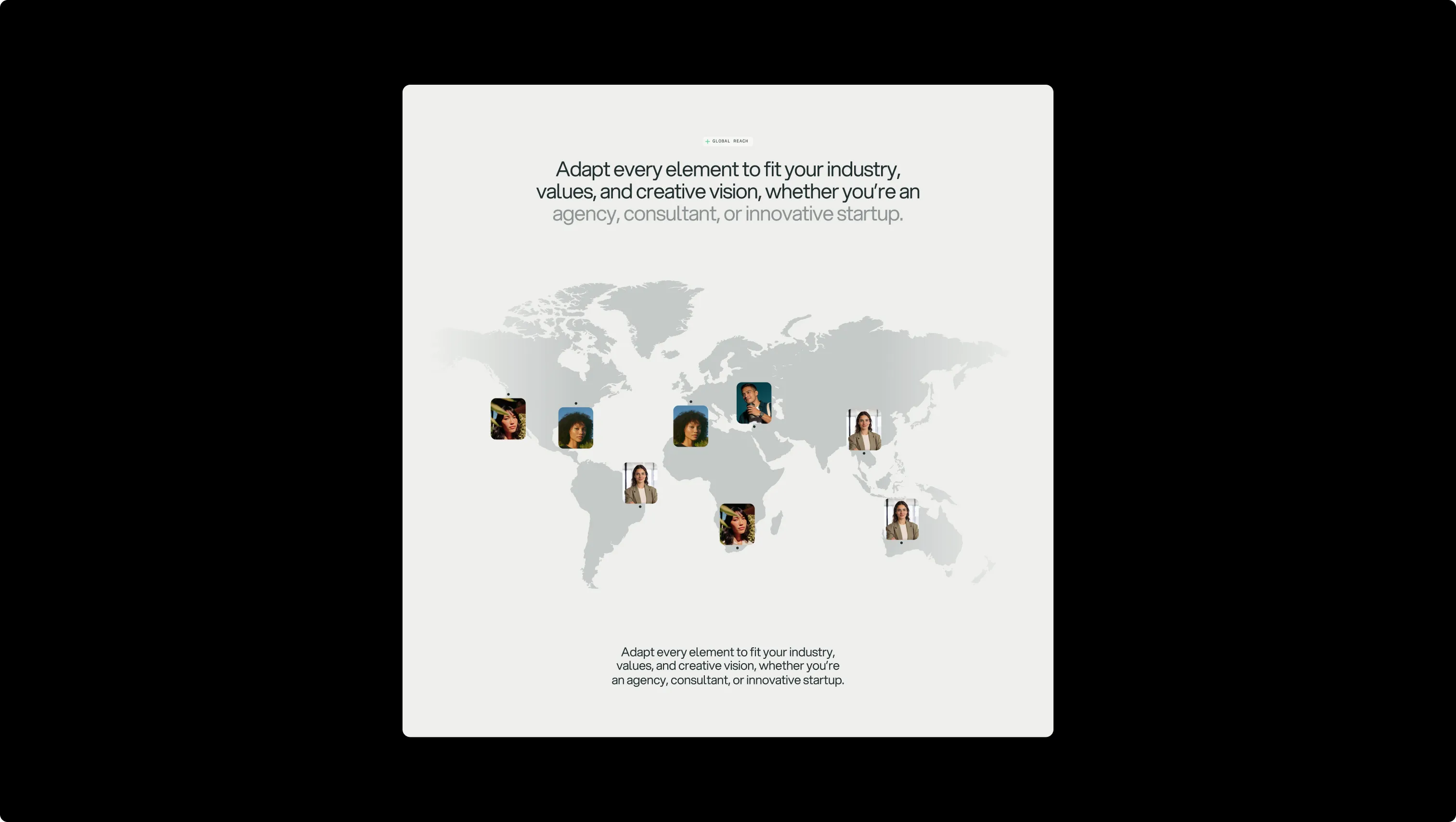
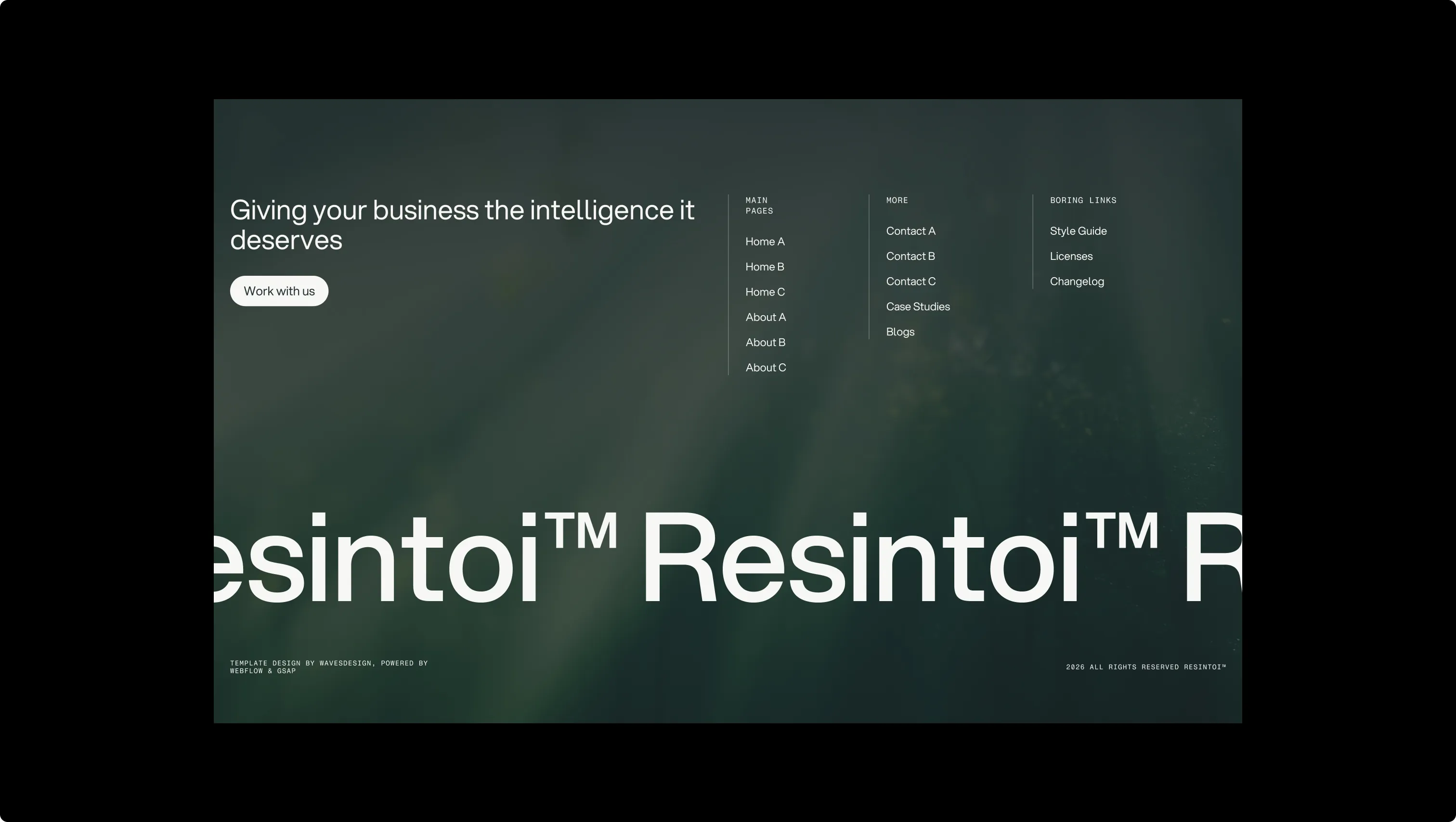
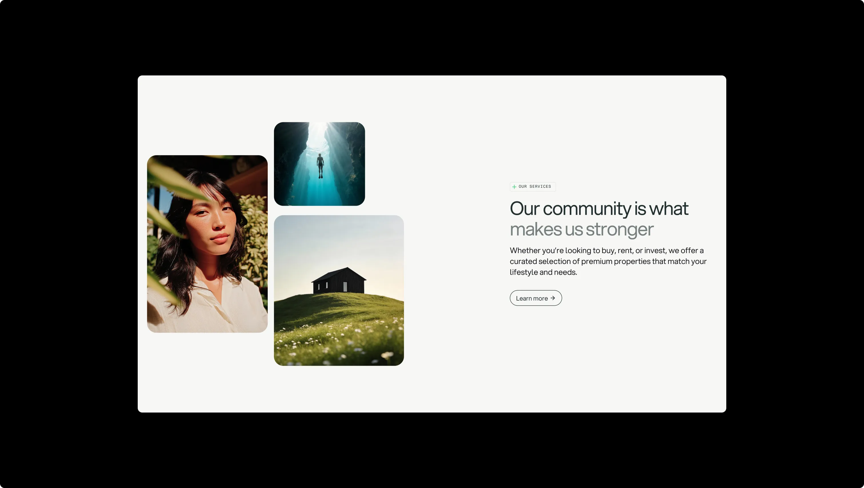
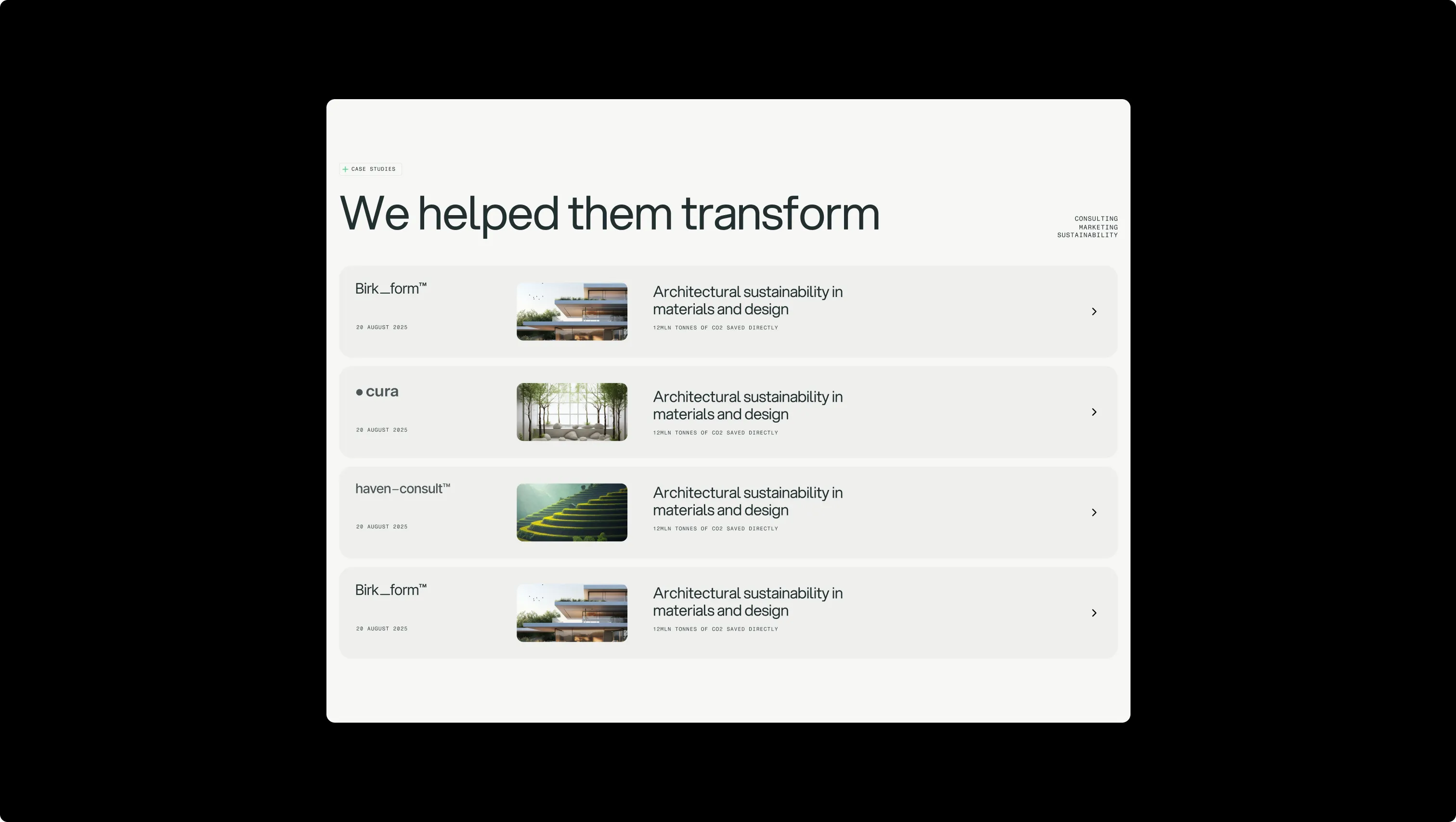
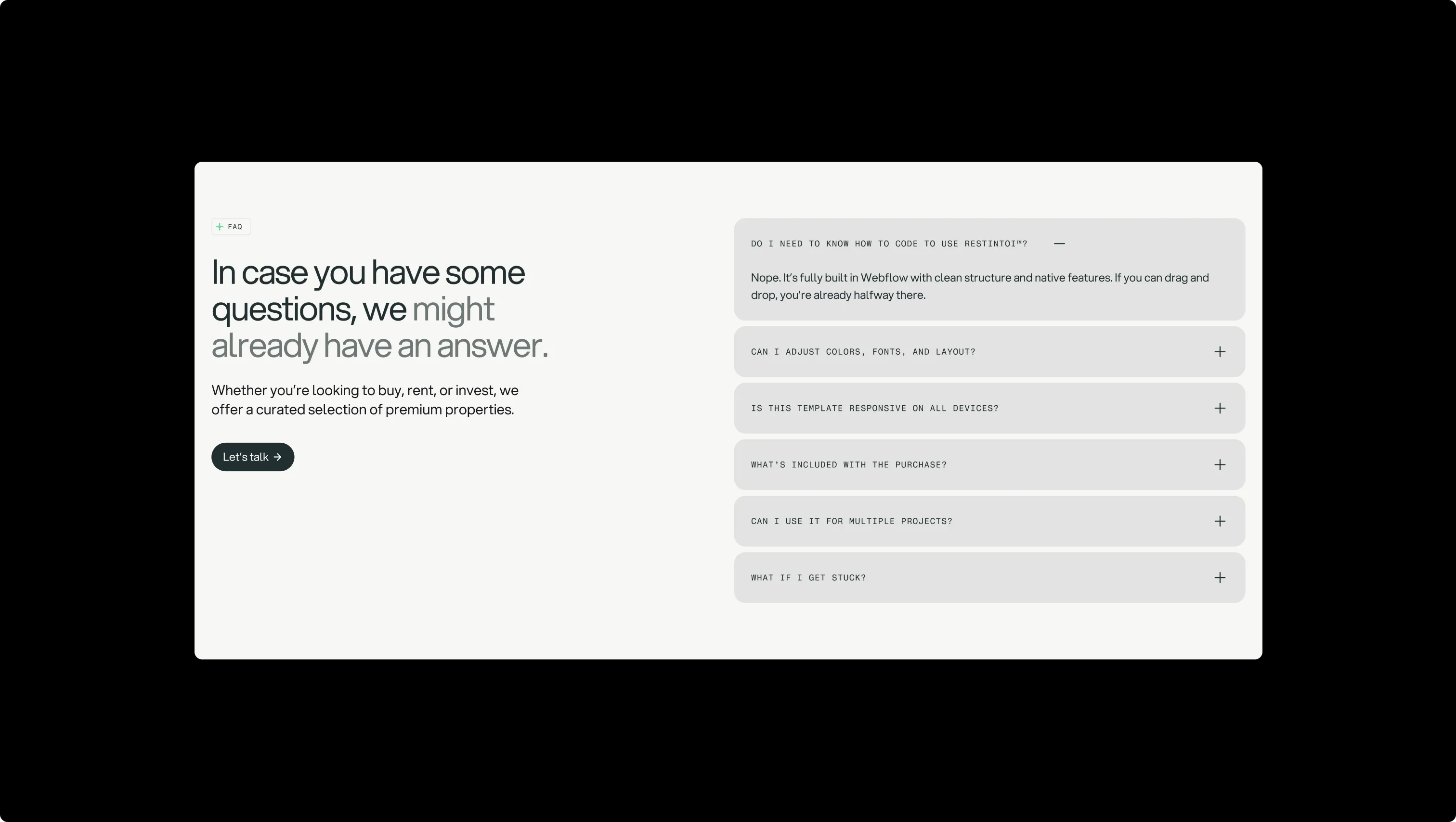
Lifted card surface. Used for feature tiles, tab backgrounds, and secondary section fills.
Base page canvas. Default background for all content sections and the navbar.
Higher-elevation card surface. Contact tiles, hover states on lifted components.
Overlay & glass tile medium. Semi-transparent overlays on hero images and floating contact tiles.
Subtle body text & muted tone. Secondary paragraphs, dimmed headings, and de-emphasized labels.
Primary dark surface & ink. Hero backgrounds, primary buttons, footer overlays, and all headline text on light surfaces.
Brand accent & interactive signal. Accent buttons, brand plus icon, label icons, and status dots.
Error state indicator. Form validation errors and destructive feedback only.
Warning state indicator. Cautionary notices and in-progress status signals.
Success state indicator. Form confirmation, positive feedback, and completion signals.
The quick brown fox jumps
Primary typeface for all headings, body copy, and buttons. Geometric sans-serif that bridges warmth and precision.
The quick brown fox jumps
Monospace label typeface exclusively for uppercase micro-labels, tags, and metadata callouts.
comfortable1920px120px32px24px4px8px12px16px20px24px32px48px64px80px120px160px180px200pxfull9999pxtags6pxcards16pxinputs8pxbuttons32pxcards-large24pxbuttons-circle24pxsection-rounded60pxStep from canvas (level 1) to lifted (level 2) to inset depth (level 3), then invert into the dark levels for full-bleed sections. Hex codes and roles live in the Colors section above; this ladder shows the layering only.
# Design System Guide

> Unlock the template to access the full design system.

## Brand voice

A short paragraph describing the brand voice, mood, and visual
principles that anchor the system. Tone, cadence, and intent.

## Colors

| Token        | Hex      | Role                                  |
| ------------ | -------- | ------------------------------------- |
| canvas-1     | #xxxxxx  | Page background, large surfaces       |
| canvas-2     | #xxxxxx  | Lifted surfaces, cards                |
| canvas-3     | #xxxxxx  | Inset wells, depressed states         |
| ink-1        | #xxxxxx  | Primary body text                     |
| ink-2        | #xxxxxx  | Secondary text, labels                |
| ink-3        | #xxxxxx  | Tertiary text, hints                  |
| accent-1     | #xxxxxx  | Primary brand accent                  |
| accent-2     | #xxxxxx  | Secondary accent                      |
| state-ok     | #xxxxxx  | Success, confirmations                |
| state-warn   | #xxxxxx  | Warnings                              |
| state-err    | #xxxxxx  | Errors, destructive actions           |

## Typography

- **Display** — heading scale, used for hero text and section titles.
- **Body** — primary reading text, optimized for paragraphs.
- **Mono** — code, data, and tabular numerals.

```
display: 32px / 40px / 48px / 64px / 80px
body:    14px / 16px / 18px
mono:    12px / 14px
```

## Spacing & shape

Base unit: 4px. Scale: 4, 8, 12, 16, 24, 32, 48, 64, 96, 128.
Radii: sm (4px), md (8px), lg (12px), xl (20px), full (9999px).

## Surfaces

Layered elevation from canvas → lifted → inset. Surfaces invert in
dark sections for full-bleed contrast.

## Do's and don'ts

- Do use accent-1 sparingly for primary CTAs only.
- Do maintain at least 4.5:1 contrast on body text.
- Don't mix display and body in the same line.
- Don't use state colors for branding.

## Agent prompt guide

Prompts for AI design tools that respect this system.
Includes example prompts for sections, components, and layouts.

# ...
Unlock the full style guide