Design systems, extracted.
Paste any URL to create a design system from it. Open any style for colors, type, spacing, components, and a DESIGN.md or tokens.json your agent can use.
Quickly navigate through the dashboard with your keyboard using the command menu.
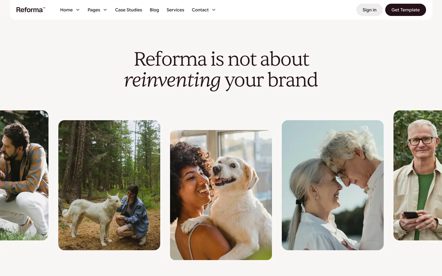
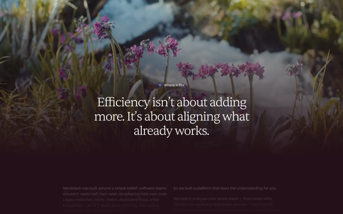
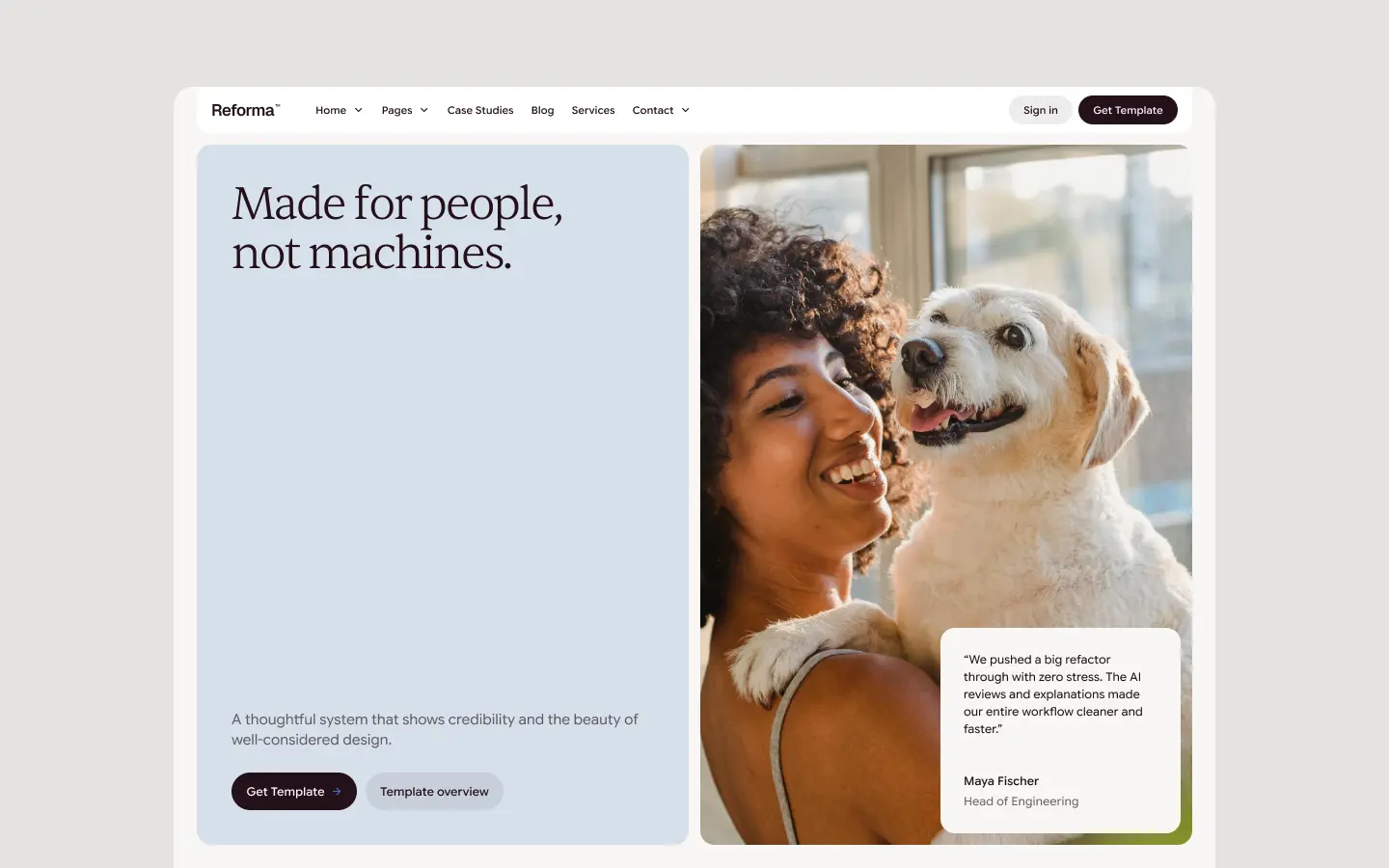

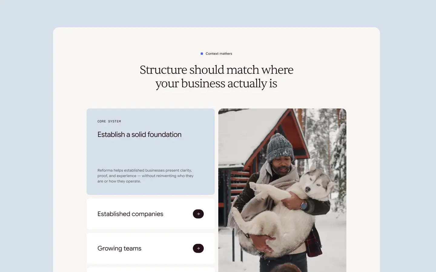
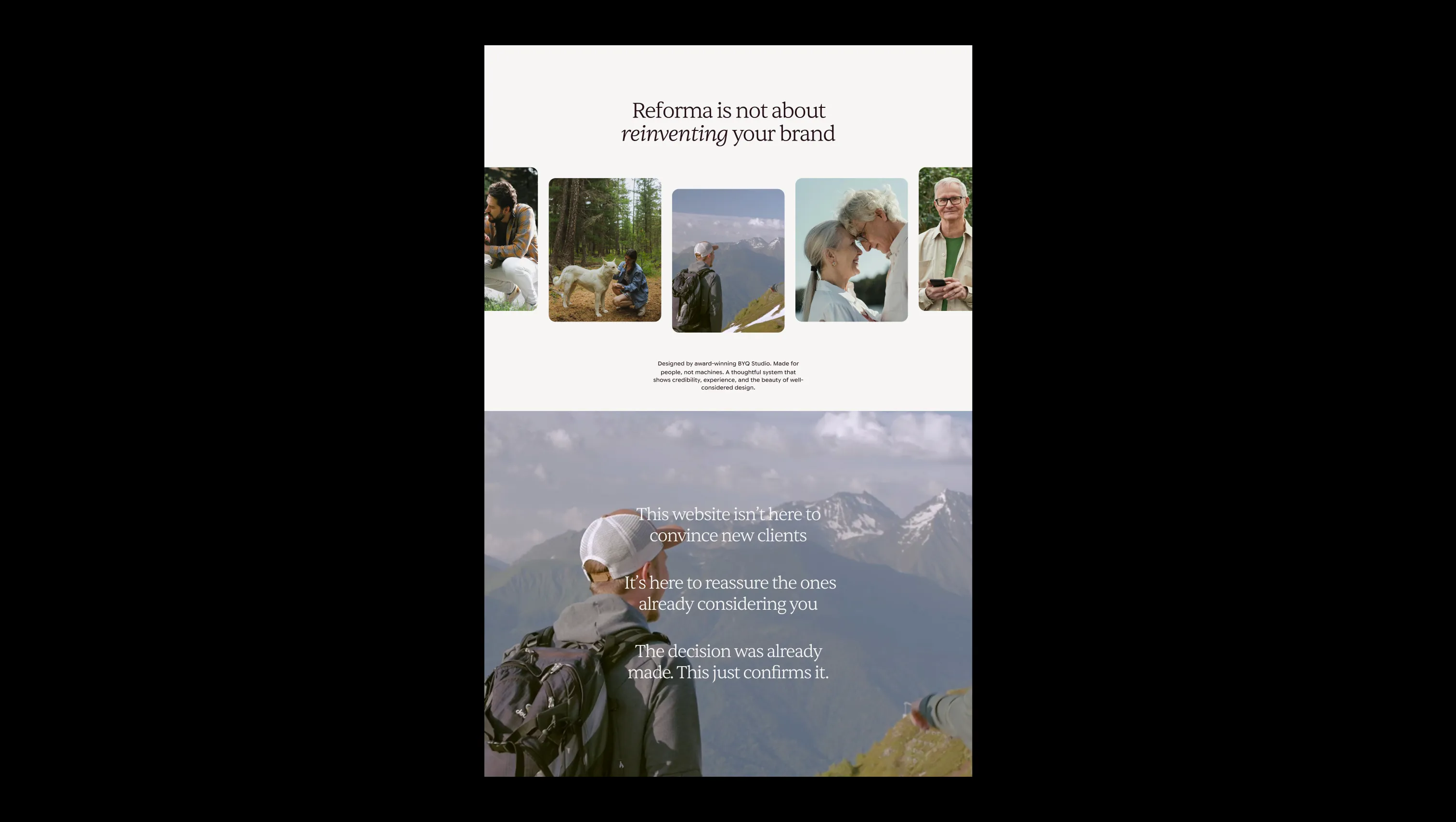
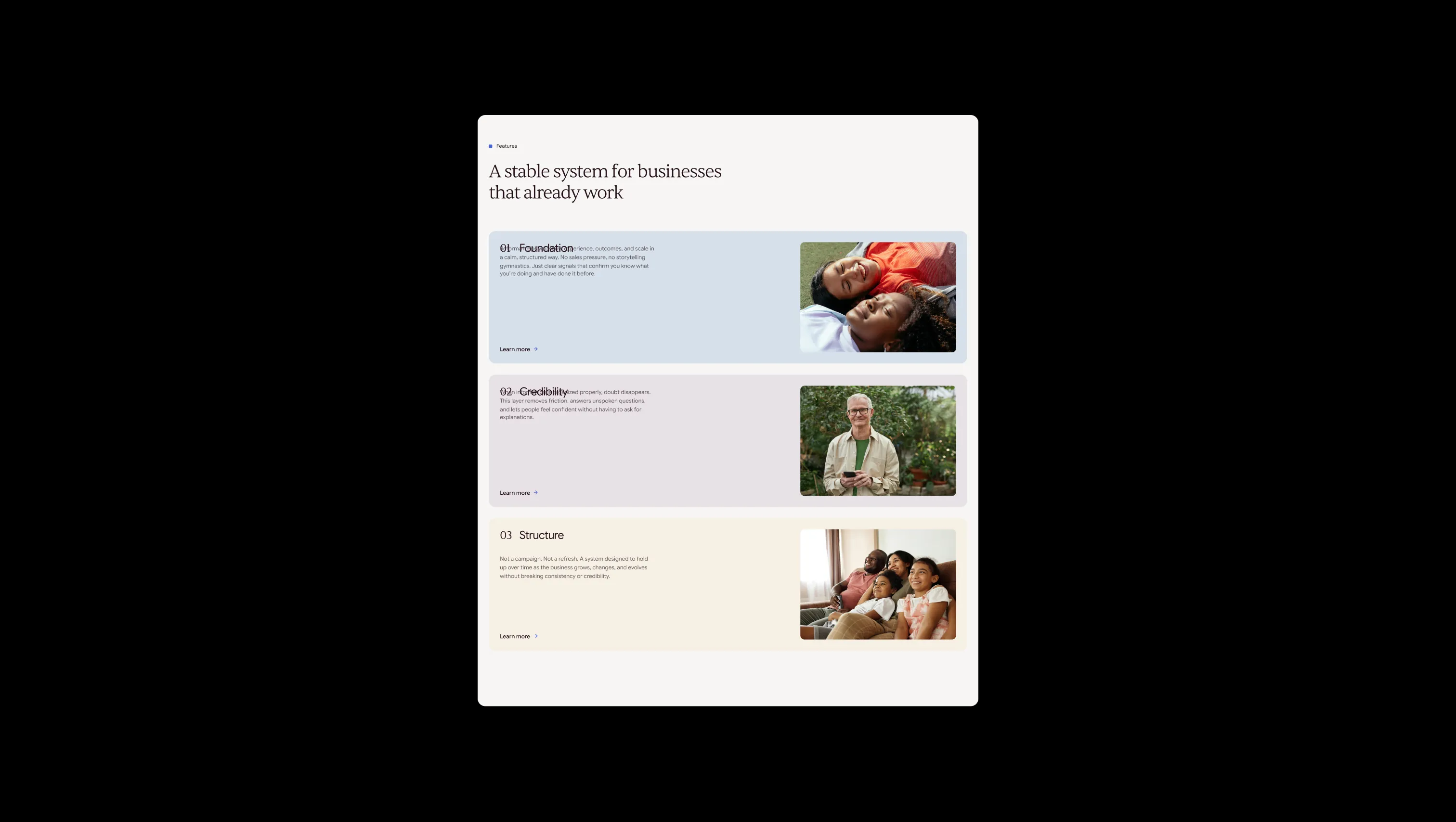
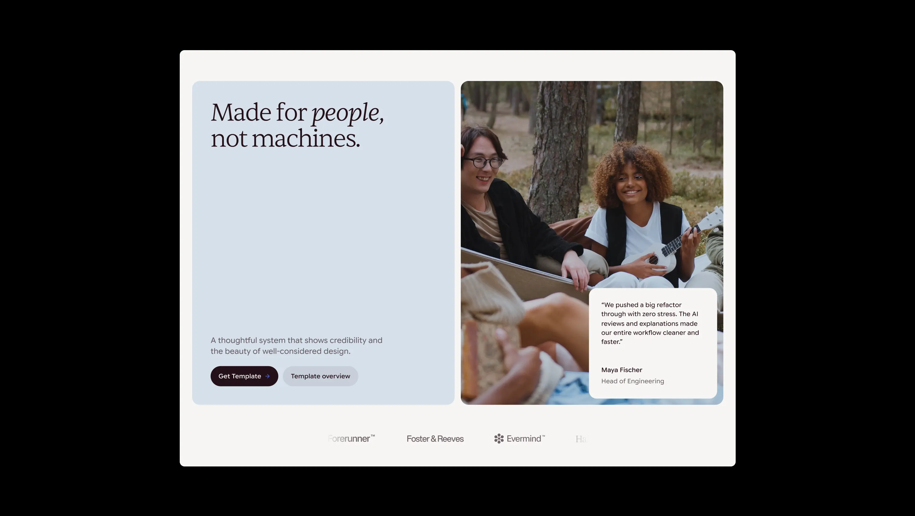
Reforma is a premium Webflow template built for established businesses, solo founders, and creative studios who need a web presence that reassures rather than performs. Its aesthetic is grounded in warm neutrality — a linen-toned canvas, deep burgundy ink, and a carefully limited palette of muted washes (blue, sage, plum, yellow) that surface as section accents without ever competing for attention. The typographic system pairs Sentient Variable, an editorial serif with gentle optical weight, against Google Sans Flex Variable for body and UI copy, creating a layered hierarchy that feels simultaneously journalistic and modern. Layout logic is spacious and deliberate: large section padding, full-bleed image grids with rounded corners, and a fixed pill-shaped navigation bar that floats above the page content. Scroll-triggered entrance animations (translate3d Y-offset to zero, opacity 0→1) give every section a composed, unhurried arrival. The template communicates trust not through decoration but through structural clarity — every element earns its position.
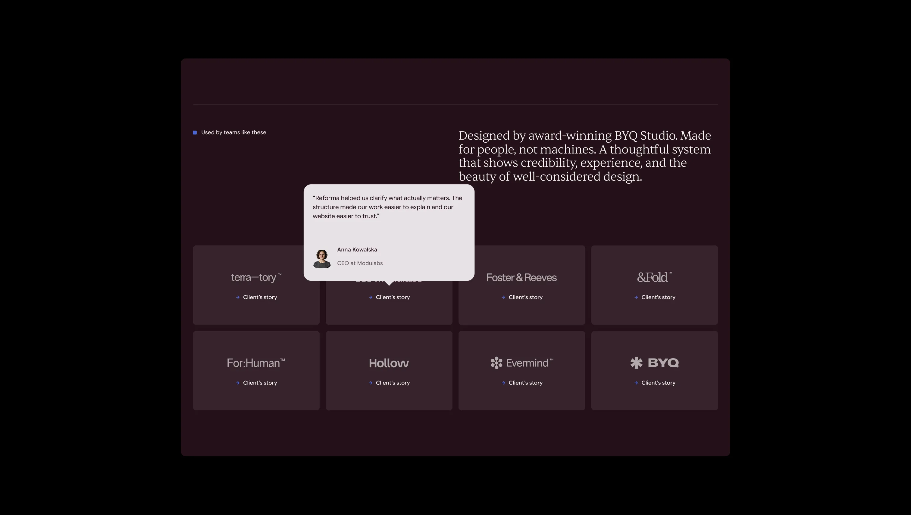
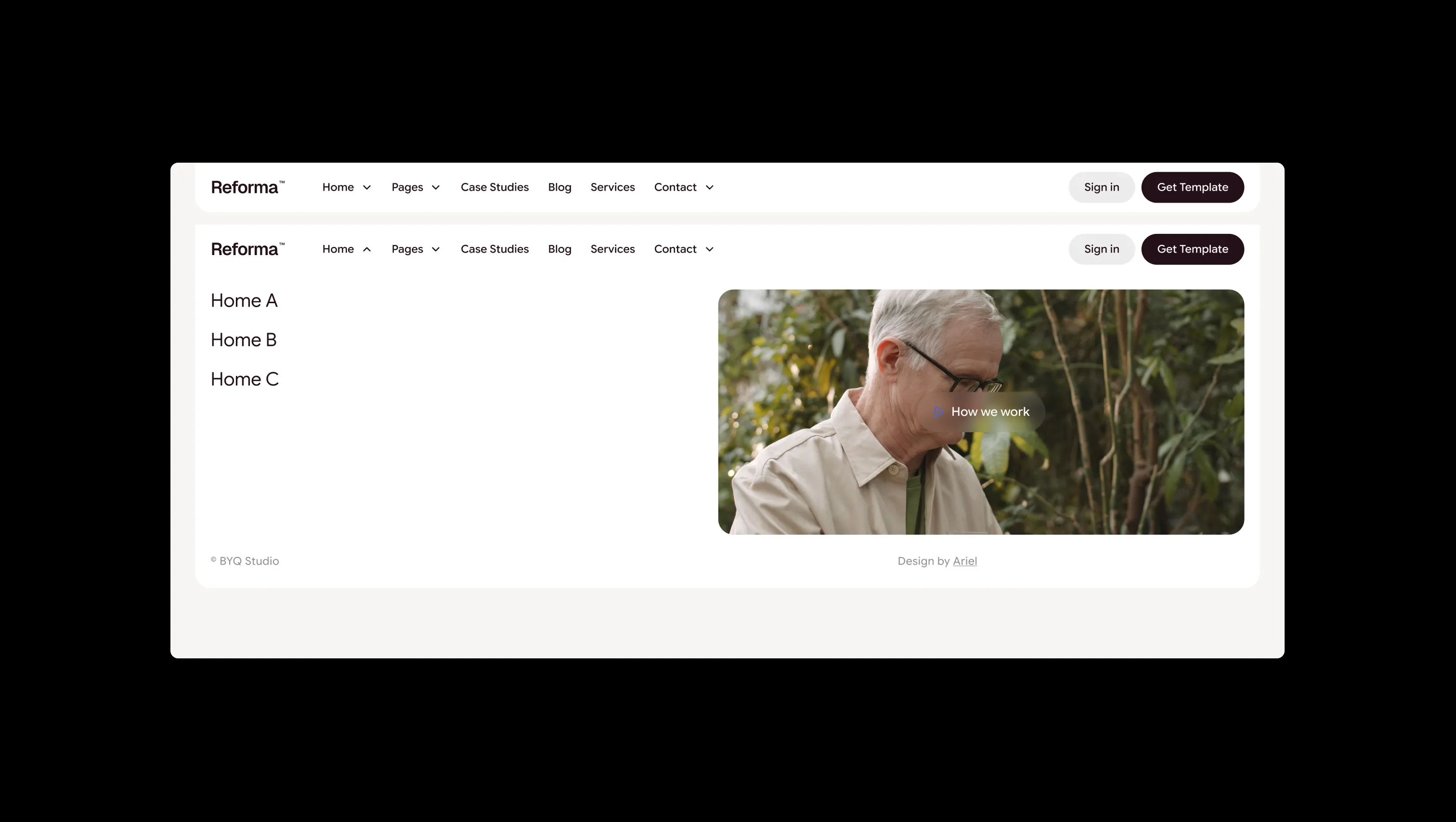
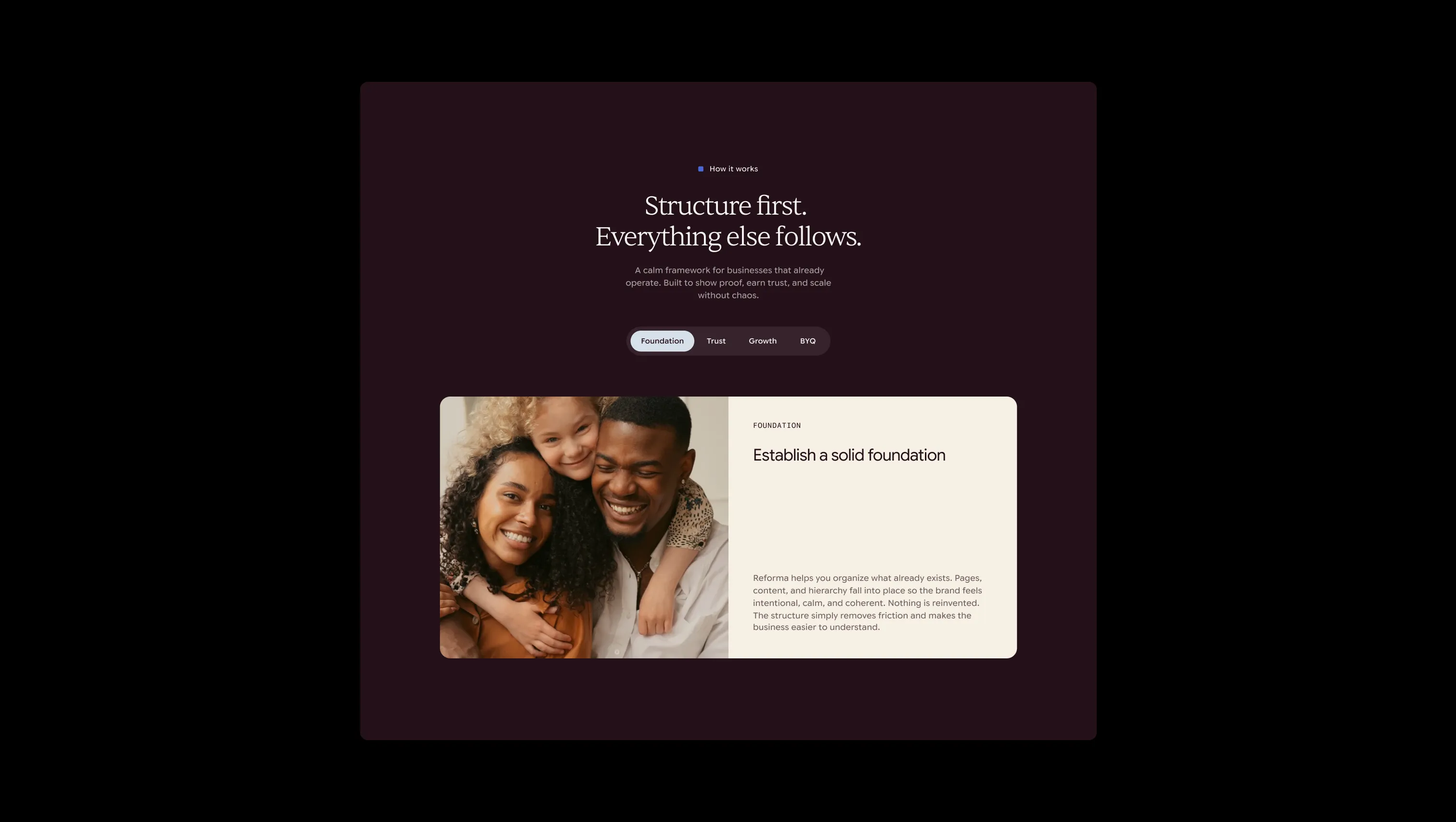
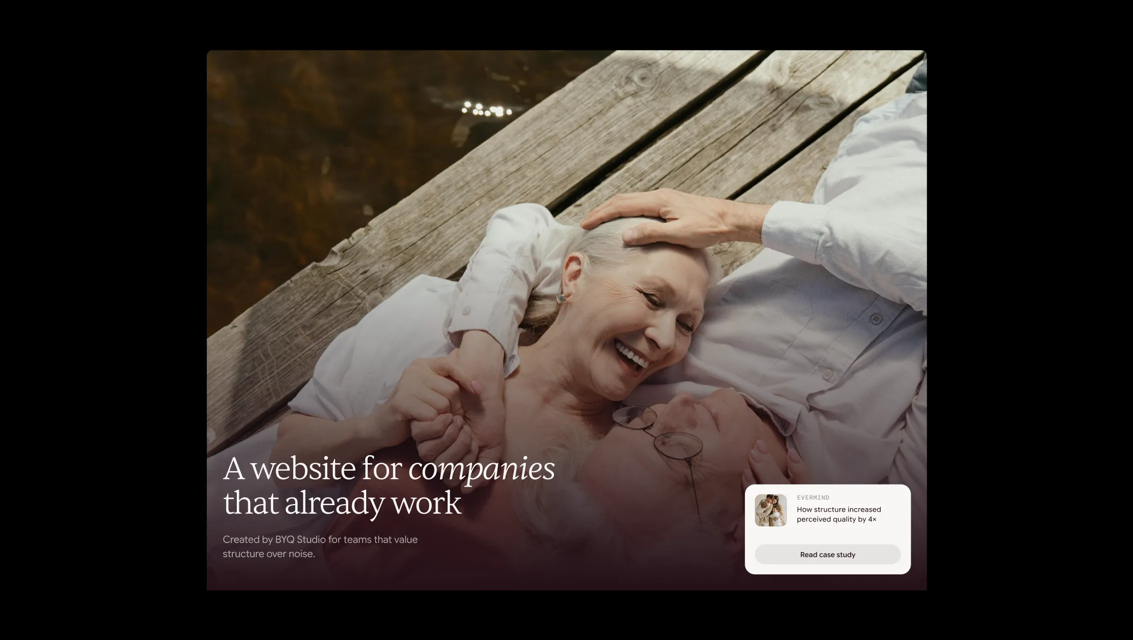
A handful of real sections that ship with this template. Click any card to preview, or explore them all under the Sections tab.
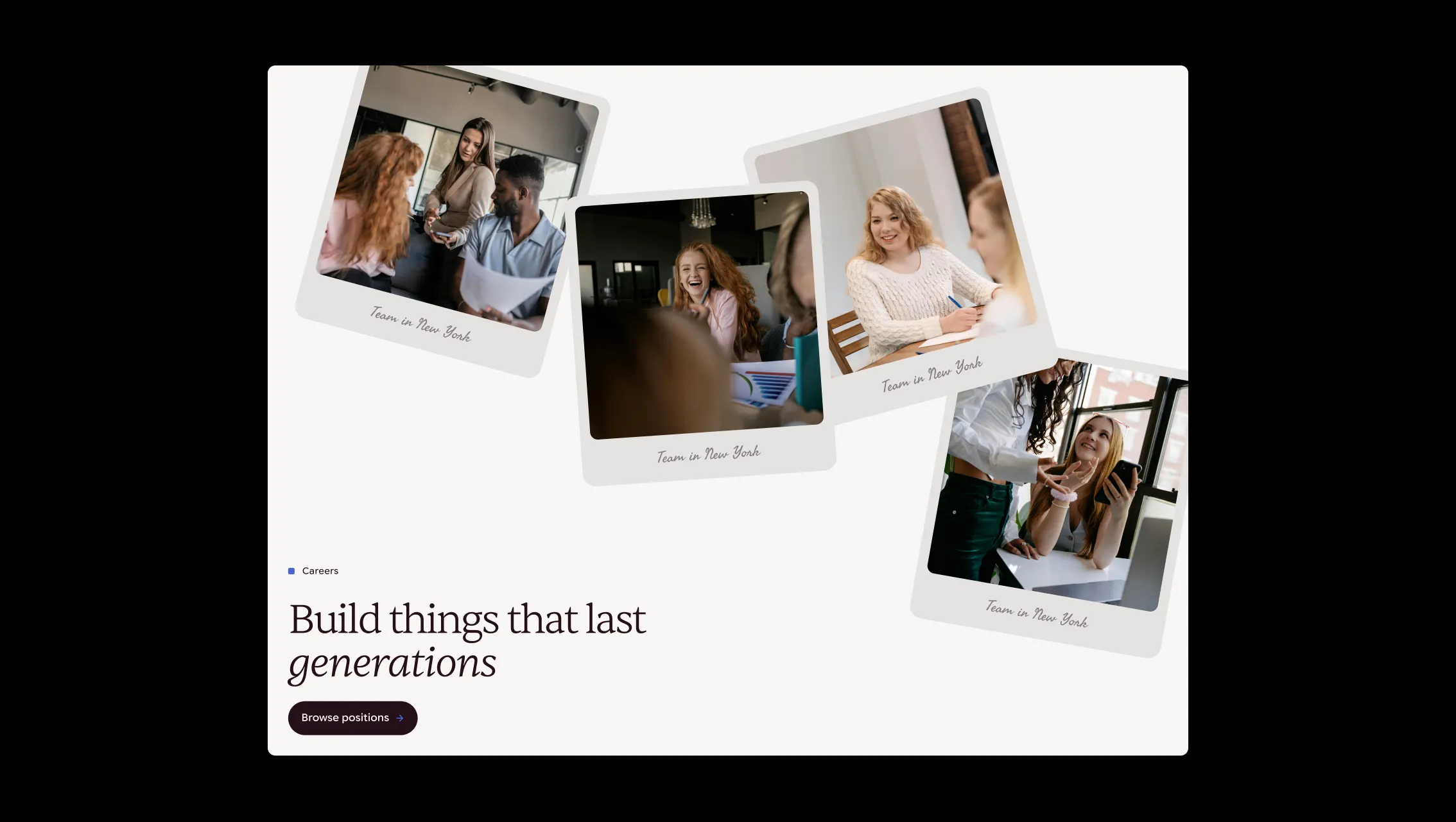
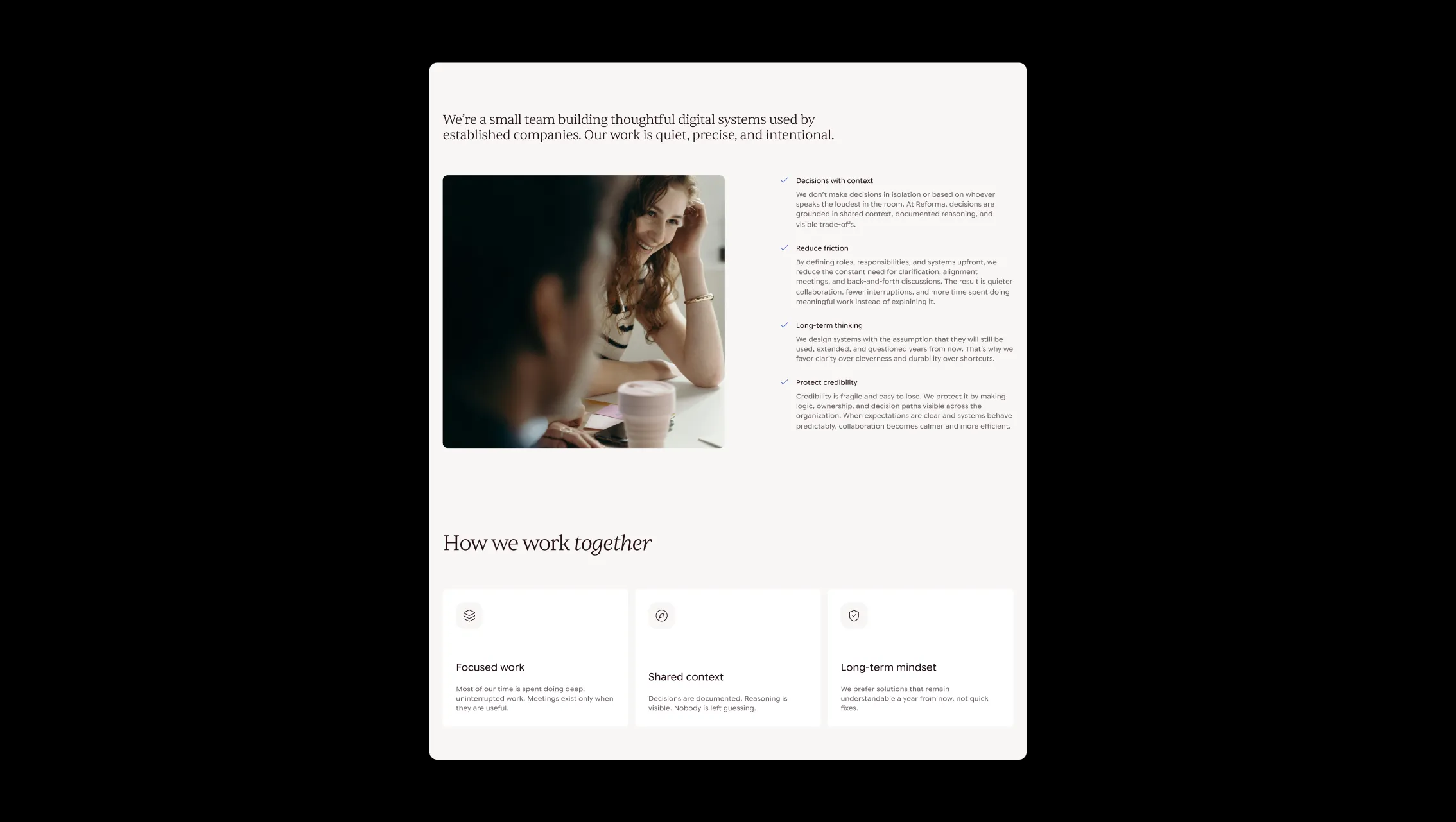
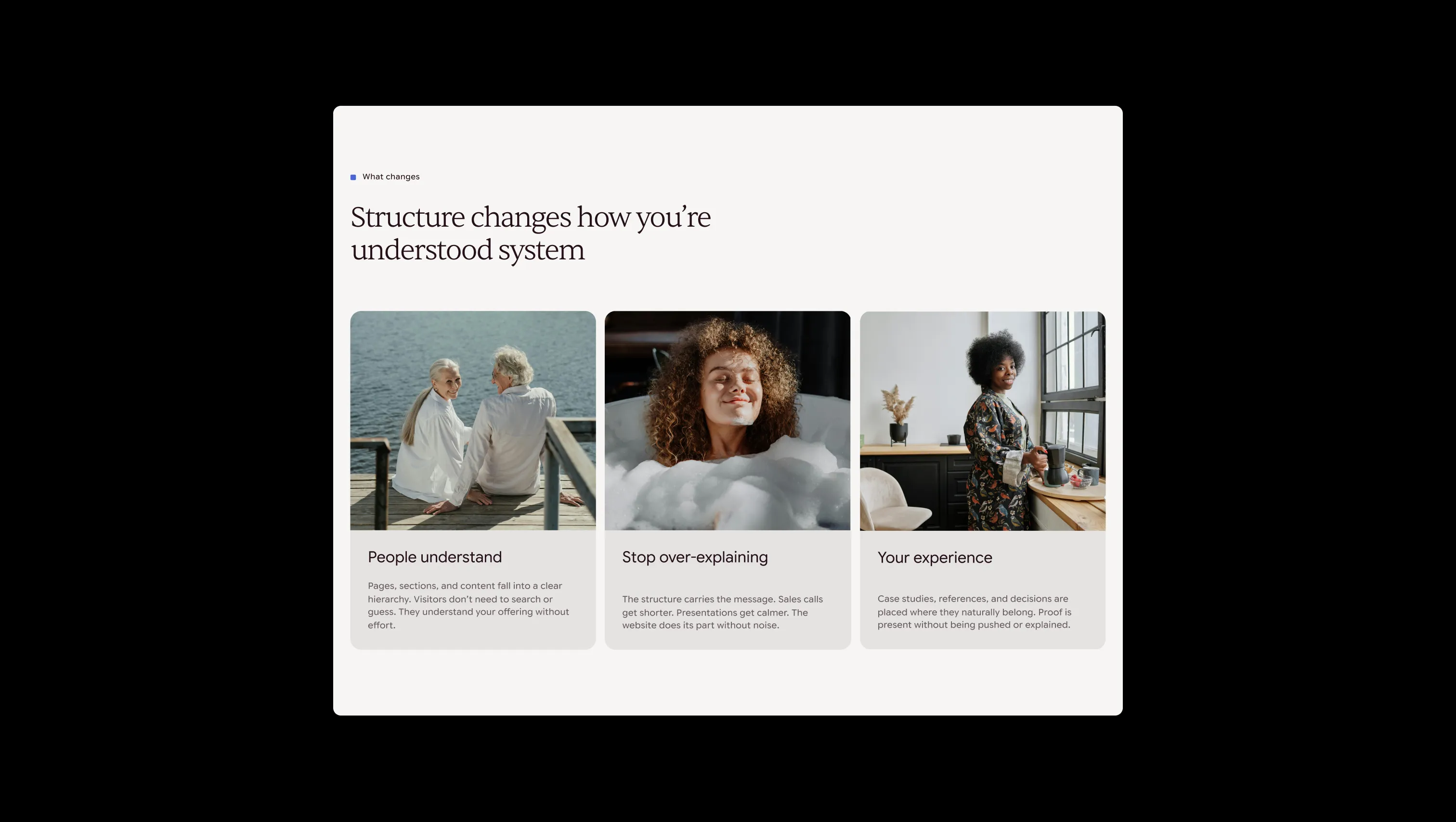
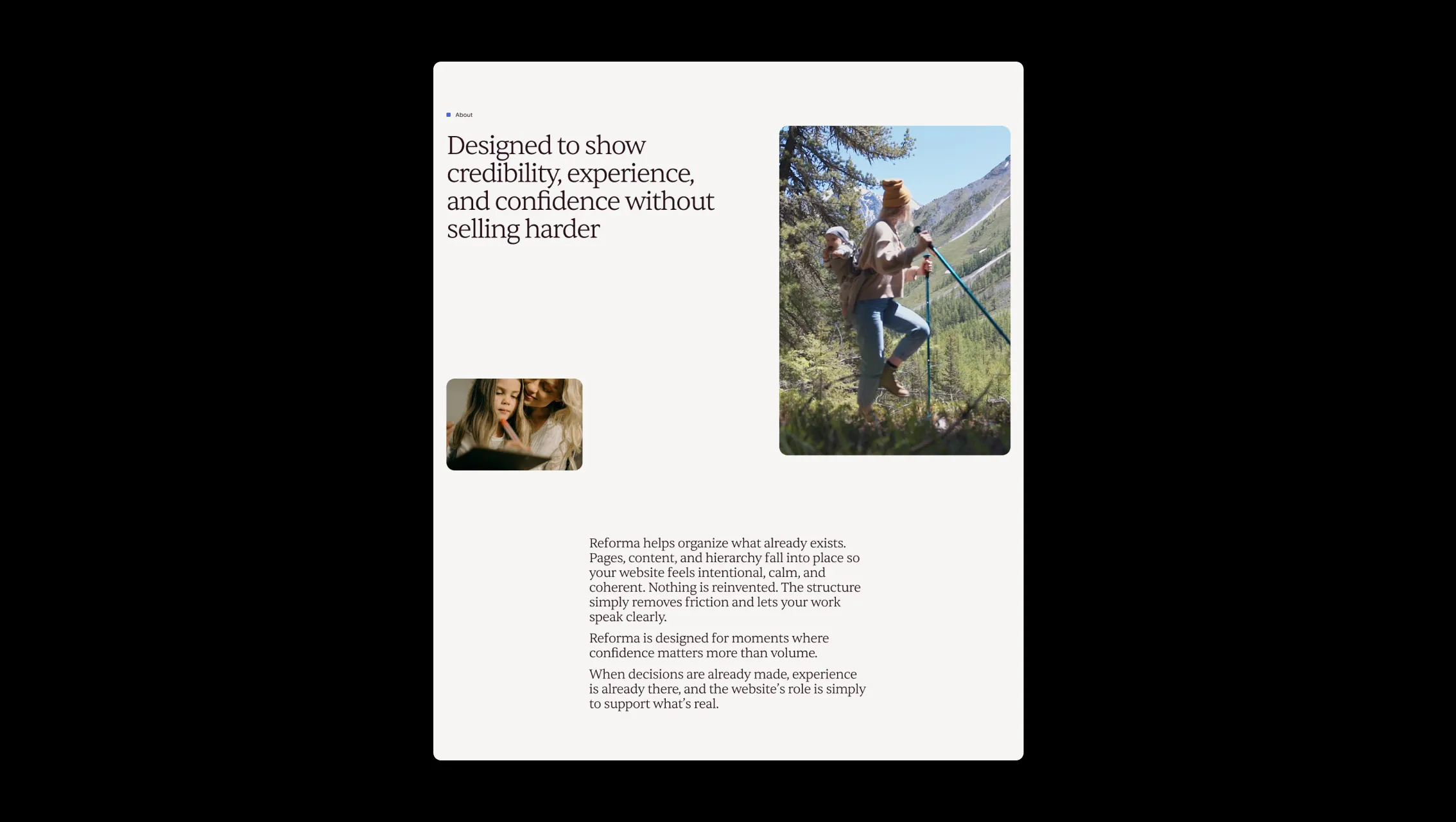
Input & depth surface. Form field backgrounds, inset areas, and divider tones.
Card & nav surface lift. Navigation bar background, testimonial cards, and elevated UI containers.
Primary page canvas. Applied to the background of every major section and the footer.
Primary text & dark surface. Headlines, body copy, primary button fills, and the logotype.
Accent text & icon highlight. Icon color in button groups, label dots, and link indicators.
Tertiary tinted wash. Sage-toned section backgrounds and card fill variants.
Interactive accent wash. Secondary button hover backgrounds and tinted card panels.
Warm testimonial card wash. Yellow-tinted testimonial card backgrounds for visual rhythm.
Error state. Form validation error borders and inline error feedback.
Success state. Form submission success and positive feedback indicators.
The quick brown fox jumps
Label & caption typeface. Used exclusively for uppercase label components and small metadata tags at weight 500, providing a technical counterpoint to the serif headlines.
The quick brown fox jumps
Body, UI, and button typeface. Used at weight 400 for body copy and weight 500 for labels, buttons, and bold emphasis. Neutral and legible at all display sizes.
The quick brown fox jumps
Display & heading typeface. All H0–H6 elements use this optical serif at weight 300, with pronounced negative tracking at large sizes for a refined editorial quality.
spacious1800px120px24px16px4px8px12px16px20px24px32px48px64px80px120px160px200pxpill9999pxtags8pxcards20pxlarge20pxsmall8pxinputs8pxmedium12pxbuttons32pxStep from canvas (level 1) to lifted (level 2) to inset depth (level 3), then invert into the dark levels for full-bleed sections. Hex codes and roles live in the Colors section above; this ladder shows the layering only.
# Design System Guide

> Unlock the template to access the full design system.

## Brand voice

A short paragraph describing the brand voice, mood, and visual
principles that anchor the system. Tone, cadence, and intent.

## Colors

| Token        | Hex      | Role                                  |
| ------------ | -------- | ------------------------------------- |
| canvas-1     | #xxxxxx  | Page background, large surfaces       |
| canvas-2     | #xxxxxx  | Lifted surfaces, cards                |
| canvas-3     | #xxxxxx  | Inset wells, depressed states         |
| ink-1        | #xxxxxx  | Primary body text                     |
| ink-2        | #xxxxxx  | Secondary text, labels                |
| ink-3        | #xxxxxx  | Tertiary text, hints                  |
| accent-1     | #xxxxxx  | Primary brand accent                  |
| accent-2     | #xxxxxx  | Secondary accent                      |
| state-ok     | #xxxxxx  | Success, confirmations                |
| state-warn   | #xxxxxx  | Warnings                              |
| state-err    | #xxxxxx  | Errors, destructive actions           |

## Typography

- **Display** — heading scale, used for hero text and section titles.
- **Body** — primary reading text, optimized for paragraphs.
- **Mono** — code, data, and tabular numerals.

```
display: 32px / 40px / 48px / 64px / 80px
body:    14px / 16px / 18px
mono:    12px / 14px
```

## Spacing & shape

Base unit: 4px. Scale: 4, 8, 12, 16, 24, 32, 48, 64, 96, 128.
Radii: sm (4px), md (8px), lg (12px), xl (20px), full (9999px).

## Surfaces

Layered elevation from canvas → lifted → inset. Surfaces invert in
dark sections for full-bleed contrast.

## Do's and don'ts

- Do use accent-1 sparingly for primary CTAs only.
- Do maintain at least 4.5:1 contrast on body text.
- Don't mix display and body in the same line.
- Don't use state colors for branding.

## Agent prompt guide

Prompts for AI design tools that respect this system.
Includes example prompts for sections, components, and layouts.

# ...
Unlock the full style guide