Design systems, extracted.
Search curated design systems pulled from premium templates or create one from URL. Open any style for colors, type, spacing, components, and a DESIGN.md or tokens.json your agent can use.
Quickly navigate through the dashboard with your keyboard using the command menu.

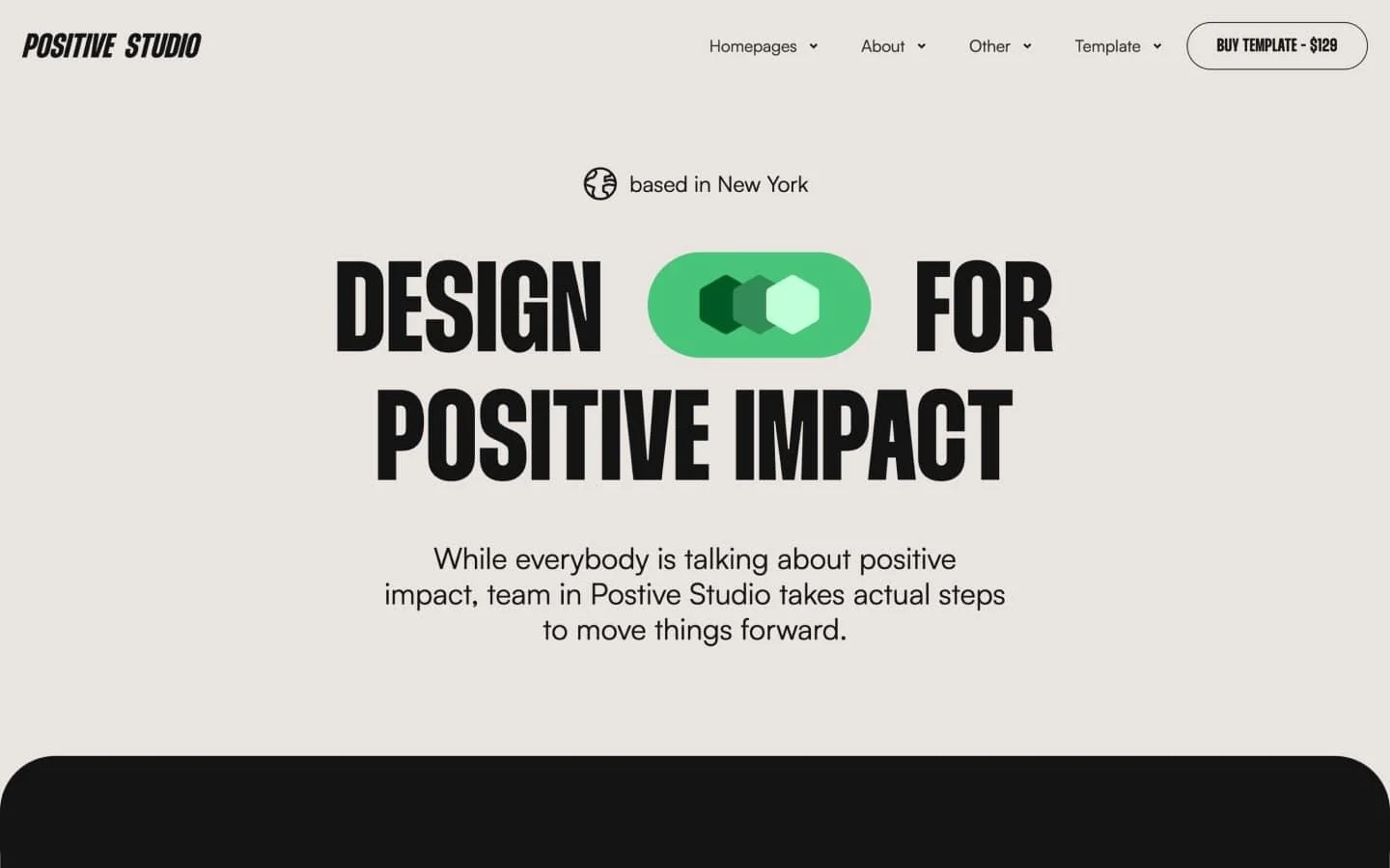
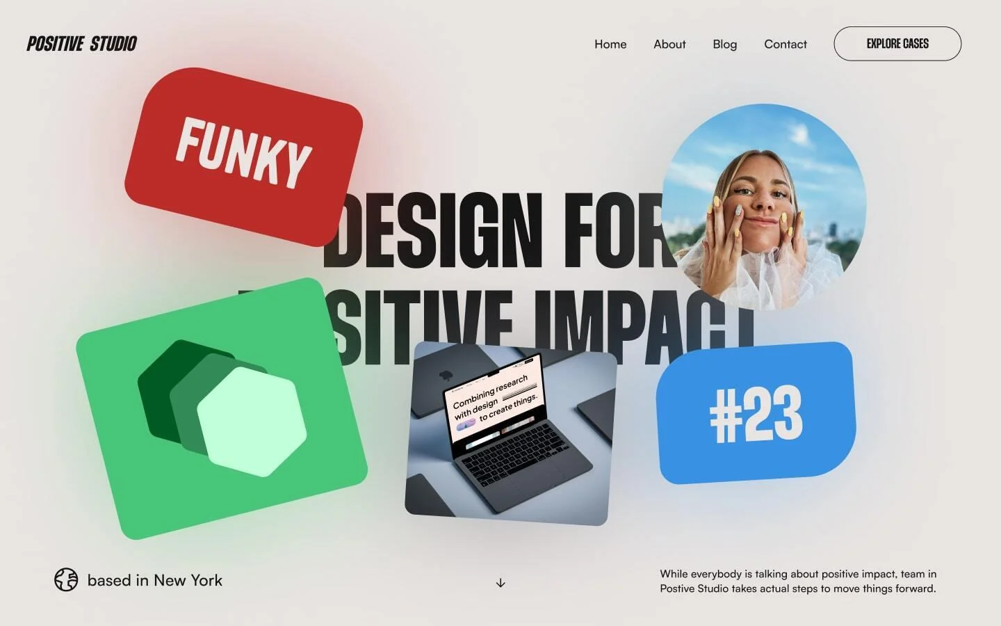
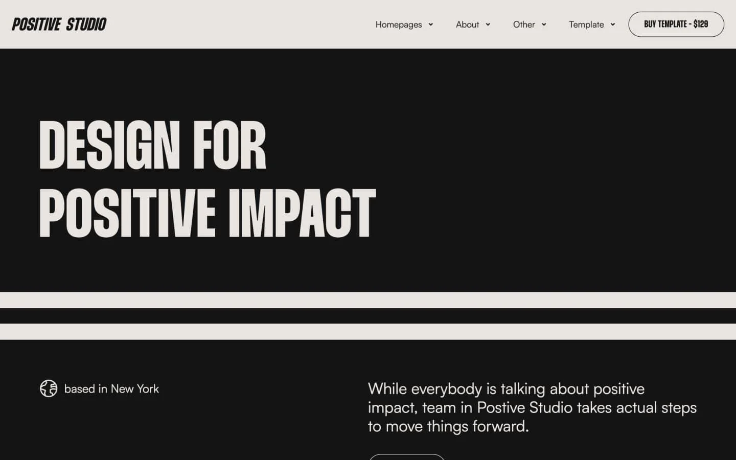
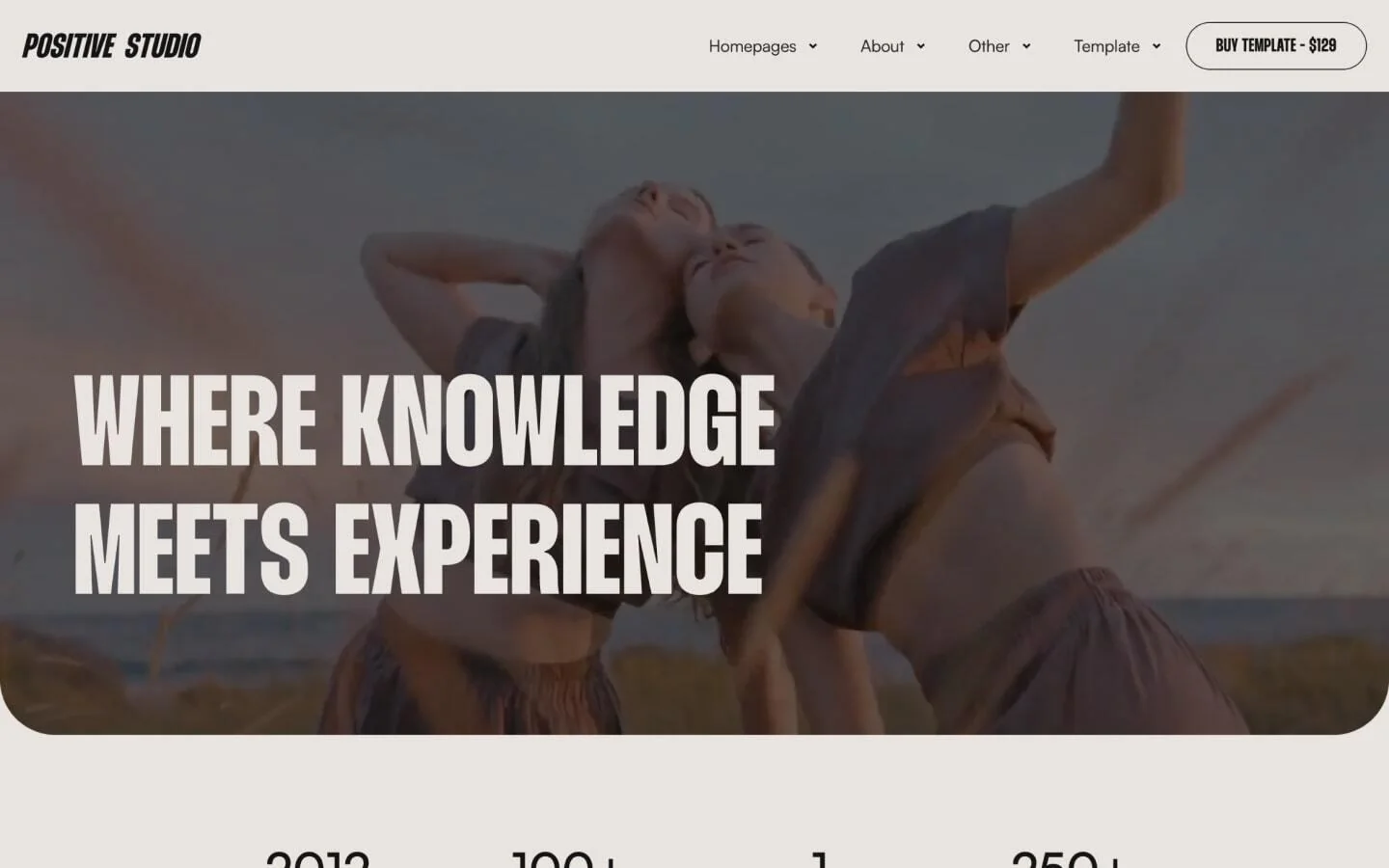
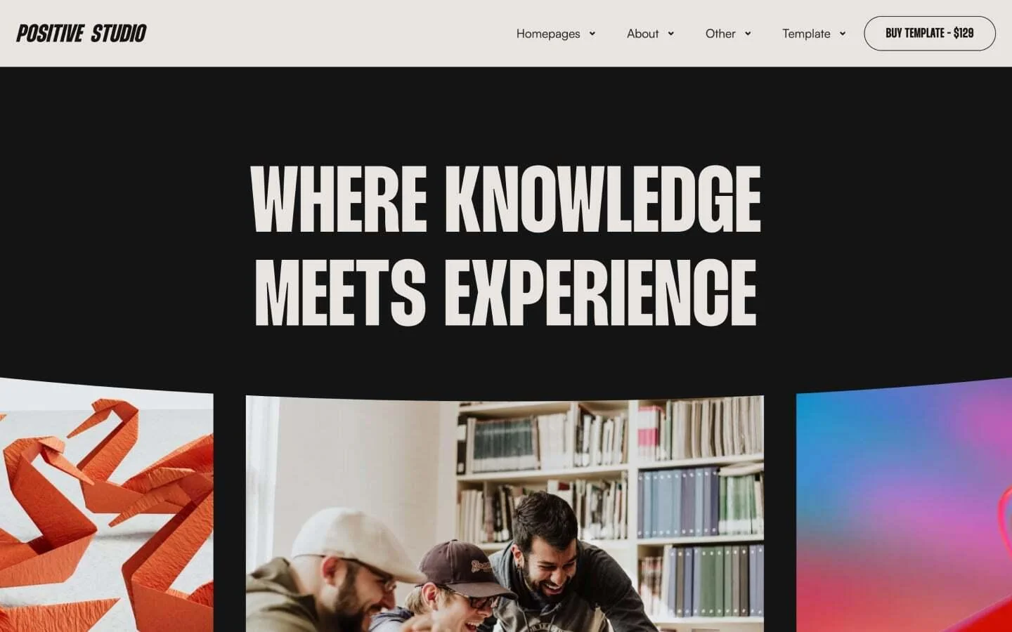
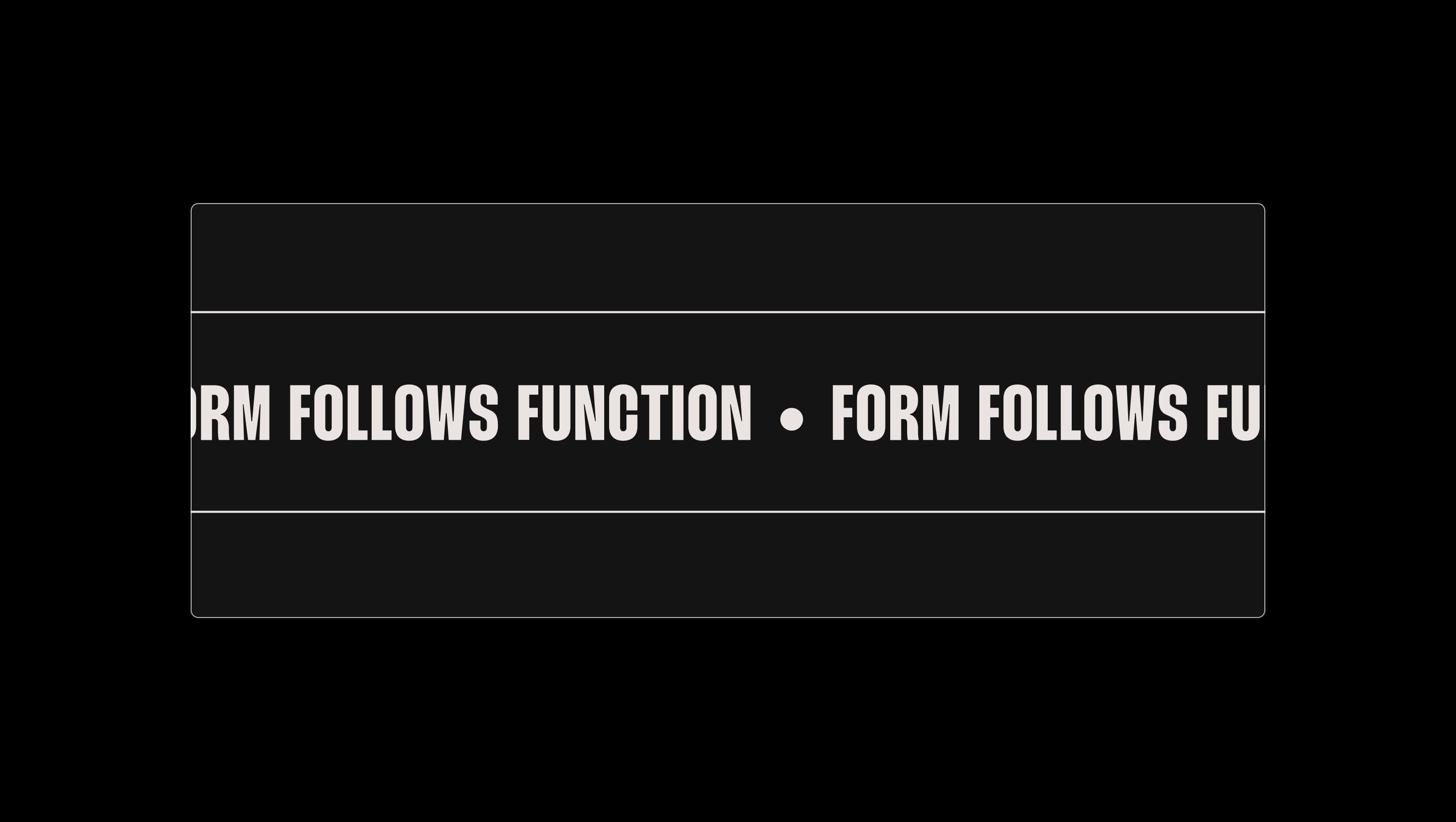
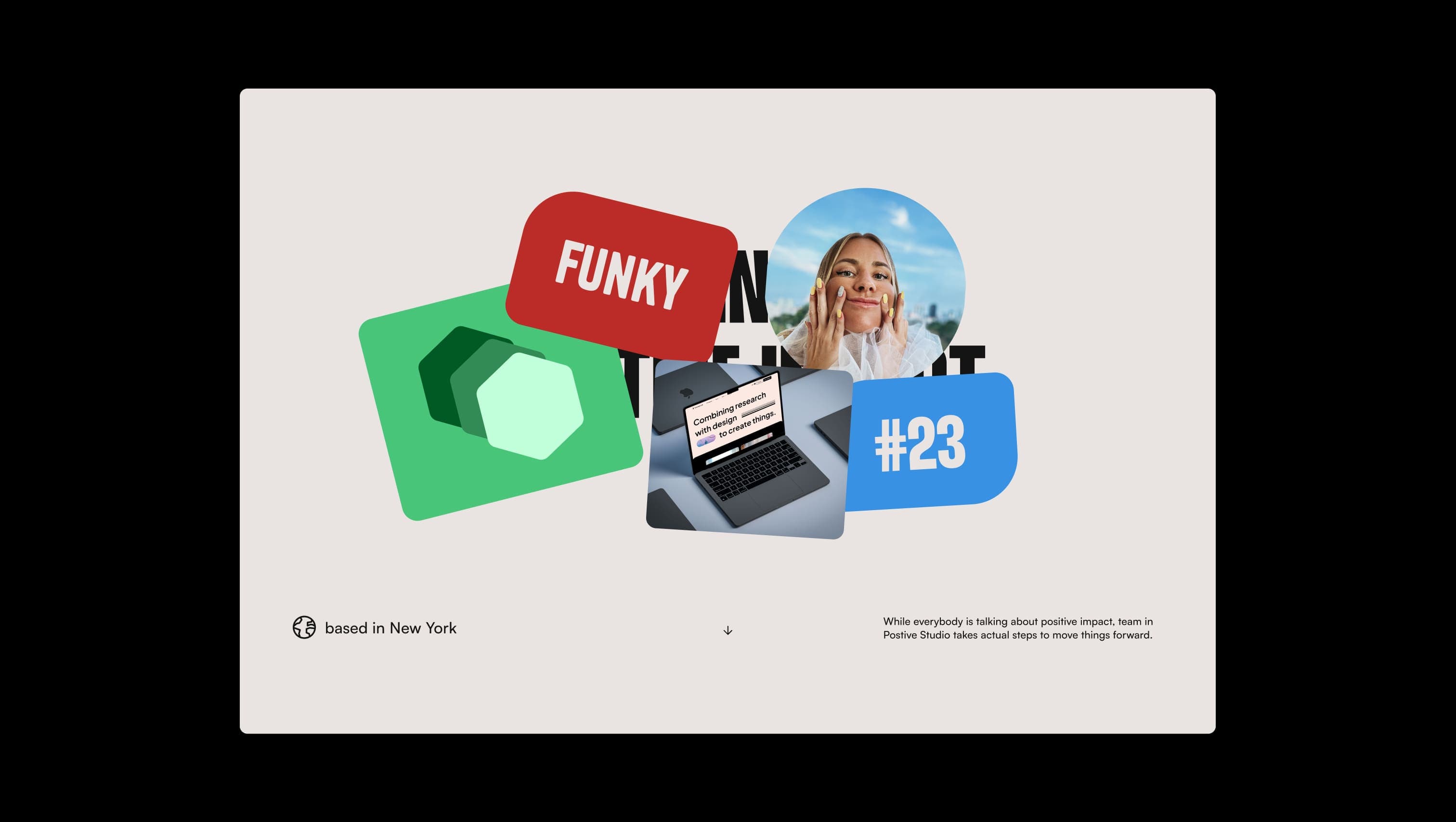
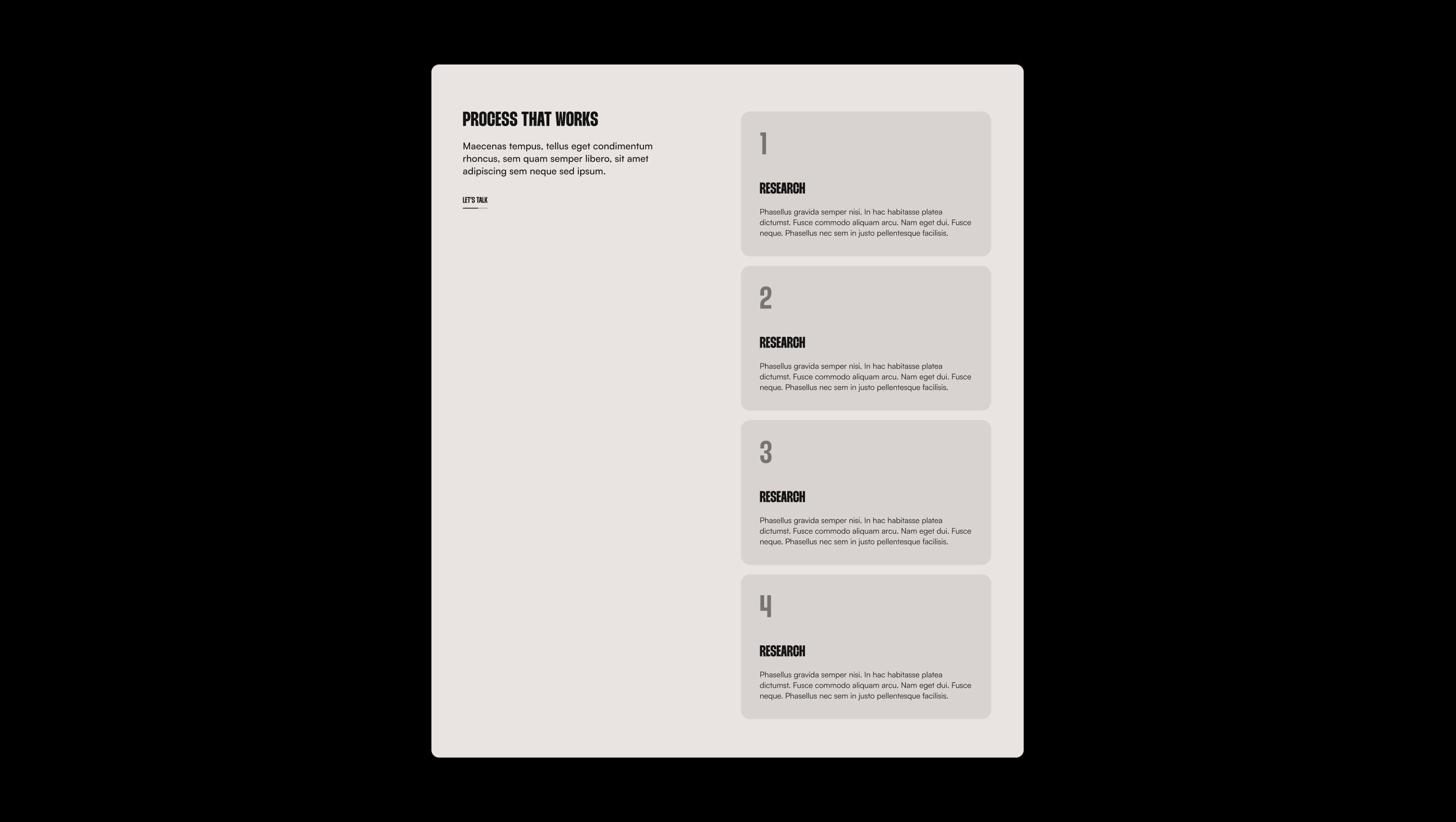
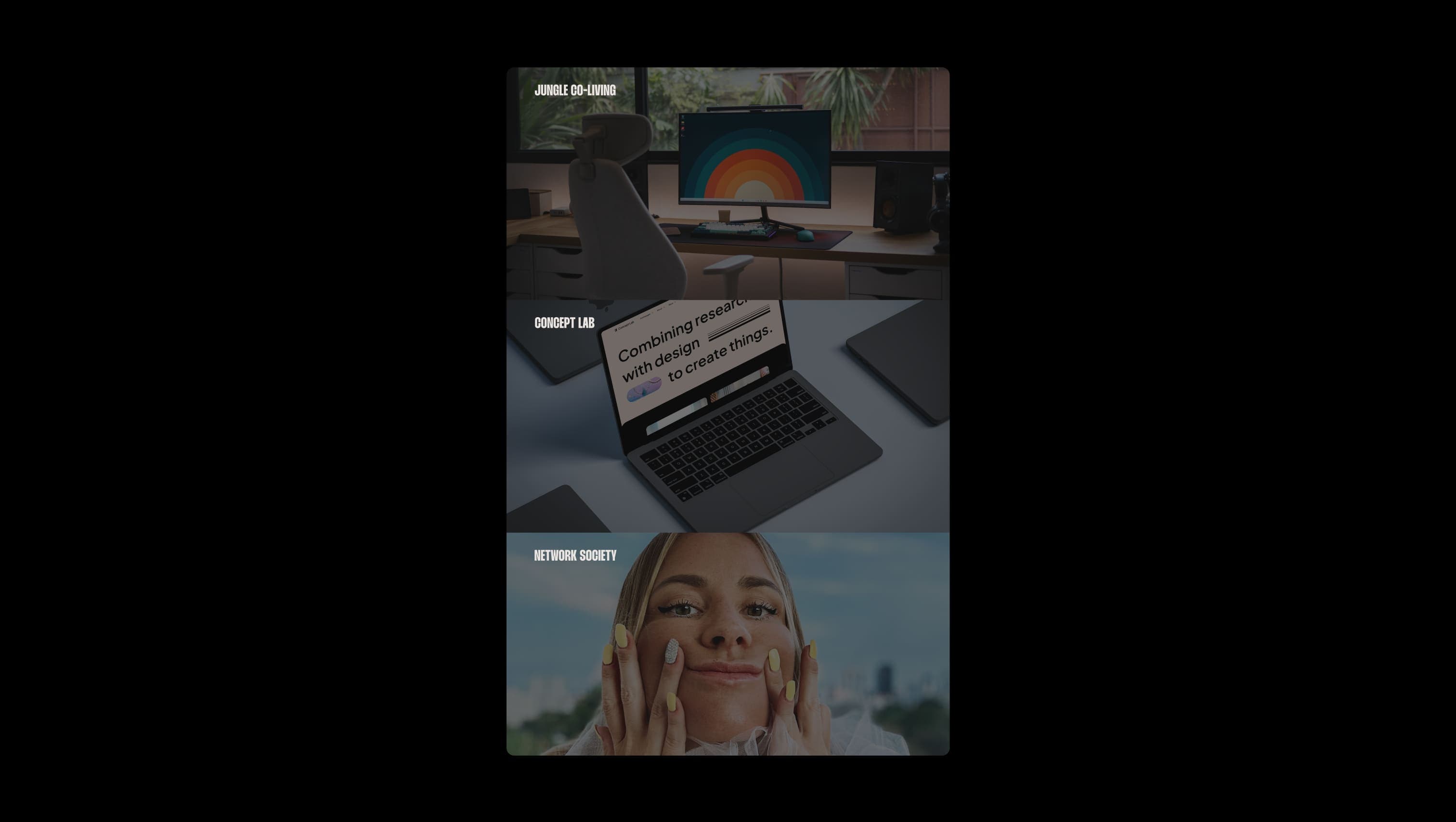
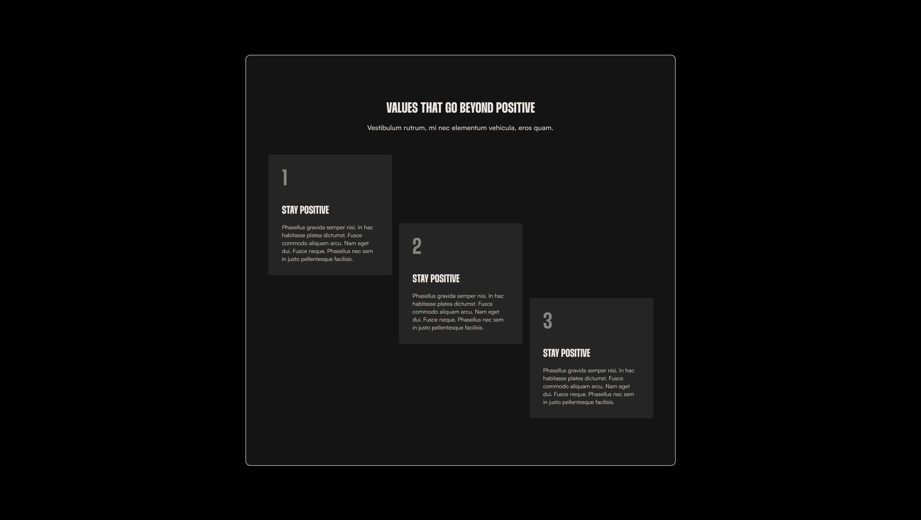
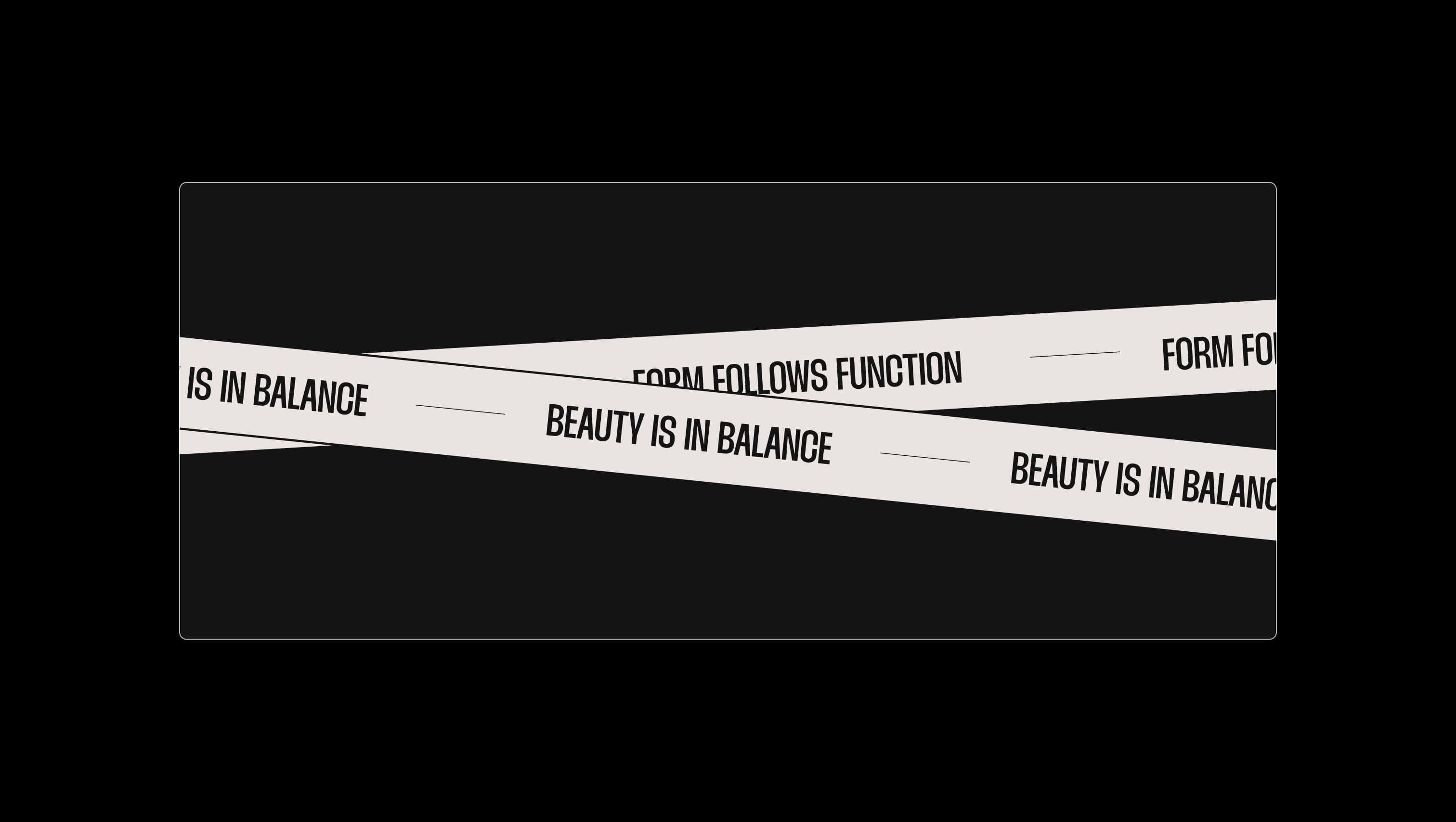
Positive Studio is a creative agency template built around a single confident idea: warm putty paper meeting unapologetic black ink, punctuated by playful pill shapes and a single jolt of jade. The hero composition stacks a colossal condensed display face — Thunder, drawn at heroic 120–160px sizes — against humble, generously leaded Satoshi body copy, so every page reads as if a typographic poster were narrated by a calm voiceover. The rhythm is deliberate: full-width sections of bone-white canvas snap into deep ink panels with 60px rounded shoulders, marquees scroll in oversized caps, and tabs and CTAs hide inside long pill silhouettes. It feels like a contemporary studio monograph — graphic, slightly funky, never decorative for its own sake.
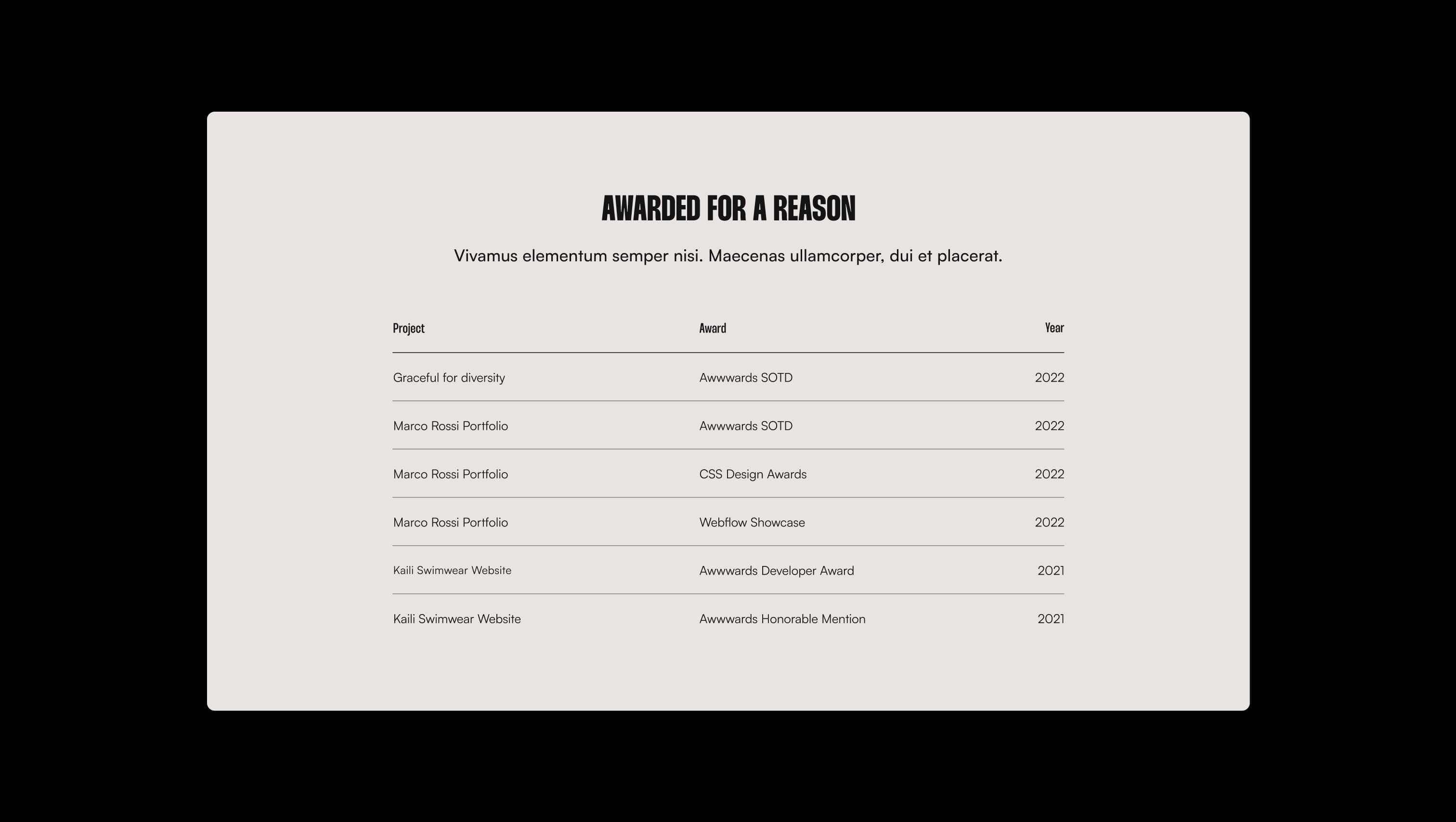
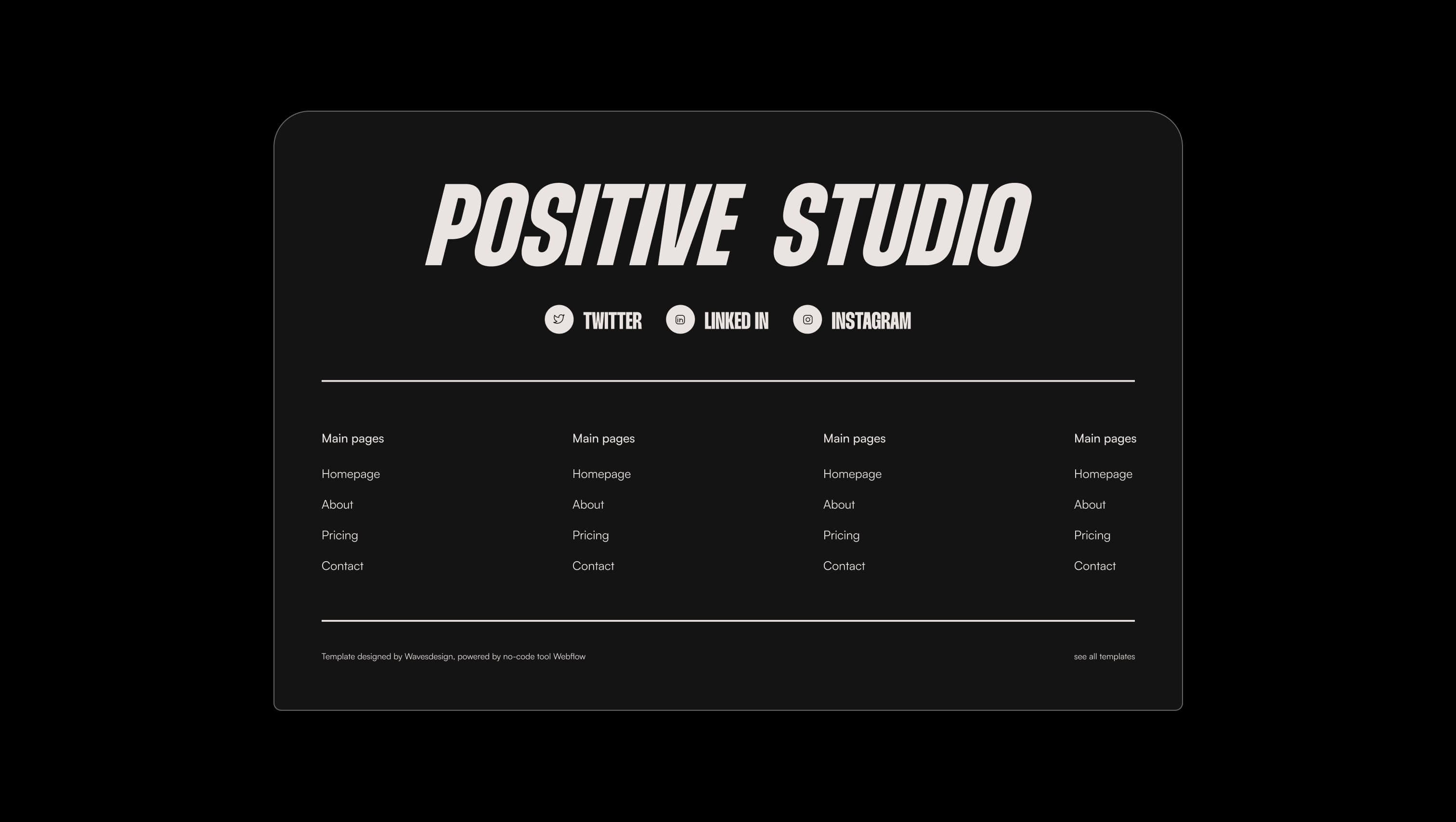
A handful of real sections that ship with this template. Click any card to preview, or explore them all under the Sections tab.
Translucent bone. Underline rails and dividers on dark panels.
Lifted canvas. Slightly deeper putty for testimonial tiles, dropdowns, and elevated cards on light surfaces.
Primary canvas. Warm putty paper for default page surfaces and light mode body copy on dark.
Translucent ink. Underline rails and 30% ink overlays beneath link fills.
Primary ink. Headlines, body copy, dark sections, and pill button fills.
Lifted ink. Inner panels, tab content cards, and pill backgrounds inside dark sections.
Footer text and dividers. Slightly muted off-bone for secondary links on dark panels.
Signature accent. Reserved for the hero pill, hexagon mark, and rare highlight shapes.
Accent highlight. Innermost hexagon and tertiary spot color in playful collages.
Accent shadow. Layered hexagon depth behind the primary jade pop.
The quick brown fox jumps
Body & UI. Paragraphs, subtitles, testimonials, navigation, and form text.
The quick brown fox jumps
Display & headlines. Used for every H1–H3, marquee text, CTA labels, and tabs.
spacious1400px120px64px40px8px16px24px32px40px48px56px64px80px100px120px160pxcards32pxpills80pxsmall16pxcircle9999pxmedium24pxpanels60pxbuttons50pxStep from canvas (level 1) to lifted (level 2) to inset depth (level 3), then invert into the dark levels for full-bleed sections. Hex codes and roles live in the Colors section above; this ladder shows the layering only.
# Design System Guide
> Unlock the template to access the full design system.
## Brand voice
A short paragraph describing the brand voice, mood, and visual
principles that anchor the system. Tone, cadence, and intent.
## Colors
| Token | Hex | Role |
| ------------ | -------- | ------------------------------------- |
| canvas-1 | #xxxxxx | Page background, large surfaces |
| canvas-2 | #xxxxxx | Lifted surfaces, cards |
| canvas-3 | #xxxxxx | Inset wells, depressed states |
| ink-1 | #xxxxxx | Primary body text |
| ink-2 | #xxxxxx | Secondary text, labels |
| ink-3 | #xxxxxx | Tertiary text, hints |
| accent-1 | #xxxxxx | Primary brand accent |
| accent-2 | #xxxxxx | Secondary accent |
| state-ok | #xxxxxx | Success, confirmations |
| state-warn | #xxxxxx | Warnings |
| state-err | #xxxxxx | Errors, destructive actions |
## Typography
- **Display** — heading scale, used for hero text and section titles.
- **Body** — primary reading text, optimized for paragraphs.
- **Mono** — code, data, and tabular numerals.
```
display: 32px / 40px / 48px / 64px / 80px
body: 14px / 16px / 18px
mono: 12px / 14px
```
## Spacing & shape
Base unit: 4px. Scale: 4, 8, 12, 16, 24, 32, 48, 64, 96, 128.
Radii: sm (4px), md (8px), lg (12px), xl (20px), full (9999px).
## Surfaces
Layered elevation from canvas → lifted → inset. Surfaces invert in
dark sections for full-bleed contrast.
## Do's and don'ts
- Do use accent-1 sparingly for primary CTAs only.
- Do maintain at least 4.5:1 contrast on body text.
- Don't mix display and body in the same line.
- Don't use state colors for branding.
## Agent prompt guide
Prompts for AI design tools that respect this system.
Includes example prompts for sections, components, and layouts.
# ...
Unlock the full style guide