Design systems, extracted.
Paste any URL to create a design system from it. Open any style for colors, type, spacing, components, and a DESIGN.md or tokens.json your agent can use.
Quickly navigate through the dashboard with your keyboard using the command menu.
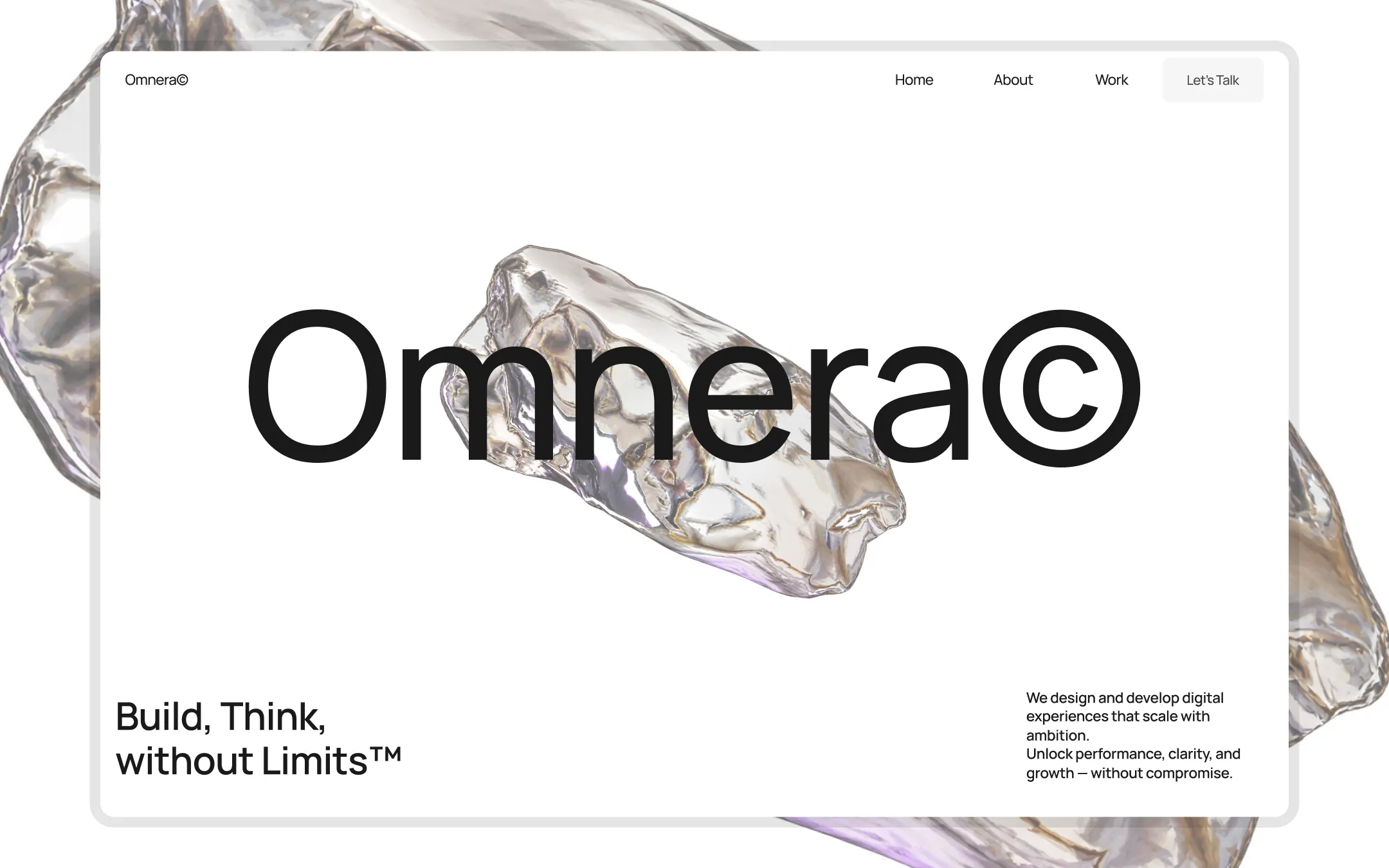
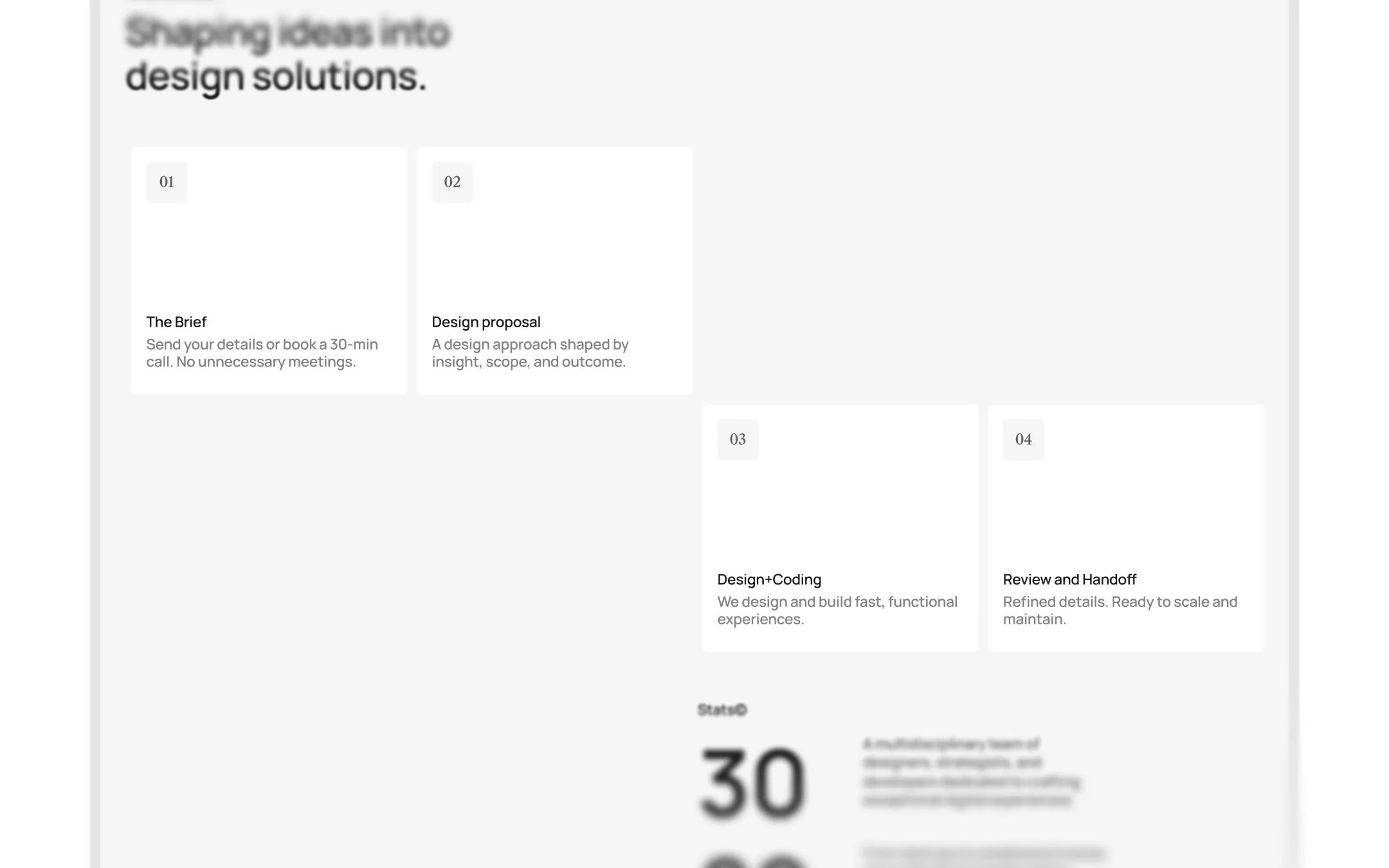
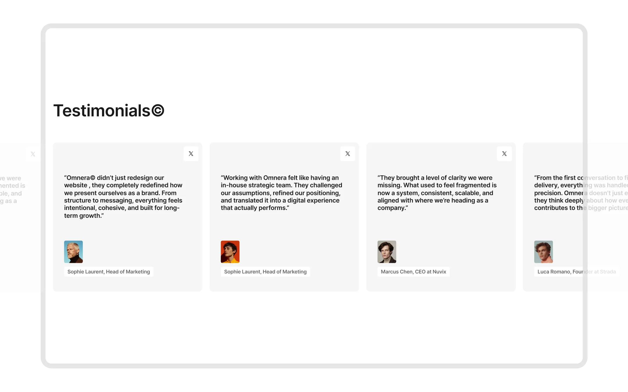
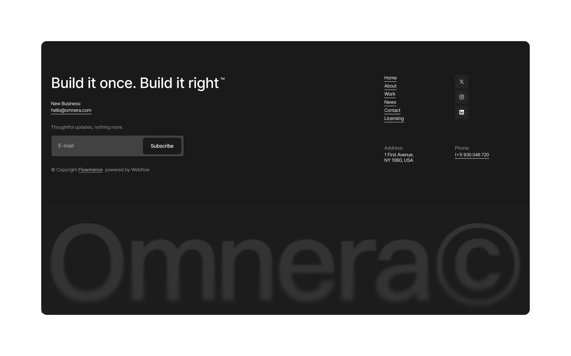
Omnera© is a proprietary-feeling agency system built on stark black-and-white contrast, oversized condensed-serif wordmarks, and ©-stamped section labels that make every heading feel trademarked and intentional. The foundation is crisp white and whisper-gray, punctuated by near-black ink, blurred glass cards, and rare flashes of acid yellow — a palette disciplined enough to let vivid editorial photography (deserts, portraits, abstract close-ups) carry the emotional weight. Spacing is generous to the point of theatrical: 250–300px section padding, sticky scroll-driven work cards, and a single 1400px container give the whole site a slow, confident pace. Typography pairs an enormous Caslon Condensed display face for hero moments with a disciplined IBM Plex Mono for eyebrow labels and tags, while Switzer Variable carries all functional UI text — the result reads as a studio that is done with generic templates and ready to own its presence.
Primary page background. Base canvas for nearly every section and card surface.
Lifted surface. Footer background, gray sections, and muted card fills.
Button fills & deepest ink. Primary CTA backgrounds, overlays, pure-black accents.
Primary text & inverted surfaces. Headlines, body copy, dark section and footer backgrounds.
Dark surface border. Hairline edges on dark-background cards and buttons.
Rare brand accent. Reserved for singular highlight moments, never decorative filler.
Tag & badge fill. Background for small uppercase labels like work-category chips.
Dark card surface. Pricing CTA backgrounds and other high-contrast inset panels.
The quick brown fox jumps
Uppercase eyebrow labels, badges, and small tracked tags layered over photography.
The quick brown fox jumps
Primary UI, body copy, navigation, and functional text across the whole site.
The quick brown fox jumps
Monumental hero wordmarks and oversized display headlines.
spacious1400px250px30px20px10px20px30px40px50px60px100px120px150px250px300pxpill160pxcards10pxsmall4pxcircle999pxbuttons10pxcontainer10pxlarge-cards25pxStep from canvas (level 1) to lifted (level 2) to inset depth (level 3), then invert into the dark levels for full-bleed sections. Hex codes and roles live in the Colors section above; this ladder shows the layering only.
# Design System Guide

> Unlock the template to access the full design system.

## Brand voice

A short paragraph describing the brand voice, mood, and visual
principles that anchor the system. Tone, cadence, and intent.

## Colors

| Token        | Hex      | Role                                  |
| ------------ | -------- | ------------------------------------- |
| canvas-1     | #xxxxxx  | Page background, large surfaces       |
| canvas-2     | #xxxxxx  | Lifted surfaces, cards                |
| canvas-3     | #xxxxxx  | Inset wells, depressed states         |
| ink-1        | #xxxxxx  | Primary body text                     |
| ink-2        | #xxxxxx  | Secondary text, labels                |
| ink-3        | #xxxxxx  | Tertiary text, hints                  |
| accent-1     | #xxxxxx  | Primary brand accent                  |
| accent-2     | #xxxxxx  | Secondary accent                      |
| state-ok     | #xxxxxx  | Success, confirmations                |
| state-warn   | #xxxxxx  | Warnings                              |
| state-err    | #xxxxxx  | Errors, destructive actions           |

## Typography

- **Display** — heading scale, used for hero text and section titles.
- **Body** — primary reading text, optimized for paragraphs.
- **Mono** — code, data, and tabular numerals.

```
display: 32px / 40px / 48px / 64px / 80px
body:    14px / 16px / 18px
mono:    12px / 14px
```

## Spacing & shape

Base unit: 4px. Scale: 4, 8, 12, 16, 24, 32, 48, 64, 96, 128.
Radii: sm (4px), md (8px), lg (12px), xl (20px), full (9999px).

## Surfaces

Layered elevation from canvas → lifted → inset. Surfaces invert in
dark sections for full-bleed contrast.

## Do's and don'ts

- Do use accent-1 sparingly for primary CTAs only.
- Do maintain at least 4.5:1 contrast on body text.
- Don't mix display and body in the same line.
- Don't use state colors for branding.

## Agent prompt guide

Prompts for AI design tools that respect this system.
Includes example prompts for sections, components, and layouts.

# ...
Unlock the full style guide