Design systems, extracted.
Search curated design systems pulled from premium templates or create one from URL. Open any style for colors, type, spacing, components, and a DESIGN.md or tokens.json your agent can use.
Quickly navigate through the dashboard with your keyboard using the command menu.
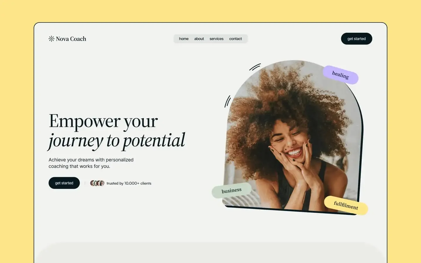
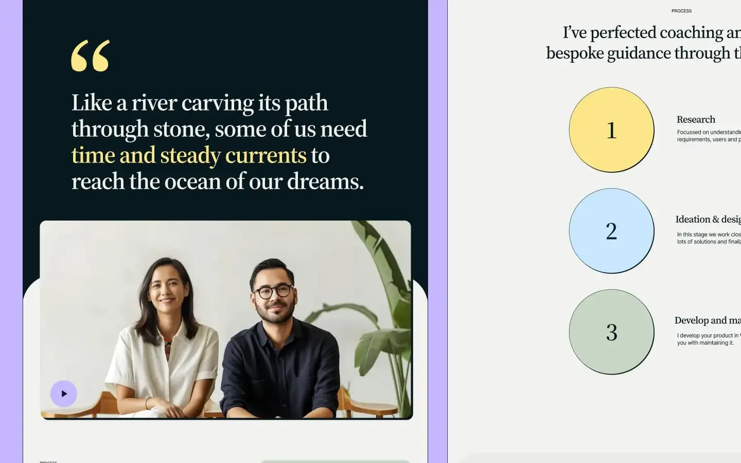
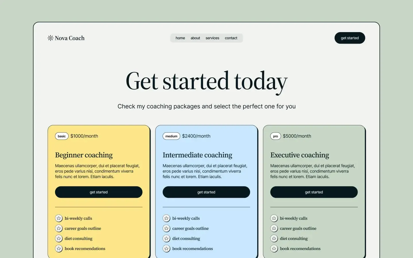
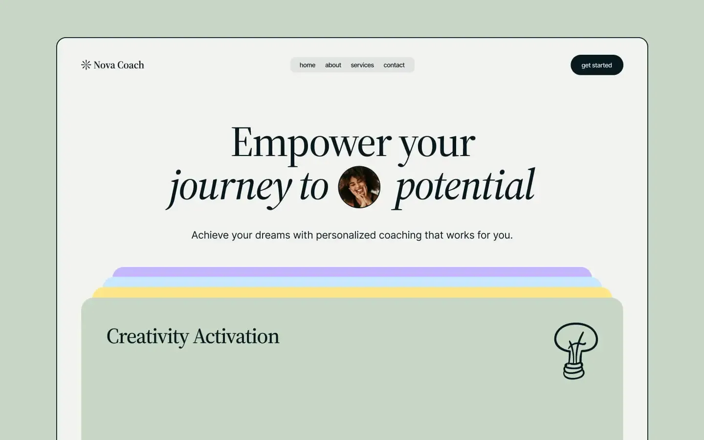
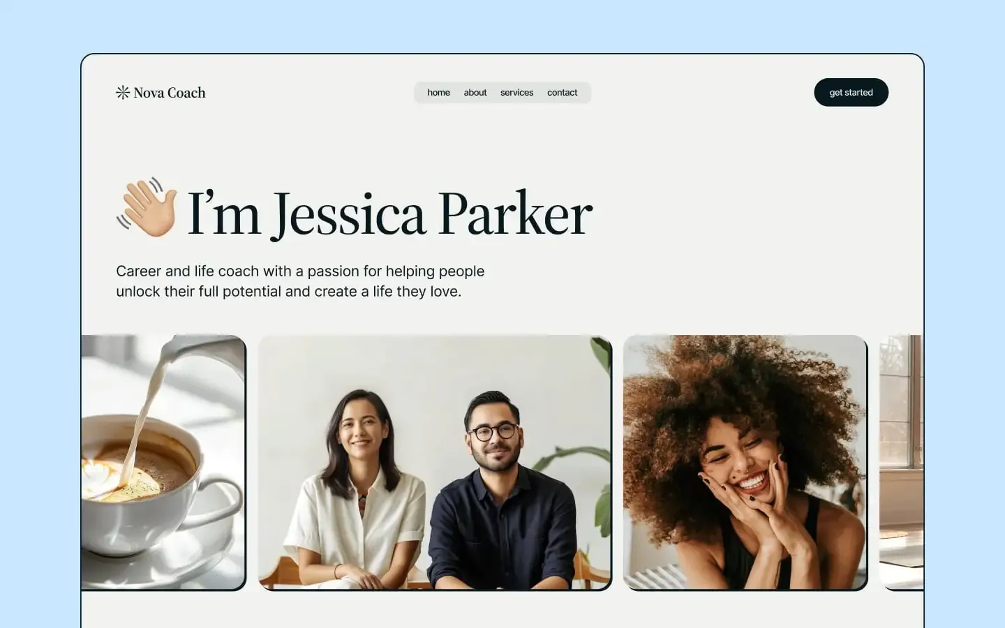
Nova Coach is the visual language of a personal coach who feels both grounded and aspirational — a practice that takes itself seriously without losing its sense of play. Cream-paper canvases hold elegant Source Serif 4 headlines beside cleanly set Inter body copy, with italic pull-quotes that breathe like handwritten margin notes. Pastel sticker tags — buttery yellow, sage green, sky blue, lavender purple — float at hand-drawn angles around arched portraits and rounded-corner videos, lending the layout a scrapbook warmth. Sections stack like layered paper: the cream page tucks under deep midnight panels with 80px rounded shoulders, each transition cushioned by a -80px pull-up that creates the signature peeking edge. Buttons are full pill-shaped charcoal lozenges, cards wear 24px corners with a 6px hard offset shadow, and every surface is bordered, considered, and quietly confident — retro-modern, tender, and unmistakably brand-led.
A handful of real sections that ship with this template. Click any card to preview, or explore them all under the Sections tab.
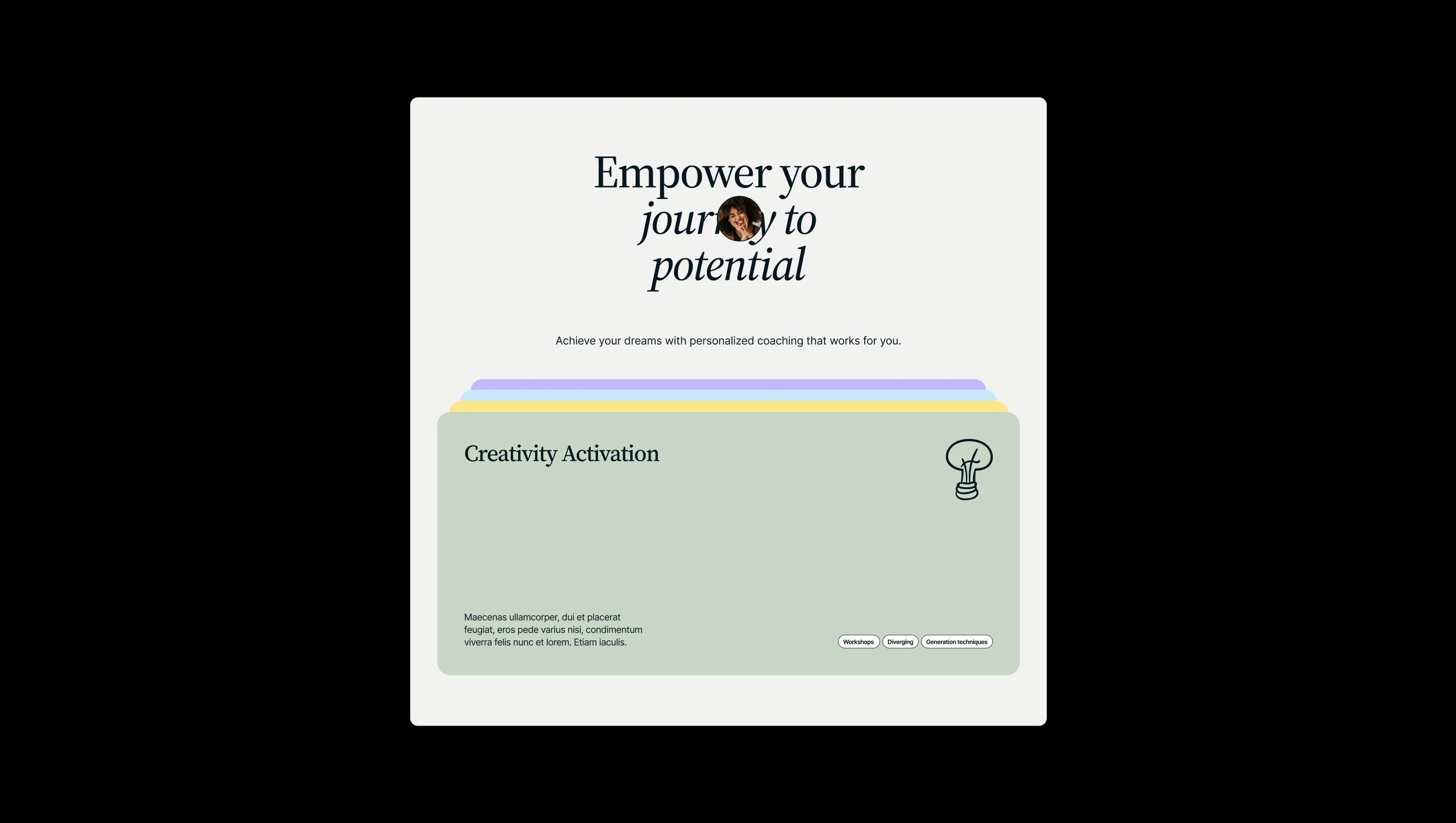
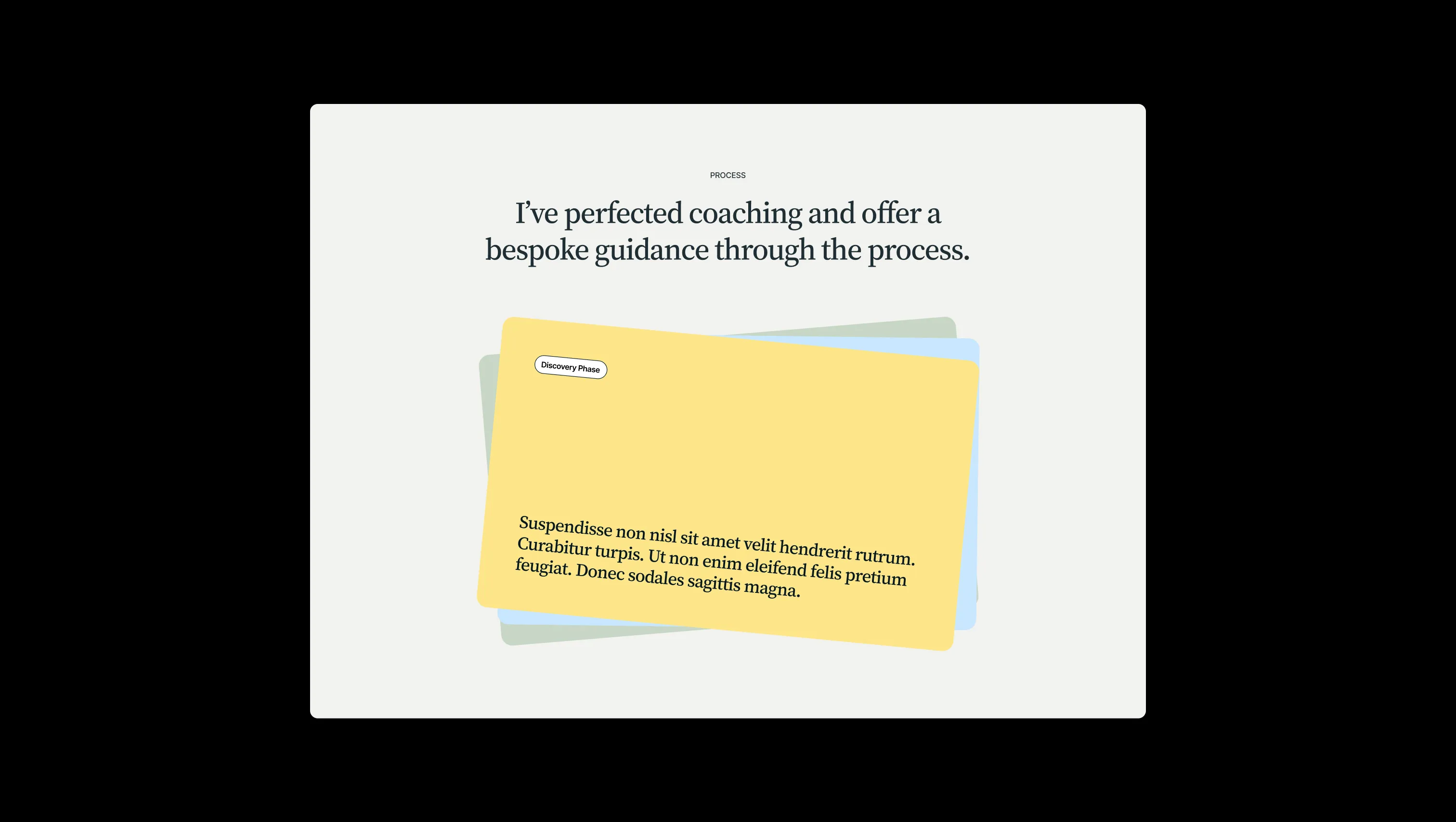
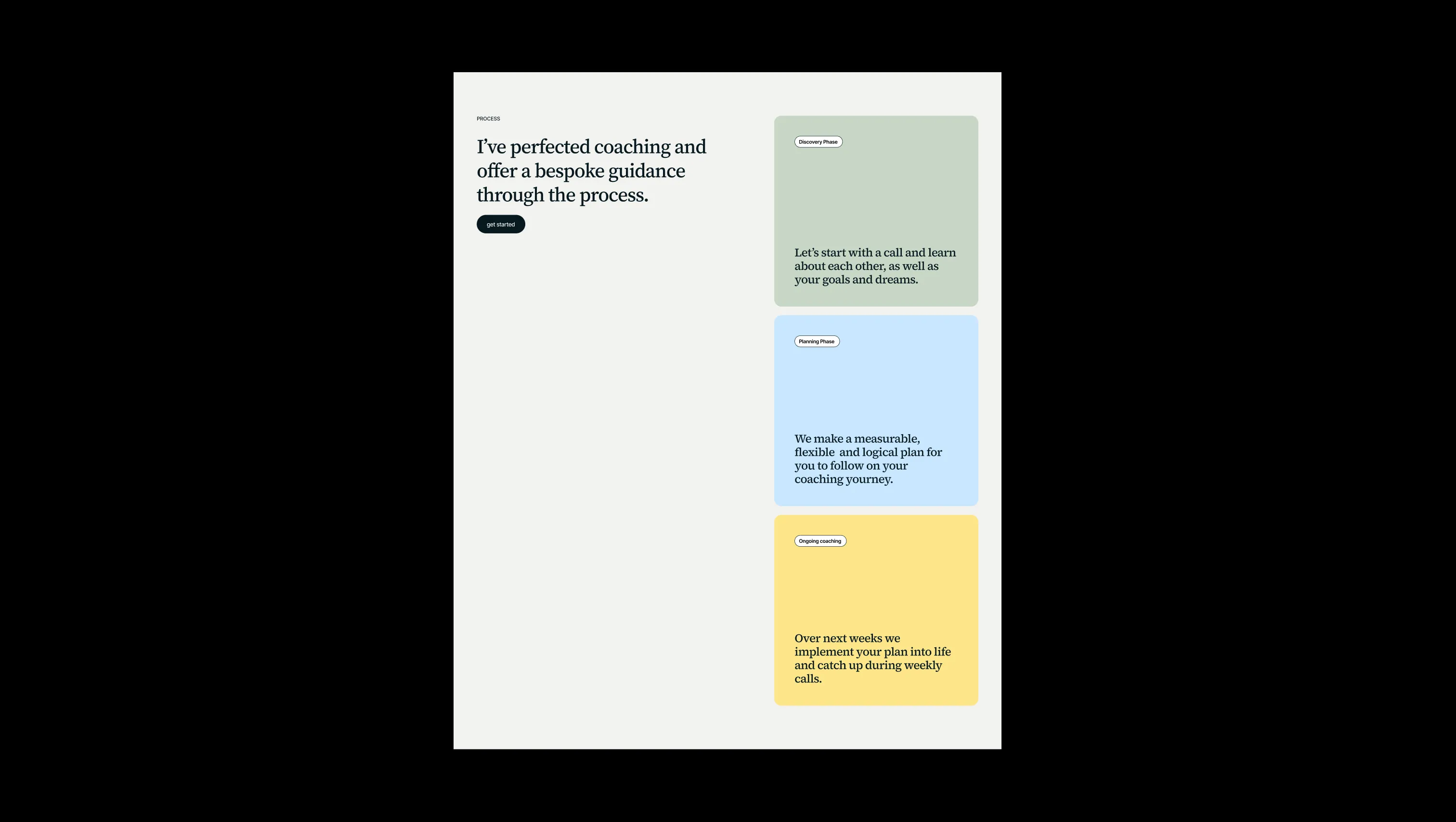
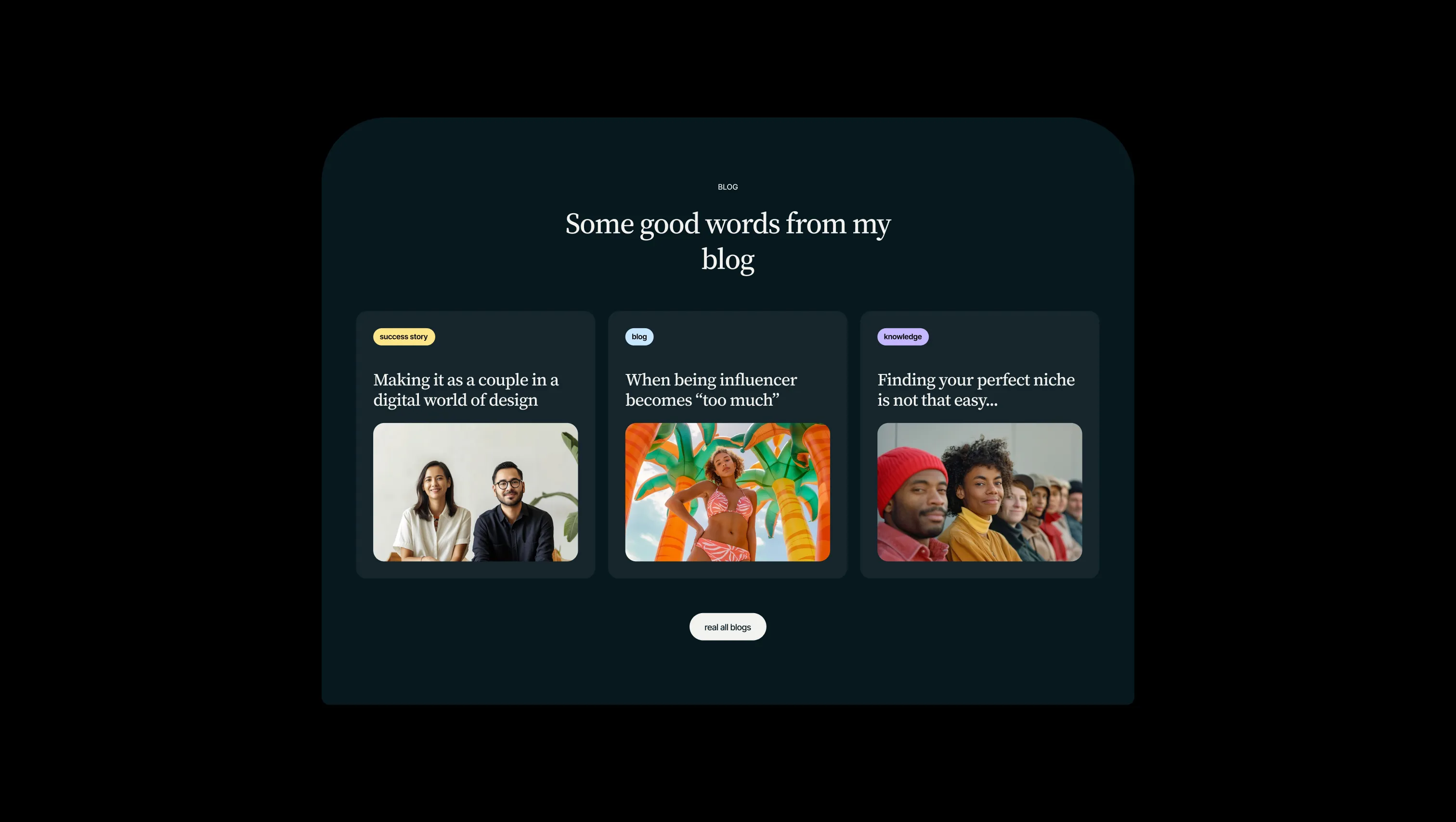


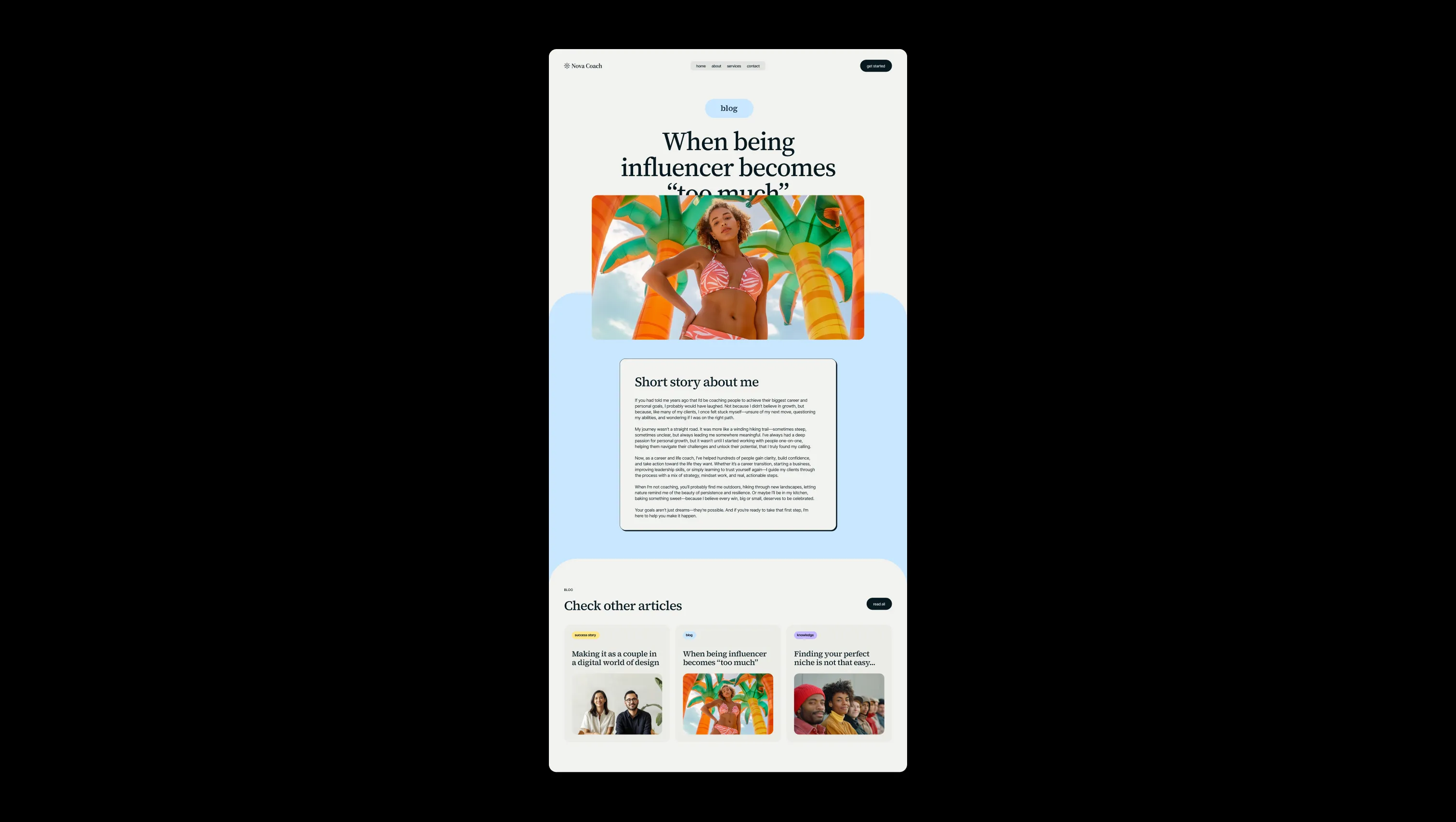
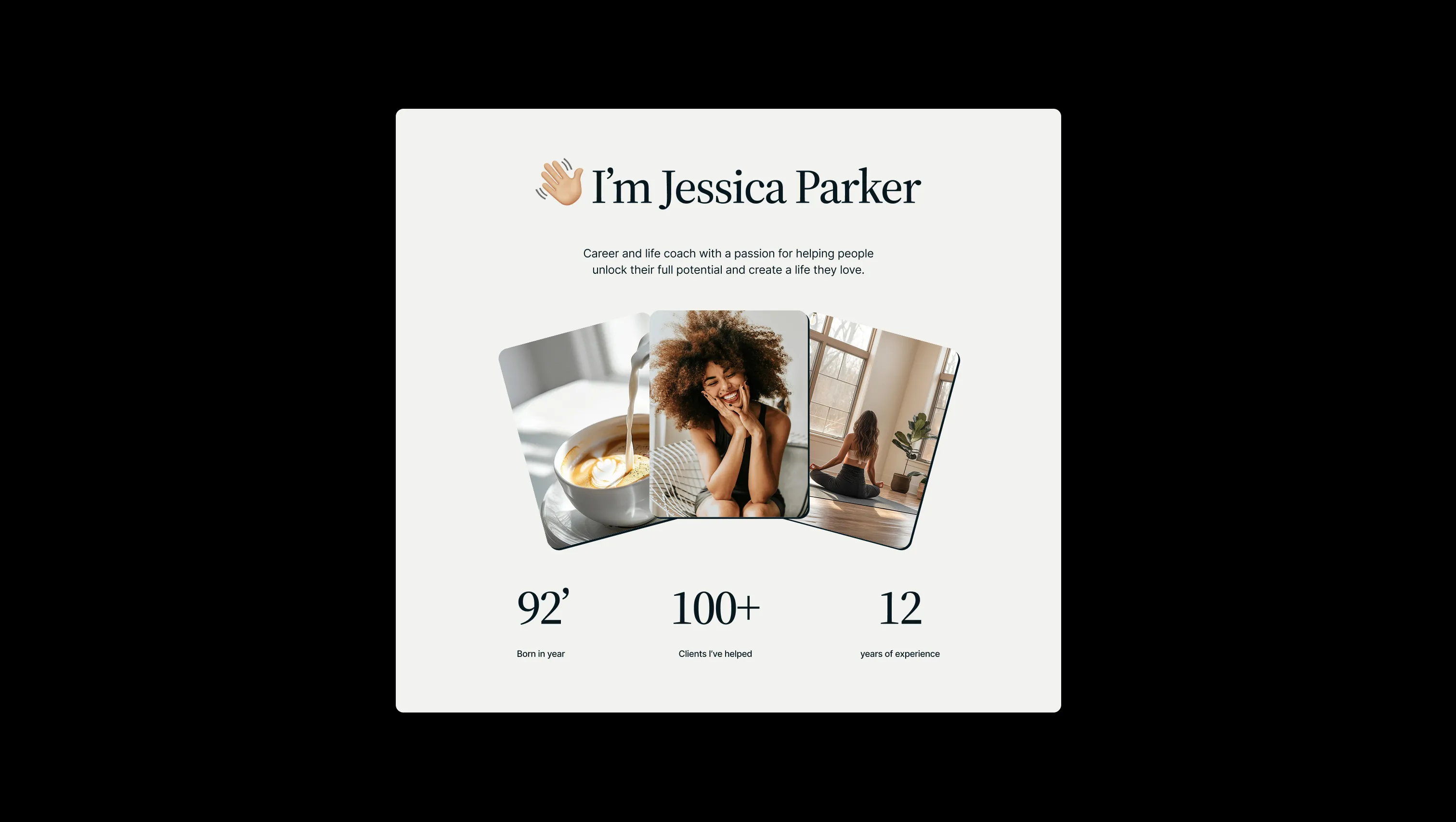
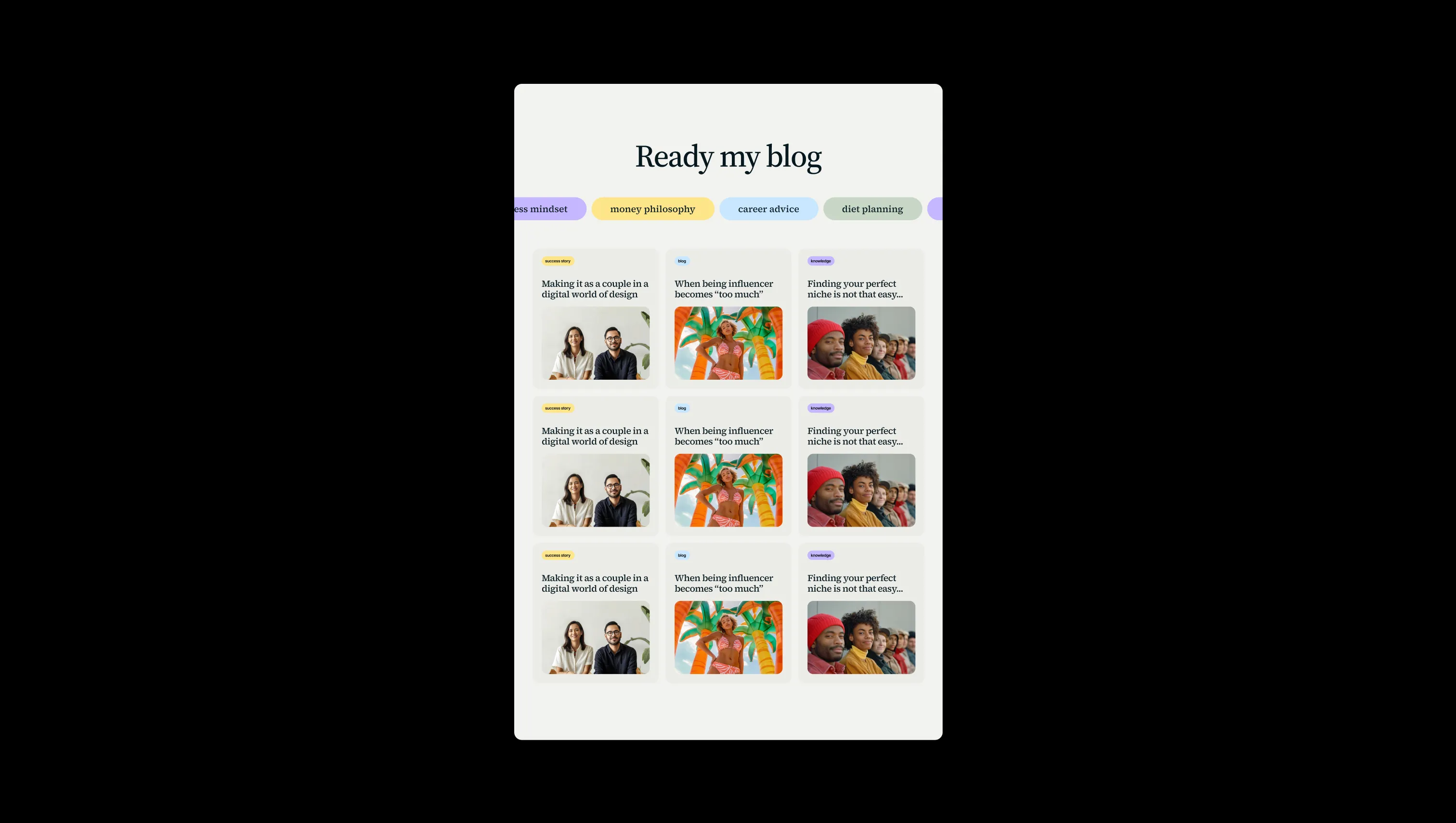
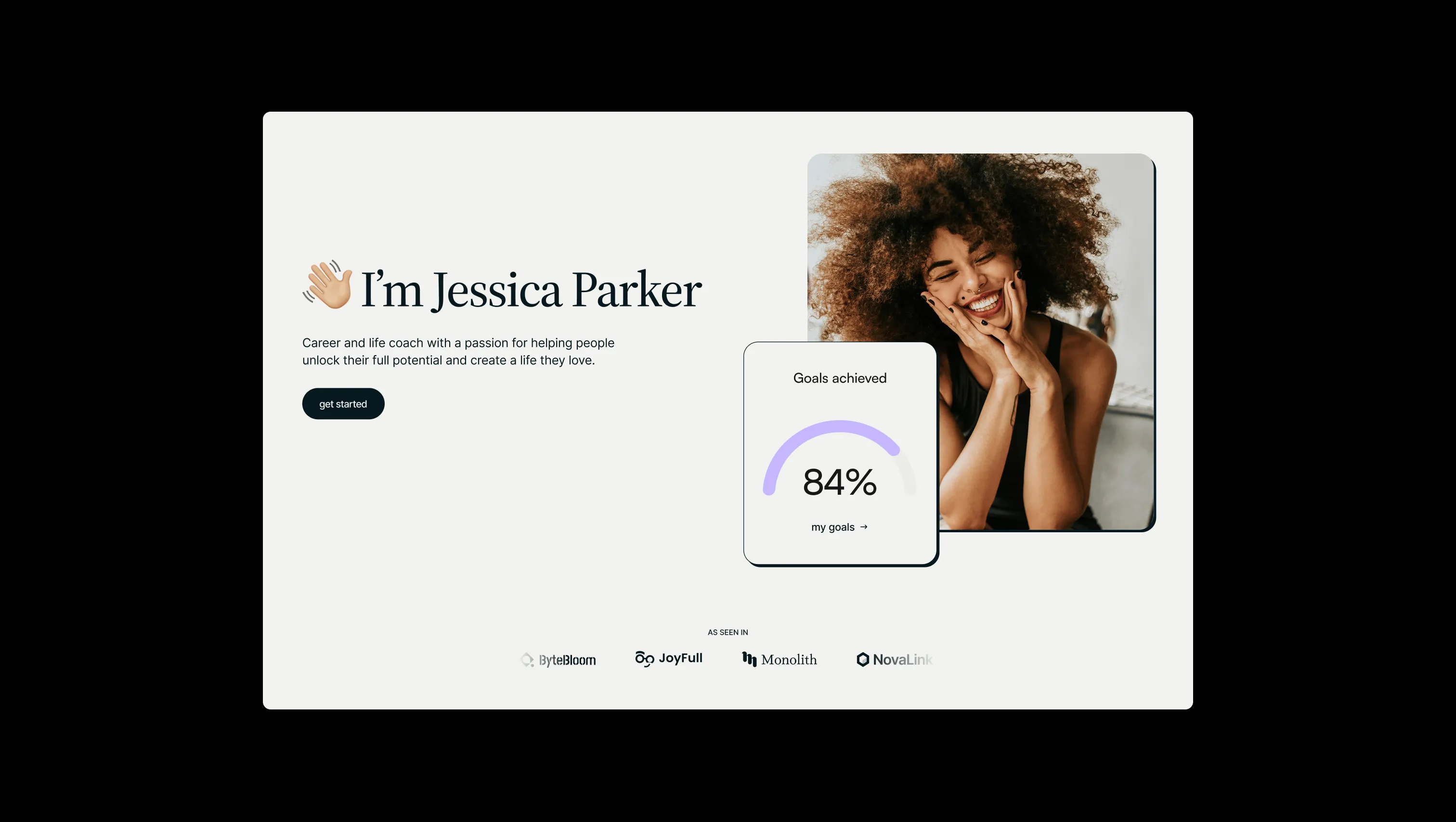
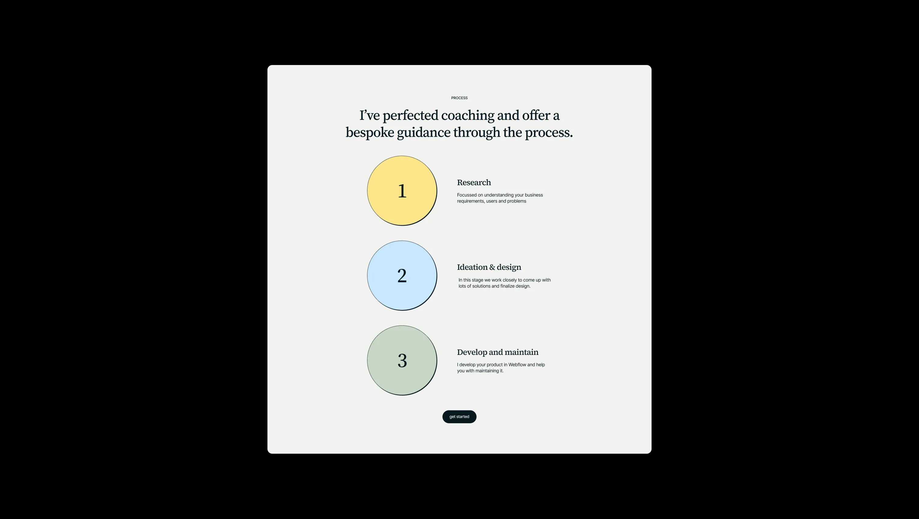
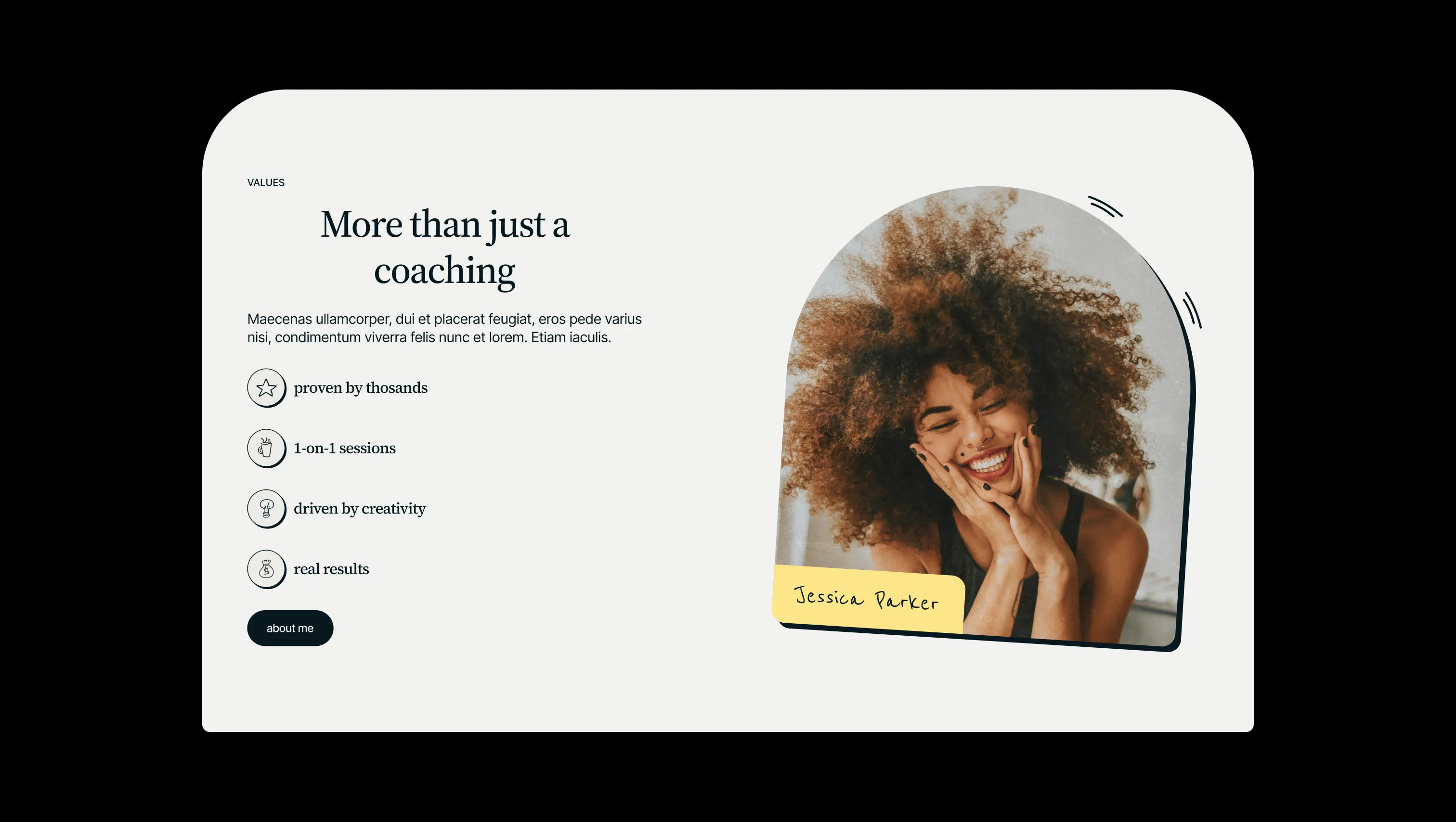
Lifted canvas. Secondary section backgrounds and rounded panels stacked above the cream base.
Primary canvas. Page background, footer, light-mode hero surfaces, light button fills.
Elevated dark surface. Subtle lift inside dark-rounded sections for cards or quote blocks.
Primary text & ink. Headlines, body copy, dark sections, primary button fills, all hard-shadow offsets.
Cool sticker accent. Story panels, mid-tier pricing tile, blog tag chips.
Calm sticker accent. Pricing tiles, decorative tags, soft callouts and process circles.
Warm sticker accent. Pricing tiles, floating tags, accent highlights inside dark quotes.
Playful sticker accent. Floating tags, play-button fills, decorative section frames.
The quick brown fox jumps
Body copy, navigation, buttons, form fields, captions, footer microcopy.
The quick brown fox jumps
Headlines, display quotes, pricing titles, sticker tag labels — every elegant moment of voice.
spacious1440px120px52px24px4px8px12px16px24px32px40px48px64px72px80px100px120px160px200pxtags60pxcards24pxsmall16pxfields120pxbuttons70pxarch-portrait310pxsection-shoulders80pxStep from canvas (level 1) to lifted (level 2) to inset depth (level 3), then invert into the dark levels for full-bleed sections. Hex codes and roles live in the Colors section above; this ladder shows the layering only.
# Design System Guide
> Unlock the template to access the full design system.
## Brand voice
A short paragraph describing the brand voice, mood, and visual
principles that anchor the system. Tone, cadence, and intent.
## Colors
| Token | Hex | Role |
| ------------ | -------- | ------------------------------------- |
| canvas-1 | #xxxxxx | Page background, large surfaces |
| canvas-2 | #xxxxxx | Lifted surfaces, cards |
| canvas-3 | #xxxxxx | Inset wells, depressed states |
| ink-1 | #xxxxxx | Primary body text |
| ink-2 | #xxxxxx | Secondary text, labels |
| ink-3 | #xxxxxx | Tertiary text, hints |
| accent-1 | #xxxxxx | Primary brand accent |
| accent-2 | #xxxxxx | Secondary accent |
| state-ok | #xxxxxx | Success, confirmations |
| state-warn | #xxxxxx | Warnings |
| state-err | #xxxxxx | Errors, destructive actions |
## Typography
- **Display** — heading scale, used for hero text and section titles.
- **Body** — primary reading text, optimized for paragraphs.
- **Mono** — code, data, and tabular numerals.
```
display: 32px / 40px / 48px / 64px / 80px
body: 14px / 16px / 18px
mono: 12px / 14px
```
## Spacing & shape
Base unit: 4px. Scale: 4, 8, 12, 16, 24, 32, 48, 64, 96, 128.
Radii: sm (4px), md (8px), lg (12px), xl (20px), full (9999px).
## Surfaces
Layered elevation from canvas → lifted → inset. Surfaces invert in
dark sections for full-bleed contrast.
## Do's and don'ts
- Do use accent-1 sparingly for primary CTAs only.
- Do maintain at least 4.5:1 contrast on body text.
- Don't mix display and body in the same line.
- Don't use state colors for branding.
## Agent prompt guide
Prompts for AI design tools that respect this system.
Includes example prompts for sections, components, and layouts.
# ...
Unlock the full style guide