Design systems, extracted.
Paste any URL to create a design system from it. Open any style for colors, type, spacing, components, and a DESIGN.md or tokens.json your agent can use.
Quickly navigate through the dashboard with your keyboard using the command menu.

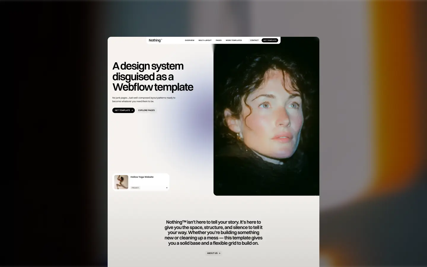
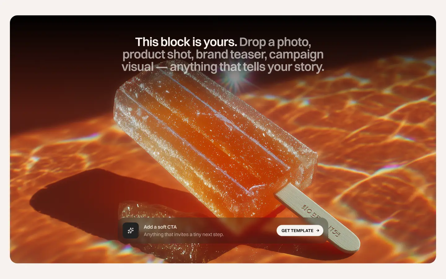
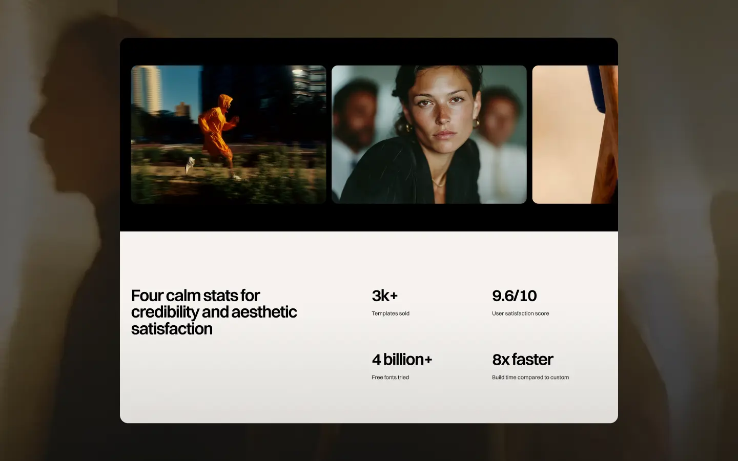
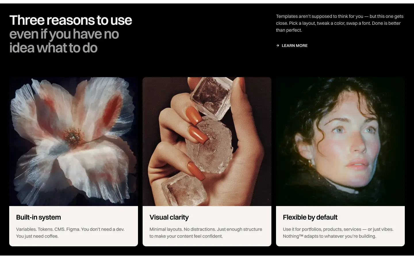
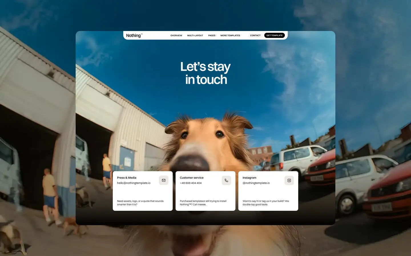
Nothing™ is a modular Webflow template engineered as a full design system in disguise — a warm, off-white canvas threaded with near-black ink and a single muted lavender accent that never shouts. The aesthetic is deliberately restrained: large, tight-tracked Switzer headings carry all the visual weight while Space Mono labels inject a quiet monospace contrast for metadata and tags. Sections alternate between a bleached linen base, a cool chalk depth surface, and crisp white lift cards, creating a calm layering rhythm punctuated by cinematic full-bleed imagery and subtle scroll-triggered blur entrances. The template operates in two modes with complete fluency — a bright parchment light mode and a pitch-black dark mode — with every token wired for both contexts. Components are pill-butted and softly radiused, icon strokes are deliberately thin at 1.5px, and the only color drama is borrowed entirely from the photography. Nothing™ is infrastructure for storytellers who understand that the most powerful design statement is knowing when to get out of the way.
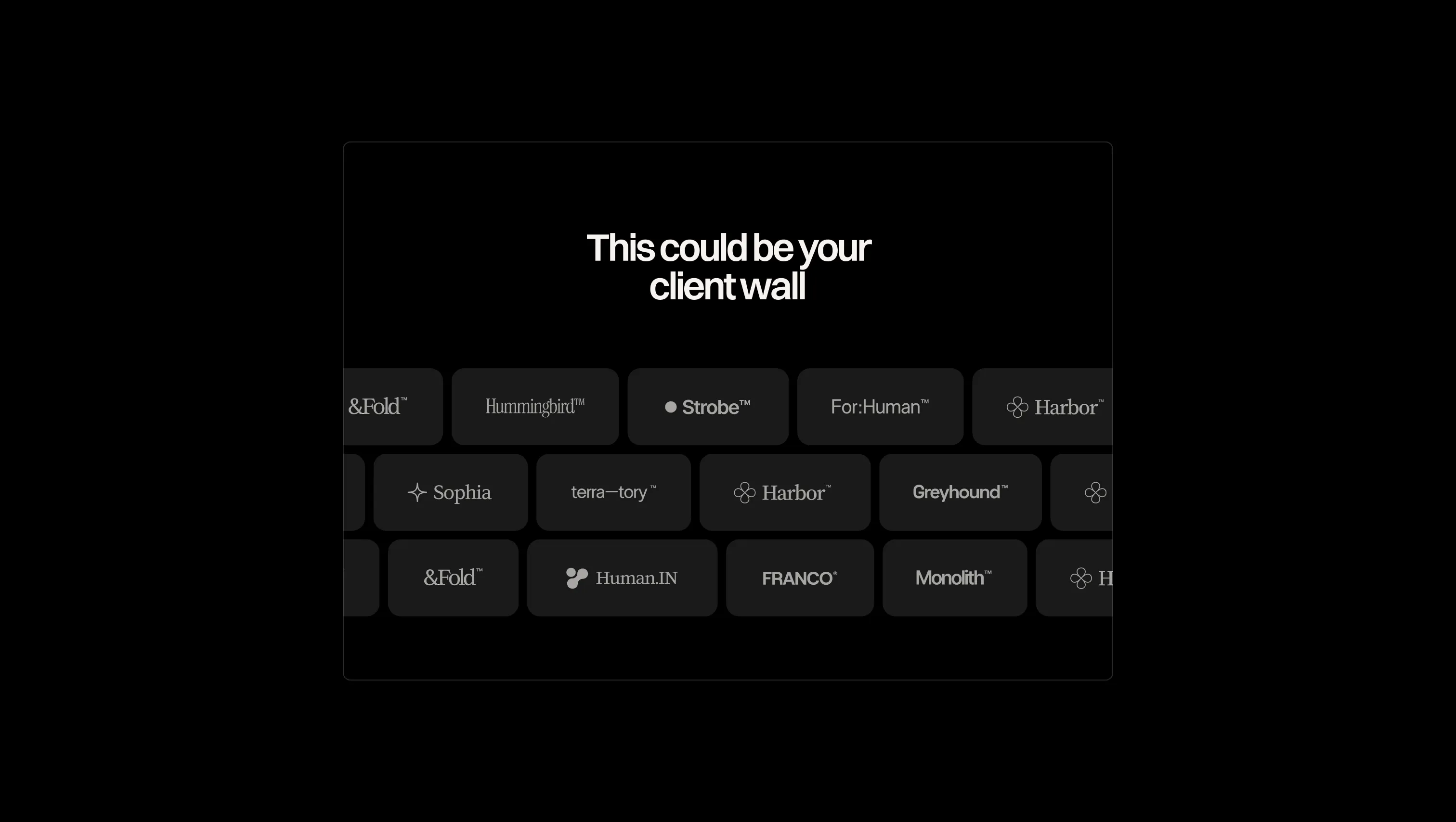
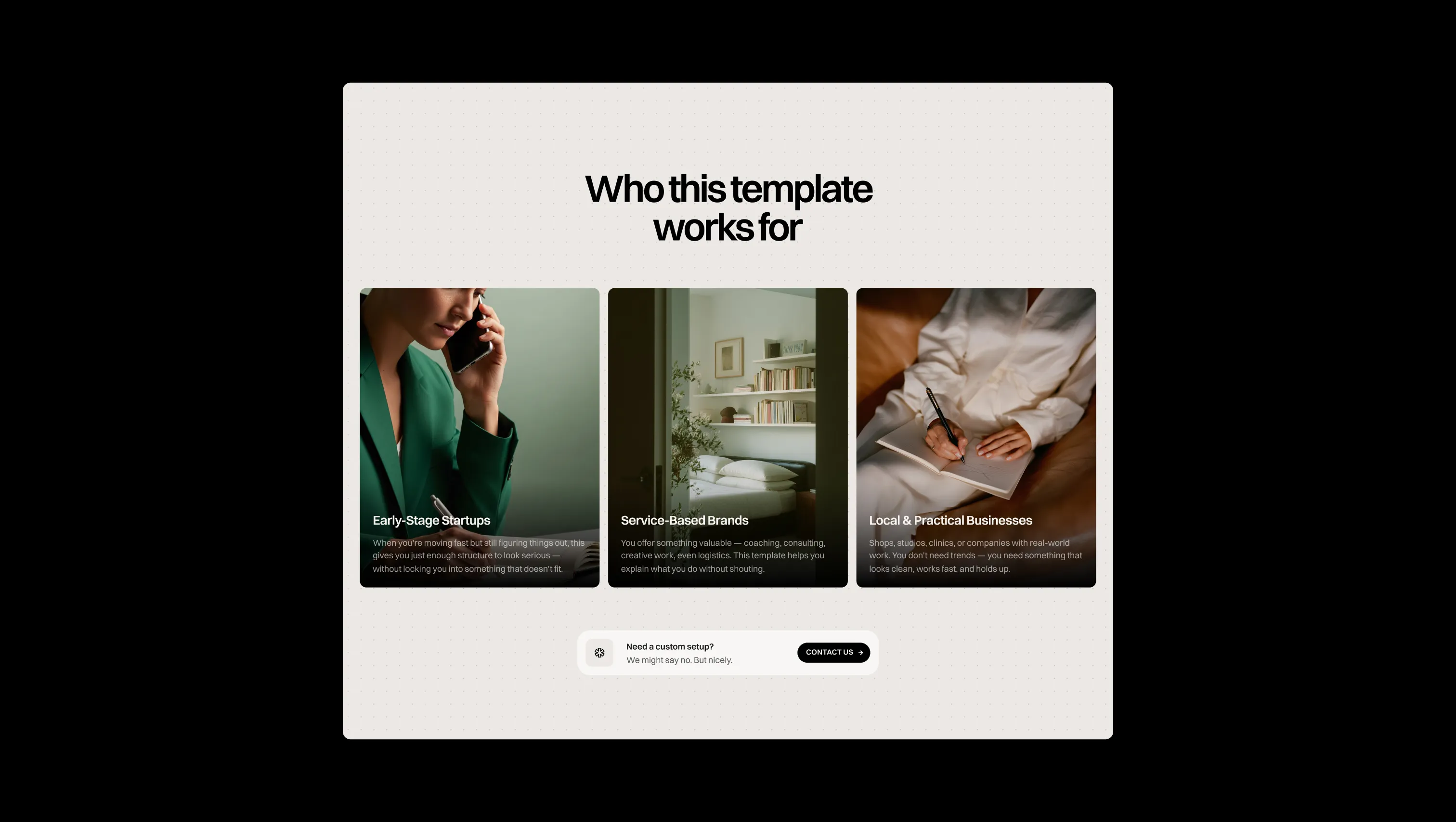
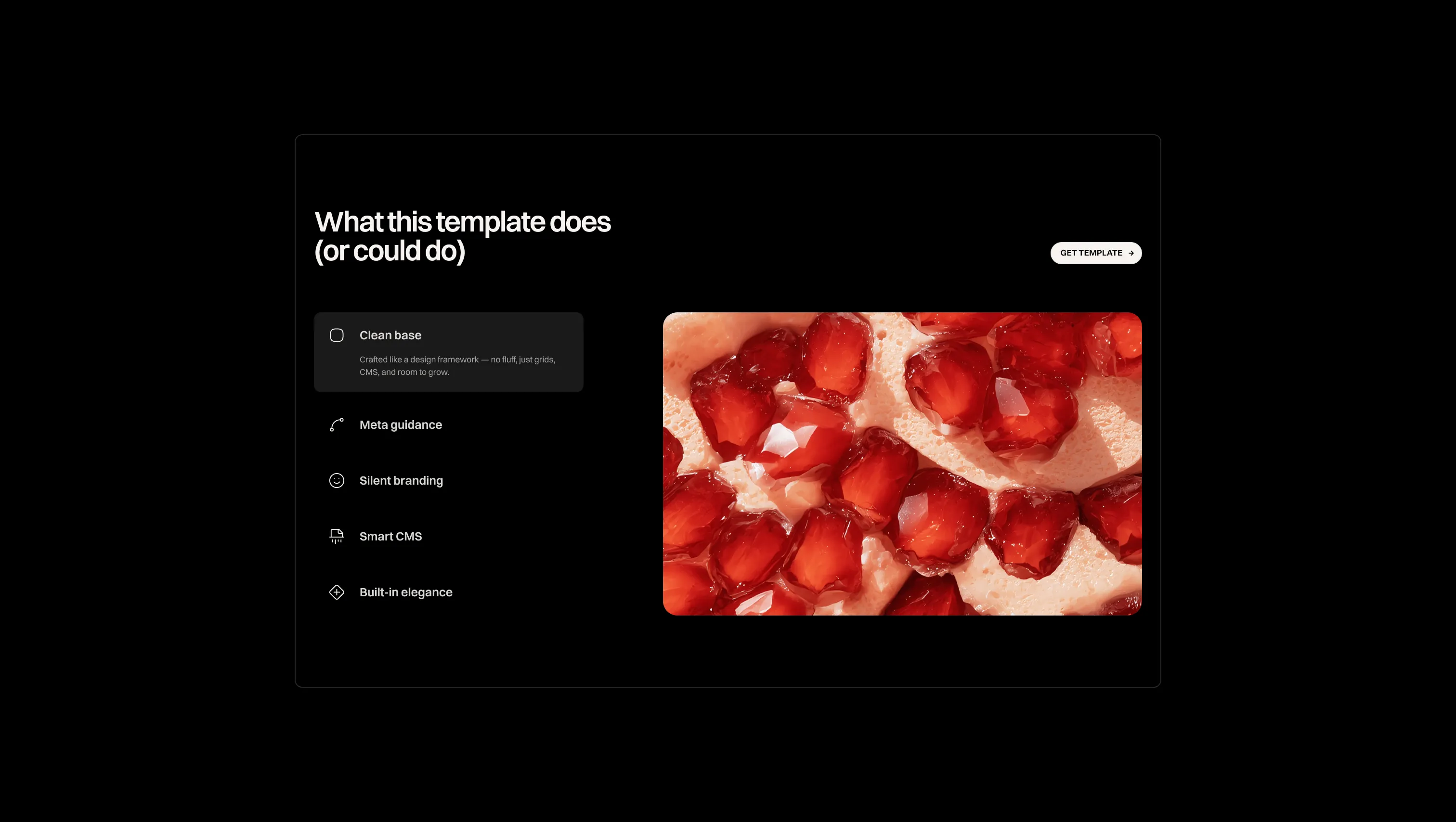
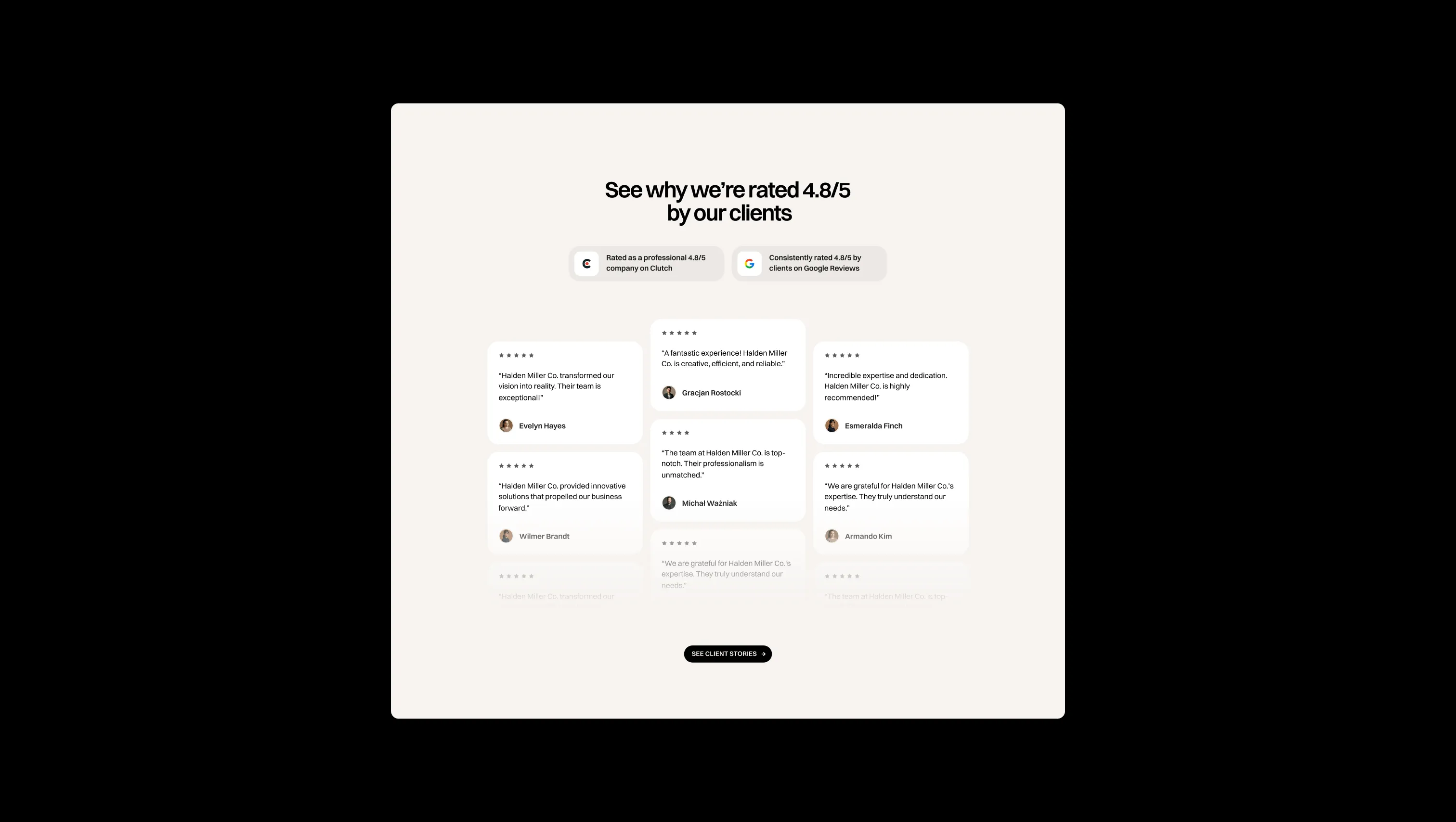
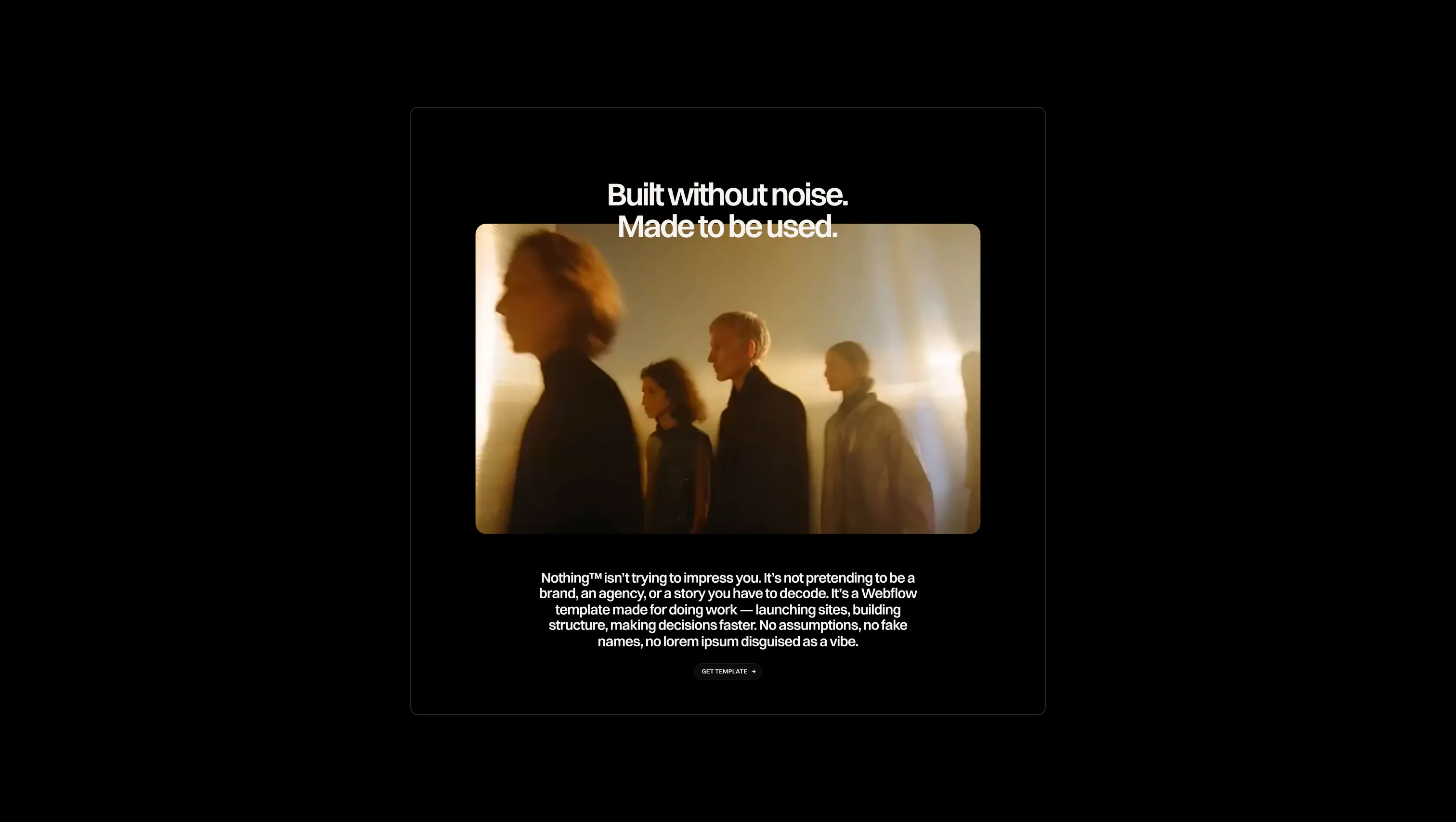
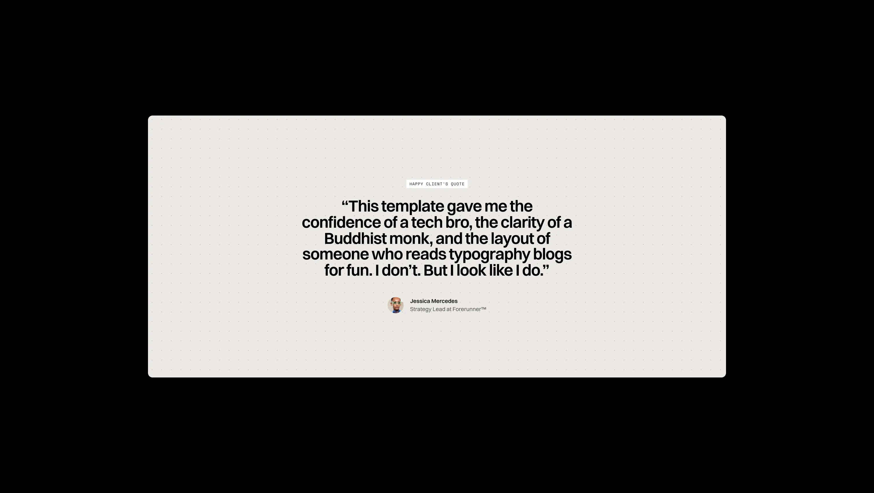
A handful of real sections that ship with this template. Click any card to preview, or explore them all under the Sections tab.
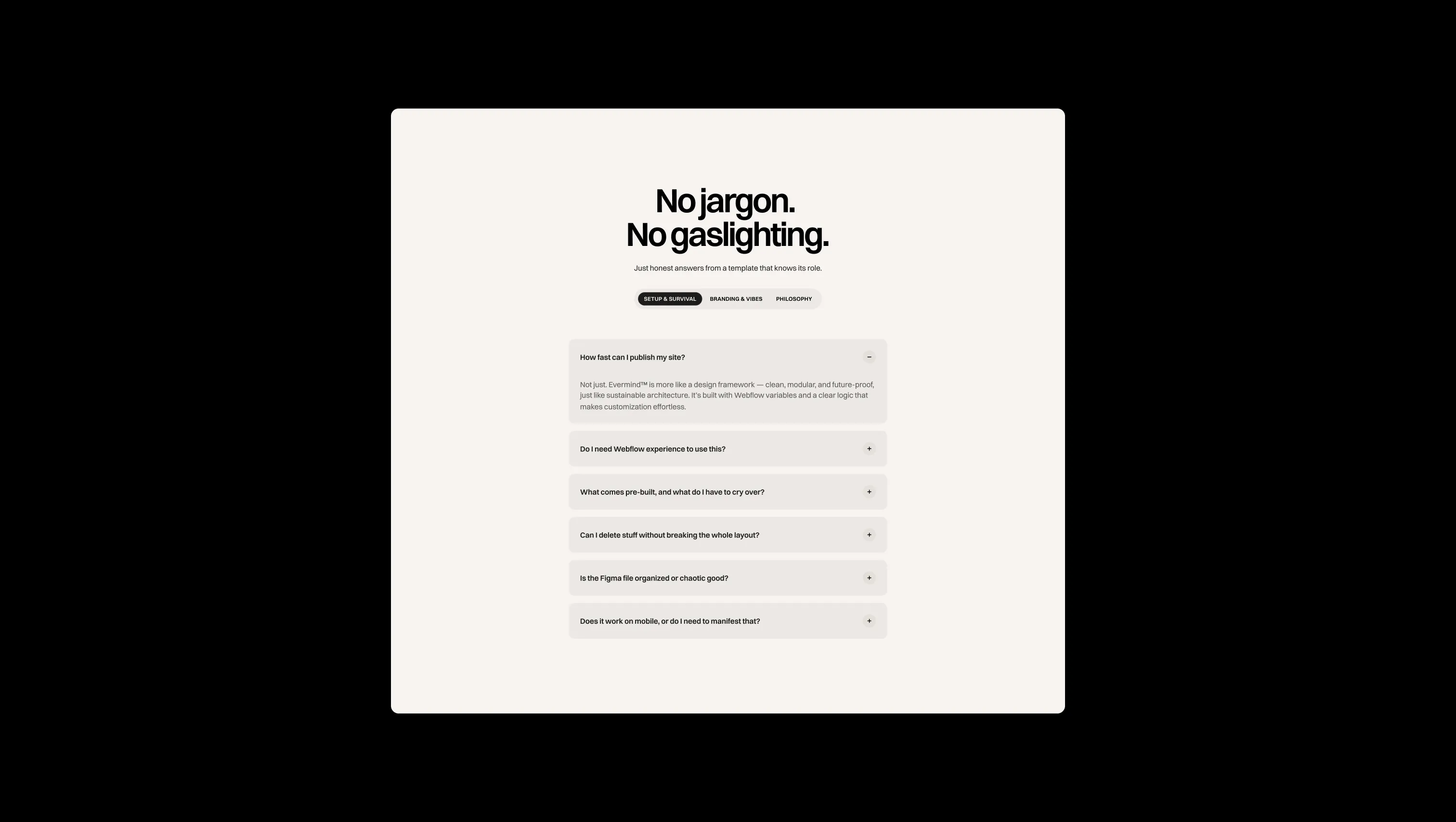
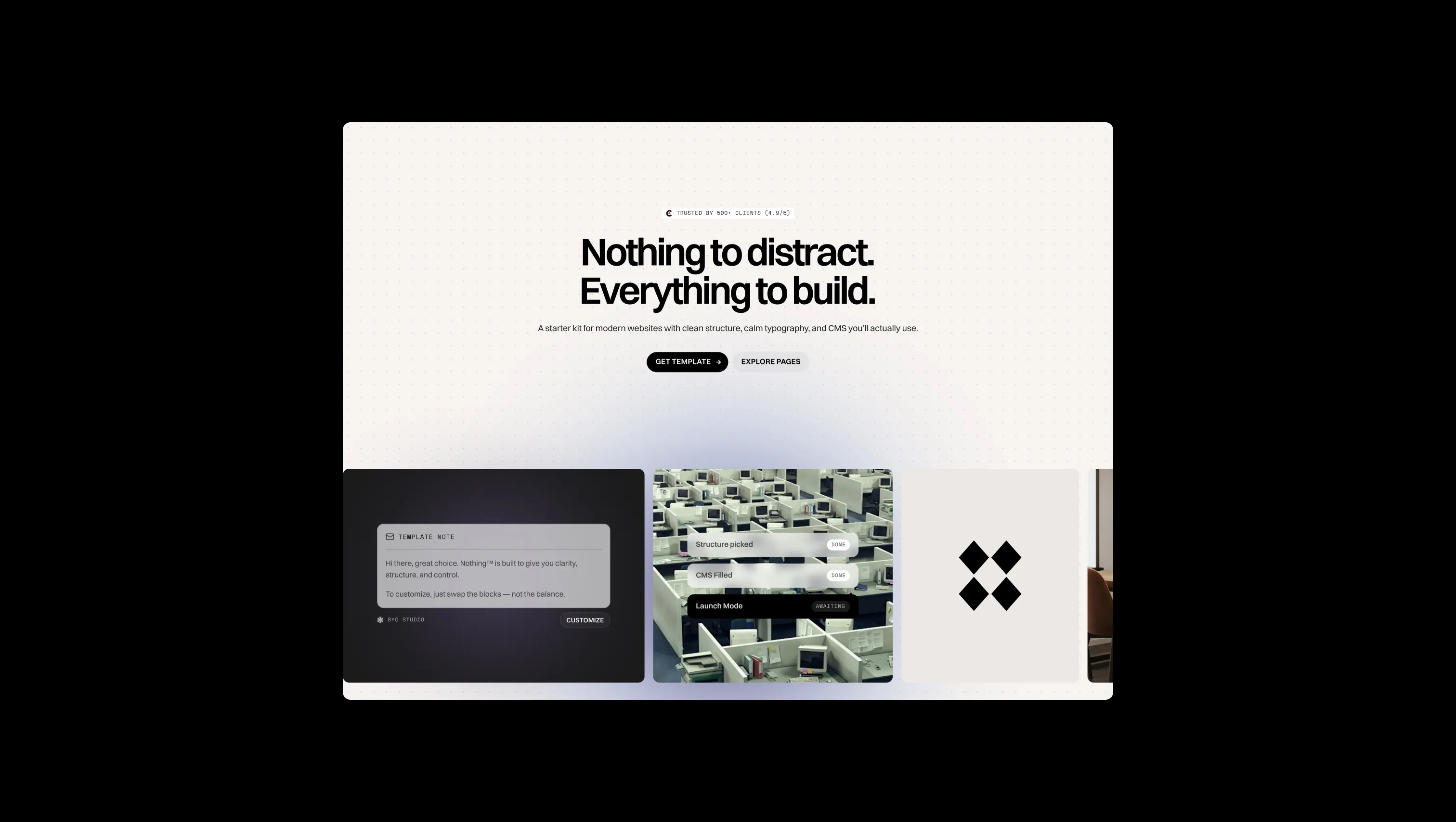
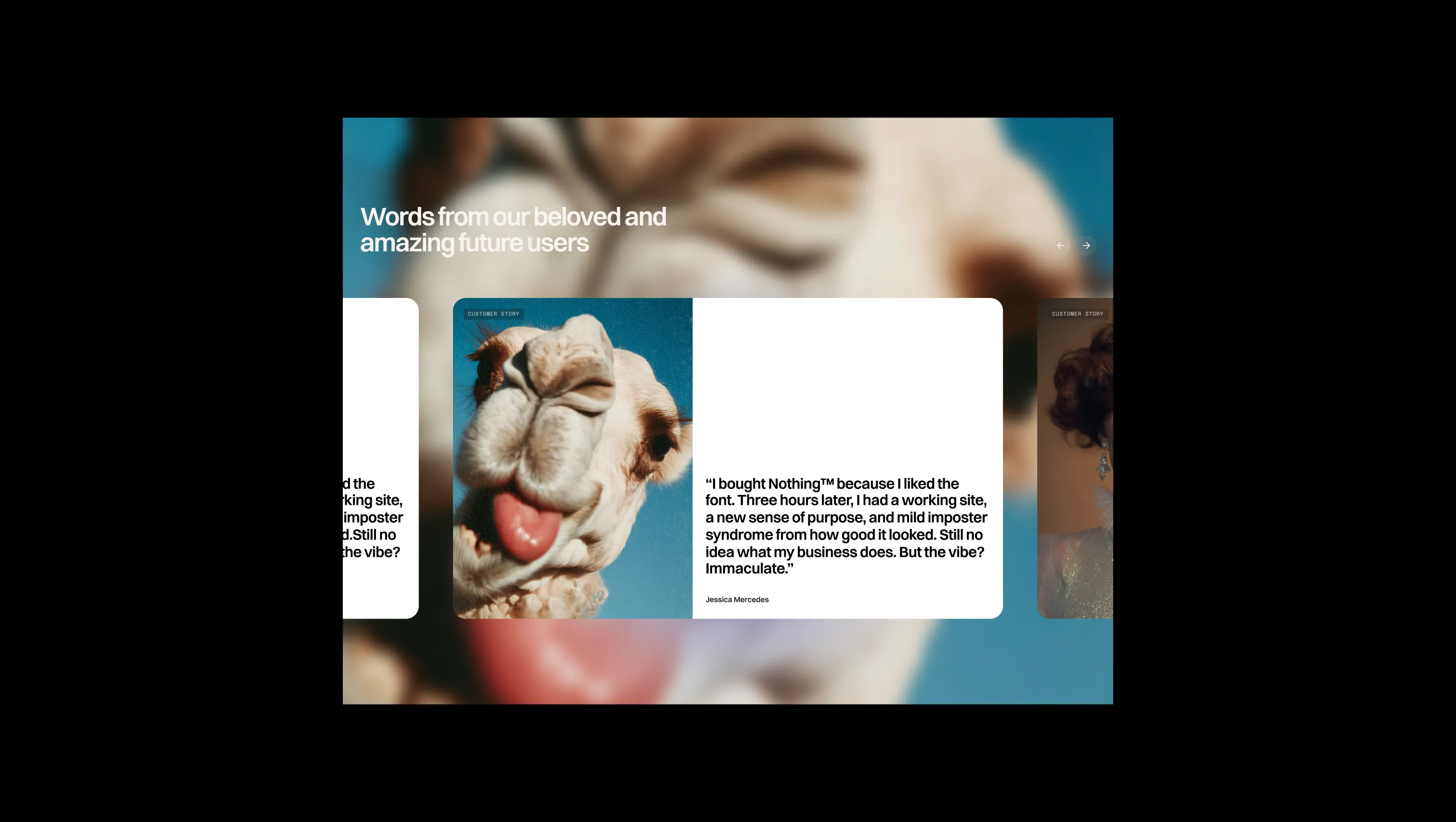
Page canvas & base background. Fills every default section, the footer, and form inputs.
Depth surface & patterned sections. Used on features, testimonials, stats, and project-list sections to create a recessed layer.
Lifted card & navbar surface. Navbar pill, form blocks, and cards that sit above the page canvas.
Dark depth surface. The deepest background within dark sections, contrasting against carbon-veil cards.
Dark surface lift. Elevated cards and panels within dark-mode sections.
Primary ink & dark section fill. All heading text, primary button backgrounds, and full dark section backgrounds.
Primary brand accent. Gradient blobs, decorative hero atmosphere — never applied to large solid fills.
Secondary accent tone. Mid-weight gradient complement to Plum Shadow in atmospheric hero overlays.
Tertiary accent highlight. Lightest accent, used for soft gradient fade edges and decorative circles.
Success confirmation state. Positive feedback indicators in forms and toasts.
Warning state. Caution notices and advisory messaging only.
Form error state. Input borders and error messaging only.
The quick brown fox jumps
Universal display, heading, body, and button typeface. A geometric grotesque that reads as contemporary and calm at every scale.
The quick brown fox jumps
Label and tag typeface only. Monospace rhythm adds technical contrast against Switzer's clean geometry in category tags, nav labels, and form field labels.
comfortable1800px80px32px16px0px4px8px12px16px20px24px32px48px64px80px120px160px200pxpill9999pxtags0pxcards24pxinputs16pxbuttons32pxdefault12pxbutton-circle24pxStep from canvas (level 1) to lifted (level 2) to inset depth (level 3), then invert into the dark levels for full-bleed sections. Hex codes and roles live in the Colors section above; this ladder shows the layering only.
# Design System Guide

> Unlock the template to access the full design system.

## Brand voice

A short paragraph describing the brand voice, mood, and visual
principles that anchor the system. Tone, cadence, and intent.

## Colors

| Token        | Hex      | Role                                  |
| ------------ | -------- | ------------------------------------- |
| canvas-1     | #xxxxxx  | Page background, large surfaces       |
| canvas-2     | #xxxxxx  | Lifted surfaces, cards                |
| canvas-3     | #xxxxxx  | Inset wells, depressed states         |
| ink-1        | #xxxxxx  | Primary body text                     |
| ink-2        | #xxxxxx  | Secondary text, labels                |
| ink-3        | #xxxxxx  | Tertiary text, hints                  |
| accent-1     | #xxxxxx  | Primary brand accent                  |
| accent-2     | #xxxxxx  | Secondary accent                      |
| state-ok     | #xxxxxx  | Success, confirmations                |
| state-warn   | #xxxxxx  | Warnings                              |
| state-err    | #xxxxxx  | Errors, destructive actions           |

## Typography

- **Display** — heading scale, used for hero text and section titles.
- **Body** — primary reading text, optimized for paragraphs.
- **Mono** — code, data, and tabular numerals.

```
display: 32px / 40px / 48px / 64px / 80px
body:    14px / 16px / 18px
mono:    12px / 14px
```

## Spacing & shape

Base unit: 4px. Scale: 4, 8, 12, 16, 24, 32, 48, 64, 96, 128.
Radii: sm (4px), md (8px), lg (12px), xl (20px), full (9999px).

## Surfaces

Layered elevation from canvas → lifted → inset. Surfaces invert in
dark sections for full-bleed contrast.

## Do's and don'ts

- Do use accent-1 sparingly for primary CTAs only.
- Do maintain at least 4.5:1 contrast on body text.
- Don't mix display and body in the same line.
- Don't use state colors for branding.

## Agent prompt guide

Prompts for AI design tools that respect this system.
Includes example prompts for sections, components, and layouts.

# ...
Unlock the full style guide