Design systems, extracted.
Paste any URL to create a design system from it. Open any style for colors, type, spacing, components, and a DESIGN.md or tokens.json your agent can use.
Quickly navigate through the dashboard with your keyboard using the command menu.
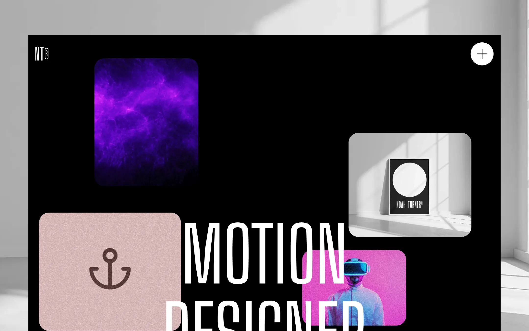
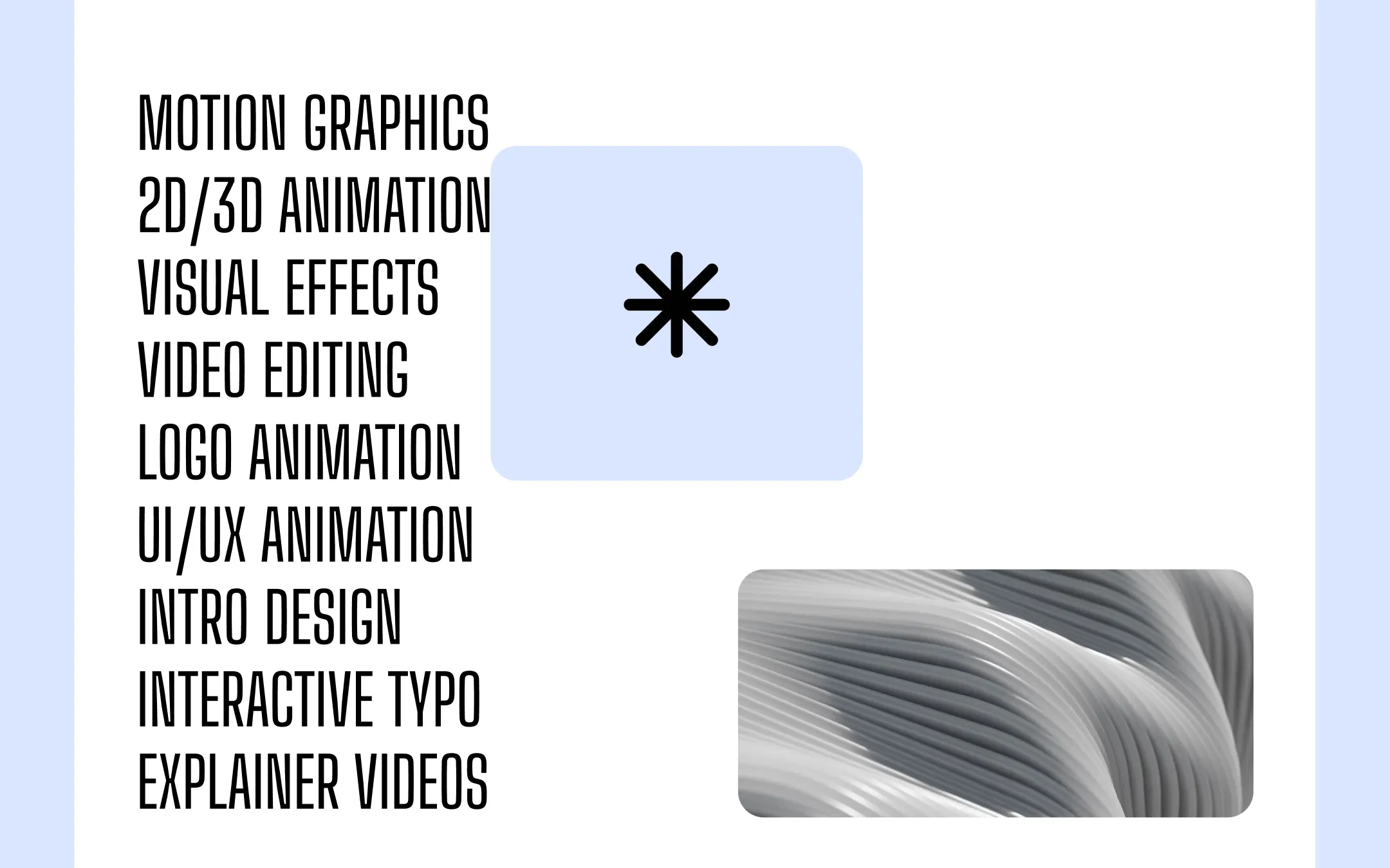
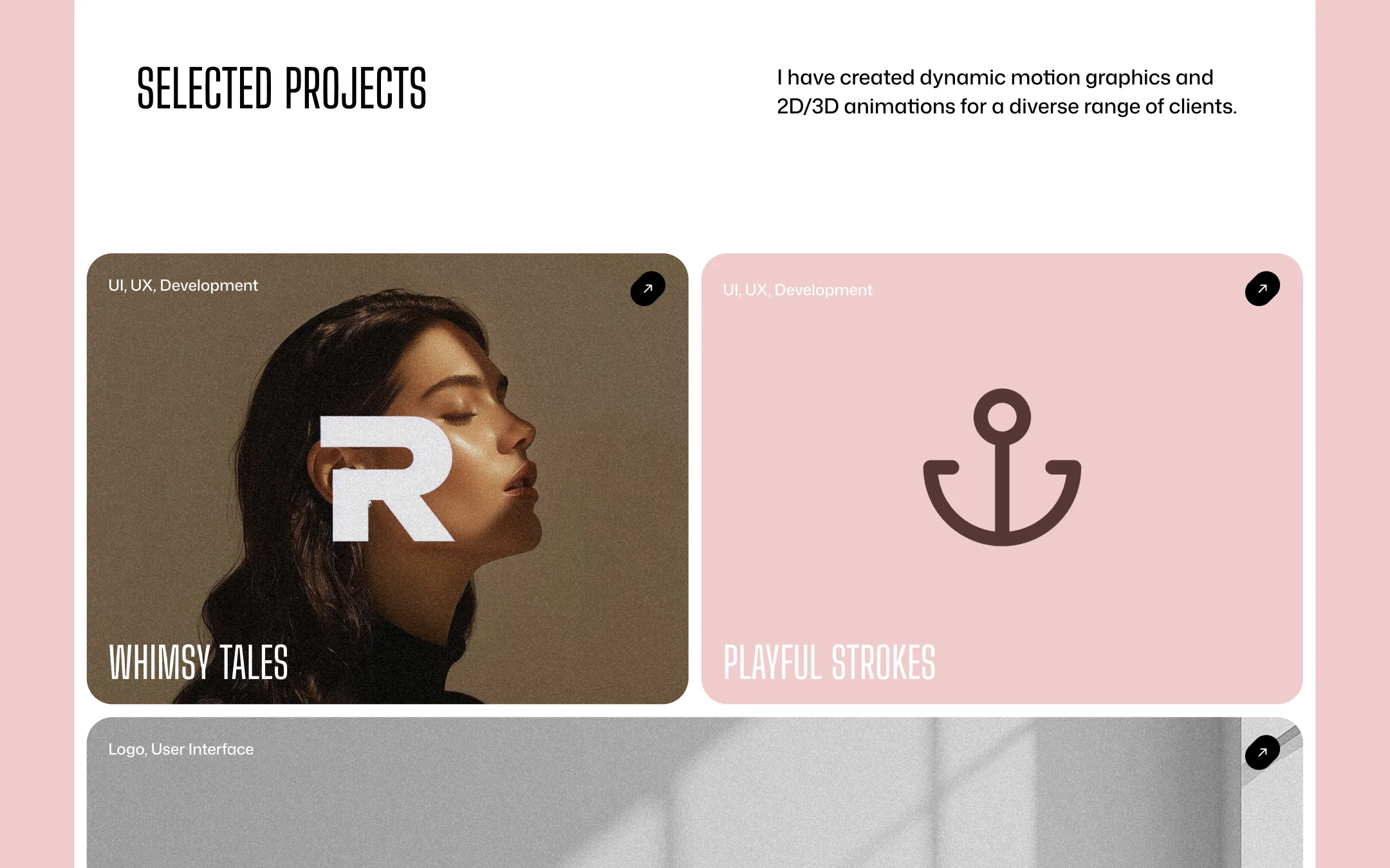
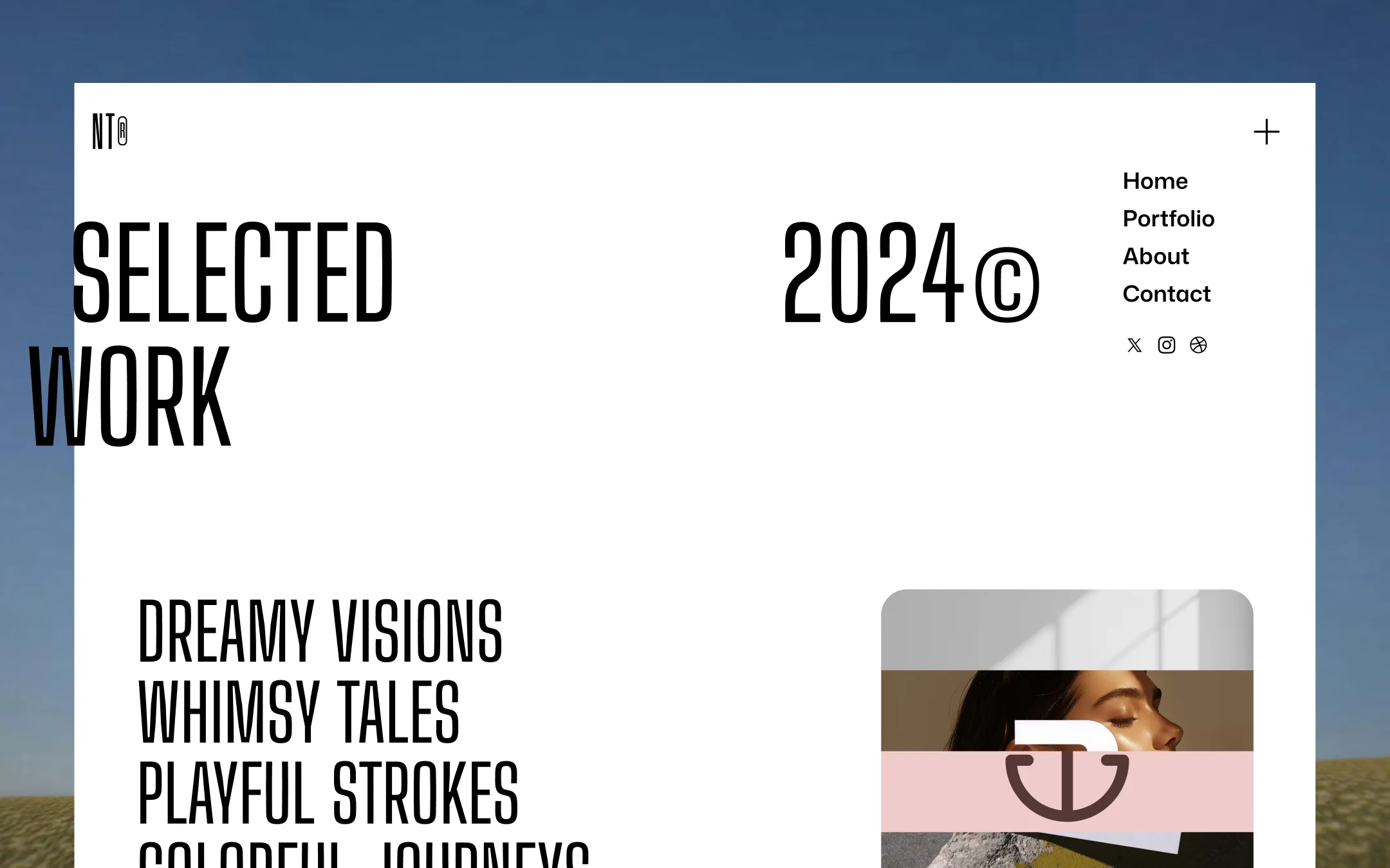
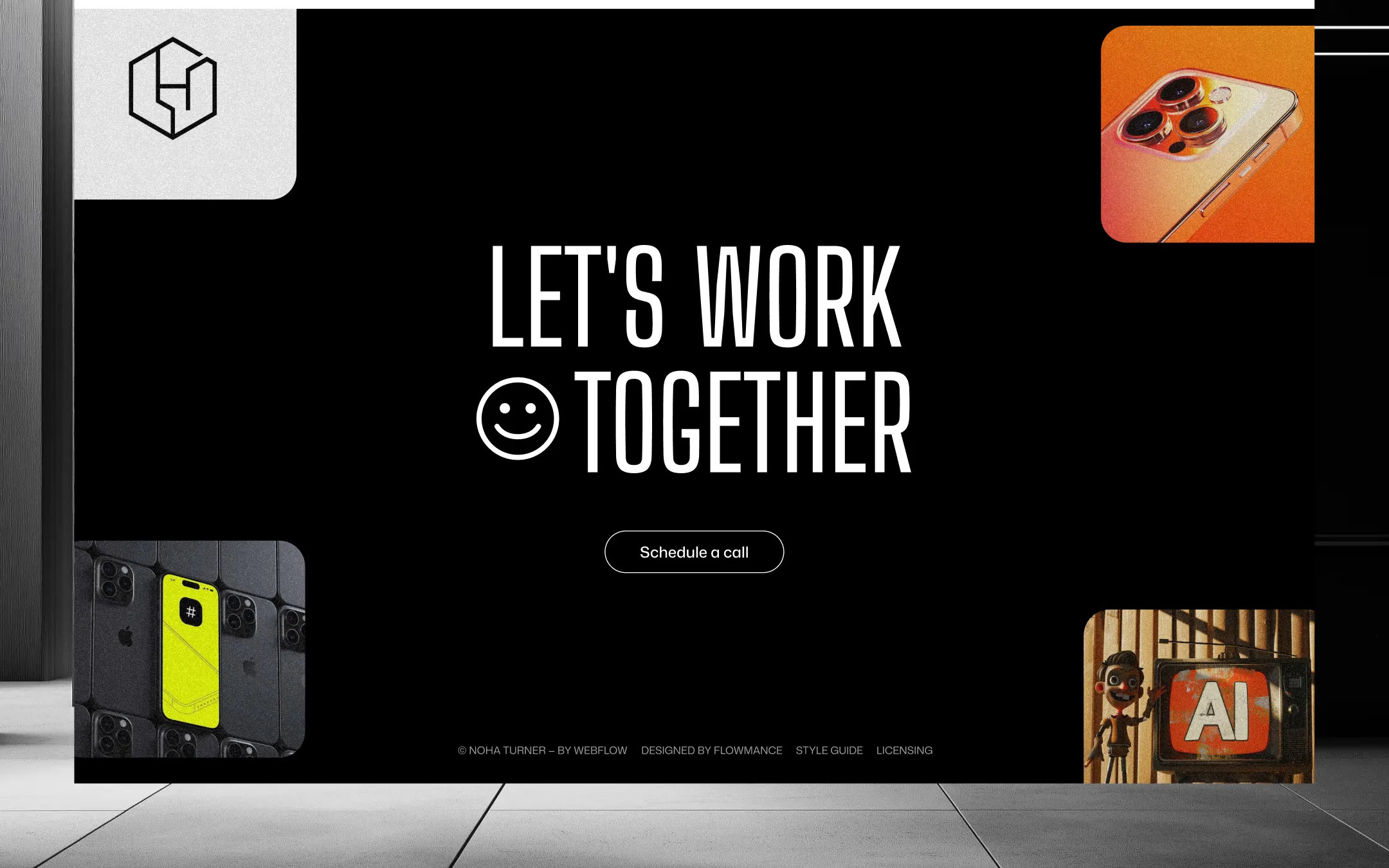
Noah Turner® stages the portfolio of a motion designer the way a director stages a reel: full-bleed black sequences crash into stark white content breaks, oversized condensed type struts across the viewport, and color-blocked project cards do the job photography alone can't. The palette stays deliberately restrained — ink black and paper white anchor everything, while a single violet glow and a soft dusty-blush accent carry all the warmth, letting pastel lavender and rosewood project tiles read like a curated mood board rather than a conventional grid. Every surface commits to extremes: type is either whisper-small uppercase labels or viewport-filling headlines set in a hyper-condensed display face, buttons are either fully pilled or softly rounded at 30px, and sections alternate between spacious 150px breathing room and tightly cropped sticky hero sequences. The system rewards confidence — big gestures, flat color blocking, and a navbar that literally inverts itself over whatever it crosses.
Lifted hover surface. Presentation-grid thumbnails brighten to this tone on hover.
Base canvas. Content sections, cards, and reversed type sit on this surface.
Icon & accent ink on light cards. Anchors line icons over blush surfaces.
Primary ink & dark surfaces. Hero, footer, and sticky-nav backgrounds plus all headline text.
Secondary accent & link ink. Rotator text, button fills, and hover reveals.
Color-blocked project card. Fills bento-style portfolio tiles in place of photography.
Signature hero accent. Gradient glows, cursor trails, and rare hover highlights.
Soft service-card surface. Backs icon tiles and feature blocks on light sections.
Alternate project-card tone. Pairs with plum iconography on work grids.
The quick brown fox jumps
UI & body voice — variable width/weight sans for buttons, nav, forms, captions
The quick brown fox jumps
Display & headline voice — condensed, uppercase, maximalist scale
spacious1920px150px50px16px5px10px15px20px25px30px40px50px60px80px100px150pxpill999pxbadge7pxcards30pxinputs6pxbuttons30pxnavlink10pxStep from canvas (level 1) to lifted (level 2) to inset depth (level 3), then invert into the dark levels for full-bleed sections. Hex codes and roles live in the Colors section above; this ladder shows the layering only.
# Design System Guide

> Unlock the template to access the full design system.

## Brand voice

A short paragraph describing the brand voice, mood, and visual
principles that anchor the system. Tone, cadence, and intent.

## Colors

| Token        | Hex      | Role                                  |
| ------------ | -------- | ------------------------------------- |
| canvas-1     | #xxxxxx  | Page background, large surfaces       |
| canvas-2     | #xxxxxx  | Lifted surfaces, cards                |
| canvas-3     | #xxxxxx  | Inset wells, depressed states         |
| ink-1        | #xxxxxx  | Primary body text                     |
| ink-2        | #xxxxxx  | Secondary text, labels                |
| ink-3        | #xxxxxx  | Tertiary text, hints                  |
| accent-1     | #xxxxxx  | Primary brand accent                  |
| accent-2     | #xxxxxx  | Secondary accent                      |
| state-ok     | #xxxxxx  | Success, confirmations                |
| state-warn   | #xxxxxx  | Warnings                              |
| state-err    | #xxxxxx  | Errors, destructive actions           |

## Typography

- **Display** — heading scale, used for hero text and section titles.
- **Body** — primary reading text, optimized for paragraphs.
- **Mono** — code, data, and tabular numerals.

```
display: 32px / 40px / 48px / 64px / 80px
body:    14px / 16px / 18px
mono:    12px / 14px
```

## Spacing & shape

Base unit: 4px. Scale: 4, 8, 12, 16, 24, 32, 48, 64, 96, 128.
Radii: sm (4px), md (8px), lg (12px), xl (20px), full (9999px).

## Surfaces

Layered elevation from canvas → lifted → inset. Surfaces invert in
dark sections for full-bleed contrast.

## Do's and don'ts

- Do use accent-1 sparingly for primary CTAs only.
- Do maintain at least 4.5:1 contrast on body text.
- Don't mix display and body in the same line.
- Don't use state colors for branding.

## Agent prompt guide

Prompts for AI design tools that respect this system.
Includes example prompts for sections, components, and layouts.

# ...
Unlock the full style guide