Design systems, extracted.
Paste any URL to create a design system from it. Open any style for colors, type, spacing, components, and a DESIGN.md or tokens.json your agent can use.
Quickly navigate through the dashboard with your keyboard using the command menu.

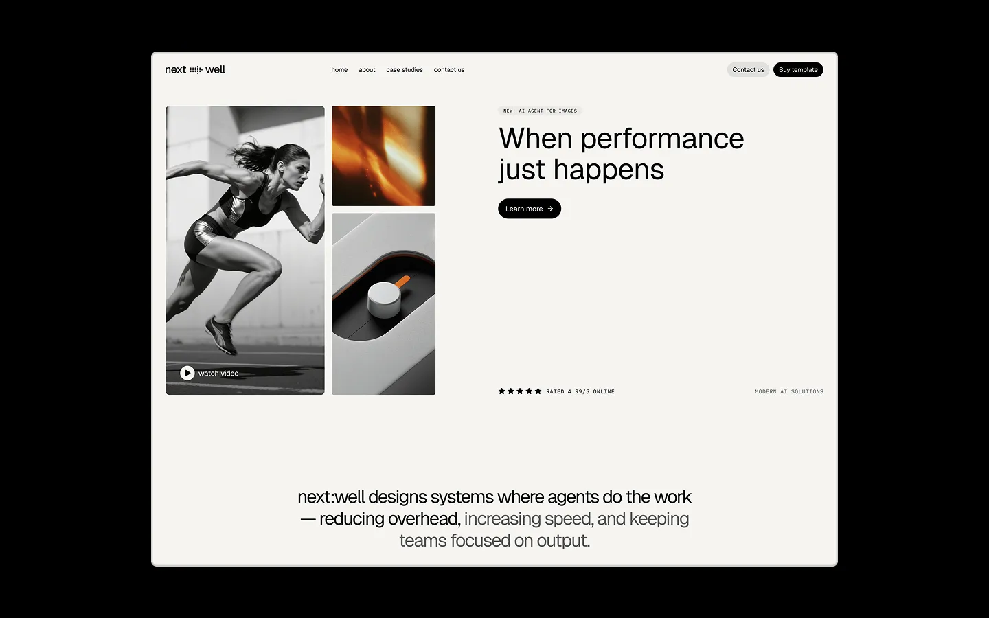
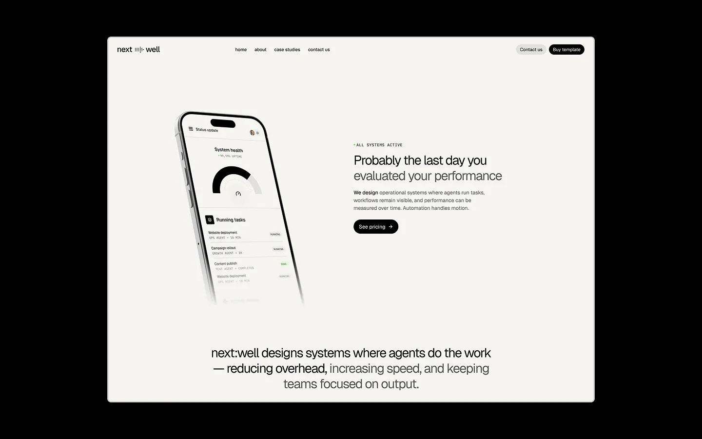
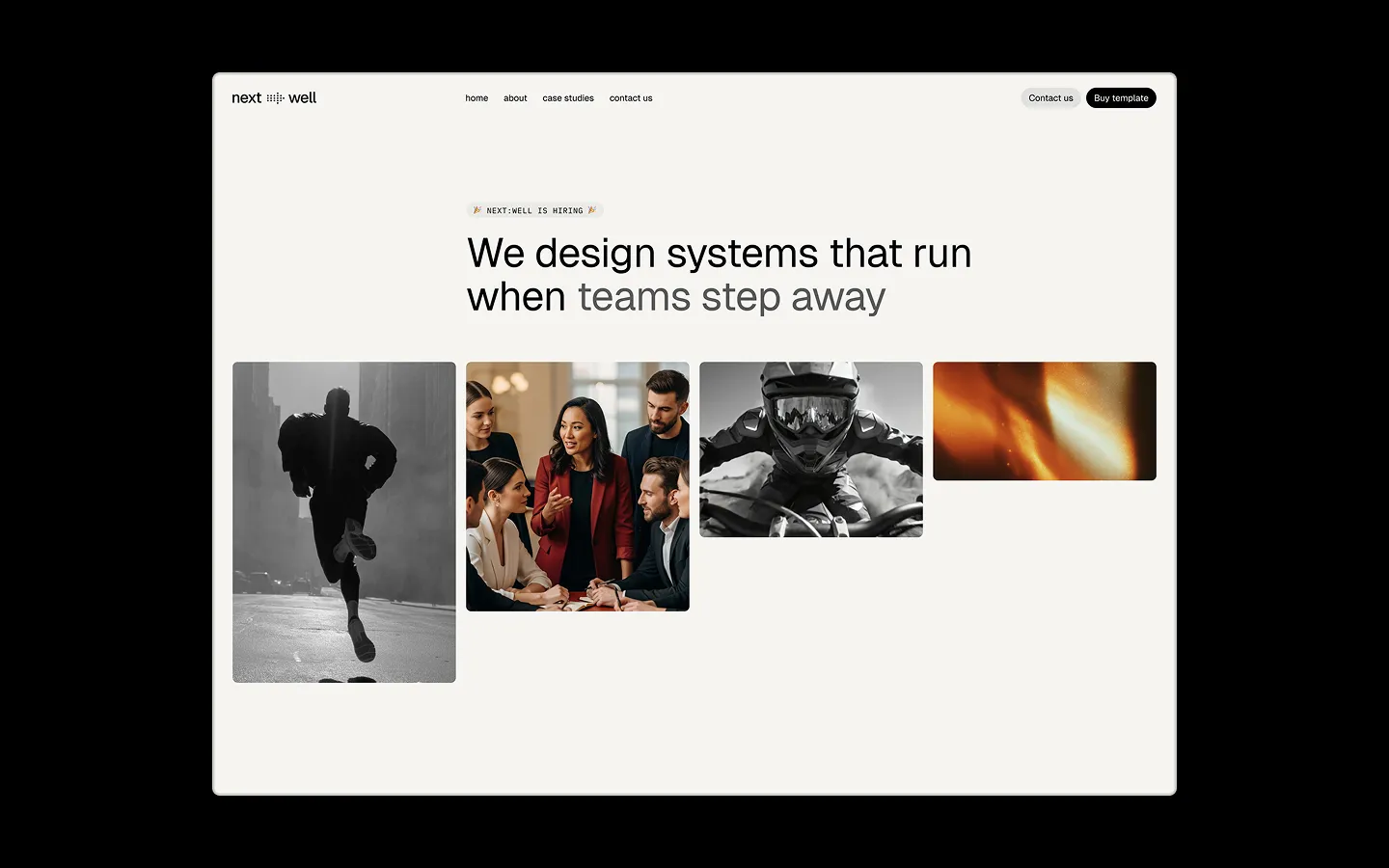
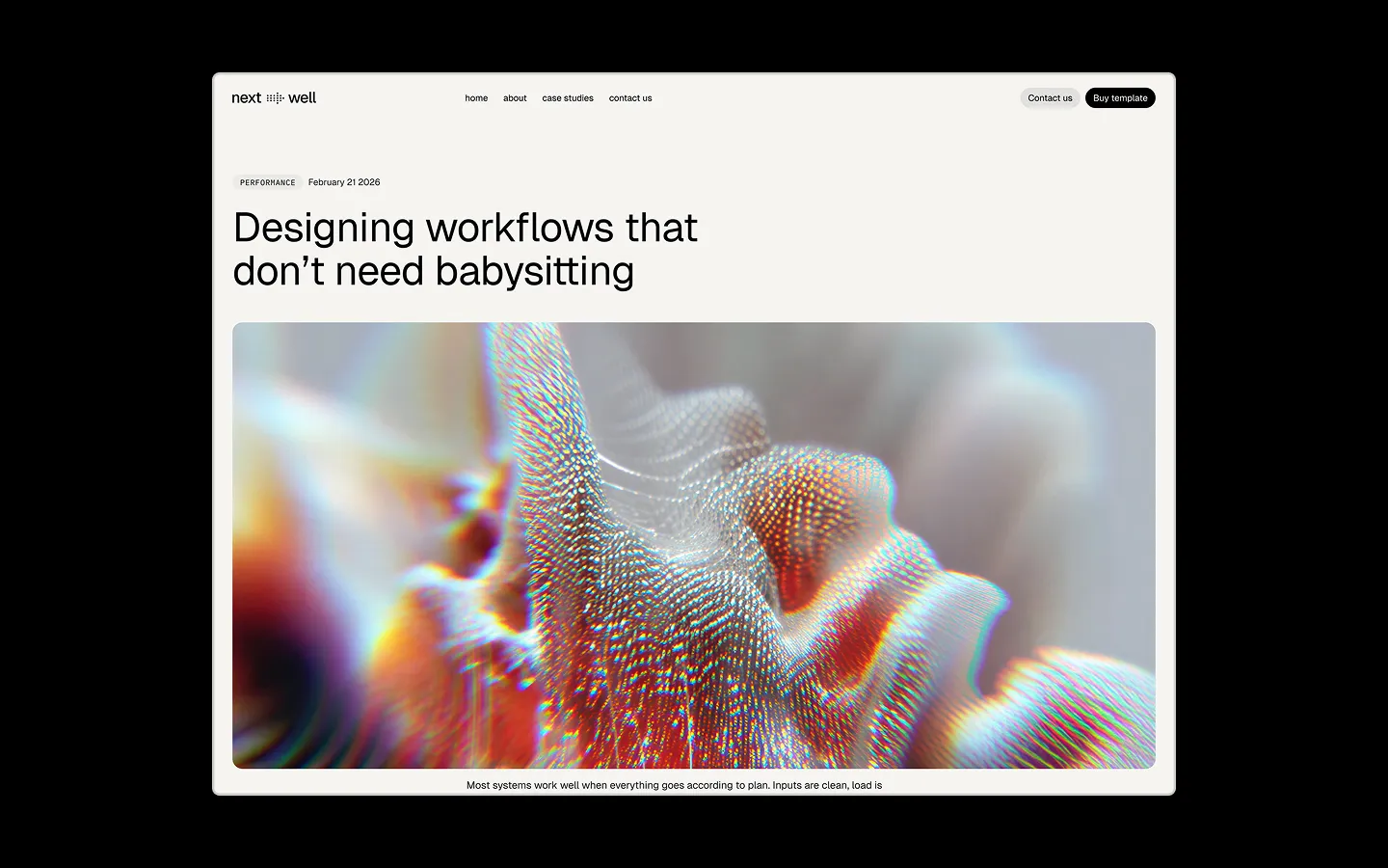
next:well is a Webflow template built for AI-operations brands that want to feel calm, engineered, and quietly confident. The system pairs an oat-toned canvas with stark black ink, letting a single dusty plum accent and a clear morning blue carry all the emotional weight — nothing is shouted, everything is placed. Typography leans on an unbolded, almost architectural Geist for headlines at enormous sizes, contrasted against IBM Plex Mono micro-labels in uppercase tracking, giving the whole template a lab-report precision beneath its soft, warm palette. Structurally the template is built from shared Webflow variables — pill-shaped buttons, a tight 4px spacing unit scaled up to vast 200px section gaps, and a small family of lifted, stone-toned surfaces that sit just a few percent darker than the base canvas. The result reads as premium SaaS: monochrome photography, generous whitespace, rounded corners everywhere, and a restrained use of color that signals control rather than decoration.
A handful of real sections that ship with this template. Click any card to preview, or explore them all under the Sections tab.
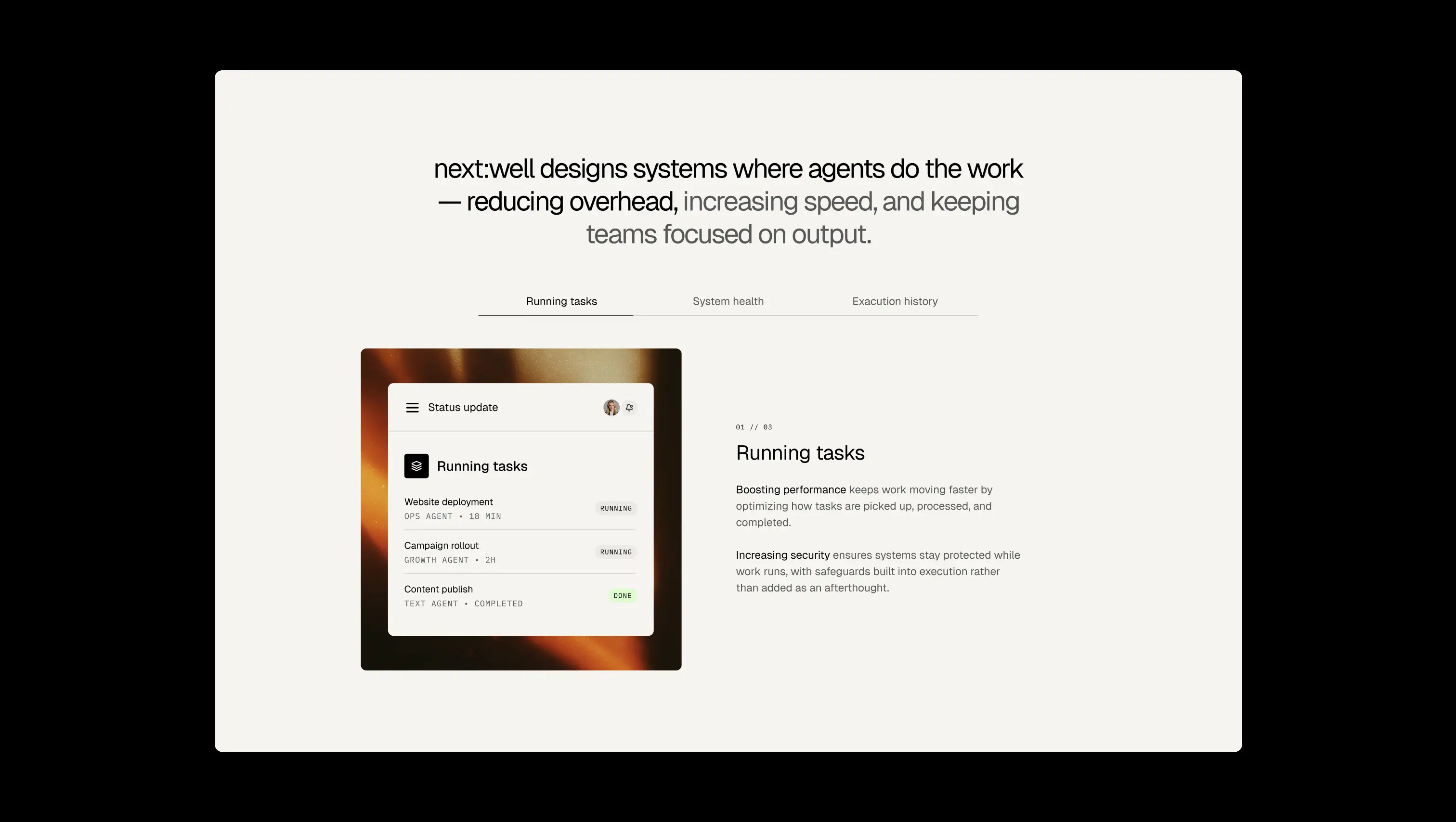
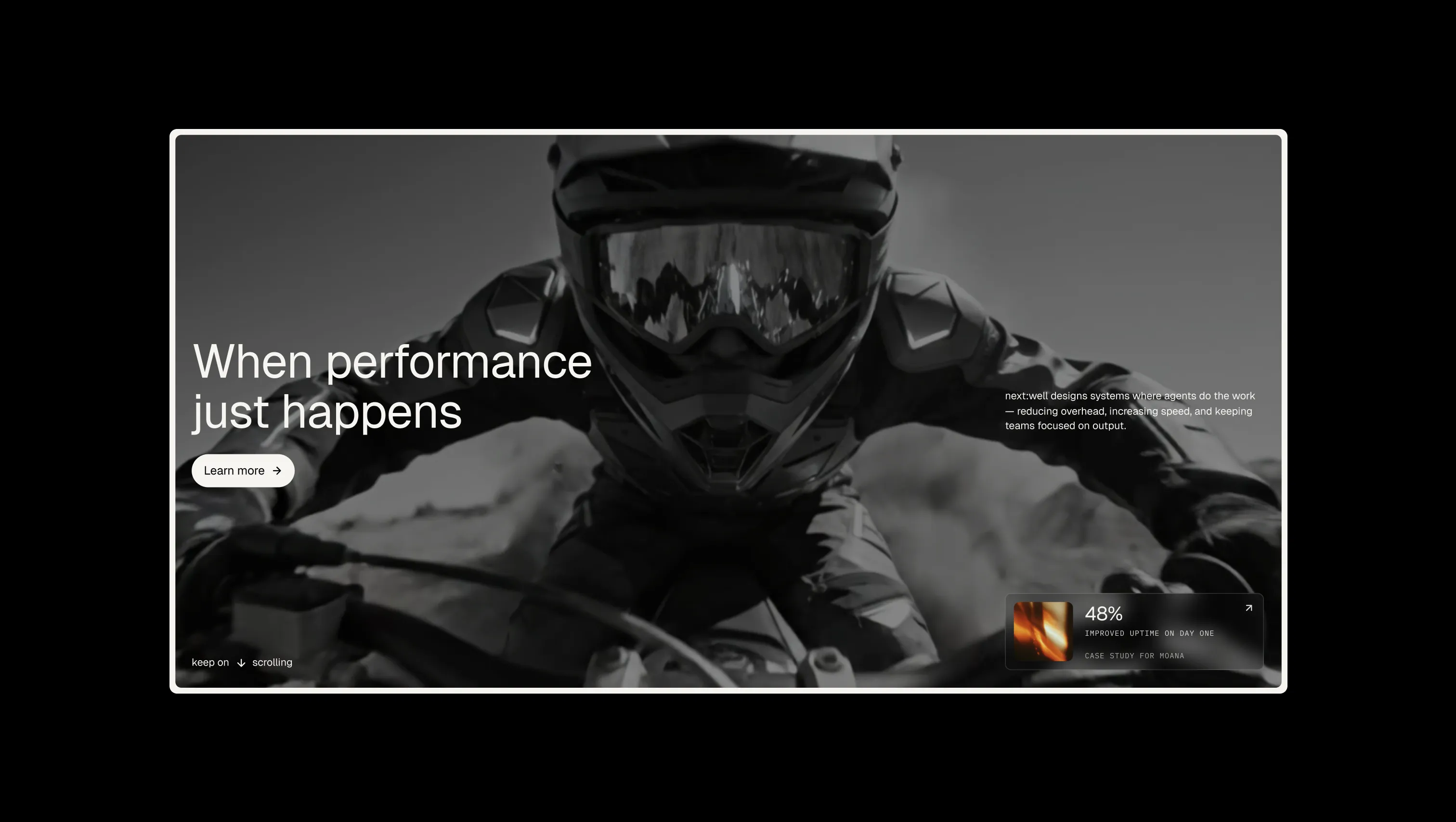
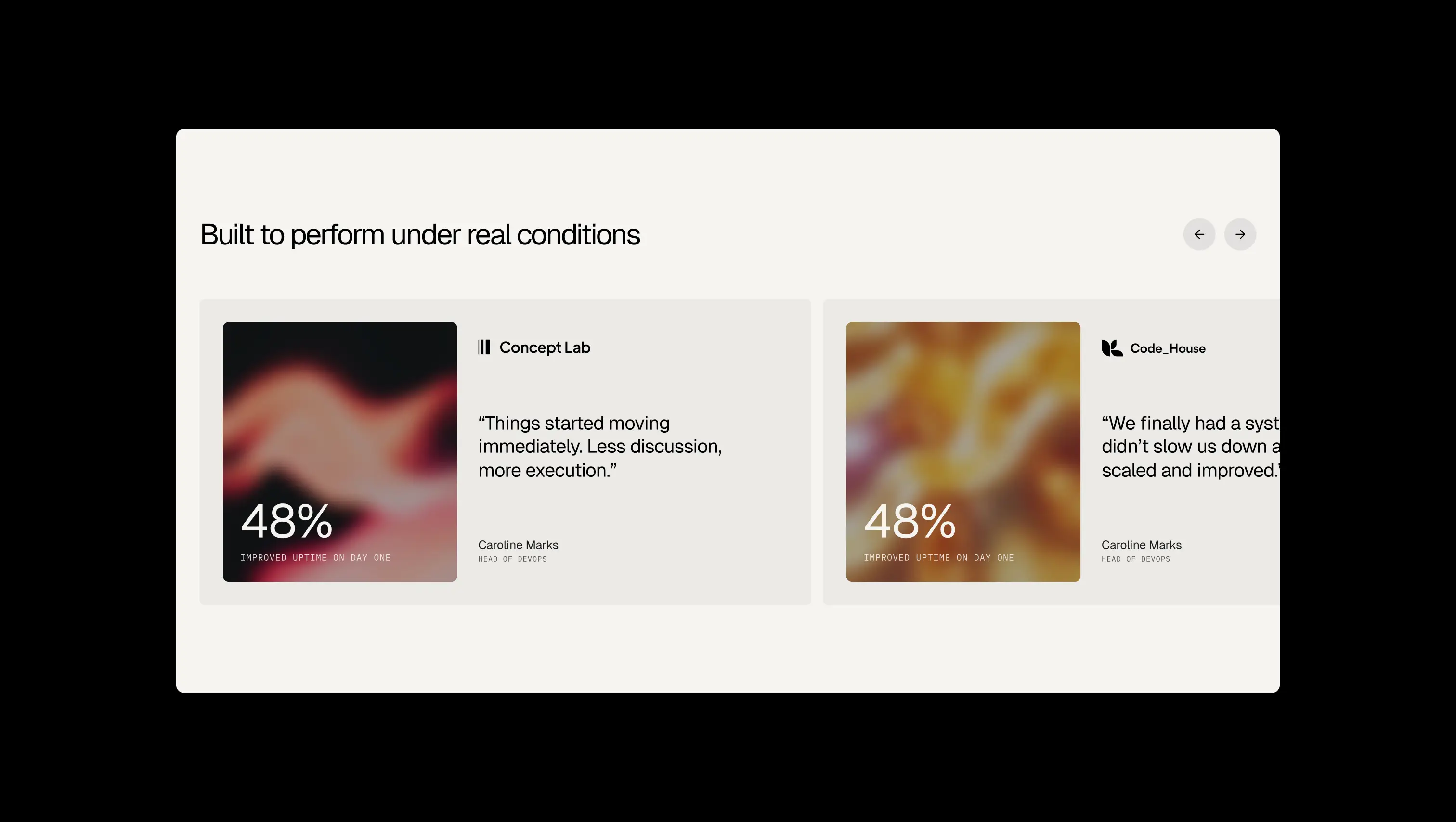
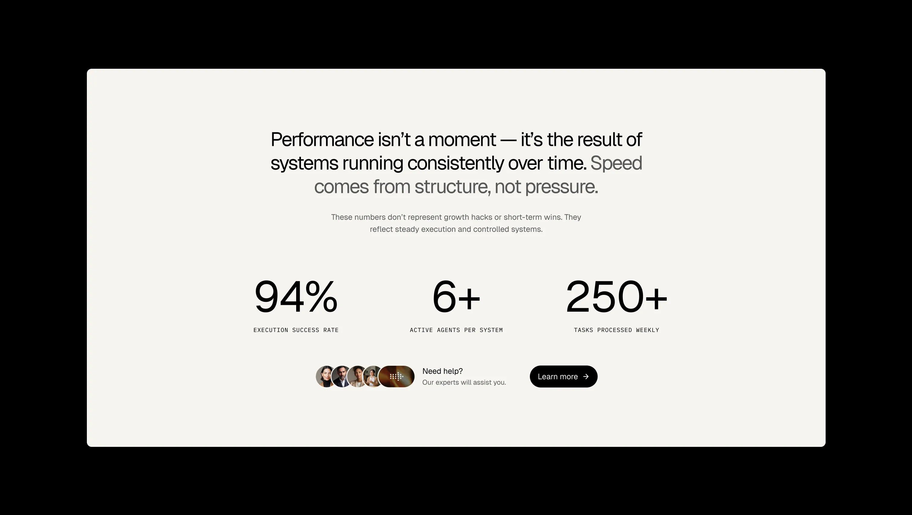
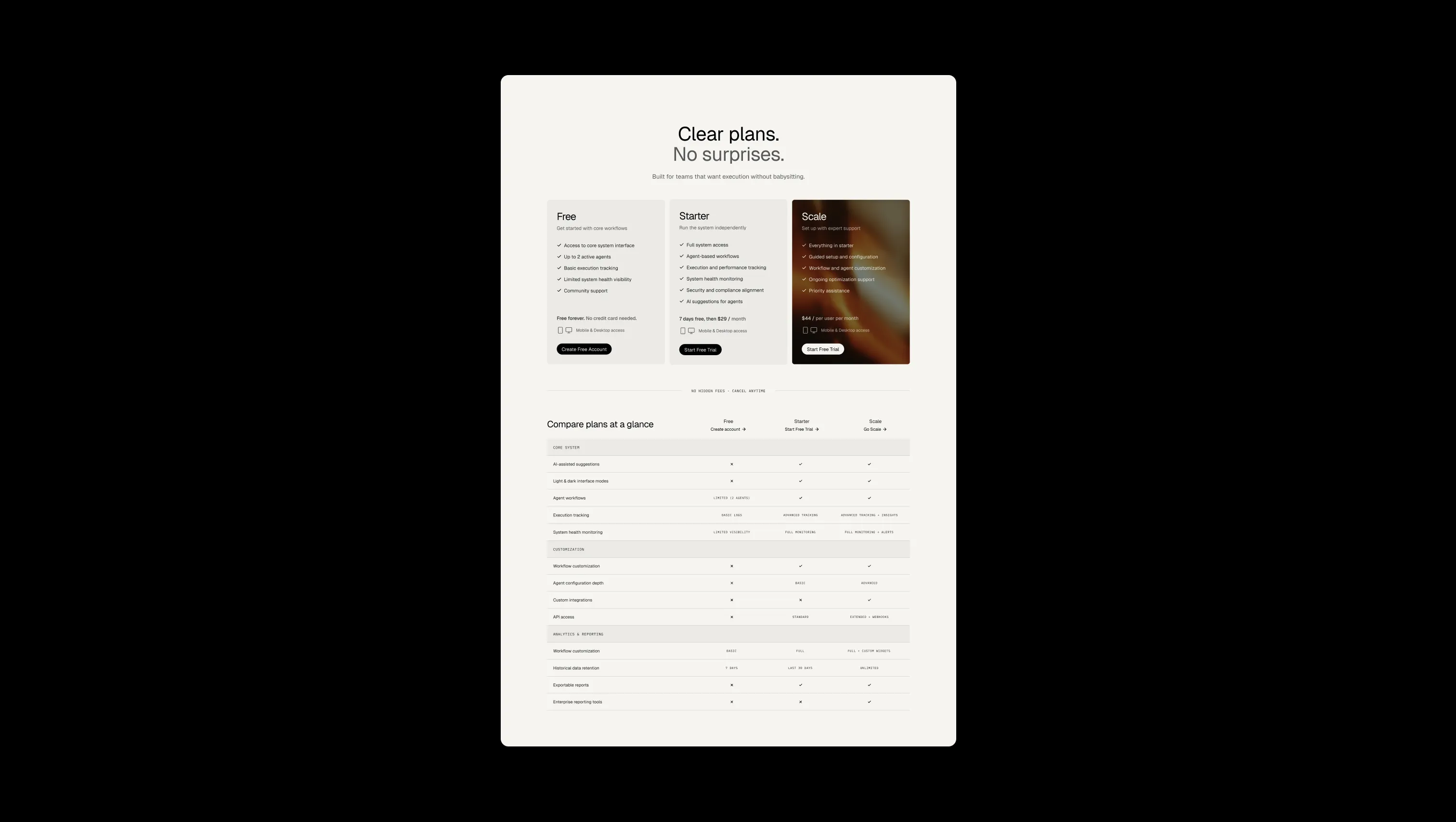
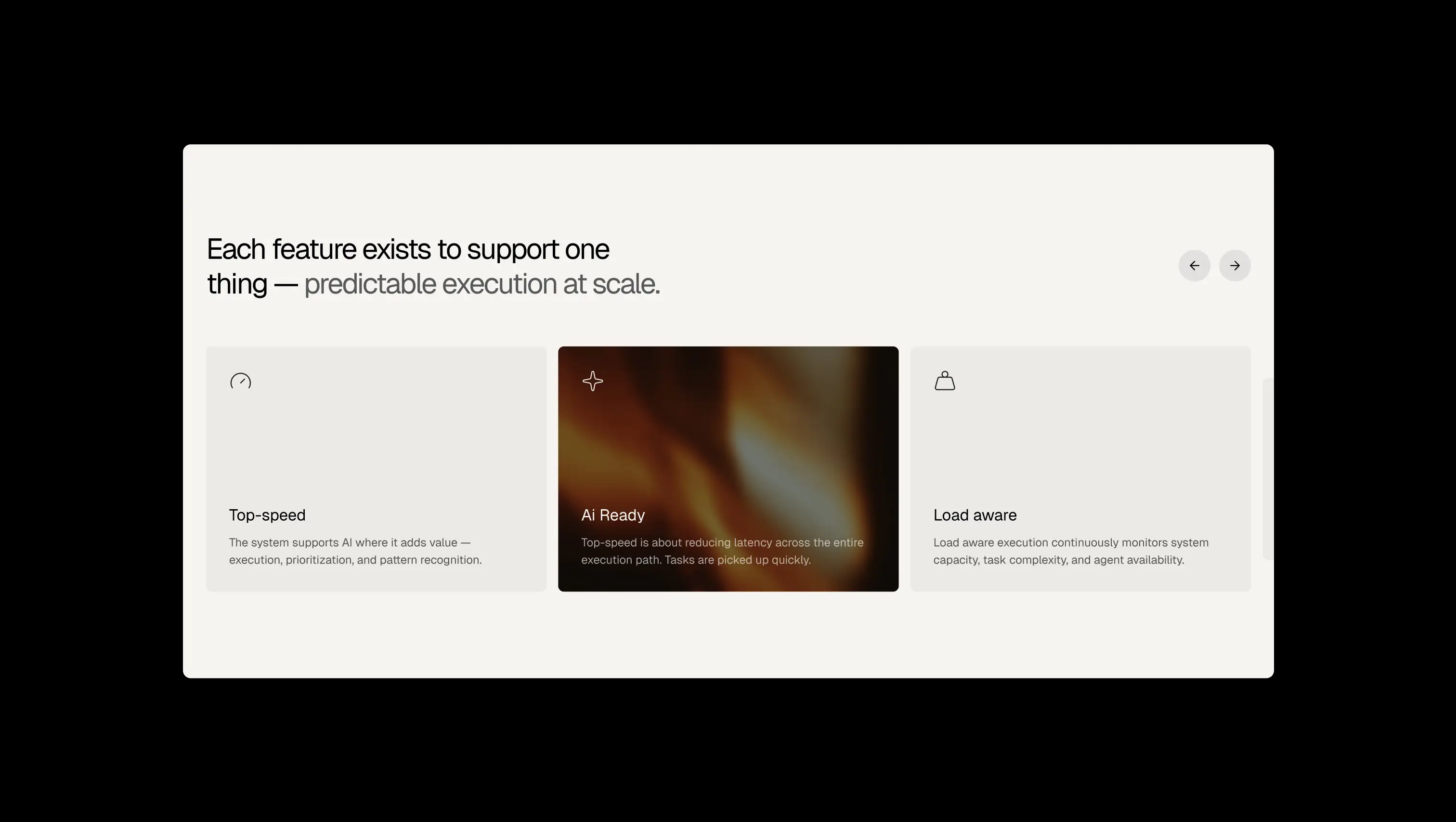
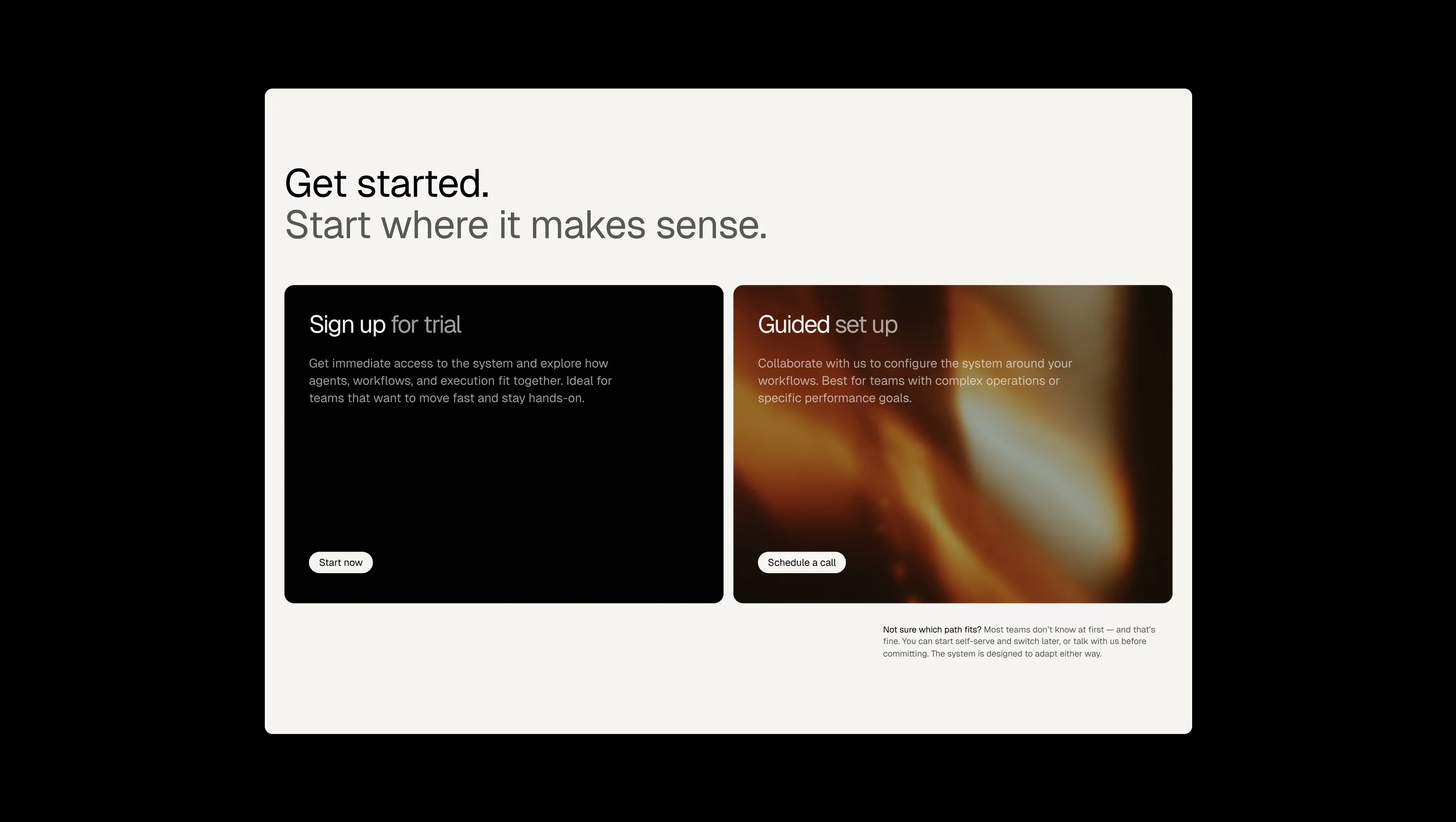
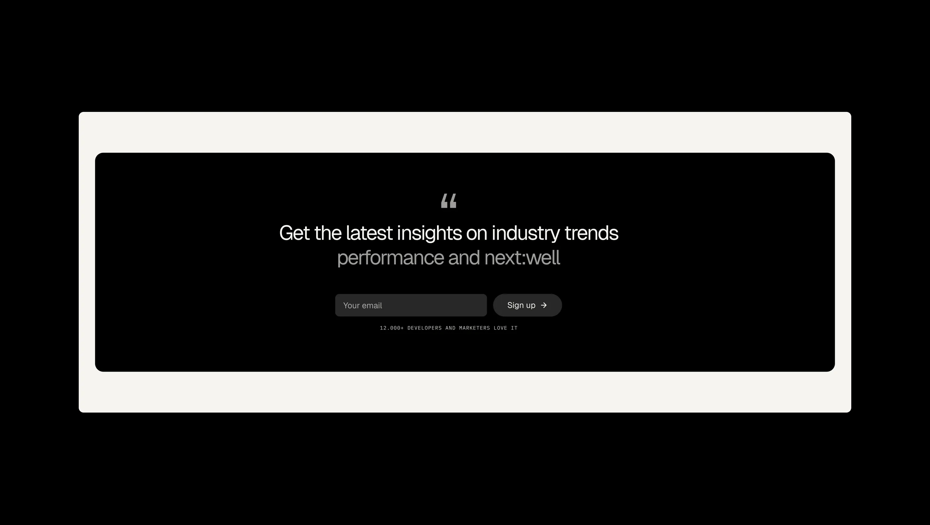
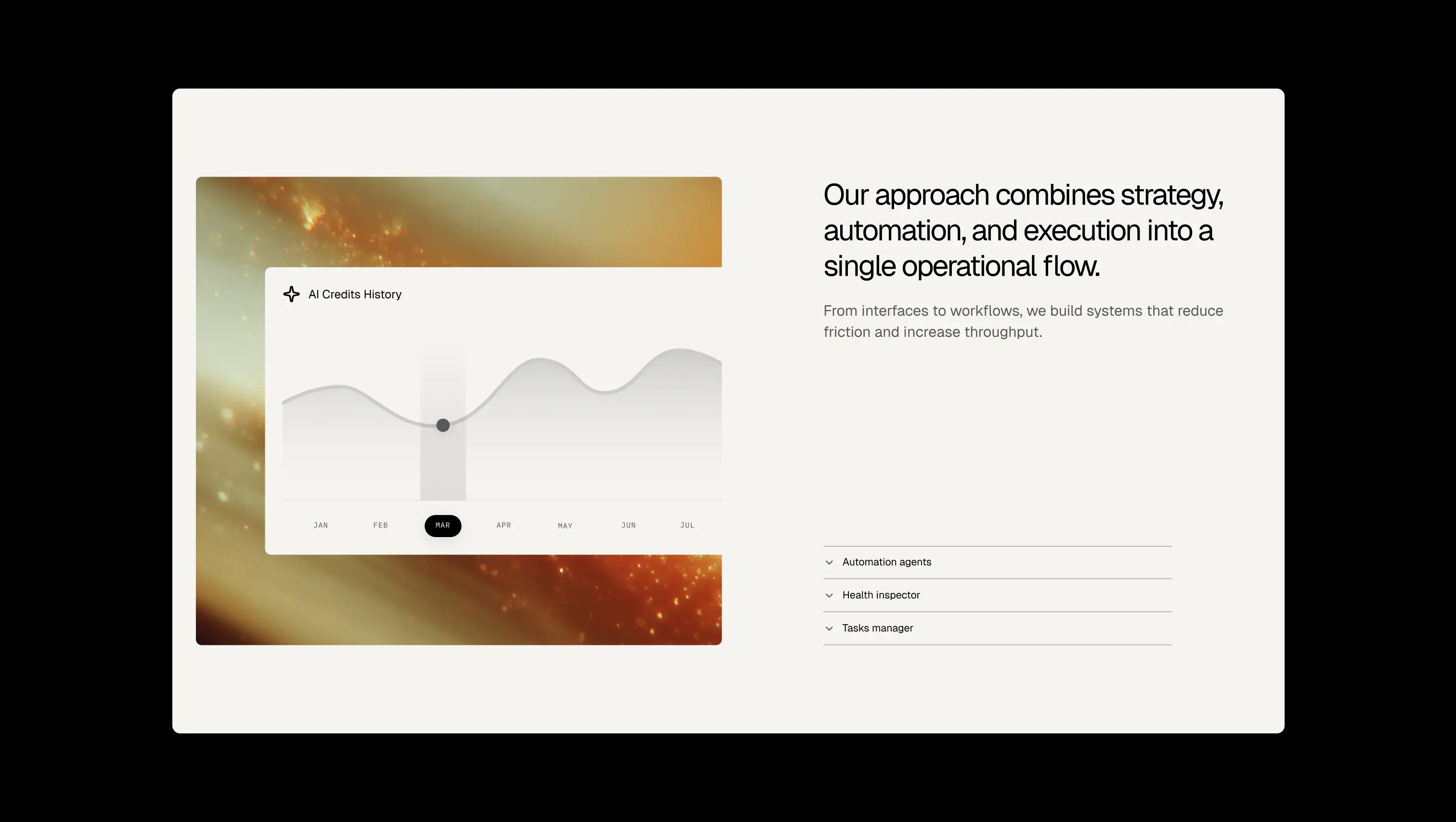
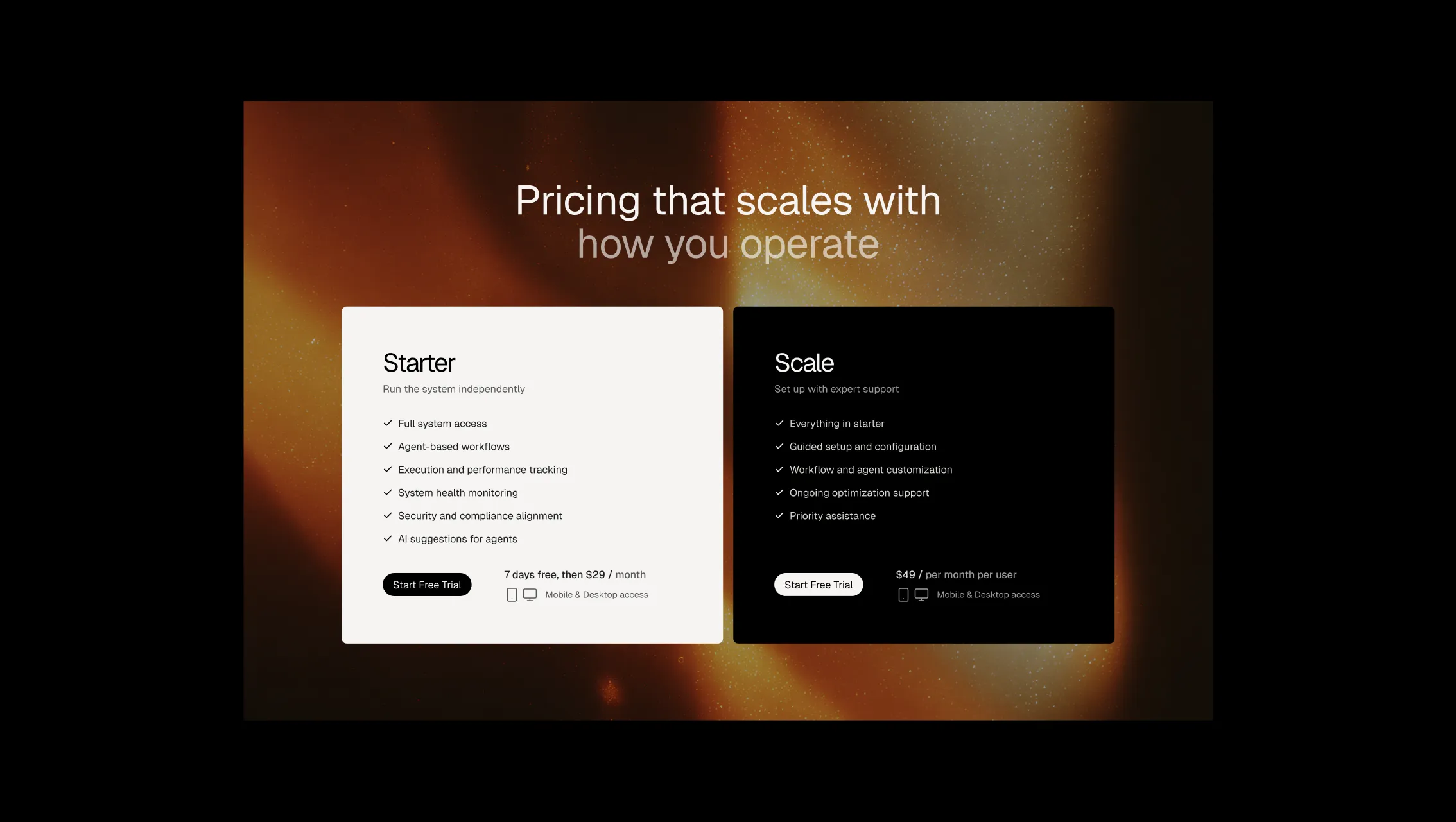
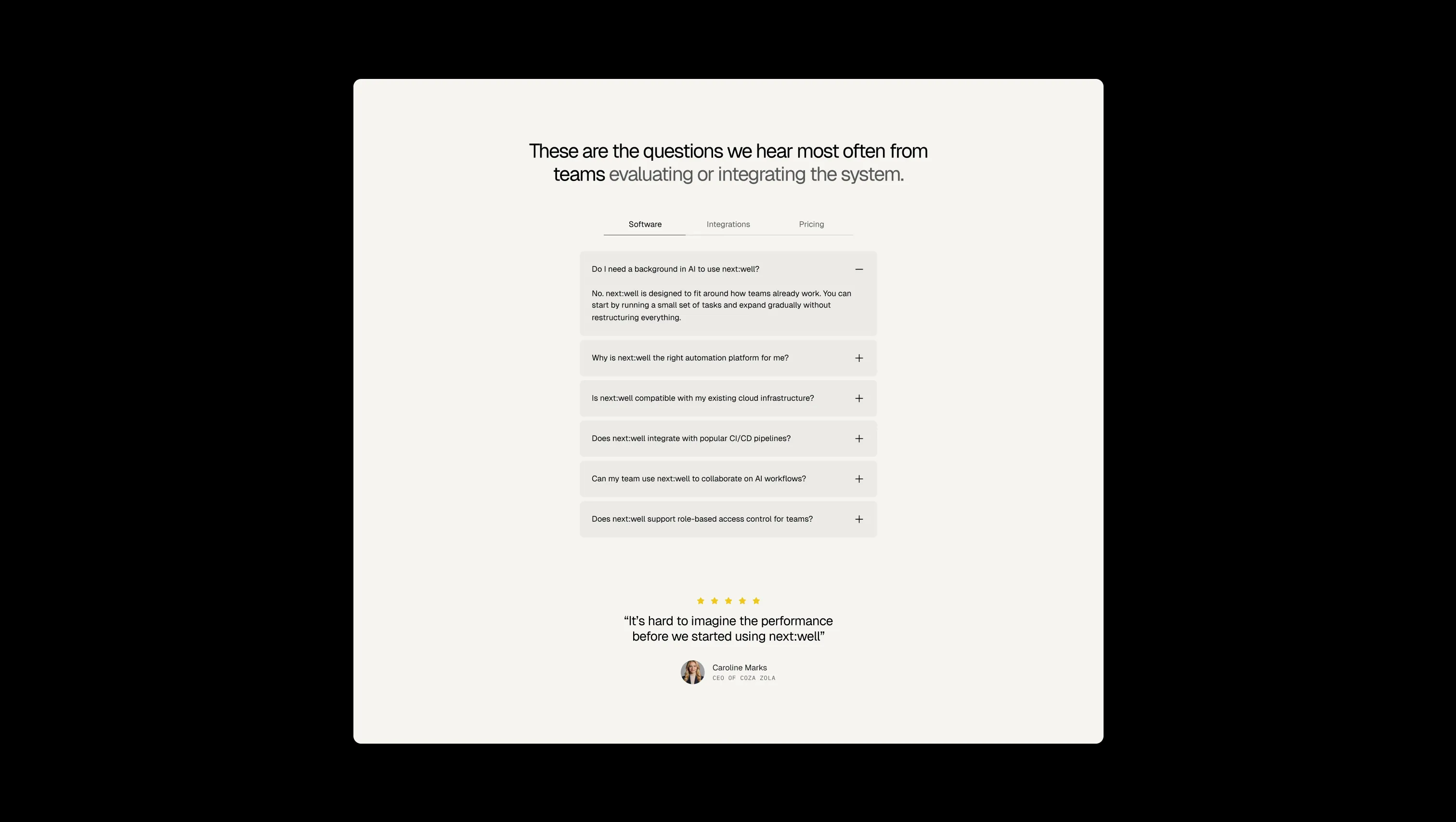
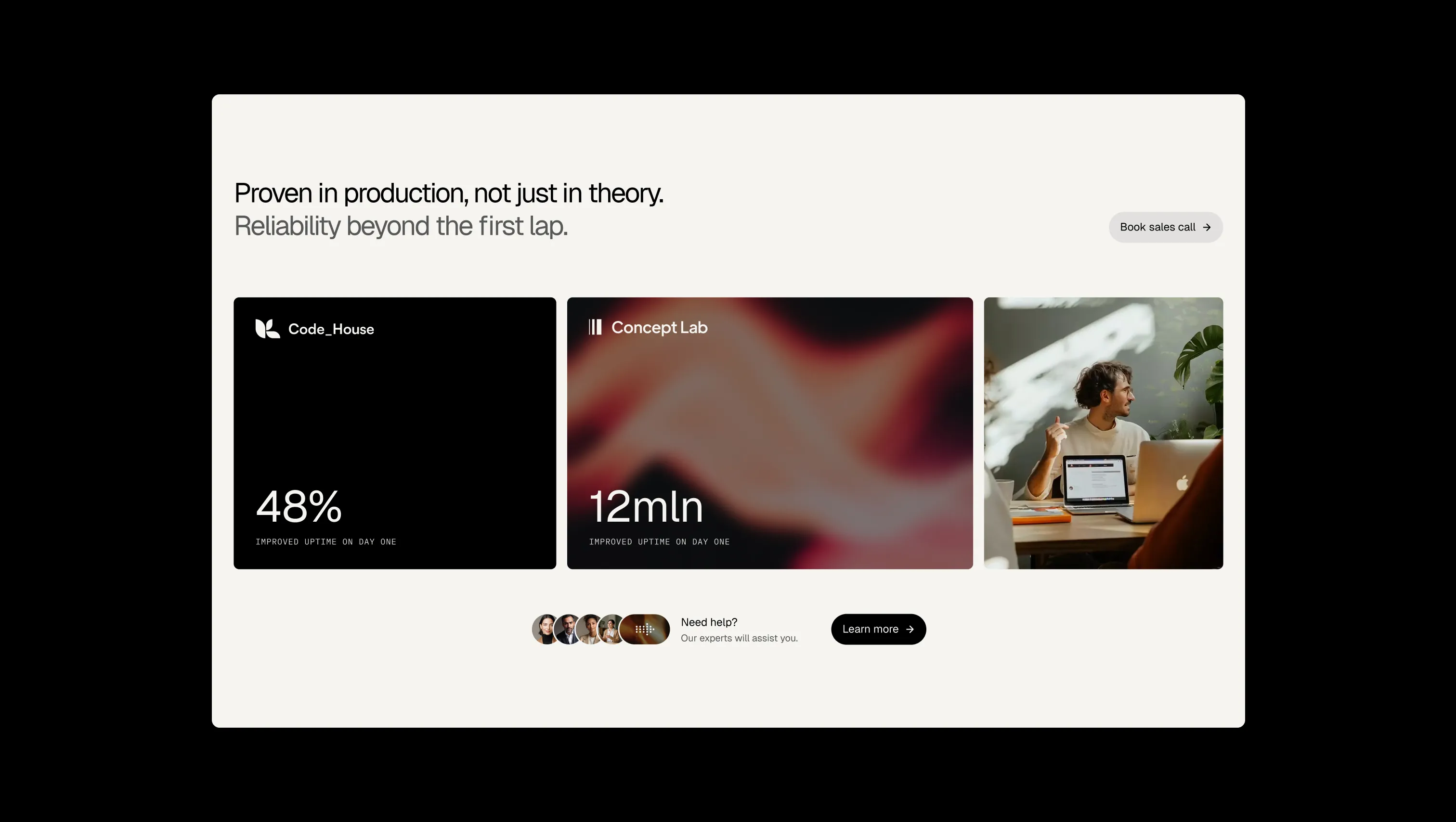
Alternate section wash. Breaks up long pages with a warmer, sandier background band.
Primary page background. Base canvas behind all sections and the default light surface.
Secondary lifted surface. A touch deeper than Lifted Linen for nested or secondary cards.
Card & tile surface. Used for sales cards, dropdown panels, and any element lifted off the base canvas.
Primary text & ink. Headlines, body copy, primary button fills, and the sticky dark navbar.
Signature brand accent. Used sparingly for highlighted words, icons, and feature callouts.
Secondary accent & link ink. Reserved for interactive highlights and gradient ink purposes.
Warning state. Caution banners and pending-task indicators.
Error state. Form validation failures and destructive action warnings.
Success state. Completed task indicators and positive confirmations.
The quick brown fox jumps
Headings, body copy, and buttons across the entire template.
The quick brown fox jumps
Uppercase eyebrow labels, badges, and micro-tags like ratings and status pills.
spacious1440px160px24px16px4px8px12px16px20px24px32px48px64px80px120px160px200pxtag16pxfull9999pxcards16pxsmall4pxbuttons32pxdefault8pxbutton-circle24pxStep from canvas (level 1) to lifted (level 2) to inset depth (level 3), then invert into the dark levels for full-bleed sections. Hex codes and roles live in the Colors section above; this ladder shows the layering only.
# Design System Guide

> Unlock the template to access the full design system.

## Brand voice

A short paragraph describing the brand voice, mood, and visual
principles that anchor the system. Tone, cadence, and intent.

## Colors

| Token        | Hex      | Role                                  |
| ------------ | -------- | ------------------------------------- |
| canvas-1     | #xxxxxx  | Page background, large surfaces       |
| canvas-2     | #xxxxxx  | Lifted surfaces, cards                |
| canvas-3     | #xxxxxx  | Inset wells, depressed states         |
| ink-1        | #xxxxxx  | Primary body text                     |
| ink-2        | #xxxxxx  | Secondary text, labels                |
| ink-3        | #xxxxxx  | Tertiary text, hints                  |
| accent-1     | #xxxxxx  | Primary brand accent                  |
| accent-2     | #xxxxxx  | Secondary accent                      |
| state-ok     | #xxxxxx  | Success, confirmations                |
| state-warn   | #xxxxxx  | Warnings                              |
| state-err    | #xxxxxx  | Errors, destructive actions           |

## Typography

- **Display** — heading scale, used for hero text and section titles.
- **Body** — primary reading text, optimized for paragraphs.
- **Mono** — code, data, and tabular numerals.

```
display: 32px / 40px / 48px / 64px / 80px
body:    14px / 16px / 18px
mono:    12px / 14px
```

## Spacing & shape

Base unit: 4px. Scale: 4, 8, 12, 16, 24, 32, 48, 64, 96, 128.
Radii: sm (4px), md (8px), lg (12px), xl (20px), full (9999px).

## Surfaces

Layered elevation from canvas → lifted → inset. Surfaces invert in
dark sections for full-bleed contrast.

## Do's and don'ts

- Do use accent-1 sparingly for primary CTAs only.
- Do maintain at least 4.5:1 contrast on body text.
- Don't mix display and body in the same line.
- Don't use state colors for branding.

## Agent prompt guide

Prompts for AI design tools that respect this system.
Includes example prompts for sections, components, and layouts.

# ...
Unlock the full style guide