Design systems, extracted.
Paste any URL to create a design system from it. Open any style for colors, type, spacing, components, and a DESIGN.md or tokens.json your agent can use.
Quickly navigate through the dashboard with your keyboard using the command menu.

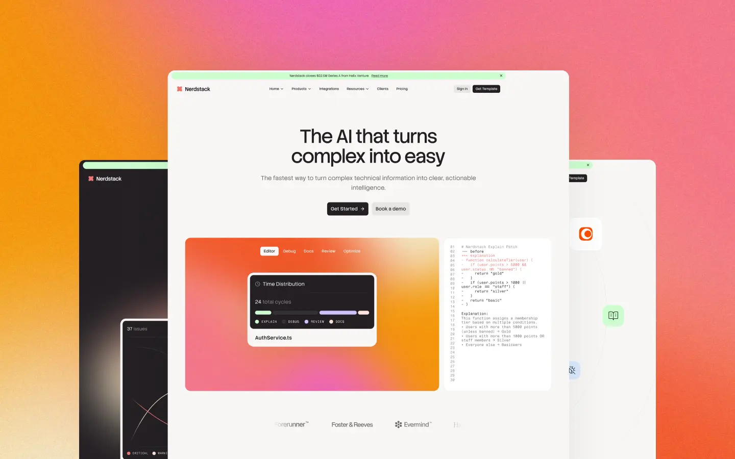
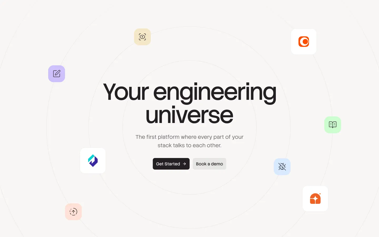
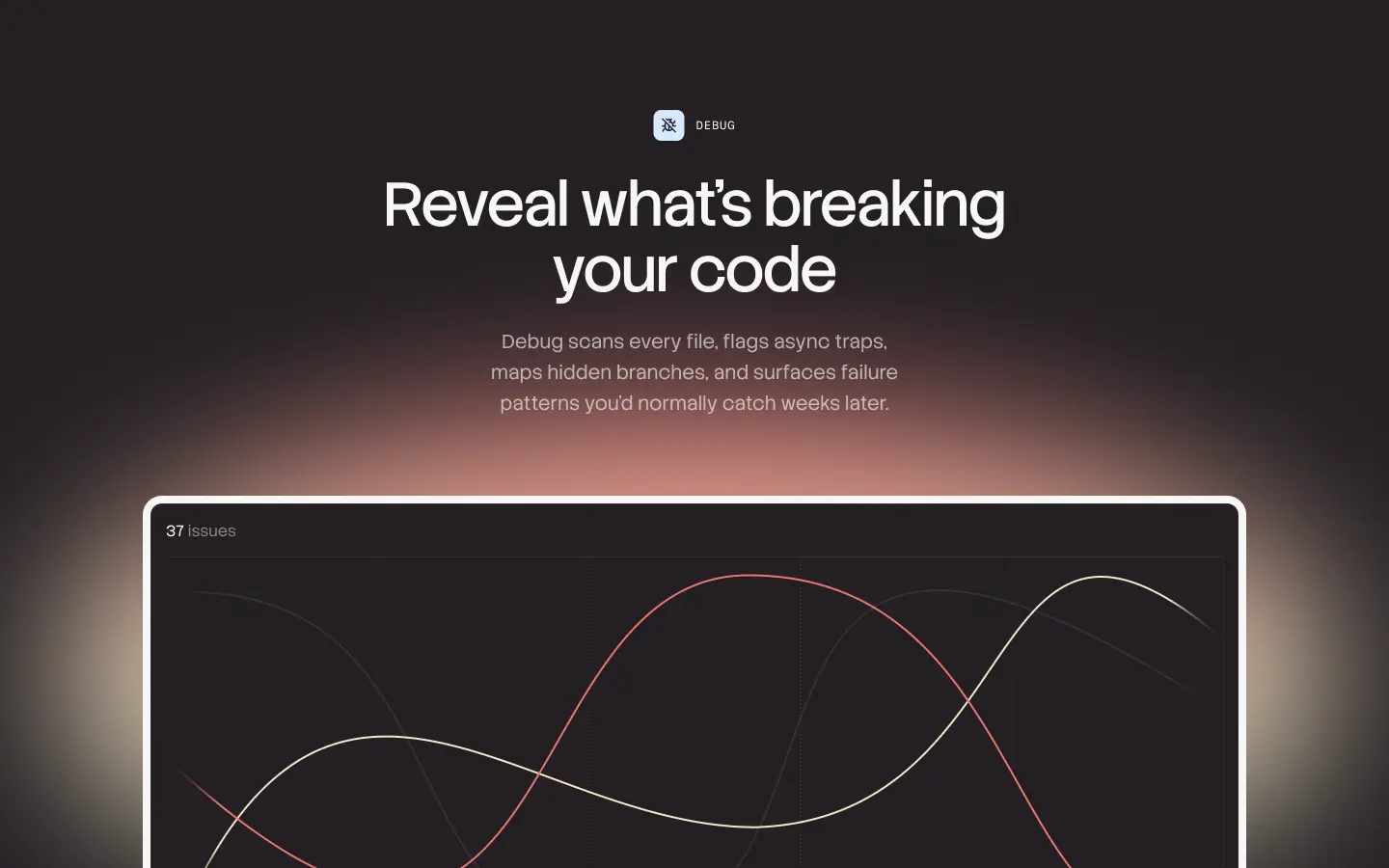

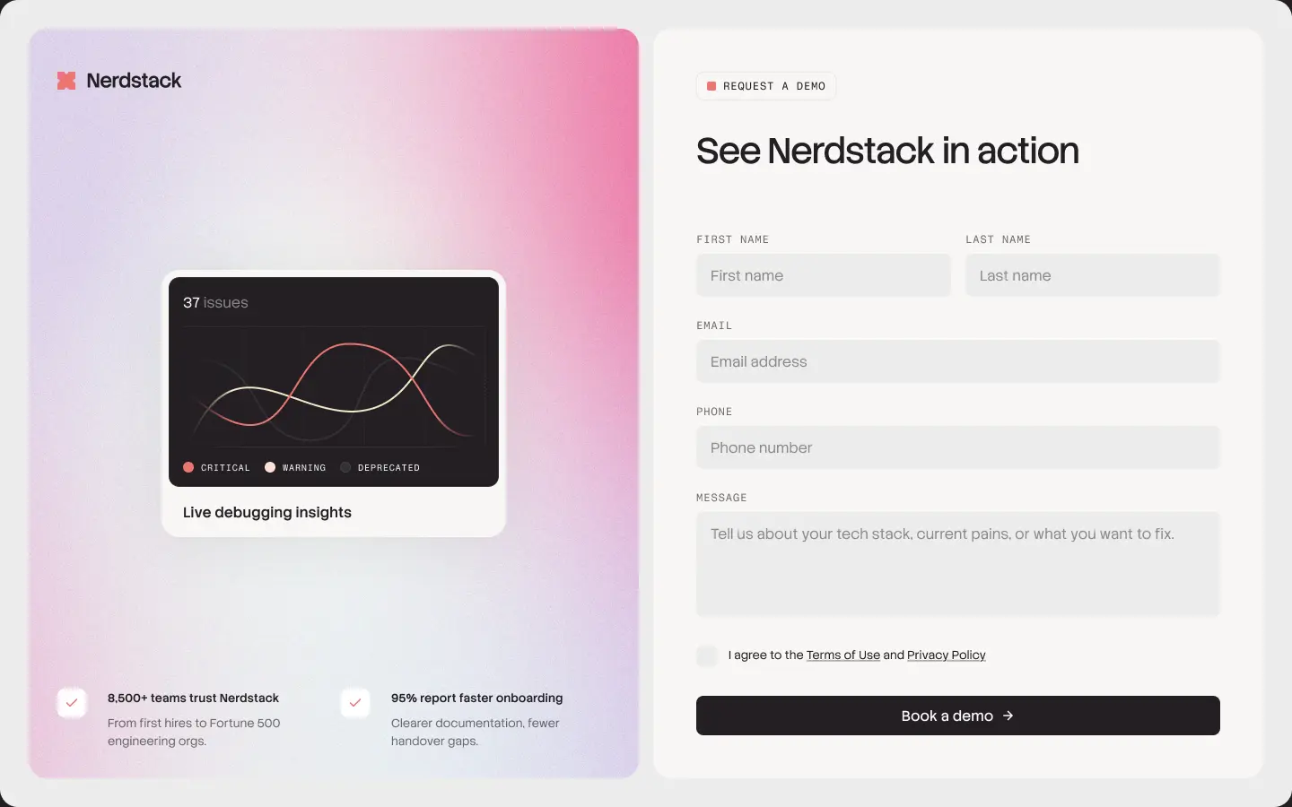
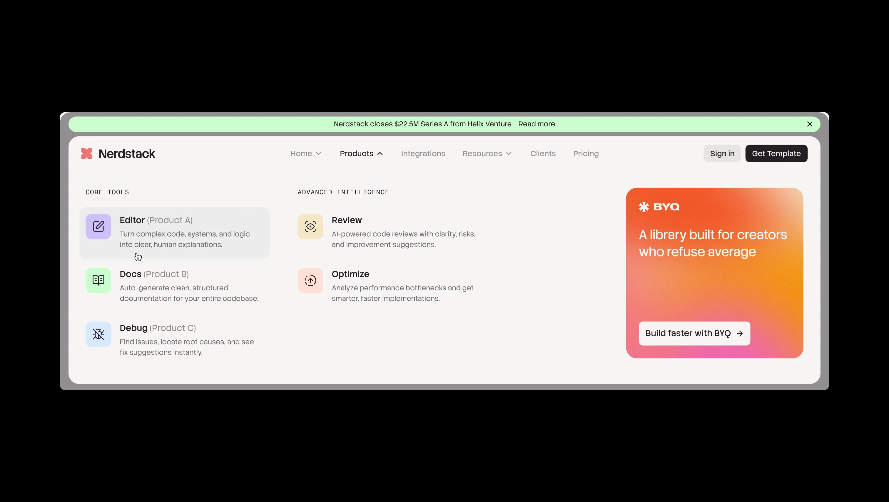
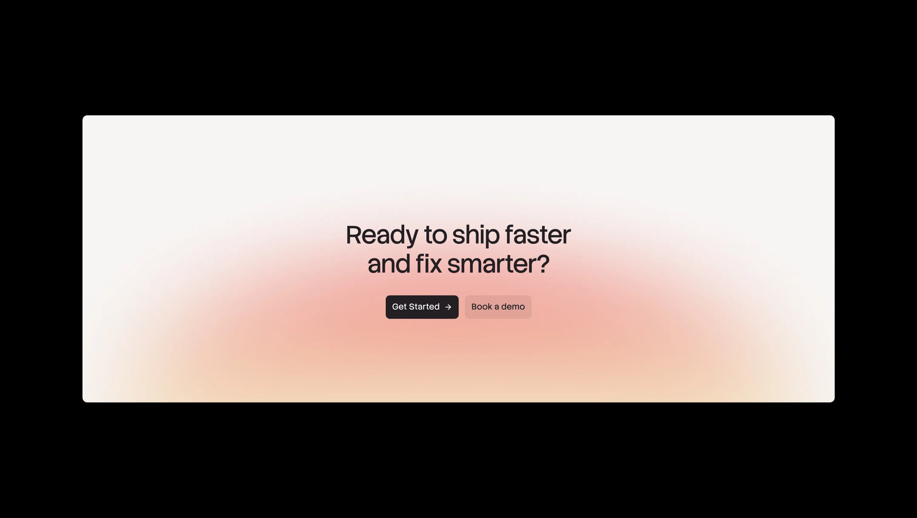
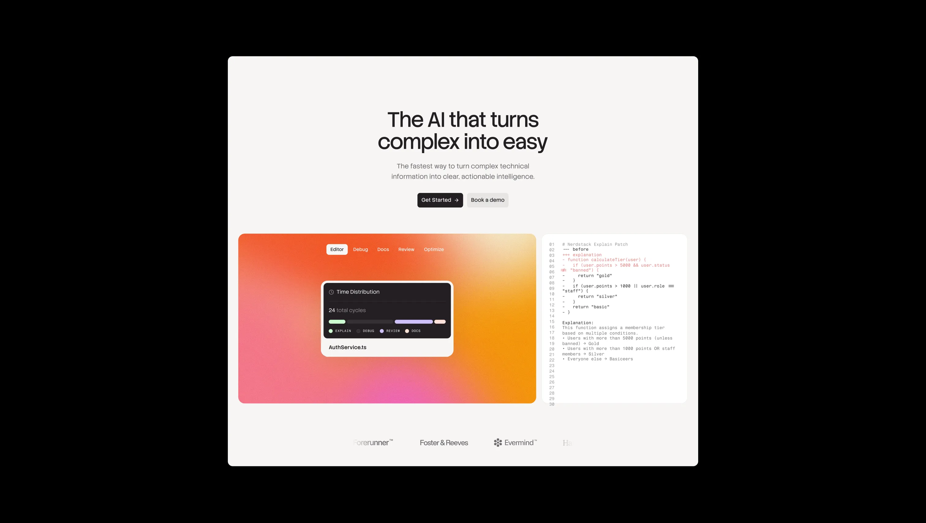
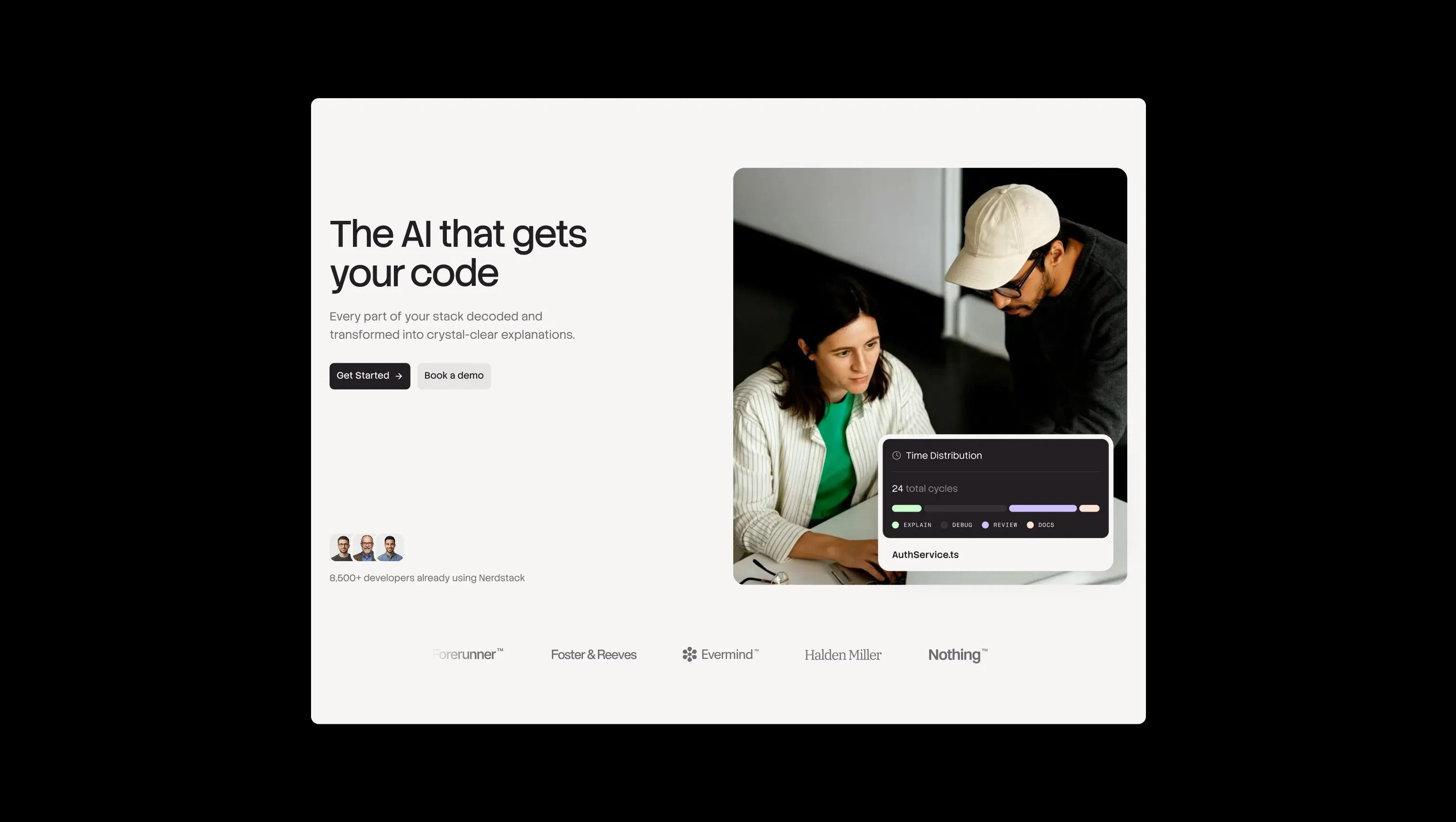
Nerdstack is a developer-tool brand that translates dense engineering systems into something legible and human. The aesthetic pairs warm off-white paper surfaces with deep ink-black type, then lets pastel utility hues — coral, orchid, mint, sky, sand, peach — surface as small badges, gradient washes, and category markers. The result is a calm, technical feeling: documentation-clean, with just enough warmth to feel inviting rather than clinical. Typography leans on a low-contrast, slightly geometric sans (StackSans) for both headlines and body, paired with a monospaced label voice (Fragment Mono) for taxonomy. Layouts breathe — generous section padding, soft 20px container radii, and floating card components shadowed onto cream paper. When the surface flips to dark, the brand stays restrained: a single deep ink (#231f23) under the same pastel accent system.
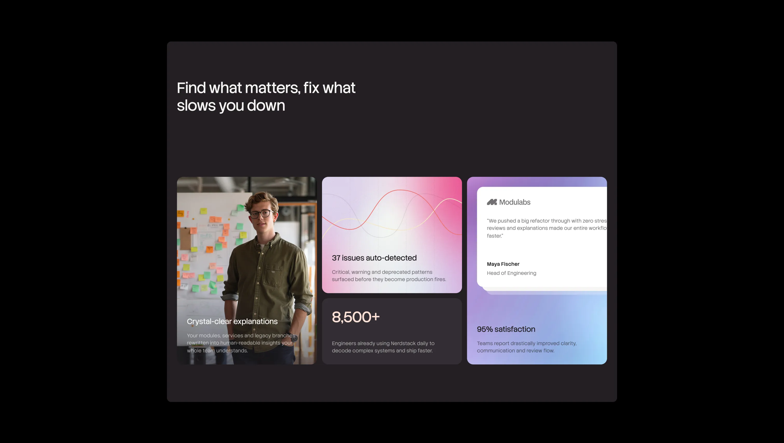
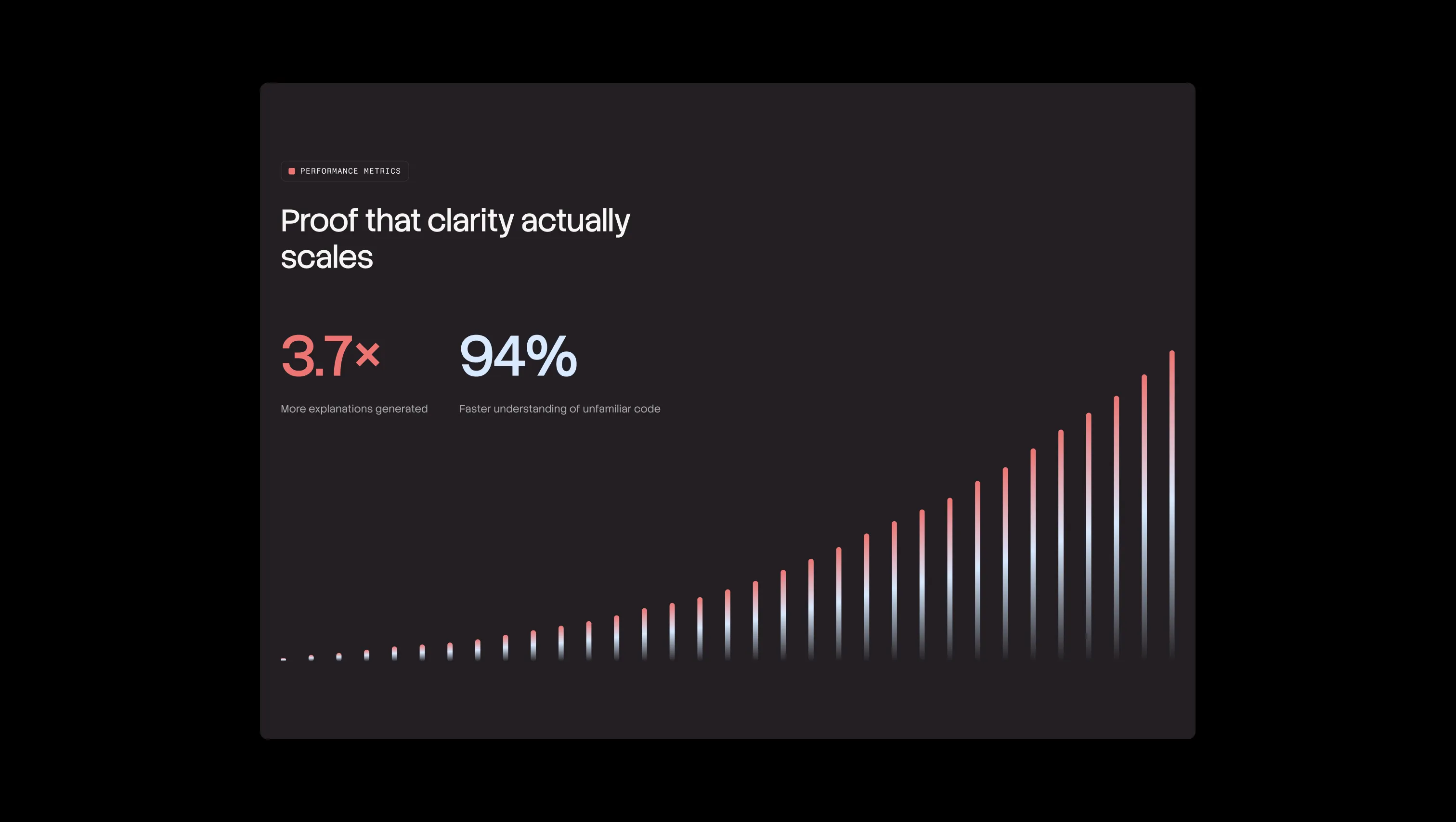
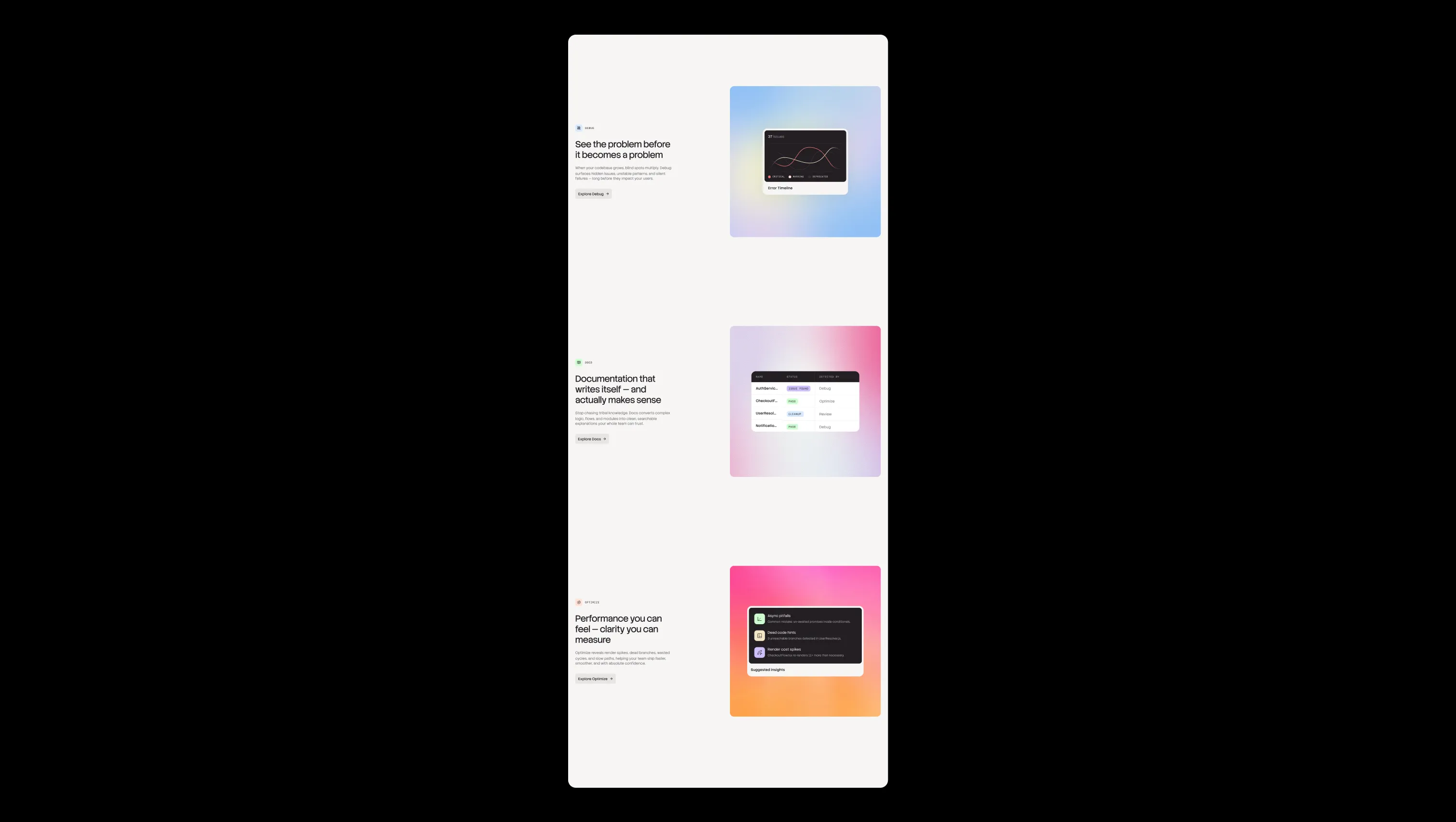
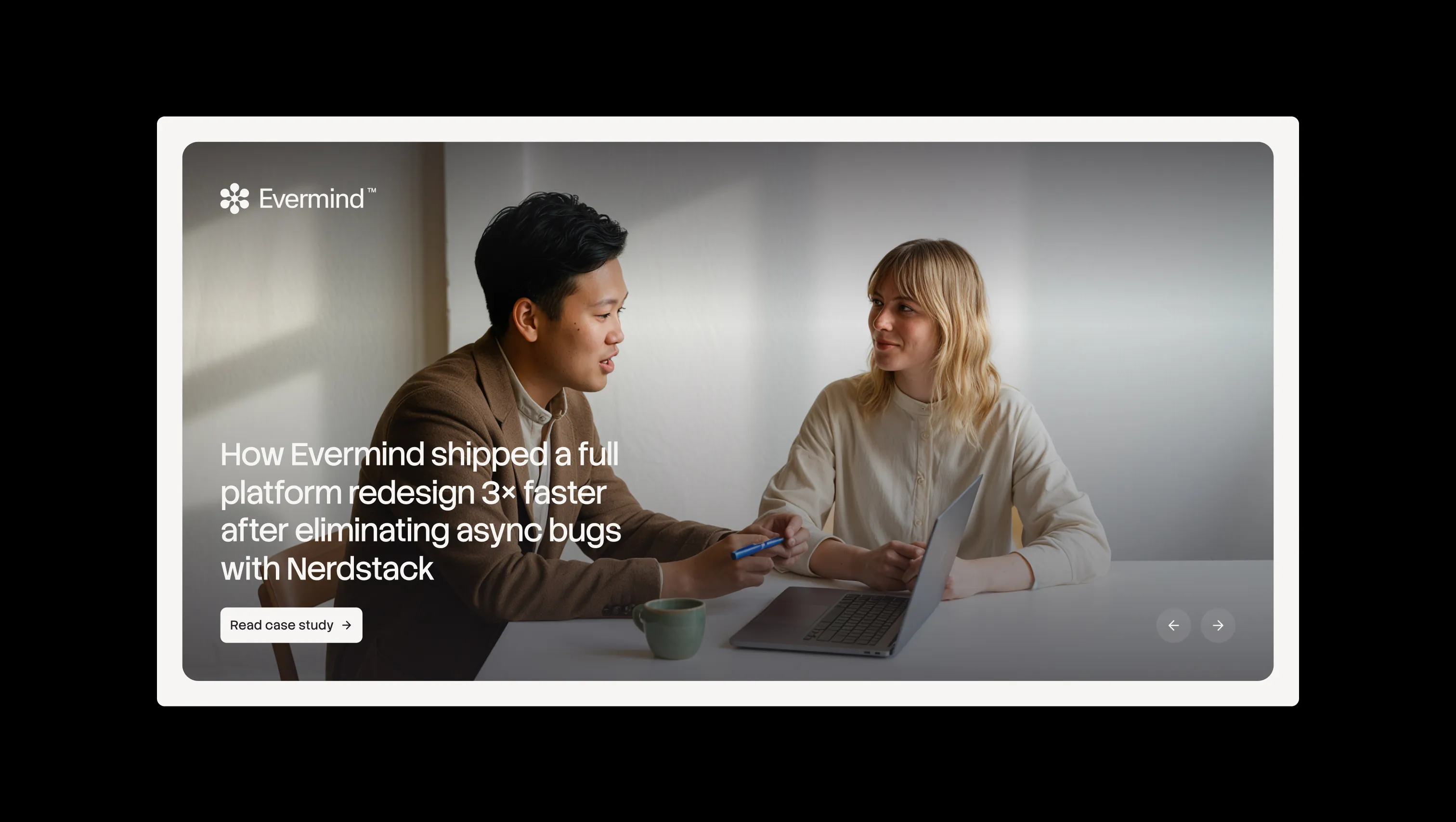
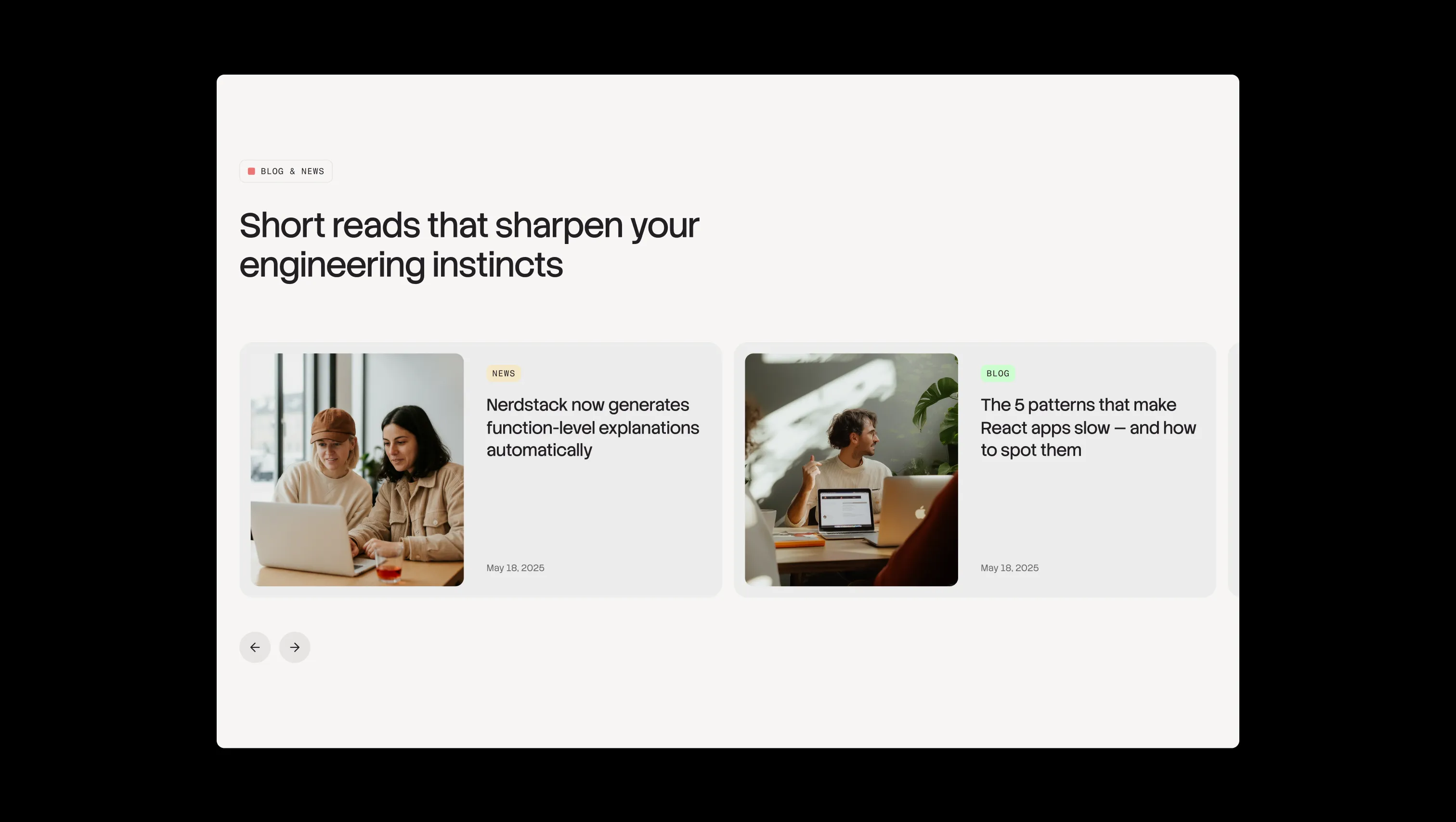
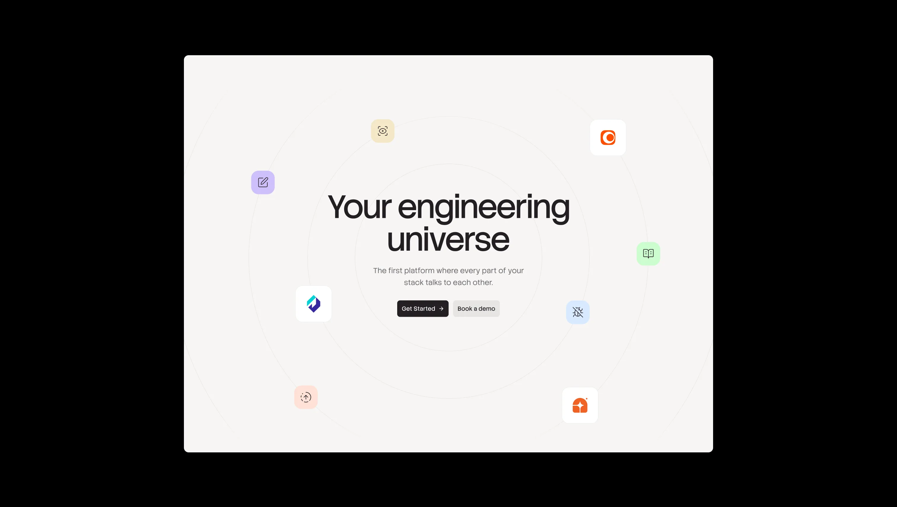
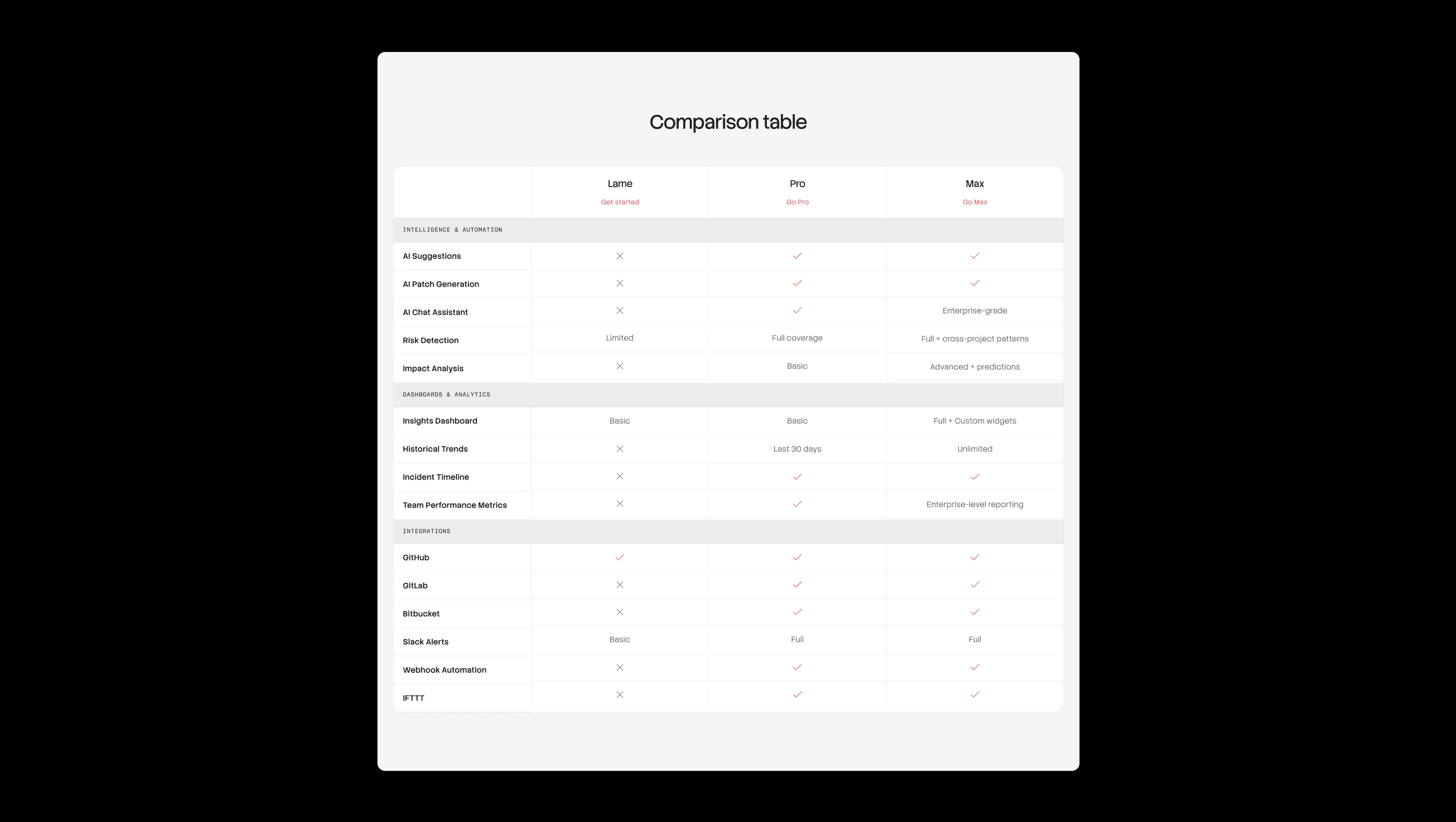
A handful of real sections that ship with this template. Click any card to preview, or explore them all under the Sections tab.

Recessed depth surface. Input fields, subtle chip wells, and inset zones beneath the canvas.
Lifted card surface. Pure white used for elevated cards, dropdowns, and floating tiles above the cream.
Alternate page canvas. Slightly warmer cream used for full-bleed background washes and hero stages.
Primary canvas. Warm off-white background that anchors every page surface and section.
Primary text & ink. Headlines, body copy, primary button fills, and dark surfaces.
Dark-mode lifted surface. Cards and form blocks elevated against obsidian backgrounds.
Deepest dark surface. Dark-mode hero backgrounds and inverted code panels.
Warm tag accent. Footer pills, blog category chips, and warm gradient endpoints.
Critical accent & error tone. Marks debug critical states, error chips, and warm gradient stops.
Cleanup & info accent. Cool pastel for review tags, debug icon backdrops, and informational chips.
Success & banner accent. Pass states, announcement banners, and docs category tags.
Issue category accent. Soft lavender tile backgrounds for issue-found tags and product icons.
Brand accent. Reserved for occasional emphasis, brand marks, and subdued highlights.
Warning accent & gradient halo. Warning markers, peach text accents, and the signature CTA gradient bloom.
Warning state. Reserved for caution indicators and validation feedback only.
Success state. Reserved for confirmed-pass indicators and form success feedback.
The quick brown fox jumps
Labels & taxonomy. Uppercased monospace voice for category tags, table headers, and small metadata.
The quick brown fox jumps
Body & UI. Light-weight default for paragraphs, buttons, navigation, and form fields.
The quick brown fox jumps
Display & headings. A low-contrast geometric sans that carries every H0–H6 with confident, slightly compressed letterforms.
spacious1800px160px32px24px4px8px12px16px20px24px32px48px64px80px120px160px200pxpill999pxtags8pxcards20pxsmall8pxcircle24pxinputs8pxbuttons8pxdefault12pxnavigation20pxStep from canvas (level 1) to lifted (level 2) to inset depth (level 3), then invert into the dark levels for full-bleed sections. Hex codes and roles live in the Colors section above; this ladder shows the layering only.
# Design System Guide

> Unlock the template to access the full design system.

## Brand voice

A short paragraph describing the brand voice, mood, and visual
principles that anchor the system. Tone, cadence, and intent.

## Colors

| Token        | Hex      | Role                                  |
| ------------ | -------- | ------------------------------------- |
| canvas-1     | #xxxxxx  | Page background, large surfaces       |
| canvas-2     | #xxxxxx  | Lifted surfaces, cards                |
| canvas-3     | #xxxxxx  | Inset wells, depressed states         |
| ink-1        | #xxxxxx  | Primary body text                     |
| ink-2        | #xxxxxx  | Secondary text, labels                |
| ink-3        | #xxxxxx  | Tertiary text, hints                  |
| accent-1     | #xxxxxx  | Primary brand accent                  |
| accent-2     | #xxxxxx  | Secondary accent                      |
| state-ok     | #xxxxxx  | Success, confirmations                |
| state-warn   | #xxxxxx  | Warnings                              |
| state-err    | #xxxxxx  | Errors, destructive actions           |

## Typography

- **Display** — heading scale, used for hero text and section titles.
- **Body** — primary reading text, optimized for paragraphs.
- **Mono** — code, data, and tabular numerals.

```
display: 32px / 40px / 48px / 64px / 80px
body:    14px / 16px / 18px
mono:    12px / 14px
```

## Spacing & shape

Base unit: 4px. Scale: 4, 8, 12, 16, 24, 32, 48, 64, 96, 128.
Radii: sm (4px), md (8px), lg (12px), xl (20px), full (9999px).

## Surfaces

Layered elevation from canvas → lifted → inset. Surfaces invert in
dark sections for full-bleed contrast.

## Do's and don'ts

- Do use accent-1 sparingly for primary CTAs only.
- Do maintain at least 4.5:1 contrast on body text.
- Don't mix display and body in the same line.
- Don't use state colors for branding.

## Agent prompt guide

Prompts for AI design tools that respect this system.
Includes example prompts for sections, components, and layouts.

# ...
Unlock the full style guide