Design systems, extracted.
Paste any URL to create a design system from it. Open any style for colors, type, spacing, components, and a DESIGN.md or tokens.json your agent can use.
Quickly navigate through the dashboard with your keyboard using the command menu.
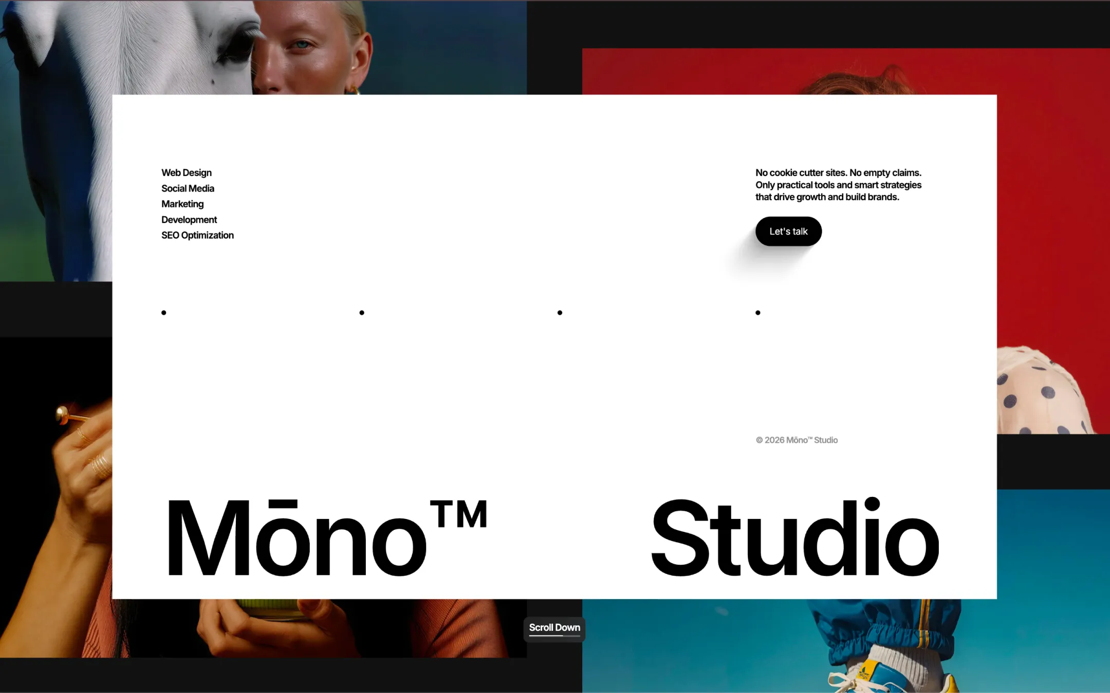
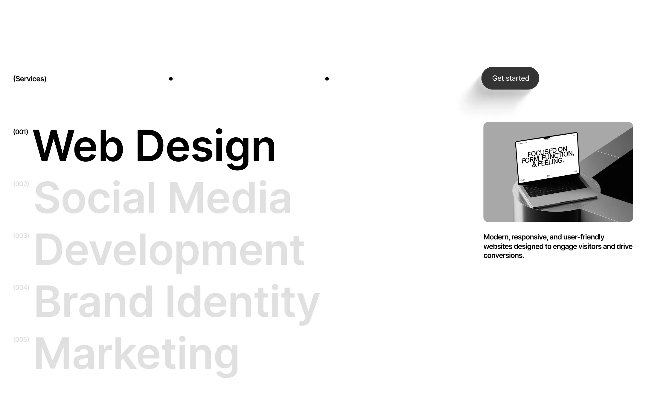
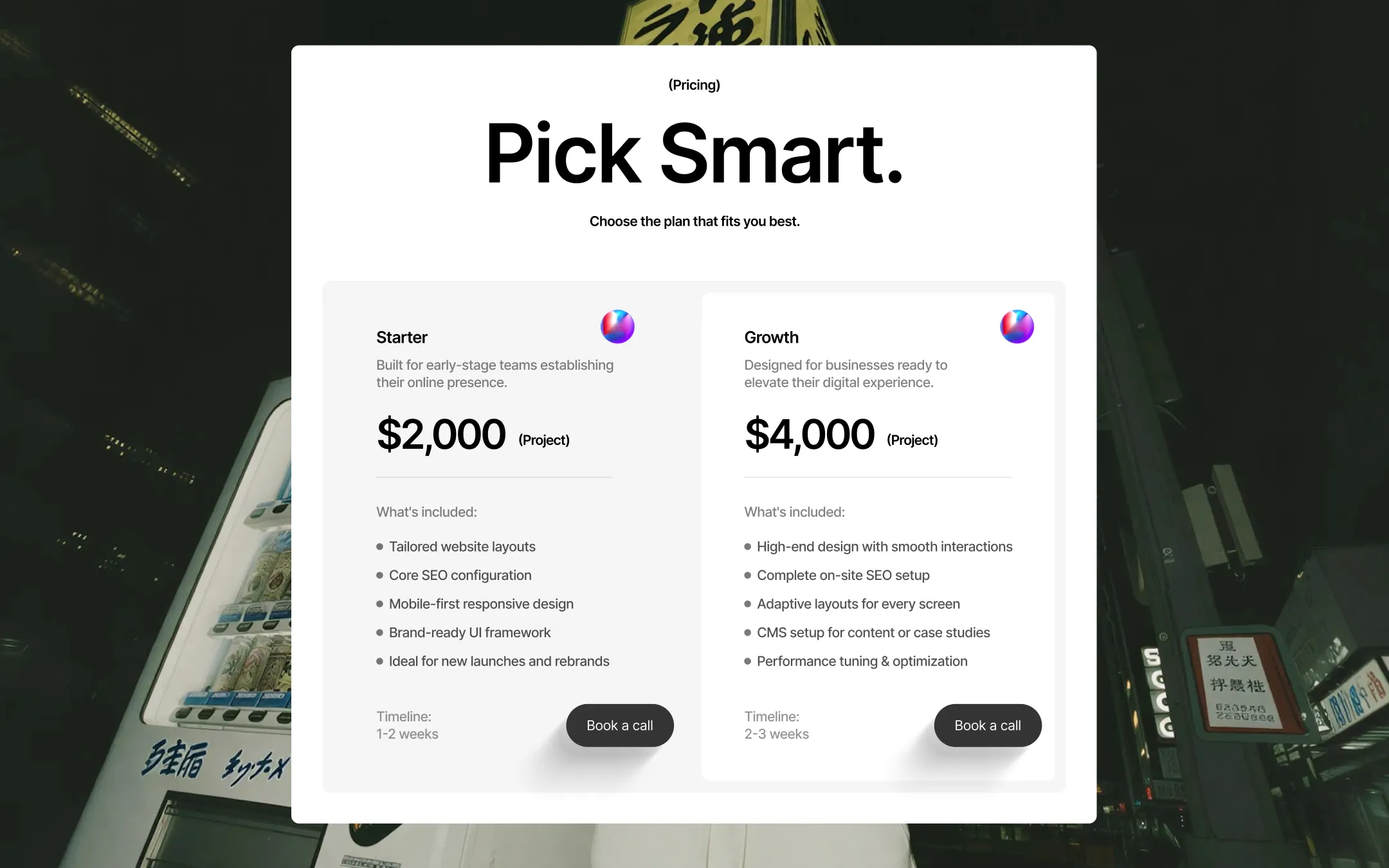
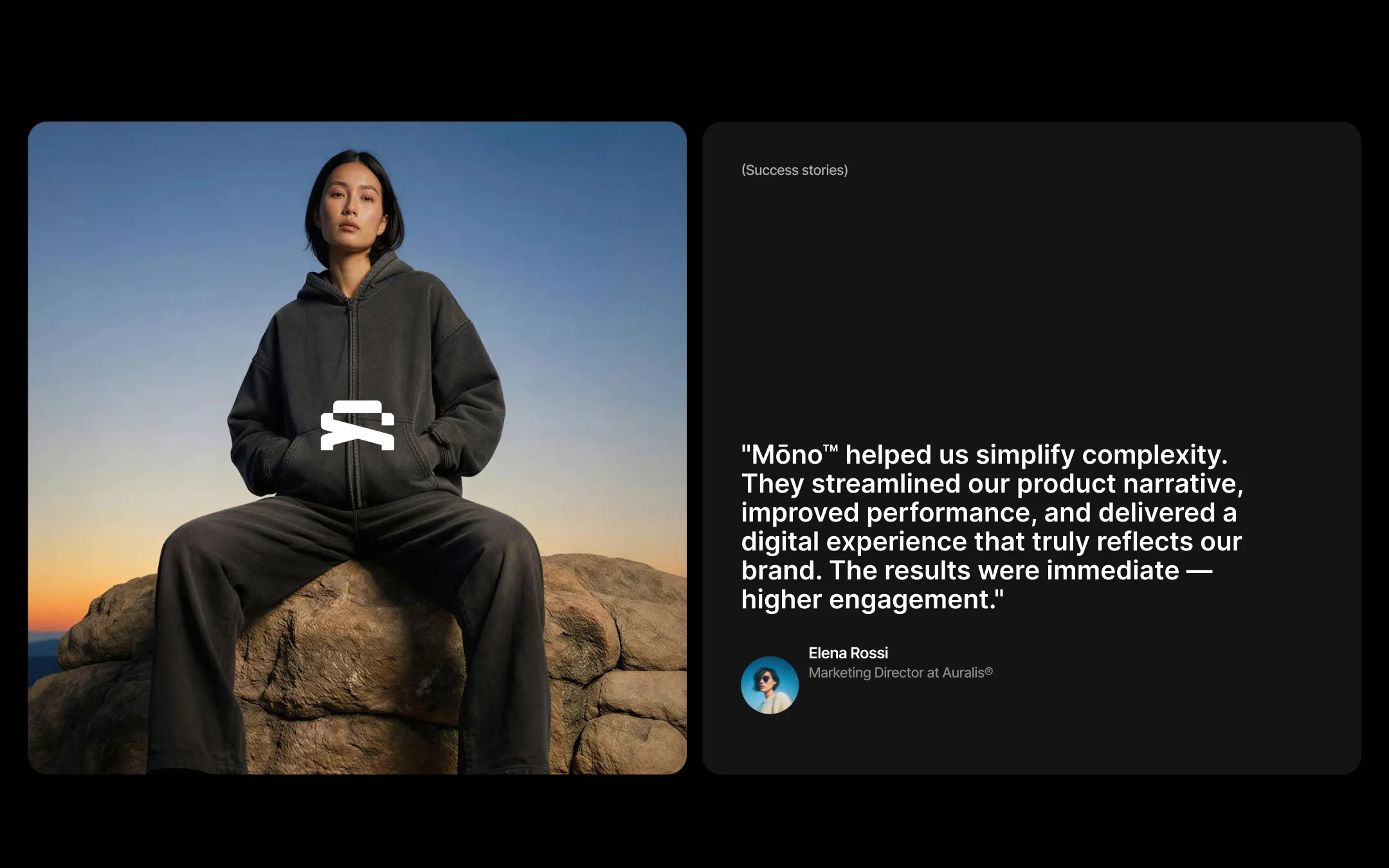
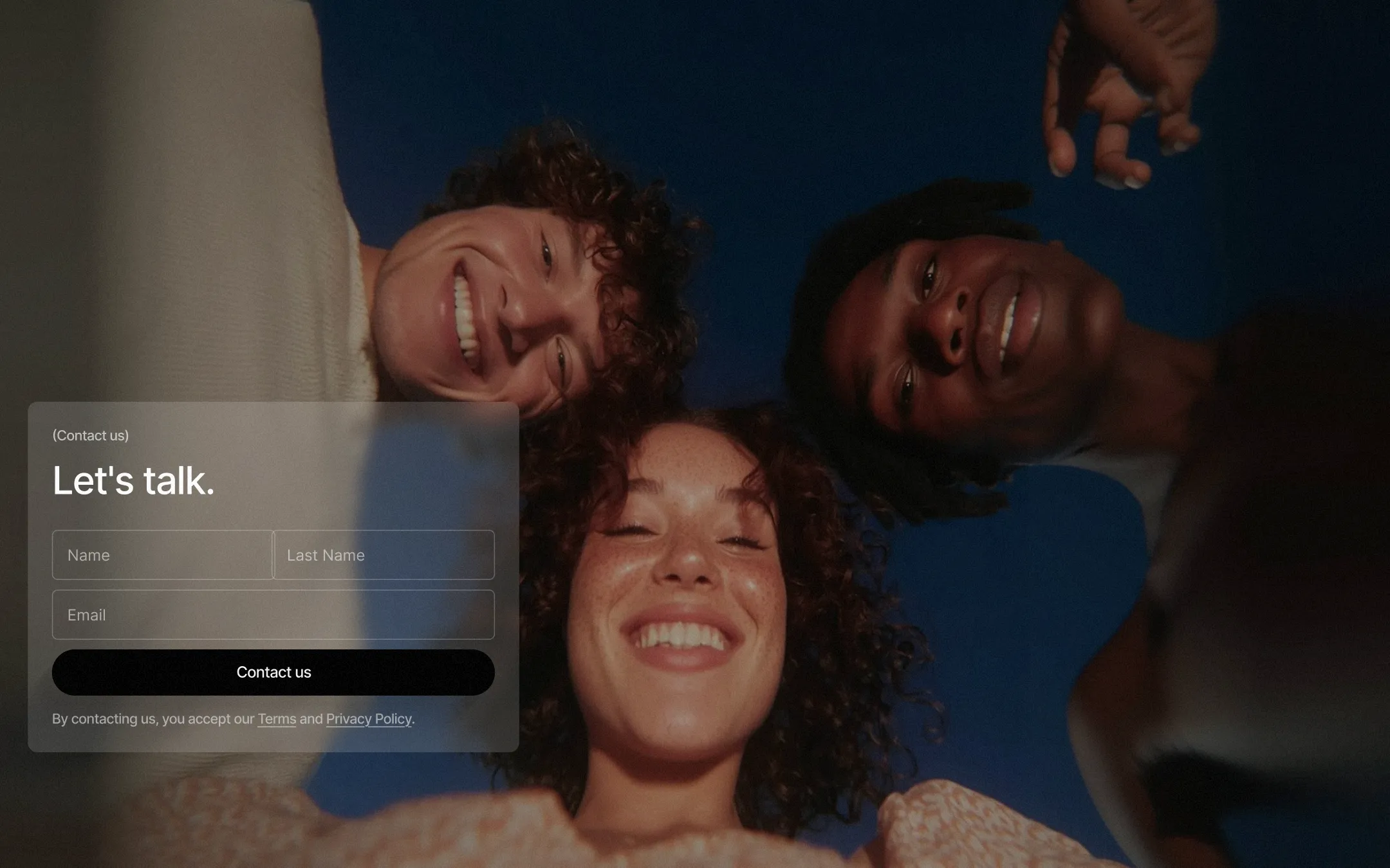
Mōno™ strips branding down to its structural essentials: pure white canvases, razor-black type, and editorial photography doing all the emotional heavy lifting. There are no gradients to hide behind and no decorative color to lean on — the discipline of the palette is the point, letting full-bleed imagery, hover-reveal video, and confident oversized type carry the premium feel. Every interface decision reinforces a studio-grade, almost architectural restraint: parenthetical micro-labels like "(Services)" and "(Pricing)", pill-shaped buttons with soft layered shadows, and massive display type set at tight negative tracking. Motion is present but quiet — sticky scroll reveals, smooth card flips, gentle opacity fades — never competing with the work itself.
Footer & utility section backdrop
Base canvas & card surfaces
Secondary canvas, section backgrounds
Primary text & ink
Muted overlay text on dark imagery
Dark card surfaces & image placeholders
Darkest elevated panels, pricing dark tier
Rare decorative accent for subtle highlight moments
Live availability indicator
The quick brown fox jumps
Rare handwritten accent for signature moments
The quick brown fox jumps
Primary UI, body copy, headings
The quick brown fox jumps
Oversized hero/CTA display accents
spacious1400px250px40px20px10px20px30px50px60px100px120px150px250pxcards10pxsmall4pxcircle160pxpanels20pxbuttons30pxcontainer9.6pxbutton-pill160pxStep from canvas (level 1) to lifted (level 2) to inset depth (level 3), then invert into the dark levels for full-bleed sections. Hex codes and roles live in the Colors section above; this ladder shows the layering only.
# Design System Guide

> Unlock the template to access the full design system.

## Brand voice

A short paragraph describing the brand voice, mood, and visual
principles that anchor the system. Tone, cadence, and intent.

## Colors

| Token        | Hex      | Role                                  |
| ------------ | -------- | ------------------------------------- |
| canvas-1     | #xxxxxx  | Page background, large surfaces       |
| canvas-2     | #xxxxxx  | Lifted surfaces, cards                |
| canvas-3     | #xxxxxx  | Inset wells, depressed states         |
| ink-1        | #xxxxxx  | Primary body text                     |
| ink-2        | #xxxxxx  | Secondary text, labels                |
| ink-3        | #xxxxxx  | Tertiary text, hints                  |
| accent-1     | #xxxxxx  | Primary brand accent                  |
| accent-2     | #xxxxxx  | Secondary accent                      |
| state-ok     | #xxxxxx  | Success, confirmations                |
| state-warn   | #xxxxxx  | Warnings                              |
| state-err    | #xxxxxx  | Errors, destructive actions           |

## Typography

- **Display** — heading scale, used for hero text and section titles.
- **Body** — primary reading text, optimized for paragraphs.
- **Mono** — code, data, and tabular numerals.

```
display: 32px / 40px / 48px / 64px / 80px
body:    14px / 16px / 18px
mono:    12px / 14px
```

## Spacing & shape

Base unit: 4px. Scale: 4, 8, 12, 16, 24, 32, 48, 64, 96, 128.
Radii: sm (4px), md (8px), lg (12px), xl (20px), full (9999px).

## Surfaces

Layered elevation from canvas → lifted → inset. Surfaces invert in
dark sections for full-bleed contrast.

## Do's and don'ts

- Do use accent-1 sparingly for primary CTAs only.
- Do maintain at least 4.5:1 contrast on body text.
- Don't mix display and body in the same line.
- Don't use state colors for branding.

## Agent prompt guide

Prompts for AI design tools that respect this system.
Includes example prompts for sections, components, and layouts.

# ...
Unlock the full style guide