Design systems, extracted.
Paste any URL to create a design system from it. Open any style for colors, type, spacing, components, and a DESIGN.md or tokens.json your agent can use.
Quickly navigate through the dashboard with your keyboard using the command menu.
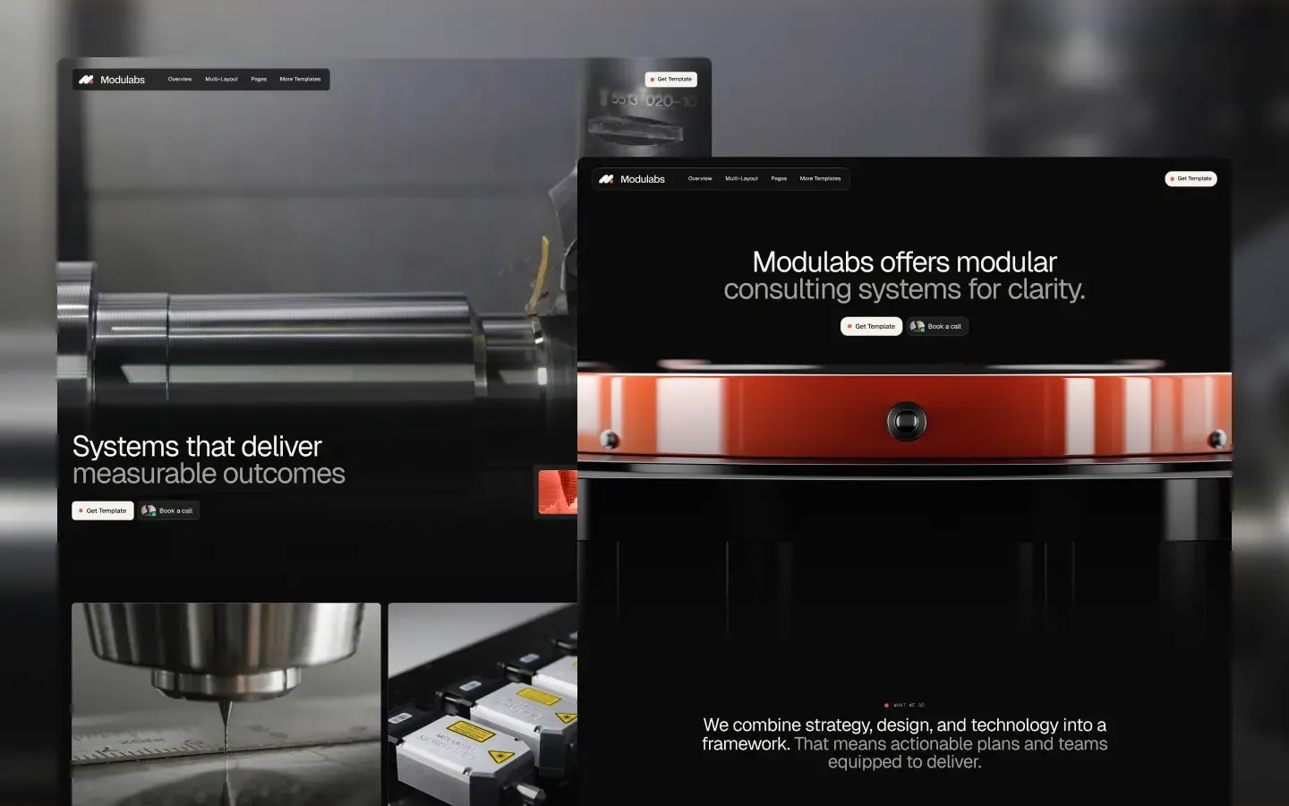
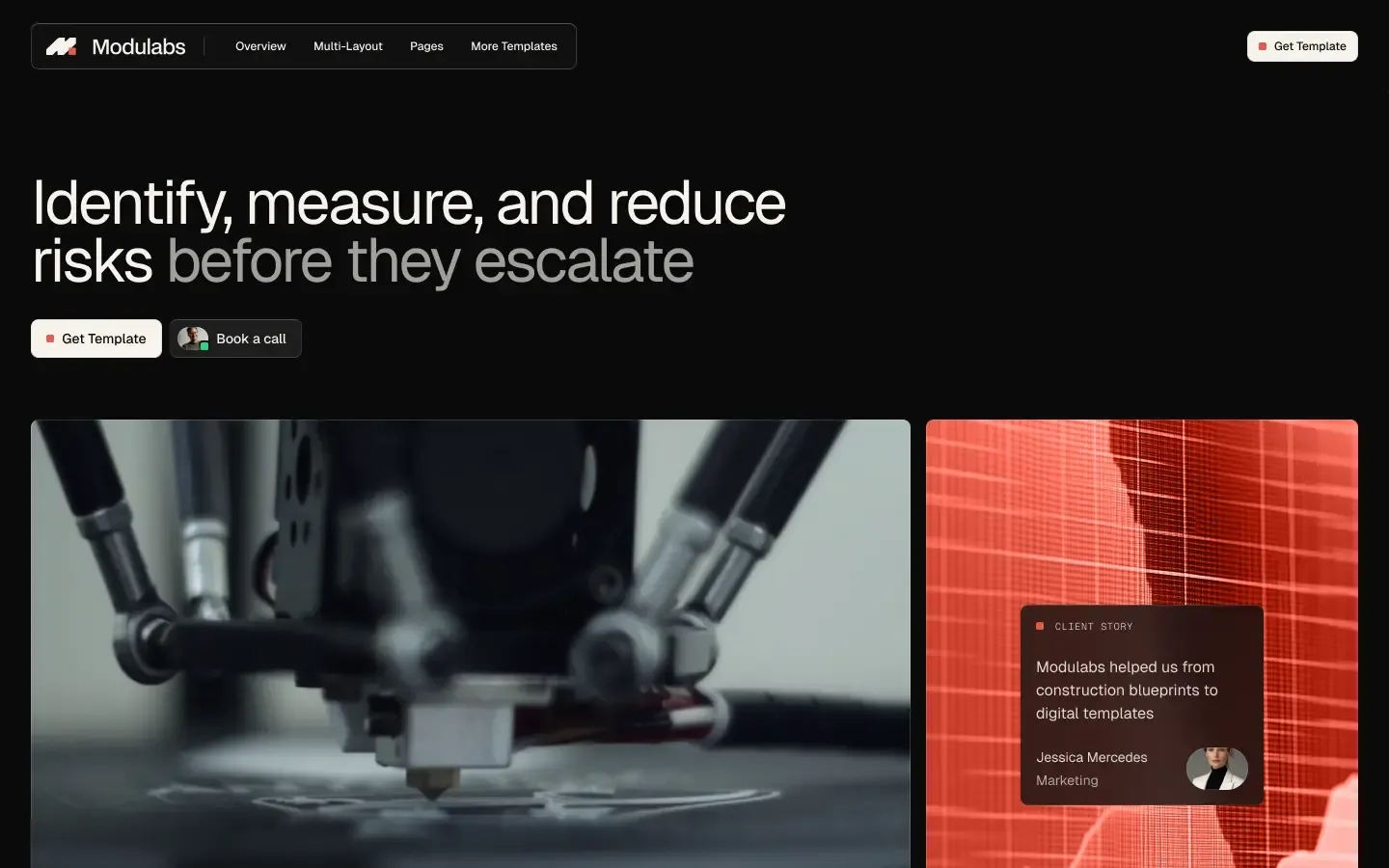
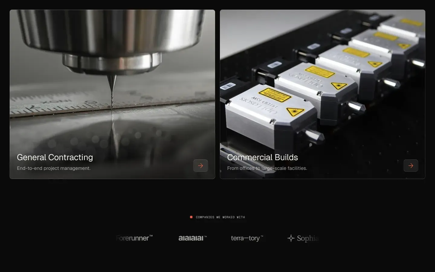
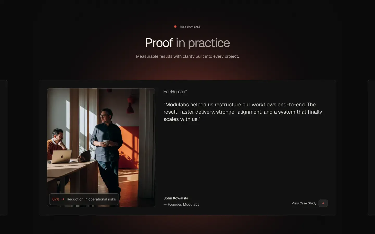
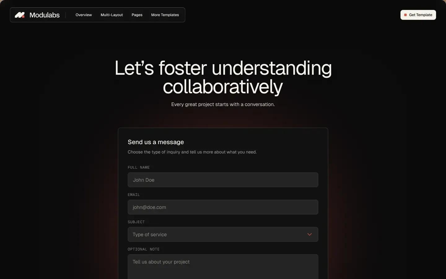
Modulabs is a precision-engineered dark-first design system tuned for consulting firms, software teams, and advanced-industry brands. Its signature mood blends near-black canvases with warm cream contrast and a single ember-orange accent — the kind of restraint you find in instrumentation panels and machined parts. The template trades flourish for legibility: variable Geist sans handles every headline and body, Geist Mono carries uppercase micro-labels, and translucent lifted surfaces with hairline 1px borders create depth without ornament. Typography pulls tight (-2.5px tracking on display) while UI radii stay deliberately small at 8px — corporate polish with experimental, instrument-grade flair.
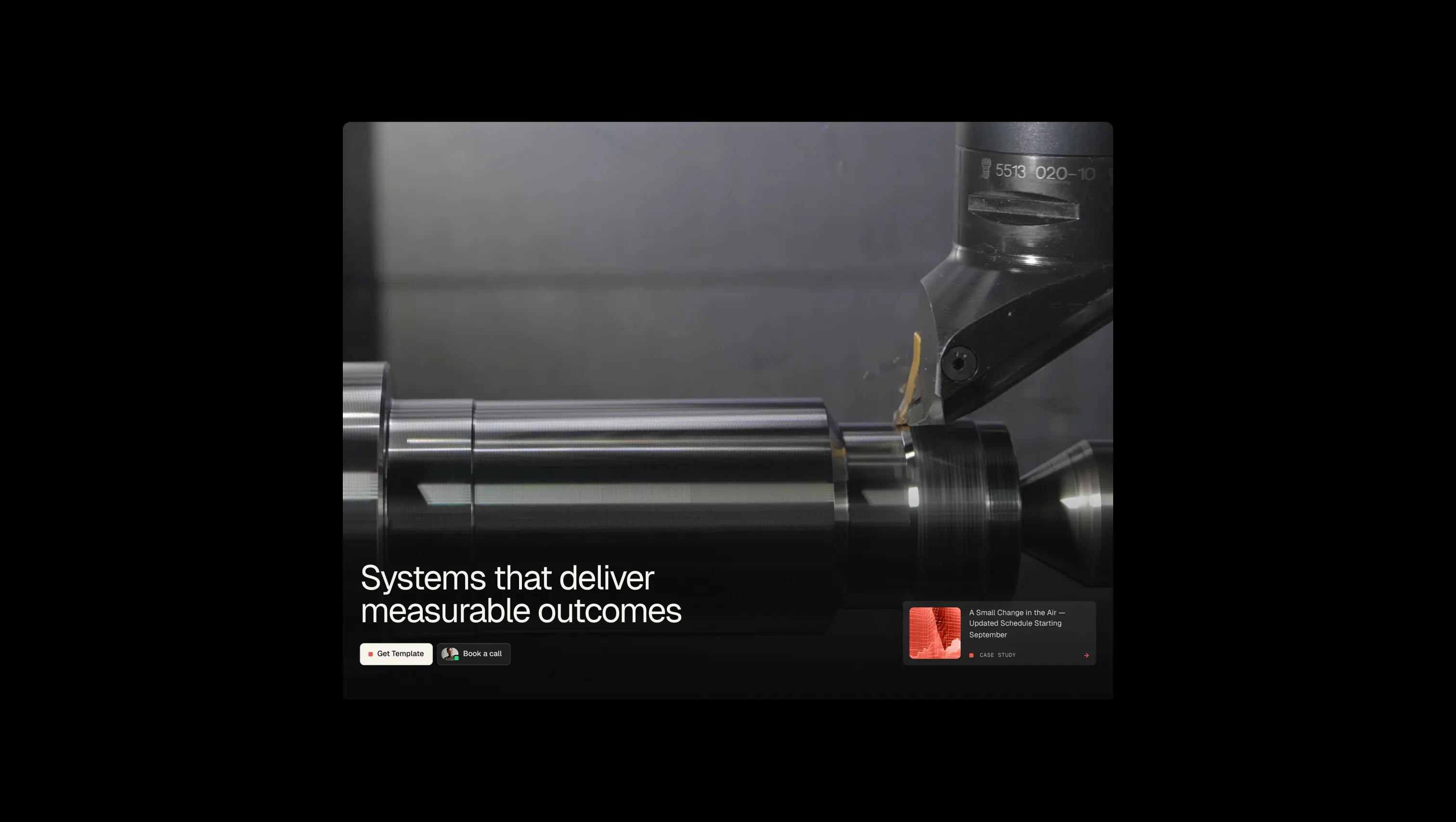
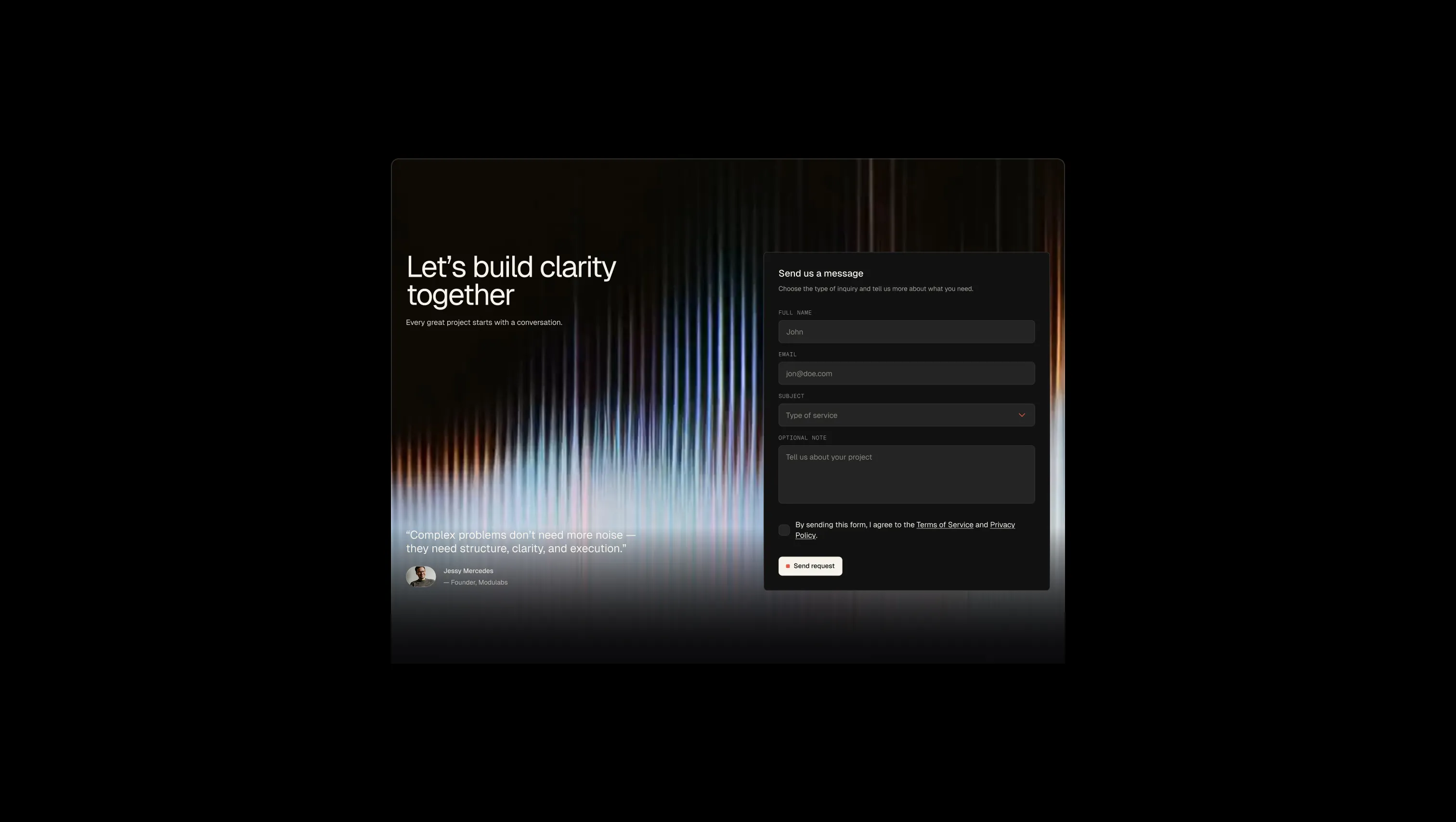
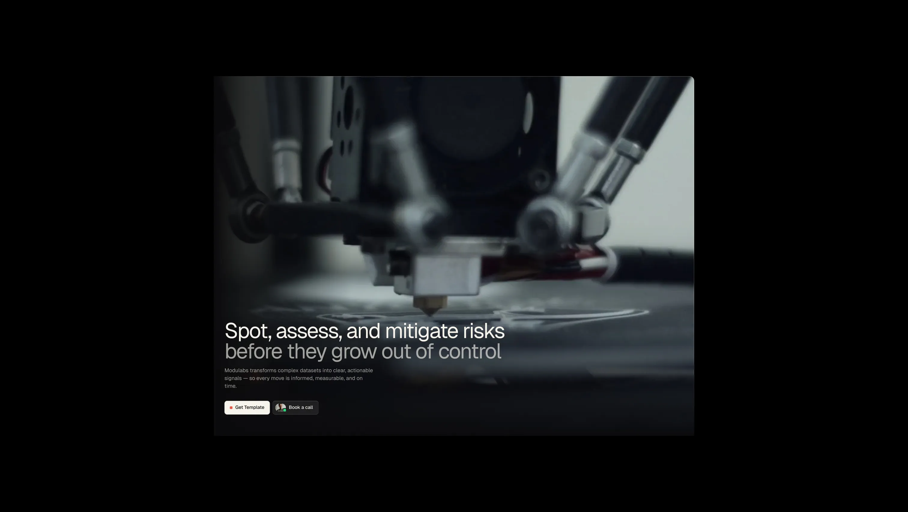
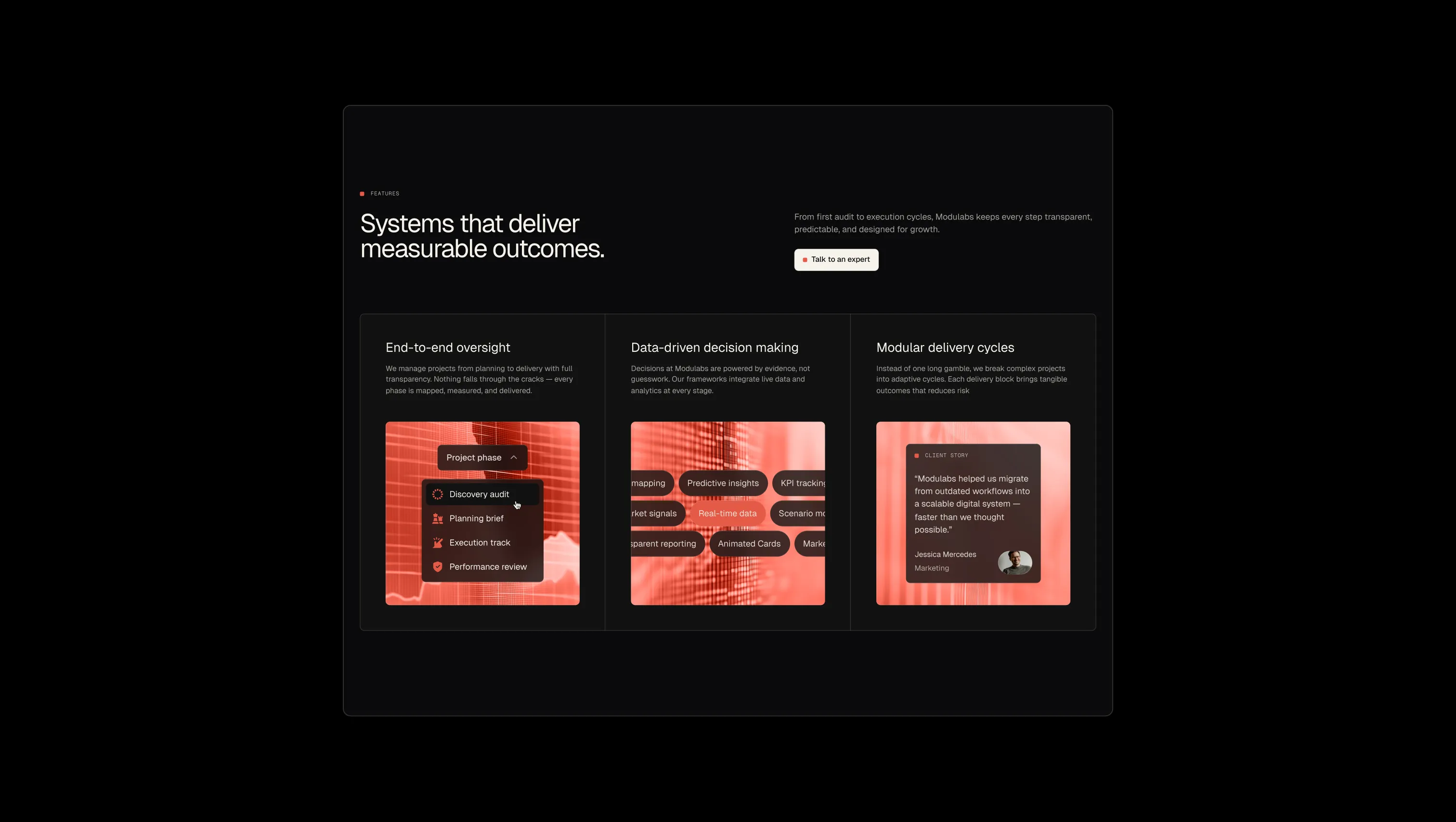
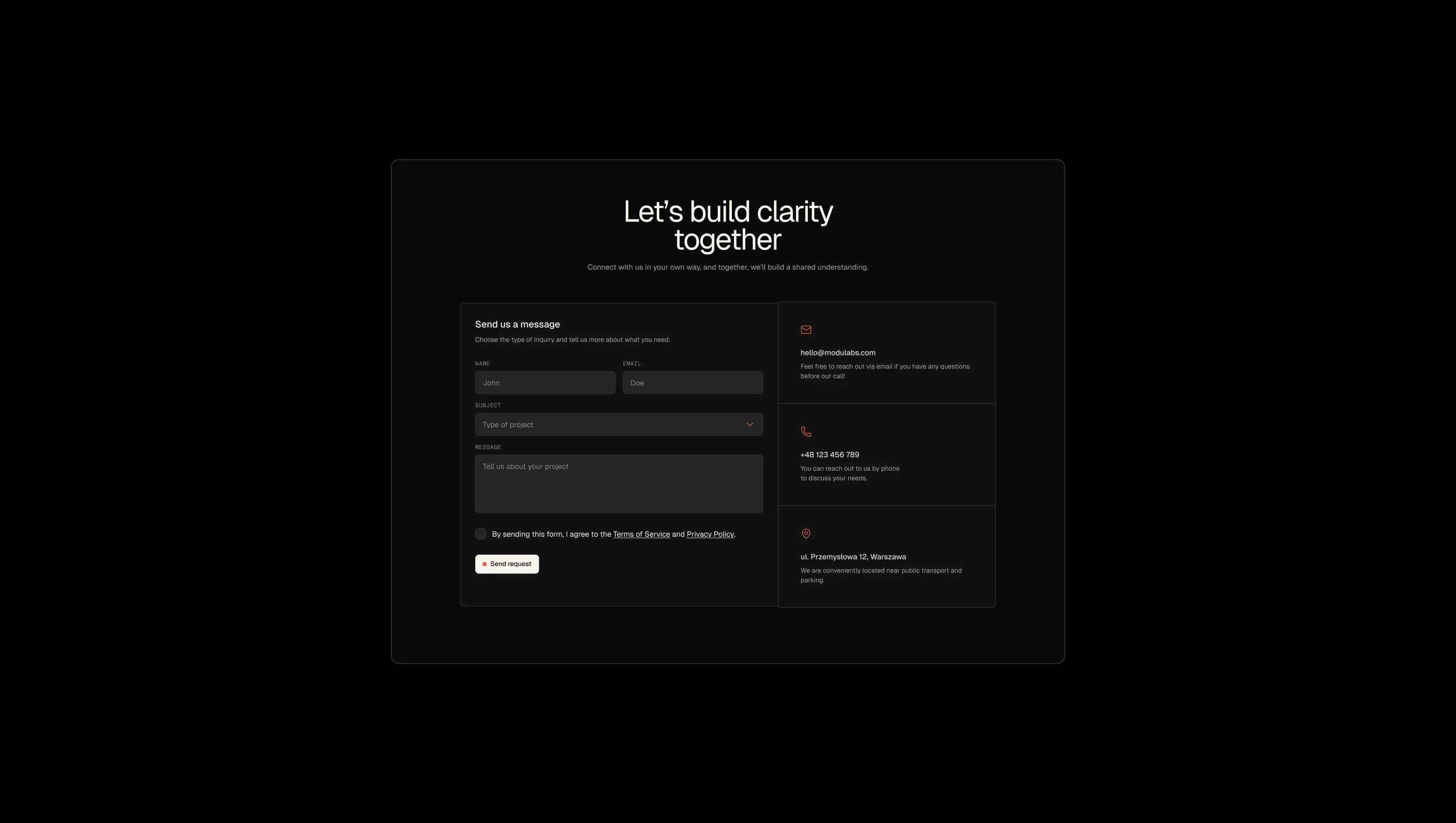
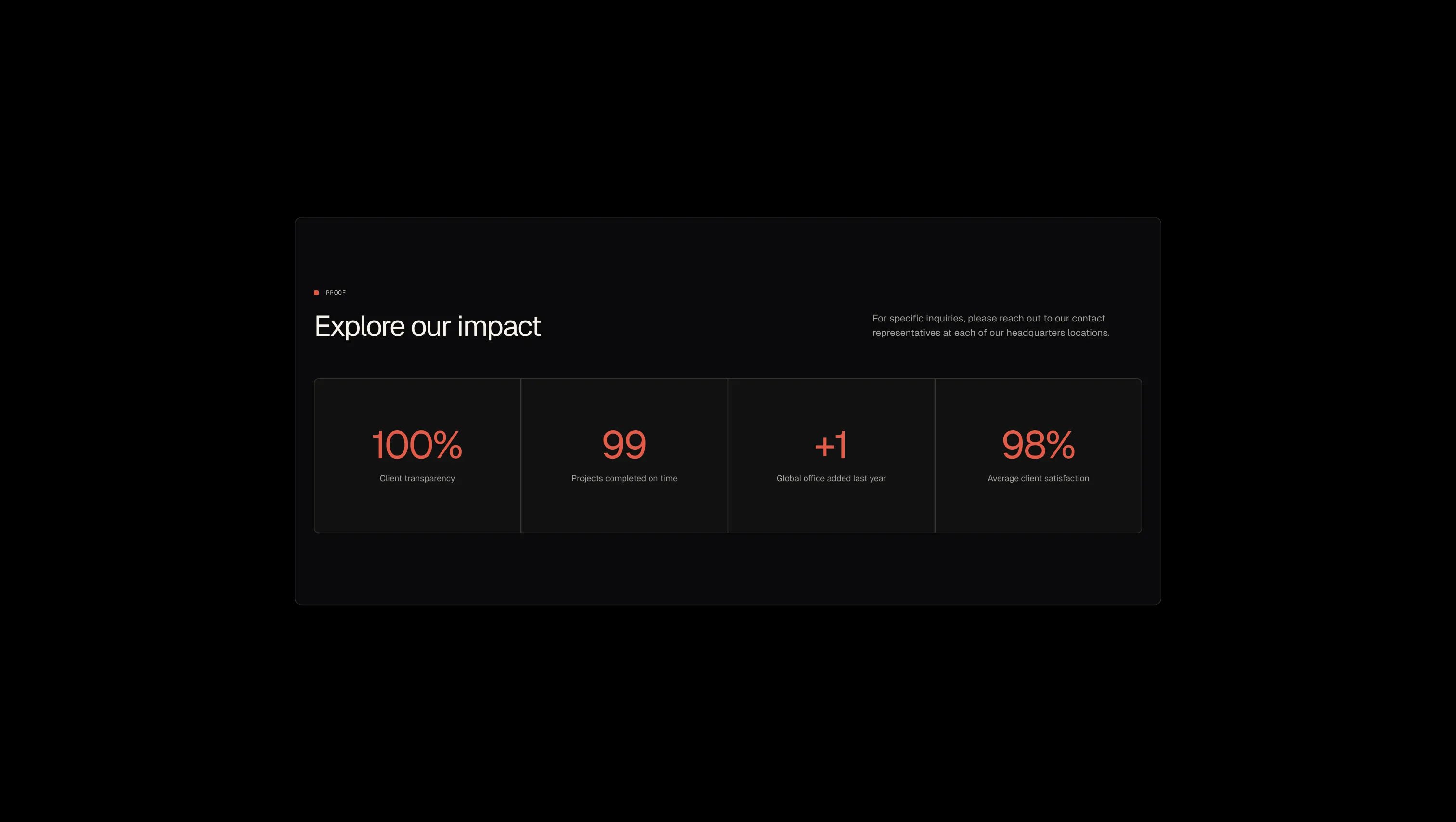
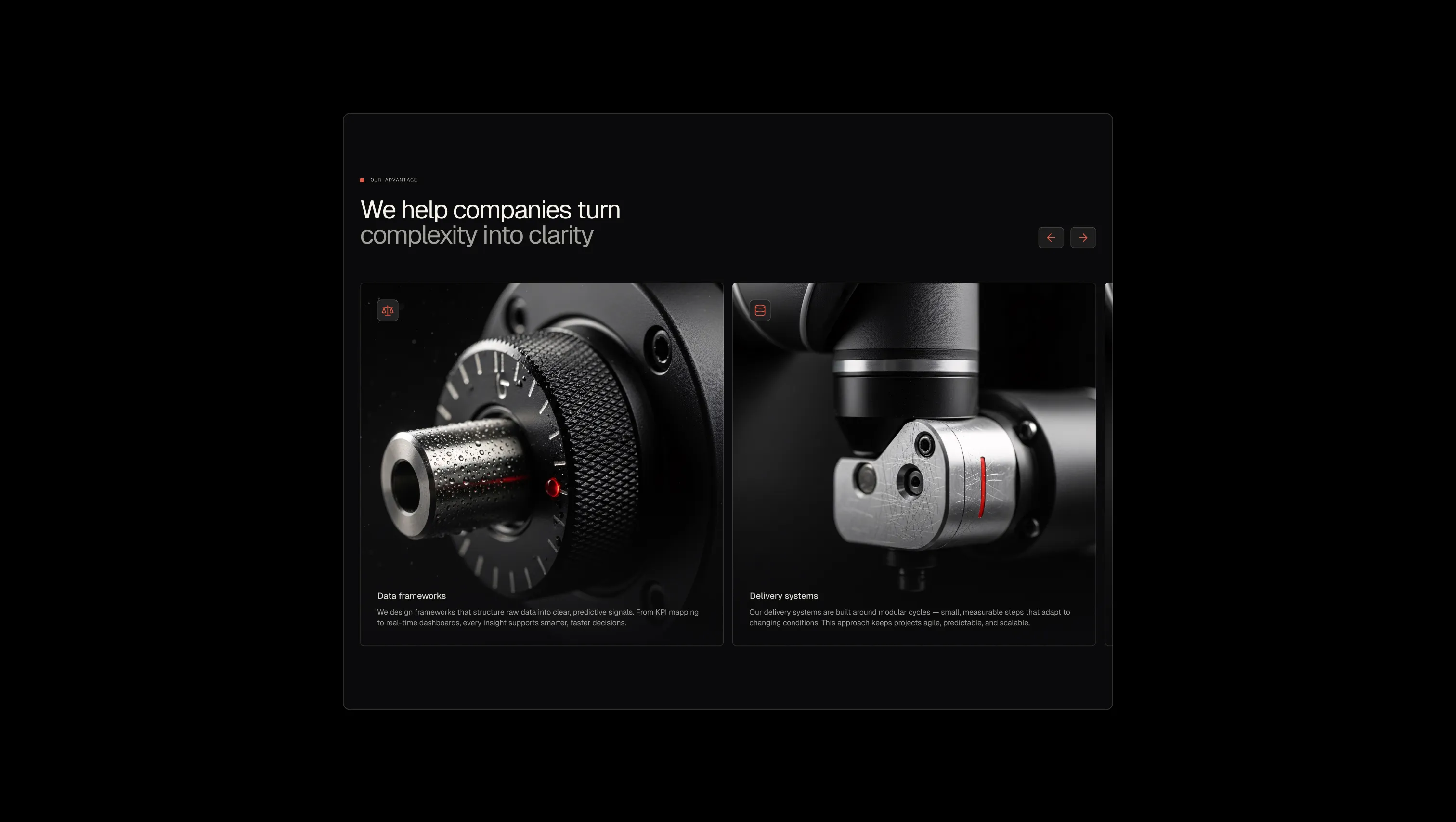
A handful of real sections that ship with this template. Click any card to preview, or explore them all under the Sections tab.
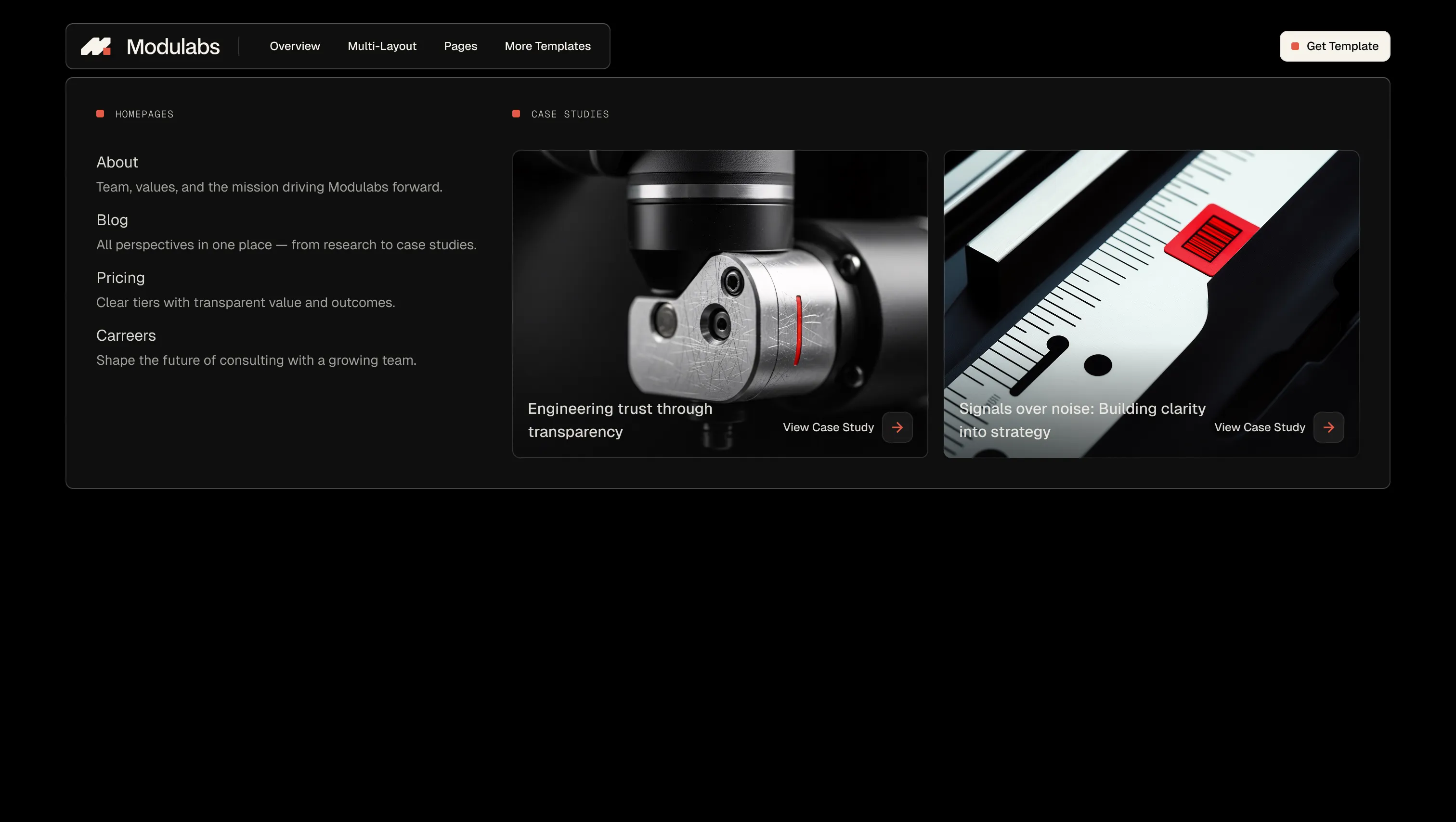
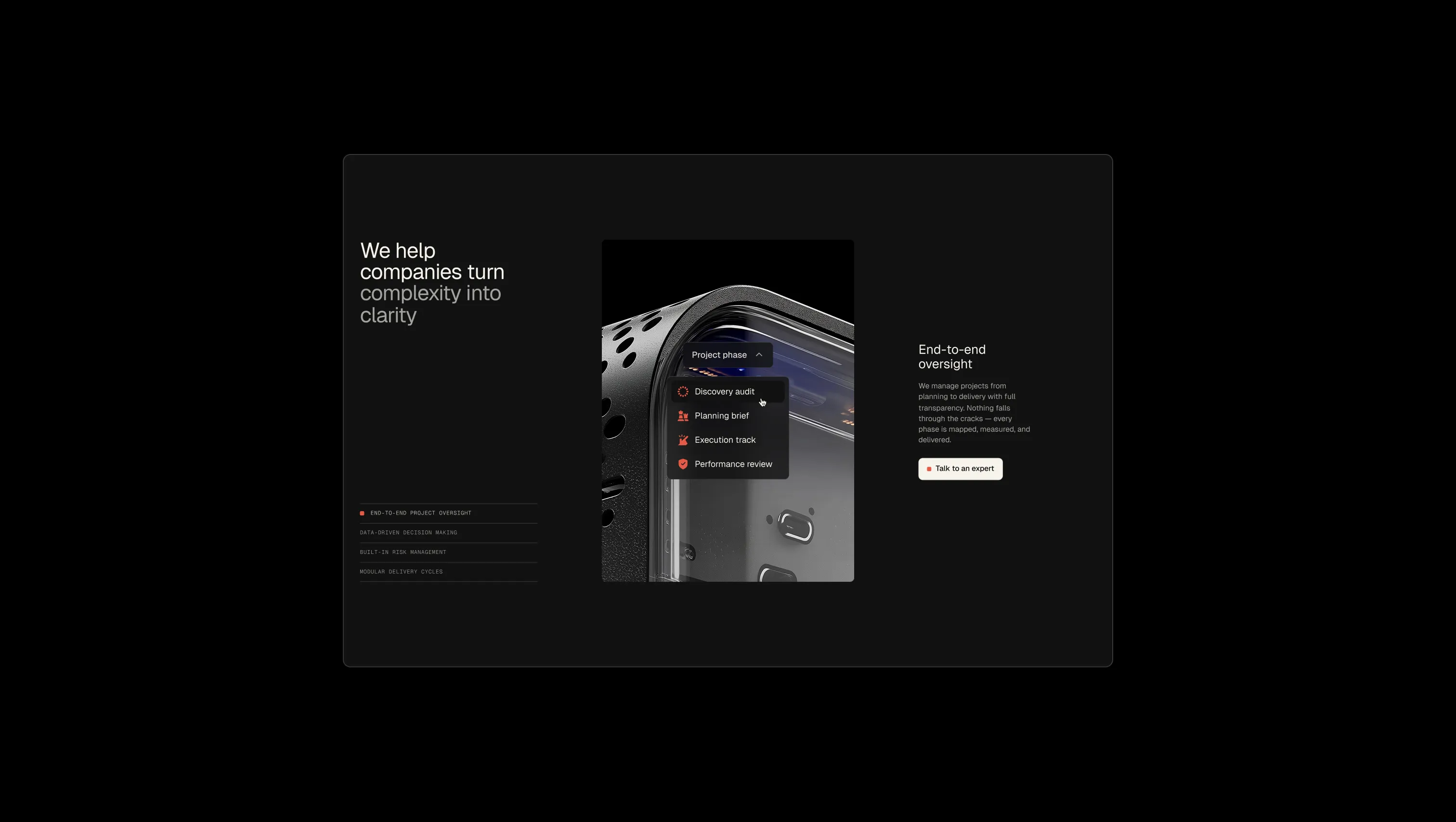
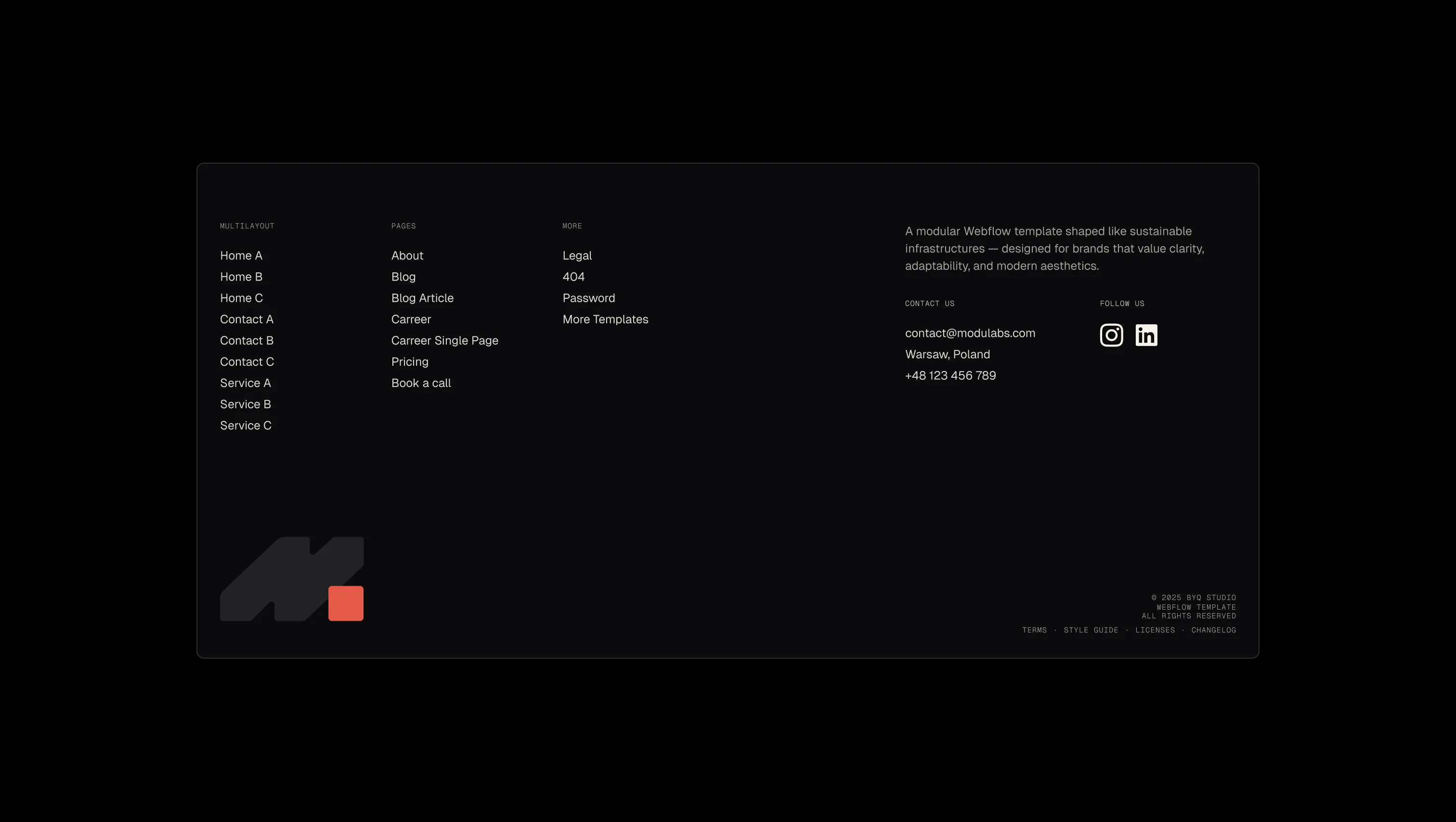
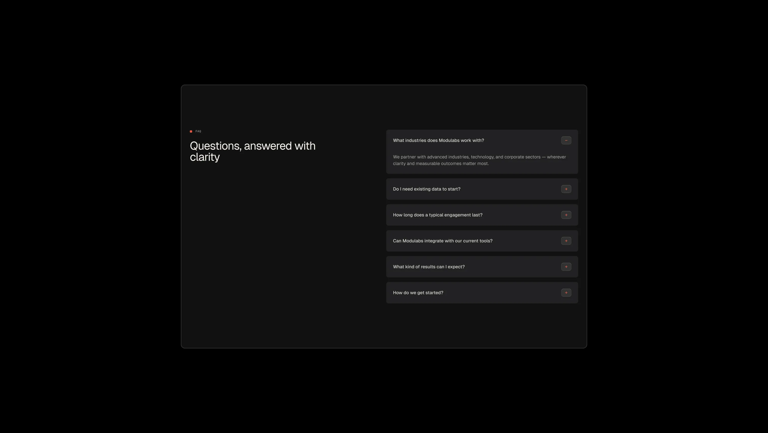
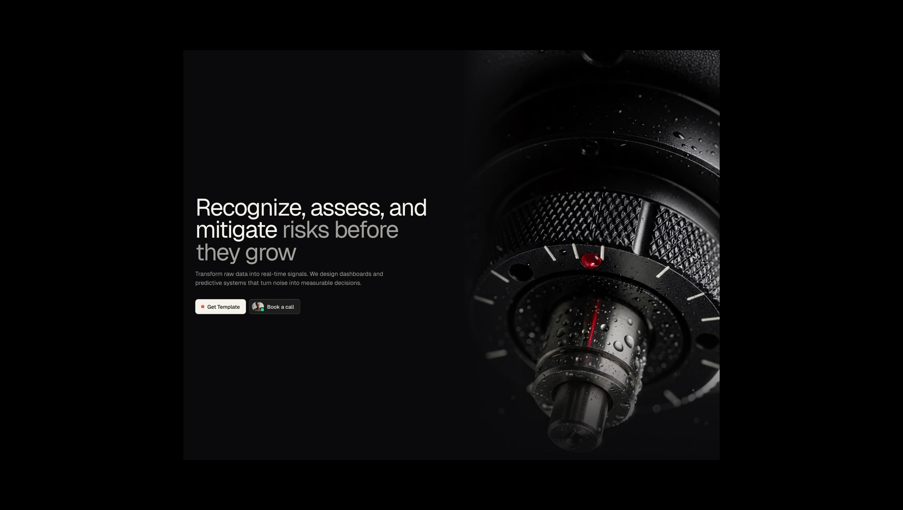
Elevated surface in dark mode. Cards, form panels, and lifted sections atop the void.
Light-mode depth surface. Inset panels and contrast areas in light theme.
Light-mode lifted surface. Cards and panels in light theme contexts.
Base canvas & primary dark surface. Page backgrounds, hero sections, and dark-mode foundation.
Deepest contrast surface. Tag chips, custom plan cards, and inset panels needing extra depth.
Primary text on dark & light canvas. Headlines, primary button fills, and the warm light-mode base.
Secondary heading & strong body text. 88% cream for slightly recessed copy.
Sole brand accent. Label dots, arrow icons, accent text spans, and active-state indicators.
Warning state utility. Reserved for system messages and form caution.
Error state utility. Form validation and destructive feedback only.
Success state & live indicator. Used sparingly on availability dots inside the Book a call button.
The quick brown fox jumps
Micro-label family. Reserved for uppercase eyebrow labels, footer legal links, and form input labels.
The quick brown fox jumps
Primary family. Powers all headings, body copy, and button labels — a single voice across the system.
spacious1800px120px32px24px0px4px8px12px16px20px24px32px48px64px80px120pxpill9999pxcards8pxinput8pxlarge16pxbuttons8pxdefault8pxStep from canvas (level 1) to lifted (level 2) to inset depth (level 3), then invert into the dark levels for full-bleed sections. Hex codes and roles live in the Colors section above; this ladder shows the layering only.
# Design System Guide

> Unlock the template to access the full design system.

## Brand voice

A short paragraph describing the brand voice, mood, and visual
principles that anchor the system. Tone, cadence, and intent.

## Colors

| Token        | Hex      | Role                                  |
| ------------ | -------- | ------------------------------------- |
| canvas-1     | #xxxxxx  | Page background, large surfaces       |
| canvas-2     | #xxxxxx  | Lifted surfaces, cards                |
| canvas-3     | #xxxxxx  | Inset wells, depressed states         |
| ink-1        | #xxxxxx  | Primary body text                     |
| ink-2        | #xxxxxx  | Secondary text, labels                |
| ink-3        | #xxxxxx  | Tertiary text, hints                  |
| accent-1     | #xxxxxx  | Primary brand accent                  |
| accent-2     | #xxxxxx  | Secondary accent                      |
| state-ok     | #xxxxxx  | Success, confirmations                |
| state-warn   | #xxxxxx  | Warnings                              |
| state-err    | #xxxxxx  | Errors, destructive actions           |

## Typography

- **Display** — heading scale, used for hero text and section titles.
- **Body** — primary reading text, optimized for paragraphs.
- **Mono** — code, data, and tabular numerals.

```
display: 32px / 40px / 48px / 64px / 80px
body:    14px / 16px / 18px
mono:    12px / 14px
```

## Spacing & shape

Base unit: 4px. Scale: 4, 8, 12, 16, 24, 32, 48, 64, 96, 128.
Radii: sm (4px), md (8px), lg (12px), xl (20px), full (9999px).

## Surfaces

Layered elevation from canvas → lifted → inset. Surfaces invert in
dark sections for full-bleed contrast.

## Do's and don'ts

- Do use accent-1 sparingly for primary CTAs only.
- Do maintain at least 4.5:1 contrast on body text.
- Don't mix display and body in the same line.
- Don't use state colors for branding.

## Agent prompt guide

Prompts for AI design tools that respect this system.
Includes example prompts for sections, components, and layouts.

# ...
Unlock the full style guide