Design systems, extracted.
Paste any URL to create a design system from it. Open any style for colors, type, spacing, components, and a DESIGN.md or tokens.json your agent can use.
Quickly navigate through the dashboard with your keyboard using the command menu.
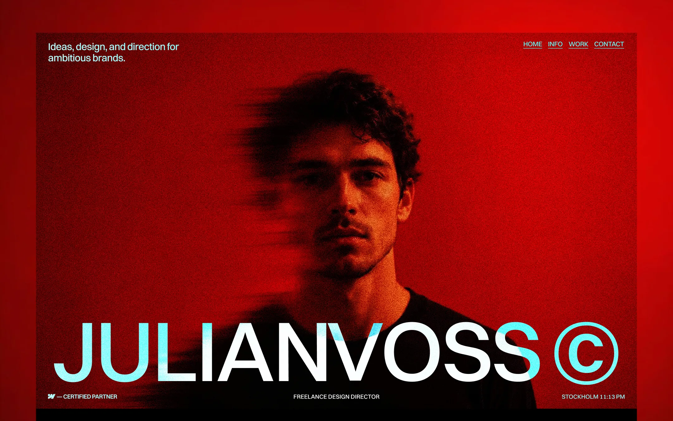
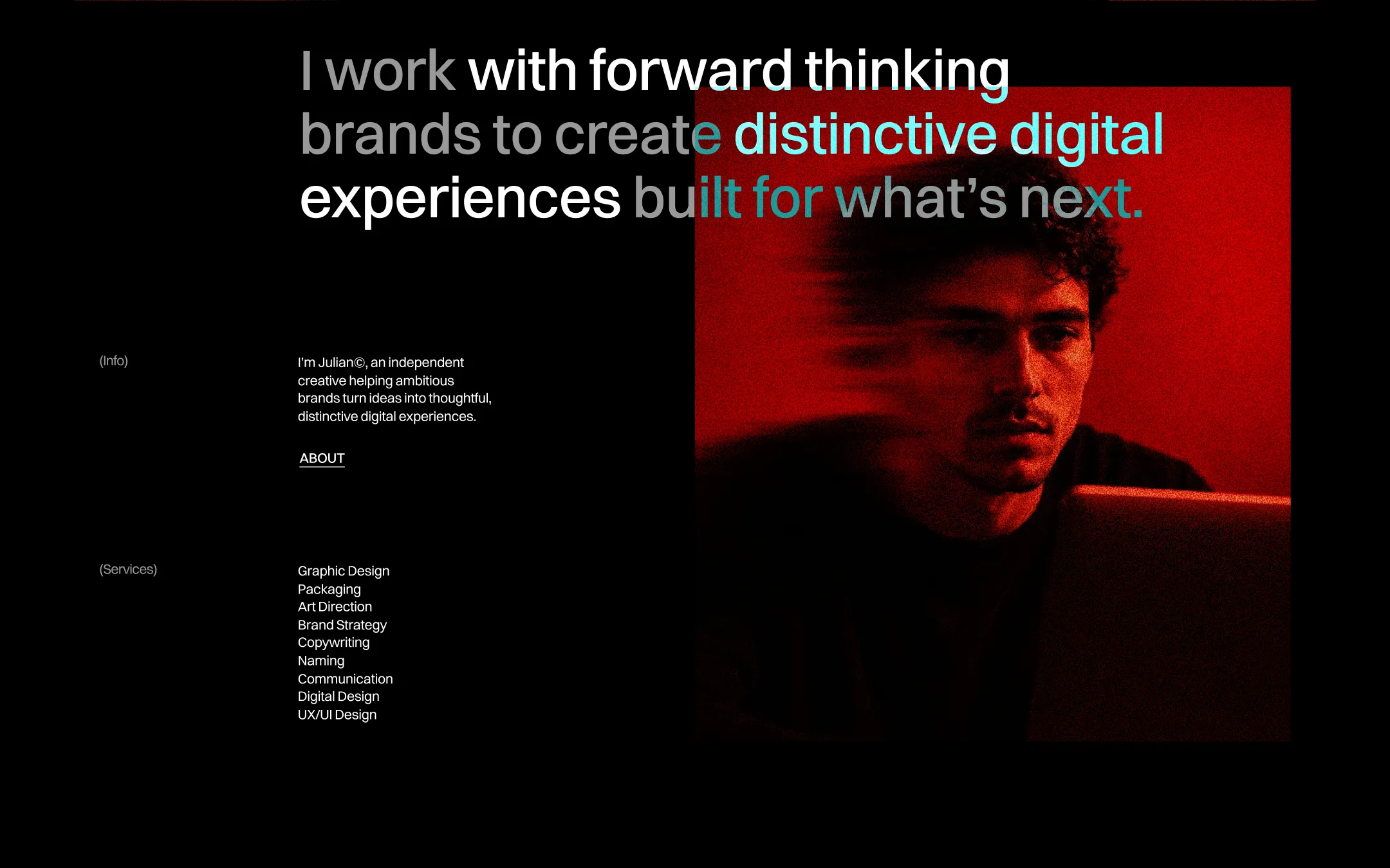
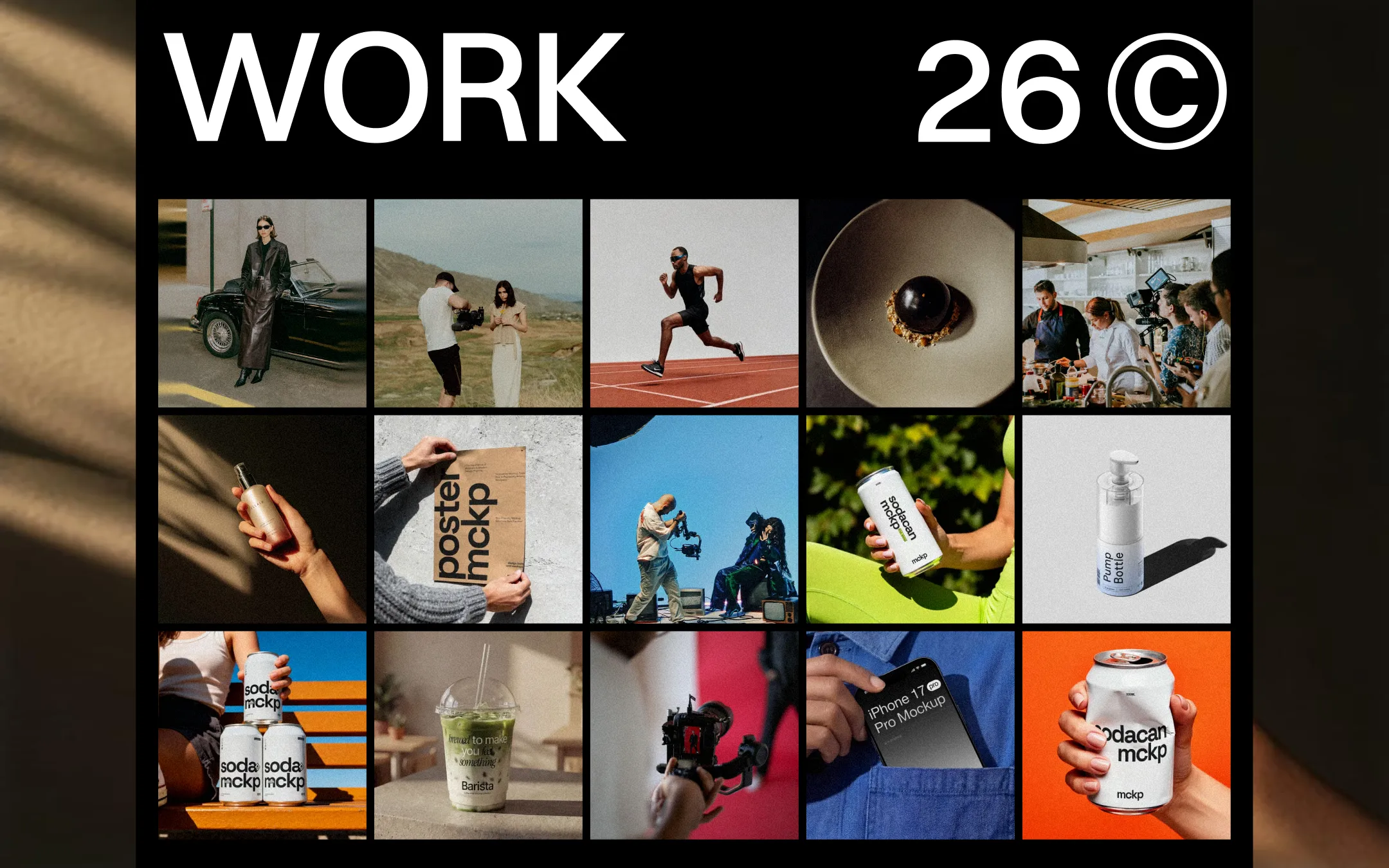
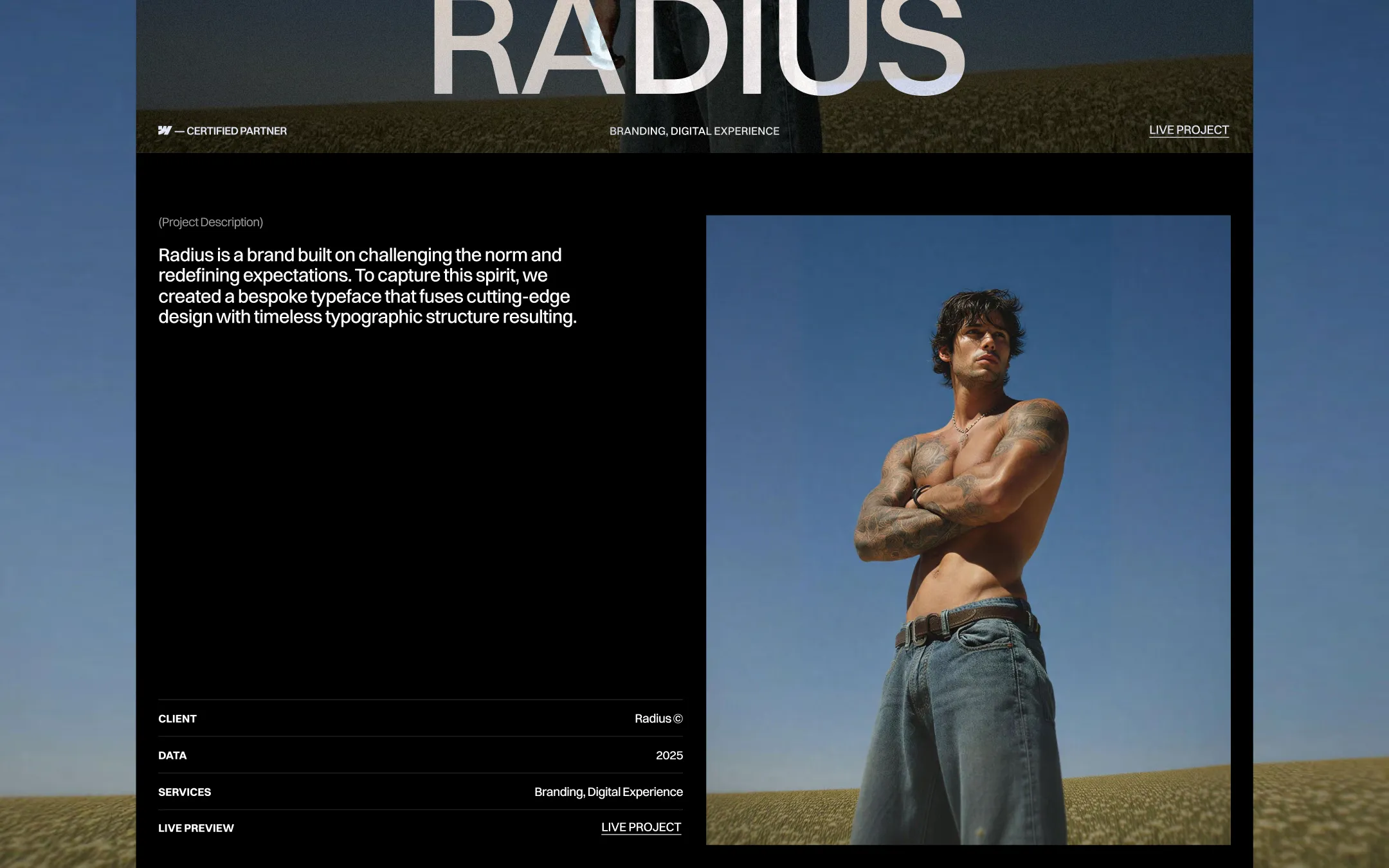
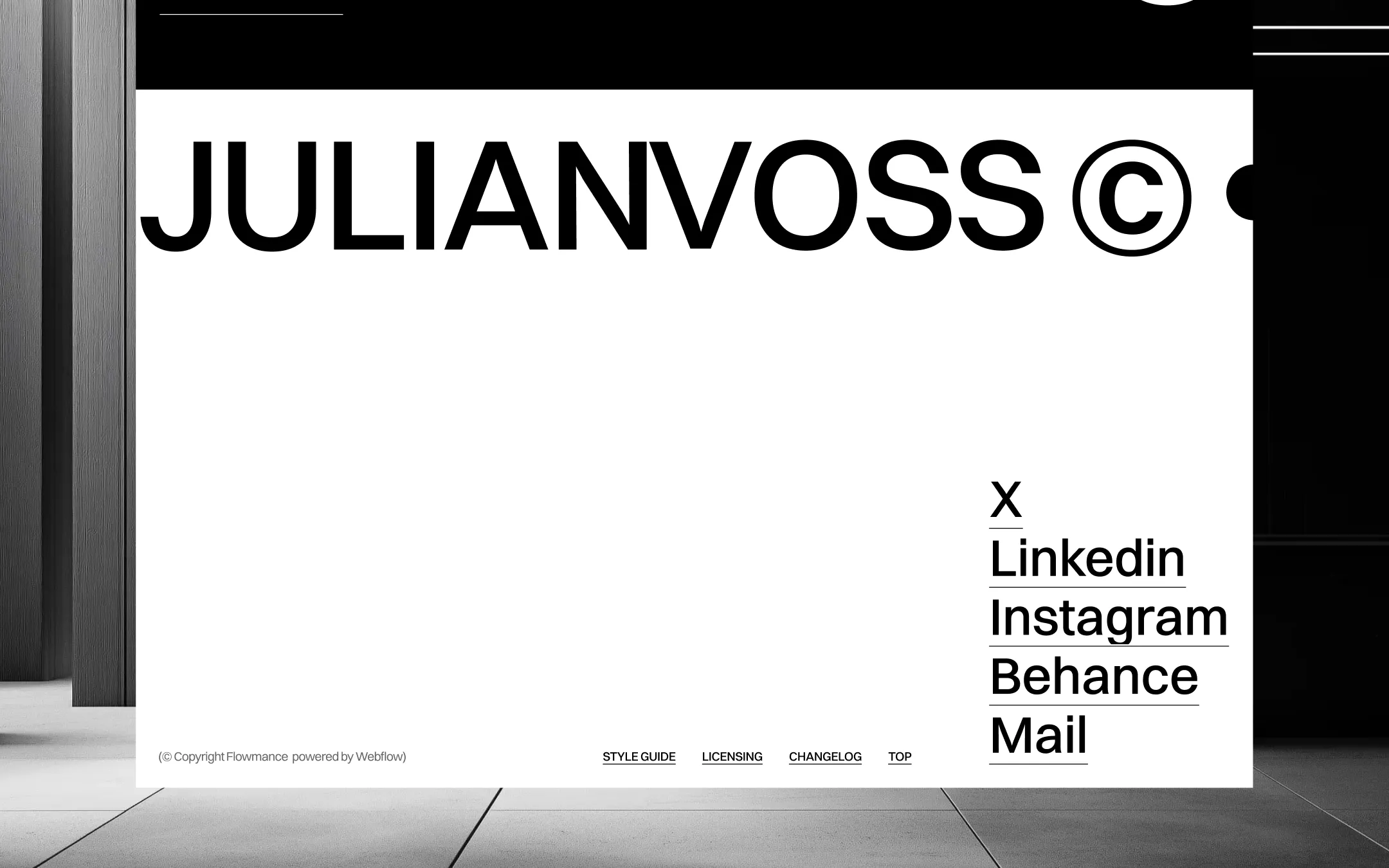
JulianVoss© is a portfolio system built on confrontation rather than persuasion — a single blood-red hero portrait, a massive wordmark, and a terse statement of intent replace the usual scroll of self-justification. Typography does the heavy lifting: an oversized Switzer Variable grotesque is set at gargantuan viewport-relative sizes, tightened with aggressive negative tracking, while a wisp of italic Playfair Display gives the only moment of softness in an otherwise unapologetically graphic system. The palette is a study in tension — near-black ink, stark white, and a glowing cyan accent are all pushed through a saturated red field that functions as both background and mood lighting. Everything else — grids, dividers, tables — stays quiet and structural, letting the imagery and the headline type carry the entire emotional register.
Soft structural surface. Subtle dividers and secondary panel fills in light contexts.
Footer & closing surface. Grounds the final marquee section in a near-white canvas.
Muted secondary text & button fill. Section labels, deemphasized copy, default button background.
Primary ink & deep surface. Base page color, footer background, and body text on light sections.
Translucent overlay ink. Semi-transparent captions and secondary labels over imagery.
Primary inverse ink. Wordmark, headlines, and button text over dark or red surfaces.
Signature accent glow. Emphasis spans in headlines, nav underlines, and the certified-partner mark.
Hero atmosphere & brand signature. Full-bleed portrait background and page-opening mood lighting.
The quick brown fox jumps
Italic accent voice. Reserved for the 'Voss' flourish in the wordmark and rare editorial emphasis.
The quick brown fox jumps
Primary display & body grotesque. Used for the wordmark, navigation, headings, and all body copy.
spacious1600px250px20px20px10px20px30px50px67px120px150px250pxcards10pxbadges7pxbuttons2560pxcontainer10pxnavigation2560pxStep from canvas (level 1) to lifted (level 2) to inset depth (level 3), then invert into the dark levels for full-bleed sections. Hex codes and roles live in the Colors section above; this ladder shows the layering only.
# Design System Guide

> Unlock the template to access the full design system.

## Brand voice

A short paragraph describing the brand voice, mood, and visual
principles that anchor the system. Tone, cadence, and intent.

## Colors

| Token        | Hex      | Role                                  |
| ------------ | -------- | ------------------------------------- |
| canvas-1     | #xxxxxx  | Page background, large surfaces       |
| canvas-2     | #xxxxxx  | Lifted surfaces, cards                |
| canvas-3     | #xxxxxx  | Inset wells, depressed states         |
| ink-1        | #xxxxxx  | Primary body text                     |
| ink-2        | #xxxxxx  | Secondary text, labels                |
| ink-3        | #xxxxxx  | Tertiary text, hints                  |
| accent-1     | #xxxxxx  | Primary brand accent                  |
| accent-2     | #xxxxxx  | Secondary accent                      |
| state-ok     | #xxxxxx  | Success, confirmations                |
| state-warn   | #xxxxxx  | Warnings                              |
| state-err    | #xxxxxx  | Errors, destructive actions           |

## Typography

- **Display** — heading scale, used for hero text and section titles.
- **Body** — primary reading text, optimized for paragraphs.
- **Mono** — code, data, and tabular numerals.

```
display: 32px / 40px / 48px / 64px / 80px
body:    14px / 16px / 18px
mono:    12px / 14px
```

## Spacing & shape

Base unit: 4px. Scale: 4, 8, 12, 16, 24, 32, 48, 64, 96, 128.
Radii: sm (4px), md (8px), lg (12px), xl (20px), full (9999px).

## Surfaces

Layered elevation from canvas → lifted → inset. Surfaces invert in
dark sections for full-bleed contrast.

## Do's and don'ts

- Do use accent-1 sparingly for primary CTAs only.
- Do maintain at least 4.5:1 contrast on body text.
- Don't mix display and body in the same line.
- Don't use state colors for branding.

## Agent prompt guide

Prompts for AI design tools that respect this system.
Includes example prompts for sections, components, and layouts.

# ...
Unlock the full style guide