Design systems, extracted.
Paste any URL to create a design system from it. Open any style for colors, type, spacing, components, and a DESIGN.md or tokens.json your agent can use.
Quickly navigate through the dashboard with your keyboard using the command menu.
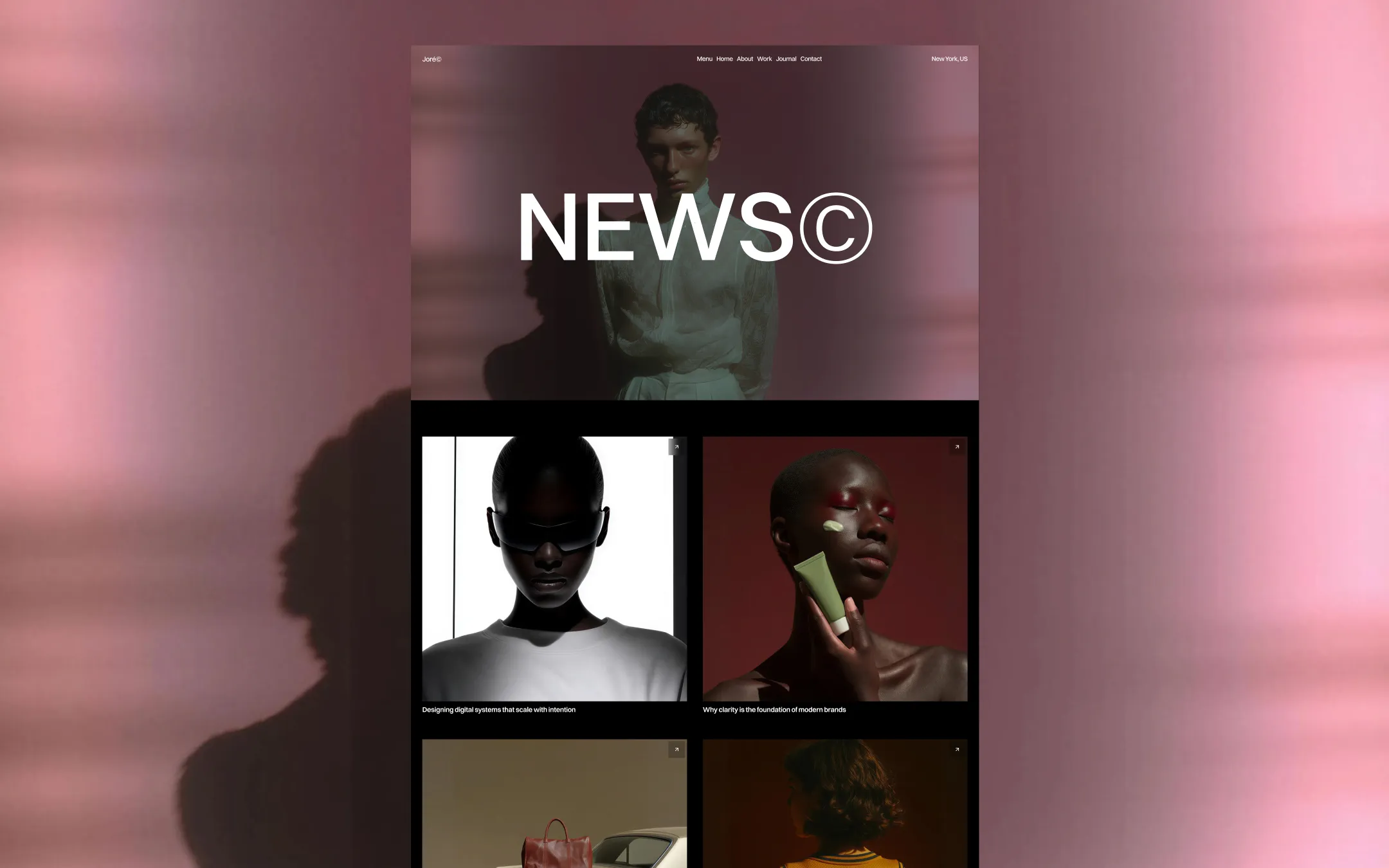
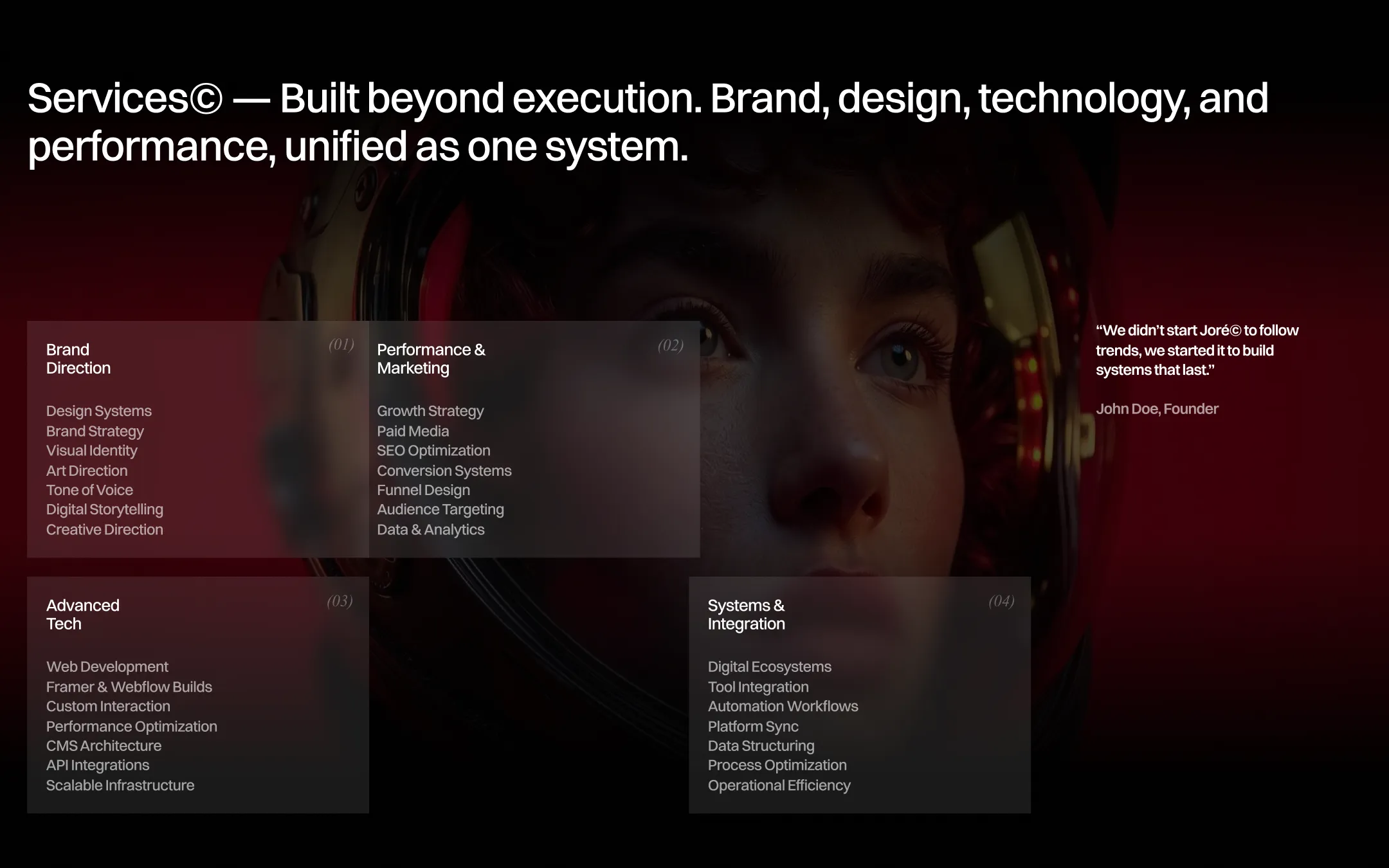

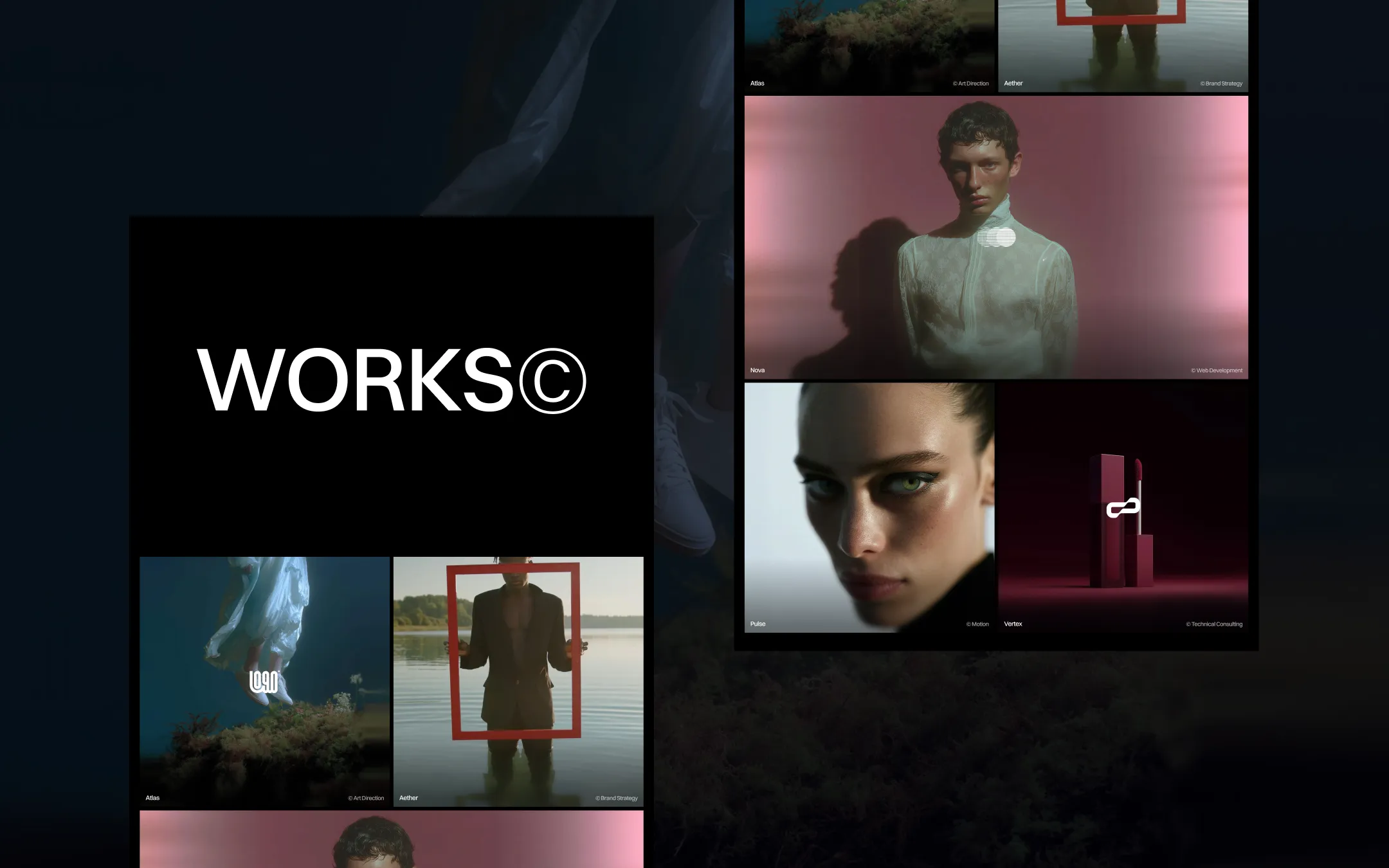
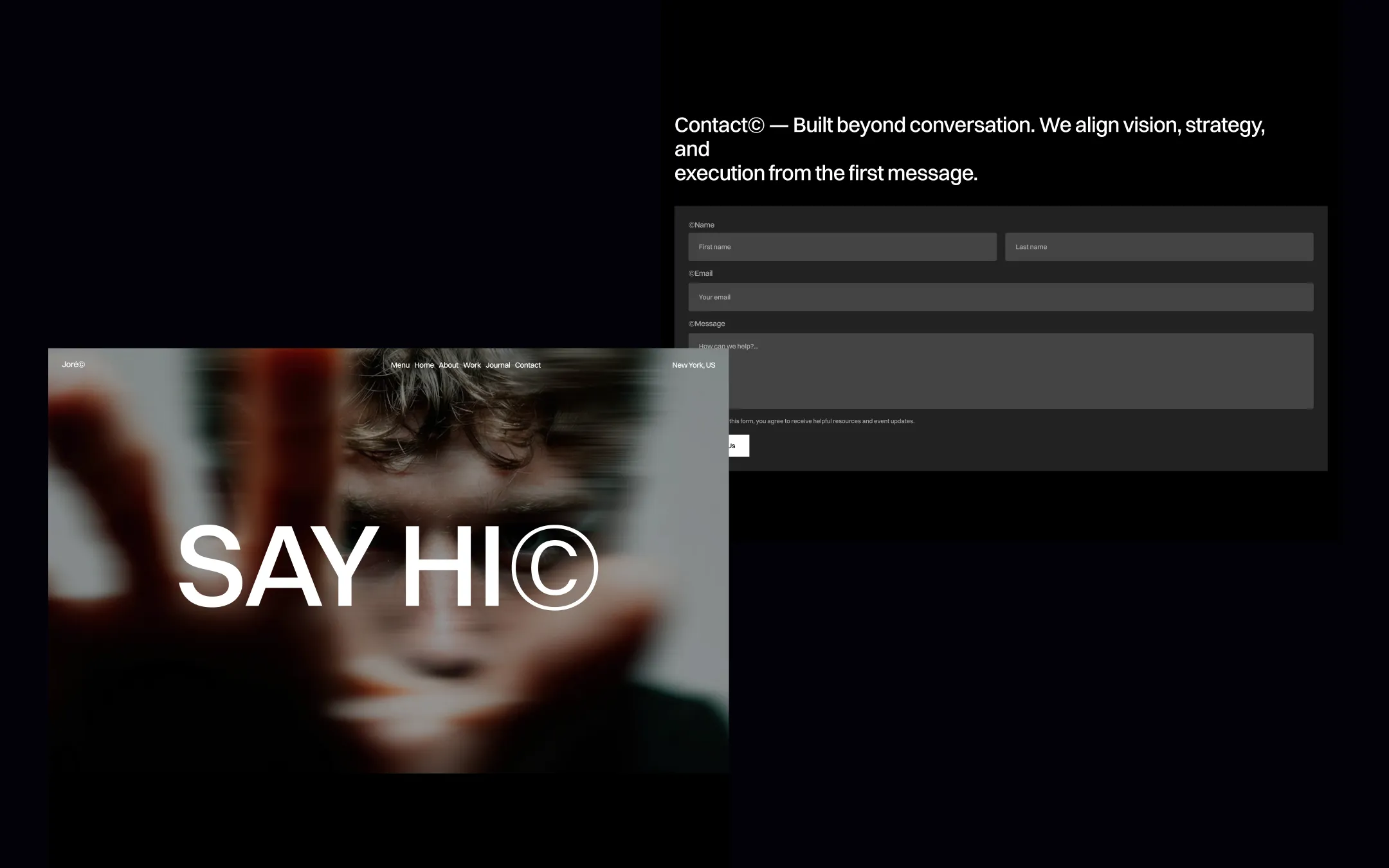
Joré© is a cinematic agency template built almost entirely in black, where every scroll feels like a scene change rather than a page transition. An oversized headline system — topping out near 248px — anchors each view, flanked by autoplay video thumbnails, parallax portraits, and a ©-stamped heading convention that gives every section the air of proprietary studio IP. The palette stays disciplined: true black voids, stark white type, a single blood-red signature accent, and glassy near-transparent overlays that blur beneath floating UI chrome. Typographically the system pairs a clean variable grotesk for structure with an uppercase monospace for eyebrow labels and a condensed italic serif for quoted, editorial, or tooltip moments — three distinct voices used sparingly and deliberately. Spacing is spacious and architectural, with 250px section rhythms and generous dividers, while buttons and circular controls use a consistent pill/circle radius language. The result reads like a creative house that owns its process: confident, monochrome, and unapologetically large.
Card & form surface. Backing for pricing links, field inputs, and glass-blur service cards.
Primary canvas & darkest surface. Base body background for every section, creating the cinematic void the photography explodes against.
Secondary section surface. Lifts alternating sections like the team/awards blocks off the pure-black base.
Footer & inverted surface. Used where the palette flips to light for the footer block and inverted logos/icons.
Primary text & ink. Headlines, nav labels, button fills, and the dominant ink against the black void.
Glass overlay tint. The translucent backdrop-blur fill behind floating nav and modal chrome.
Borders & dividers. Thin hairlines around cards, inputs, and dashed award-list separators.
Brand signature accent. Reserved for the single saturated highlight across link states and badge accents.
The quick brown fox jumps
Uppercase eyebrow labels and oversized section numerals
The quick brown fox jumps
Primary grotesk for headlines, body copy, nav, and buttons
The quick brown fox jumps
Italic condensed serif for tooltip cursors, quoted service numerals, and editorial asides
spacious1400px250px20px16px10px20px30px50px60px120px250pxcards8pxfields4pxbuttons35pxcontainer10pxbuttons-circle160pxStep from canvas (level 1) to lifted (level 2) to inset depth (level 3), then invert into the dark levels for full-bleed sections. Hex codes and roles live in the Colors section above; this ladder shows the layering only.
# Design System Guide

> Unlock the template to access the full design system.

## Brand voice

A short paragraph describing the brand voice, mood, and visual
principles that anchor the system. Tone, cadence, and intent.

## Colors

| Token        | Hex      | Role                                  |
| ------------ | -------- | ------------------------------------- |
| canvas-1     | #xxxxxx  | Page background, large surfaces       |
| canvas-2     | #xxxxxx  | Lifted surfaces, cards                |
| canvas-3     | #xxxxxx  | Inset wells, depressed states         |
| ink-1        | #xxxxxx  | Primary body text                     |
| ink-2        | #xxxxxx  | Secondary text, labels                |
| ink-3        | #xxxxxx  | Tertiary text, hints                  |
| accent-1     | #xxxxxx  | Primary brand accent                  |
| accent-2     | #xxxxxx  | Secondary accent                      |
| state-ok     | #xxxxxx  | Success, confirmations                |
| state-warn   | #xxxxxx  | Warnings                              |
| state-err    | #xxxxxx  | Errors, destructive actions           |

## Typography

- **Display** — heading scale, used for hero text and section titles.
- **Body** — primary reading text, optimized for paragraphs.
- **Mono** — code, data, and tabular numerals.

```
display: 32px / 40px / 48px / 64px / 80px
body:    14px / 16px / 18px
mono:    12px / 14px
```

## Spacing & shape

Base unit: 4px. Scale: 4, 8, 12, 16, 24, 32, 48, 64, 96, 128.
Radii: sm (4px), md (8px), lg (12px), xl (20px), full (9999px).

## Surfaces

Layered elevation from canvas → lifted → inset. Surfaces invert in
dark sections for full-bleed contrast.

## Do's and don'ts

- Do use accent-1 sparingly for primary CTAs only.
- Do maintain at least 4.5:1 contrast on body text.
- Don't mix display and body in the same line.
- Don't use state colors for branding.

## Agent prompt guide

Prompts for AI design tools that respect this system.
Includes example prompts for sections, components, and layouts.

# ...
Unlock the full style guide