Design systems, extracted.
Search curated design systems pulled from premium templates or create one from URL. Open any style for colors, type, spacing, components, and a DESIGN.md or tokens.json your agent can use.
Quickly navigate through the dashboard with your keyboard using the command menu.

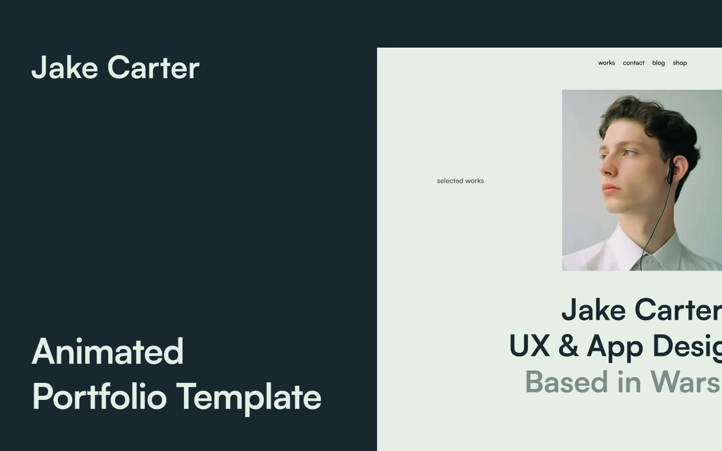
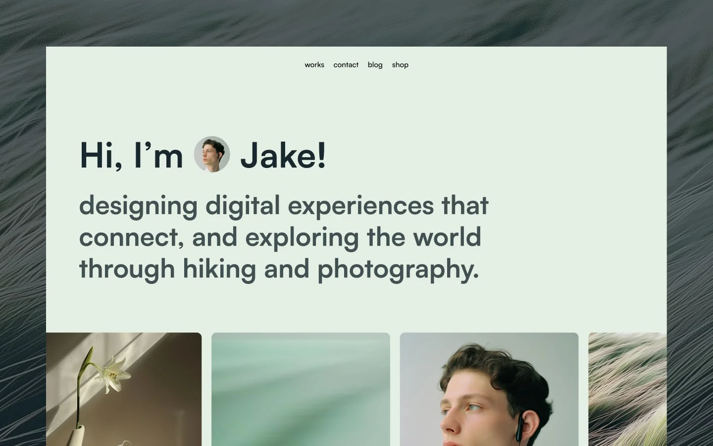
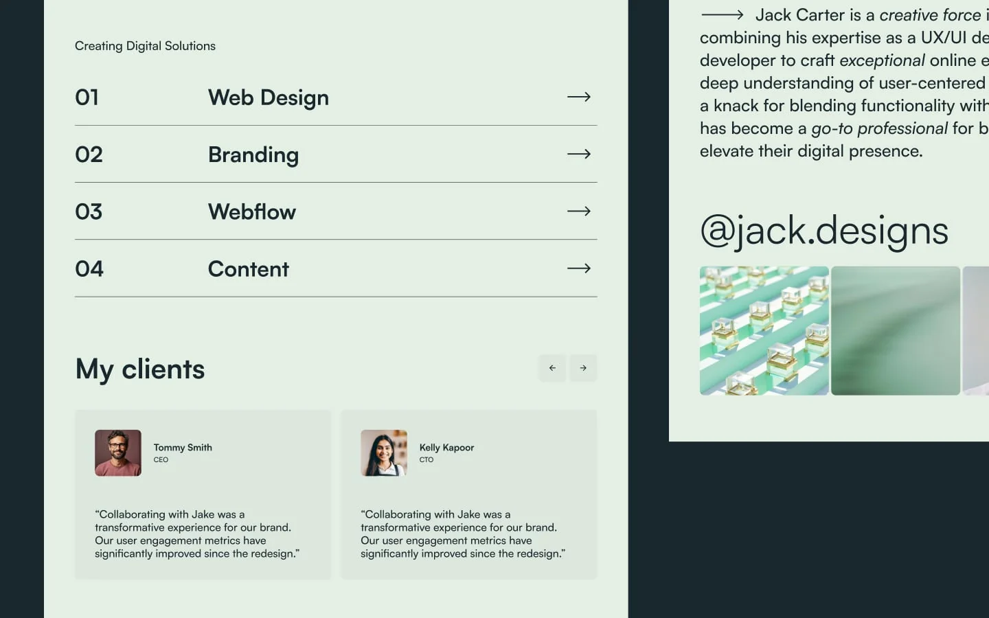
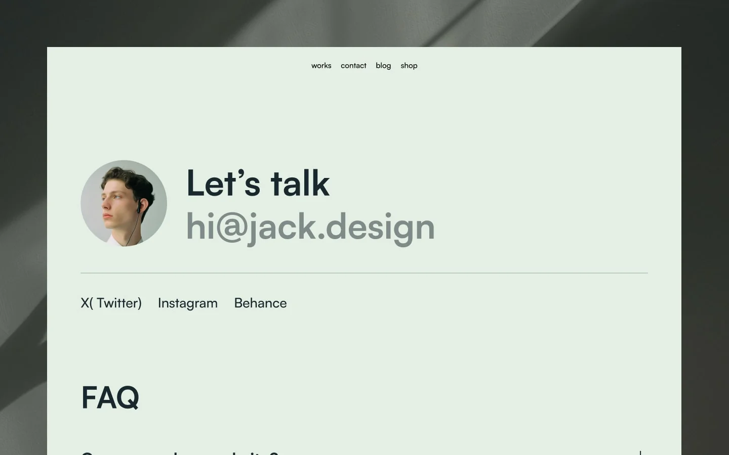
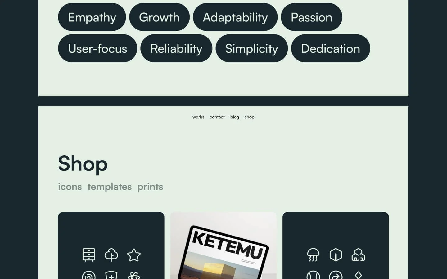
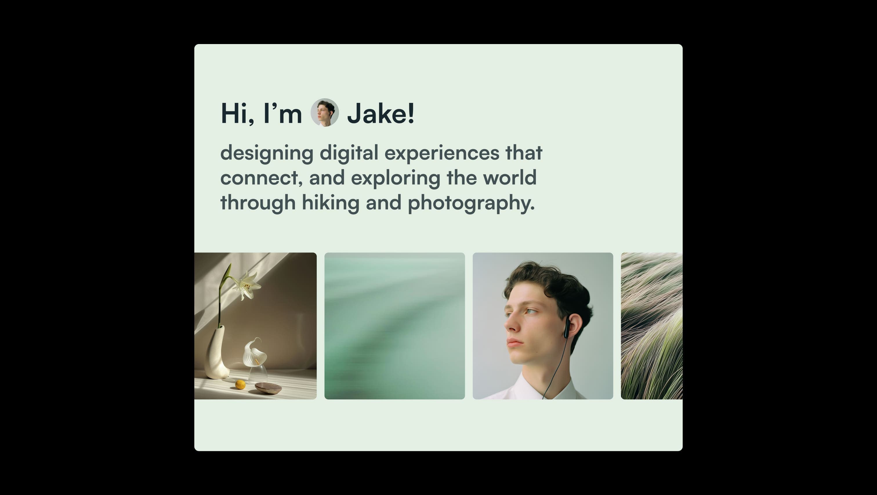
Jake Carter is a freelance creative's portfolio steeped in a soft sage stillness — a pale eucalyptus canvas paired with deep slate-teal ink, where typography does the heavy lifting and imagery breathes between generous gutters. The mood is contemplative and confident: a designer's notebook left open in a bright minimalist studio. Every surface tilts toward calm. Pill-shaped buttons and gently rounded tiles avoid hard geometry, while oversized sans-serif headlines slide into view with restrained motion. The single grey accent — used for fading-out lines, secondary captions, and subdued italicized prose — keeps the page anchored without disturbing its quiet.
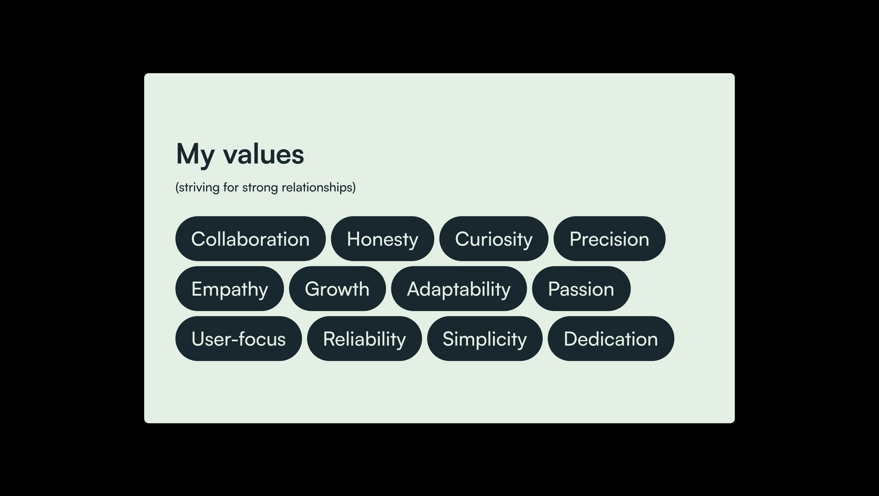
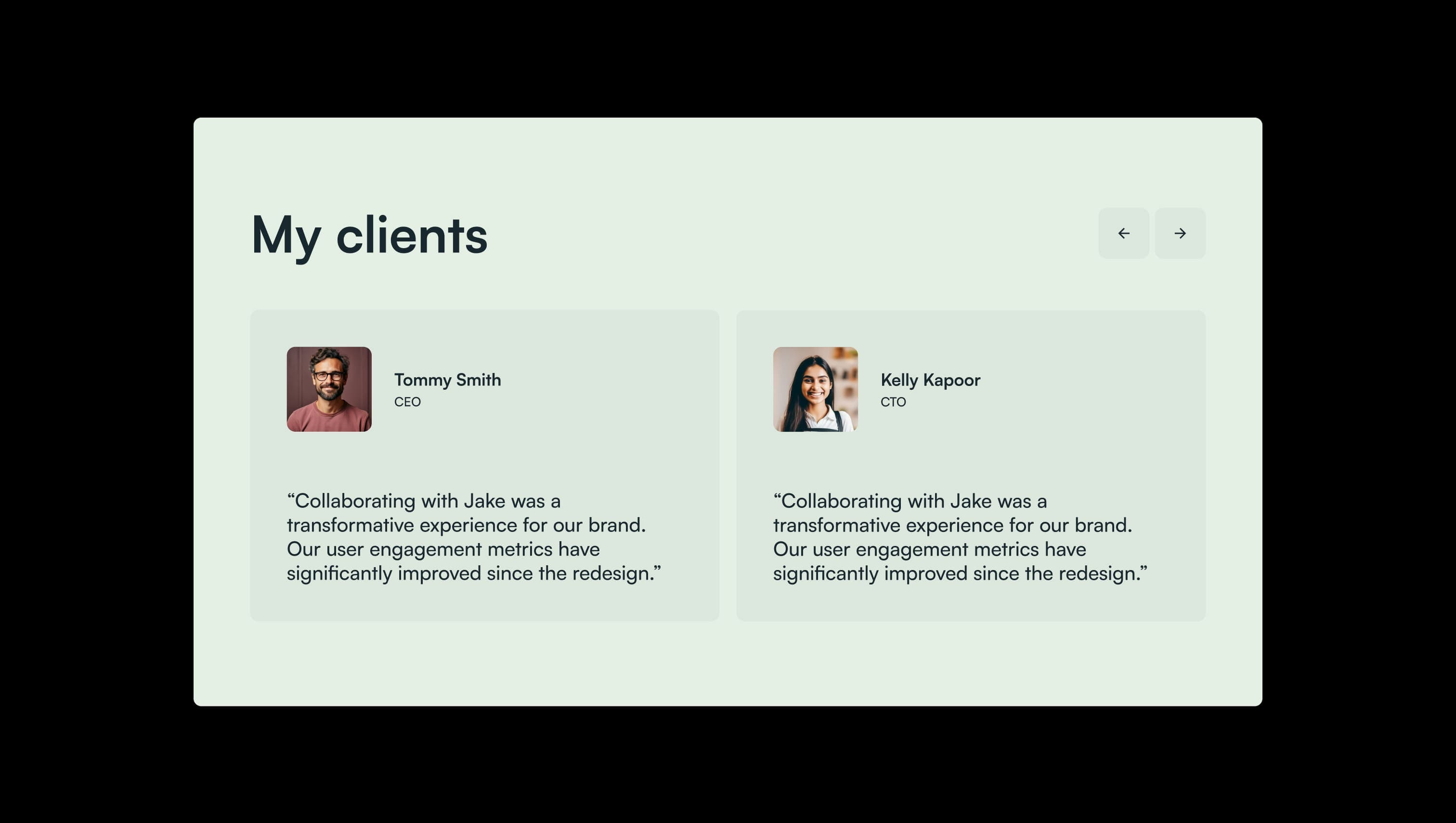
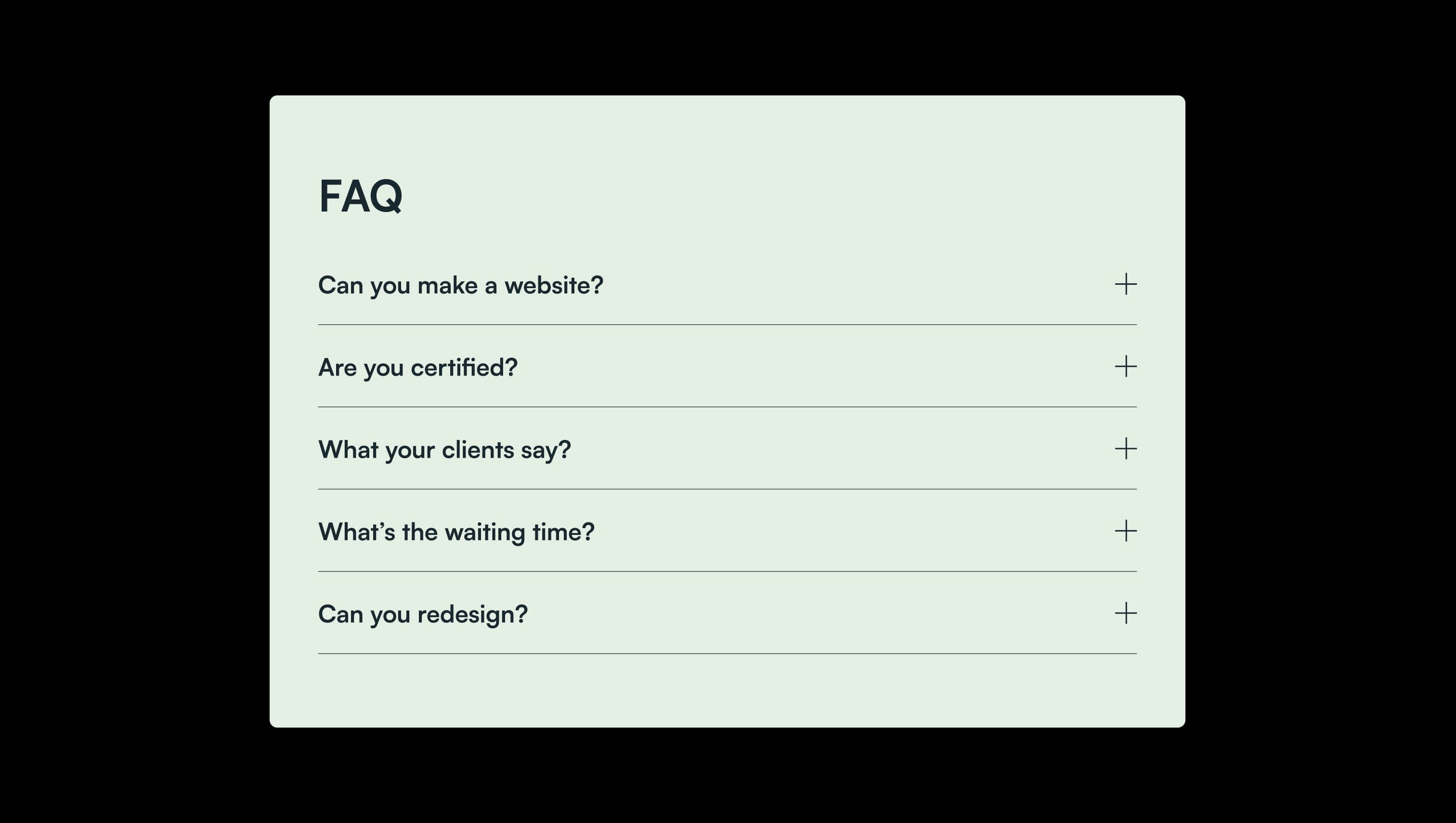
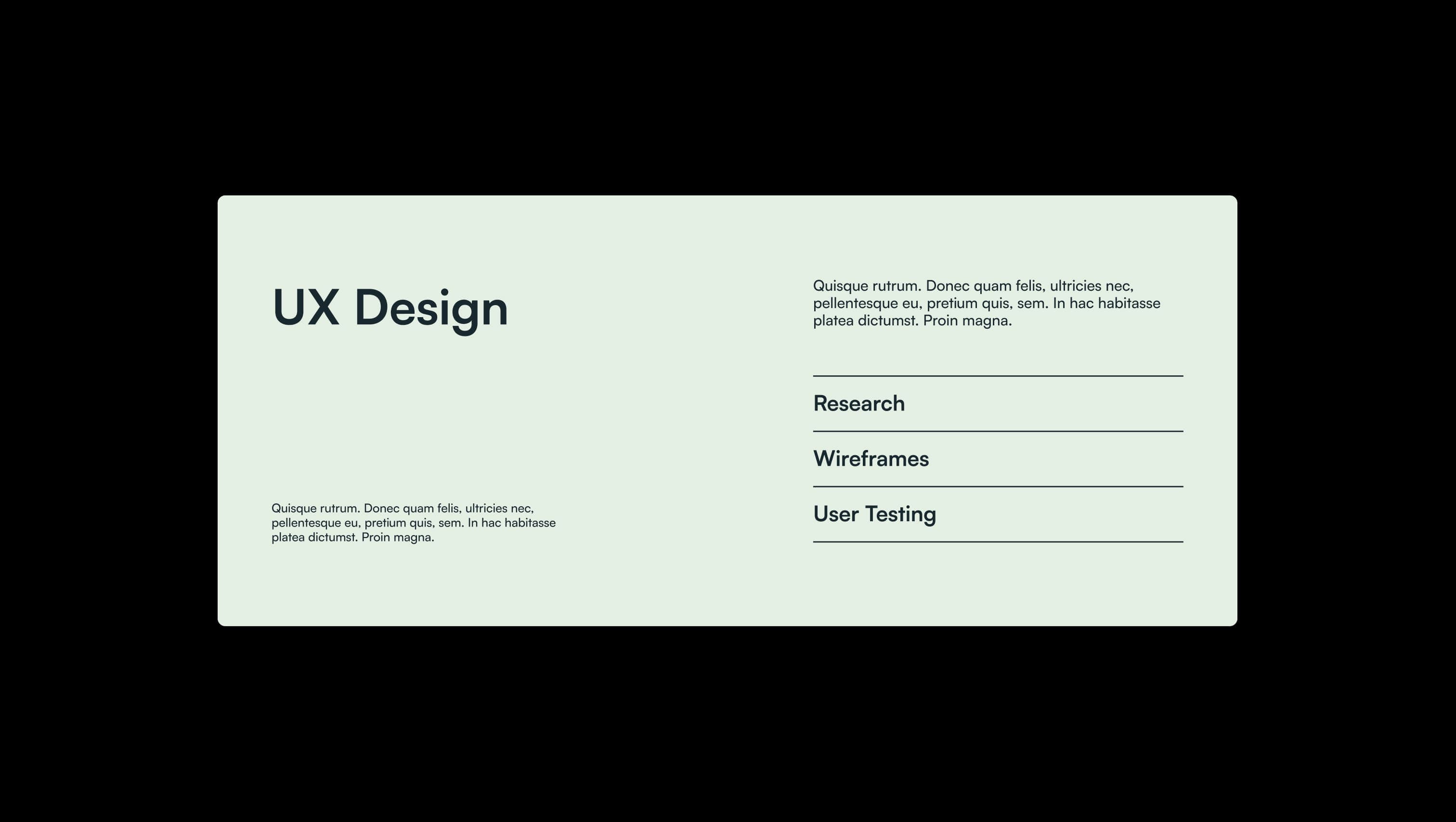
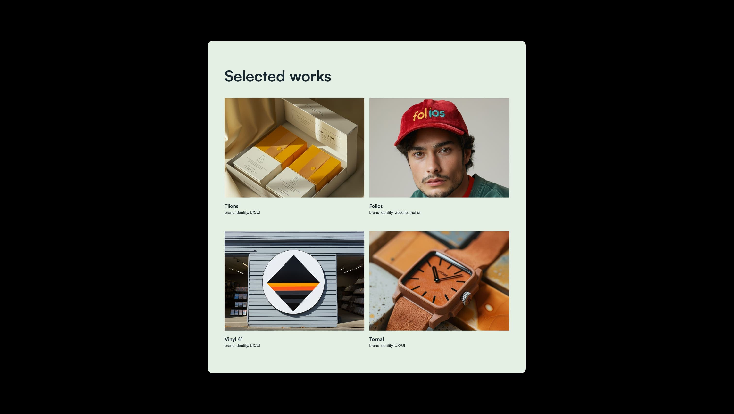
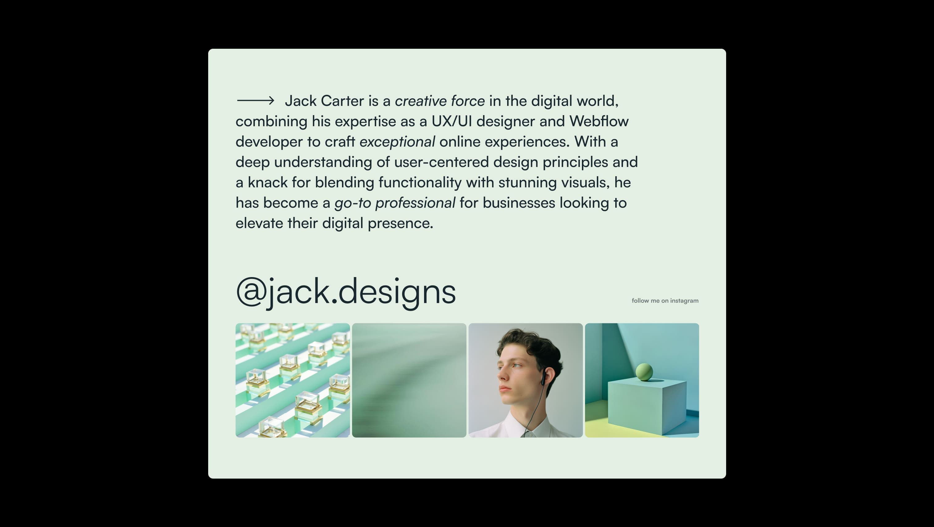
A handful of real sections that ship with this template. Click any card to preview, or explore them all under the Sections tab.
Primary canvas. Page background and footer text — the defining pale-eucalyptus surface that sets the calm tone.
Lifted surface. Testimonial cards, cart container, checkout fields, and small chrome elements that need to sit just above the canvas.
Footer fineprint. 60% opacity Sage Mist used over Midnight Pine for legal text and divider lines.
Primary ink. Headlines, body copy, dark CTA fills, footer background, and form borders.
Hover ink. Lifted state for the dark pill CTA — a single shade lighter than Midnight Pine.
Soft ink. 80% opacity Midnight Pine for subtitles and secondary headings that need to recede.
Faded accent. Italicized phrases, fade-out heading lines, and quiet supporting metadata.
Interactive hover. Slightly cooler tint used on slider arrow hover states above the elevated surface.
The quick brown fox jumps
Single workhorse family for the entire site — display, headings, body, navigation, and UI labels.
spacious1600px100px52px24px4px8px12px16px24px32px48px52px64px76px80px100px120pxtags80pxcards12pxavatar120pxbuttons70pxhairline4pxpill-field60pxpill-input50pxStep from canvas (level 1) to lifted (level 2) to inset depth (level 3), then invert into the dark levels for full-bleed sections. Hex codes and roles live in the Colors section above; this ladder shows the layering only.
# Design System Guide

> Unlock the template to access the full design system.

## Brand voice

A short paragraph describing the brand voice, mood, and visual
principles that anchor the system. Tone, cadence, and intent.

## Colors

| Token        | Hex      | Role                                  |
| ------------ | -------- | ------------------------------------- |
| canvas-1     | #xxxxxx  | Page background, large surfaces       |
| canvas-2     | #xxxxxx  | Lifted surfaces, cards                |
| canvas-3     | #xxxxxx  | Inset wells, depressed states         |
| ink-1        | #xxxxxx  | Primary body text                     |
| ink-2        | #xxxxxx  | Secondary text, labels                |
| ink-3        | #xxxxxx  | Tertiary text, hints                  |
| accent-1     | #xxxxxx  | Primary brand accent                  |
| accent-2     | #xxxxxx  | Secondary accent                      |
| state-ok     | #xxxxxx  | Success, confirmations                |
| state-warn   | #xxxxxx  | Warnings                              |
| state-err    | #xxxxxx  | Errors, destructive actions           |

## Typography

- **Display** — heading scale, used for hero text and section titles.
- **Body** — primary reading text, optimized for paragraphs.
- **Mono** — code, data, and tabular numerals.

```
display: 32px / 40px / 48px / 64px / 80px
body:    14px / 16px / 18px
mono:    12px / 14px
```

## Spacing & shape

Base unit: 4px. Scale: 4, 8, 12, 16, 24, 32, 48, 64, 96, 128.
Radii: sm (4px), md (8px), lg (12px), xl (20px), full (9999px).

## Surfaces

Layered elevation from canvas → lifted → inset. Surfaces invert in
dark sections for full-bleed contrast.

## Do's and don'ts

- Do use accent-1 sparingly for primary CTAs only.
- Do maintain at least 4.5:1 contrast on body text.
- Don't mix display and body in the same line.
- Don't use state colors for branding.

## Agent prompt guide

Prompts for AI design tools that respect this system.
Includes example prompts for sections, components, and layouts.

# ...
Unlock the full style guide