Design systems, extracted.
Paste any URL to create a design system from it. Open any style for colors, type, spacing, components, and a DESIGN.md or tokens.json your agent can use.
Quickly navigate through the dashboard with your keyboard using the command menu.

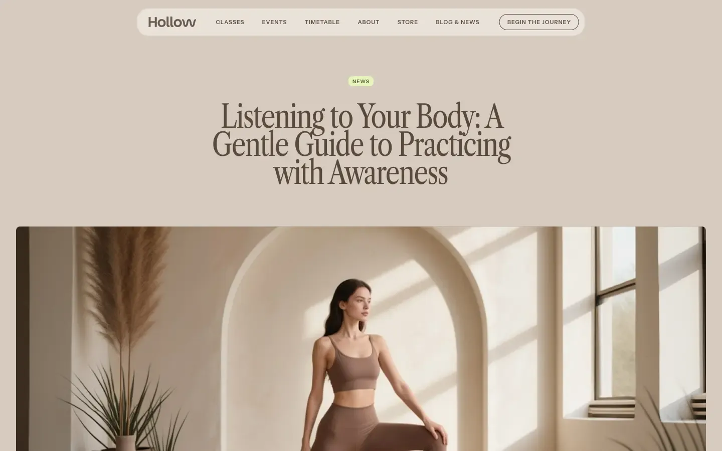
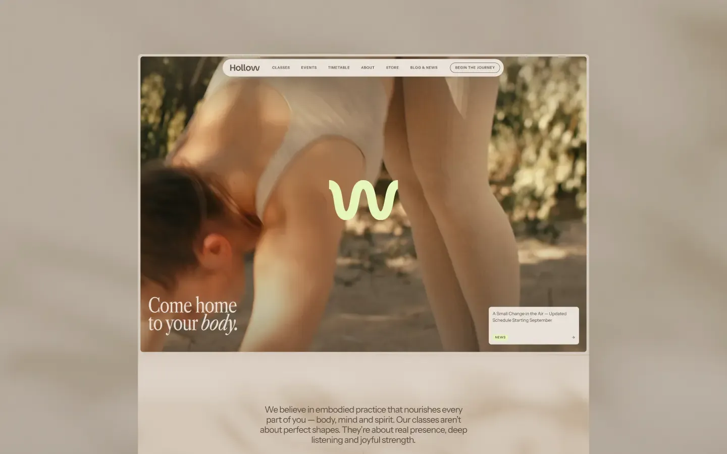
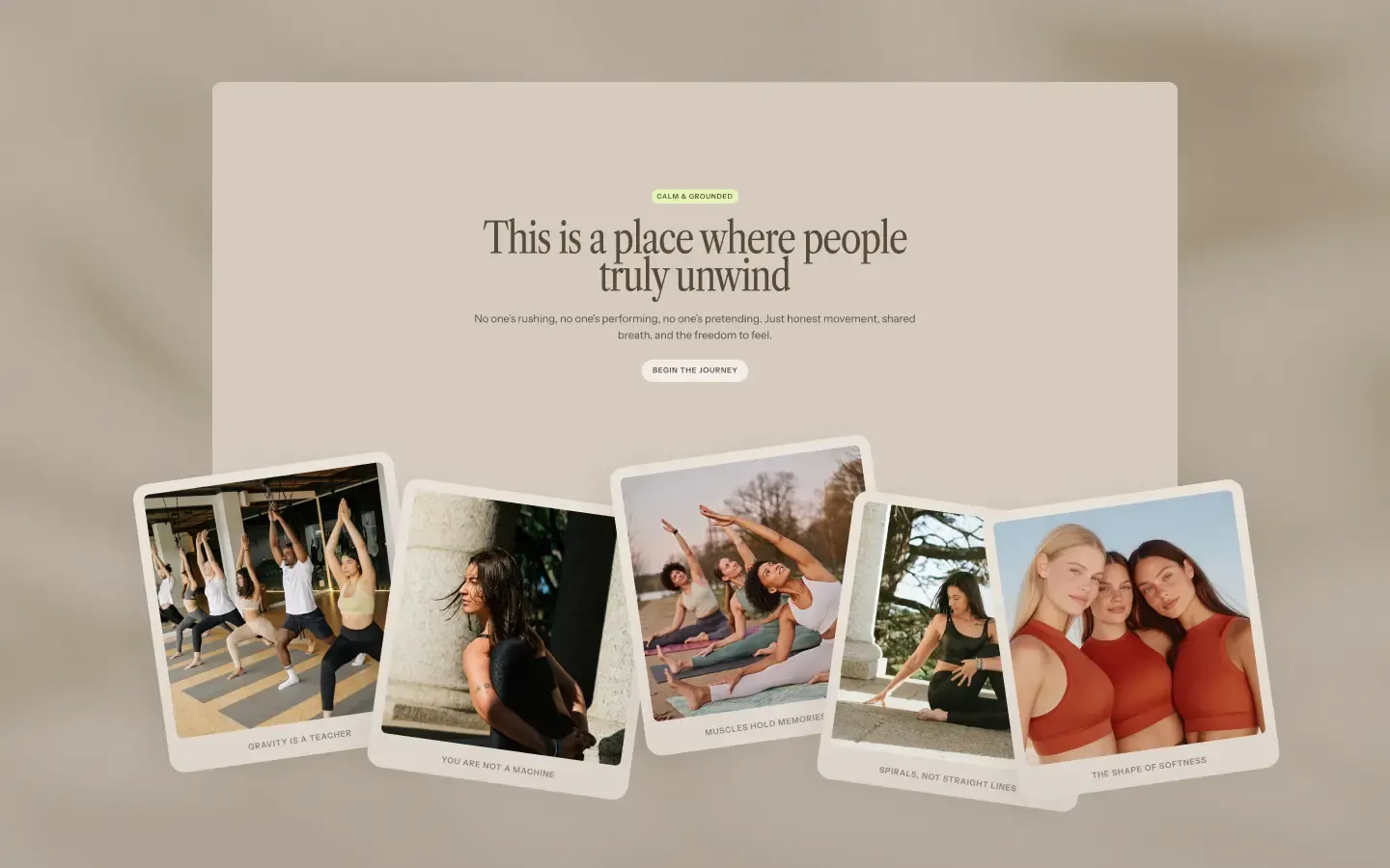
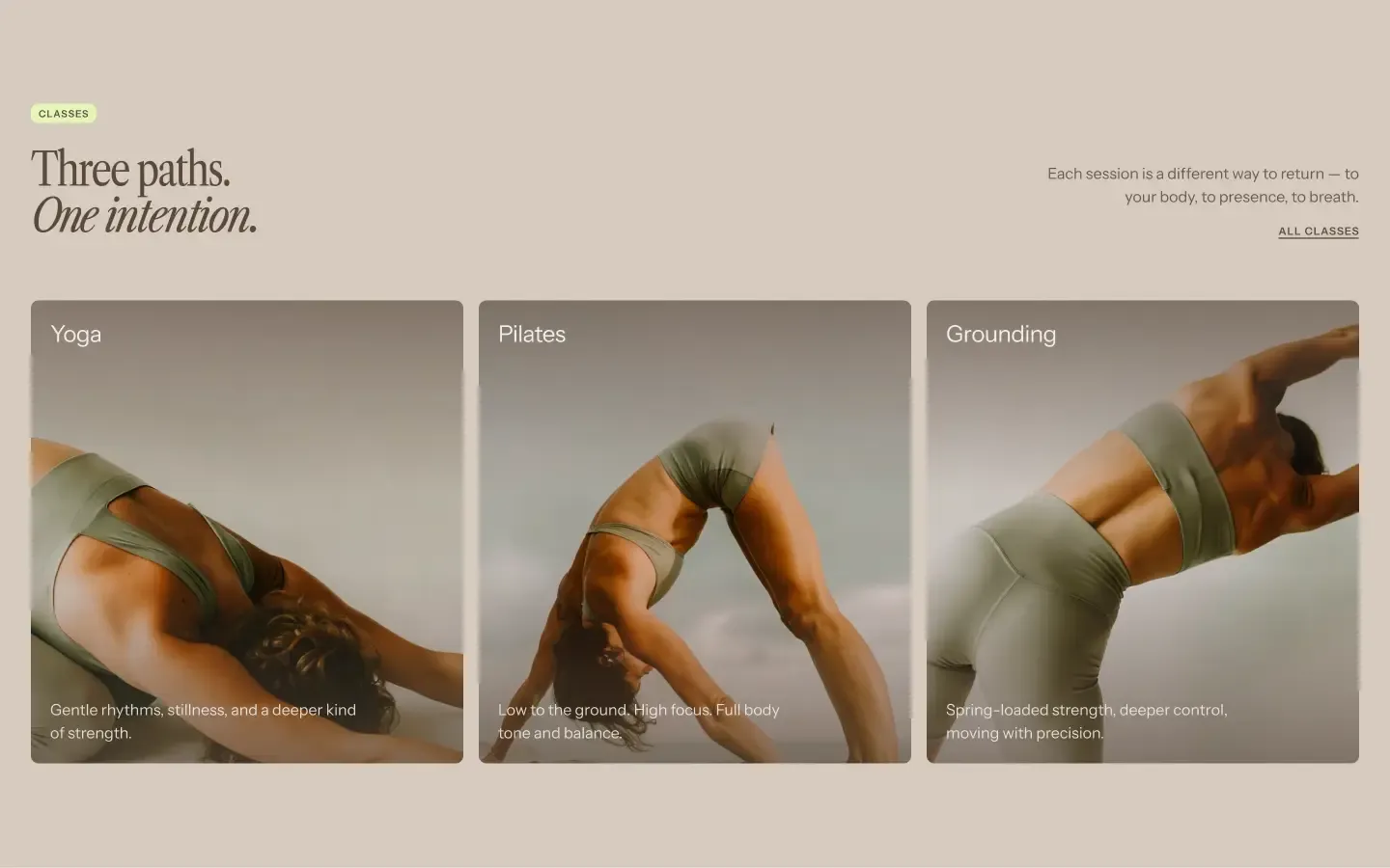
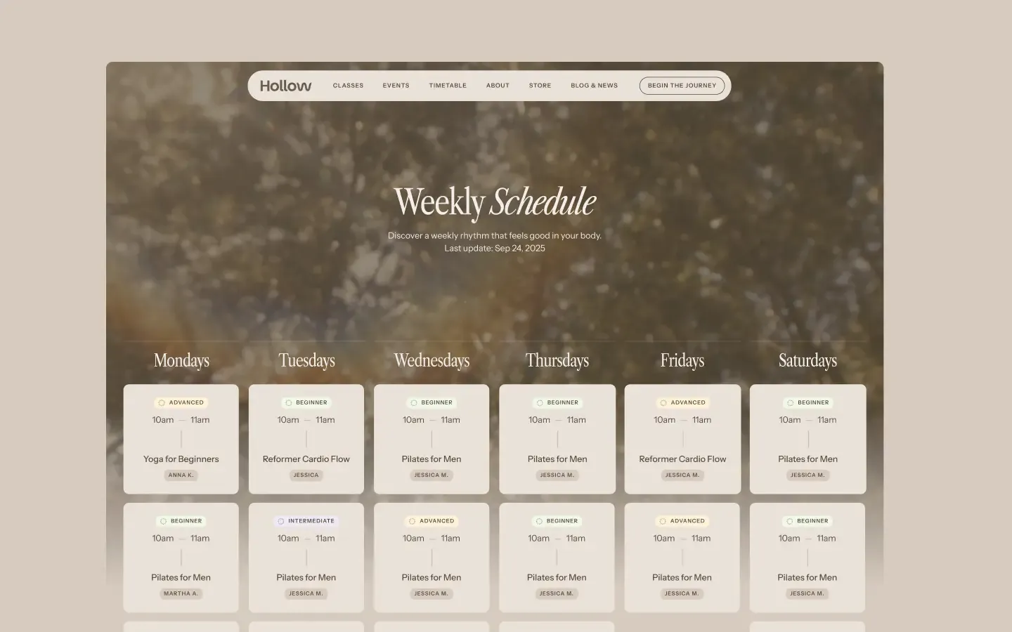
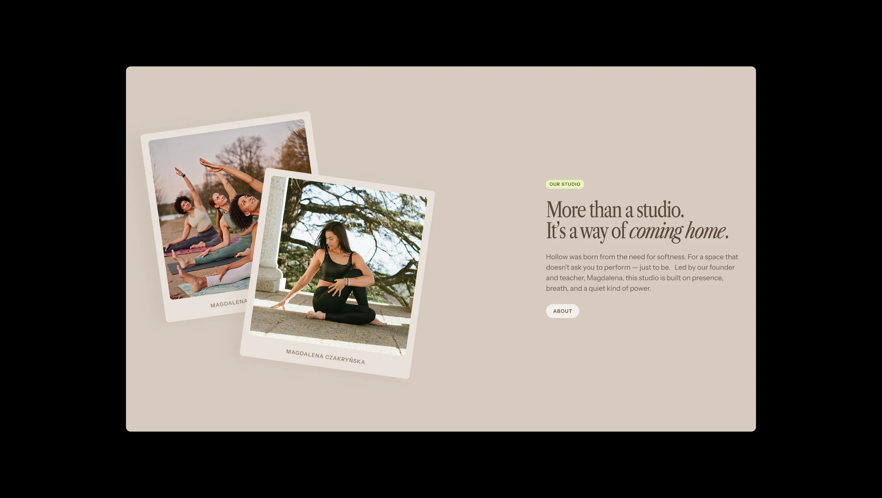
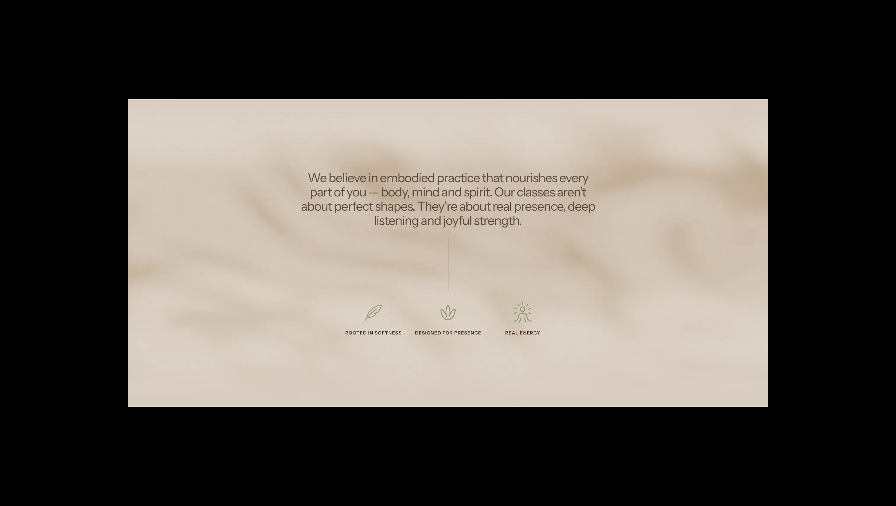
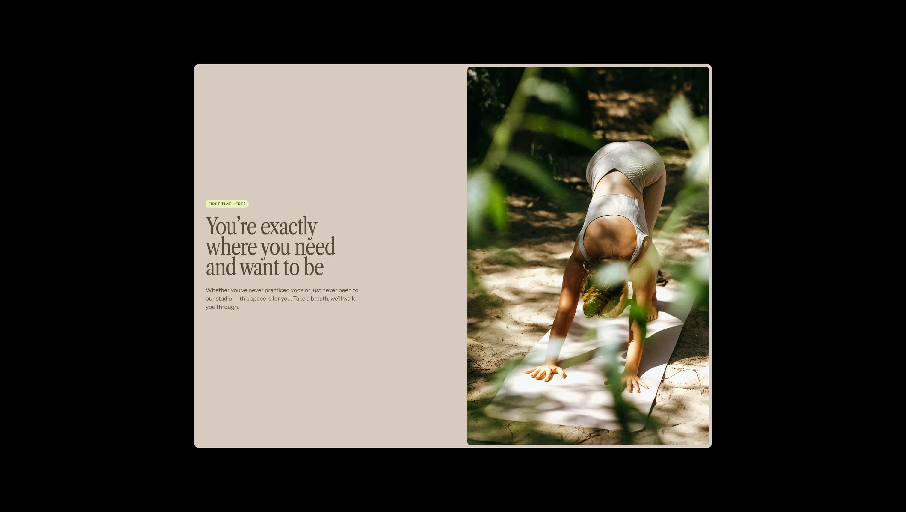
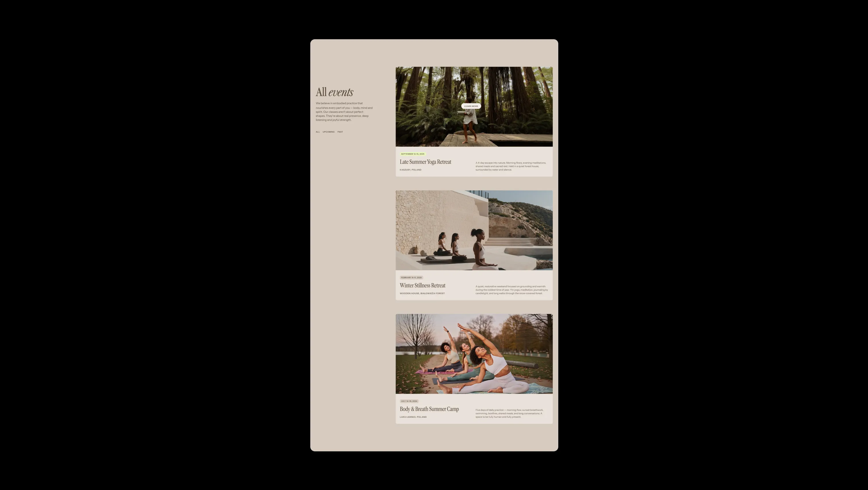
Hollow is a wellness sanctuary rendered in soft, sun-warmed neutrals — a palette of moon dust, lotus milk, and warm sand that feels like late afternoon light through linen curtains. The brand pairs a delicate condensed serif (Libre Caslon) with a humanist sans (Instrument Sans) to balance contemplative ritual with modern clarity. Italic flourishes inside headlines and a single luminous solar-core green accent give the system a quiet but unmistakable signature. The layout breathes: oversized section padding, pill-shaped capsules, soft polaroid cards rotated at gentle angles, and looping ambient video treated with low-opacity color burn. Nothing shouts; everything invites. This is a design language built for slow scrolling, deep exhales, and the feeling of being unhurried.
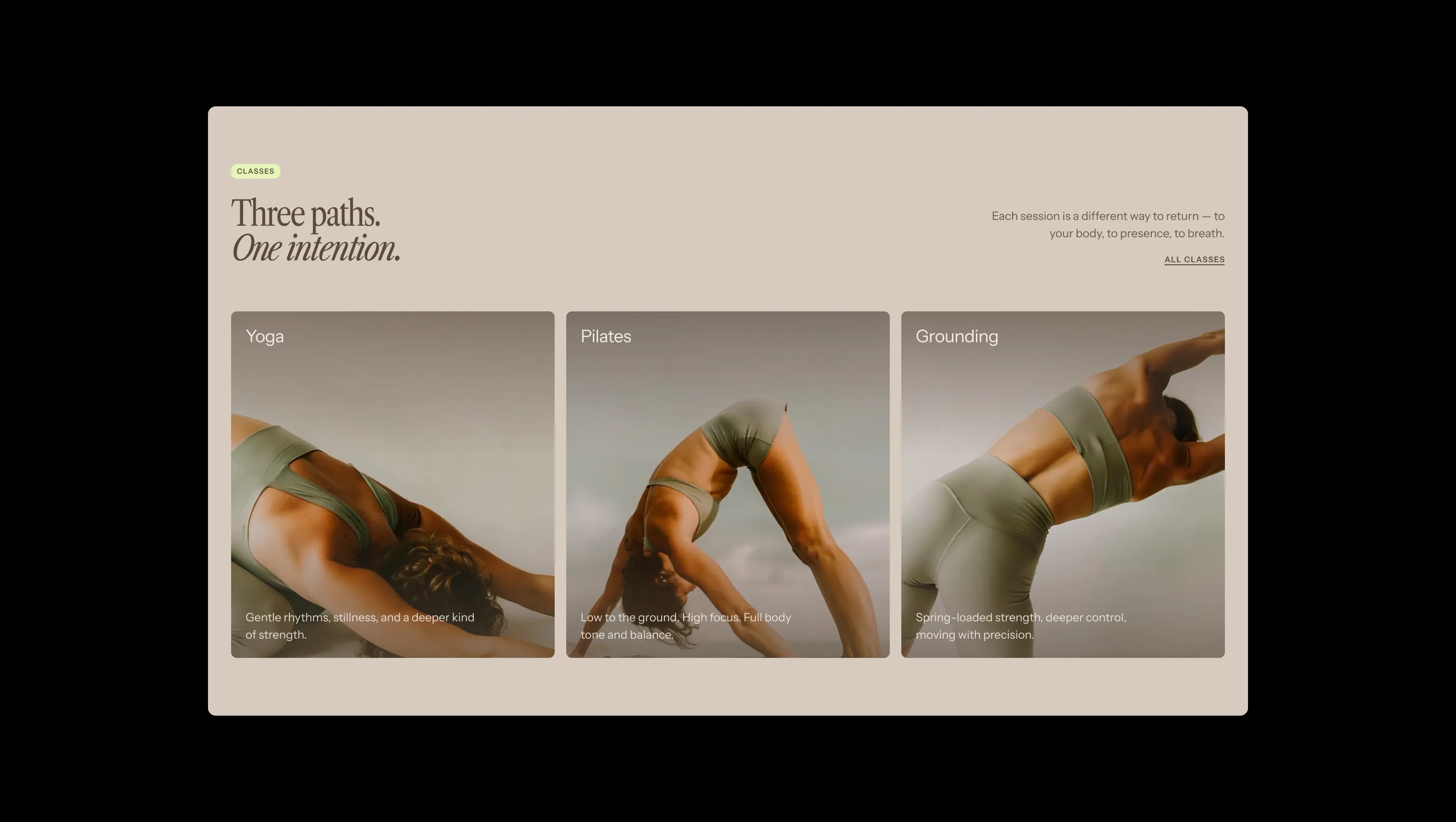
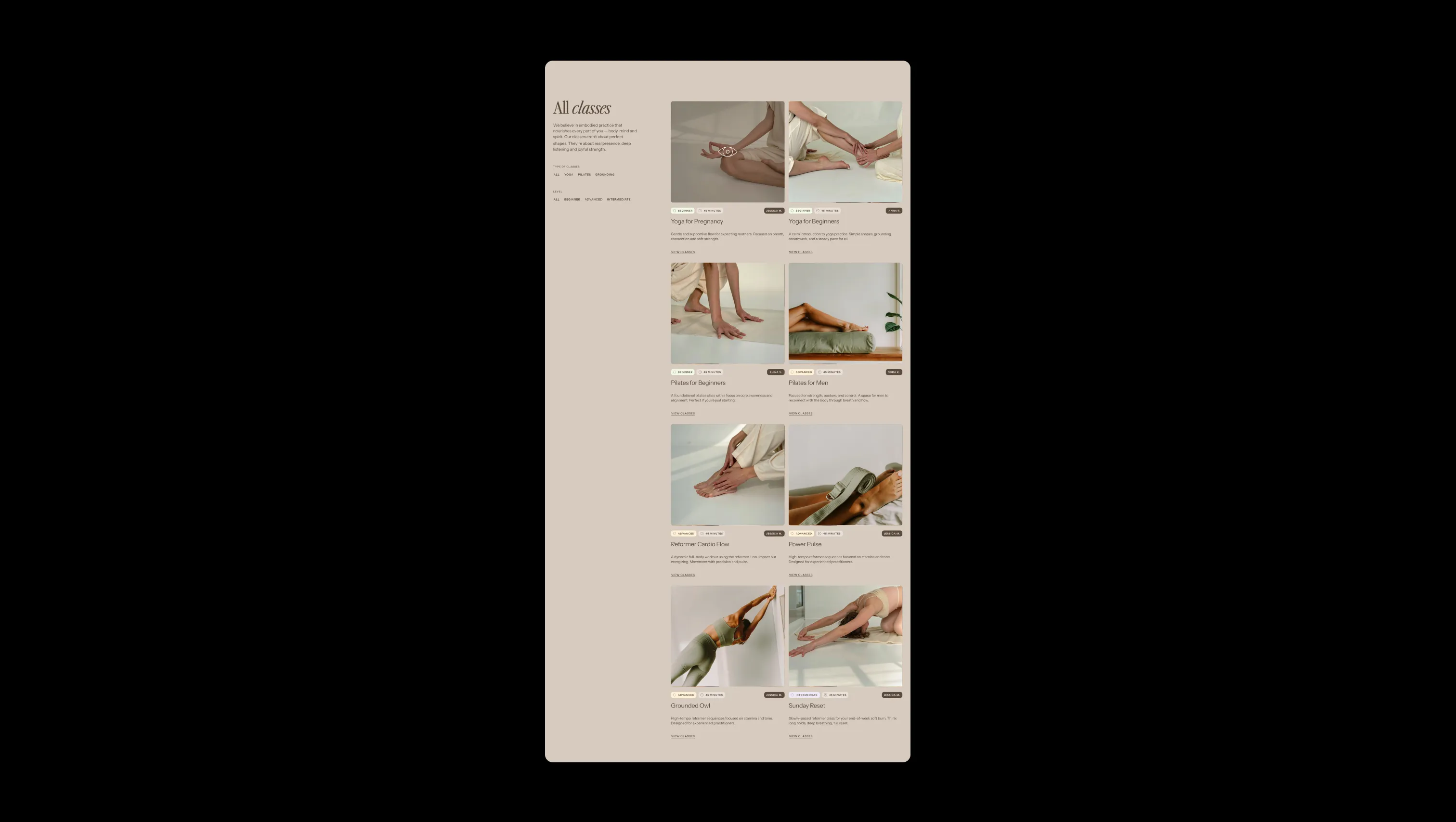
A handful of real sections that ship with this template. Click any card to preview, or explore them all under the Sections tab.
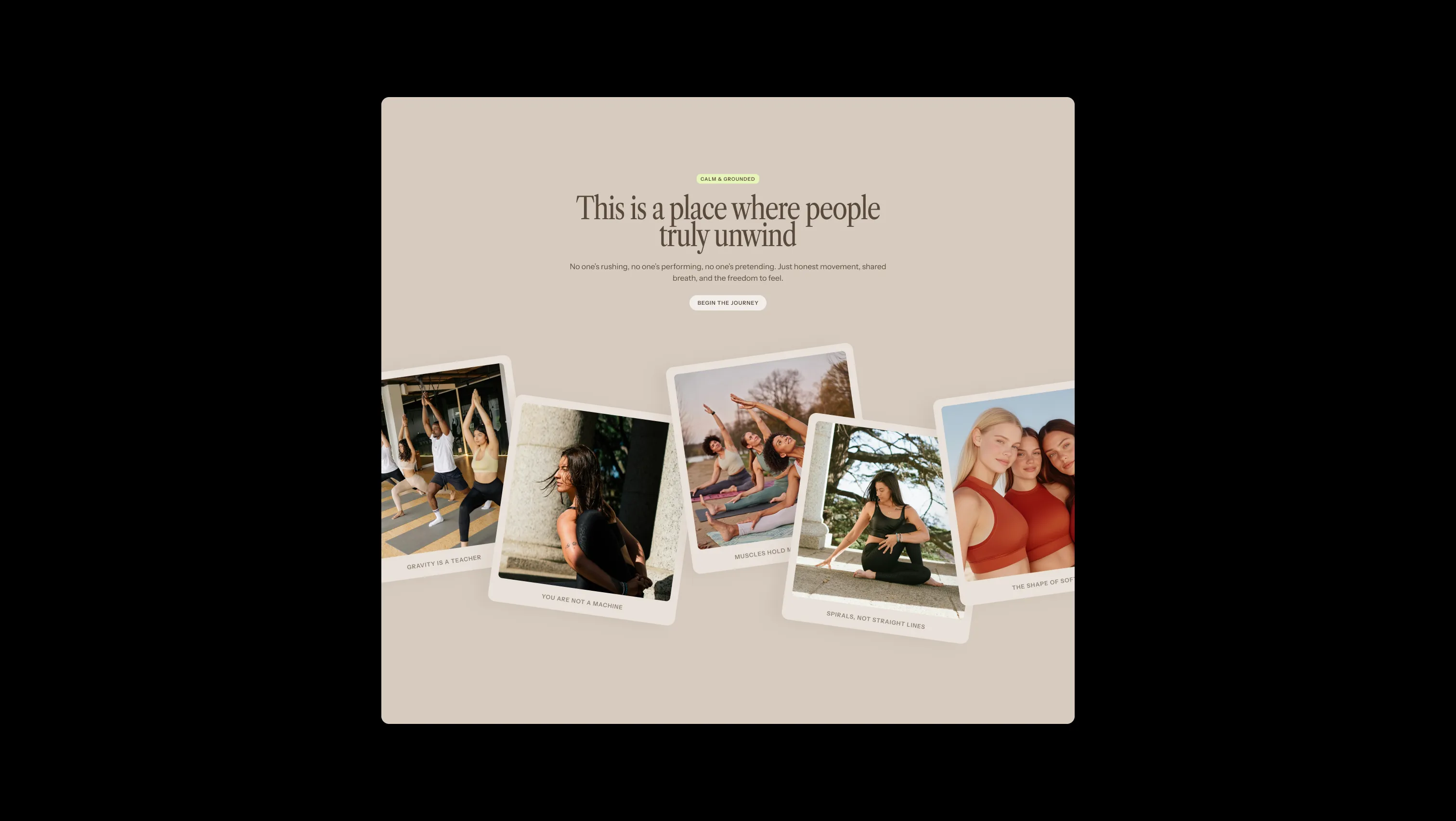
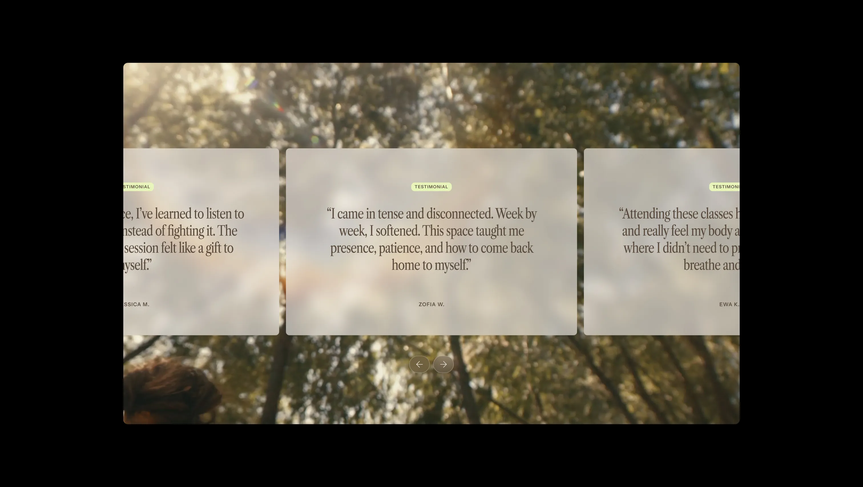
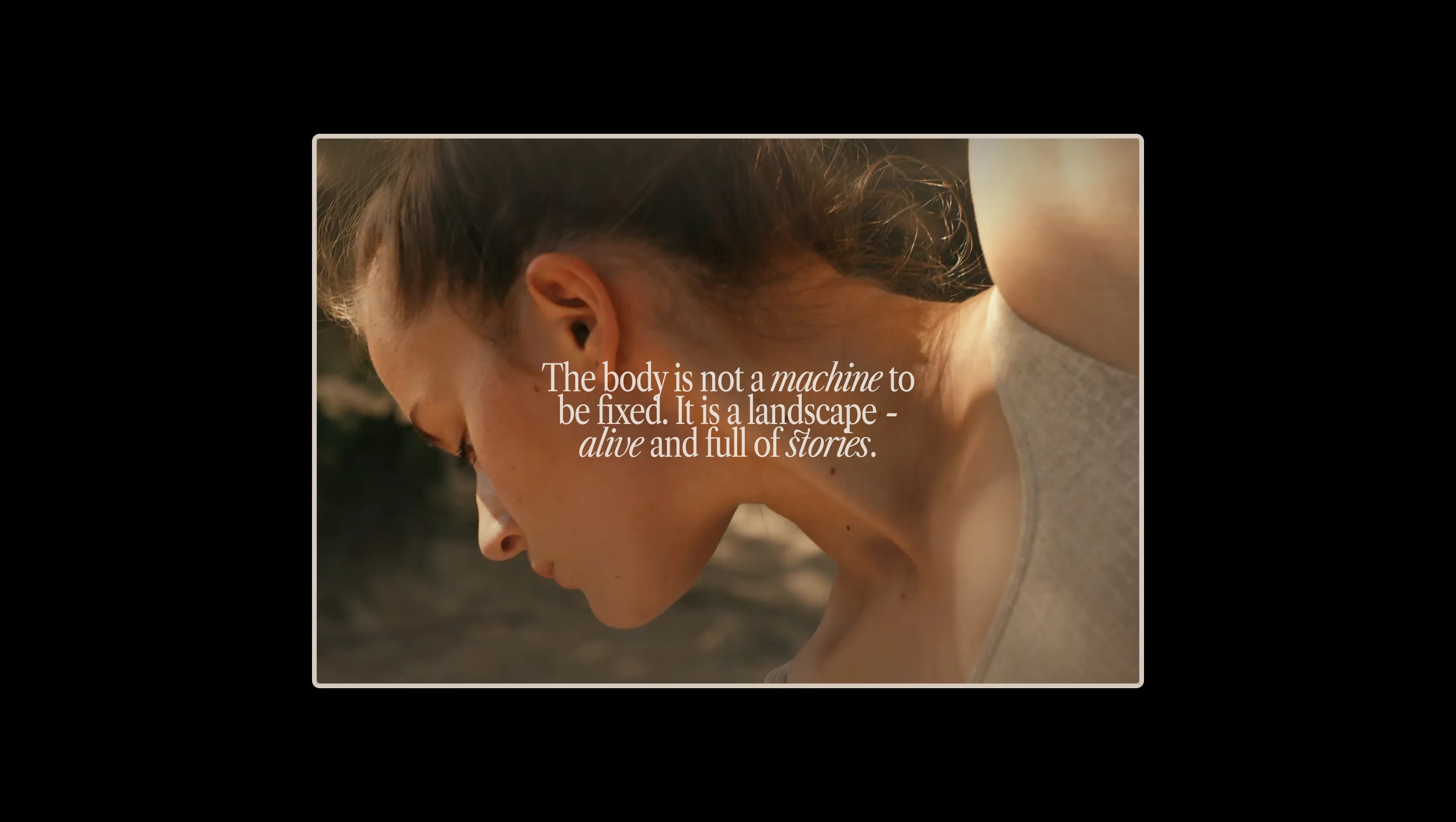
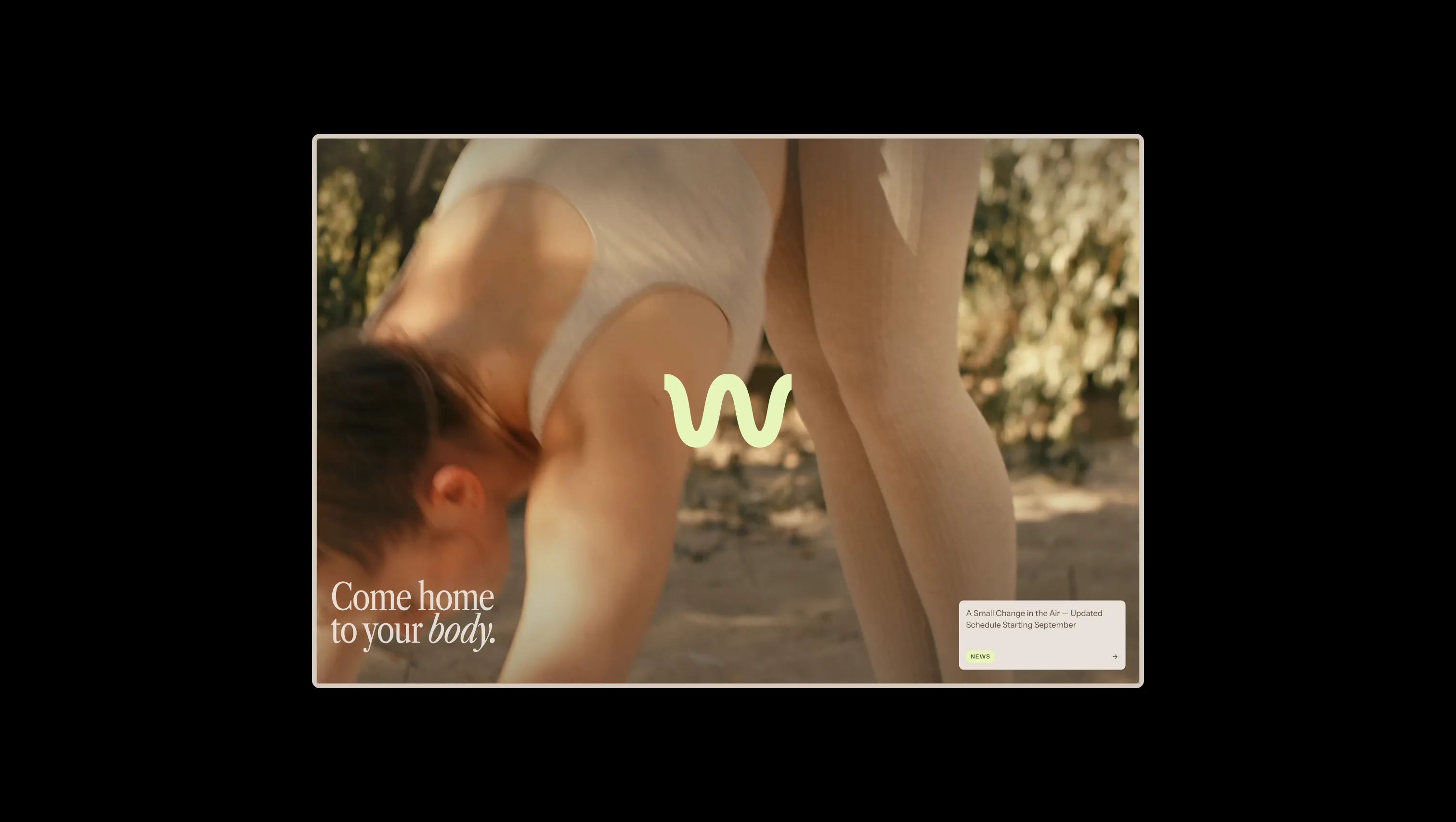
Primary canvas. The default page background — a warm dusty taupe that sets the meditative mood throughout.
Secondary surface. Powers navbar capsules, polaroid cards, feature cards, and softer lifts above the canvas.
Lifted surface & light text. Used for input fills, light text on dark surfaces, and the brightest neutral lift.
Brightest off-white. Reserved for highlight surfaces and the cleanest neutral moments.
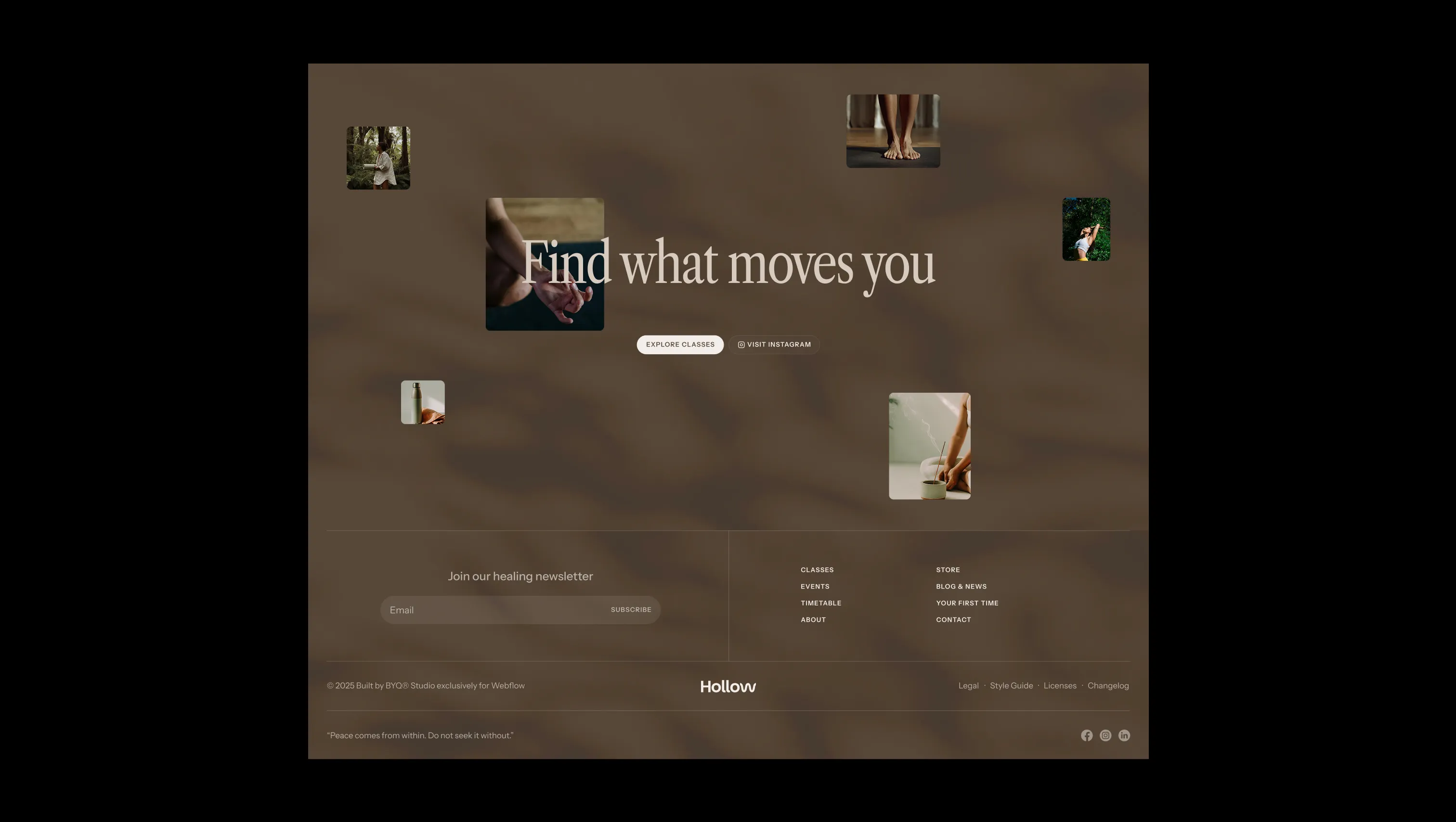
Primary ink & dark surface. Body copy, headlines, and the deep footer background.
Softer secondary ink. Used for subdued metadata and warm muted text moments.
Signature accent. The luminous lime-green pill that powers primary buttons, news labels, and the wave logomark.
Accent hover. The deeper sage-olive that buttons and nav pills shift into on interaction.
Class-level tag. Warm cream wash signaling advanced practice content.
Class-level tag. Soft green wash signaling beginner-friendly content.
Error & validation. Reserved exclusively for form errors and destructive states.
The quick brown fox jumps
Display & editorial headlines (h0–h4). The condensed serif with italic emphasis carries the meditative, editorial voice.
The quick brown fox jumps
Body, UI, labels, and smaller subheads (h5–h6). A humanist variable sans for clarity and warmth.
spacious1800px160px24px24px0px4px8px12px16px20px24px32px48px64px80px120px160px200pxfull9999pxlarge16pxsharp0pxsmall8pxnavbar20pxbuttons24pxStep from canvas (level 1) to lifted (level 2) to inset depth (level 3), then invert into the dark levels for full-bleed sections. Hex codes and roles live in the Colors section above; this ladder shows the layering only.
# Design System Guide

> Unlock the template to access the full design system.

## Brand voice

A short paragraph describing the brand voice, mood, and visual
principles that anchor the system. Tone, cadence, and intent.

## Colors

| Token        | Hex      | Role                                  |
| ------------ | -------- | ------------------------------------- |
| canvas-1     | #xxxxxx  | Page background, large surfaces       |
| canvas-2     | #xxxxxx  | Lifted surfaces, cards                |
| canvas-3     | #xxxxxx  | Inset wells, depressed states         |
| ink-1        | #xxxxxx  | Primary body text                     |
| ink-2        | #xxxxxx  | Secondary text, labels                |
| ink-3        | #xxxxxx  | Tertiary text, hints                  |
| accent-1     | #xxxxxx  | Primary brand accent                  |
| accent-2     | #xxxxxx  | Secondary accent                      |
| state-ok     | #xxxxxx  | Success, confirmations                |
| state-warn   | #xxxxxx  | Warnings                              |
| state-err    | #xxxxxx  | Errors, destructive actions           |

## Typography

- **Display** — heading scale, used for hero text and section titles.
- **Body** — primary reading text, optimized for paragraphs.
- **Mono** — code, data, and tabular numerals.

```
display: 32px / 40px / 48px / 64px / 80px
body:    14px / 16px / 18px
mono:    12px / 14px
```

## Spacing & shape

Base unit: 4px. Scale: 4, 8, 12, 16, 24, 32, 48, 64, 96, 128.
Radii: sm (4px), md (8px), lg (12px), xl (20px), full (9999px).

## Surfaces

Layered elevation from canvas → lifted → inset. Surfaces invert in
dark sections for full-bleed contrast.

## Do's and don'ts

- Do use accent-1 sparingly for primary CTAs only.
- Do maintain at least 4.5:1 contrast on body text.
- Don't mix display and body in the same line.
- Don't use state colors for branding.

## Agent prompt guide

Prompts for AI design tools that respect this system.
Includes example prompts for sections, components, and layouts.

# ...
Unlock the full style guide