Design systems, extracted.
Paste any URL to create a design system from it. Open any style for colors, type, spacing, components, and a DESIGN.md or tokens.json your agent can use.
Quickly navigate through the dashboard with your keyboard using the command menu.
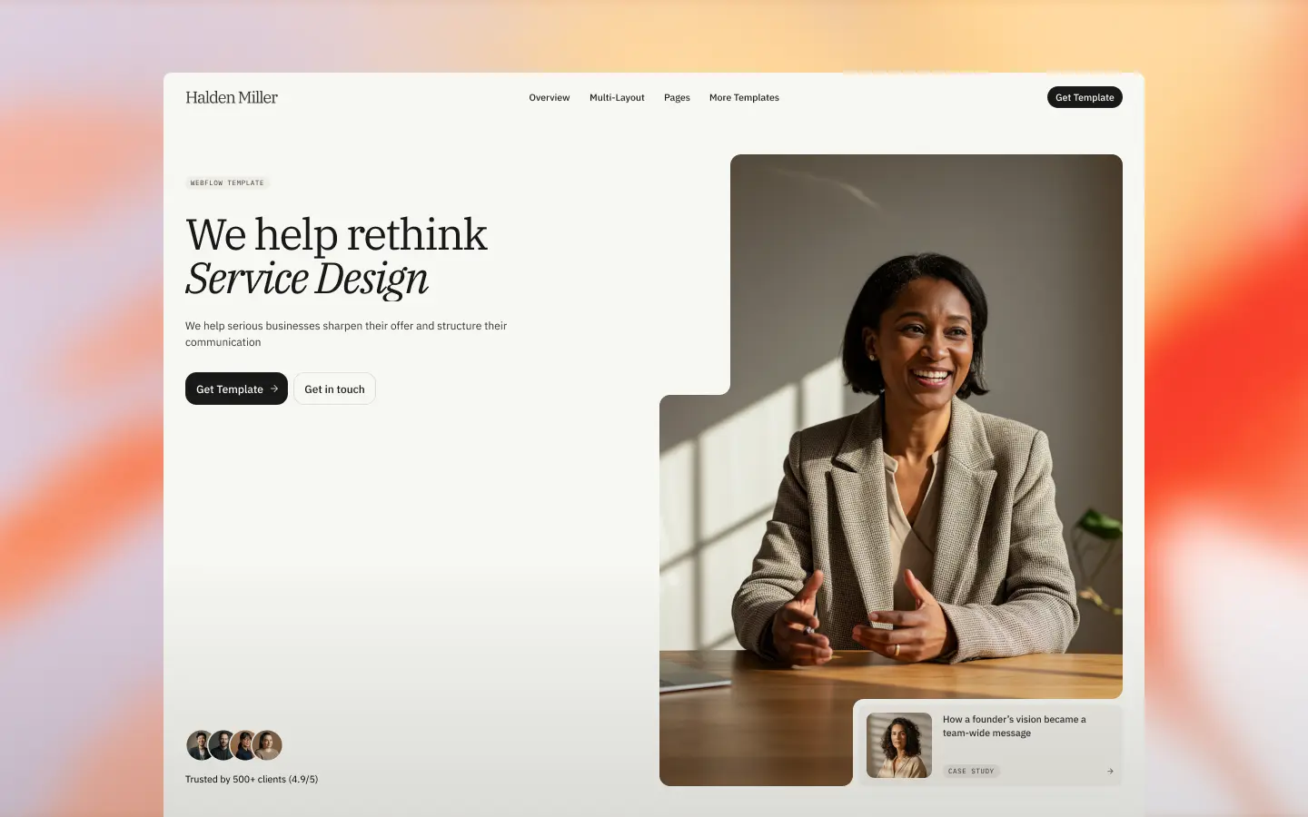

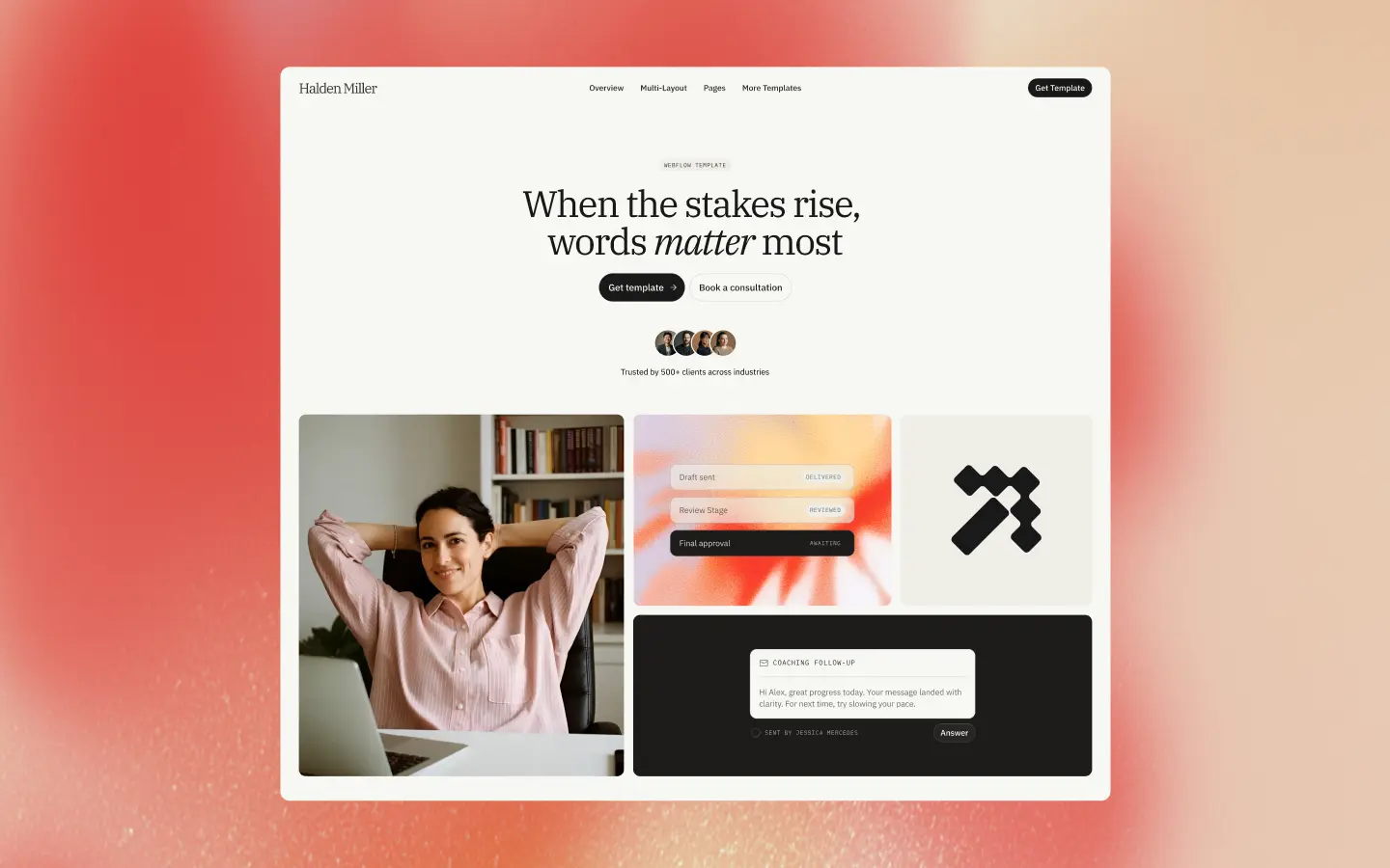
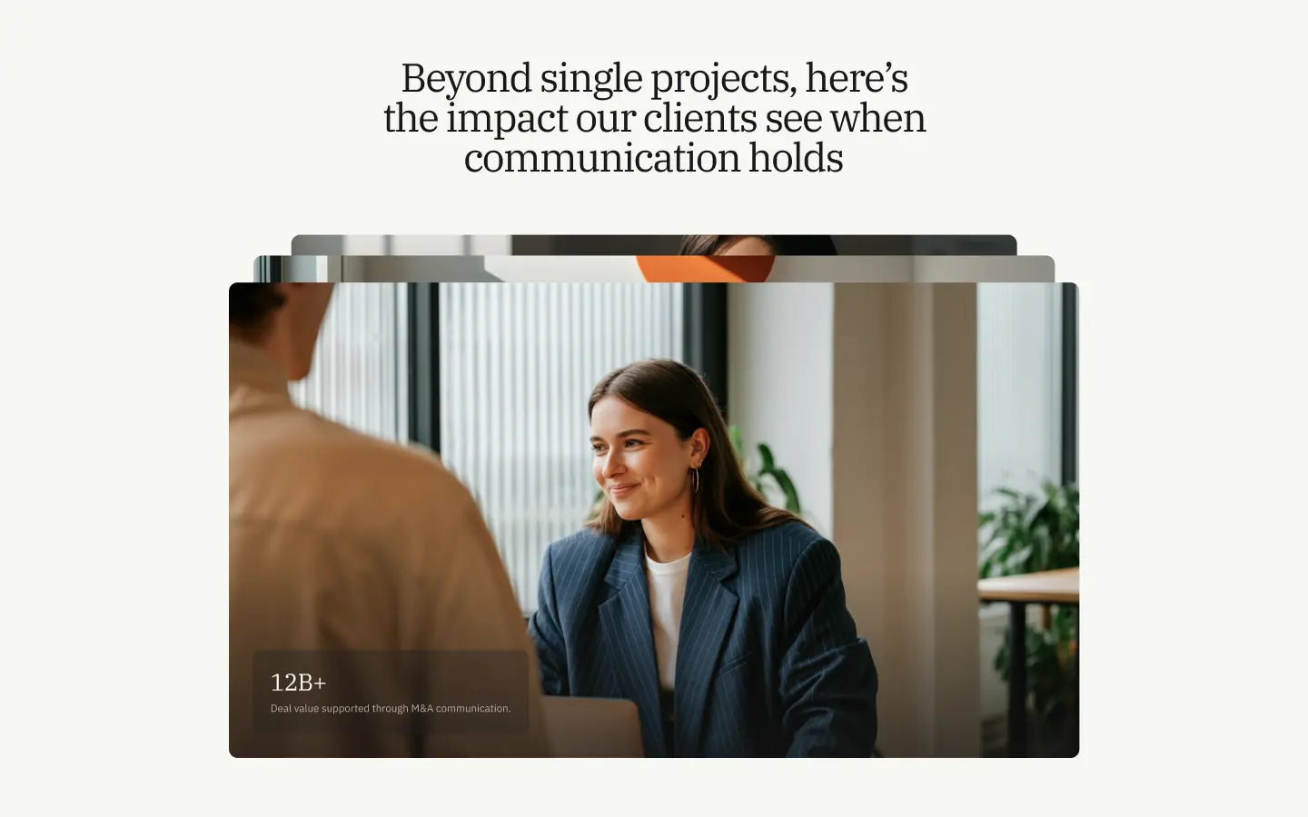
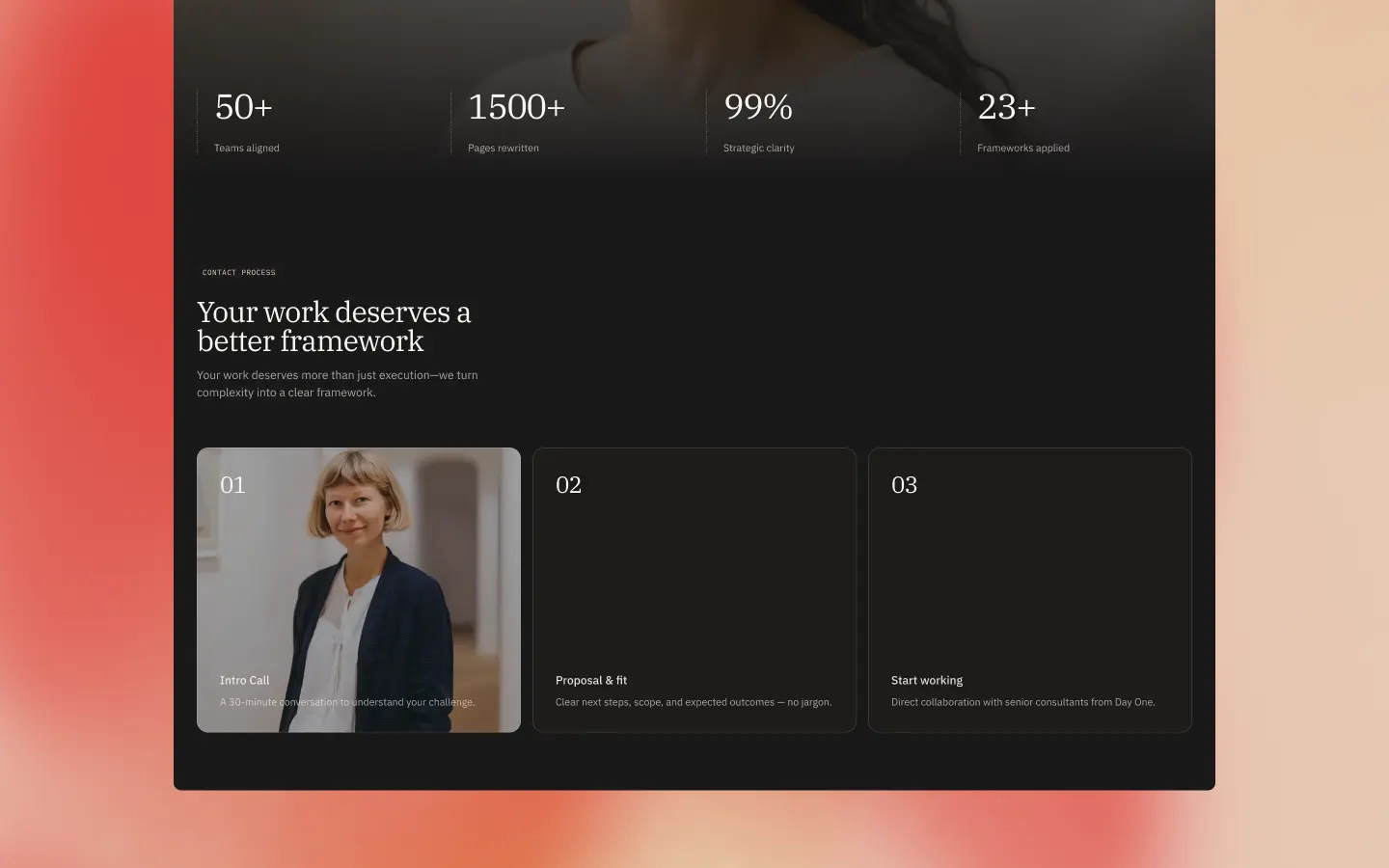
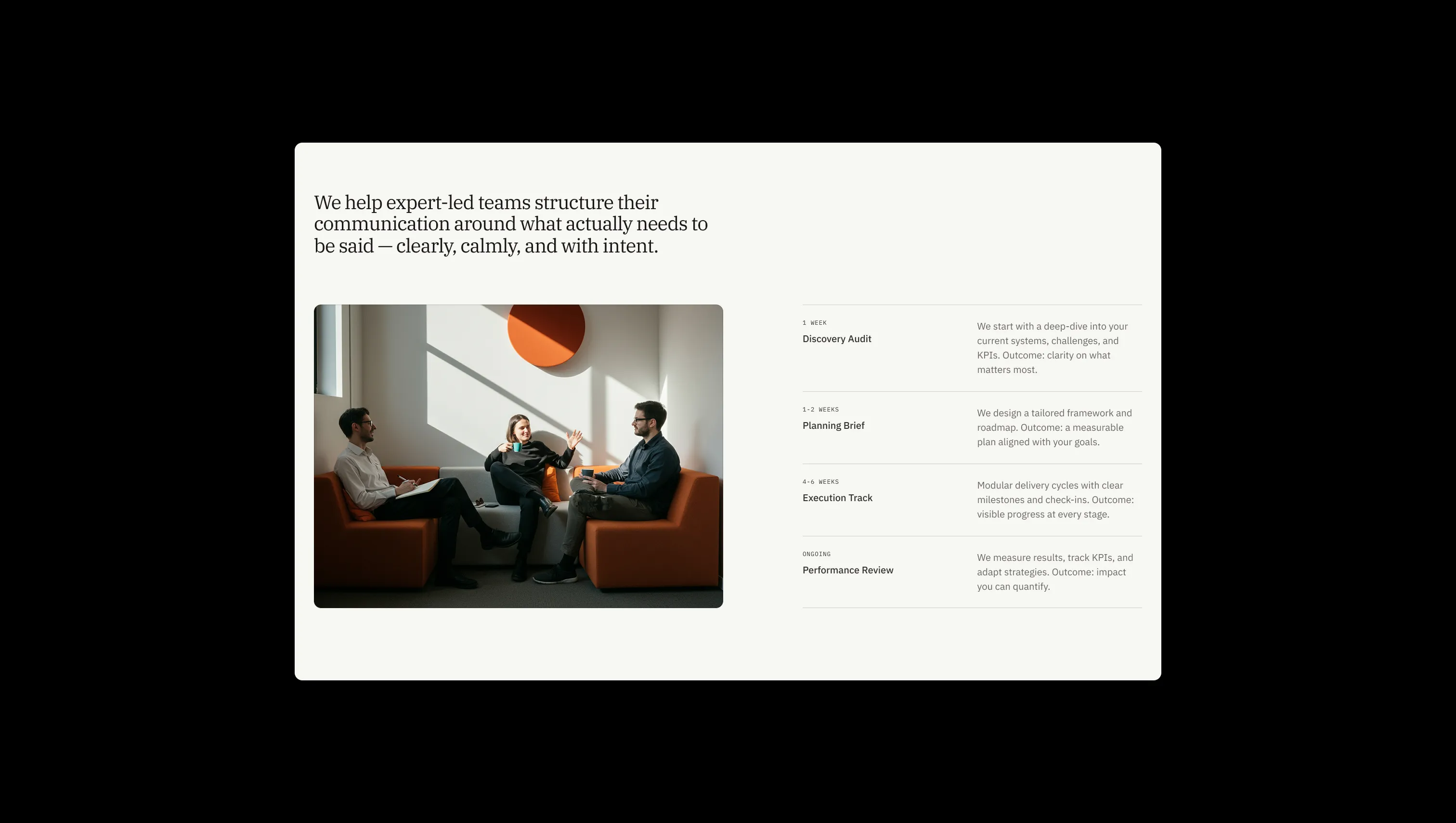
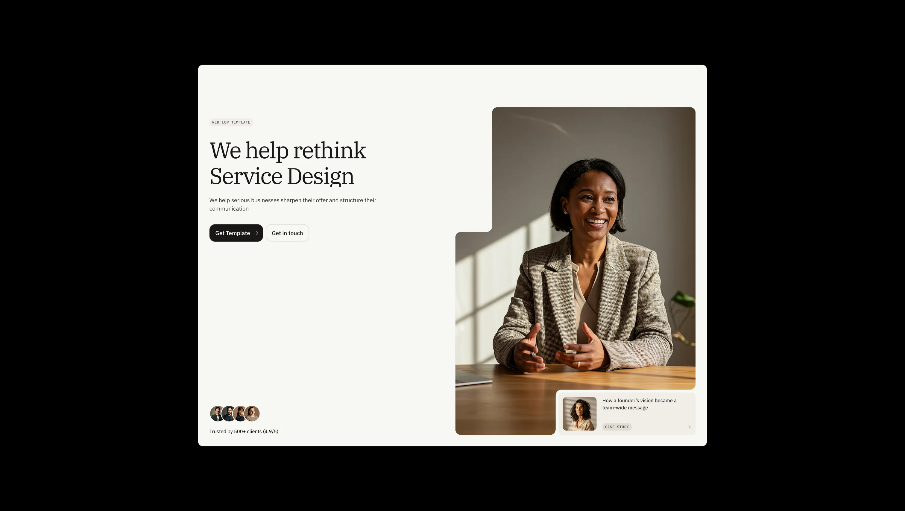
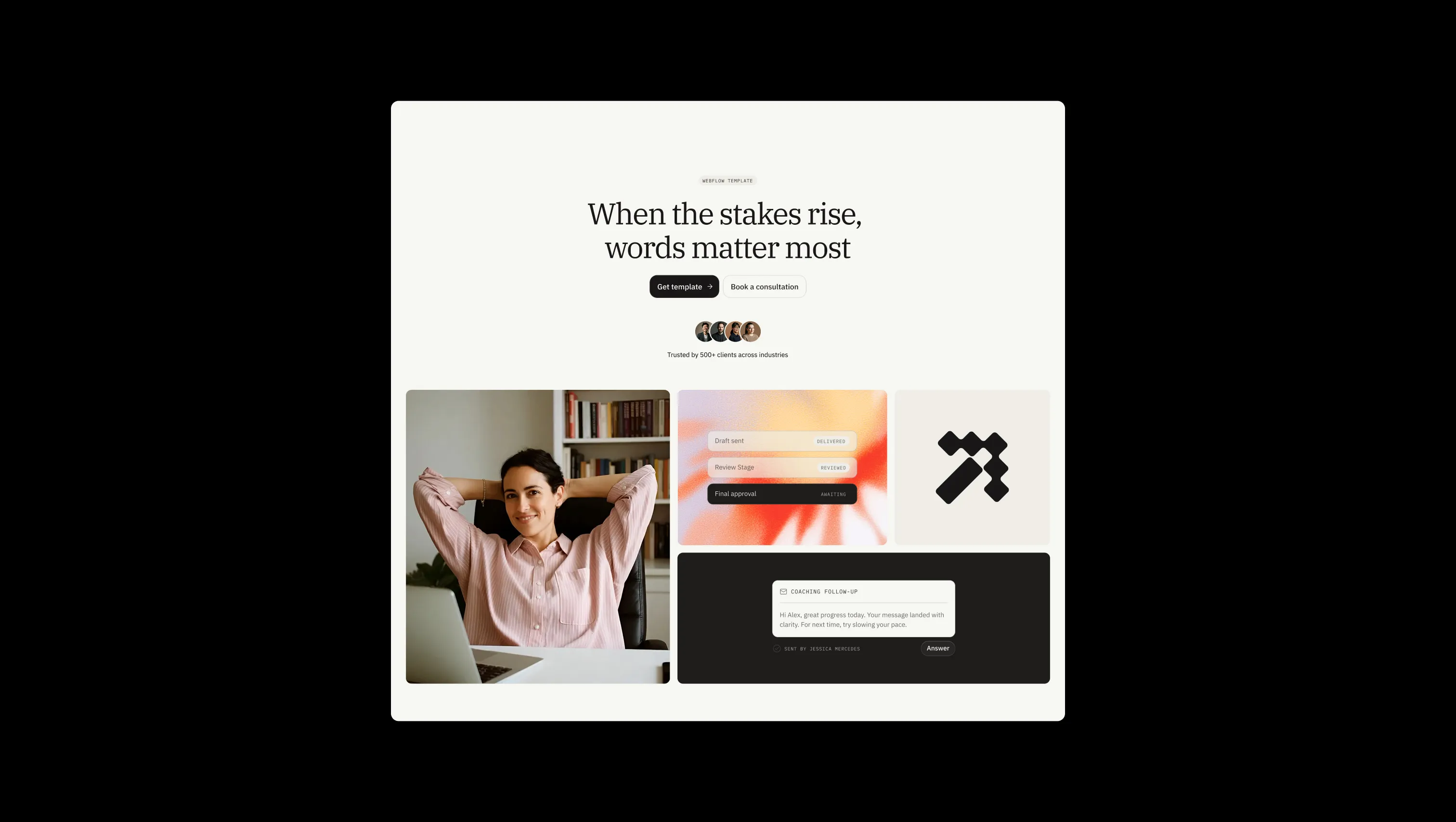
Halden Miller is a literary, consultative brand system: cream parchment surfaces, charcoal ink, italic serif emphasis. Soft pill buttons, monospace eyebrow labels, uppercase tags — restrained and precise, designed to convey expertise rather than performance. The palette stays close to the page: one canvas tone, two lifted parchments, near-black ink, plus utility states (amber, red, fern) reserved strictly for feedback. Scales from quiet long-form pages to dark hero sections without losing its tone.
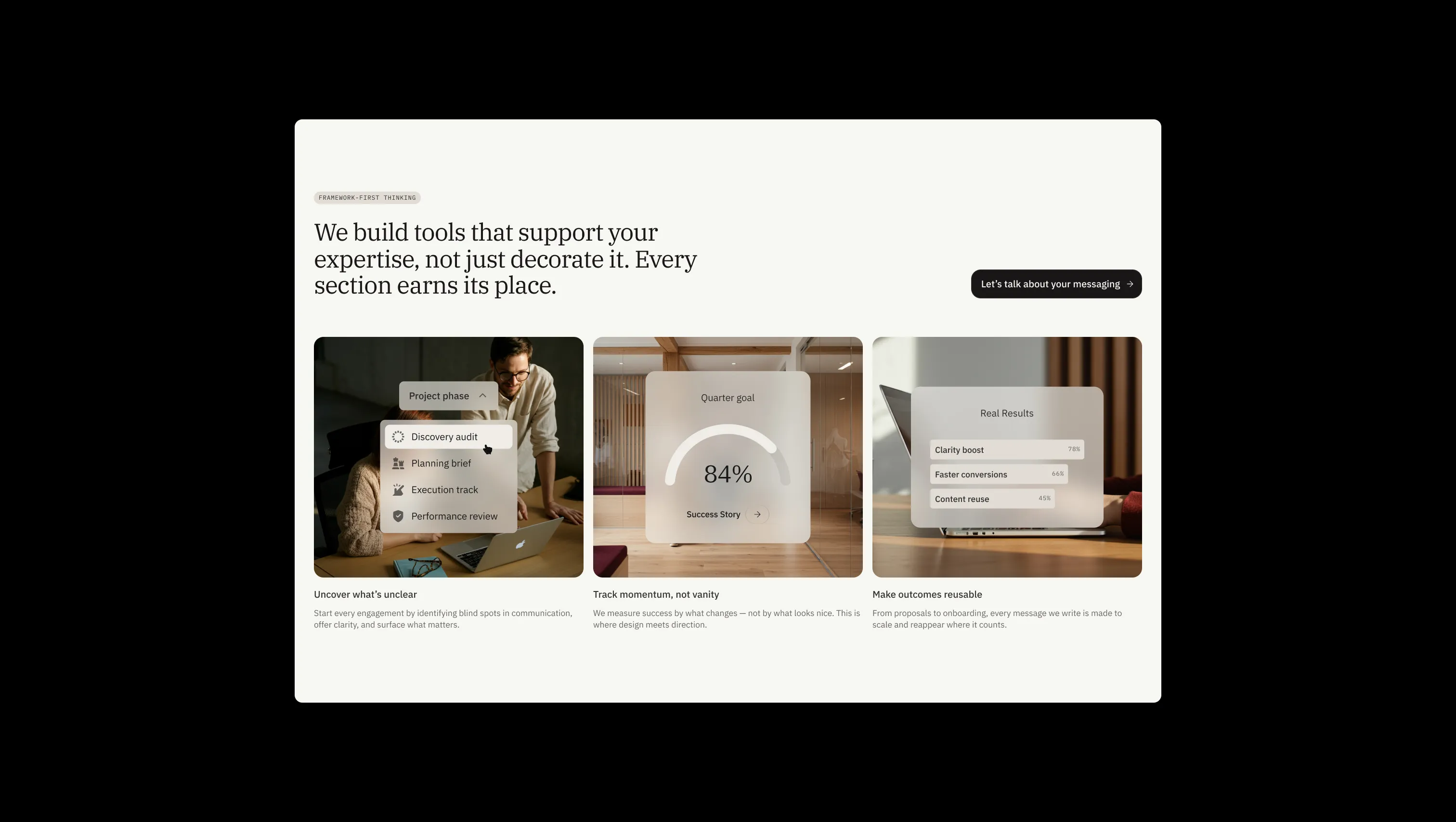
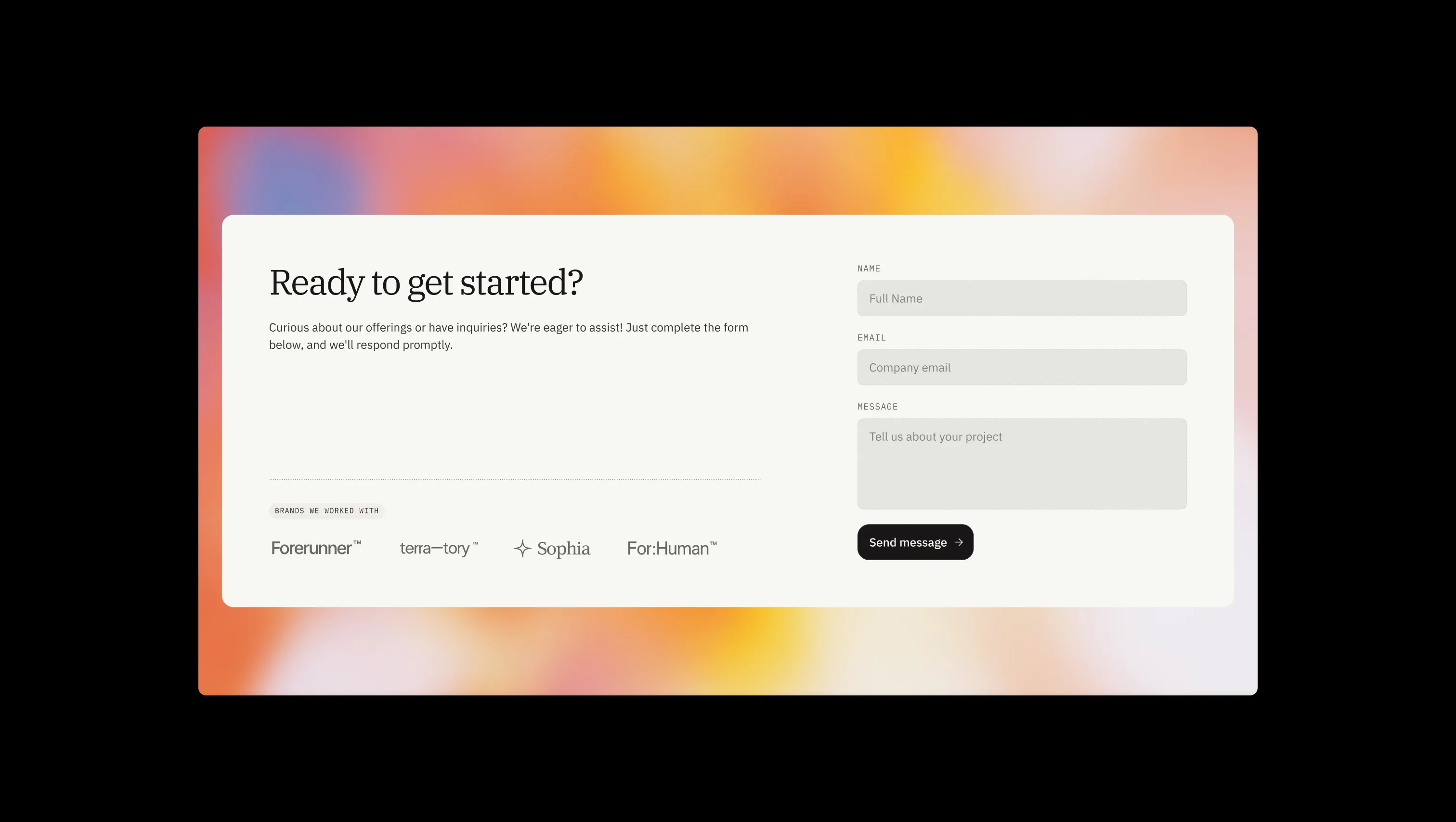
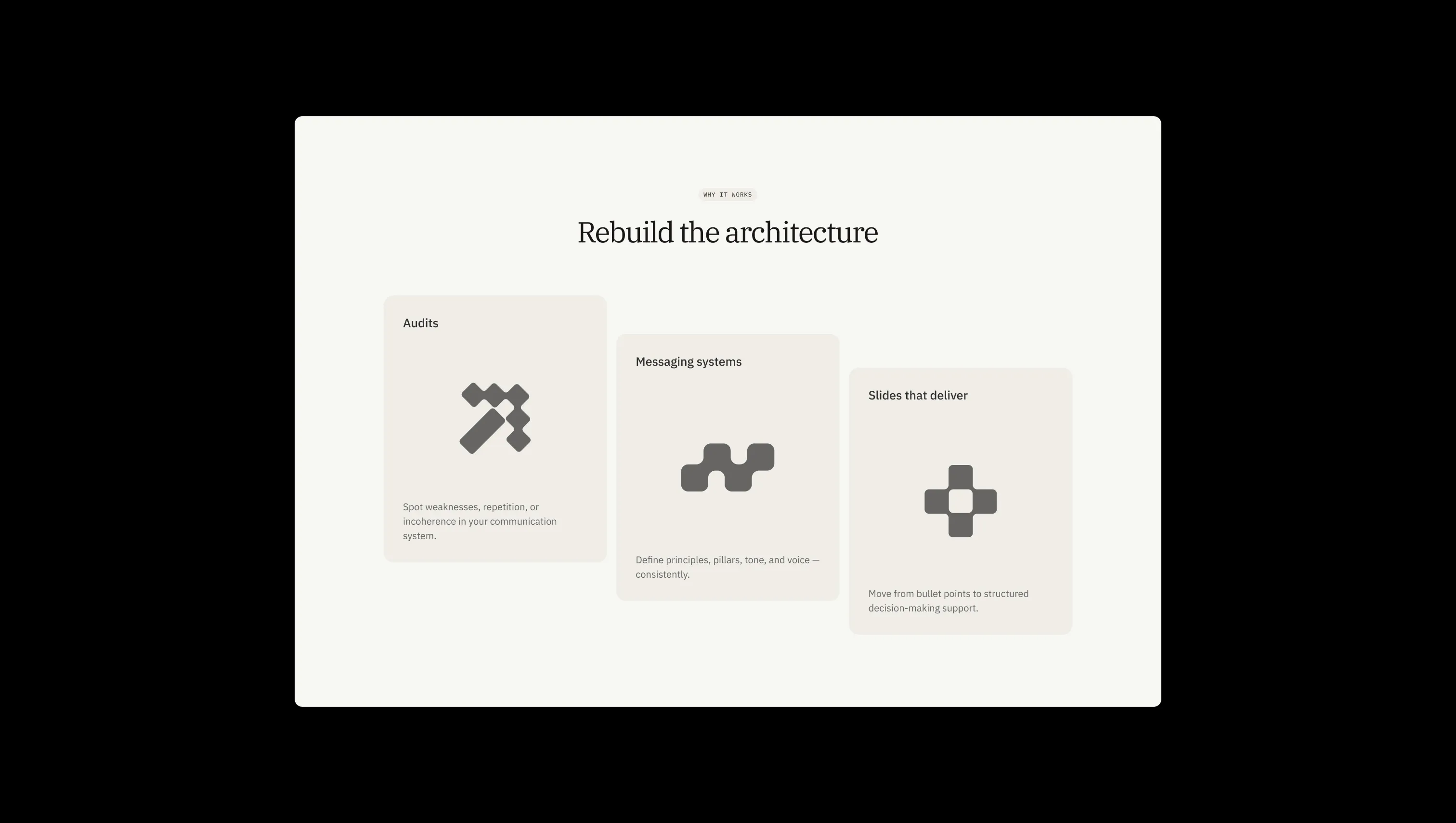
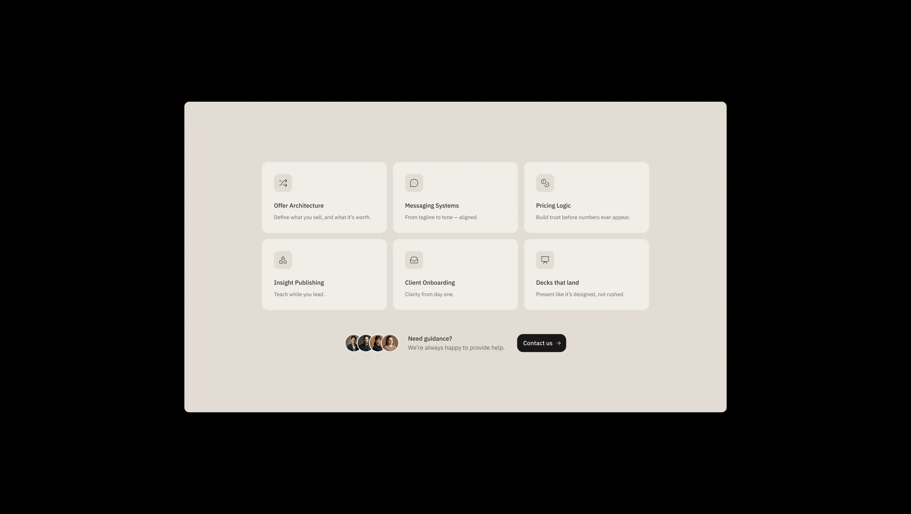
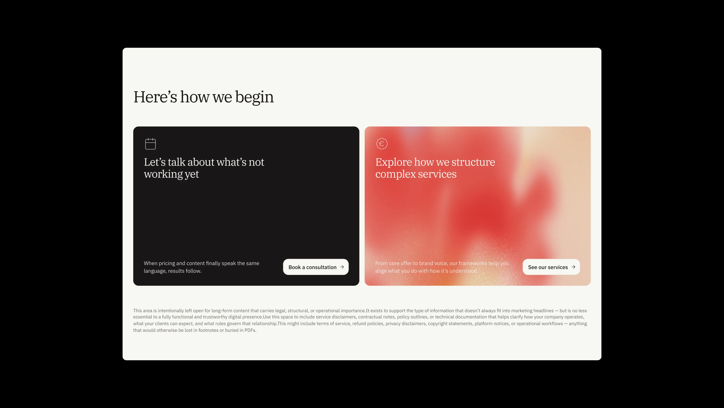
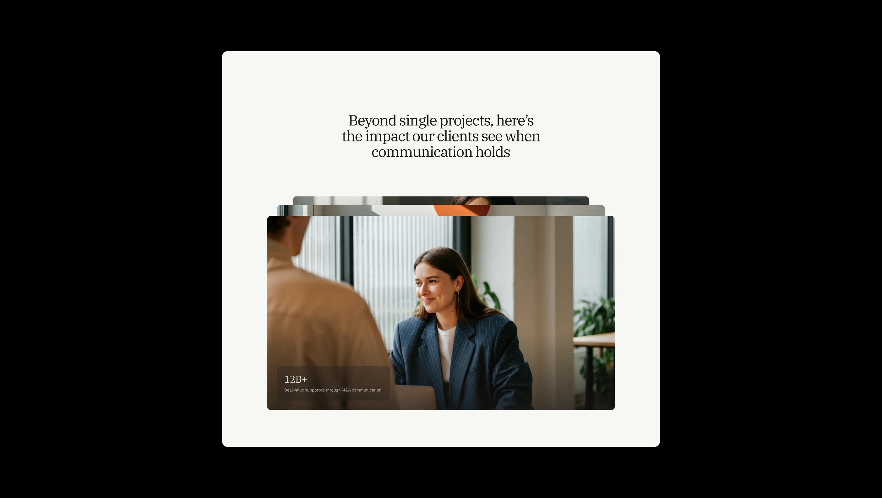
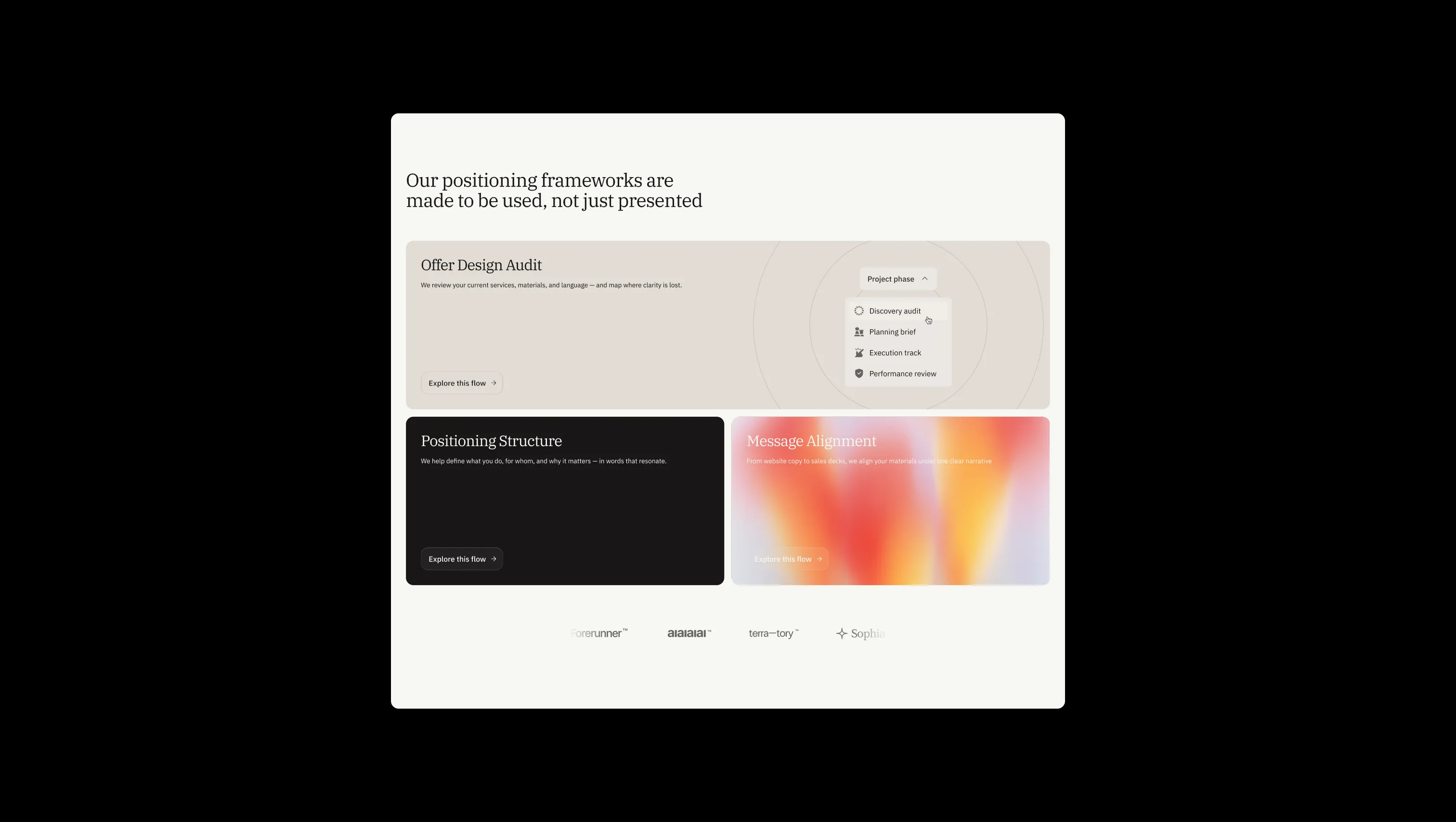
A handful of real sections that ship with this template. Click any card to preview, or explore them all under the Sections tab.

Lifted surface. Cards, form blocks, label tags, soft section gradients.
Page canvas. Warm off-white that anchors the light theme.
Depth surface. Inset sections, FAQ backdrops, gradient bases.
Dark depth. Innermost dark surface, slightly lifted from black.
Primary text & ink. Headlines, body copy, primary button fills.
Dark surface. Navigation, footer, full-bleed dark sections.
Error state. Form validation, destructive cues. Used sparingly.
Warning state. Single warm accent for cautionary UI, never decorative.
Success state. Confirmation pills, positive validation.
The quick brown fox jumps
Uppercase eyebrow labels, tags, and stat captions. Monospace introduces a quietly technical, archival counterpoint to the serif headlines.
The quick brown fox jumps
Body copy and button labels. Calm, neutral, and highly legible — the voice of the brand at conversational volume.
The quick brown fox jumps
All headings (H0–H6). The italic style is used as a deliberate emphasis device on key words to create editorial rhythm.
spacious1800px120px32px24px0px4px8px12px16px20px24px32px48px64px80px120pxfull9999pxtags16pxcards12pxinputs8pxbuttons16pxcards-large16pxbuttons-pill24pxStep from canvas (level 1) to lifted (level 2) to inset depth (level 3), then invert into the dark levels for full-bleed sections. Hex codes and roles live in the Colors section above; this ladder shows the layering only.
# Design System Guide

> Unlock the template to access the full design system.

## Brand voice

A short paragraph describing the brand voice, mood, and visual
principles that anchor the system. Tone, cadence, and intent.

## Colors

| Token        | Hex      | Role                                  |
| ------------ | -------- | ------------------------------------- |
| canvas-1     | #xxxxxx  | Page background, large surfaces       |
| canvas-2     | #xxxxxx  | Lifted surfaces, cards                |
| canvas-3     | #xxxxxx  | Inset wells, depressed states         |
| ink-1        | #xxxxxx  | Primary body text                     |
| ink-2        | #xxxxxx  | Secondary text, labels                |
| ink-3        | #xxxxxx  | Tertiary text, hints                  |
| accent-1     | #xxxxxx  | Primary brand accent                  |
| accent-2     | #xxxxxx  | Secondary accent                      |
| state-ok     | #xxxxxx  | Success, confirmations                |
| state-warn   | #xxxxxx  | Warnings                              |
| state-err    | #xxxxxx  | Errors, destructive actions           |

## Typography

- **Display** — heading scale, used for hero text and section titles.
- **Body** — primary reading text, optimized for paragraphs.
- **Mono** — code, data, and tabular numerals.

```
display: 32px / 40px / 48px / 64px / 80px
body:    14px / 16px / 18px
mono:    12px / 14px
```

## Spacing & shape

Base unit: 4px. Scale: 4, 8, 12, 16, 24, 32, 48, 64, 96, 128.
Radii: sm (4px), md (8px), lg (12px), xl (20px), full (9999px).

## Surfaces

Layered elevation from canvas → lifted → inset. Surfaces invert in
dark sections for full-bleed contrast.

## Do's and don'ts

- Do use accent-1 sparingly for primary CTAs only.
- Do maintain at least 4.5:1 contrast on body text.
- Don't mix display and body in the same line.
- Don't use state colors for branding.

## Agent prompt guide

Prompts for AI design tools that respect this system.
Includes example prompts for sections, components, and layouts.

# ...
Unlock the full style guide