Design systems, extracted.
Search curated design systems pulled from premium templates or create one from URL. Open any style for colors, type, spacing, components, and a DESIGN.md or tokens.json your agent can use.
Quickly navigate through the dashboard with your keyboard using the command menu.

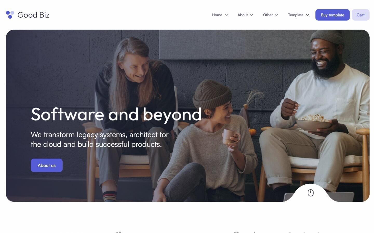
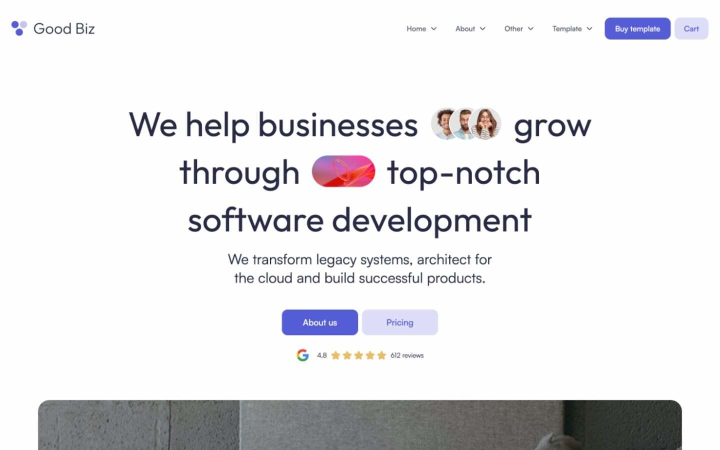
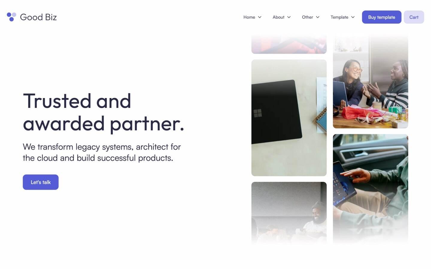
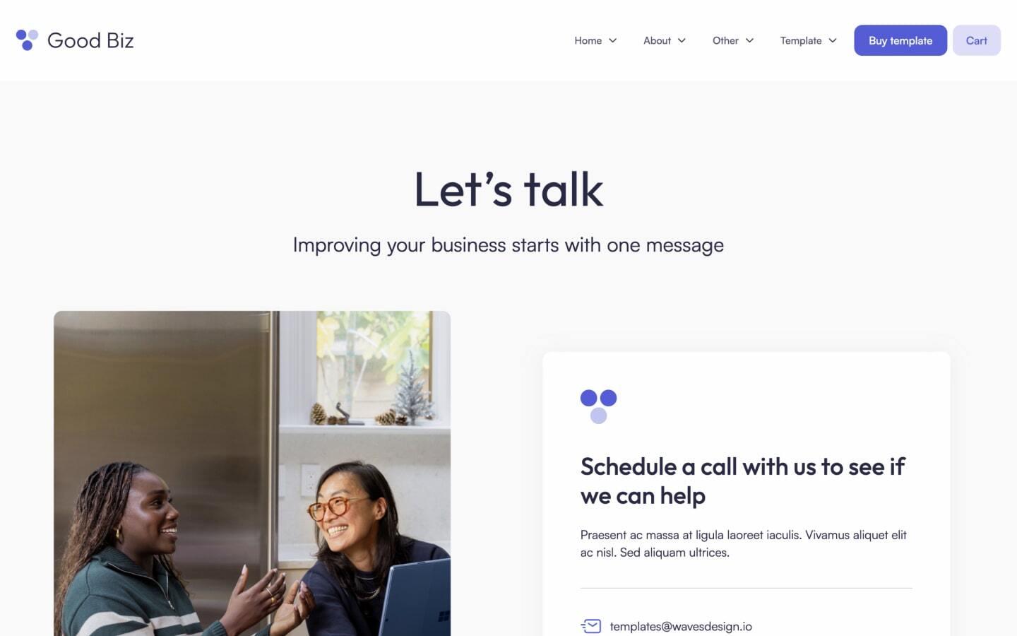
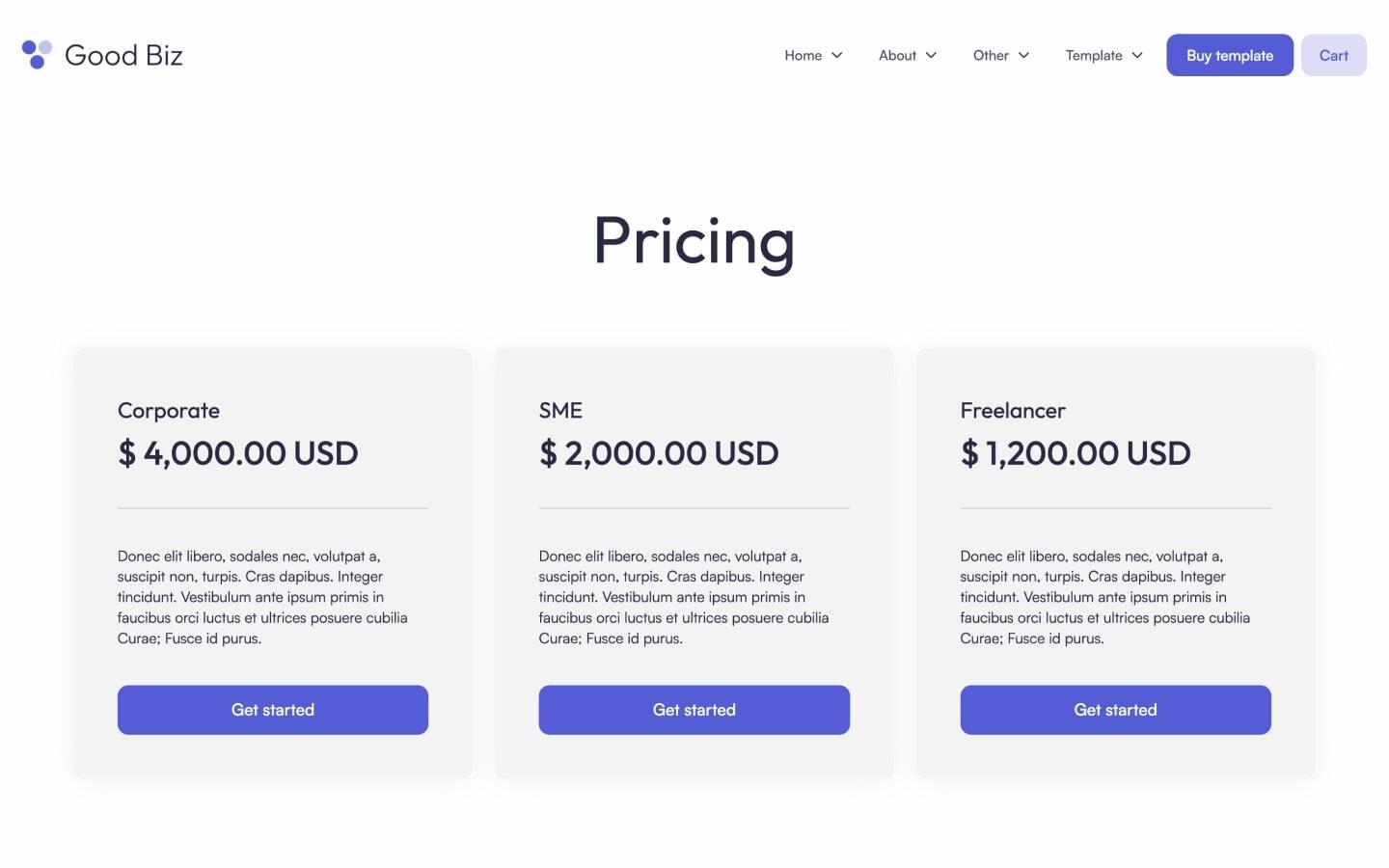
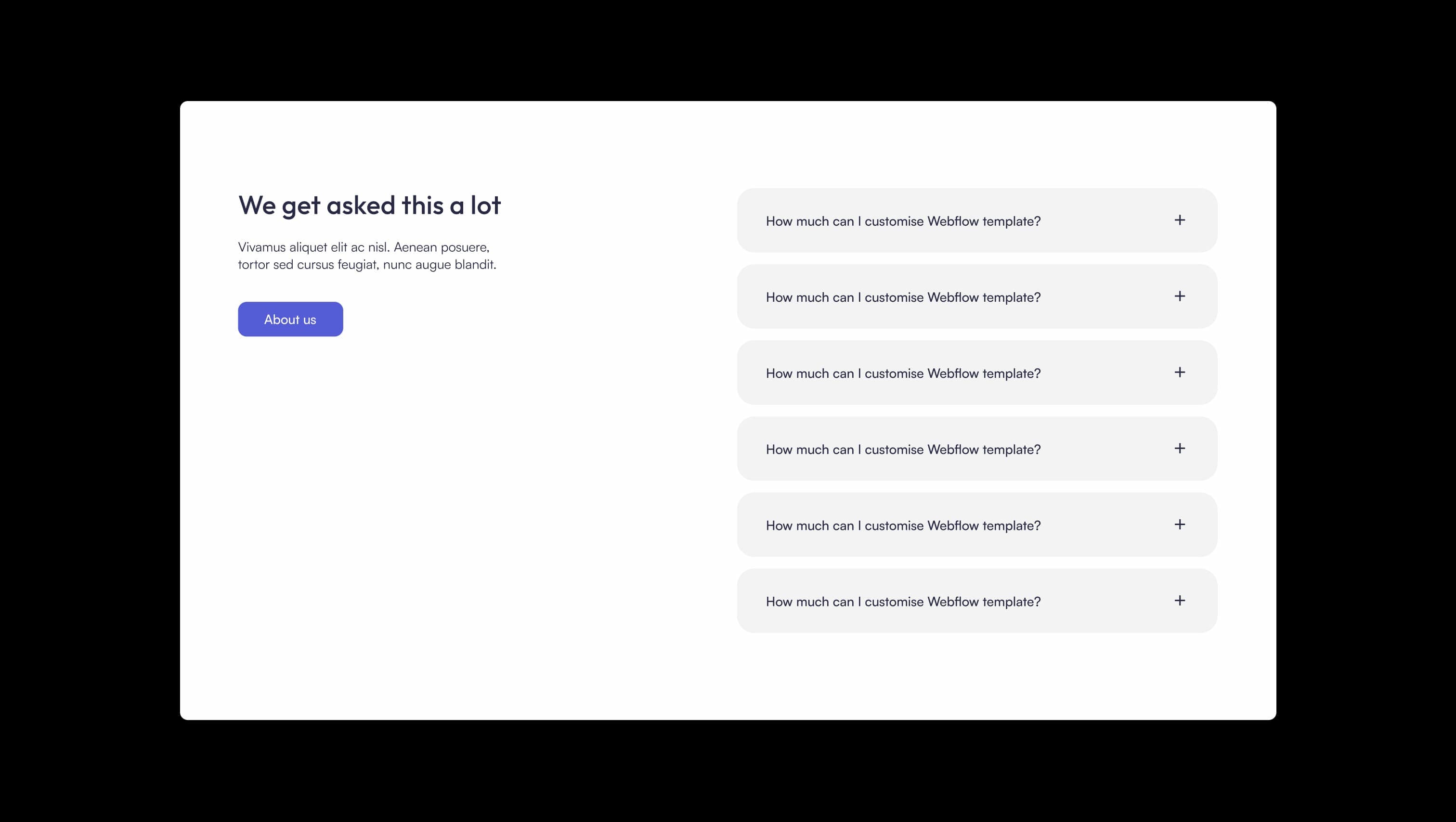
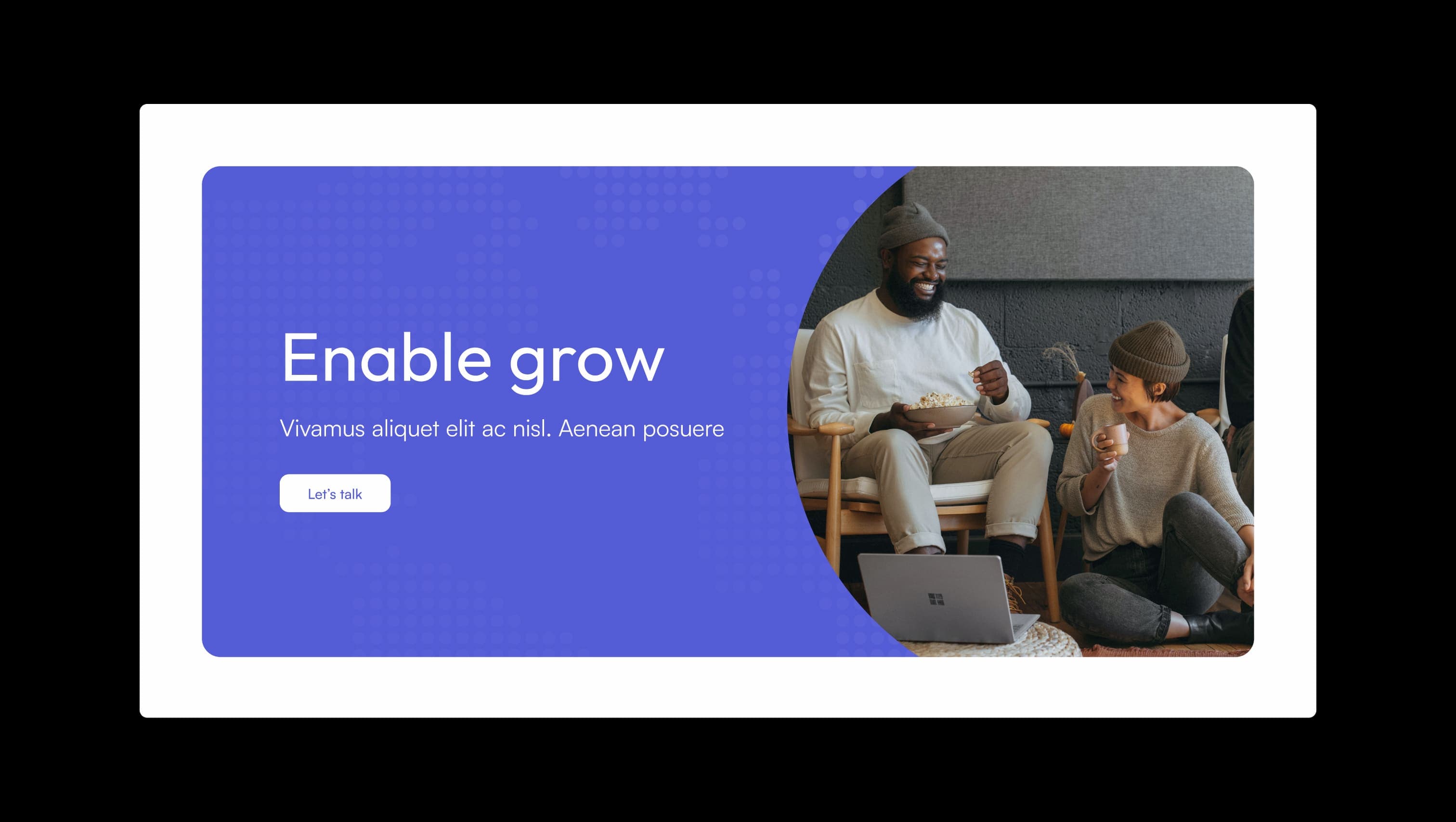
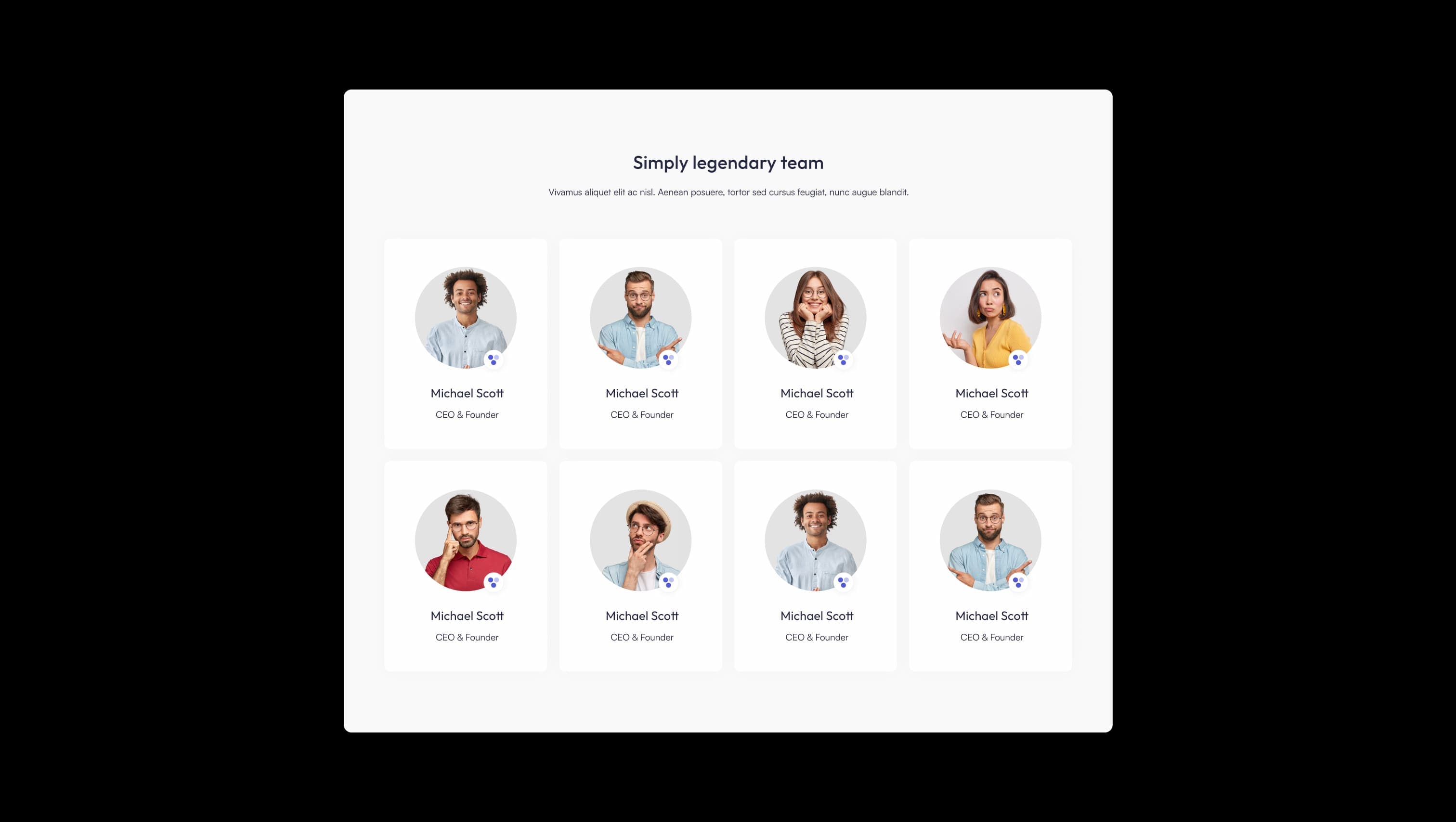
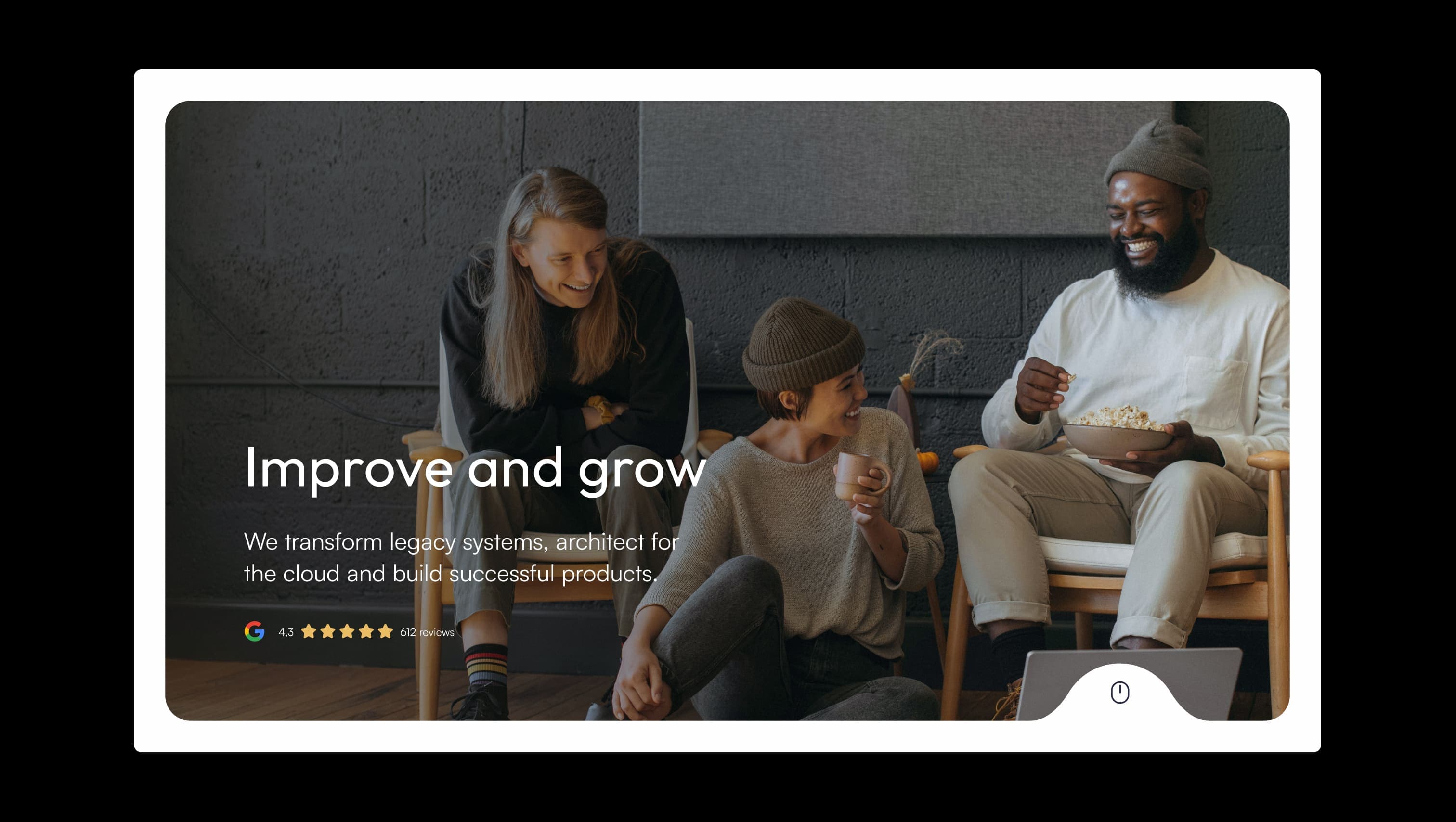
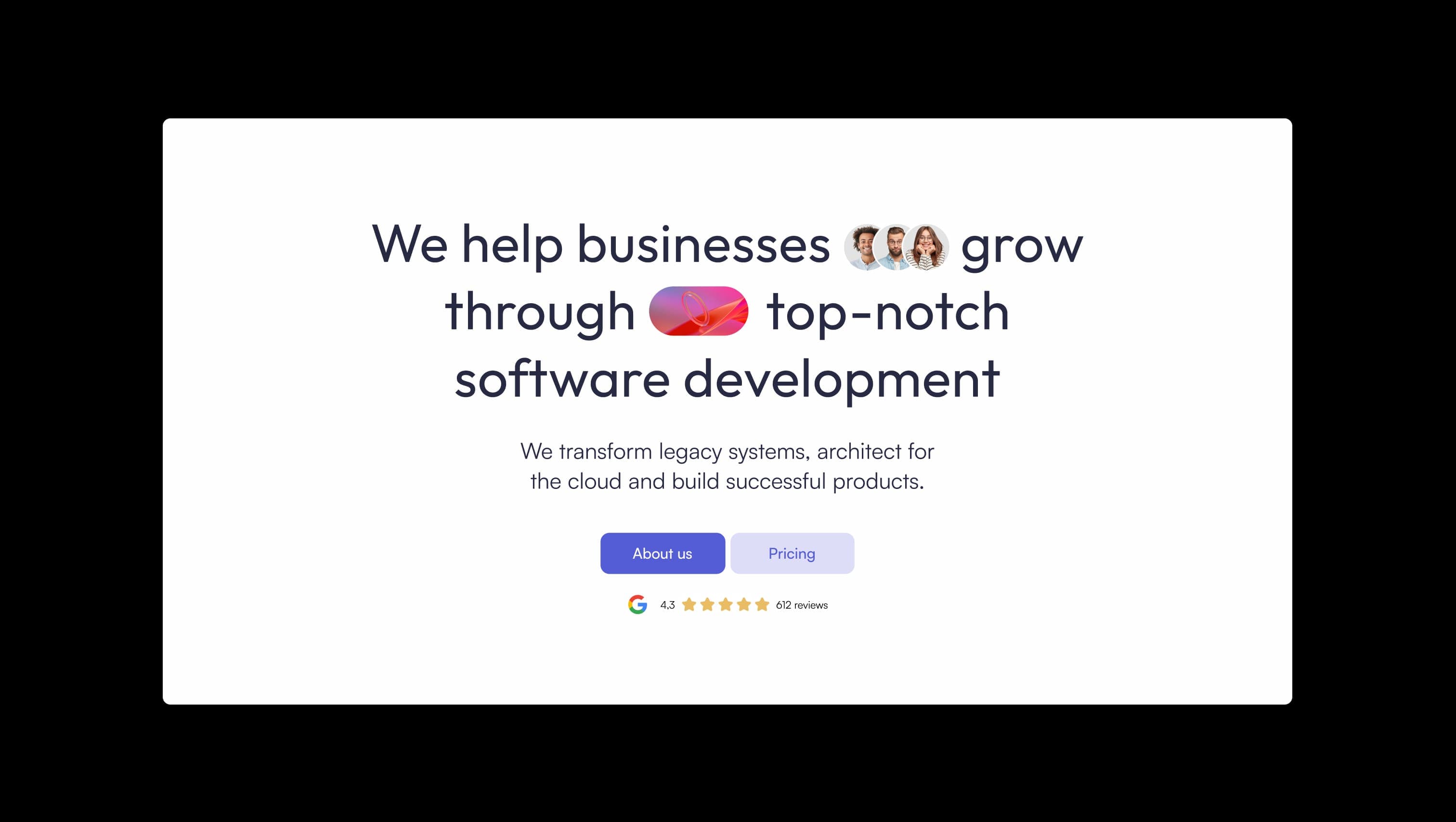
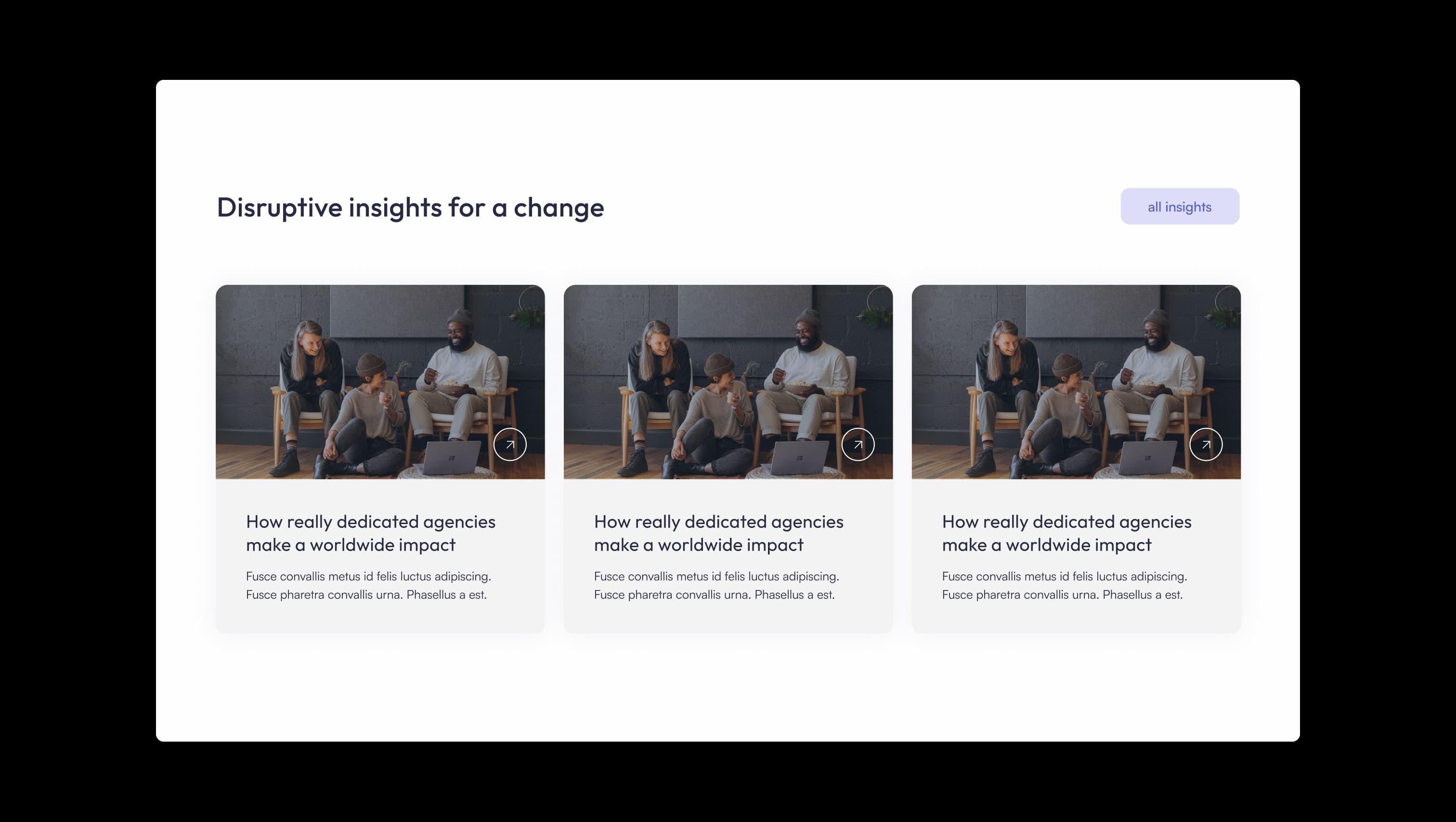
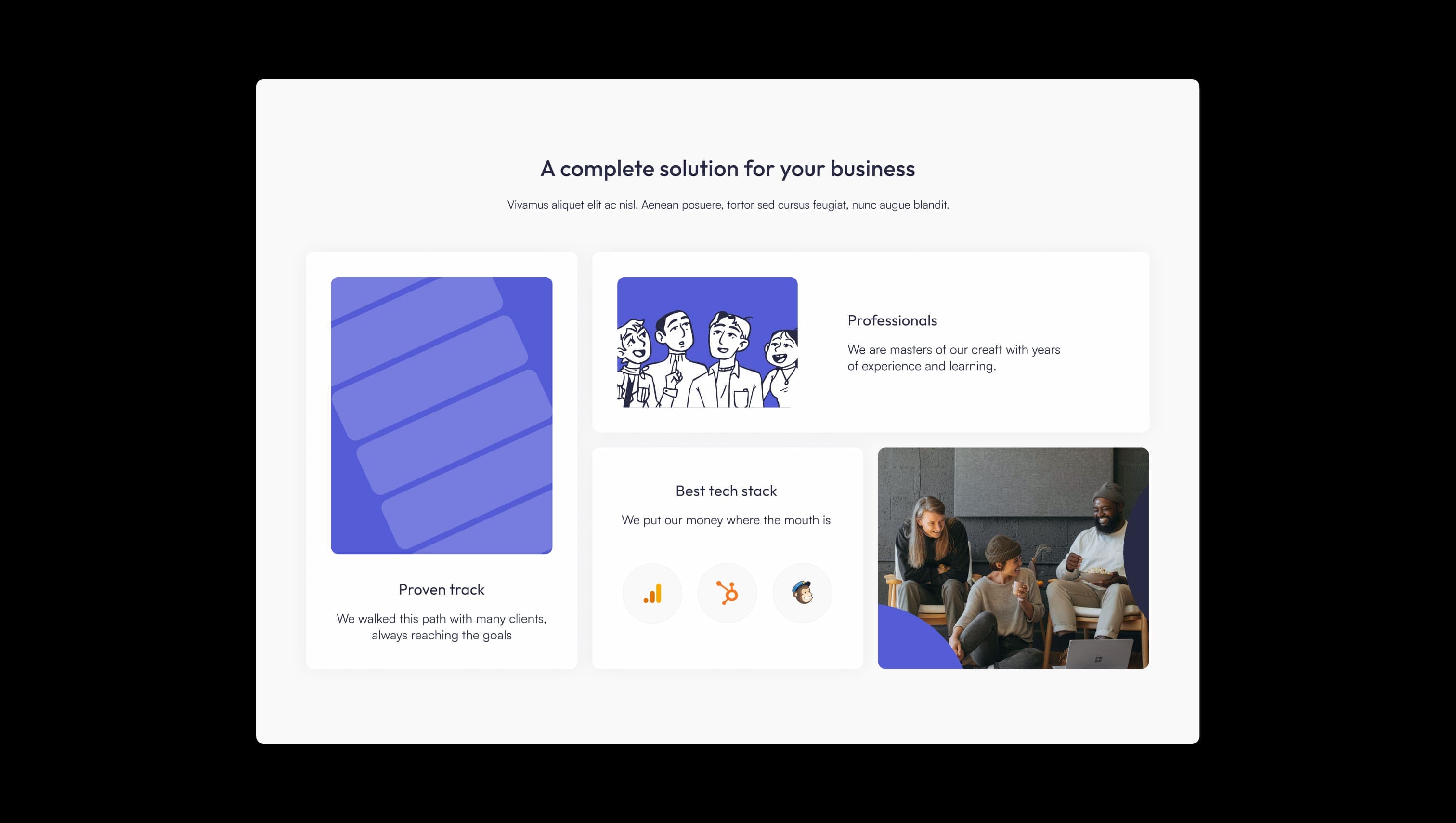
Good Biz is a warm, optimistic business identity built around a single vivid indigo accent and a deep navy ink. The brand reads as approachable and modern: rounded pill buttons, generously rounded photo cards, and confident sans-serif typography that softens corporate convention with a touch of personality. Hero compositions pair full-bleed editorial photography with cheerful inline emoji-style avatars and gradient pill ornaments, signalling a studio that takes the work seriously without taking itself too seriously. The palette is restrained — almost monochromatic — letting the indigo do the heavy lifting on every CTA, link highlight, and statistic. Surfaces alternate between a warm off-white canvas and a soft pearl grey, with ghost-blue used as a friendly secondary chip and white cards floating on subtle shadows. Layouts breathe at 120px section rhythm, and 32px–160px corner radii give every photographic asset a tactile, sculpted feel.
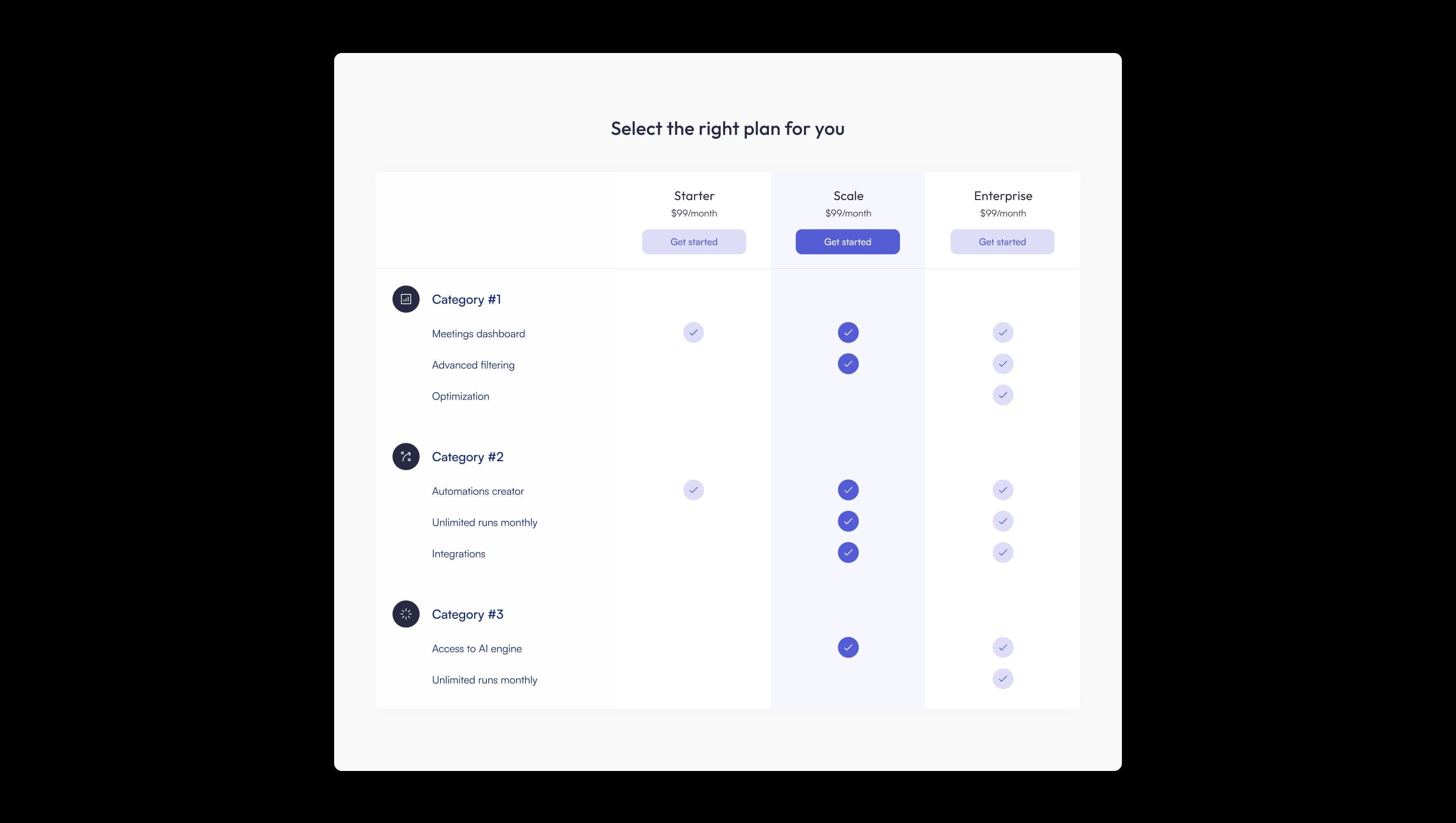
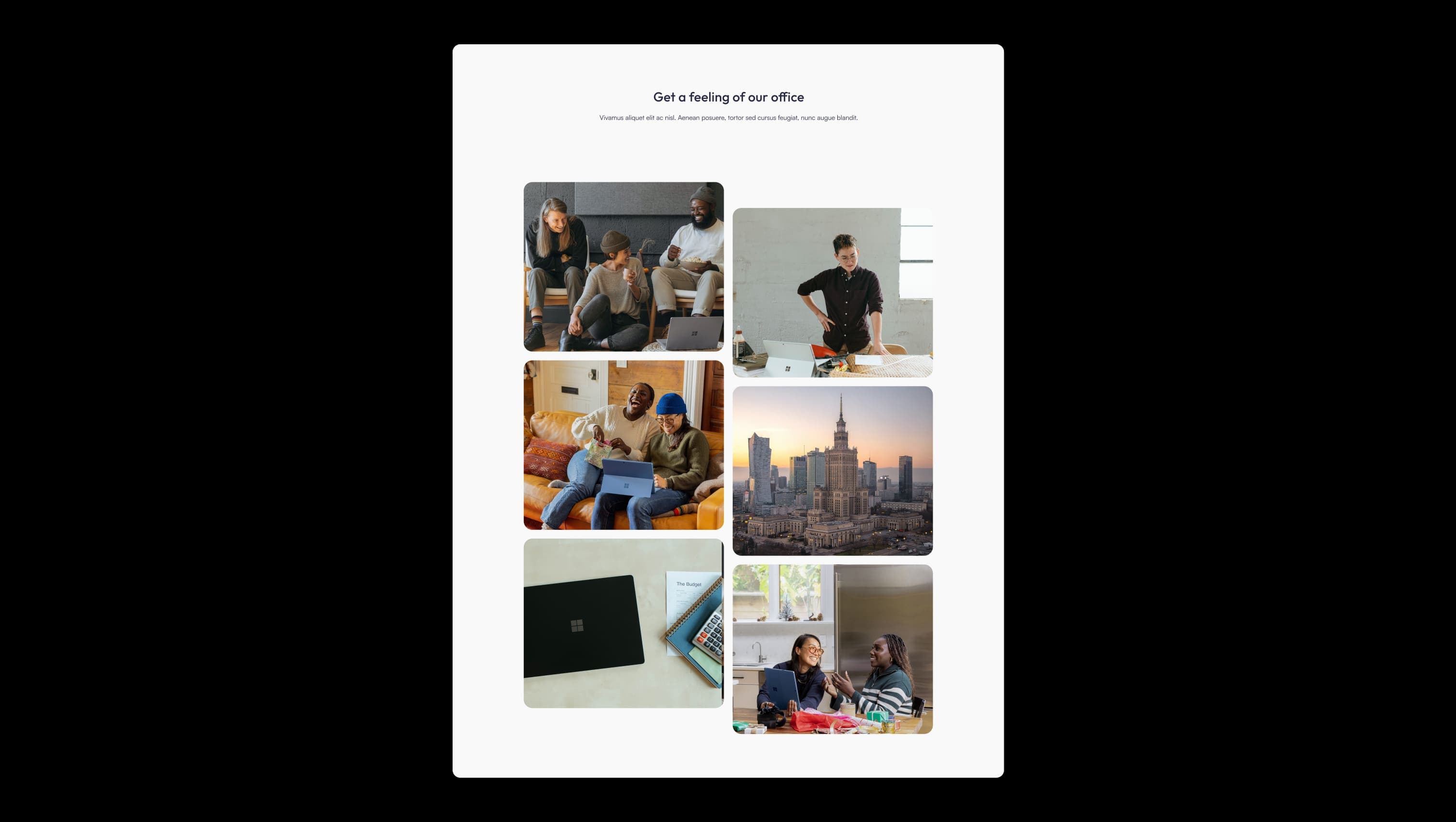
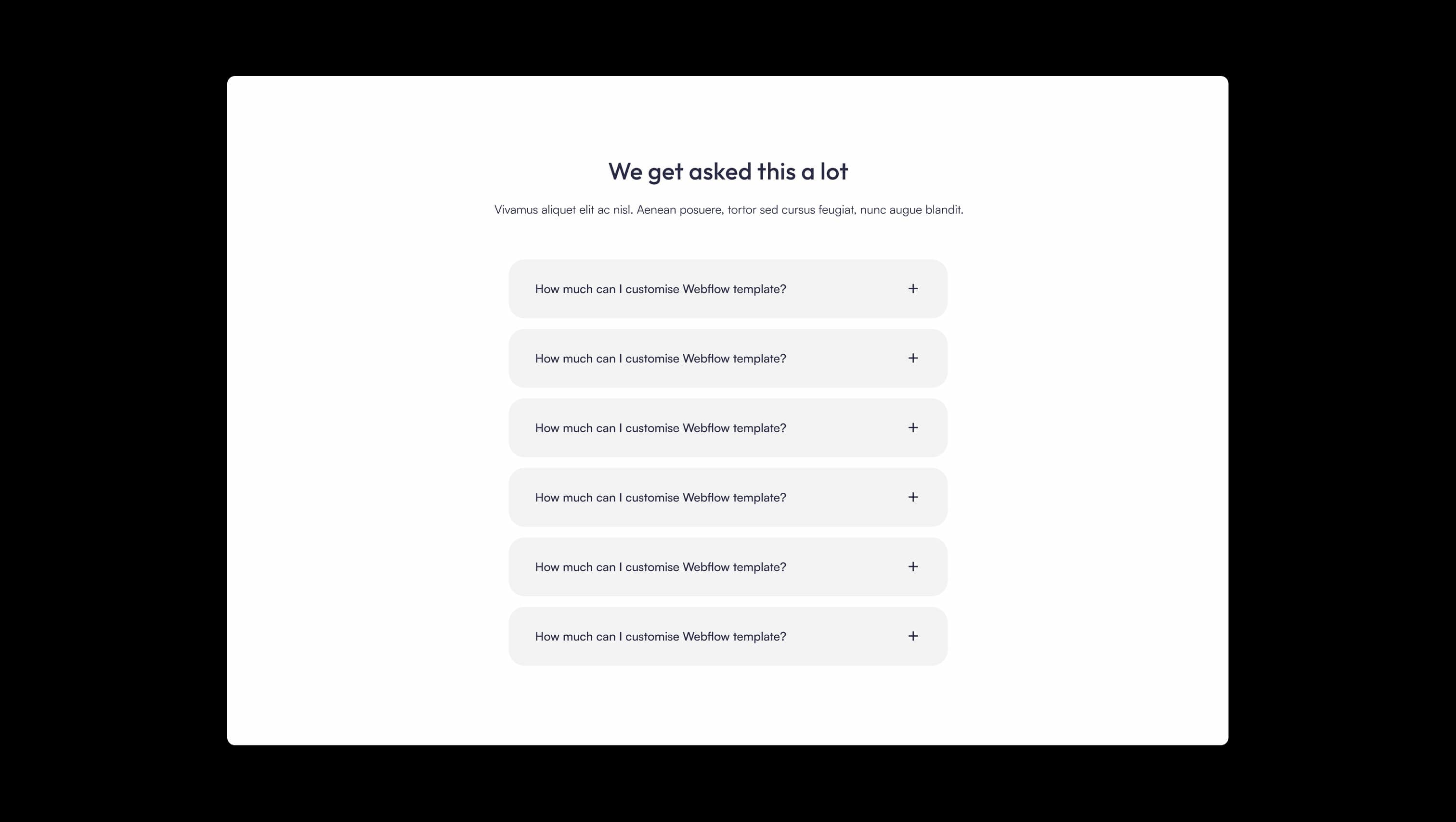
A handful of real sections that ship with this template. Click any card to preview, or explore them all under the Sections tab.

Tertiary depth tone. Dropdown menu sheets and circular slider arrow buttons.
Lifted neutral surface. Alternating section backgrounds and pricing card fills.
Primary canvas. Page background, hero panels, and white CTA fill on the indigo block.
Photographic overlay. Left-to-right gradient mask over hero imagery for legible white text.
Primary text & ink. Headlines, body copy, dark overlays on hero photography.
Signature accent. Primary buttons, link highlights, footer social chips, and stat numbers.
Soft secondary accent. Ghost button fills, cart pills, and subtle indigo wash.
The quick brown fox jumps
Statistic and big-number display family — used for percentage and figure callouts in indigo.
The quick brown fox jumps
Primary family for headings, body, navigation, and UI controls.
spacious1400px120px48px24px4px8px16px24px32px48px64px80px100px120pxcards12pxpills80pxsmall8pxcircle9999pxbuttons12pxsculpted160pxhero-panels32pxmedia-tiles24pxnavigation-pills70pxStep from canvas (level 1) to lifted (level 2) to inset depth (level 3), then invert into the dark levels for full-bleed sections. Hex codes and roles live in the Colors section above; this ladder shows the layering only.
# Design System Guide
> Unlock the template to access the full design system.
## Brand voice
A short paragraph describing the brand voice, mood, and visual
principles that anchor the system. Tone, cadence, and intent.
## Colors
| Token | Hex | Role |
| ------------ | -------- | ------------------------------------- |
| canvas-1 | #xxxxxx | Page background, large surfaces |
| canvas-2 | #xxxxxx | Lifted surfaces, cards |
| canvas-3 | #xxxxxx | Inset wells, depressed states |
| ink-1 | #xxxxxx | Primary body text |
| ink-2 | #xxxxxx | Secondary text, labels |
| ink-3 | #xxxxxx | Tertiary text, hints |
| accent-1 | #xxxxxx | Primary brand accent |
| accent-2 | #xxxxxx | Secondary accent |
| state-ok | #xxxxxx | Success, confirmations |
| state-warn | #xxxxxx | Warnings |
| state-err | #xxxxxx | Errors, destructive actions |
## Typography
- **Display** — heading scale, used for hero text and section titles.
- **Body** — primary reading text, optimized for paragraphs.
- **Mono** — code, data, and tabular numerals.
```
display: 32px / 40px / 48px / 64px / 80px
body: 14px / 16px / 18px
mono: 12px / 14px
```
## Spacing & shape
Base unit: 4px. Scale: 4, 8, 12, 16, 24, 32, 48, 64, 96, 128.
Radii: sm (4px), md (8px), lg (12px), xl (20px), full (9999px).
## Surfaces
Layered elevation from canvas → lifted → inset. Surfaces invert in
dark sections for full-bleed contrast.
## Do's and don'ts
- Do use accent-1 sparingly for primary CTAs only.
- Do maintain at least 4.5:1 contrast on body text.
- Don't mix display and body in the same line.
- Don't use state colors for branding.
## Agent prompt guide
Prompts for AI design tools that respect this system.
Includes example prompts for sections, components, and layouts.
# ...
Unlock the full style guide