Design systems, extracted.
Search curated design systems pulled from premium templates or create one from URL. Open any style for colors, type, spacing, components, and a DESIGN.md or tokens.json your agent can use.
Quickly navigate through the dashboard with your keyboard using the command menu.

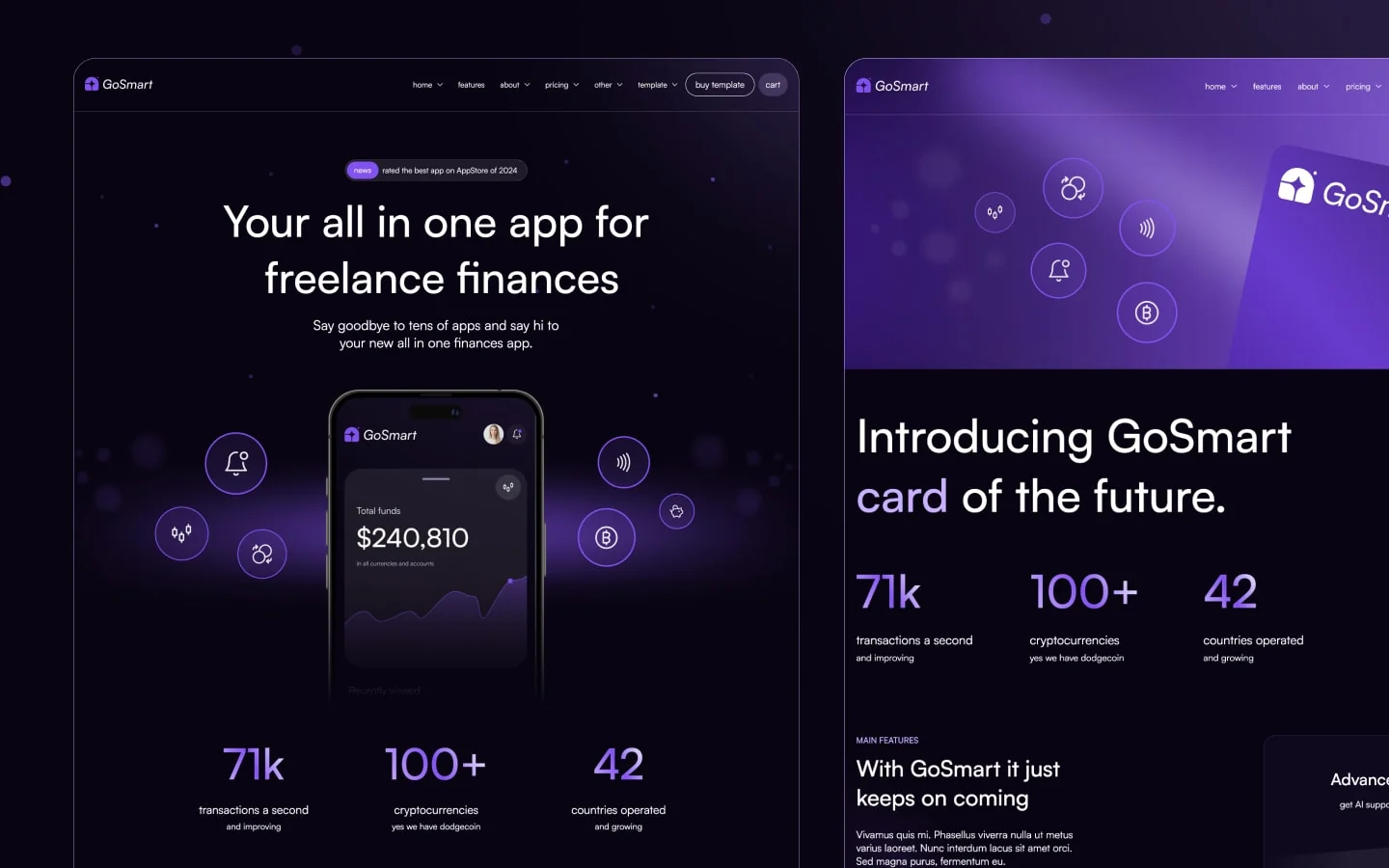
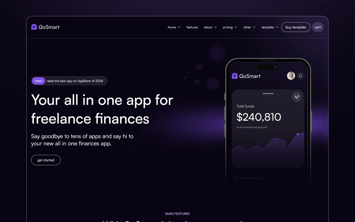
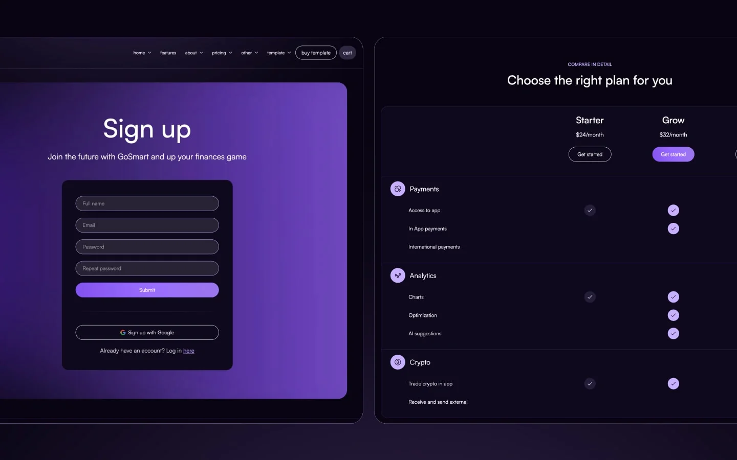
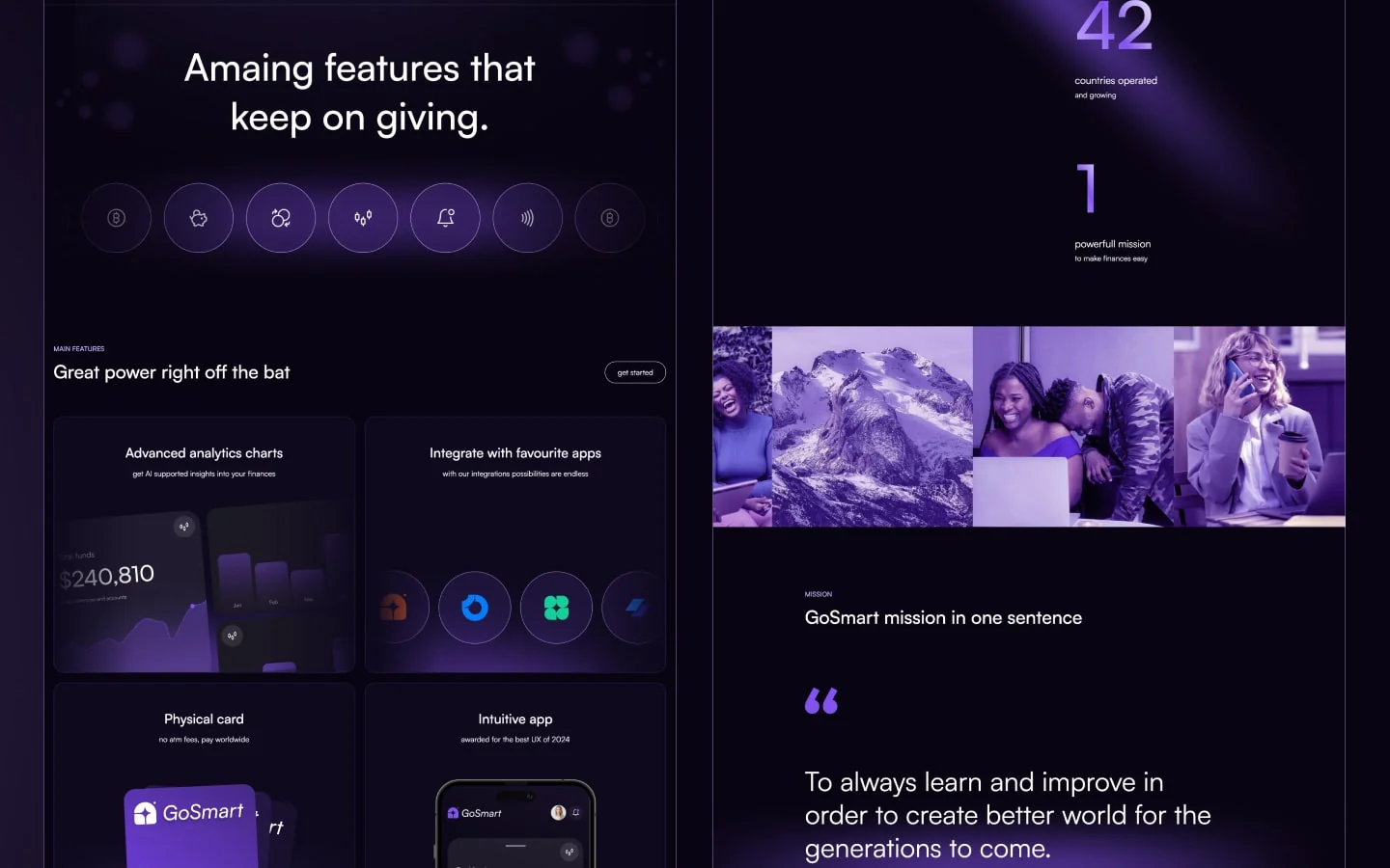
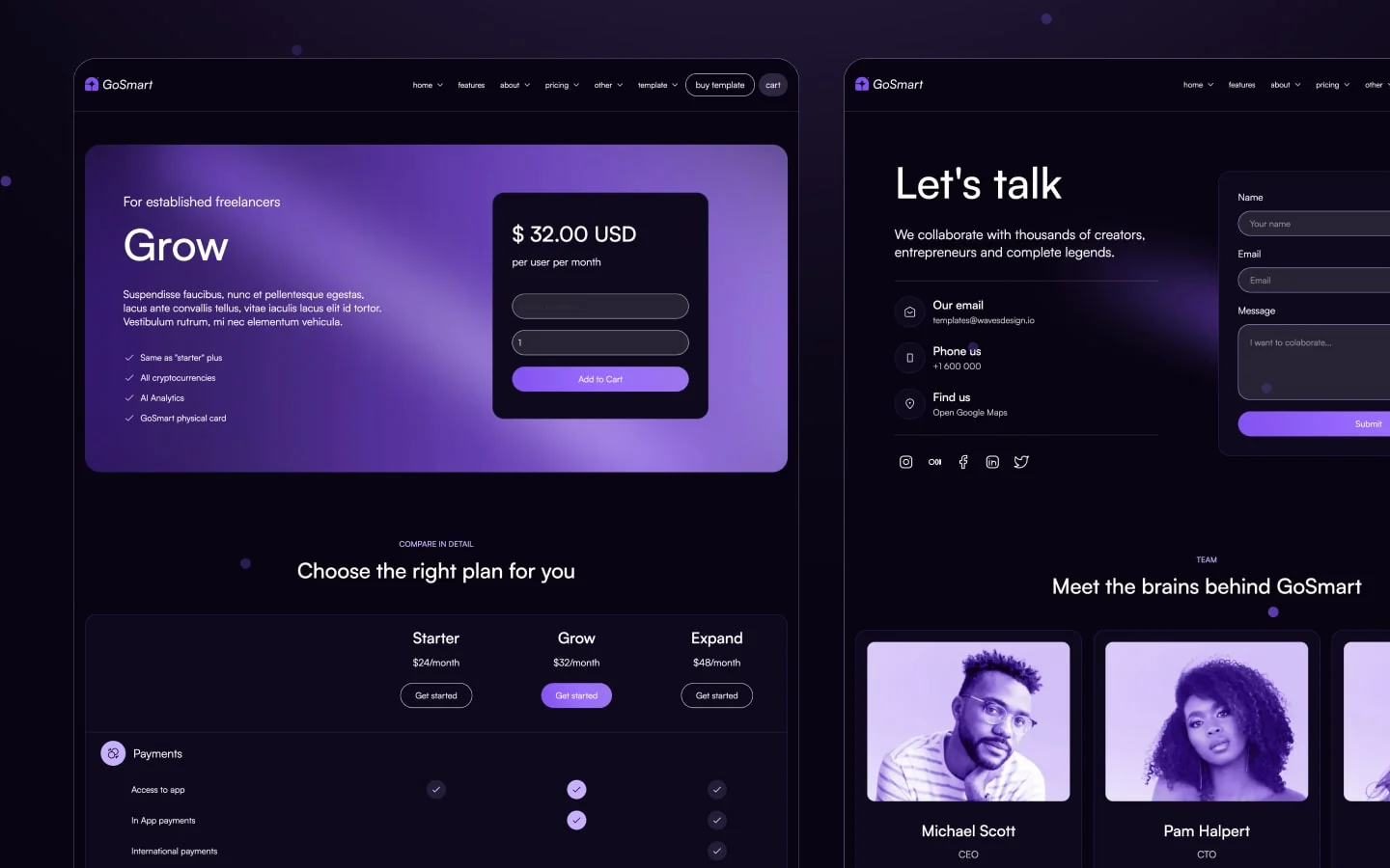
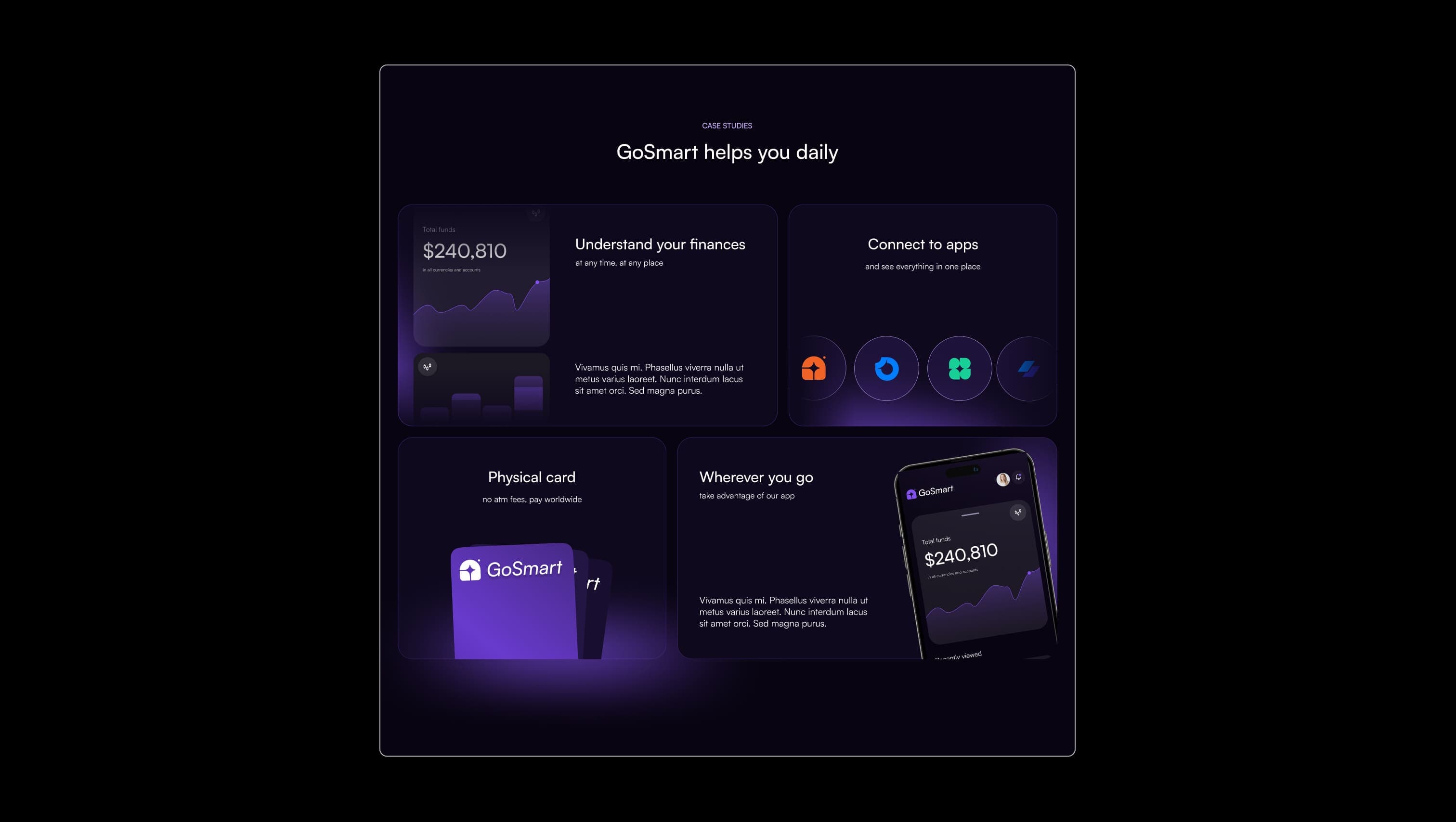
GoSmart is a deep-violet fintech aesthetic built on near-black canvases lit by electric purple gradients and soft neon glows. The mood is confident and futuristic — premium without being cold — with pill-shaped CTAs, generously rounded elevation tiles, and gradient numerals that read like illuminated signage on a midnight skyline. The system runs entirely on Satoshi, leaning into airy 130% line heights, oversized display headlines, and accent-light lavender used sparingly for emphasis. Surfaces stack from a true near-black canvas to a slightly lifted indigo-black, framed by thin violet borders so cards feel laser-cut rather than heavy.
A handful of real sections that ship with this template. Click any card to preview, or explore them all under the Sections tab.
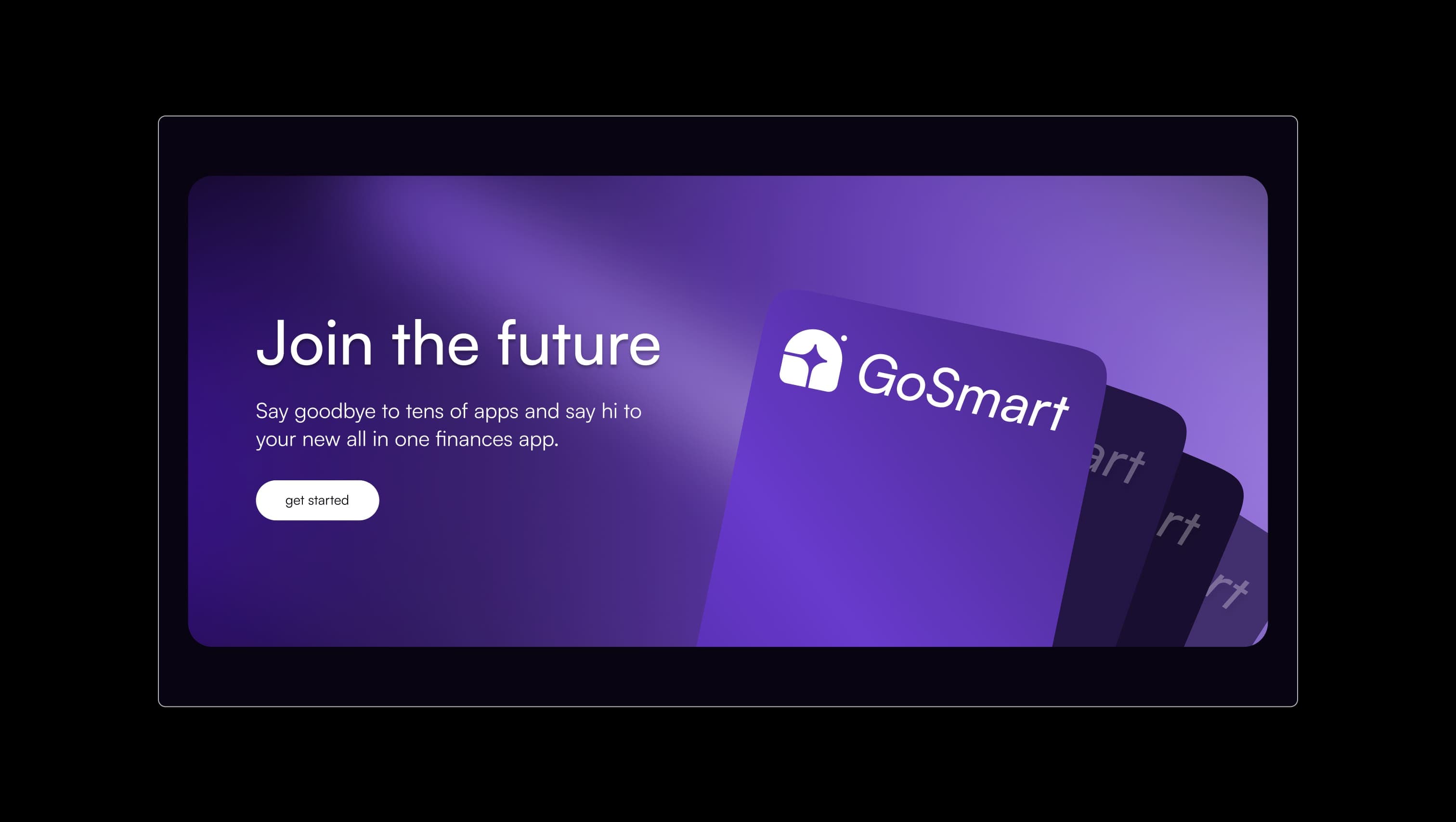
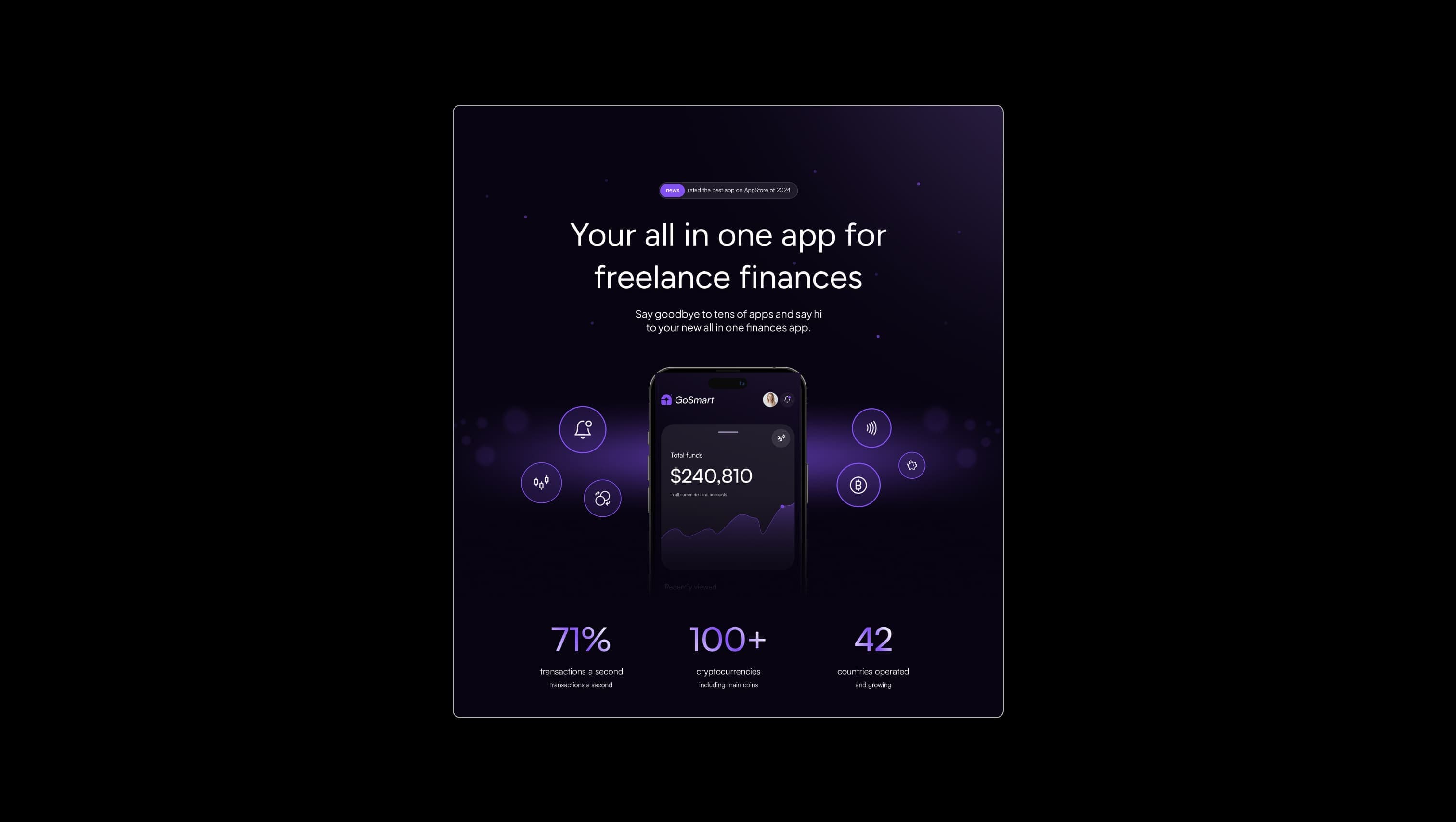
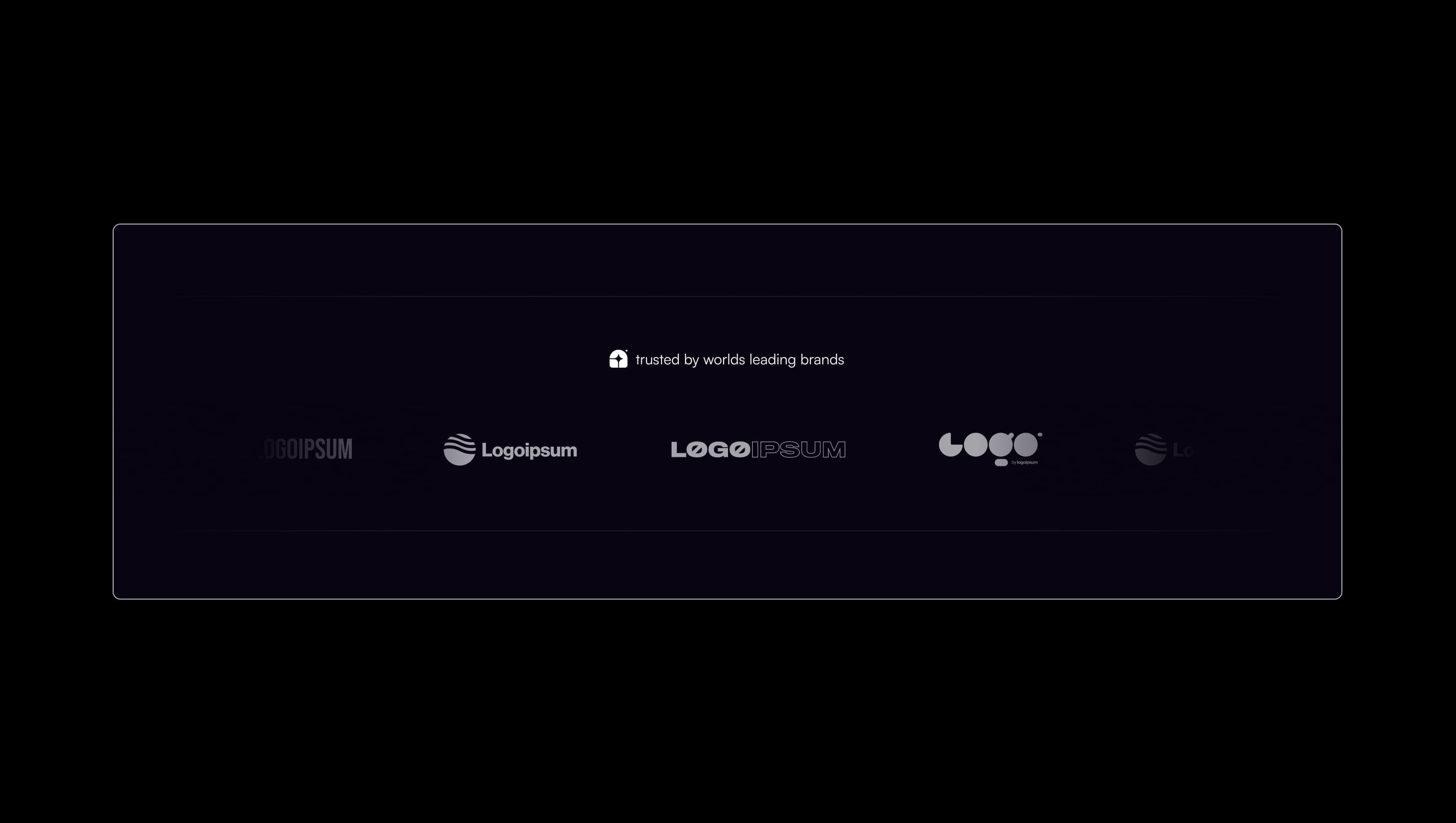
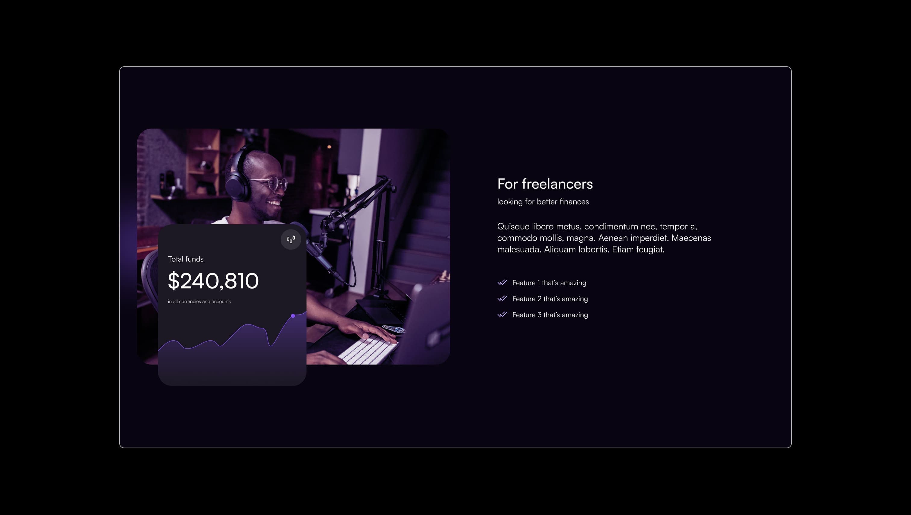
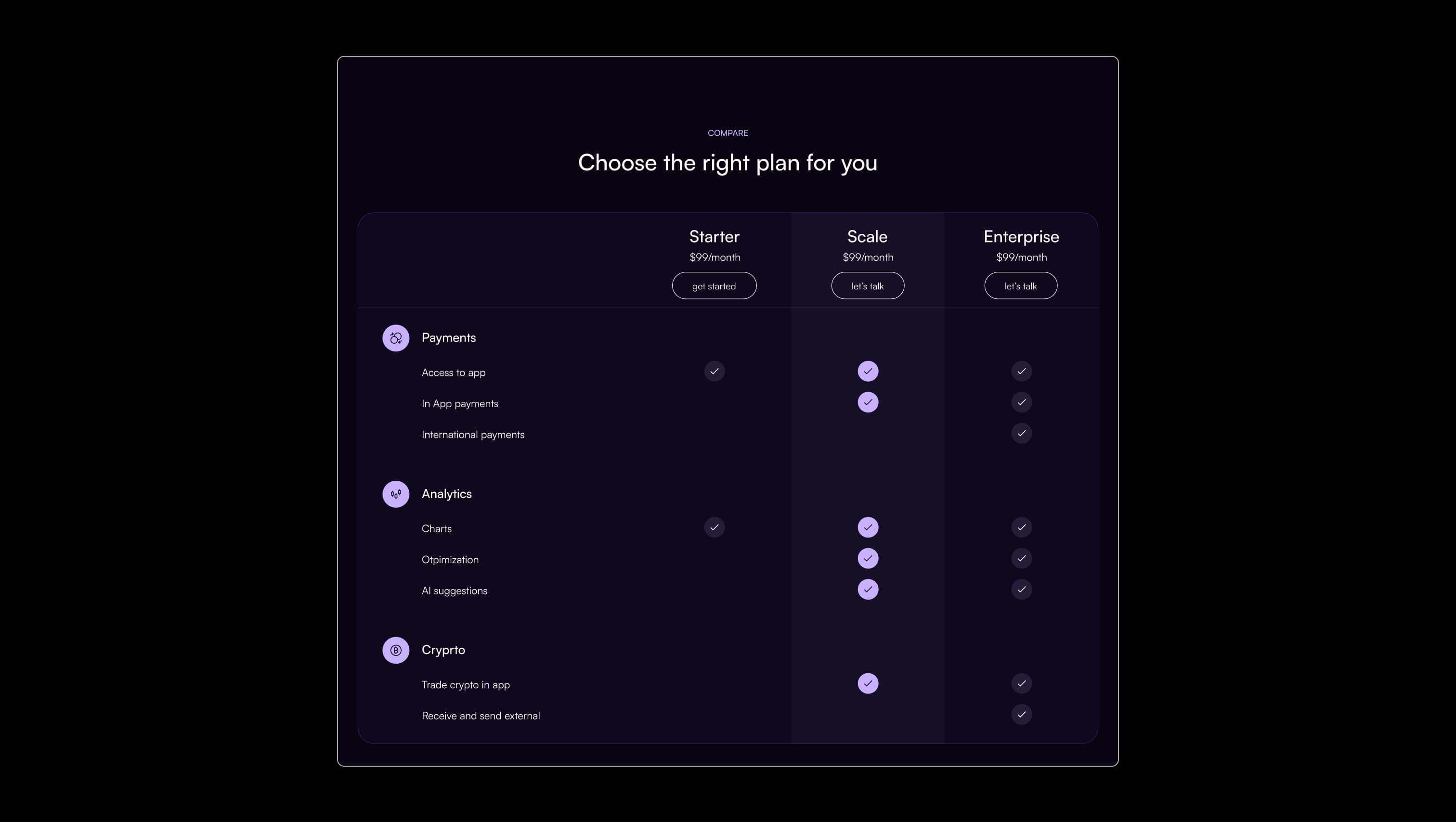
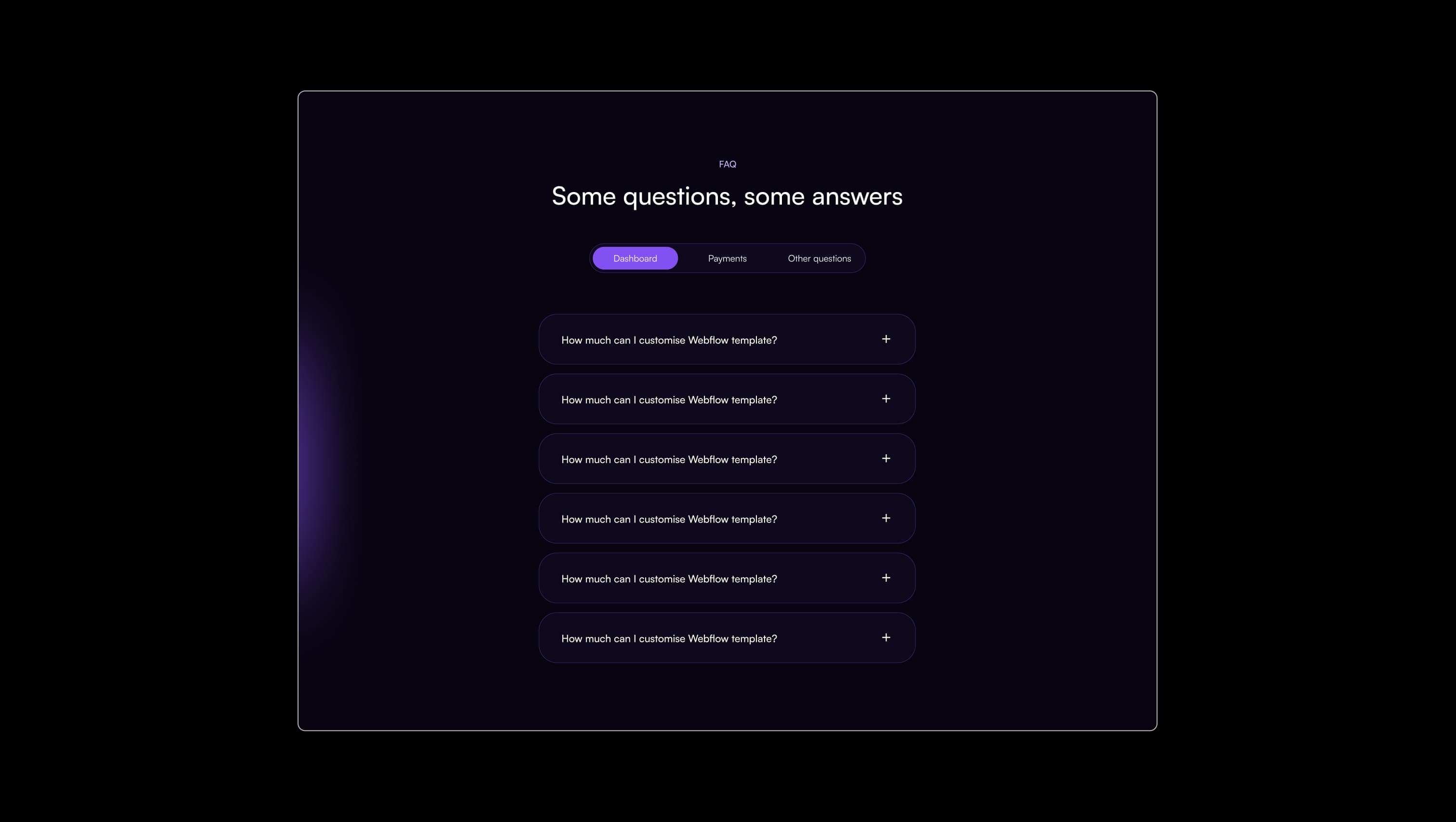
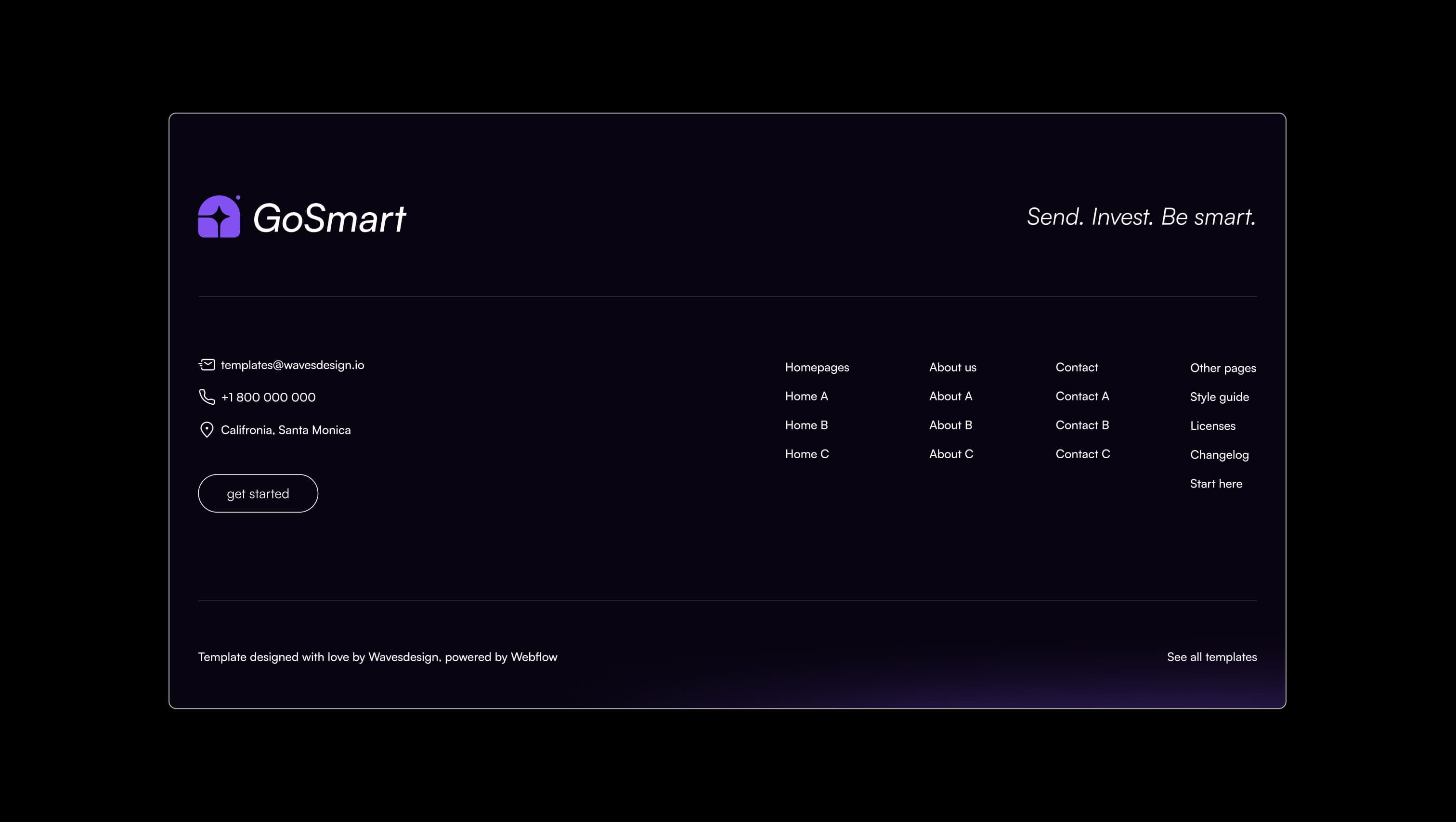
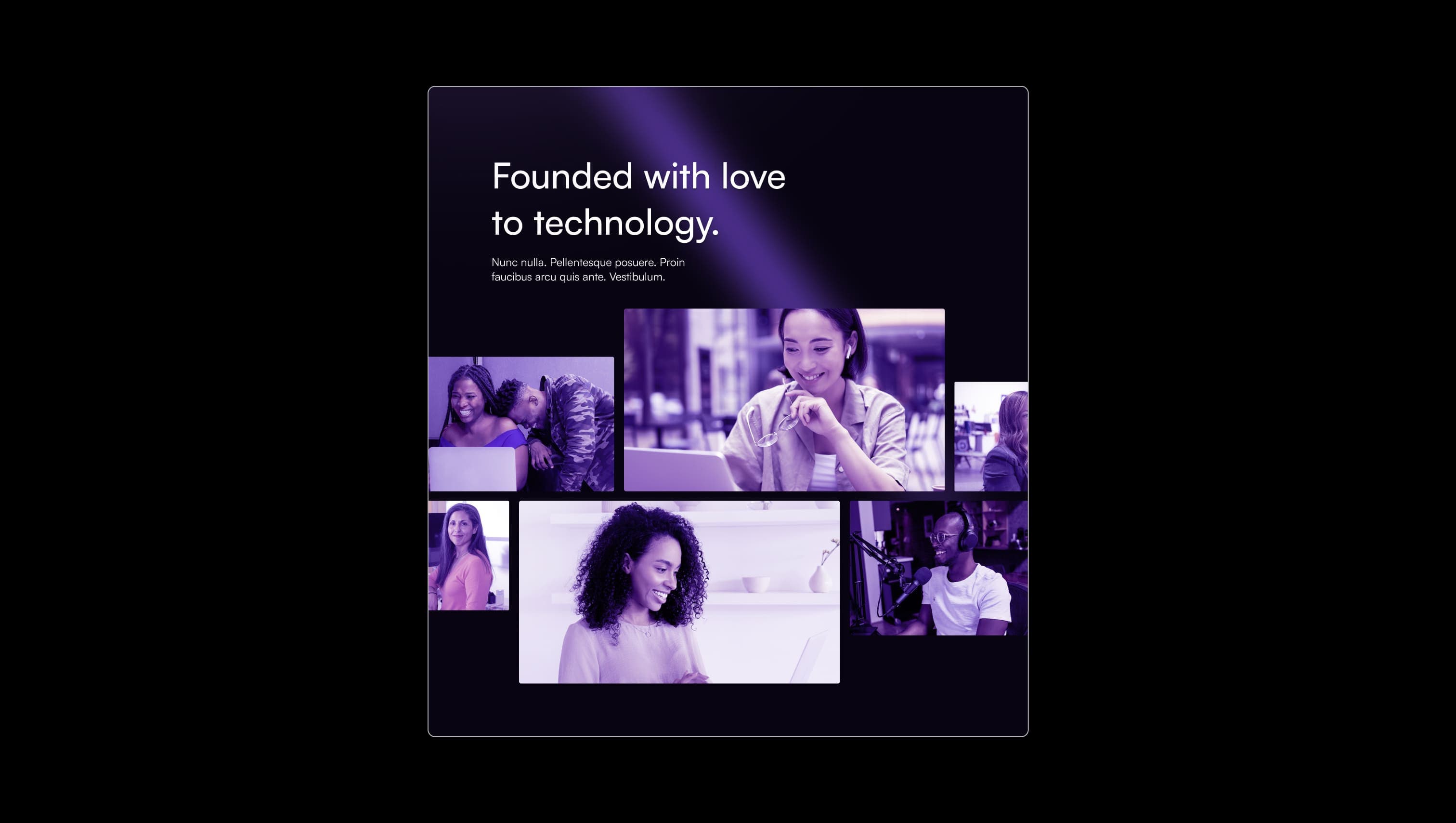
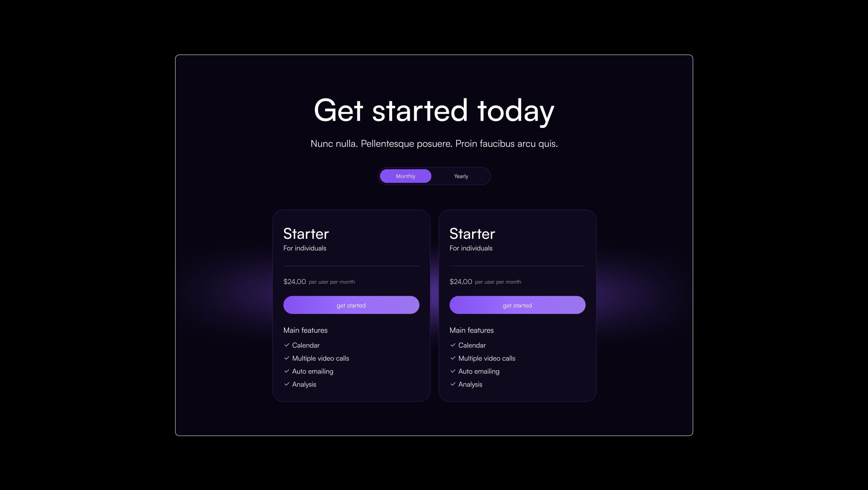
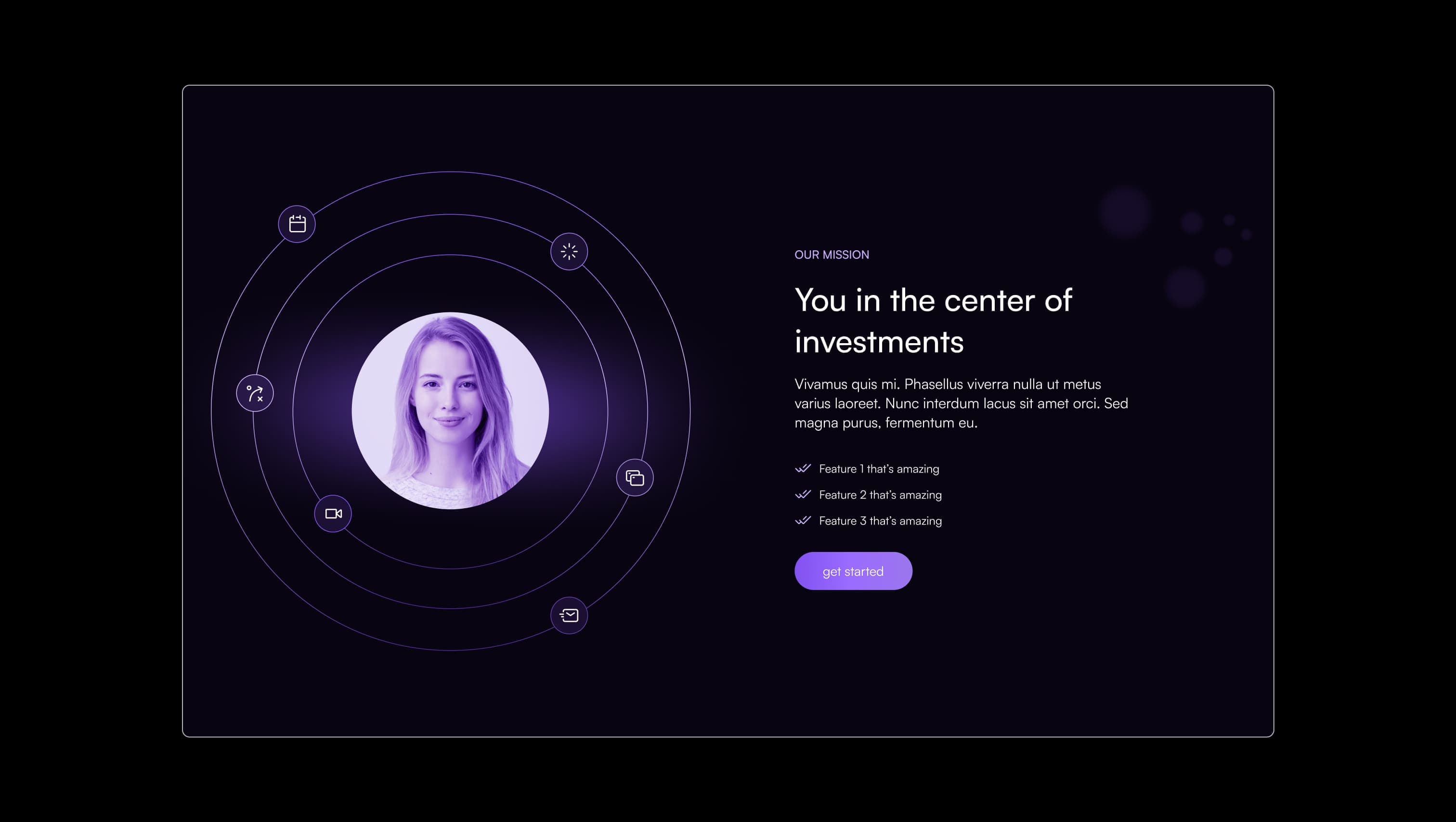
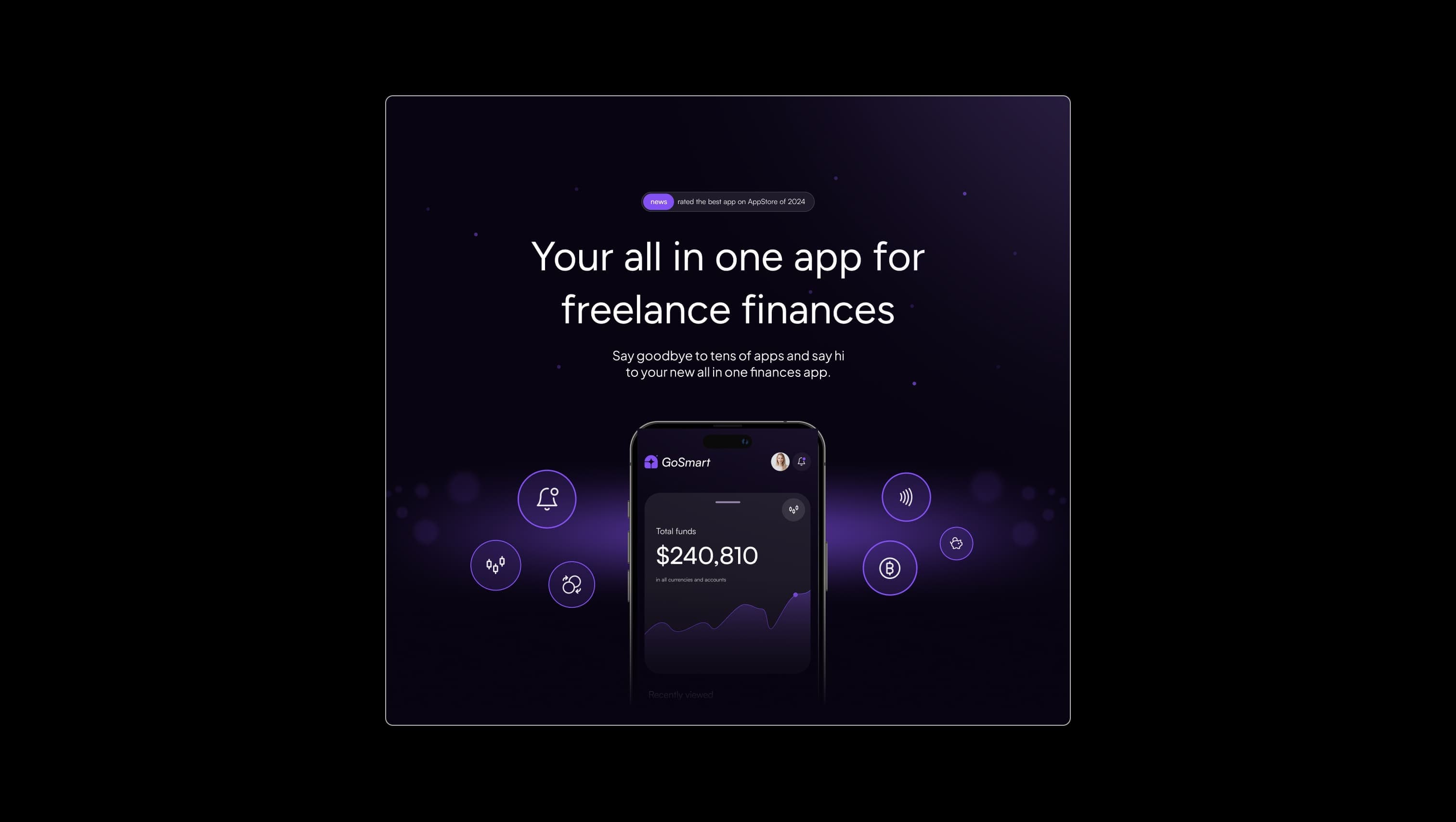
Lifted surface. Cards, tiles, dropdowns, and CTA sections sit one step above the canvas.
Primary canvas. Page background, footer, and section backgrounds — the deepest shade in the system.
Hover surface. Tile and link hover state — a subtle warming above elevation.
Muted ink. Secondary copy and faded body-big text against dark surfaces.
Primary text & ink. Headlines, body copy, outline button strokes, and form field text.
Border tone. Hairline outlines on tiles, cart, dropdowns, footer divider, and tab menu.
Brand accent. Gradient buttons, active tabs, info-tag pills, and gradient number fills.
Soft accent. Eyebrow text, current dropdown links, cart pill background, and tile link color.
The quick brown fox jumps
Single typeface for the entire system — display, headings, body, UI, and forms.
spacious1800px70px40px24px8px16px24px32px40px48px64px80px100px120px140px160pxtag80pxpill70pxtabs90pxtiles24pxavatar9999pxdropdown12pxStep from canvas (level 1) to lifted (level 2) to inset depth (level 3), then invert into the dark levels for full-bleed sections. Hex codes and roles live in the Colors section above; this ladder shows the layering only.
# Design System Guide
> Unlock the template to access the full design system.
## Brand voice
A short paragraph describing the brand voice, mood, and visual
principles that anchor the system. Tone, cadence, and intent.
## Colors
| Token | Hex | Role |
| ------------ | -------- | ------------------------------------- |
| canvas-1 | #xxxxxx | Page background, large surfaces |
| canvas-2 | #xxxxxx | Lifted surfaces, cards |
| canvas-3 | #xxxxxx | Inset wells, depressed states |
| ink-1 | #xxxxxx | Primary body text |
| ink-2 | #xxxxxx | Secondary text, labels |
| ink-3 | #xxxxxx | Tertiary text, hints |
| accent-1 | #xxxxxx | Primary brand accent |
| accent-2 | #xxxxxx | Secondary accent |
| state-ok | #xxxxxx | Success, confirmations |
| state-warn | #xxxxxx | Warnings |
| state-err | #xxxxxx | Errors, destructive actions |
## Typography
- **Display** — heading scale, used for hero text and section titles.
- **Body** — primary reading text, optimized for paragraphs.
- **Mono** — code, data, and tabular numerals.
```
display: 32px / 40px / 48px / 64px / 80px
body: 14px / 16px / 18px
mono: 12px / 14px
```
## Spacing & shape
Base unit: 4px. Scale: 4, 8, 12, 16, 24, 32, 48, 64, 96, 128.
Radii: sm (4px), md (8px), lg (12px), xl (20px), full (9999px).
## Surfaces
Layered elevation from canvas → lifted → inset. Surfaces invert in
dark sections for full-bleed contrast.
## Do's and don'ts
- Do use accent-1 sparingly for primary CTAs only.
- Do maintain at least 4.5:1 contrast on body text.
- Don't mix display and body in the same line.
- Don't use state colors for branding.
## Agent prompt guide
Prompts for AI design tools that respect this system.
Includes example prompts for sections, components, and layouts.
# ...
Unlock the full style guide