Design systems, extracted.
Paste any URL to create a design system from it. Open any style for colors, type, spacing, components, and a DESIGN.md or tokens.json your agent can use.
Quickly navigate through the dashboard with your keyboard using the command menu.

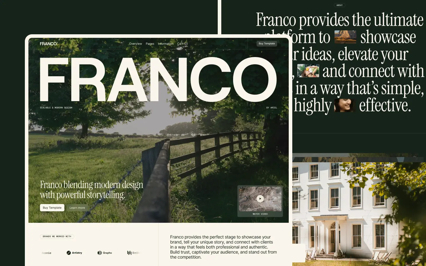
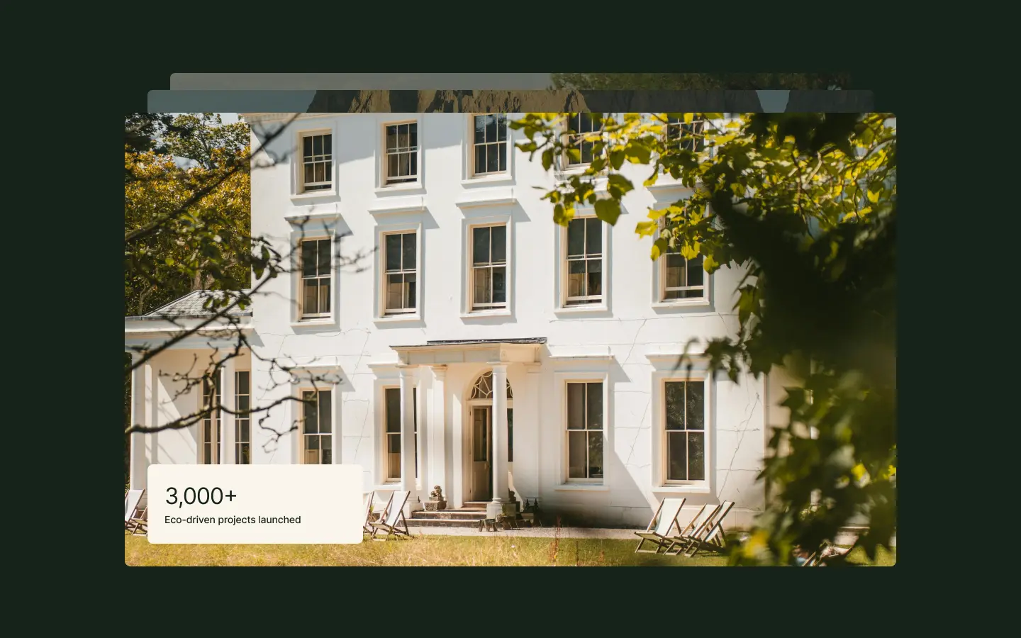
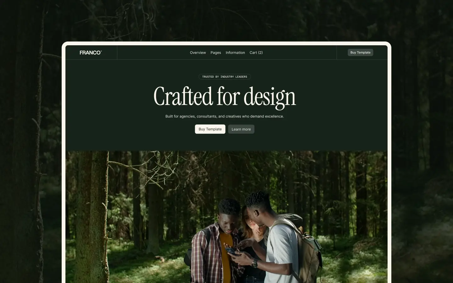
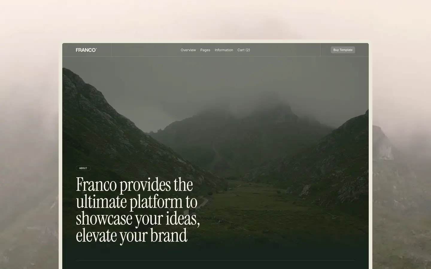
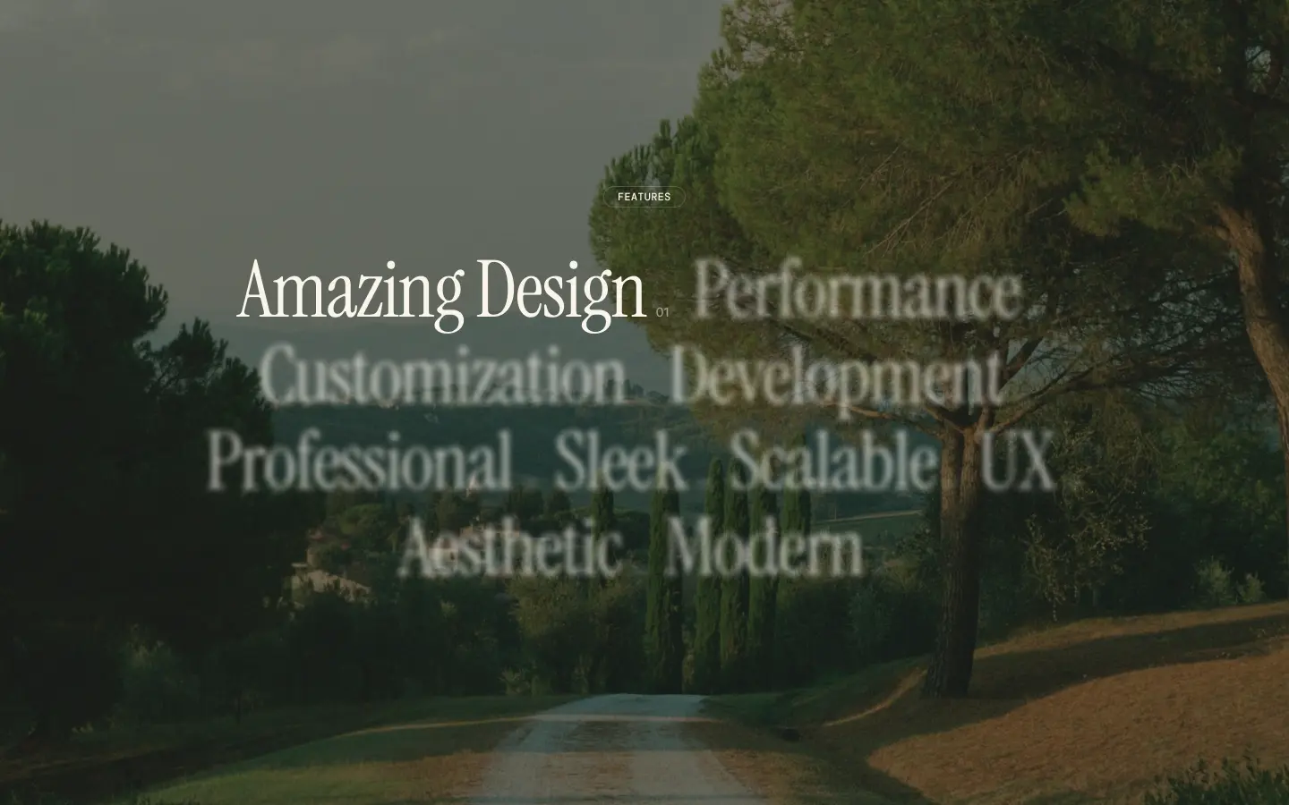
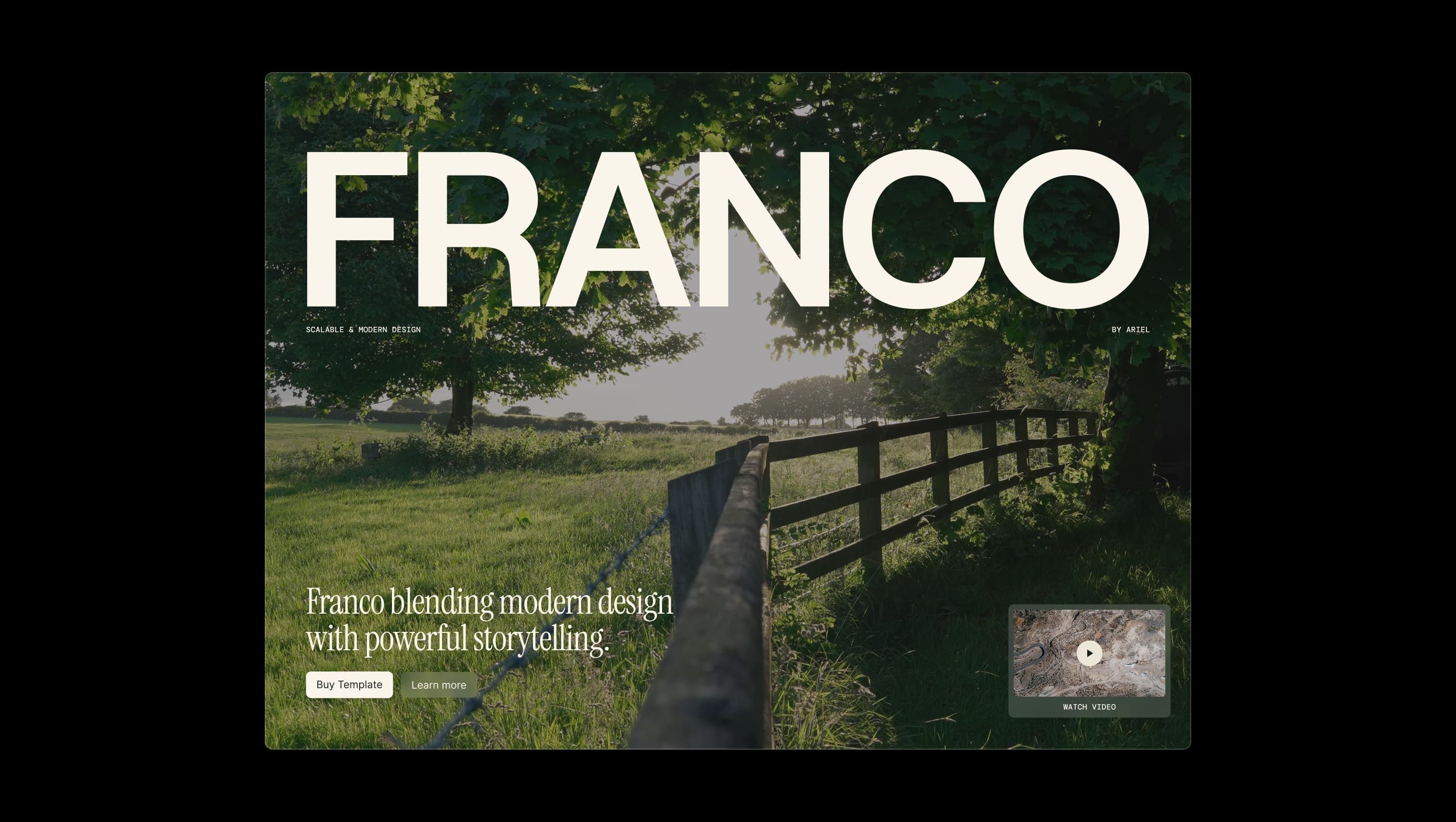
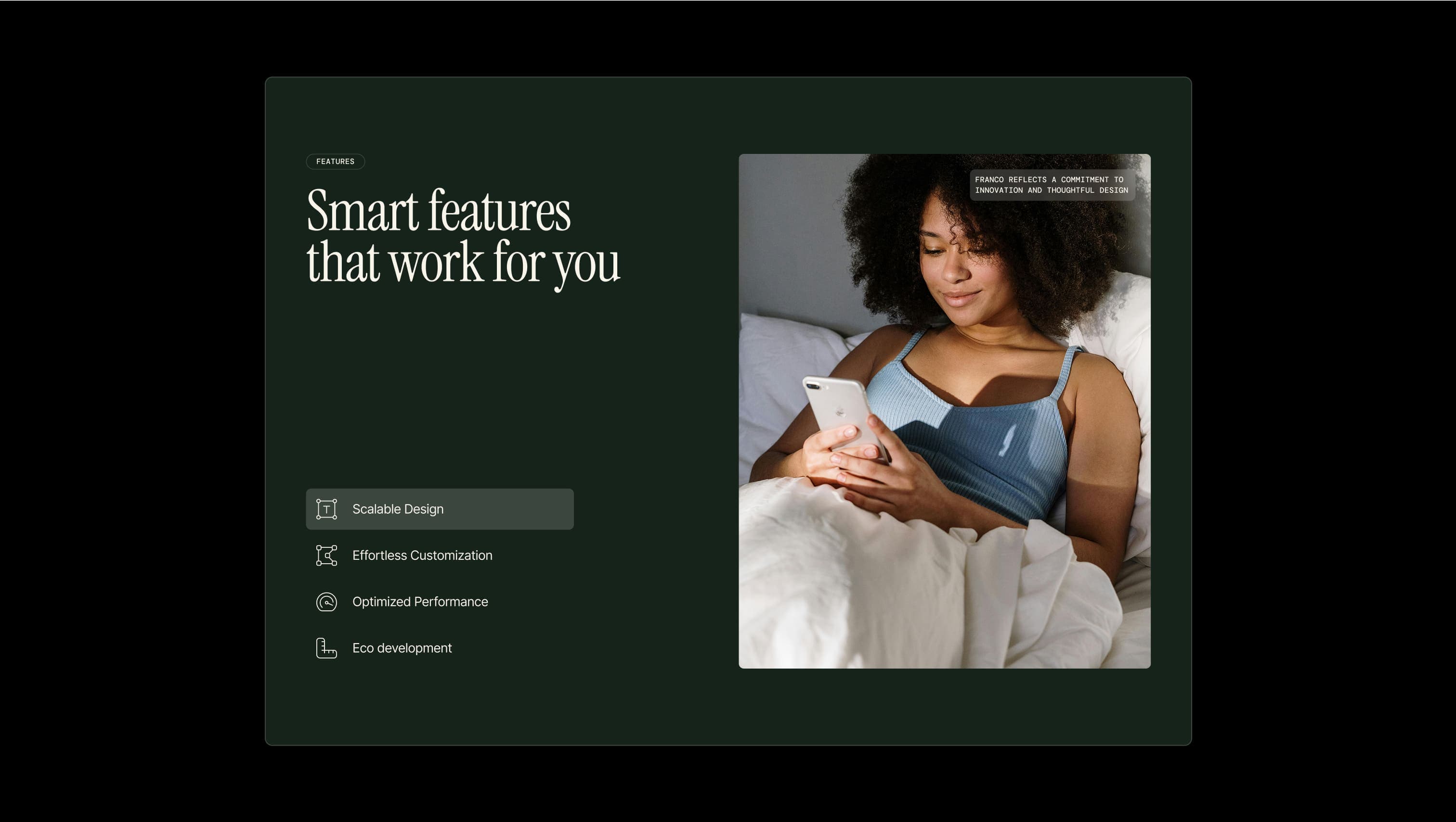
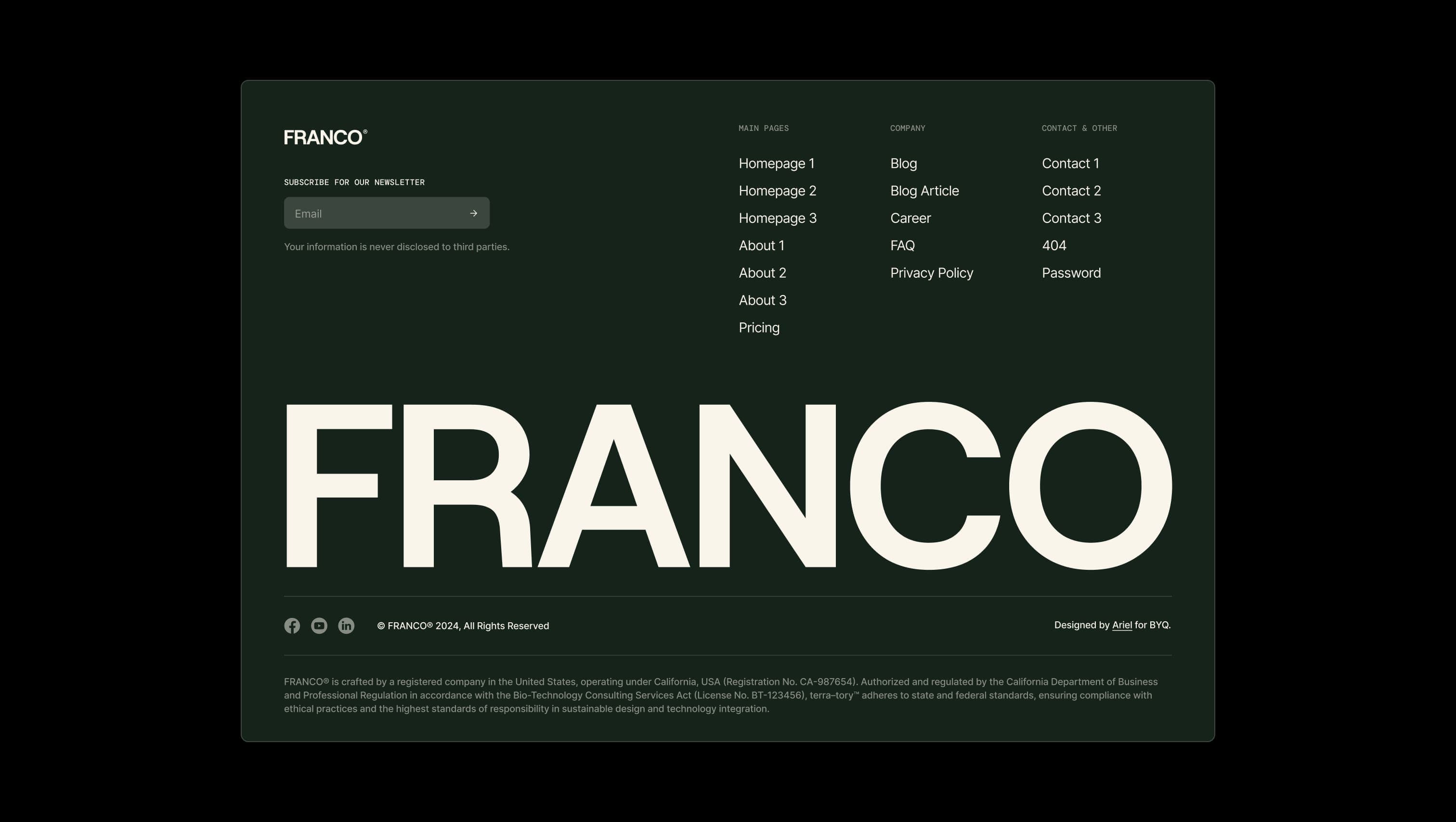
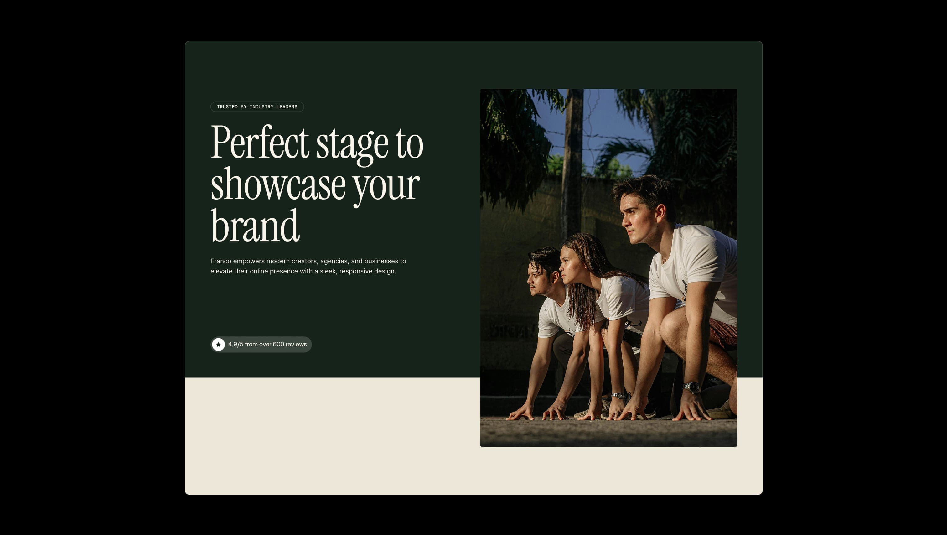
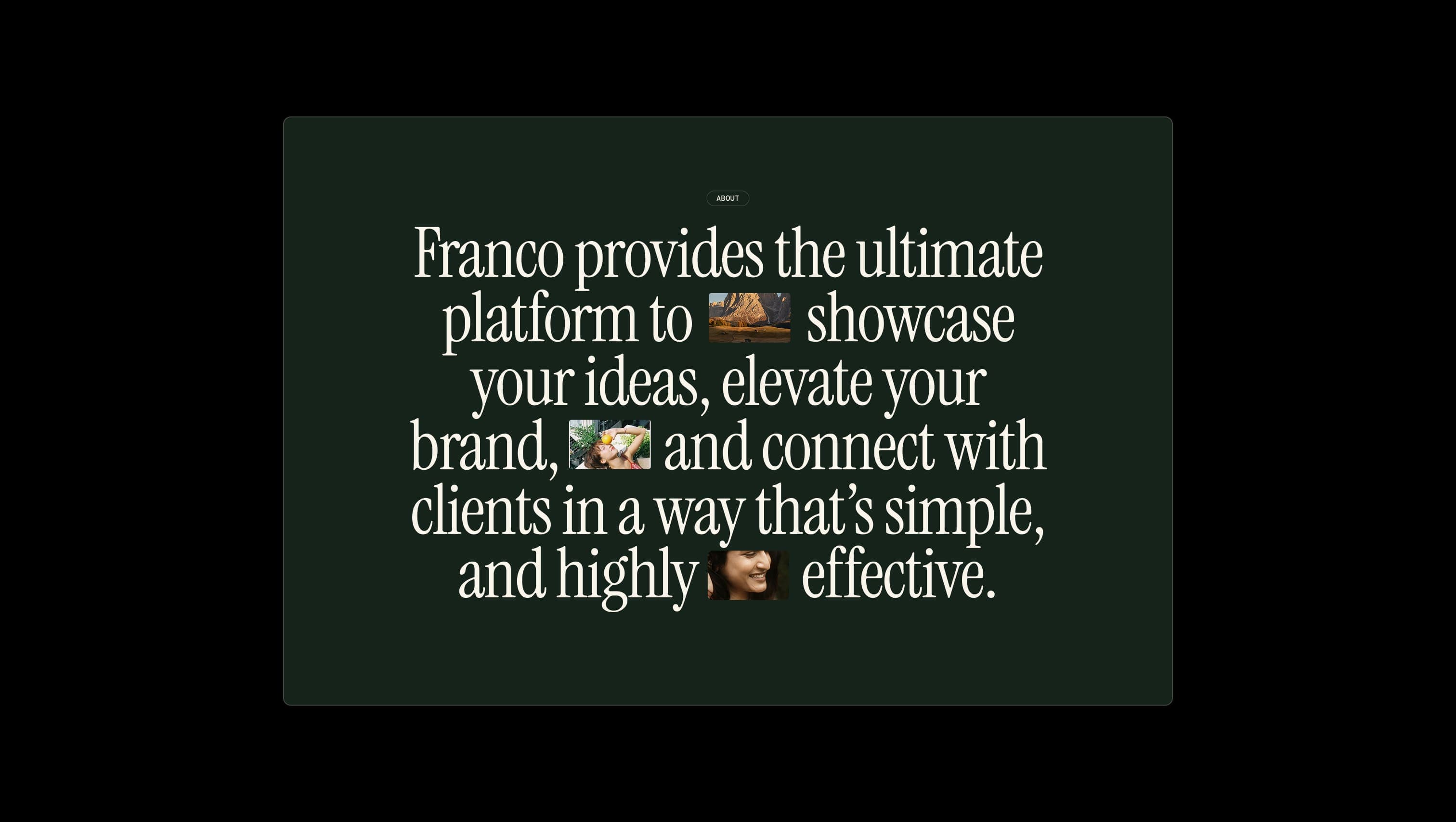
Franco is a serif-led editorial template where deep forest greens meet warm parchment cream — a design system tuned for storytelling agencies, eco-conscious brands, and creative studios that want their work framed by landscape photography and quiet typography. Sections alternate between cream canvases and inky forest panels, each anchored by oversized Instrument Serif headlines that breathe across full-bleed video and imagery. The overall feel is grounded and unhurried: tight letter-spacing on display type, generous 120px section rhythms, soft 8–32px radii, and uppercase DM Mono labels acting as quiet wayfinders. Buttons stay small and humble. Imagery does the heavy lifting — sun-dappled forests, Georgian facades, hands holding fruit — while the type system stays almost monastic in restraint.
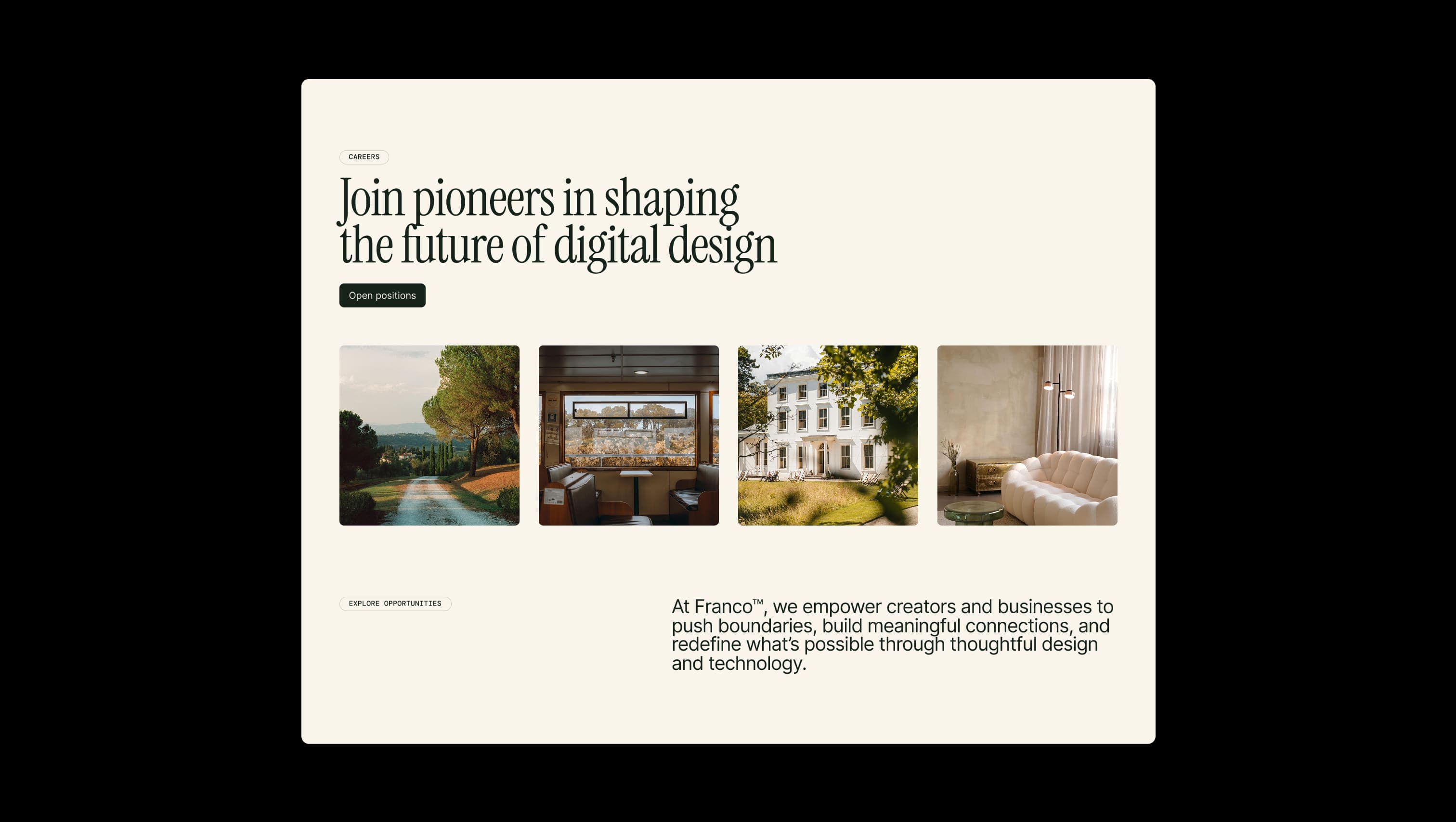
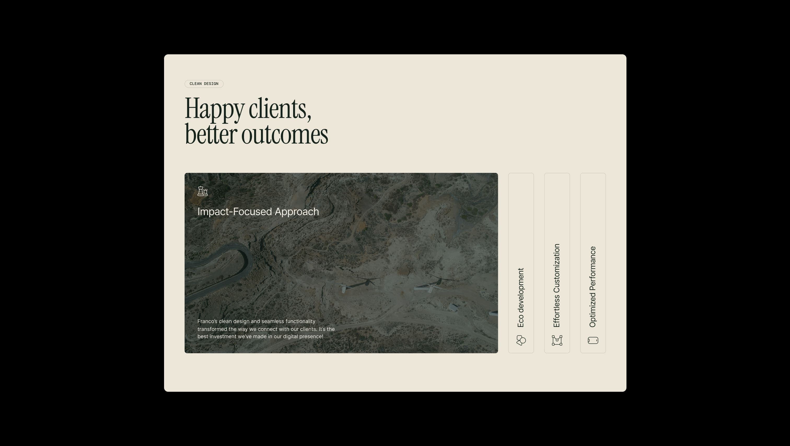
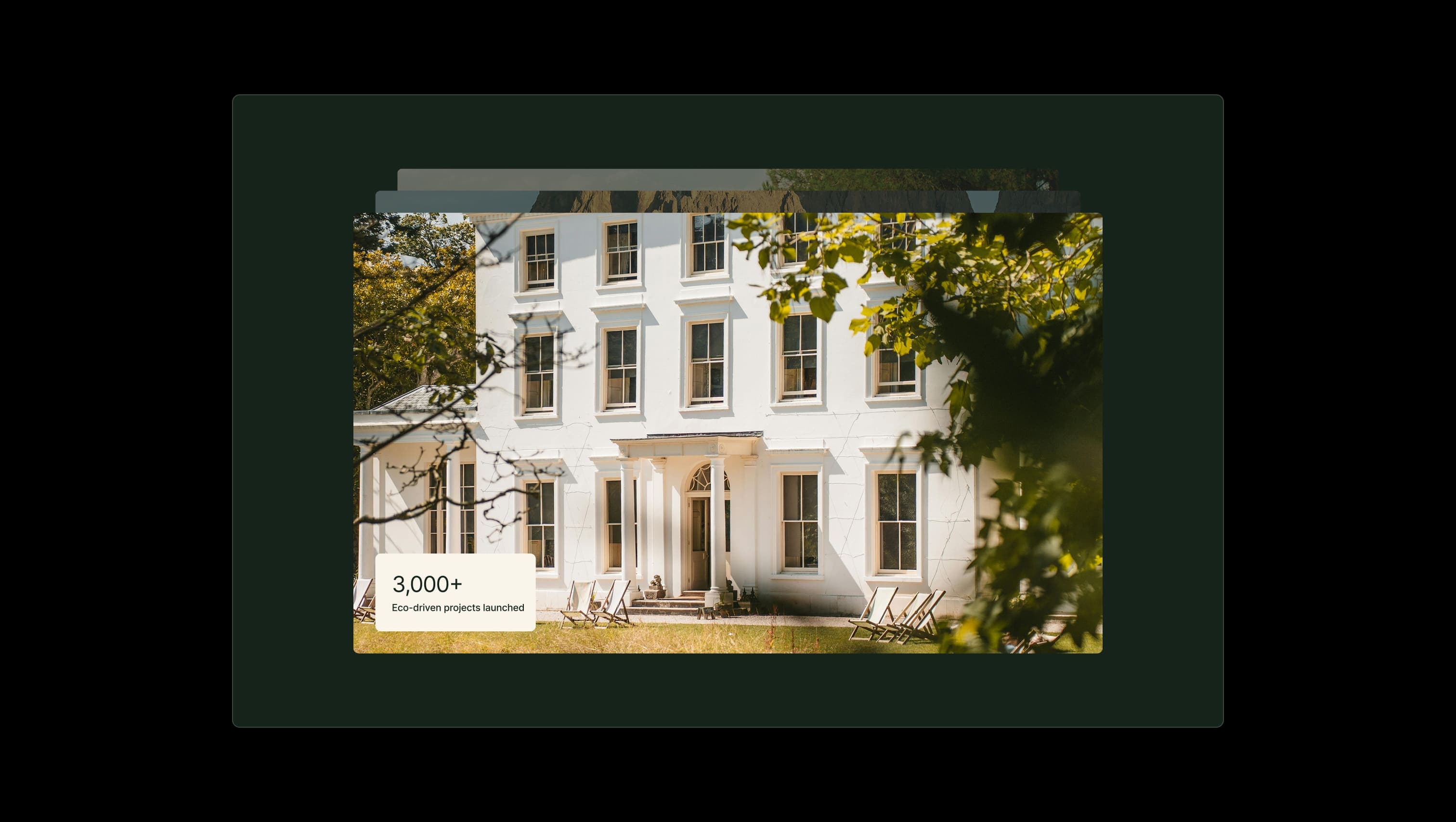
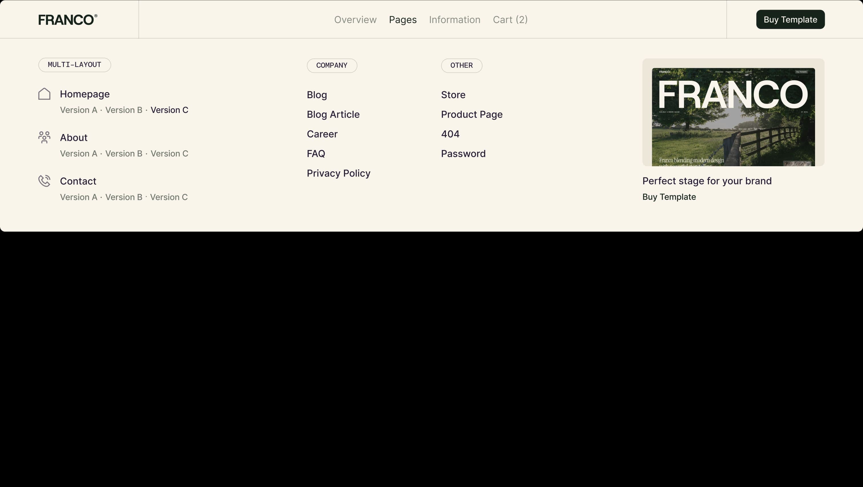
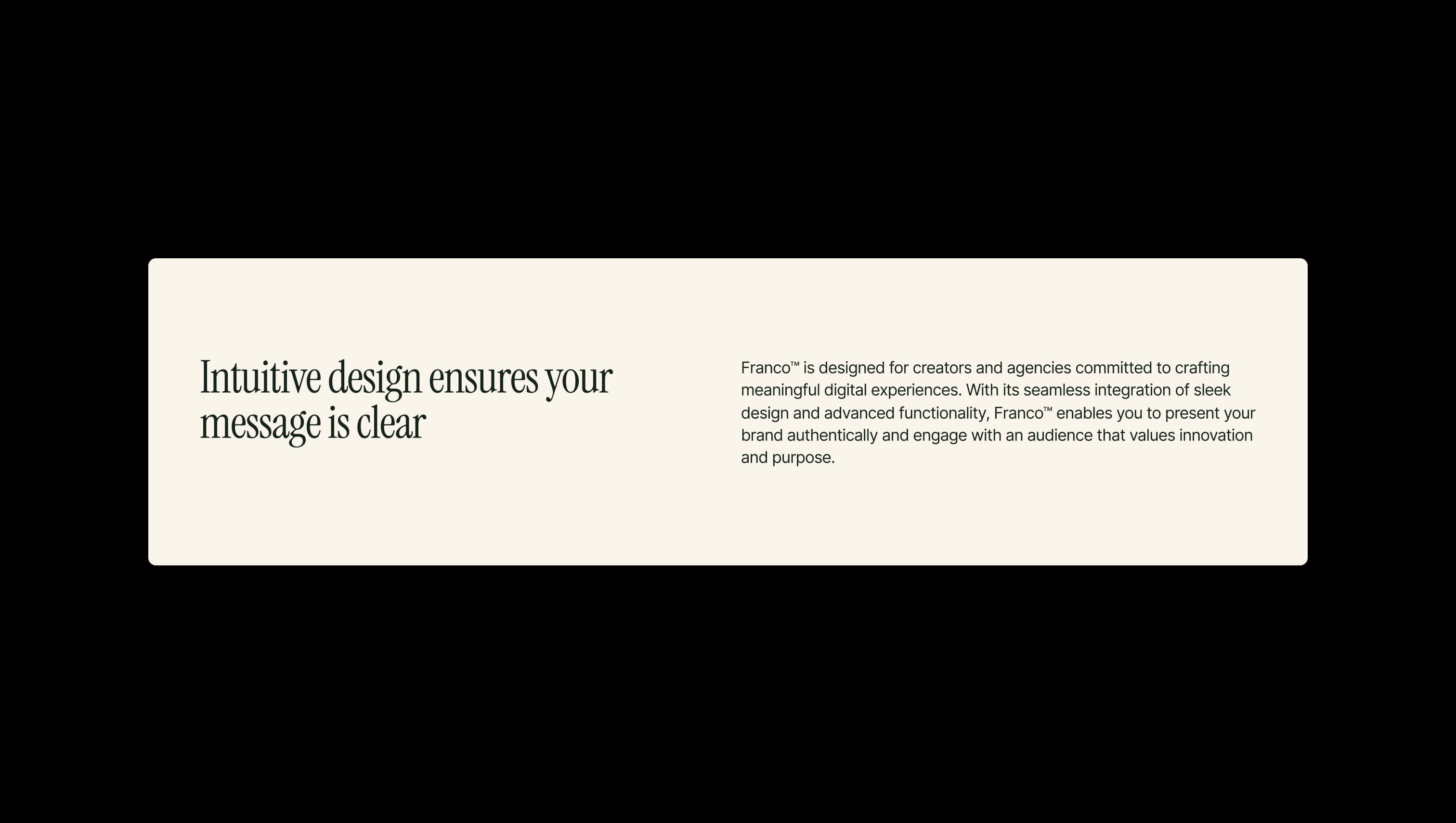
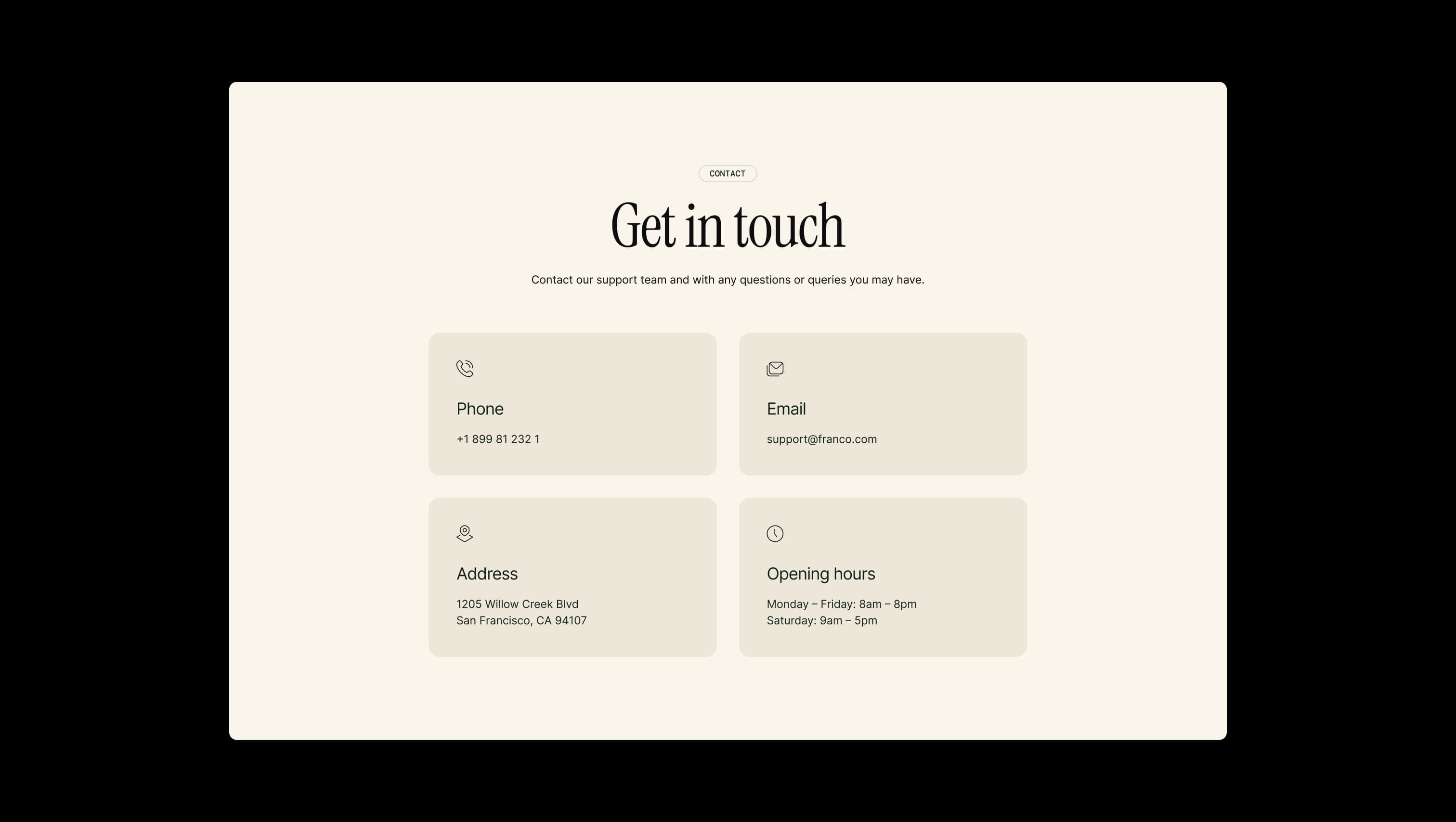
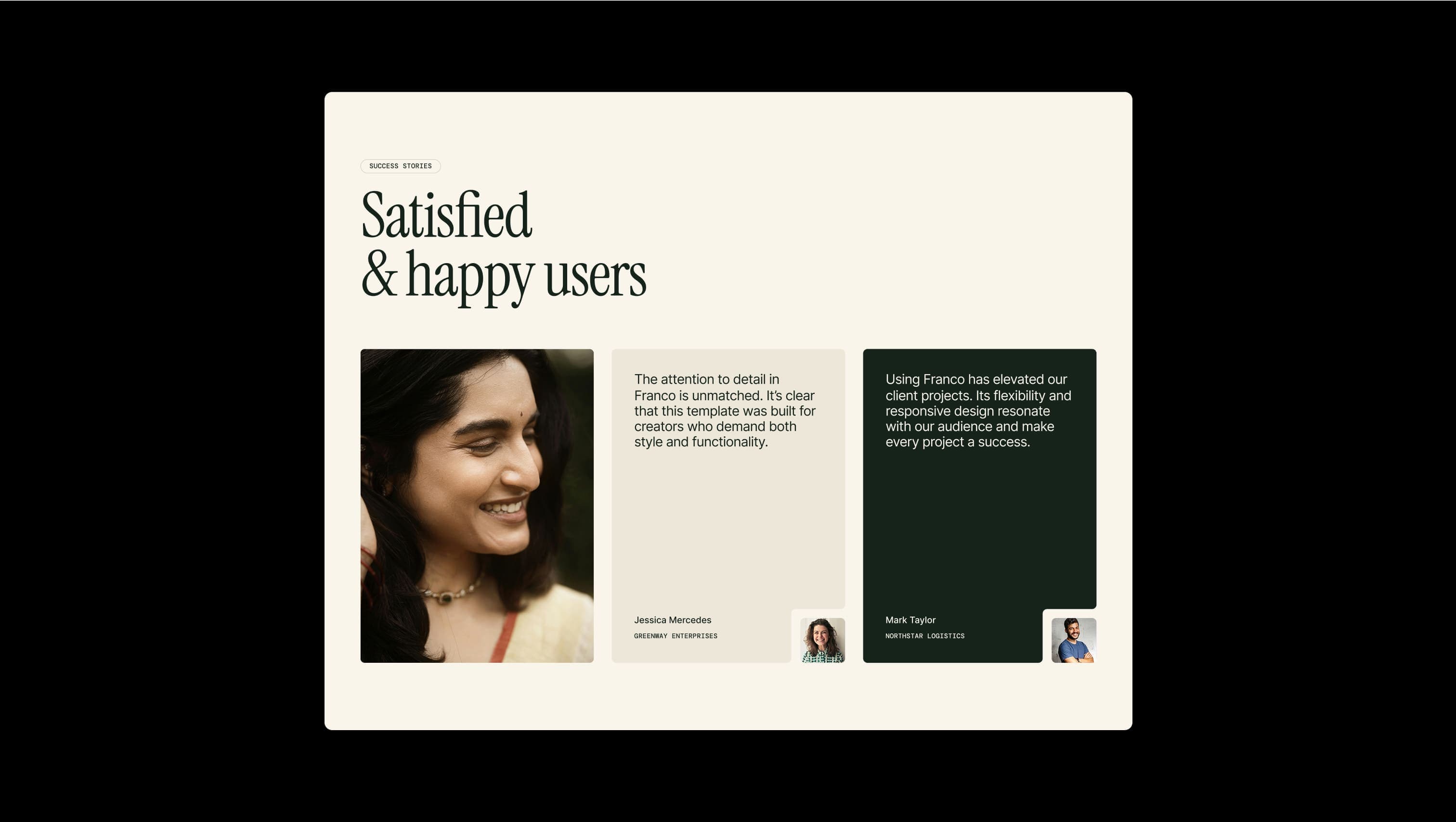
A handful of real sections that ship with this template. Click any card to preview, or explore them all under the Sections tab.
Hairline border on forest. Dividers and input outlines on dark surfaces.
Secondary surface. Lifted cards, marquee panels, and tinted feature sections within the light theme.
Translucent light overlay. Frosted button fills and soft veils over imagery.
Primary canvas. Page backgrounds, light buttons, and copy reversed onto dark sections.
Hairline border on cream. Dividers, input outlines, and quiet edges between sections.
Primary text & deep canvas. Body copy on cream, full surfaces on dark sections, and primary button fills.
Translucent ink overlay. Subdued labels, placeholder text, and image gradient stops.
The quick brown fox jumps
Eyebrow labels & metadata. Uppercase tracked-out tags, navigation badges, and category markers.
The quick brown fox jumps
Body & UI. Carries paragraphs, buttons, form fields, and navigation.
The quick brown fox jumps
Display & editorial headings. Sets the romantic, hand-set tone for hero and section titles.
spacious1800px120px24px32px4px8px16px24px32px40px64px80px96px120px144px160pxbig40pxcards16pxround9999pxsmall16pxmedium24pxxsmall12pxbuttons8pxregular32pxxxsmall8pxxxxsmall4pxStep from canvas (level 1) to lifted (level 2) to inset depth (level 3), then invert into the dark levels for full-bleed sections. Hex codes and roles live in the Colors section above; this ladder shows the layering only.
# Design System Guide

> Unlock the template to access the full design system.

## Brand voice

A short paragraph describing the brand voice, mood, and visual
principles that anchor the system. Tone, cadence, and intent.

## Colors

| Token        | Hex      | Role                                  |
| ------------ | -------- | ------------------------------------- |
| canvas-1     | #xxxxxx  | Page background, large surfaces       |
| canvas-2     | #xxxxxx  | Lifted surfaces, cards                |
| canvas-3     | #xxxxxx  | Inset wells, depressed states         |
| ink-1        | #xxxxxx  | Primary body text                     |
| ink-2        | #xxxxxx  | Secondary text, labels                |
| ink-3        | #xxxxxx  | Tertiary text, hints                  |
| accent-1     | #xxxxxx  | Primary brand accent                  |
| accent-2     | #xxxxxx  | Secondary accent                      |
| state-ok     | #xxxxxx  | Success, confirmations                |
| state-warn   | #xxxxxx  | Warnings                              |
| state-err    | #xxxxxx  | Errors, destructive actions           |

## Typography

- **Display** — heading scale, used for hero text and section titles.
- **Body** — primary reading text, optimized for paragraphs.
- **Mono** — code, data, and tabular numerals.

```
display: 32px / 40px / 48px / 64px / 80px
body:    14px / 16px / 18px
mono:    12px / 14px
```

## Spacing & shape

Base unit: 4px. Scale: 4, 8, 12, 16, 24, 32, 48, 64, 96, 128.
Radii: sm (4px), md (8px), lg (12px), xl (20px), full (9999px).

## Surfaces

Layered elevation from canvas → lifted → inset. Surfaces invert in
dark sections for full-bleed contrast.

## Do's and don'ts

- Do use accent-1 sparingly for primary CTAs only.
- Do maintain at least 4.5:1 contrast on body text.
- Don't mix display and body in the same line.
- Don't use state colors for branding.

## Agent prompt guide

Prompts for AI design tools that respect this system.
Includes example prompts for sections, components, and layouts.

# ...
Unlock the full style guide