Design systems, extracted.
Paste any URL to create a design system from it. Open any style for colors, type, spacing, components, and a DESIGN.md or tokens.json your agent can use.
Quickly navigate through the dashboard with your keyboard using the command menu.
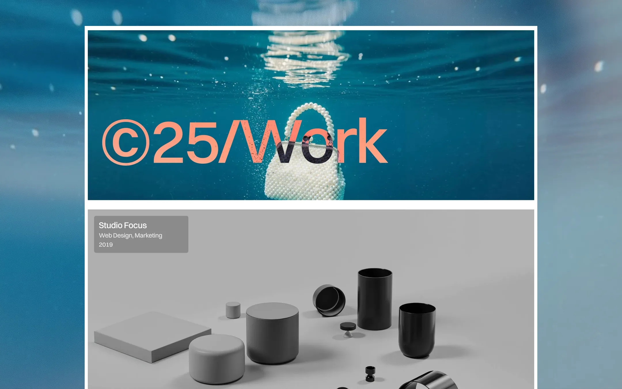
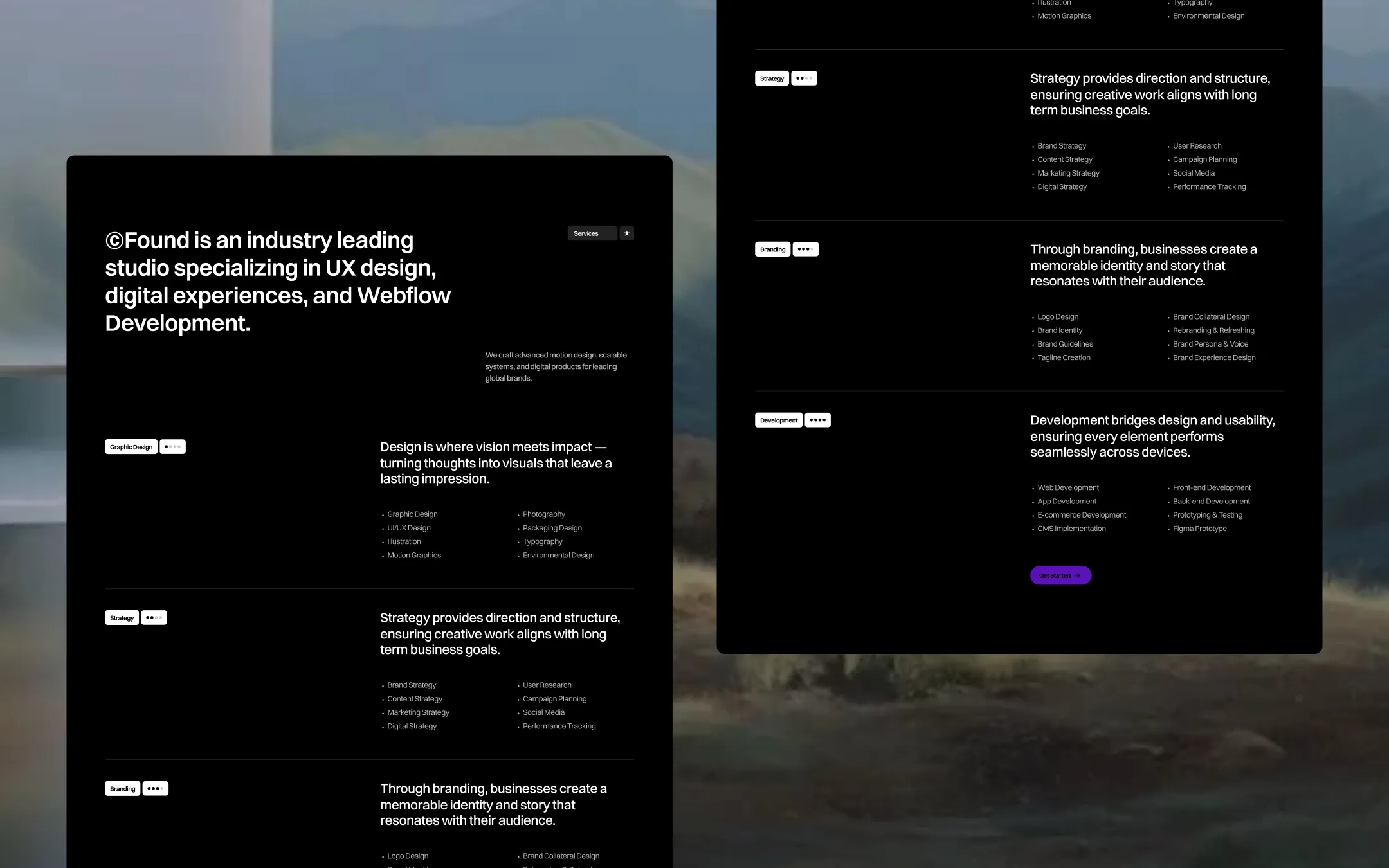
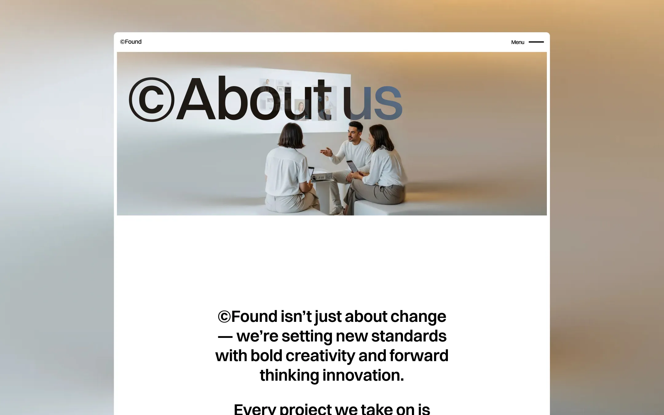
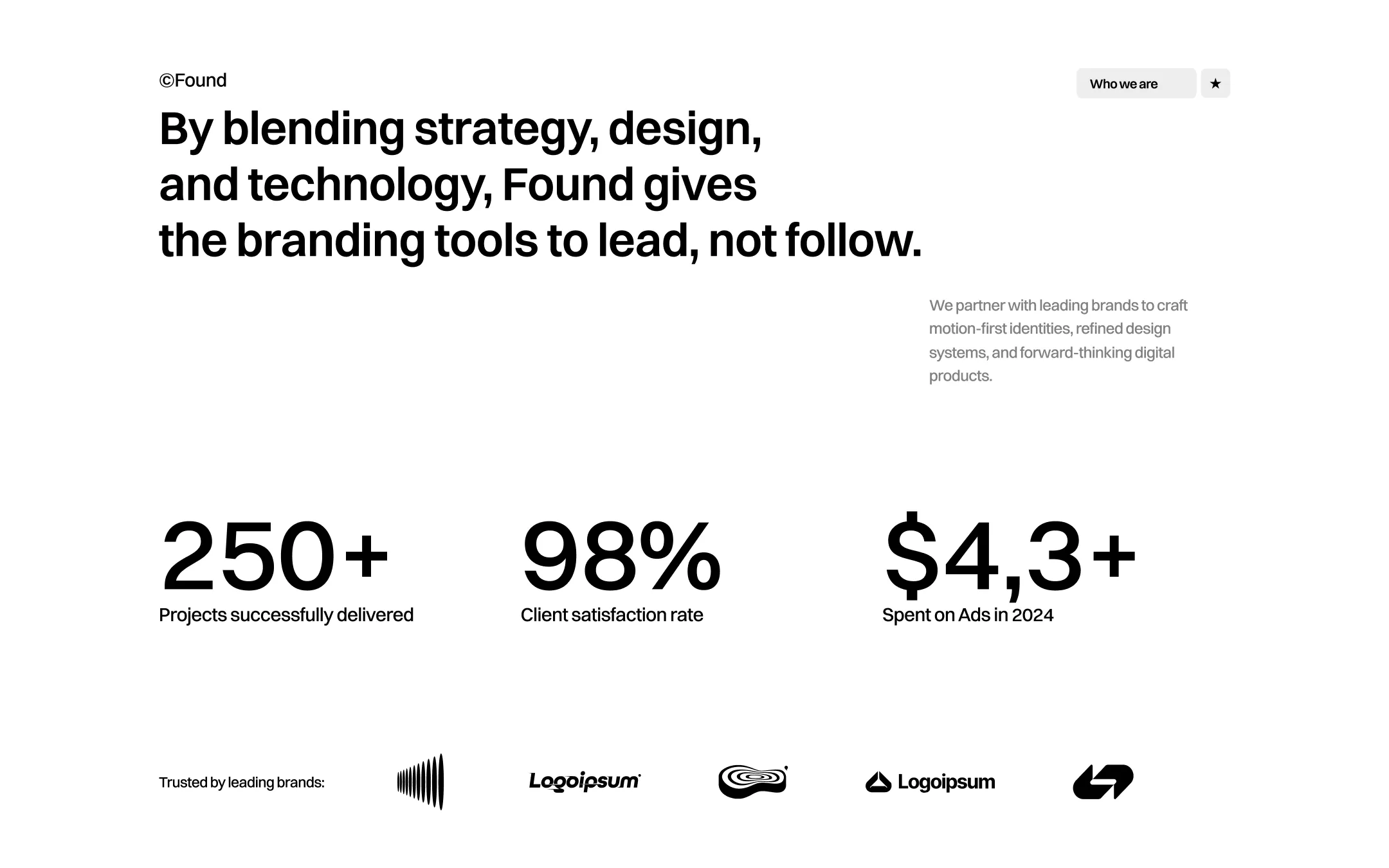
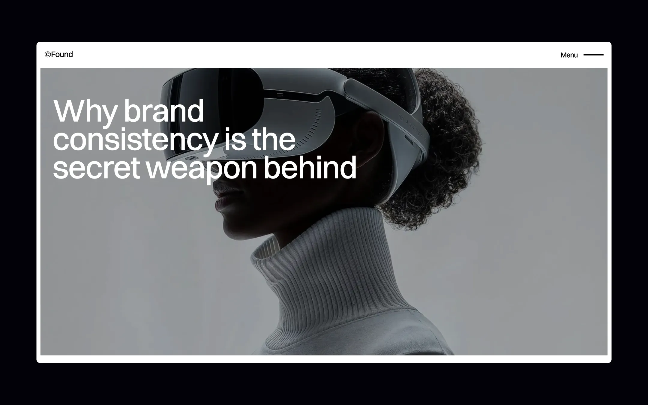
©Found runs on a crisp white foundation that lets color-blocked photography and deep-black feature sections do the talking. Violet accents punch through an otherwise monochrome ink-on-white system — in buttons, badges, and hover states — while huge kinetic type (the trademark ©-prefixed wordmarks, massive rotator text, and oversized service numerals) gives the studio an awards-wall confidence. Interactions are deliberate: cards tilt and stack, headlines slide up from below, and a scrolling marquee footer keeps momentum alive on every page.
Form field fills and input backgrounds
Primary canvas & card background
Pricing link and secondary dark UI chrome
Primary text, dark section fills, wordmark ink
Dark surface used in showreel button text and deep panels
Secondary soft accent for subtle highlights and dividers
Secondary call-to-action accent. Alternate button text and icon fills
Primary brand accent. CTA buttons, badge icons, link hovers
Animated button background bloom on hover interactions
Hover-reveal accent dot on badge interactions
The quick brown fox jumps
Display headline and wordmark typeface
The quick brown fox jumps
Primary body and UI typeface
spacious1240px300px28px30px10px20px30px50px80px100px150px300px500pxpill100pxcards6pxsmall2pxinputs7pxbuttons40pxStep from canvas (level 1) to lifted (level 2) to inset depth (level 3), then invert into the dark levels for full-bleed sections. Hex codes and roles live in the Colors section above; this ladder shows the layering only.
# Design System Guide

> Unlock the template to access the full design system.

## Brand voice

A short paragraph describing the brand voice, mood, and visual
principles that anchor the system. Tone, cadence, and intent.

## Colors

| Token        | Hex      | Role                                  |
| ------------ | -------- | ------------------------------------- |
| canvas-1     | #xxxxxx  | Page background, large surfaces       |
| canvas-2     | #xxxxxx  | Lifted surfaces, cards                |
| canvas-3     | #xxxxxx  | Inset wells, depressed states         |
| ink-1        | #xxxxxx  | Primary body text                     |
| ink-2        | #xxxxxx  | Secondary text, labels                |
| ink-3        | #xxxxxx  | Tertiary text, hints                  |
| accent-1     | #xxxxxx  | Primary brand accent                  |
| accent-2     | #xxxxxx  | Secondary accent                      |
| state-ok     | #xxxxxx  | Success, confirmations                |
| state-warn   | #xxxxxx  | Warnings                              |
| state-err    | #xxxxxx  | Errors, destructive actions           |

## Typography

- **Display** — heading scale, used for hero text and section titles.
- **Body** — primary reading text, optimized for paragraphs.
- **Mono** — code, data, and tabular numerals.

```
display: 32px / 40px / 48px / 64px / 80px
body:    14px / 16px / 18px
mono:    12px / 14px
```

## Spacing & shape

Base unit: 4px. Scale: 4, 8, 12, 16, 24, 32, 48, 64, 96, 128.
Radii: sm (4px), md (8px), lg (12px), xl (20px), full (9999px).

## Surfaces

Layered elevation from canvas → lifted → inset. Surfaces invert in
dark sections for full-bleed contrast.

## Do's and don'ts

- Do use accent-1 sparingly for primary CTAs only.
- Do maintain at least 4.5:1 contrast on body text.
- Don't mix display and body in the same line.
- Don't use state colors for branding.

## Agent prompt guide

Prompts for AI design tools that respect this system.
Includes example prompts for sections, components, and layouts.

# ...
Unlock the full style guide