Design systems, extracted.
Paste any URL to create a design system from it. Open any style for colors, type, spacing, components, and a DESIGN.md or tokens.json your agent can use.
Quickly navigate through the dashboard with your keyboard using the command menu.

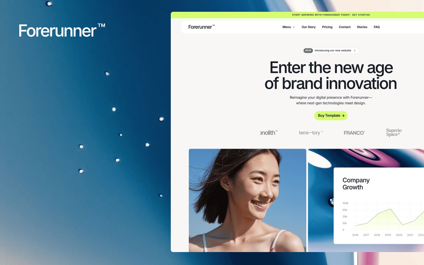
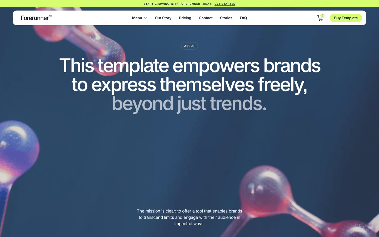
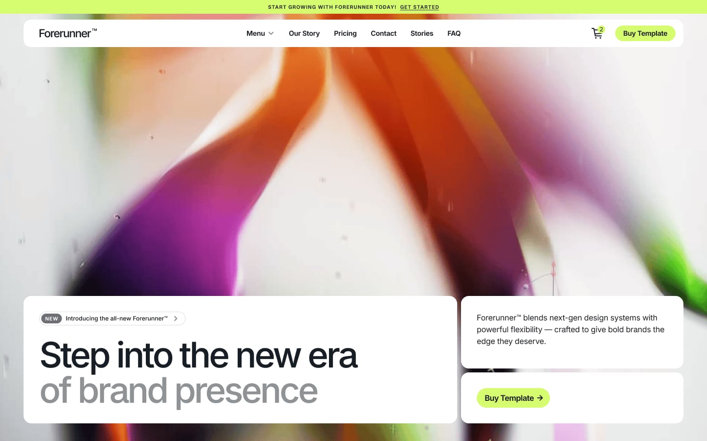
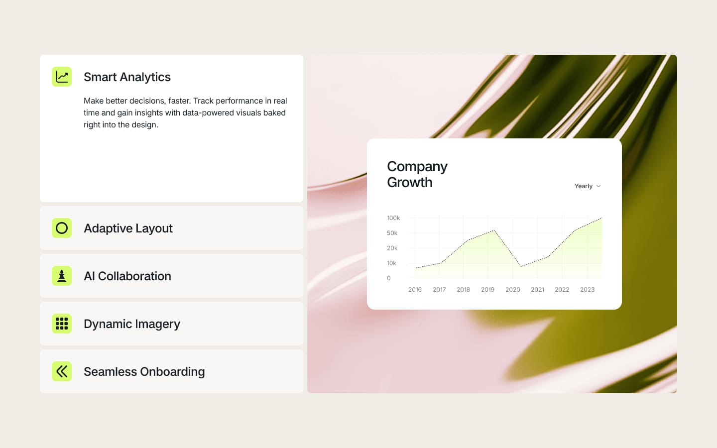
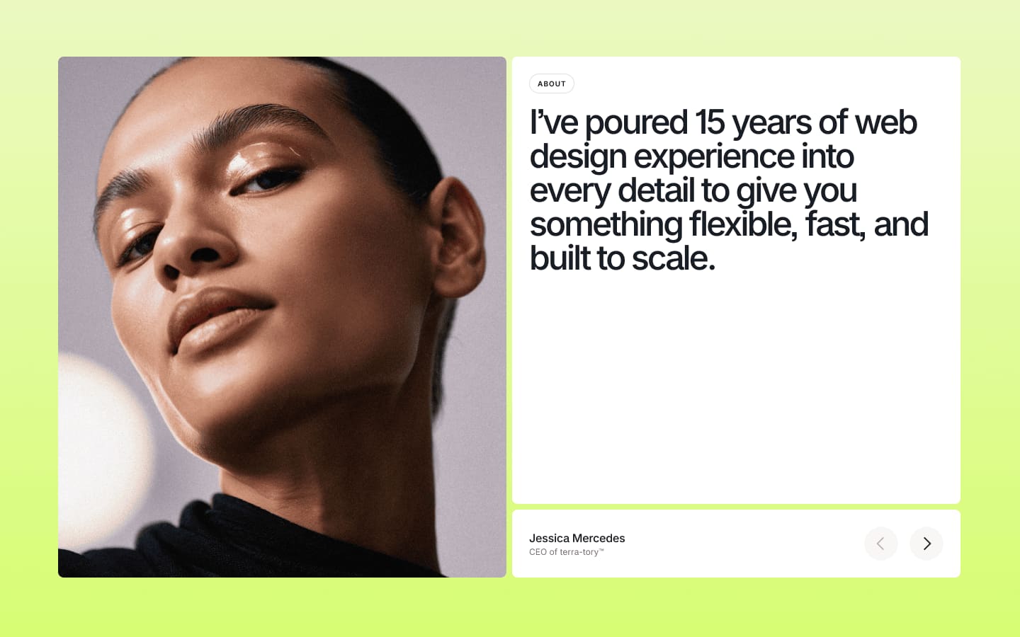
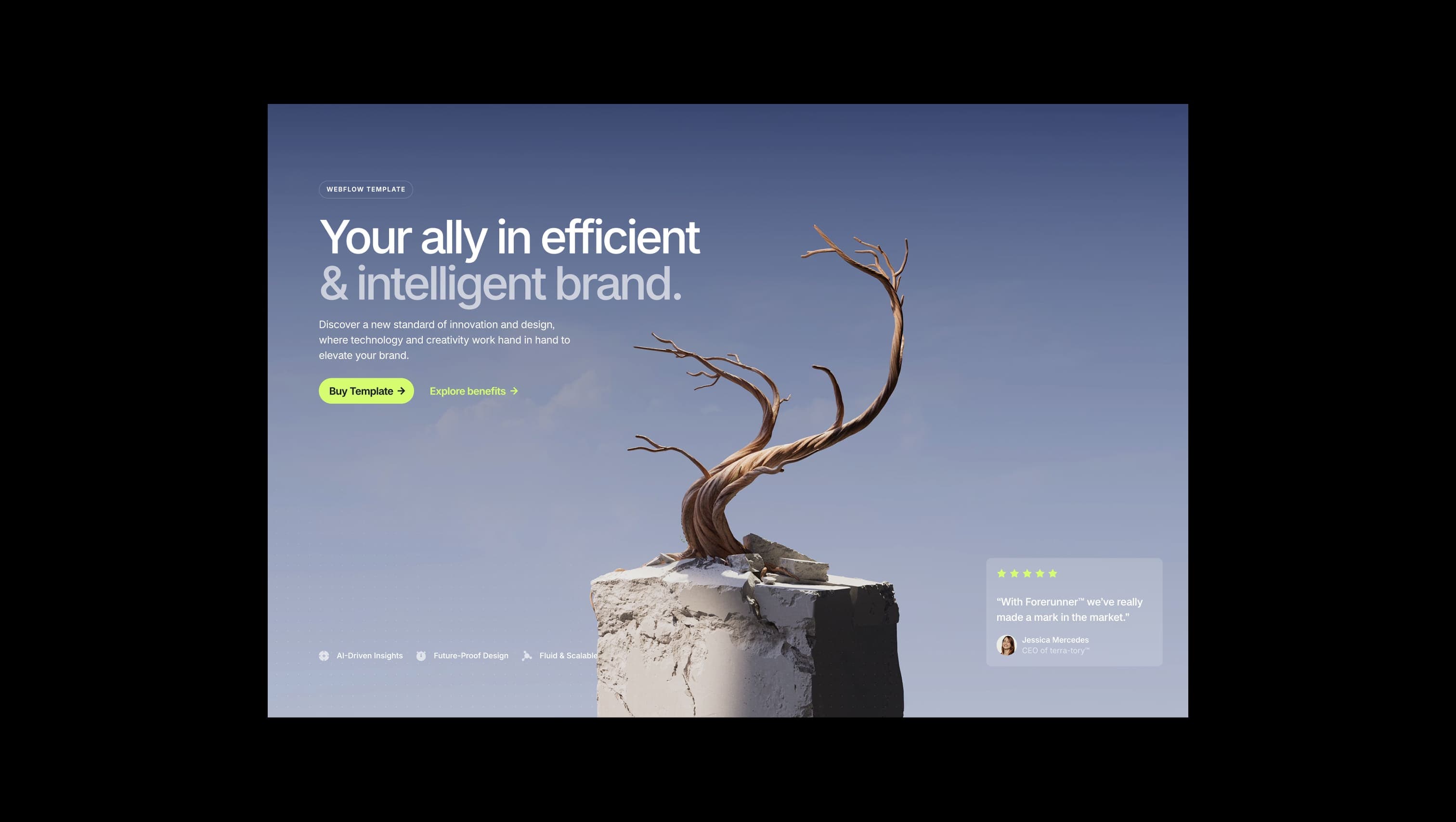
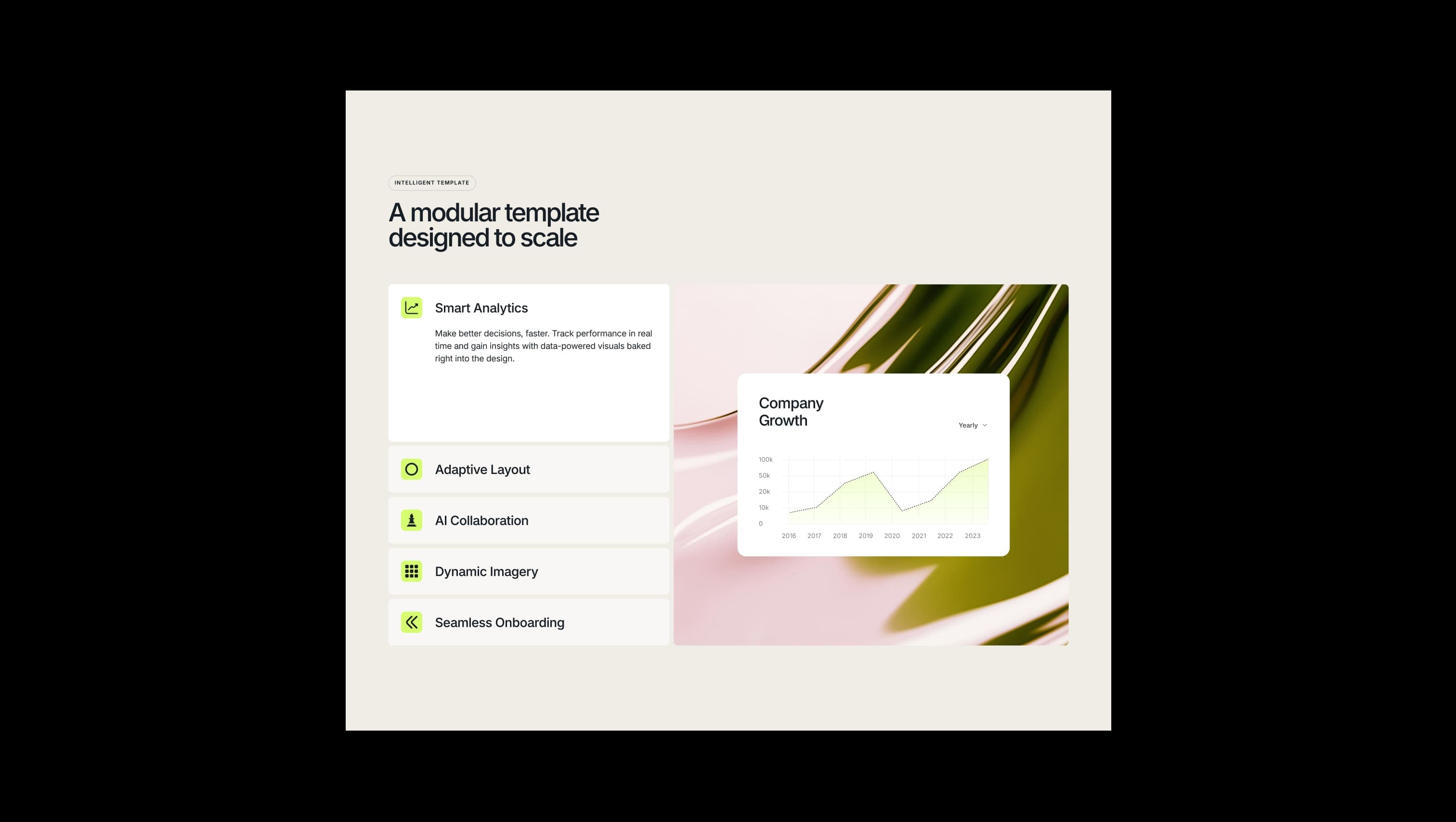
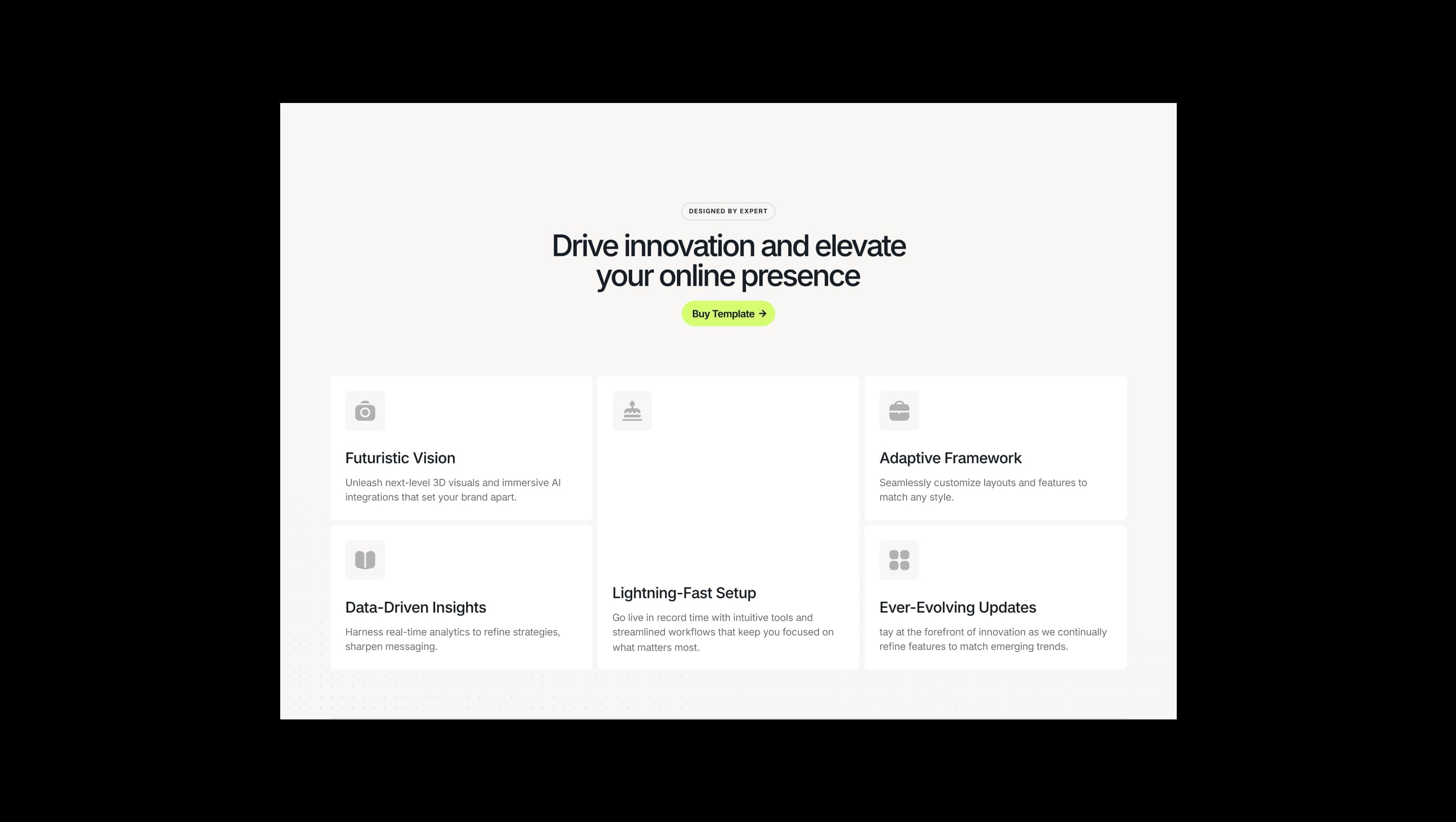
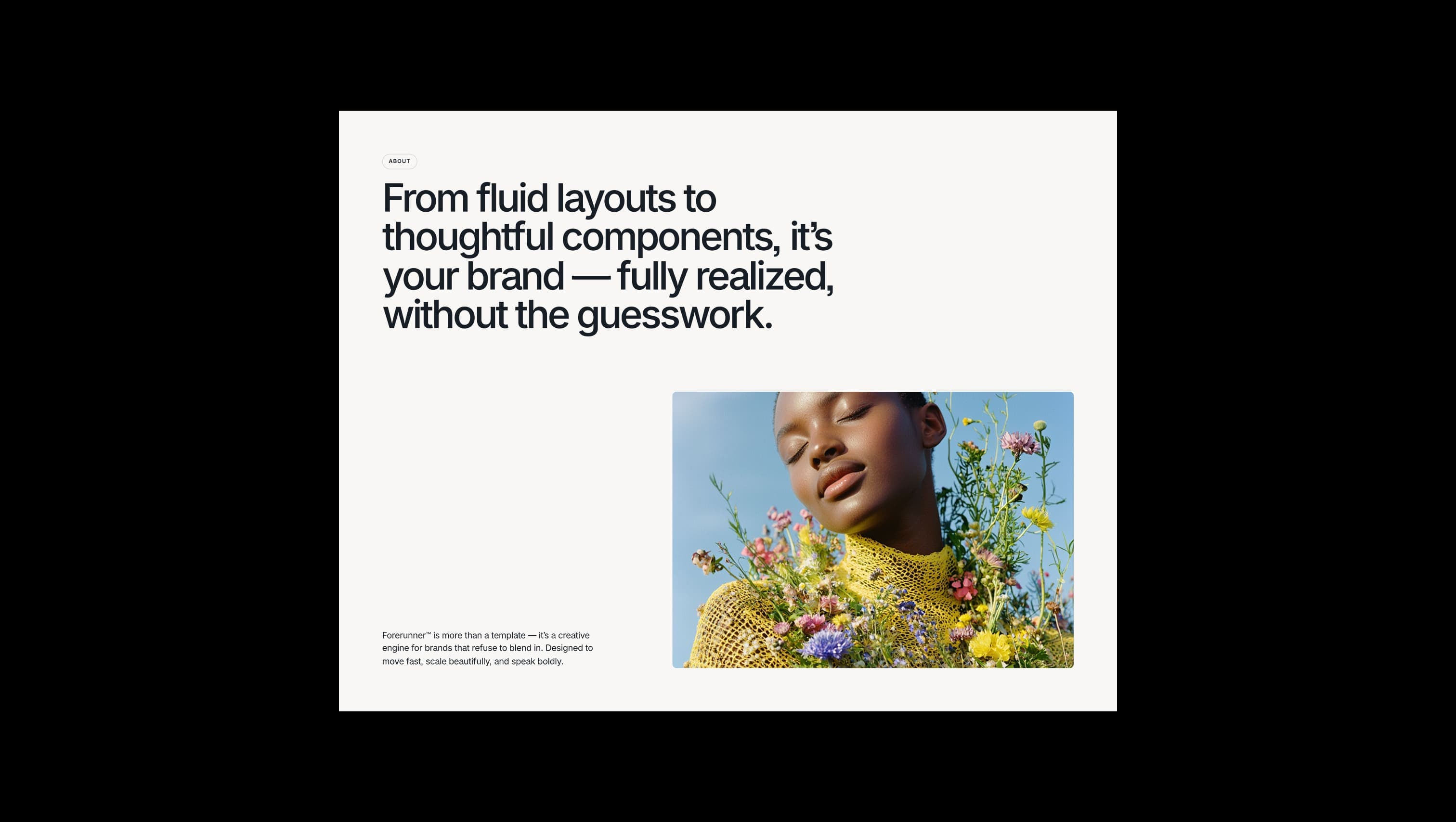
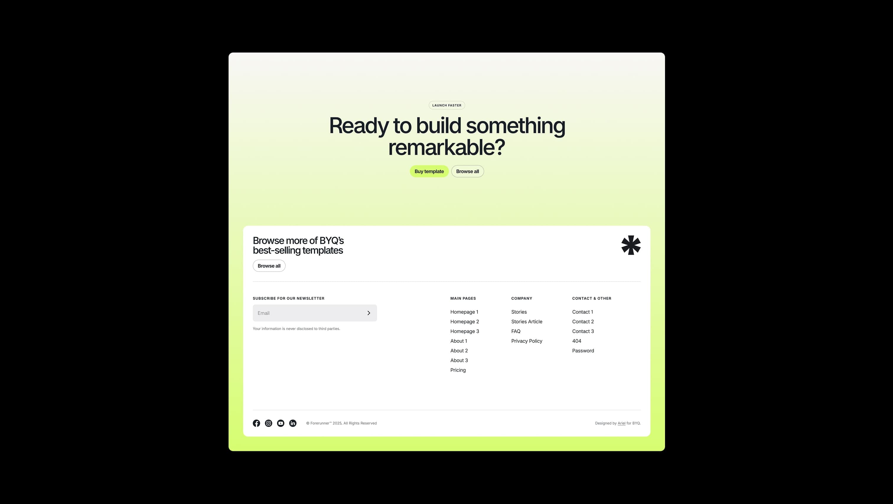
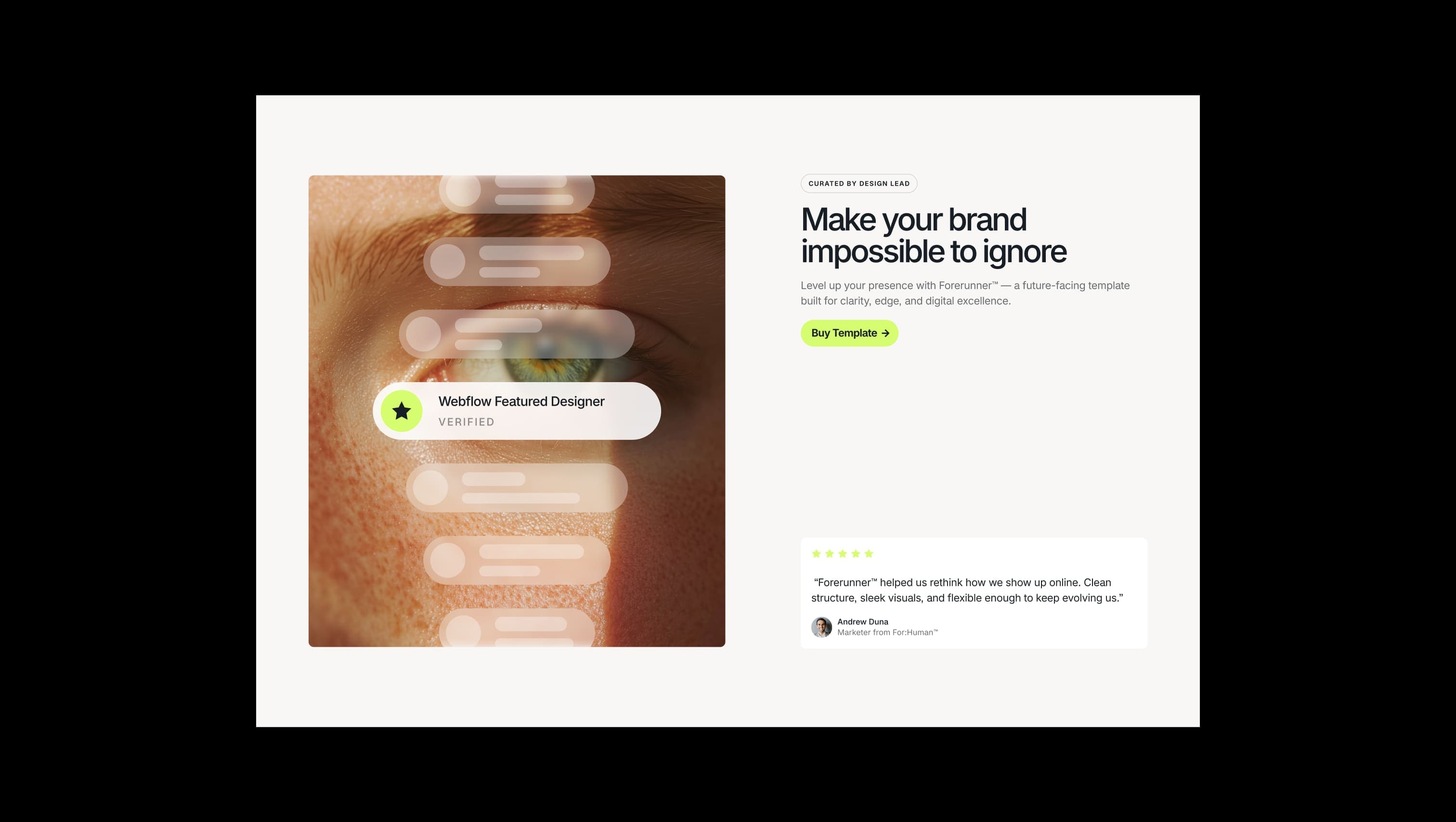
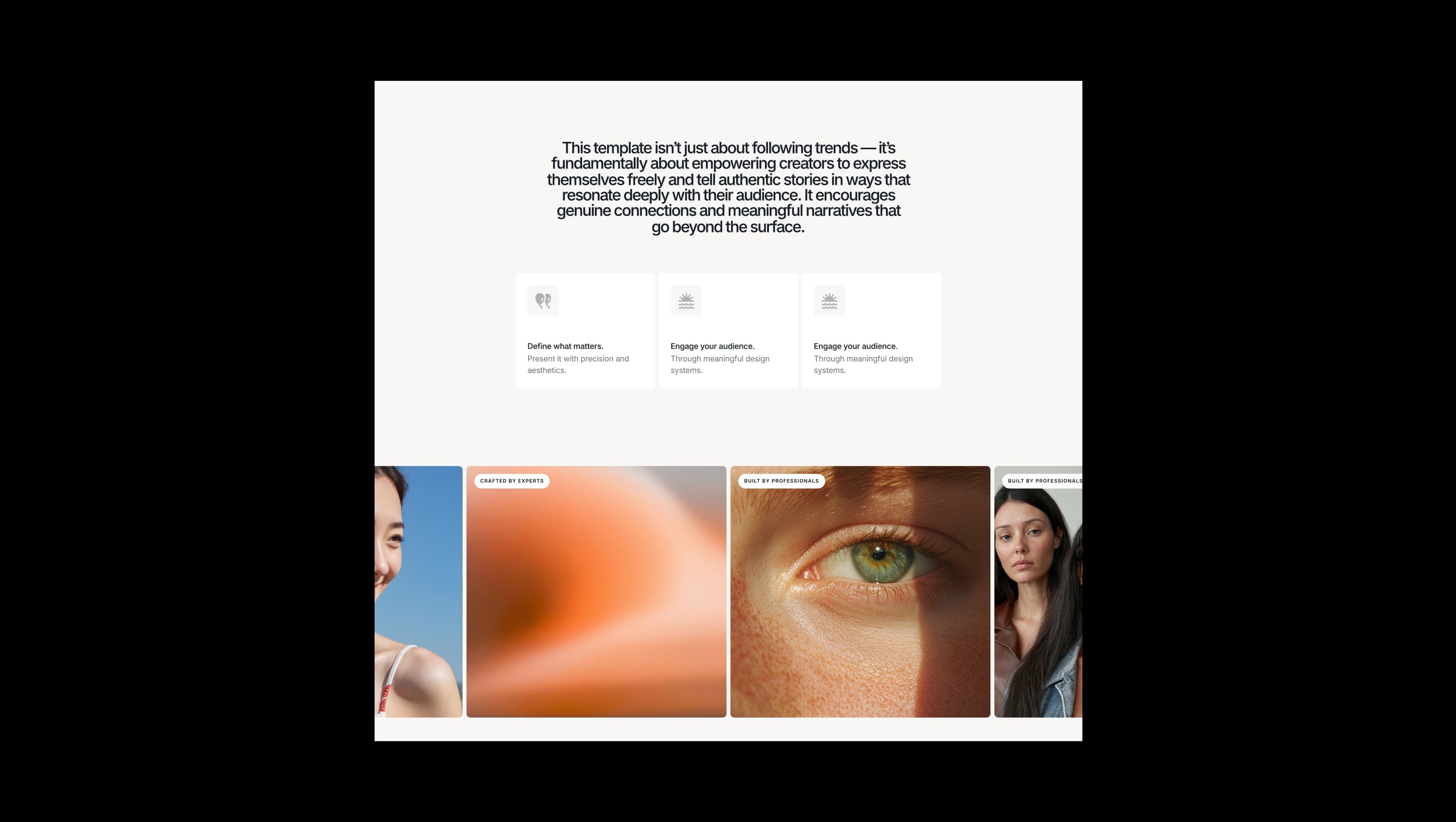
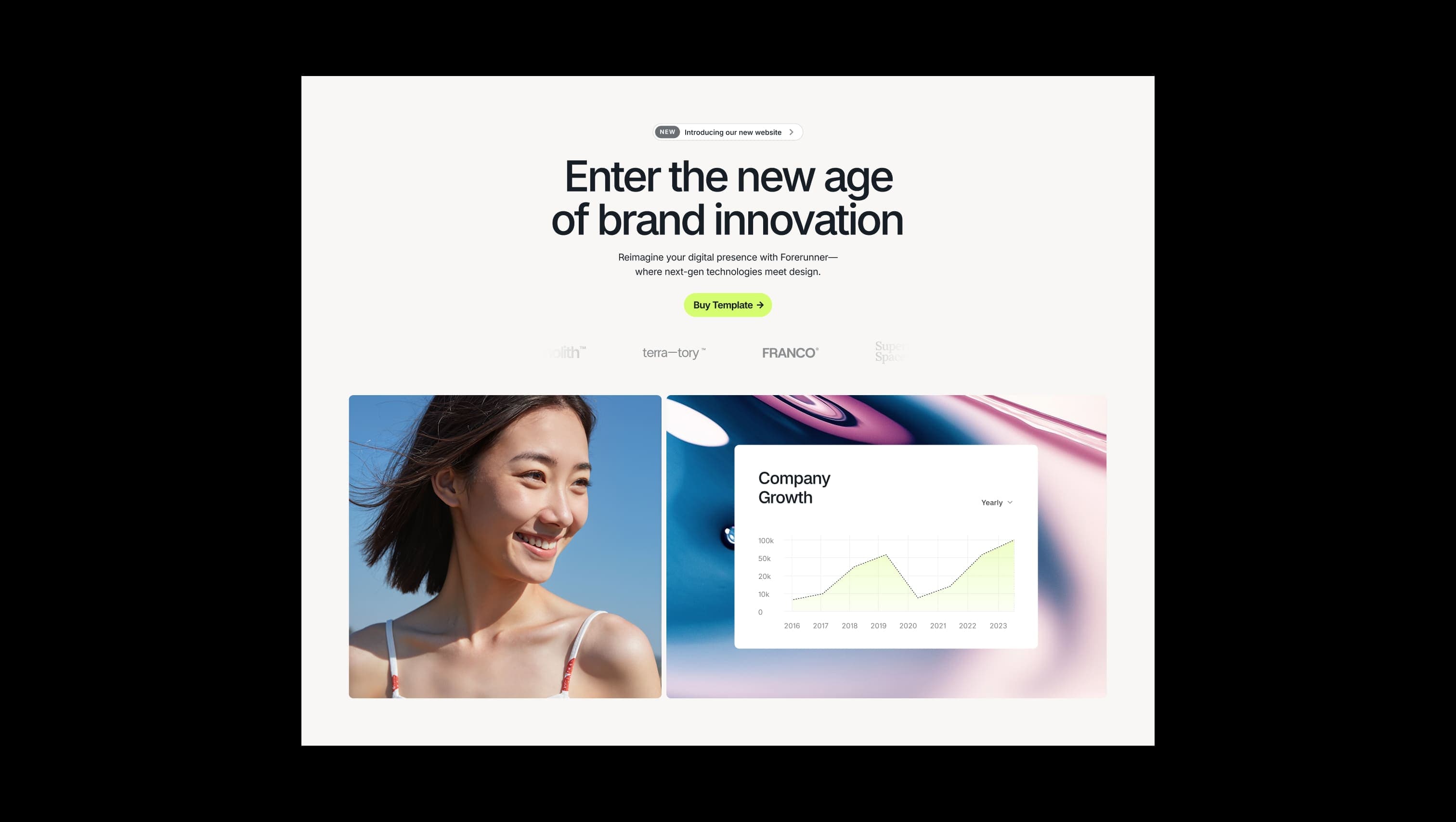
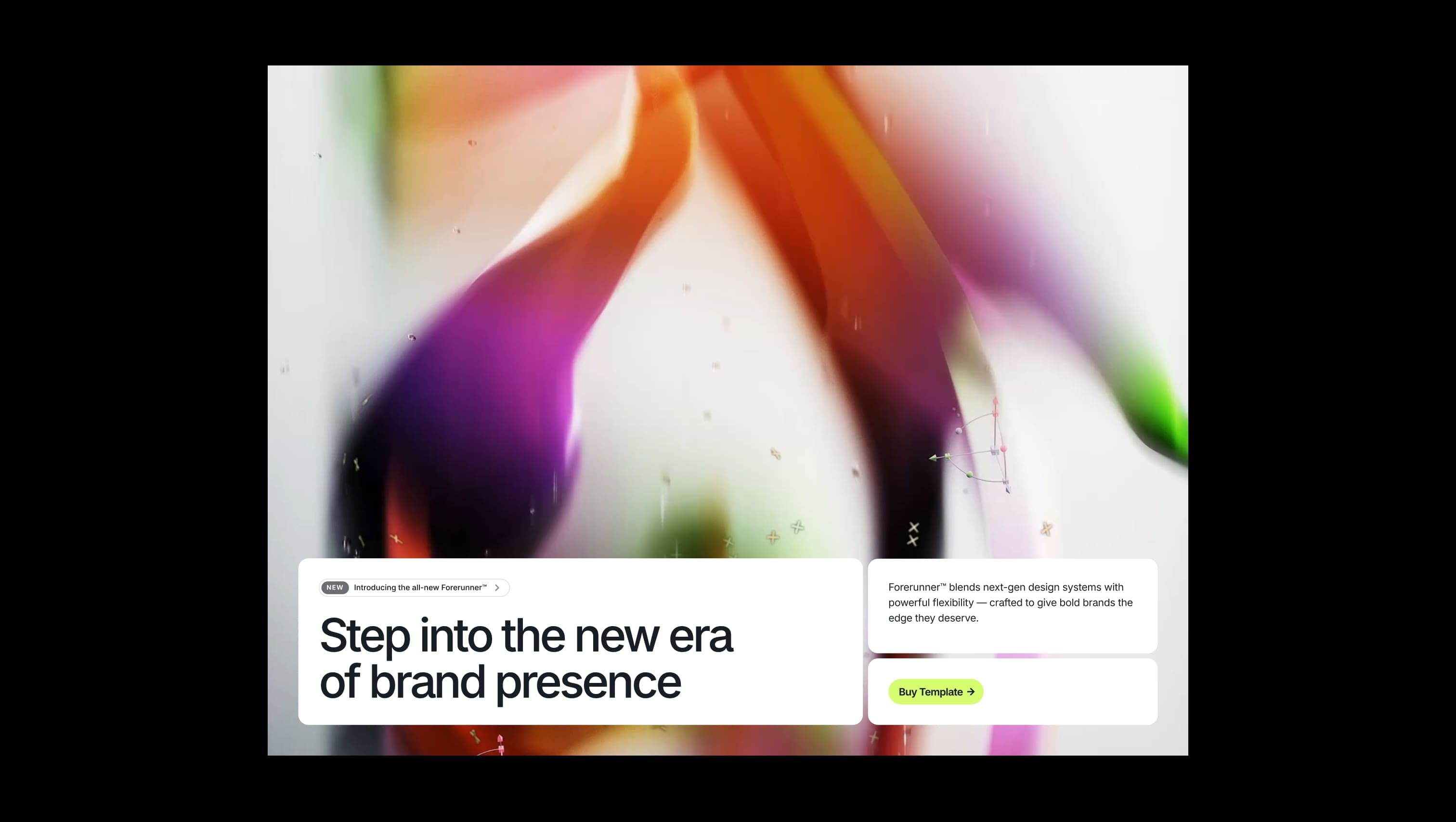
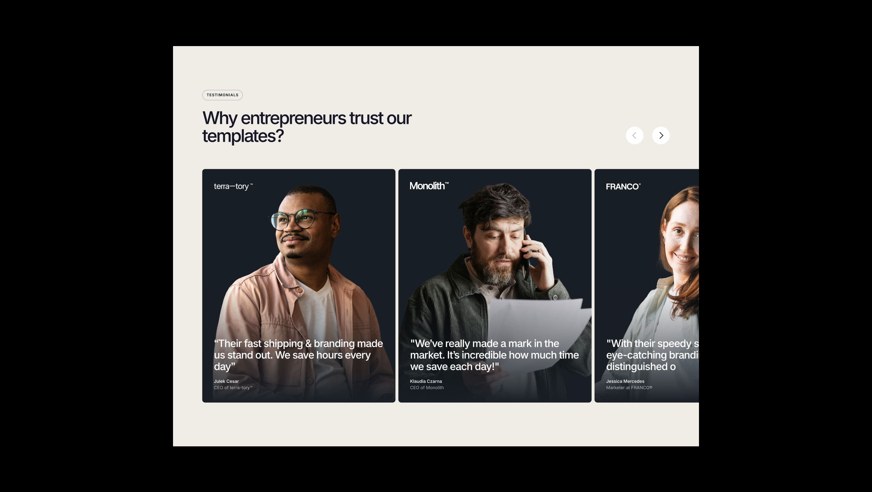
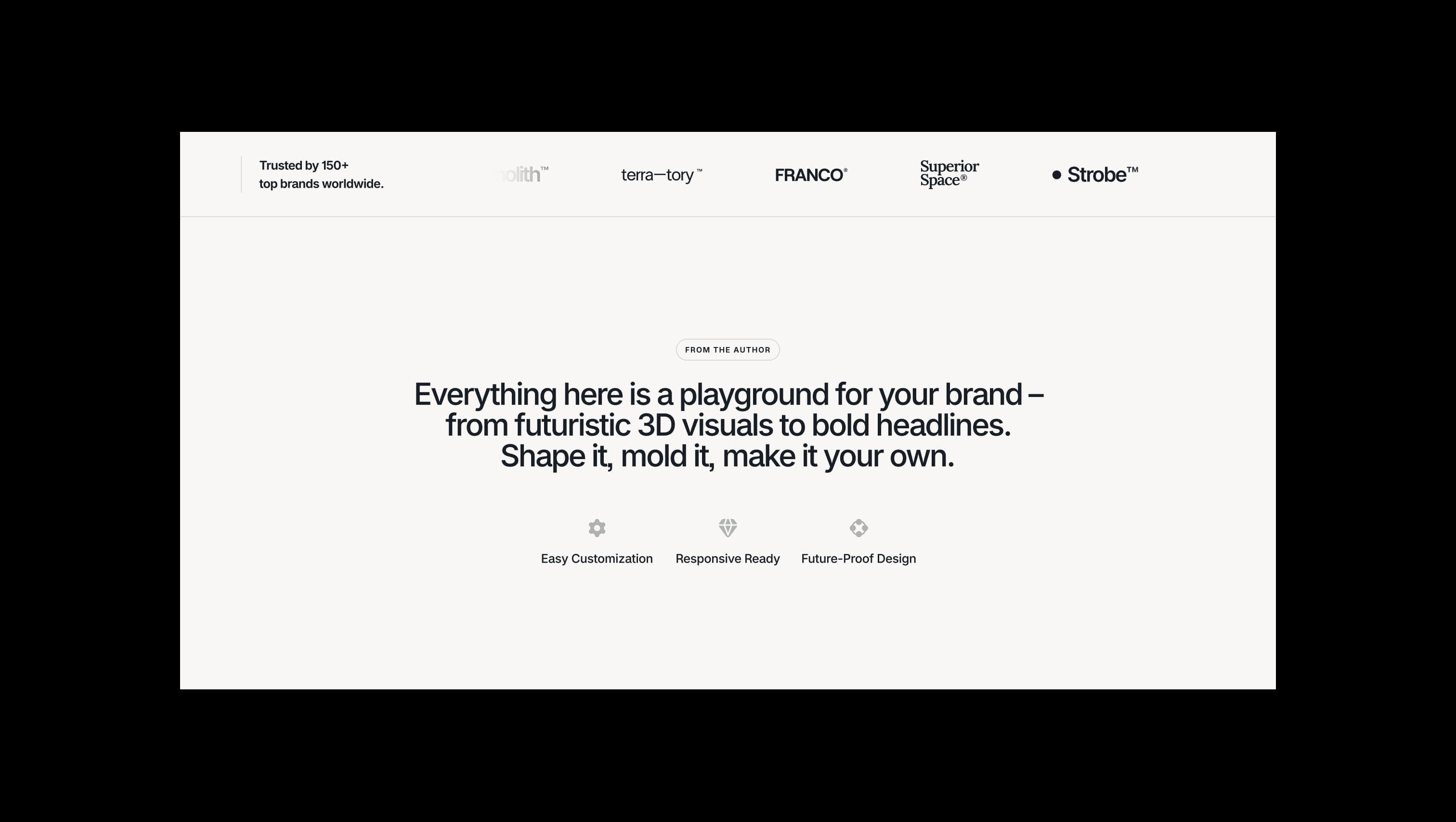
Forerunner is a forward-leaning brand template built for visionary studios and bold founders. The system pairs a near-black ink against warm bone-white canvases and lifts everything with a single jolt of electric chartreuse — a color that punches through the layout the way a highlighter punches through a notebook page. The typography is anchored by Raveo, a tightly-spaced contemporary sans whose negative tracking and medium weight give headlines an architectural confidence. The layout language is generous and modern: floating pill-shaped navbars, fully-rounded buttons, oversized hero typography, and large soft-cornered cards that lift off gradient washes. Surfaces alternate between bone-white, dim parchment, and deep ink, often connected by smooth vertical gradients that bleed into the accent green. Motion is subtle and purposeful — fades, parallax images, and slider transitions — keeping the focus on the brand, not the chrome.
A handful of real sections that ship with this template. Click any card to preview, or explore them all under the Sections tab.

Primary canvas. Page background, lifted card surfaces, and footer base.
Pure white surface. Navbar fill, form fields, testimonial cards, and pricing tiers.
Secondary canvas. Section breaks, mega-menu page tiles, and gradient destinations.
Primary text & dark surface. Headlines, body copy, dark hero sections, and primary button fills.
Muted ink. Secondary copy, captions, and meta information on light backgrounds.
Tertiary dark surface. Slightly warmer dark used as a third tonal layer beneath deep-ink.
Soft accent wash. Used for hover states and translucent gradients fading into canvas.
Hero accent. Sole brand color — banners, primary CTAs, gradient washes, and highlights.
Error & alert state. Reserved for form validation and destructive actions only.
The quick brown fox jumps
Sole typeface — display, headings, body, labels, and UI
spacious1800px120px24px24px4px8px12px16px24px32px48px64px80px96px120px160pxcards8pxlarge24pxsmall8pxmedium16pxnavbar16pxbuttons32pxpill-full9999pxStep from canvas (level 1) to lifted (level 2) to inset depth (level 3), then invert into the dark levels for full-bleed sections. Hex codes and roles live in the Colors section above; this ladder shows the layering only.
# Design System Guide

> Unlock the template to access the full design system.

## Brand voice

A short paragraph describing the brand voice, mood, and visual
principles that anchor the system. Tone, cadence, and intent.

## Colors

| Token        | Hex      | Role                                  |
| ------------ | -------- | ------------------------------------- |
| canvas-1     | #xxxxxx  | Page background, large surfaces       |
| canvas-2     | #xxxxxx  | Lifted surfaces, cards                |
| canvas-3     | #xxxxxx  | Inset wells, depressed states         |
| ink-1        | #xxxxxx  | Primary body text                     |
| ink-2        | #xxxxxx  | Secondary text, labels                |
| ink-3        | #xxxxxx  | Tertiary text, hints                  |
| accent-1     | #xxxxxx  | Primary brand accent                  |
| accent-2     | #xxxxxx  | Secondary accent                      |
| state-ok     | #xxxxxx  | Success, confirmations                |
| state-warn   | #xxxxxx  | Warnings                              |
| state-err    | #xxxxxx  | Errors, destructive actions           |

## Typography

- **Display** — heading scale, used for hero text and section titles.
- **Body** — primary reading text, optimized for paragraphs.
- **Mono** — code, data, and tabular numerals.

```
display: 32px / 40px / 48px / 64px / 80px
body:    14px / 16px / 18px
mono:    12px / 14px
```

## Spacing & shape

Base unit: 4px. Scale: 4, 8, 12, 16, 24, 32, 48, 64, 96, 128.
Radii: sm (4px), md (8px), lg (12px), xl (20px), full (9999px).

## Surfaces

Layered elevation from canvas → lifted → inset. Surfaces invert in
dark sections for full-bleed contrast.

## Do's and don'ts

- Do use accent-1 sparingly for primary CTAs only.
- Do maintain at least 4.5:1 contrast on body text.
- Don't mix display and body in the same line.
- Don't use state colors for branding.

## Agent prompt guide

Prompts for AI design tools that respect this system.
Includes example prompts for sections, components, and layouts.

# ...
Unlock the full style guide