Design systems, extracted.
Paste any URL to create a design system from it. Open any style for colors, type, spacing, components, and a DESIGN.md or tokens.json your agent can use.
Quickly navigate through the dashboard with your keyboard using the command menu.

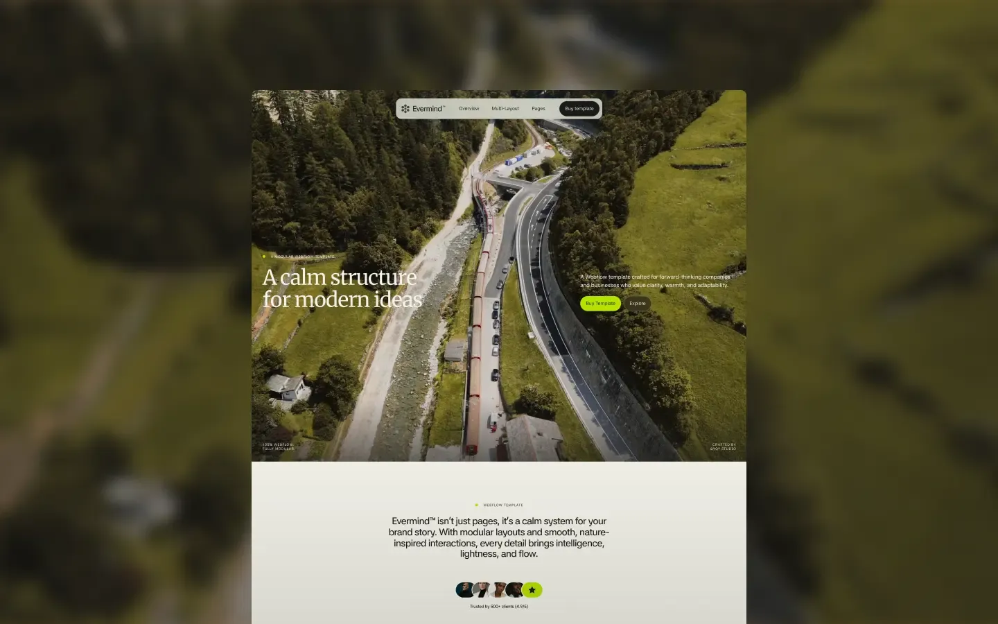
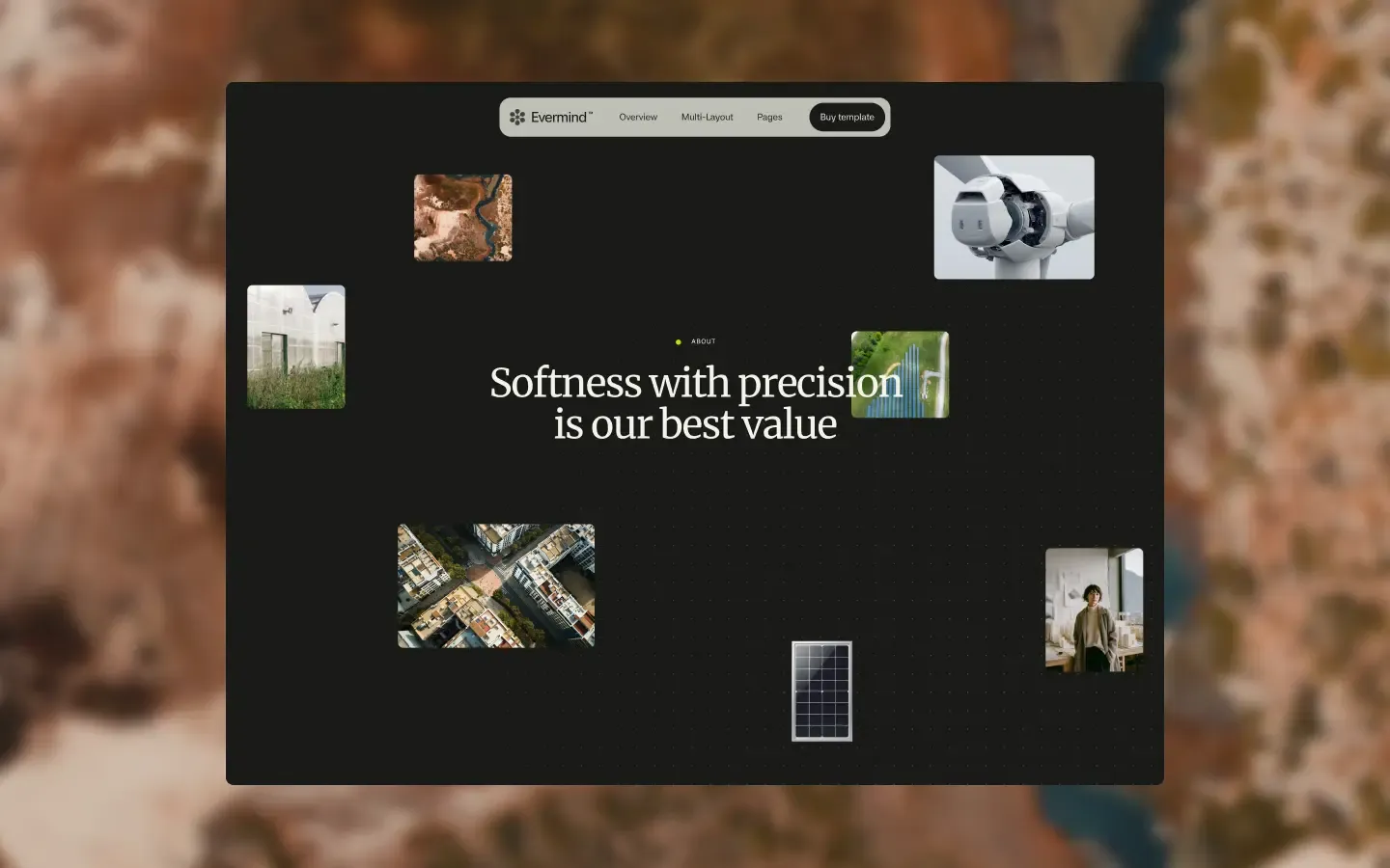
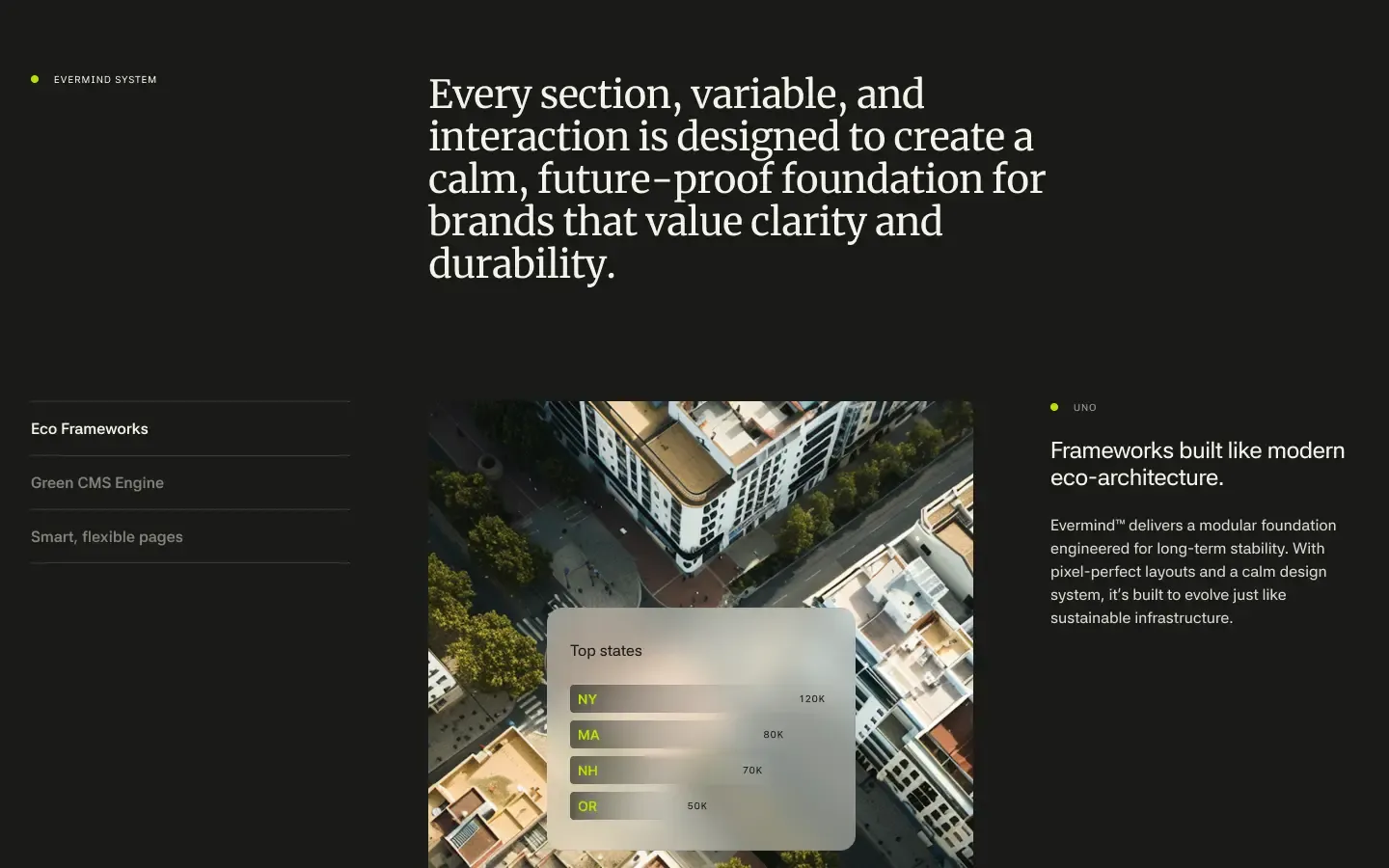
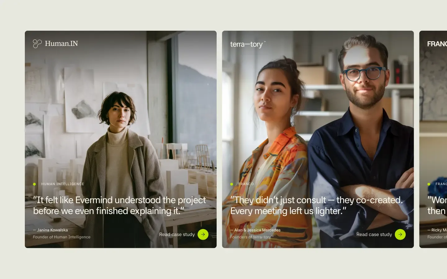
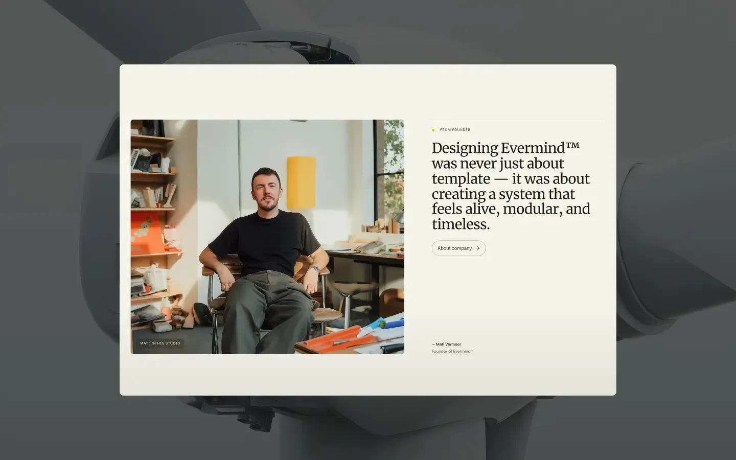
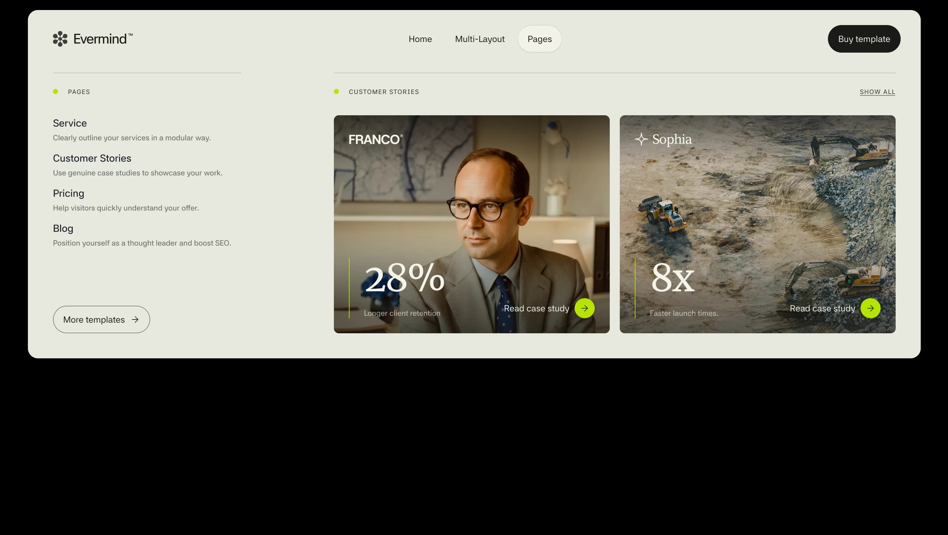
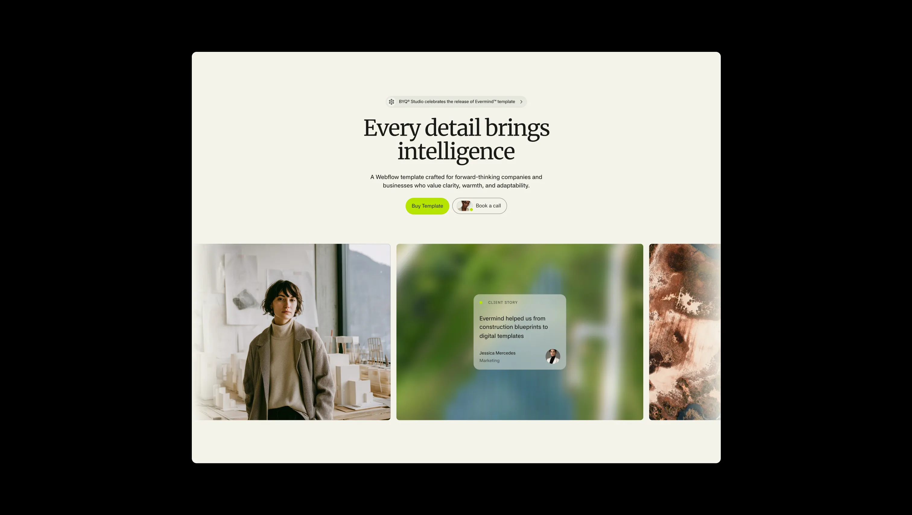
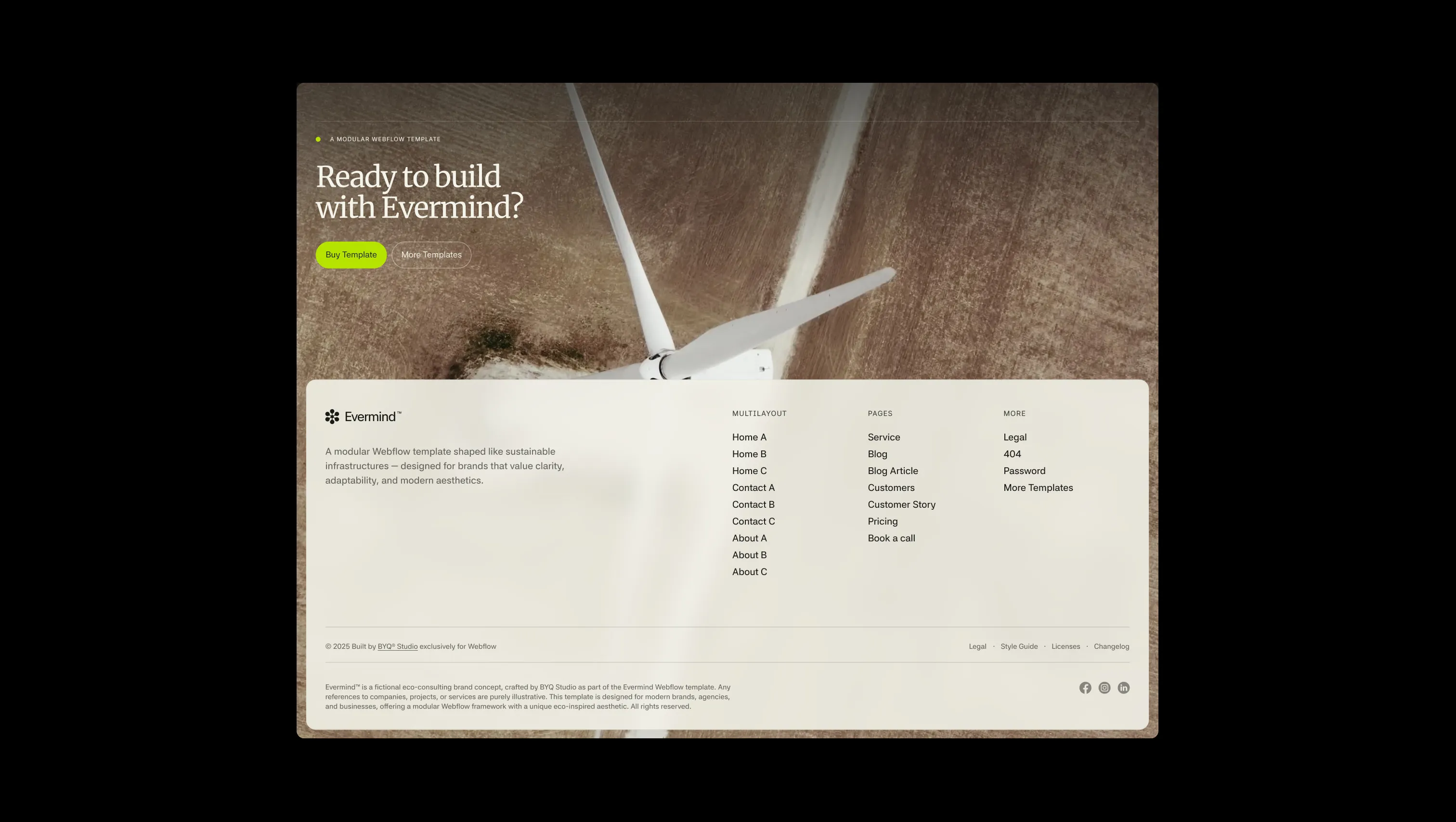
Evermind is a modular, eco-conscious design system built for consultancies, wellness brands, and purpose-led teams. The aesthetic blends warm sand-toned canvases with deep forest-ink surfaces, accented by a single electric chartreuse — Everglow — that signals action without shouting. Serif headlines in Merriweather lend an editorial, almost architectural calm, while a sans-serif body face keeps interfaces crisp and modern. The template feels like sustainable infrastructure: pixel-perfect grids, generous whitespace, soft 16px container radii, and pill-shaped buttons that float over rich landscape photography. Every section breathes — alternating light and dark canvases create a rhythm of openness and depth, mirroring the brand's promise of clarity, warmth, and adaptability.
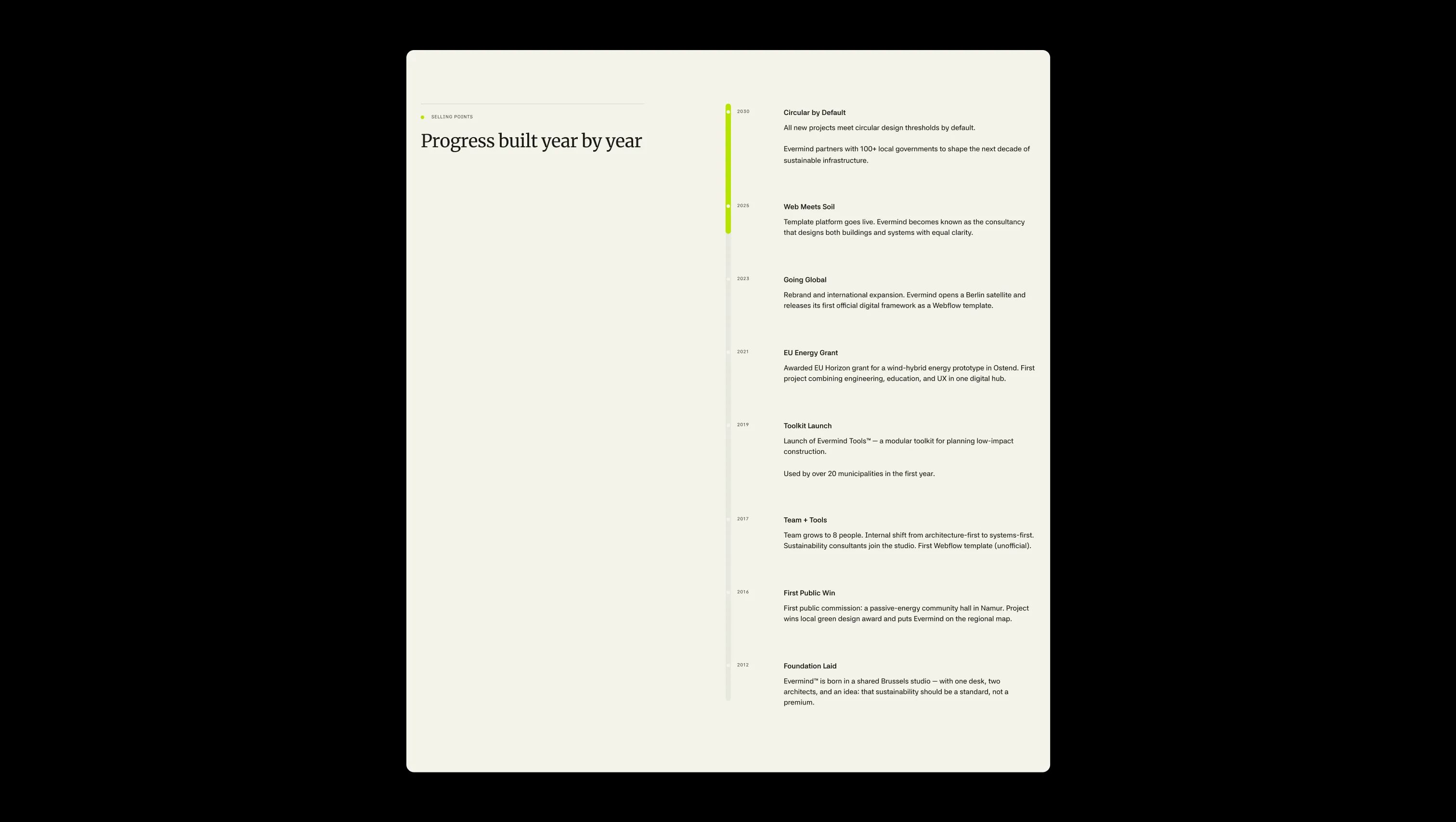
A handful of real sections that ship with this template. Click any card to preview, or explore them all under the Sections tab.
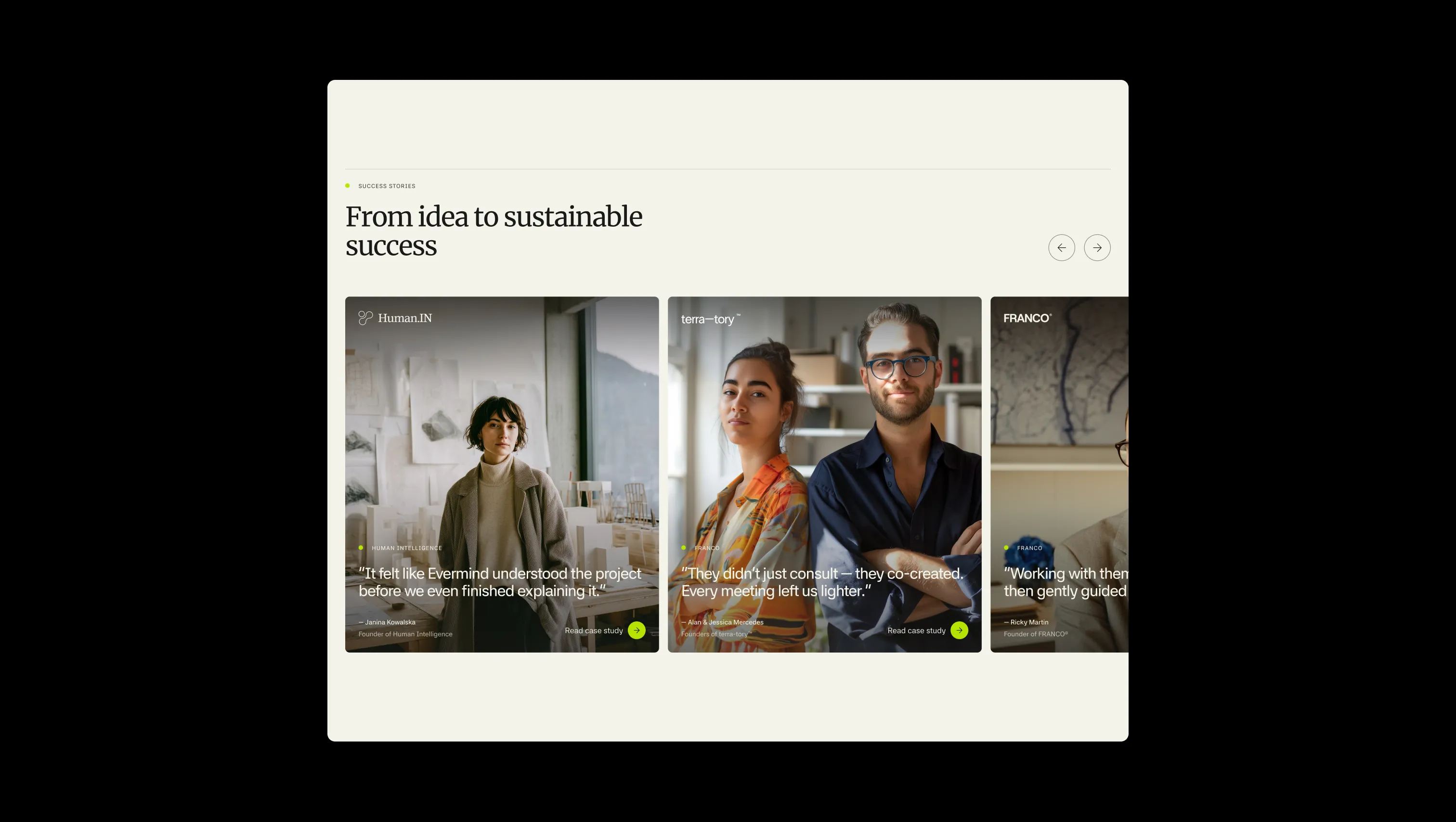
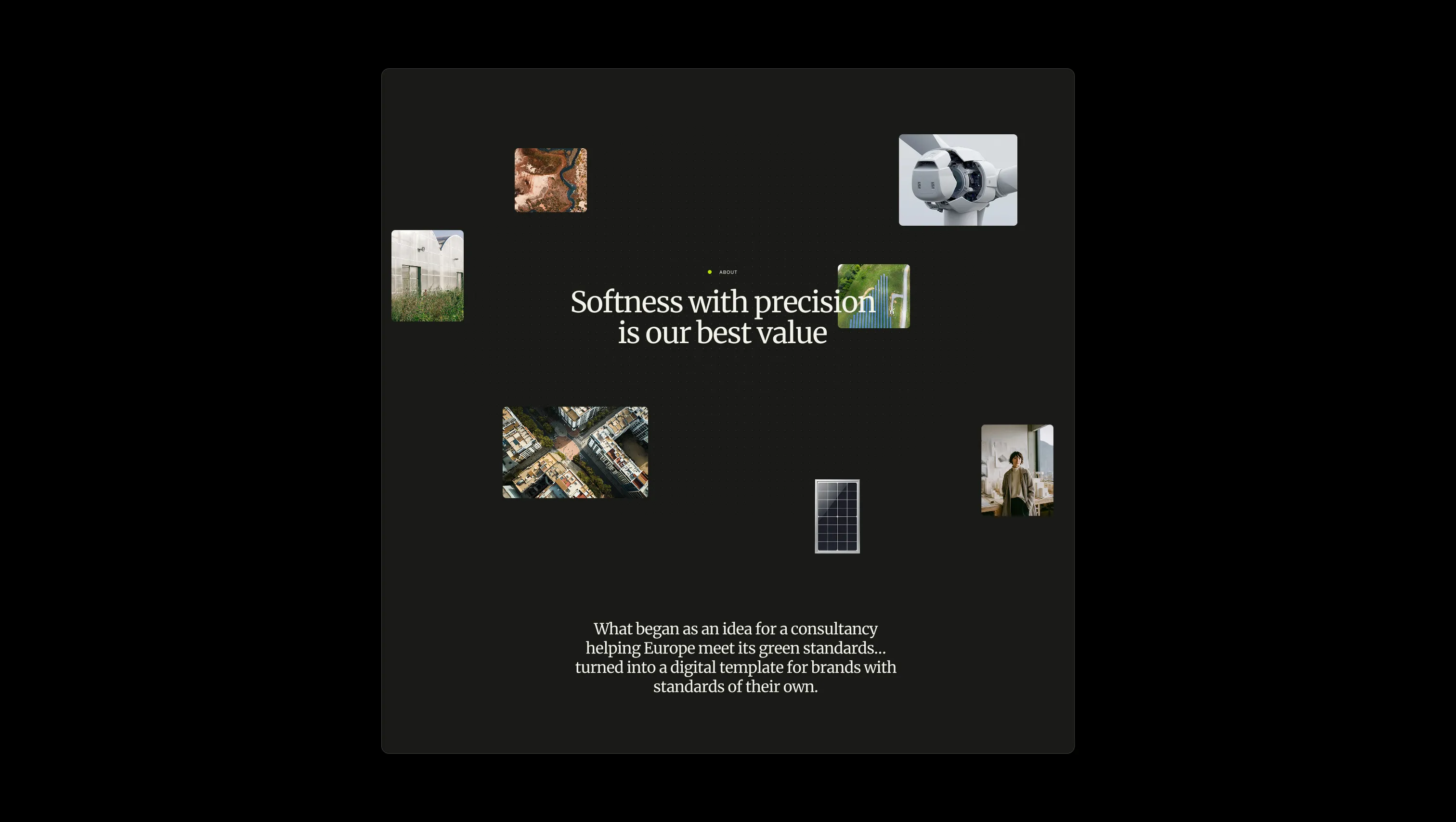
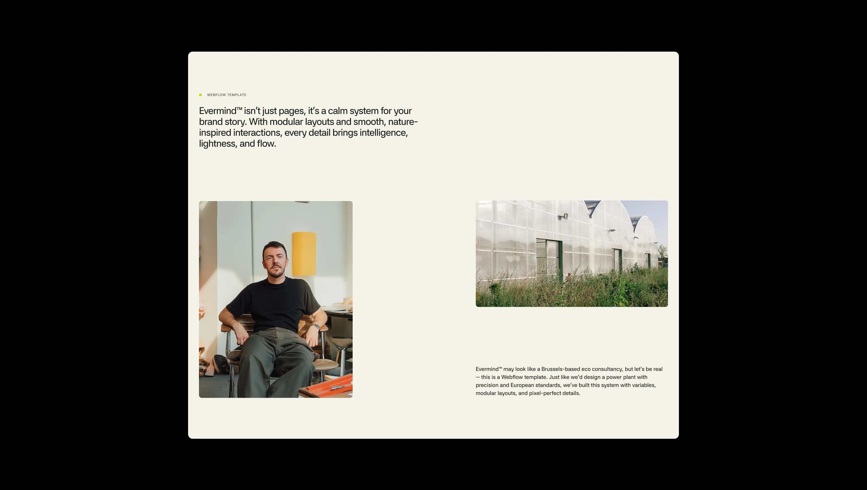
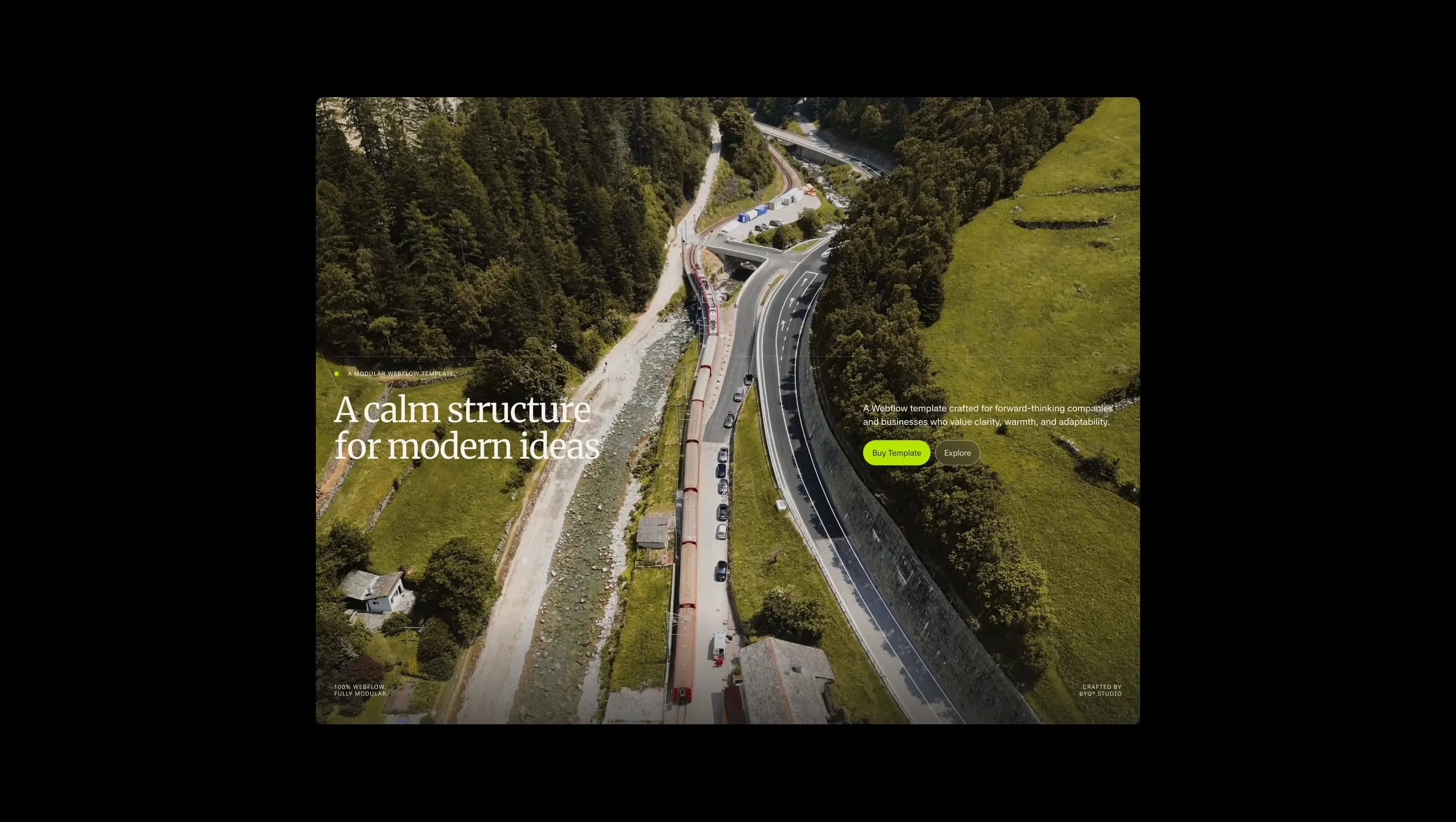
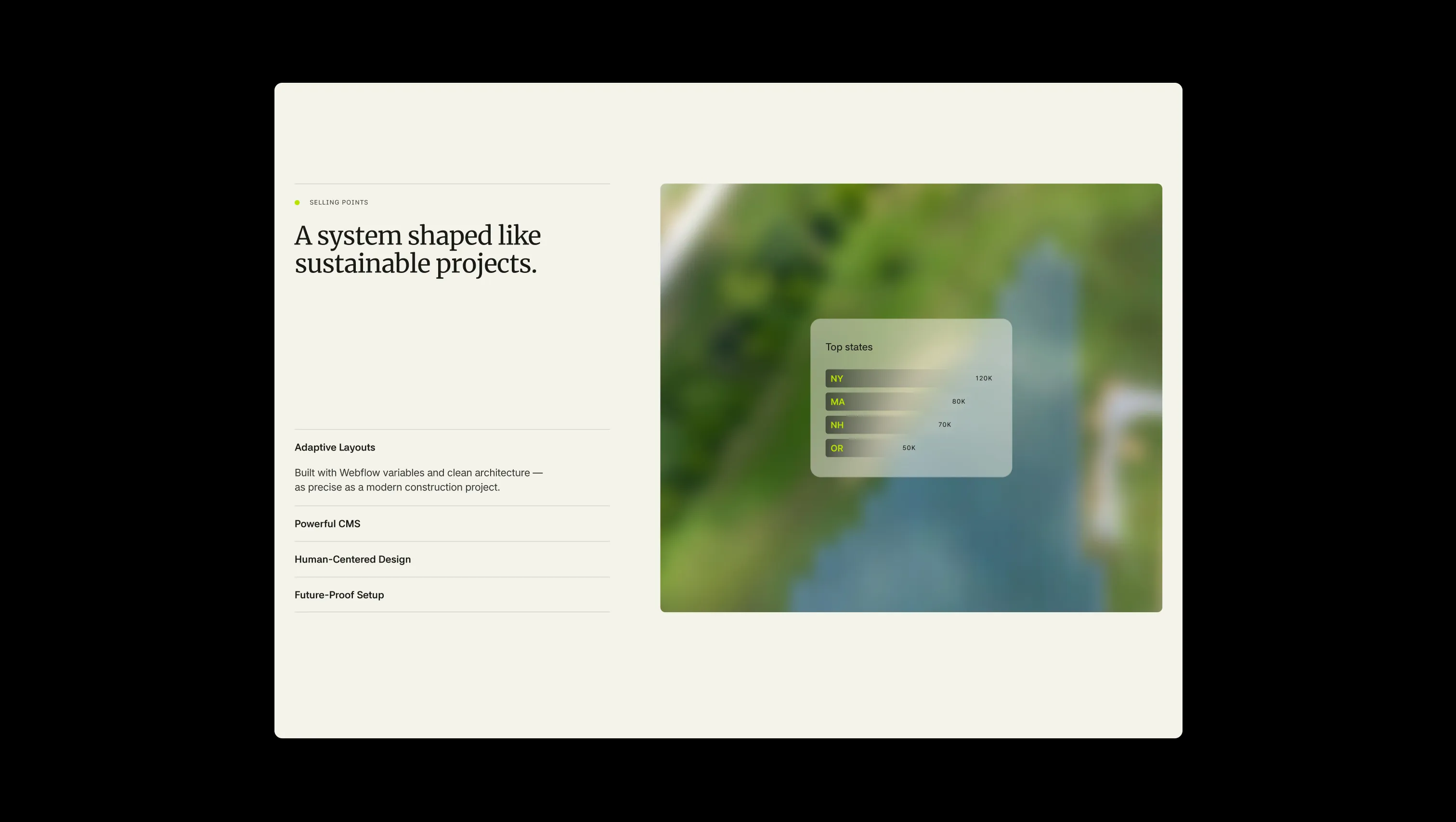
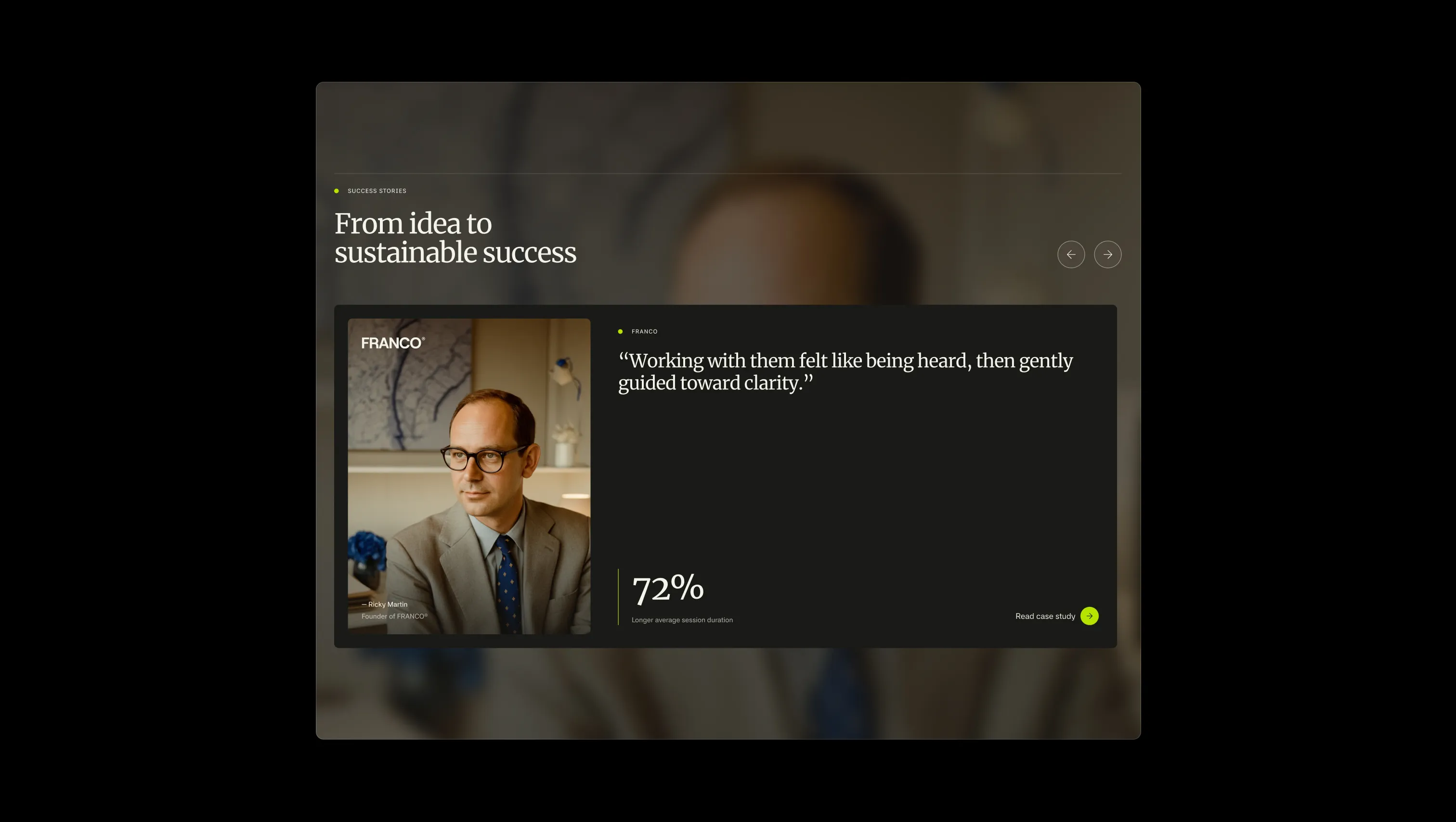
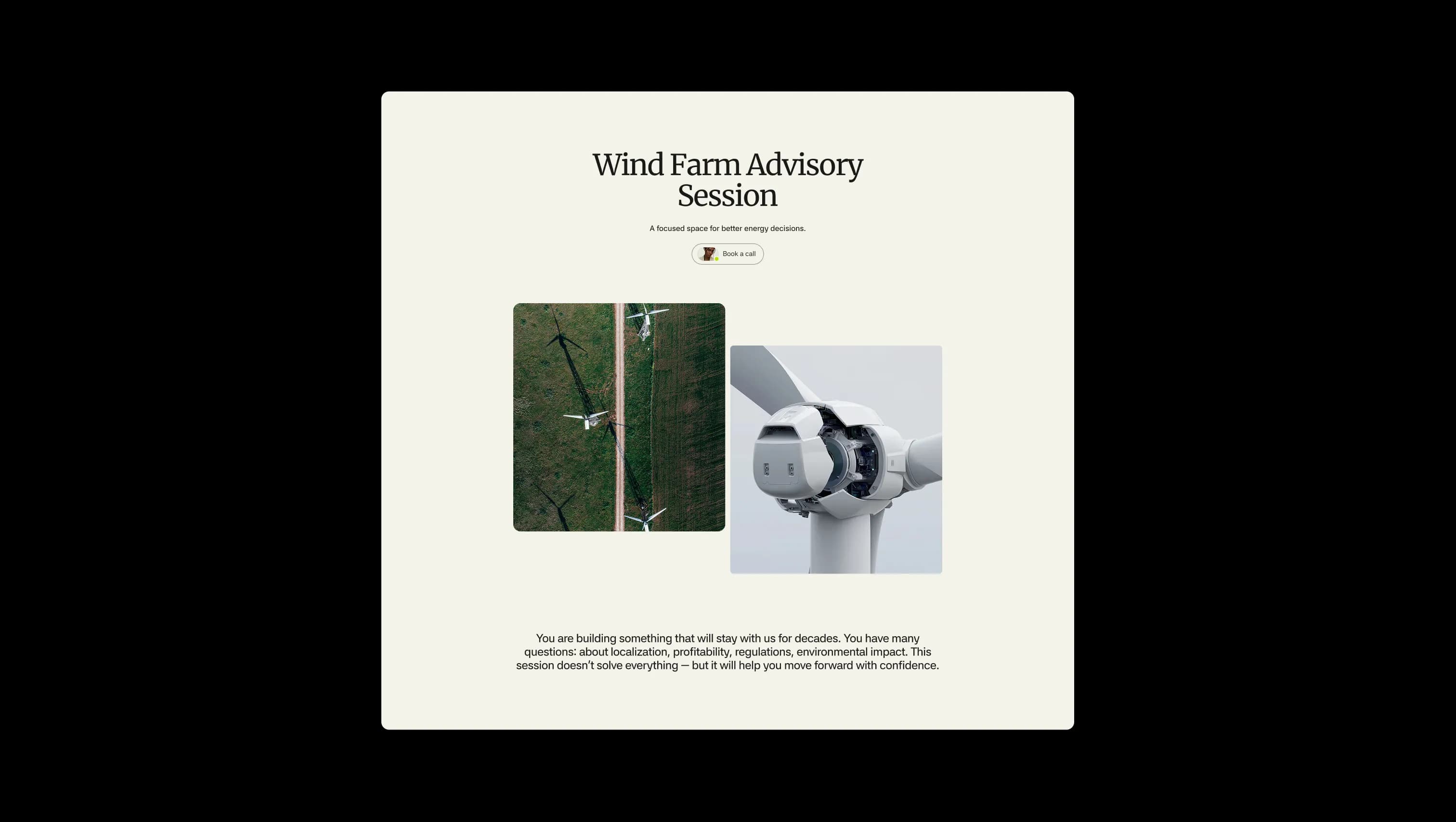
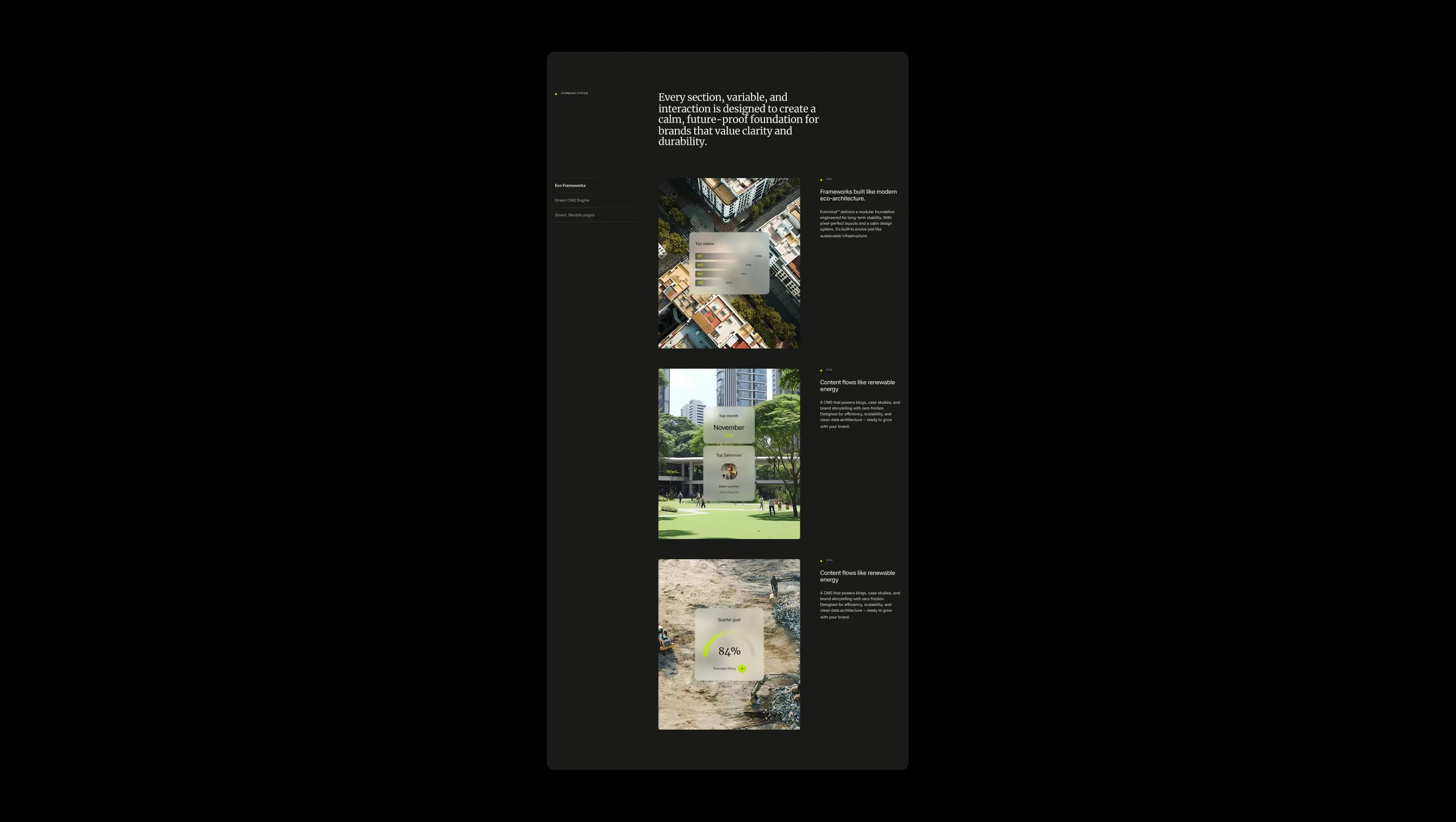
Primary canvas. Warm off-white background for default light sections, body copy surfaces, and footer.
Lifted canvas. Form panels, card surfaces, and the navigation bar fill on light pages.
Translucent navigation veil. Backdrop-blurred surface for floating navbars and overlay cards.
Semi-transparent forest wash. Image overlays and depth gradients atop hero photography.
Primary text & dark canvas. Body ink on light surfaces and full-bleed background for dark sections.
Tertiary dark surface. Testimonial cards, eyebrow ink on light, and quiet contrast layers.
Signature accent. Submit buttons, eyebrow dots, highlight chips, focus rings, and circular link badges.
Error state. Form validation messages and destructive system feedback only.
The quick brown fox jumps
Modern sans for h0, h5–h6, body, labels, and UI. Balances the serif with technical precision.
The quick brown fox jumps
Editorial headline serif for h1–h4. Carries the calm, architectural voice of the brand.
spacious1800px120px24px32px0px4px8px12px16px20px24px32px48px64px80pxnone0pxpill9999pxlarge16pxsmall8pxbuttons32pxStep from canvas (level 1) to lifted (level 2) to inset depth (level 3), then invert into the dark levels for full-bleed sections. Hex codes and roles live in the Colors section above; this ladder shows the layering only.
# Design System Guide

> Unlock the template to access the full design system.

## Brand voice

A short paragraph describing the brand voice, mood, and visual
principles that anchor the system. Tone, cadence, and intent.

## Colors

| Token        | Hex      | Role                                  |
| ------------ | -------- | ------------------------------------- |
| canvas-1     | #xxxxxx  | Page background, large surfaces       |
| canvas-2     | #xxxxxx  | Lifted surfaces, cards                |
| canvas-3     | #xxxxxx  | Inset wells, depressed states         |
| ink-1        | #xxxxxx  | Primary body text                     |
| ink-2        | #xxxxxx  | Secondary text, labels                |
| ink-3        | #xxxxxx  | Tertiary text, hints                  |
| accent-1     | #xxxxxx  | Primary brand accent                  |
| accent-2     | #xxxxxx  | Secondary accent                      |
| state-ok     | #xxxxxx  | Success, confirmations                |
| state-warn   | #xxxxxx  | Warnings                              |
| state-err    | #xxxxxx  | Errors, destructive actions           |

## Typography

- **Display** — heading scale, used for hero text and section titles.
- **Body** — primary reading text, optimized for paragraphs.
- **Mono** — code, data, and tabular numerals.

```
display: 32px / 40px / 48px / 64px / 80px
body:    14px / 16px / 18px
mono:    12px / 14px
```

## Spacing & shape

Base unit: 4px. Scale: 4, 8, 12, 16, 24, 32, 48, 64, 96, 128.
Radii: sm (4px), md (8px), lg (12px), xl (20px), full (9999px).

## Surfaces

Layered elevation from canvas → lifted → inset. Surfaces invert in
dark sections for full-bleed contrast.

## Do's and don'ts

- Do use accent-1 sparingly for primary CTAs only.
- Do maintain at least 4.5:1 contrast on body text.
- Don't mix display and body in the same line.
- Don't use state colors for branding.

## Agent prompt guide

Prompts for AI design tools that respect this system.
Includes example prompts for sections, components, and layouts.

# ...
Unlock the full style guide