Design systems, extracted.
Paste any URL to create a design system from it. Open any style for colors, type, spacing, components, and a DESIGN.md or tokens.json your agent can use.
Quickly navigate through the dashboard with your keyboard using the command menu.
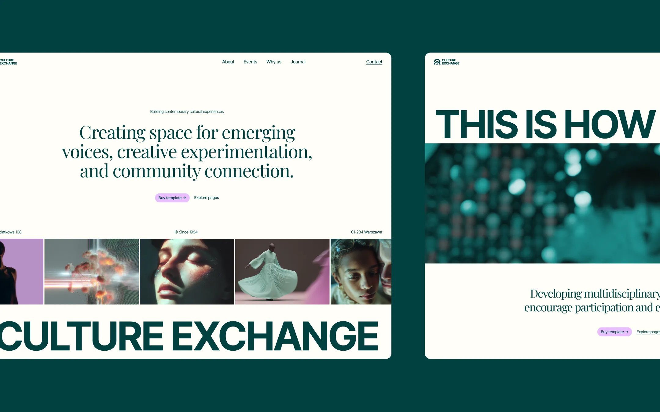
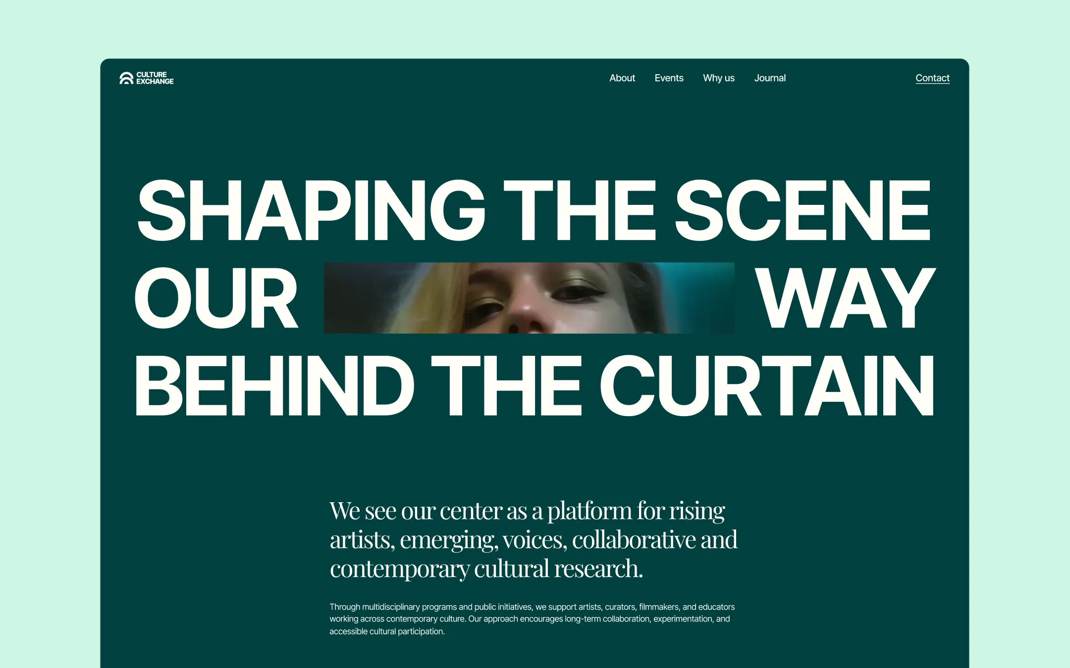
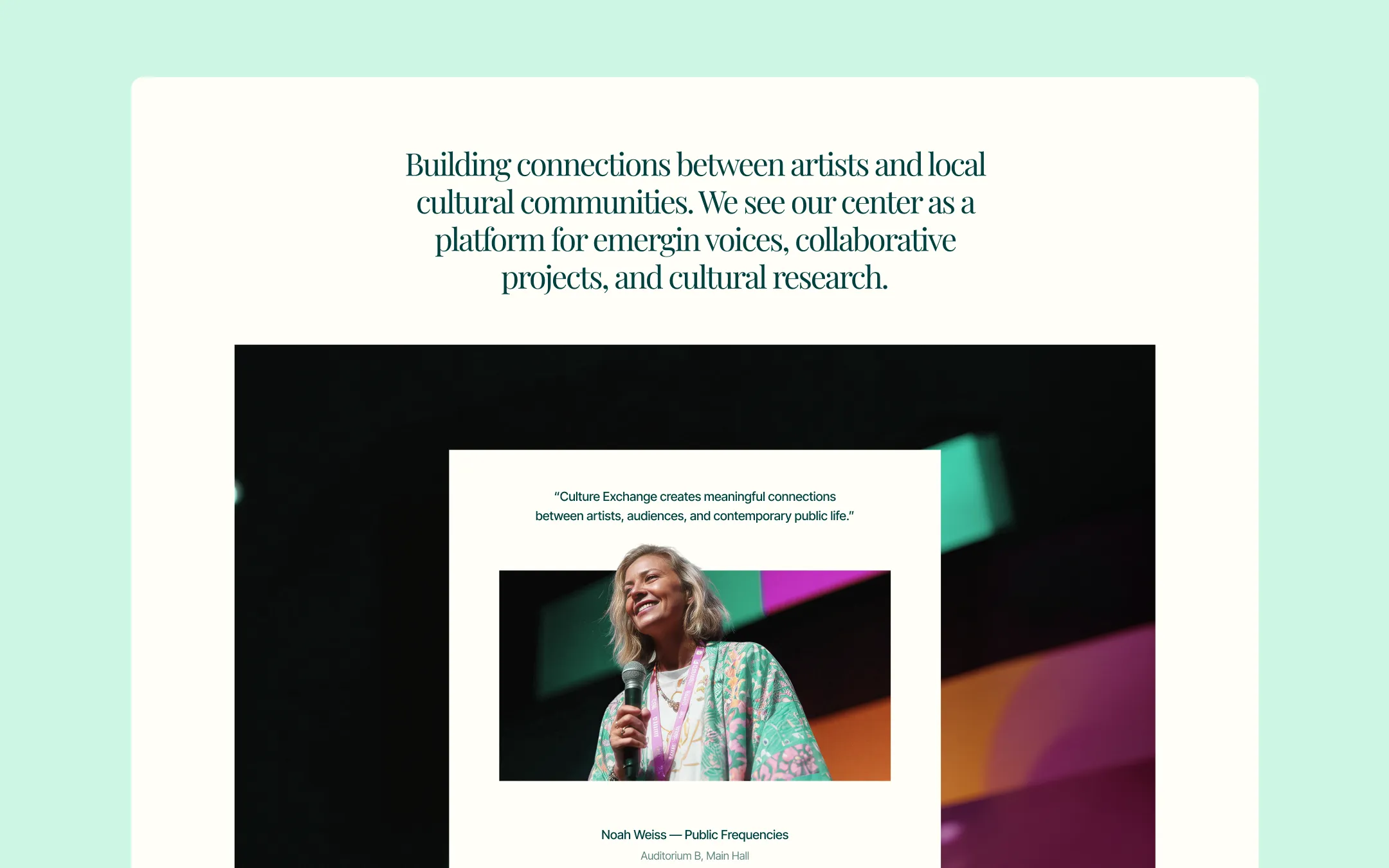
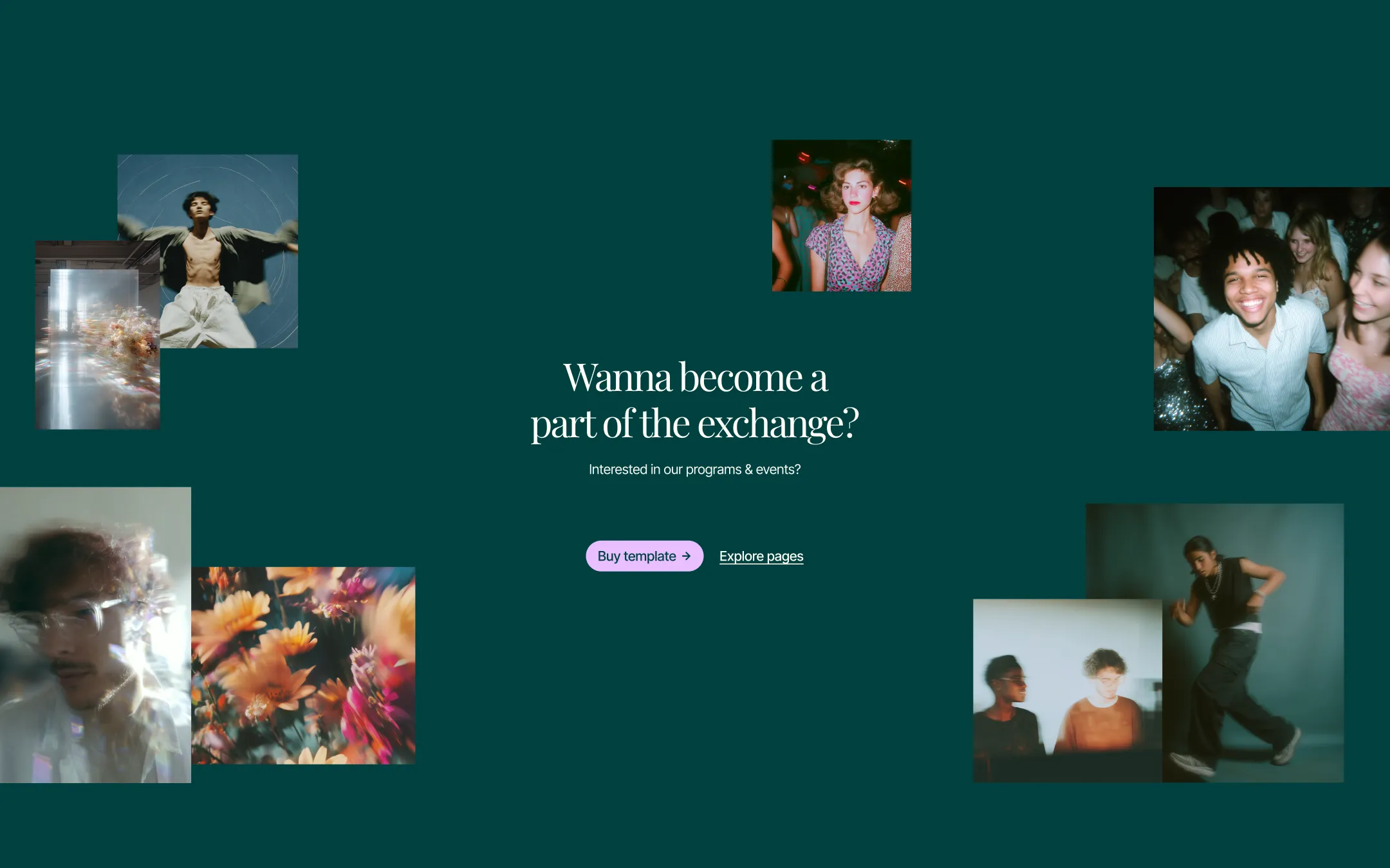
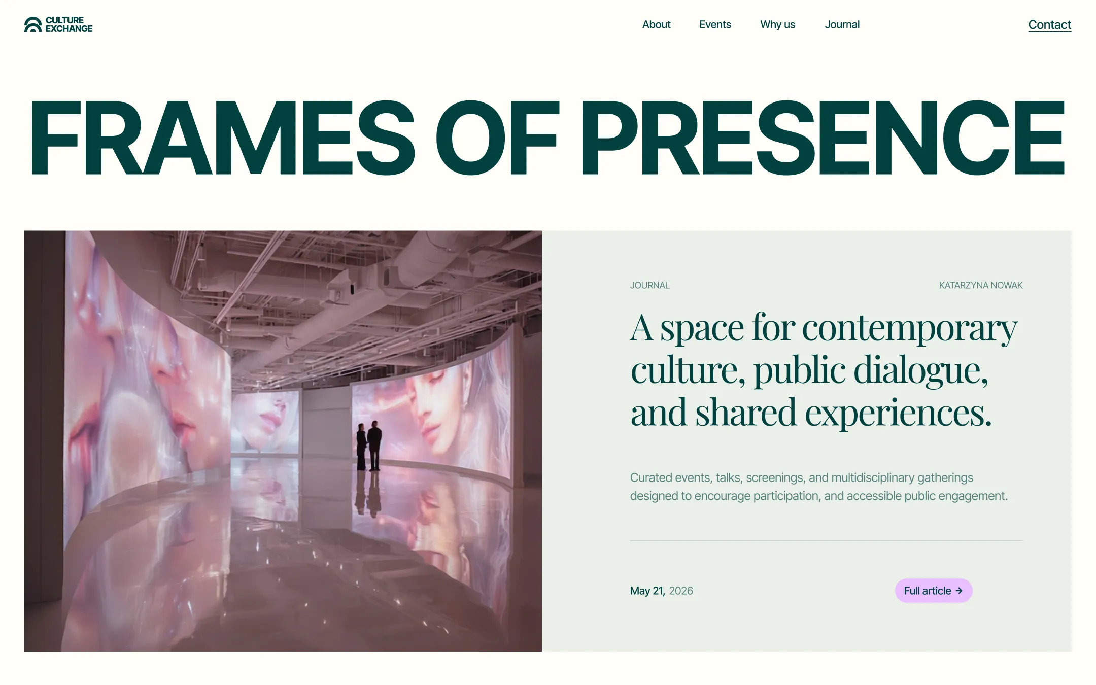
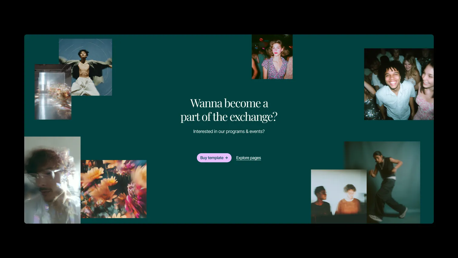
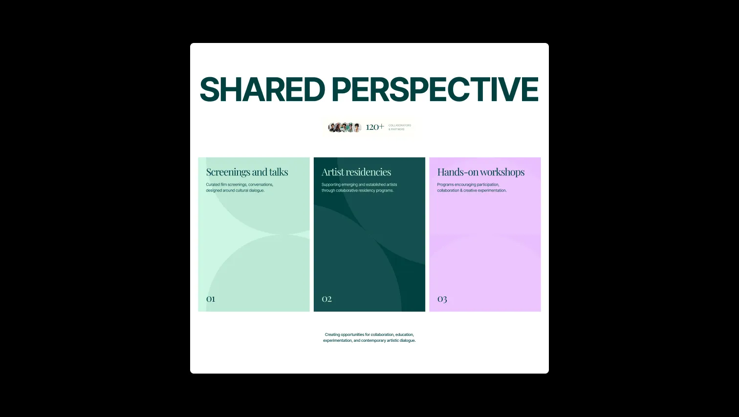
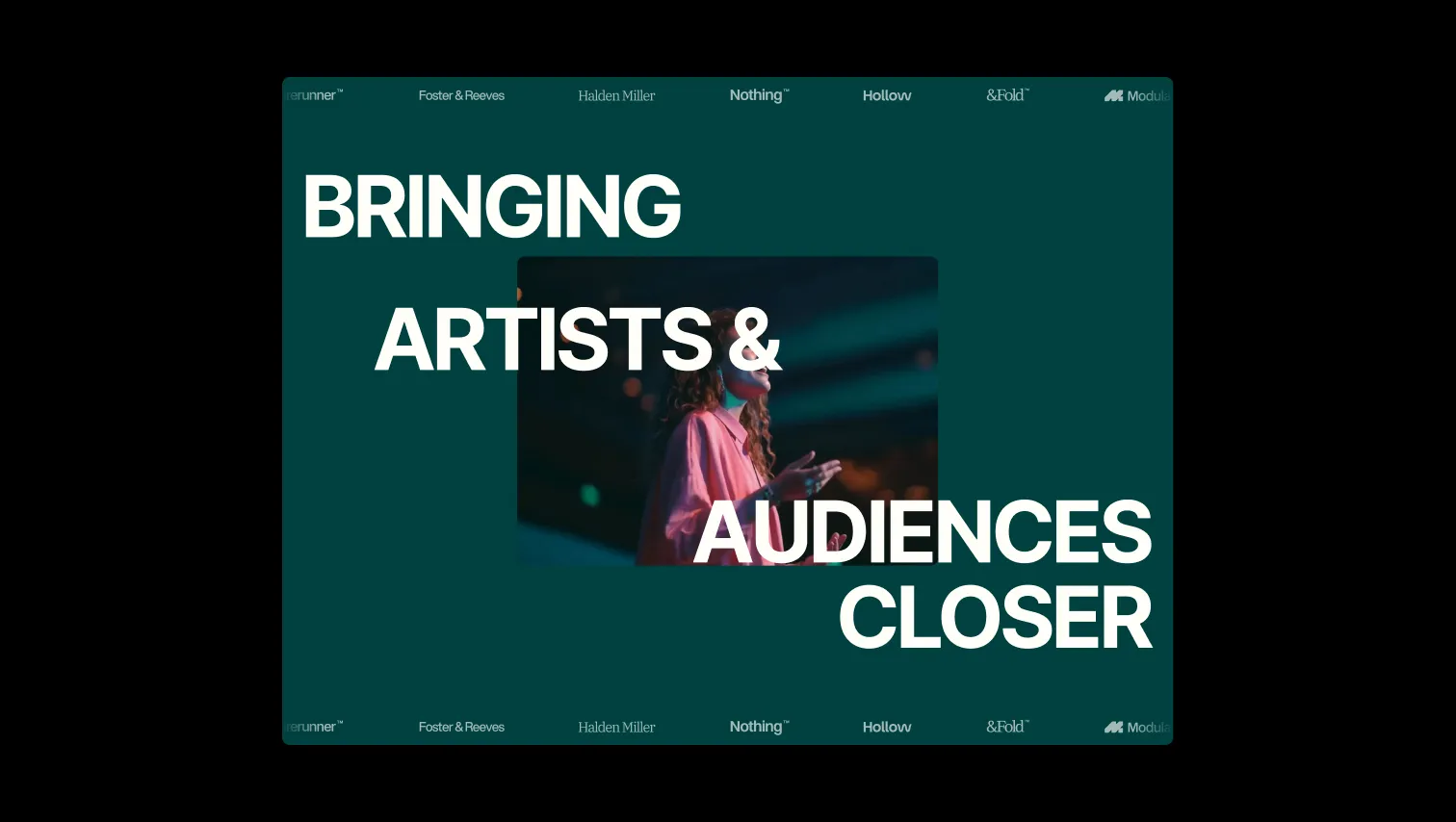
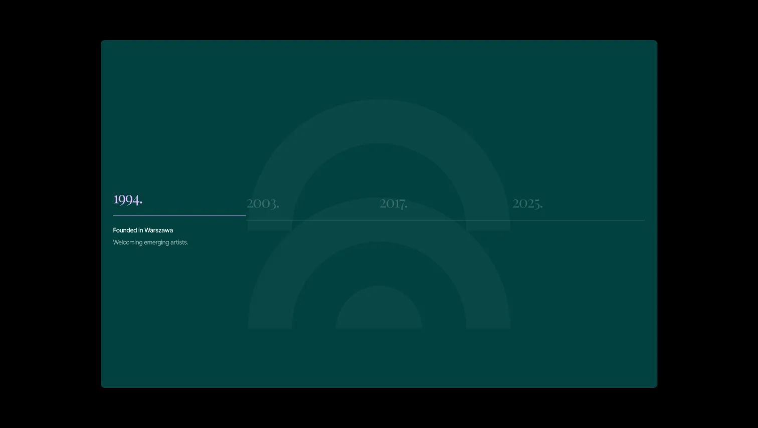
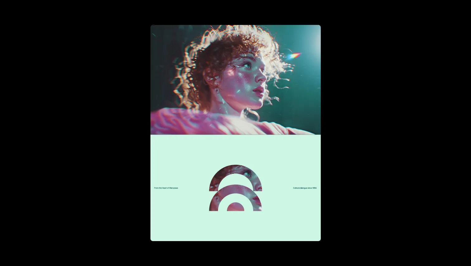
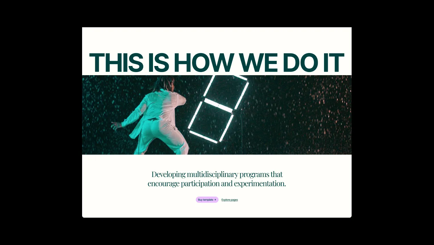
Culture Exchange reads like a gallery catalogue rebuilt for the web — a warm, almost-cream canvas punctuated by slabs of deep teal and sudden bursts of lilac and gold. Playfair Display's editorial serif carries the voice of a cultural institution (quiet, confident, a little theatrical), while Inter Tight handles the operational language of navigation, labels, and buttons with crisp neutrality. The system alternates between light, paper-like sections and inverted teal 'stage' sections, creating rhythm the way a printed program alternates text pages with full-bleed plates. Spacing is generous and unhurried — section paddings stretch from 80px to 200px — giving every exhibition, event, or journal entry room to breathe. Pill-shaped buttons in soft lilac, large uppercase display type, and tightly cropped portrait photography keep the tone human and current rather than stiff or institutional, positioning the brand as serious about art but never precious about it.
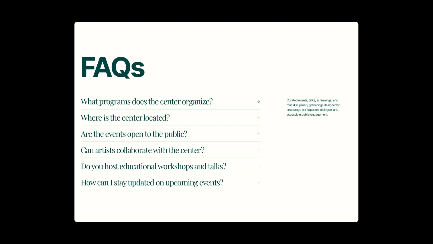
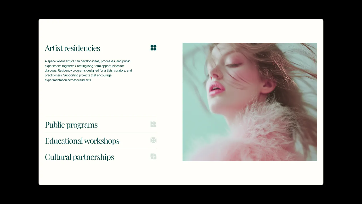
A handful of real sections that ship with this template. Click any card to preview, or explore them all under the Sections tab.
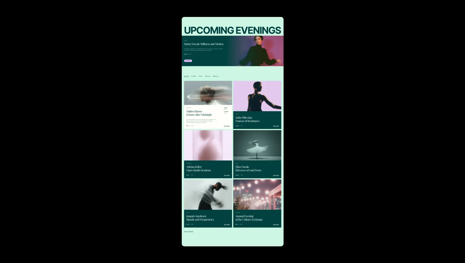
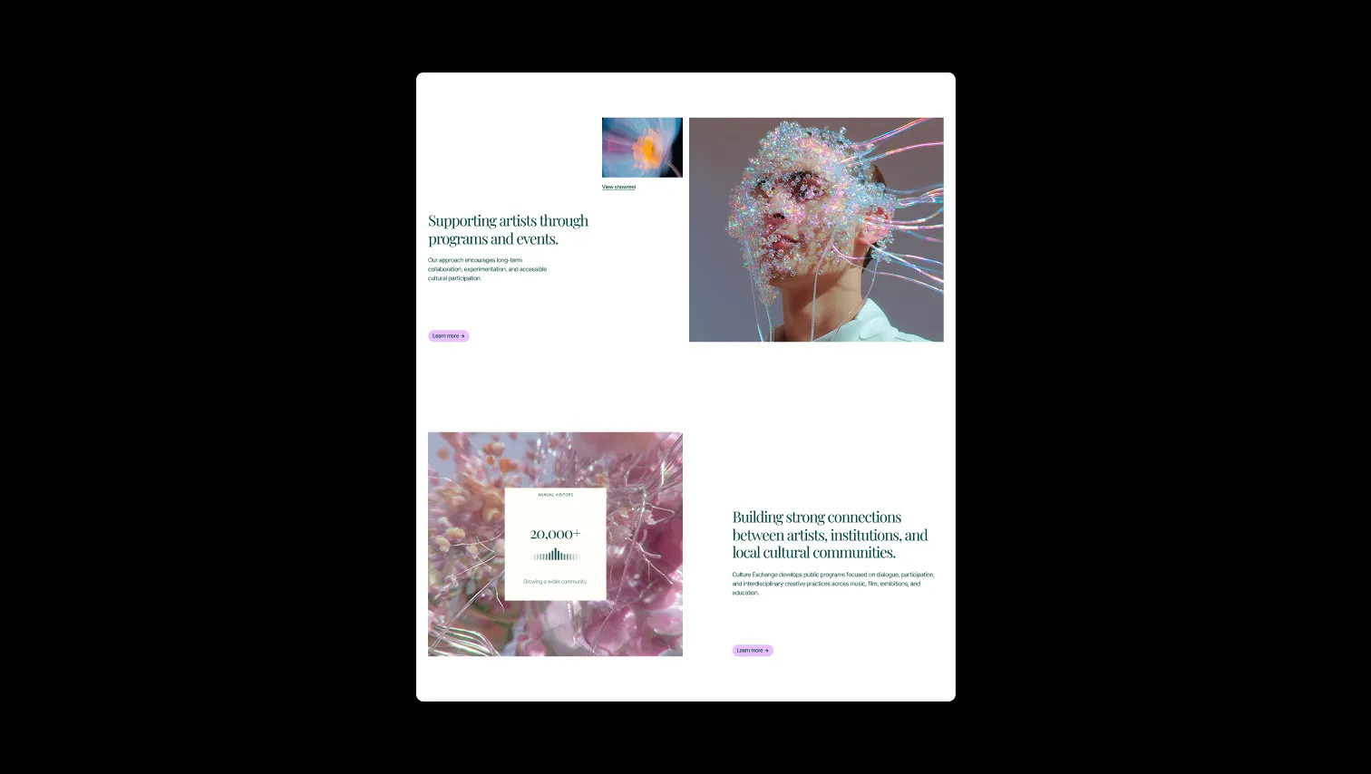
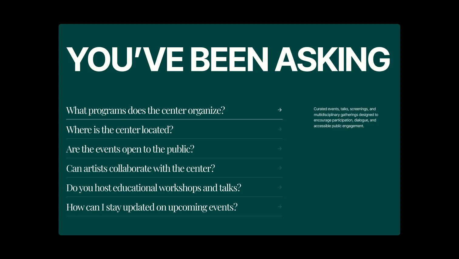
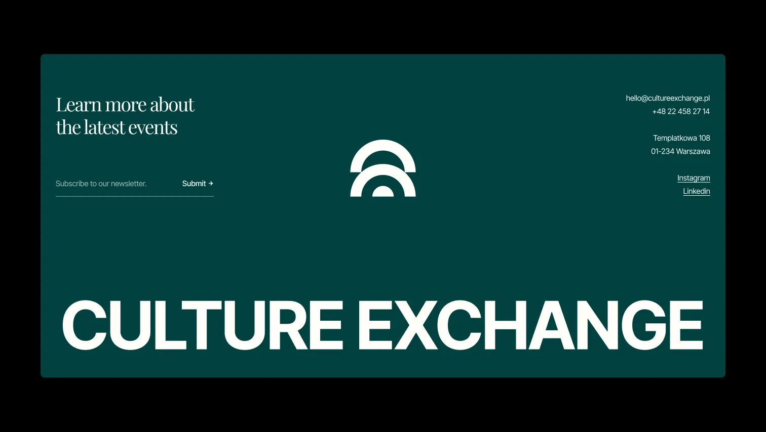
Base page canvas
Lifted card surface
Primary ink & dark surface
CTA block background
Primary button fill
Decorative accent dot
Error state
Warning state
Success state
The quick brown fox jumps
Body copy, labels, navigation, buttons, small headings
The quick brown fox jumps
Display & heading serif — editorial, gallery-catalogue voice
spacious1440px160px32px24px0px4px8px12px16px20px24px32px40px48px64px80px120px160px200pxtags32pxcards20pxsmall8pxinputs0pxbuttons24pxnavigation12pxStep from canvas (level 1) to lifted (level 2) to inset depth (level 3), then invert into the dark levels for full-bleed sections. Hex codes and roles live in the Colors section above; this ladder shows the layering only.
# Design System Guide

> Unlock the template to access the full design system.

## Brand voice

A short paragraph describing the brand voice, mood, and visual
principles that anchor the system. Tone, cadence, and intent.

## Colors

| Token        | Hex      | Role                                  |
| ------------ | -------- | ------------------------------------- |
| canvas-1     | #xxxxxx  | Page background, large surfaces       |
| canvas-2     | #xxxxxx  | Lifted surfaces, cards                |
| canvas-3     | #xxxxxx  | Inset wells, depressed states         |
| ink-1        | #xxxxxx  | Primary body text                     |
| ink-2        | #xxxxxx  | Secondary text, labels                |
| ink-3        | #xxxxxx  | Tertiary text, hints                  |
| accent-1     | #xxxxxx  | Primary brand accent                  |
| accent-2     | #xxxxxx  | Secondary accent                      |
| state-ok     | #xxxxxx  | Success, confirmations                |
| state-warn   | #xxxxxx  | Warnings                              |
| state-err    | #xxxxxx  | Errors, destructive actions           |

## Typography

- **Display** — heading scale, used for hero text and section titles.
- **Body** — primary reading text, optimized for paragraphs.
- **Mono** — code, data, and tabular numerals.

```
display: 32px / 40px / 48px / 64px / 80px
body:    14px / 16px / 18px
mono:    12px / 14px
```

## Spacing & shape

Base unit: 4px. Scale: 4, 8, 12, 16, 24, 32, 48, 64, 96, 128.
Radii: sm (4px), md (8px), lg (12px), xl (20px), full (9999px).

## Surfaces

Layered elevation from canvas → lifted → inset. Surfaces invert in
dark sections for full-bleed contrast.

## Do's and don'ts

- Do use accent-1 sparingly for primary CTAs only.
- Do maintain at least 4.5:1 contrast on body text.
- Don't mix display and body in the same line.
- Don't use state colors for branding.

## Agent prompt guide

Prompts for AI design tools that respect this system.
Includes example prompts for sections, components, and layouts.

# ...
Unlock the full style guide