Design systems, extracted.
Search curated design systems pulled from premium templates or create one from URL. Open any style for colors, type, spacing, components, and a DESIGN.md or tokens.json your agent can use.
Quickly navigate through the dashboard with your keyboard using the command menu.

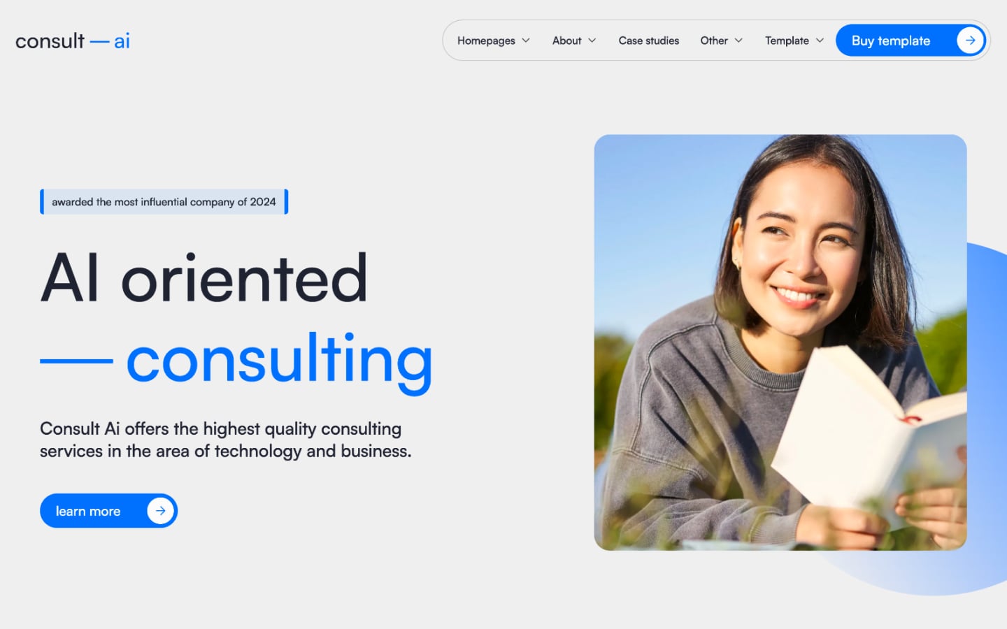
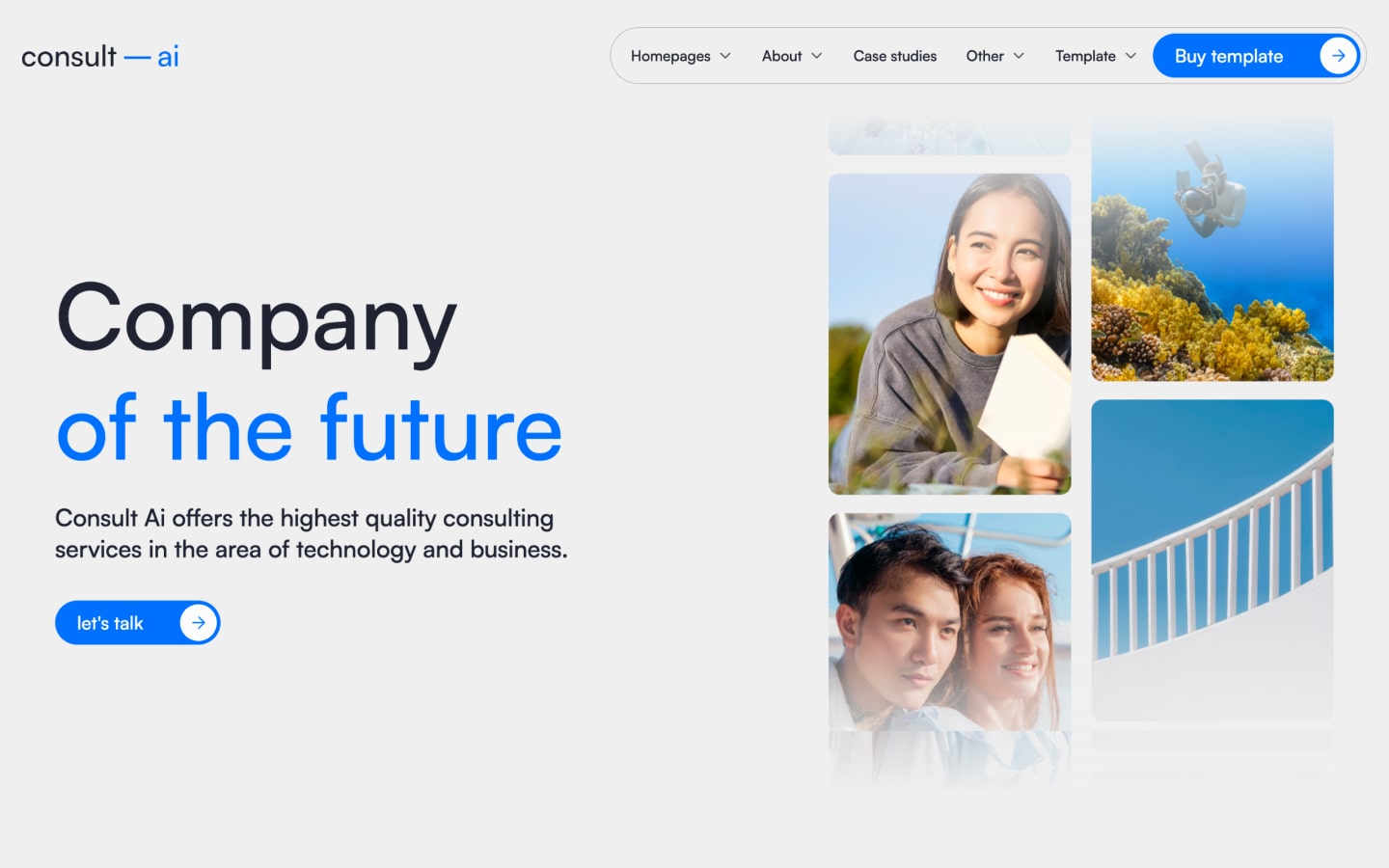
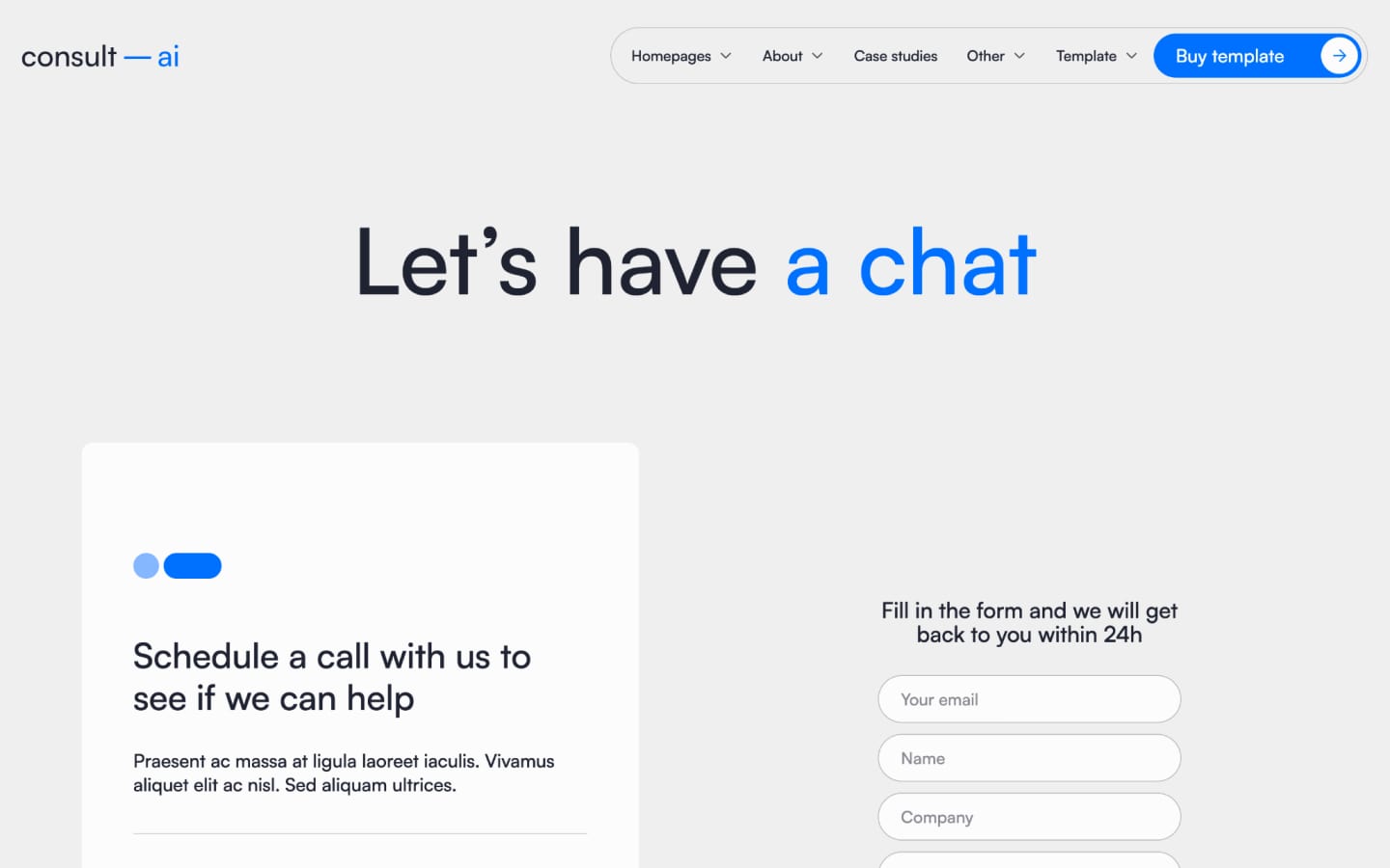
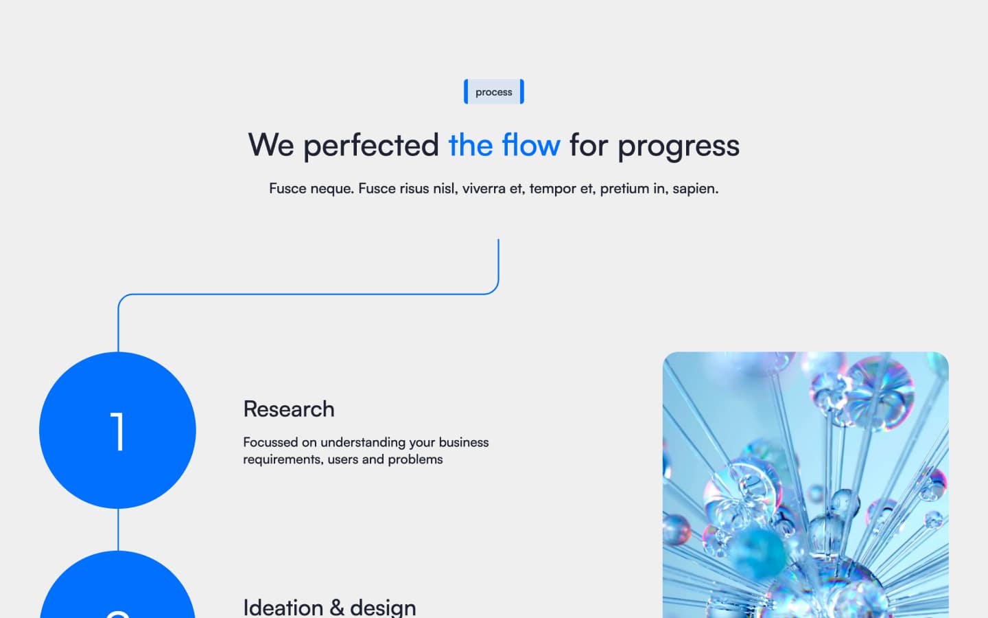
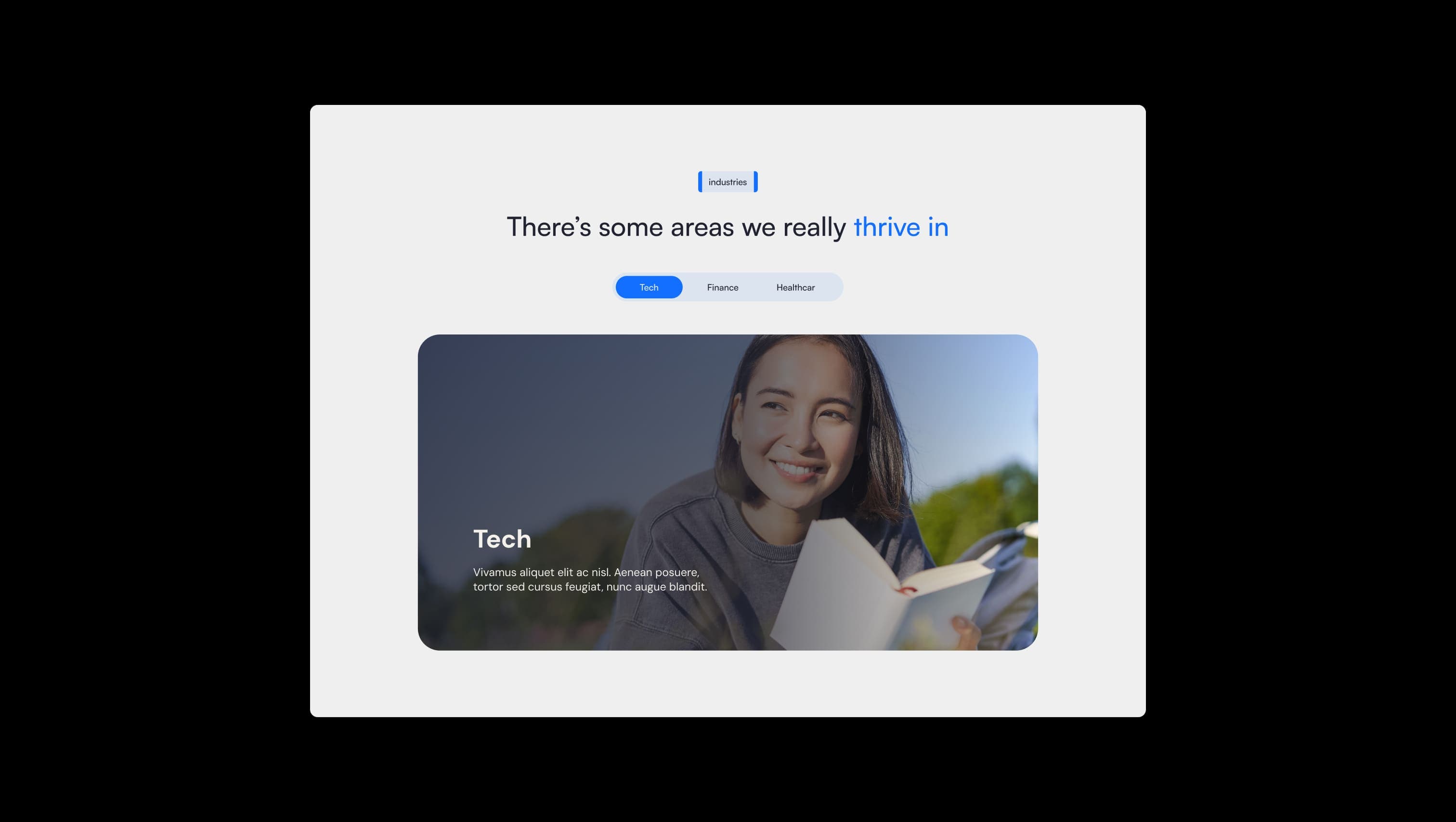
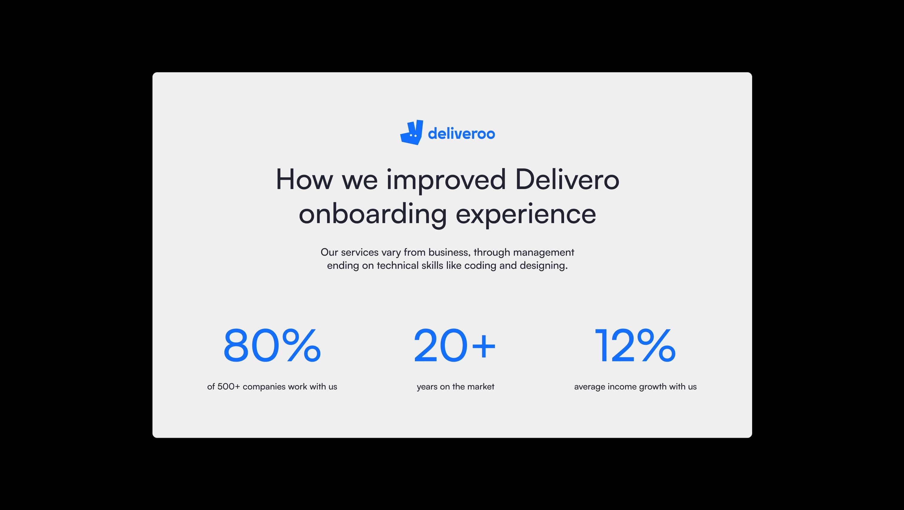
Consult AI is a calm, modern consulting brand built around a single decisive accent: a confident electric blue that punctuates an otherwise neutral, paper-soft canvas. The voice is professional yet approachable — pill-shaped CTAs, generous whitespace, and oversized Satoshi headlines establish authority without rigidity. The template leans on a duotone discipline: warm off-white backgrounds, near-black ink, and brilliant signal-blue moments where it matters — accent words, primary buttons, statistics, and decorative accent sections. Imagery is bright, optimistic, and human, framed in soft 24px rounded rectangles that echo the buttons and tabs.
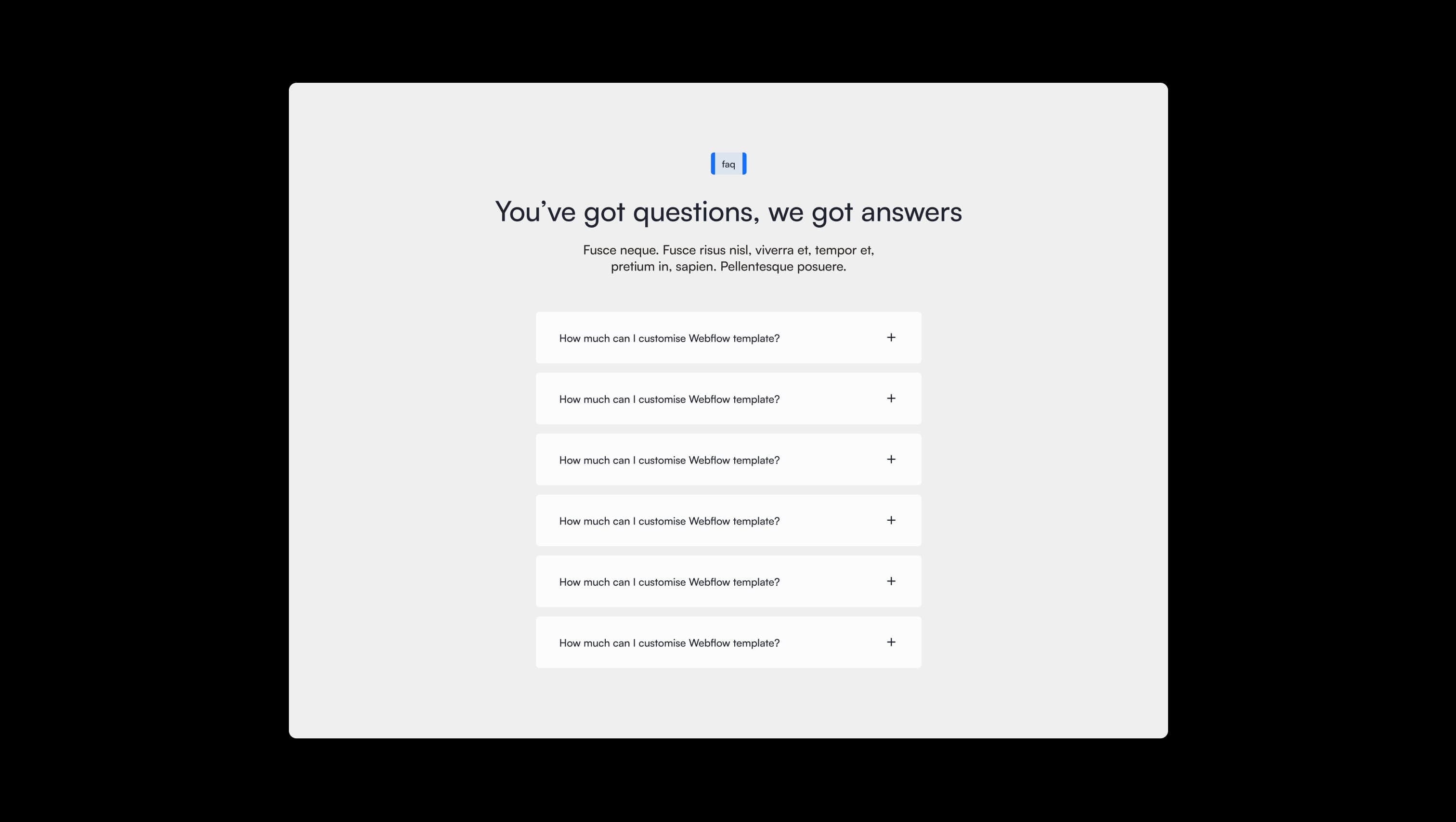
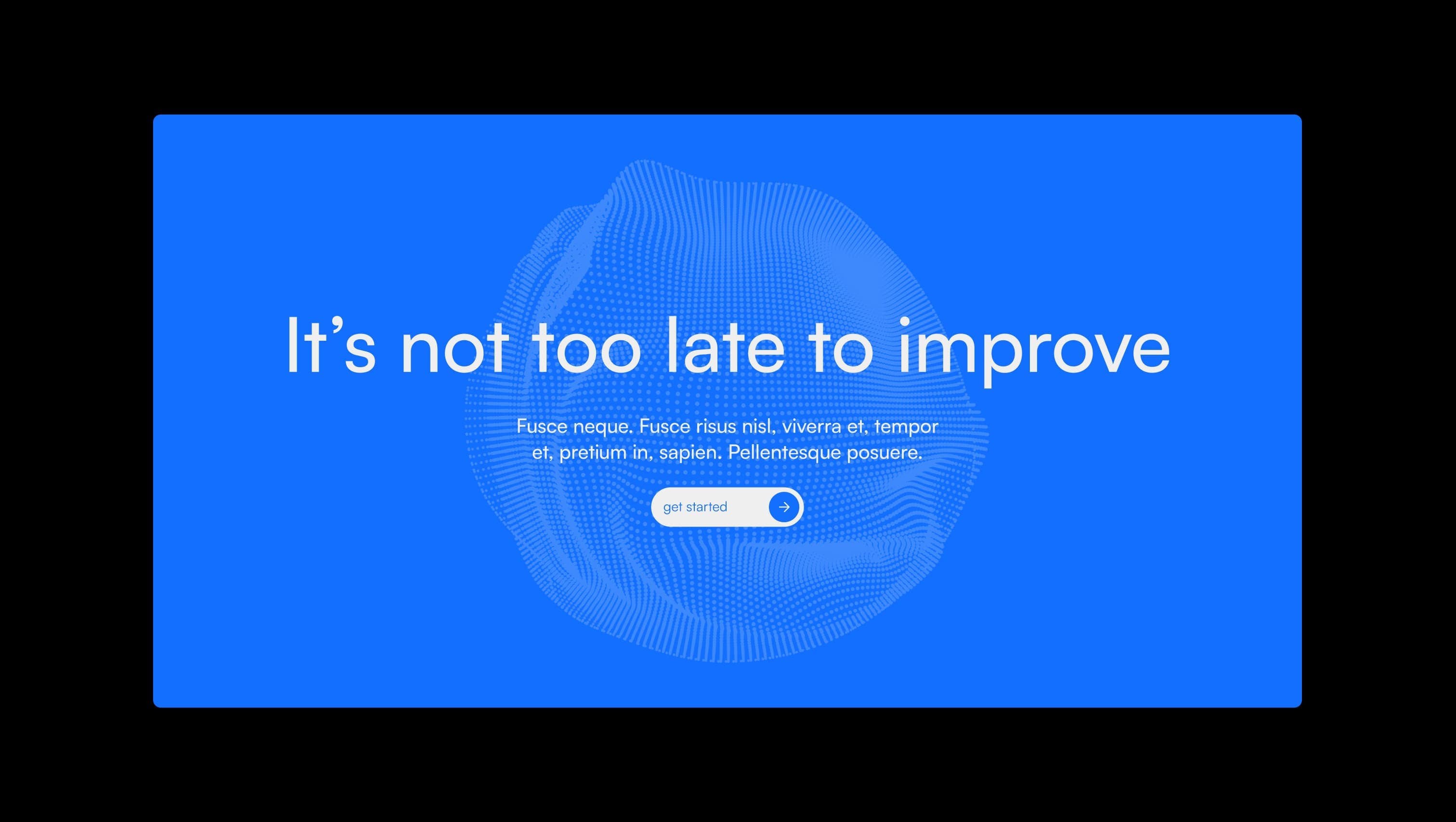
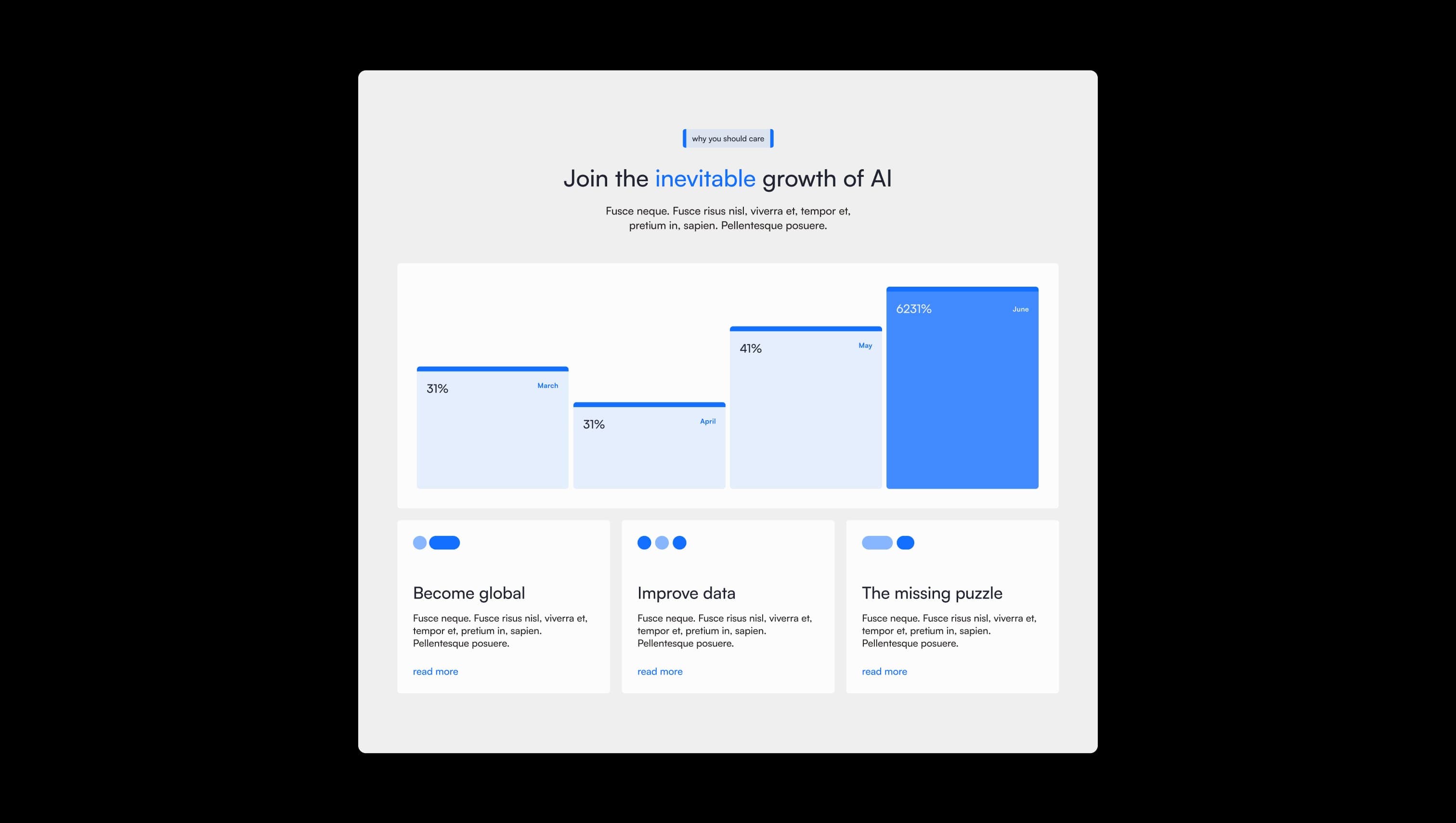
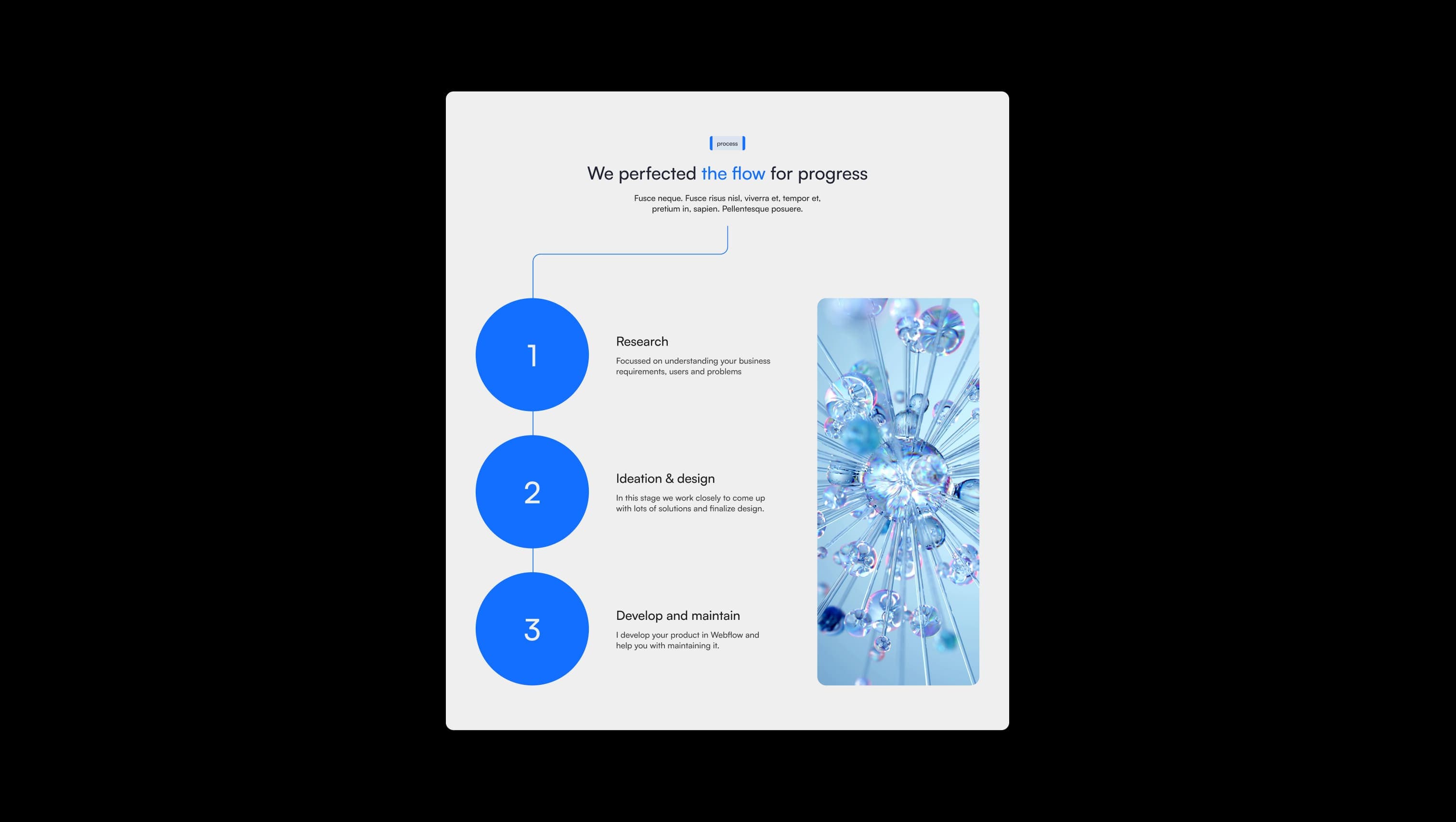
A handful of real sections that ship with this template. Click any card to preview, or explore them all under the Sections tab.
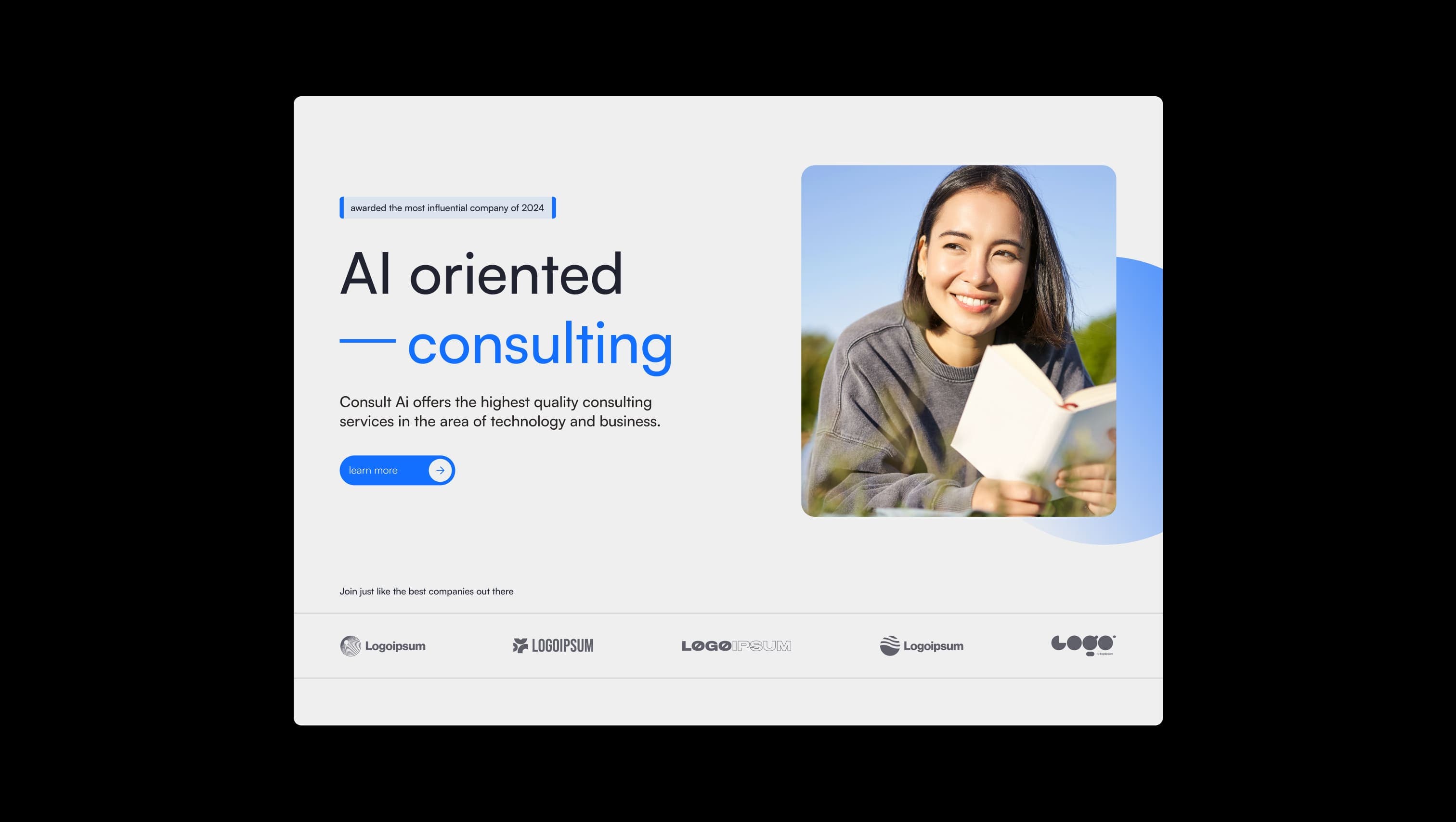
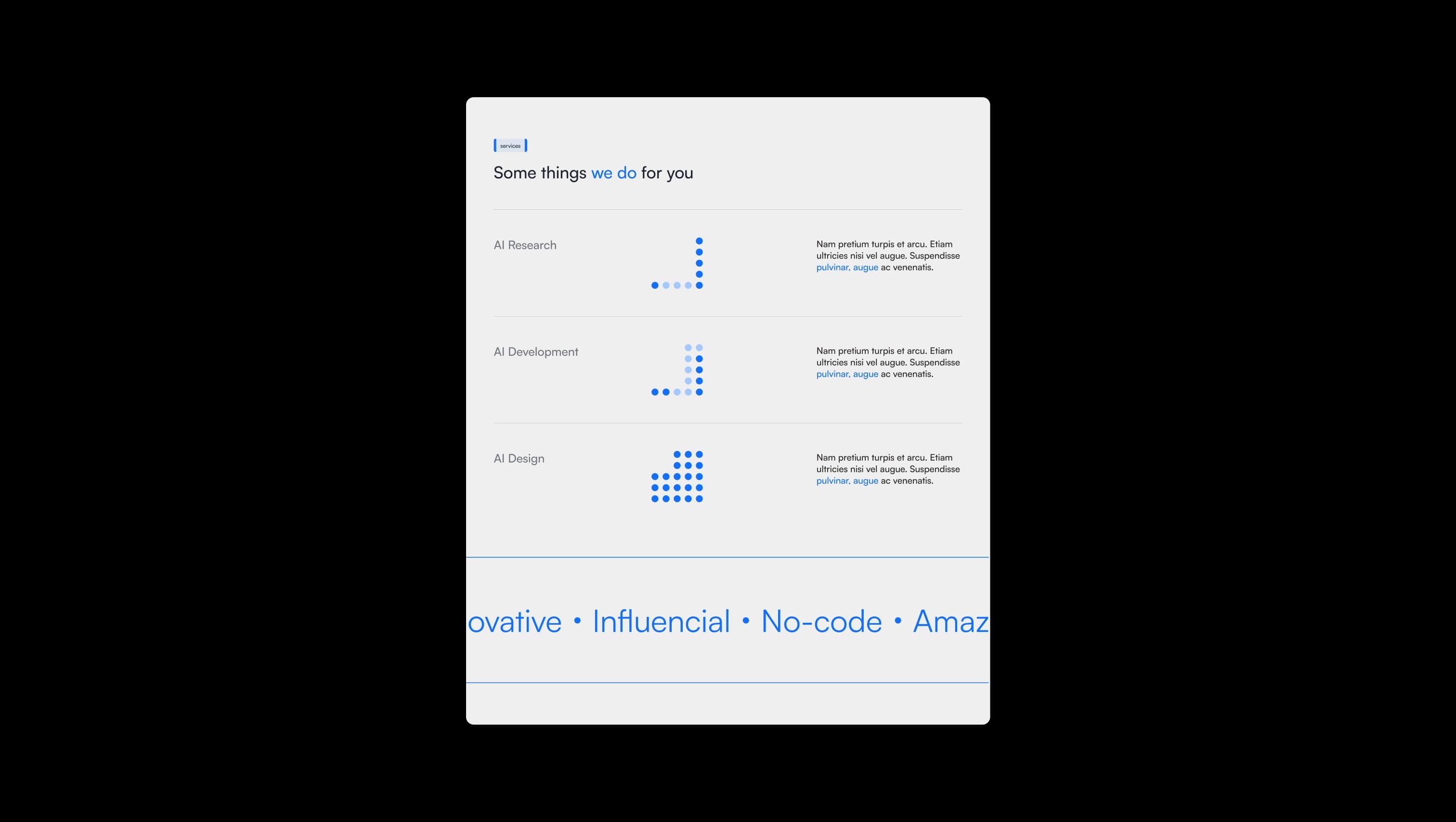
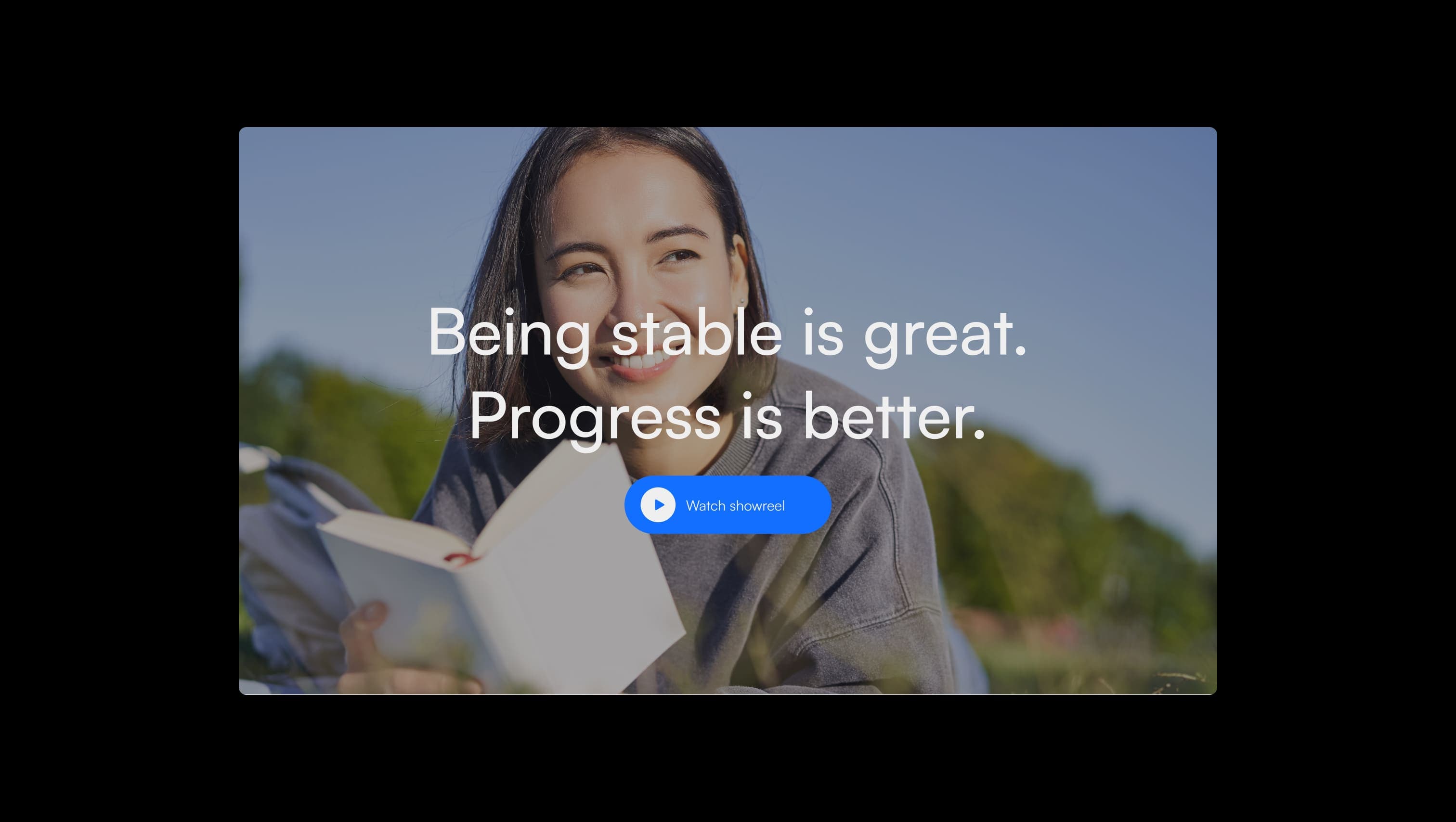
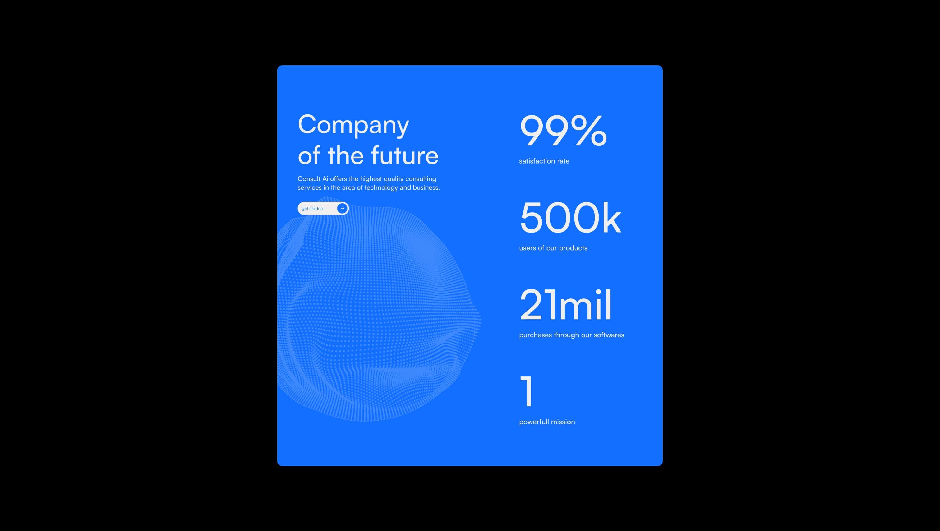
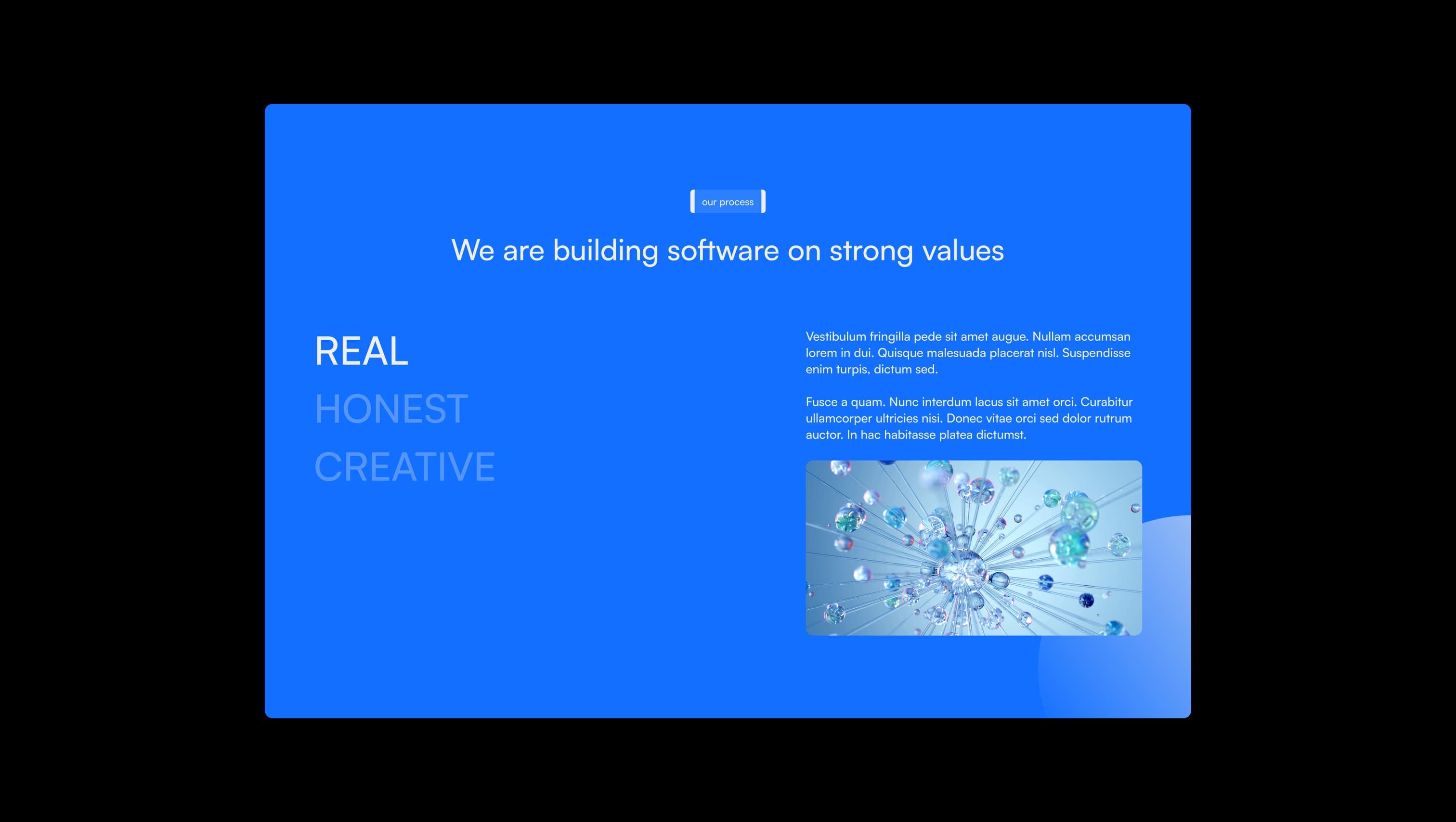
Primary canvas. Page background across all default sections, sets the calm neutral foundation.
Lifted surface & inverse text. Footer, cards on accent, and text sitting on dark or blue fills.
Hairline & divider. Borders for navbar pills, dropdown frames, and footer rules.
Primary text & ink. Headlines, body copy, and dark overlays for hero imagery.
Tag and tab background. Soft blue-tinted neutral for inline tags and unselected pill tabs.
Brand accent. Primary CTAs, accent words, statistics, decorative blocks, and link emphasis.
Accent-on-accent tag fill. Used for tags placed on Signal Blue sections.
The quick brown fox jumps
Single-family system used for all UI, body, and display copy.
spacious1440px120px40px32px4px8px16px24px32px40px64px80px100px120pxtag5pxhero32pxpill60pxcards16pxsmall12pxcircle9999pximages24pxbuttons80pxStep from canvas (level 1) to lifted (level 2) to inset depth (level 3), then invert into the dark levels for full-bleed sections. Hex codes and roles live in the Colors section above; this ladder shows the layering only.
# Design System Guide

> Unlock the template to access the full design system.

## Brand voice

A short paragraph describing the brand voice, mood, and visual
principles that anchor the system. Tone, cadence, and intent.

## Colors

| Token        | Hex      | Role                                  |
| ------------ | -------- | ------------------------------------- |
| canvas-1     | #xxxxxx  | Page background, large surfaces       |
| canvas-2     | #xxxxxx  | Lifted surfaces, cards                |
| canvas-3     | #xxxxxx  | Inset wells, depressed states         |
| ink-1        | #xxxxxx  | Primary body text                     |
| ink-2        | #xxxxxx  | Secondary text, labels                |
| ink-3        | #xxxxxx  | Tertiary text, hints                  |
| accent-1     | #xxxxxx  | Primary brand accent                  |
| accent-2     | #xxxxxx  | Secondary accent                      |
| state-ok     | #xxxxxx  | Success, confirmations                |
| state-warn   | #xxxxxx  | Warnings                              |
| state-err    | #xxxxxx  | Errors, destructive actions           |

## Typography

- **Display** — heading scale, used for hero text and section titles.
- **Body** — primary reading text, optimized for paragraphs.
- **Mono** — code, data, and tabular numerals.

```
display: 32px / 40px / 48px / 64px / 80px
body:    14px / 16px / 18px
mono:    12px / 14px
```

## Spacing & shape

Base unit: 4px. Scale: 4, 8, 12, 16, 24, 32, 48, 64, 96, 128.
Radii: sm (4px), md (8px), lg (12px), xl (20px), full (9999px).

## Surfaces

Layered elevation from canvas → lifted → inset. Surfaces invert in
dark sections for full-bleed contrast.

## Do's and don'ts

- Do use accent-1 sparingly for primary CTAs only.
- Do maintain at least 4.5:1 contrast on body text.
- Don't mix display and body in the same line.
- Don't use state colors for branding.

## Agent prompt guide

Prompts for AI design tools that respect this system.
Includes example prompts for sections, components, and layouts.

# ...
Unlock the full style guide