Design systems, extracted.
Search curated design systems pulled from premium templates or create one from URL. Open any style for colors, type, spacing, components, and a DESIGN.md or tokens.json your agent can use.
Quickly navigate through the dashboard with your keyboard using the command menu.
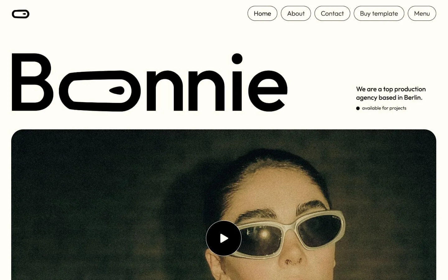
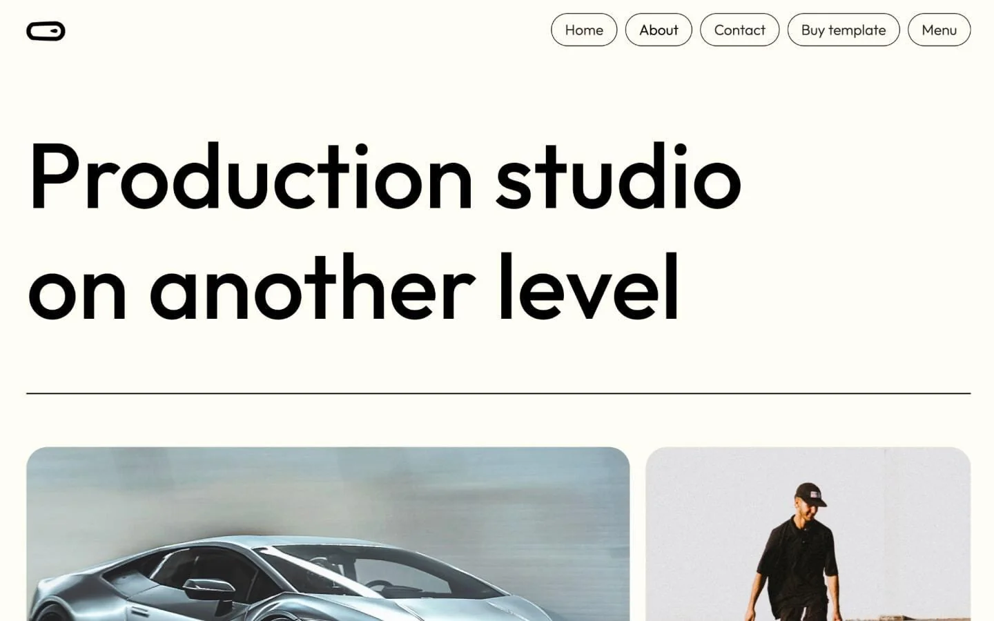
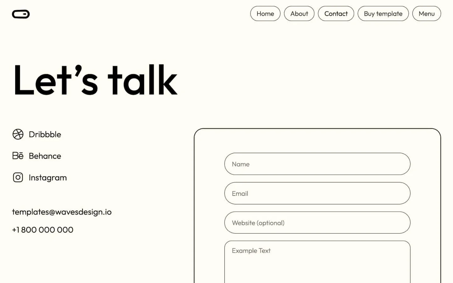
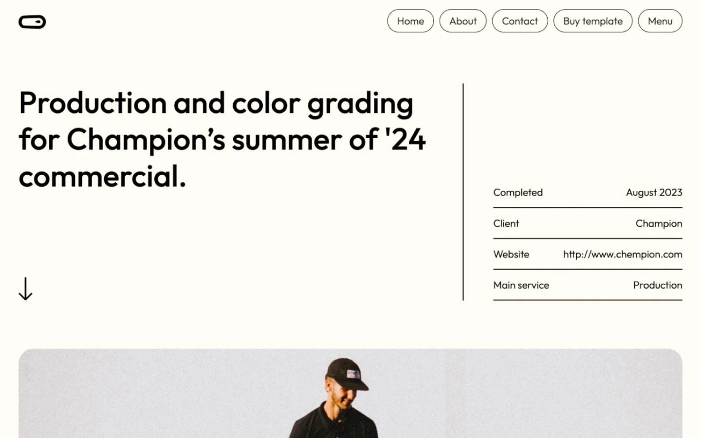
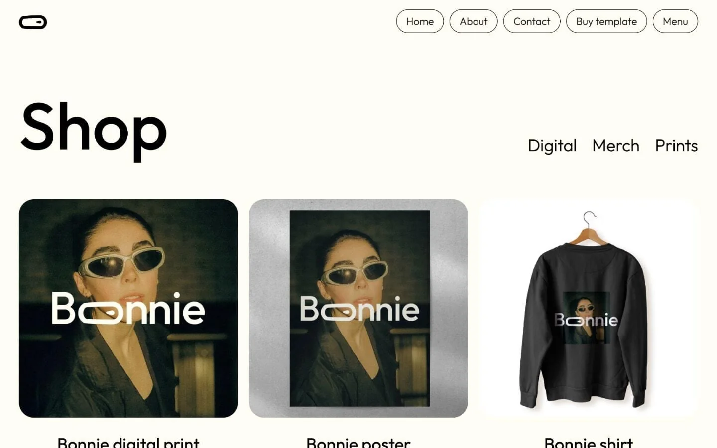
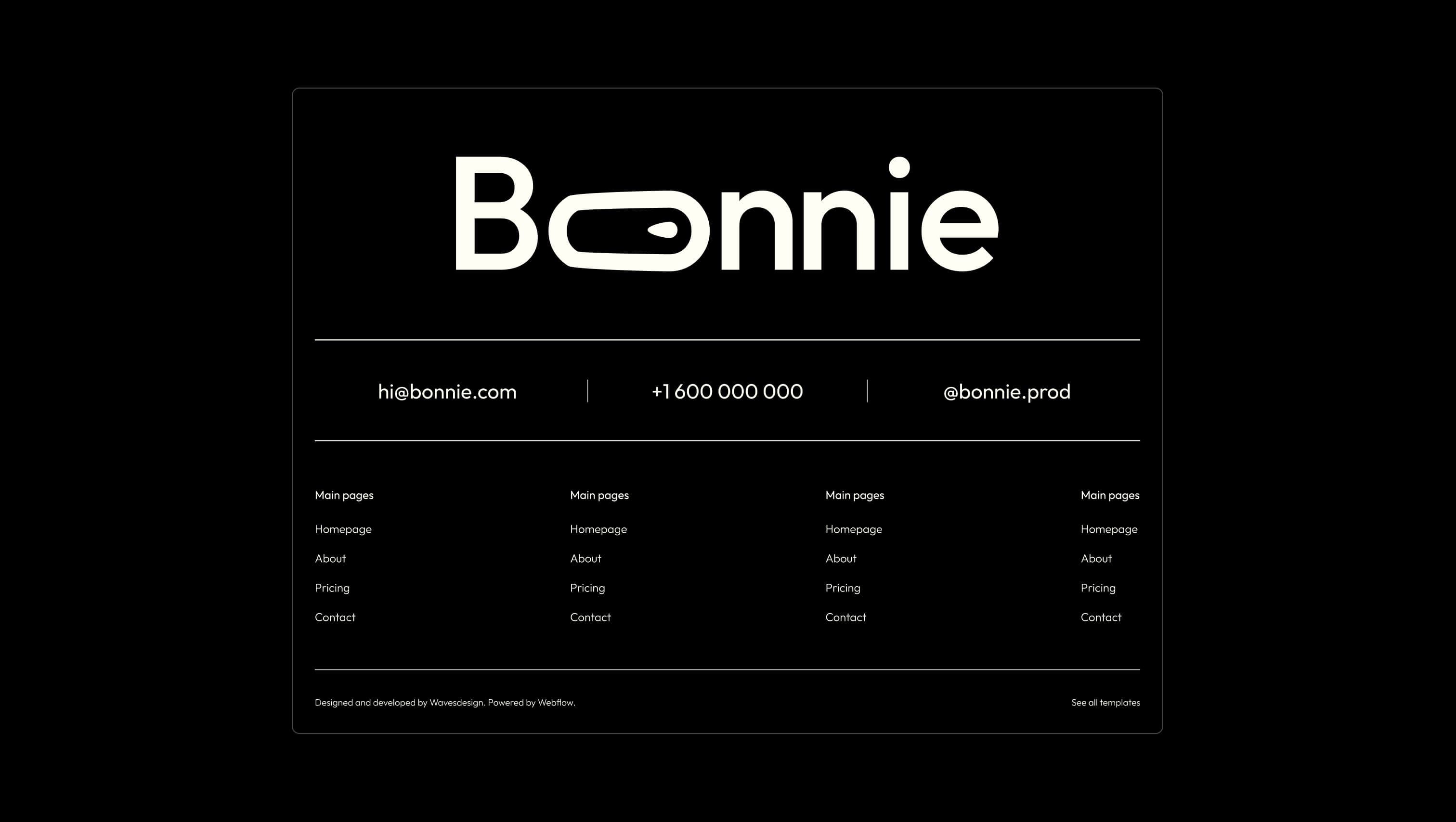
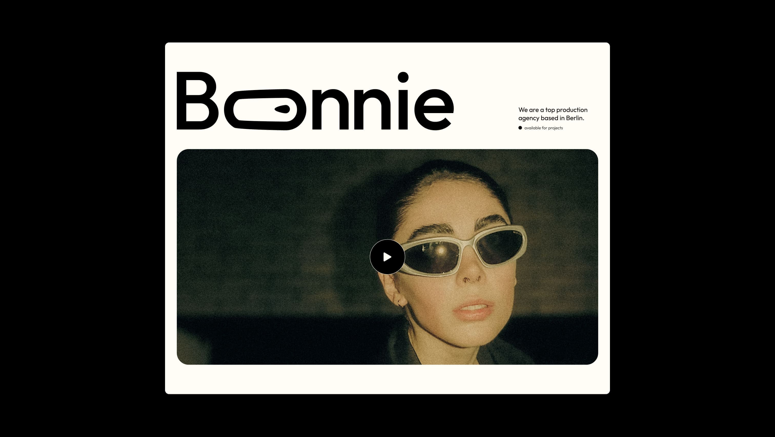
Bonnie is a production-house portfolio dressed in warm parchment and confident black ink. The page breathes around oversized display lettering — its custom 'Bonnie' logotype carries a playful loop where letters thread through one another — while the rest of the layout stays disciplined: pill-shaped nav buttons, hairline rules, and full-bleed cinematic frames. The palette is intentionally austere — a single creamy off-white canvas, pure black ink, and the cinematic grain of full-bleed photography and video. Nothing competes with the work. Type carries the personality: light Outfit at 22px for body, but blown up to 120px for marquee headlines, all set with a soft 130% line-height that keeps the page feeling unhurried.
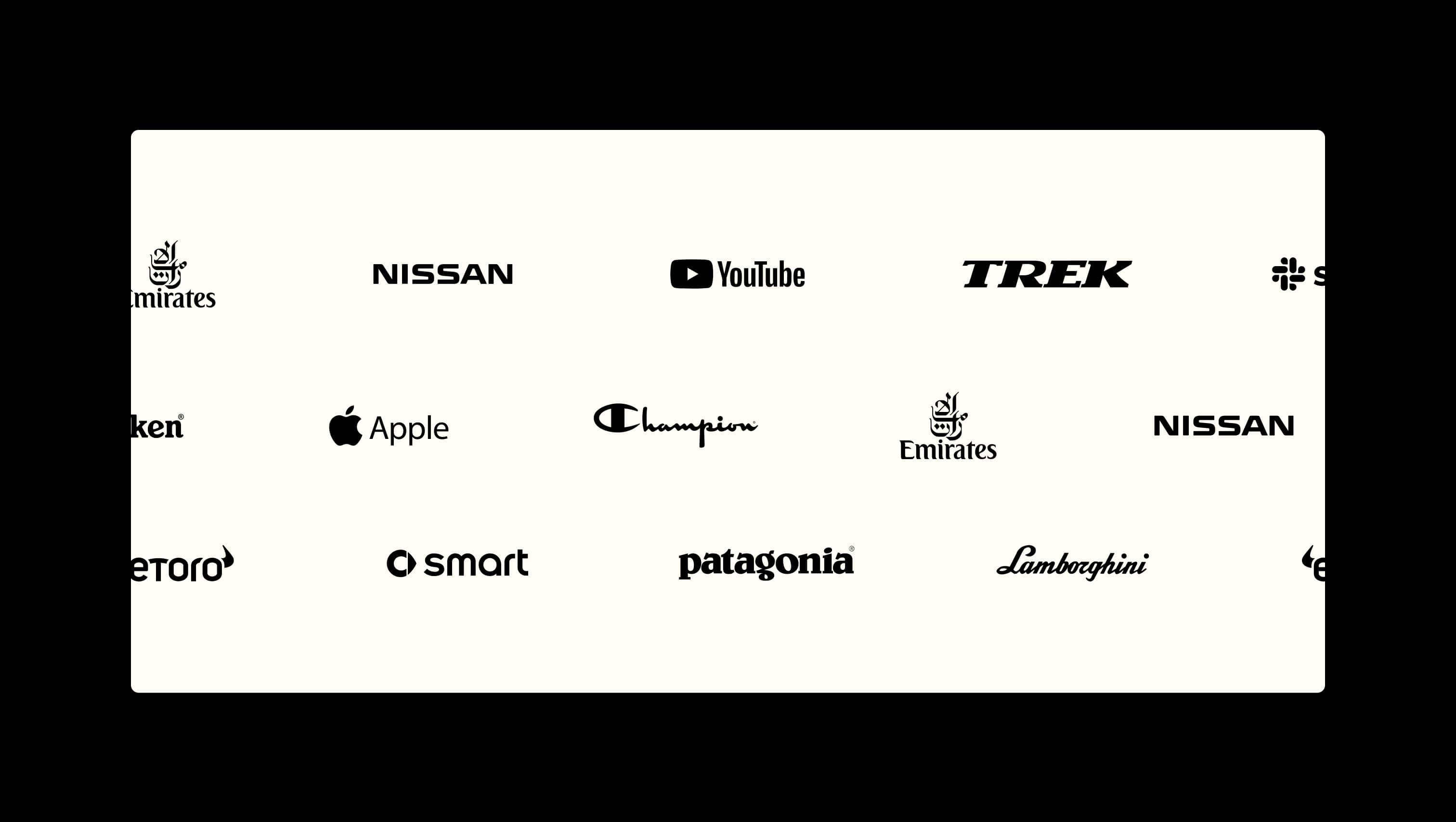
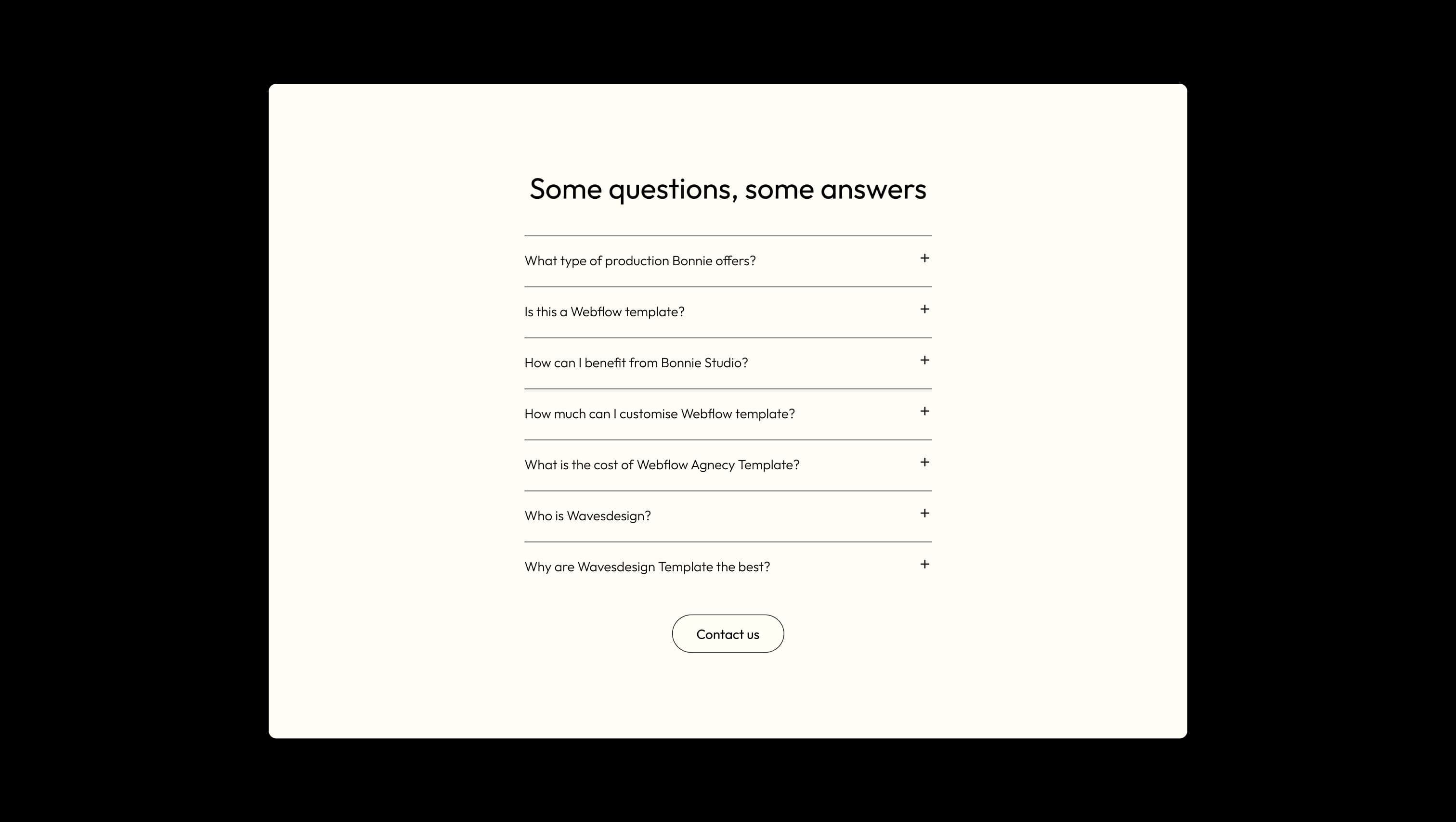
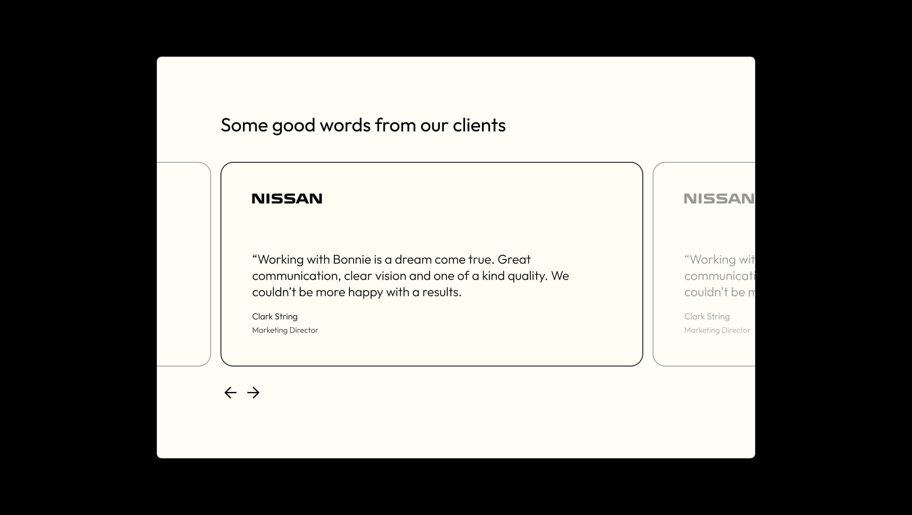
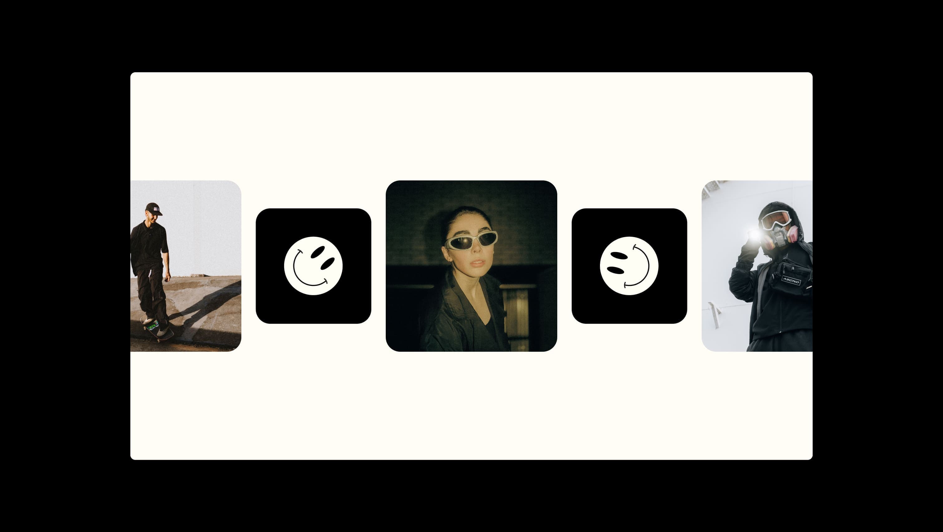
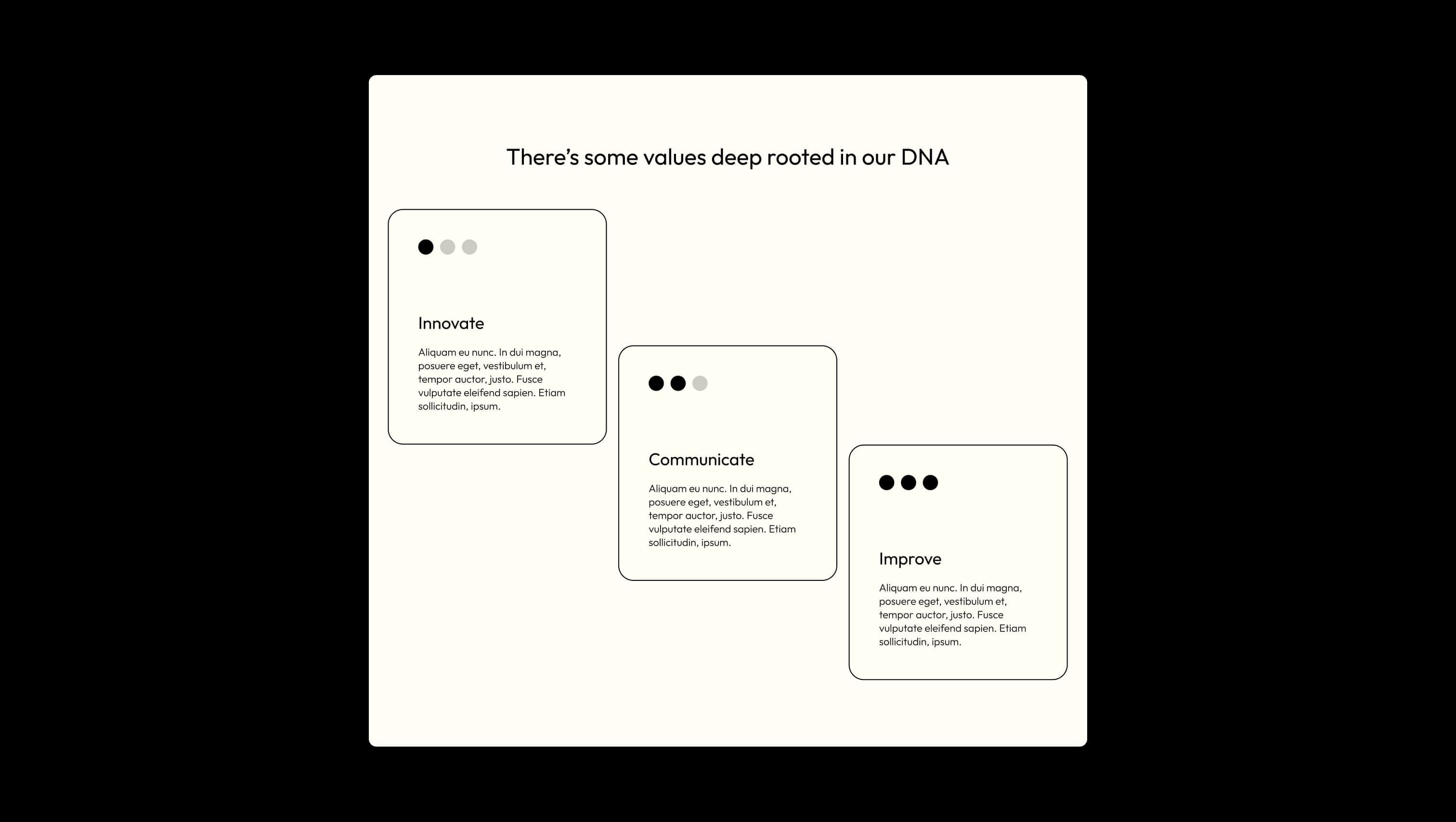
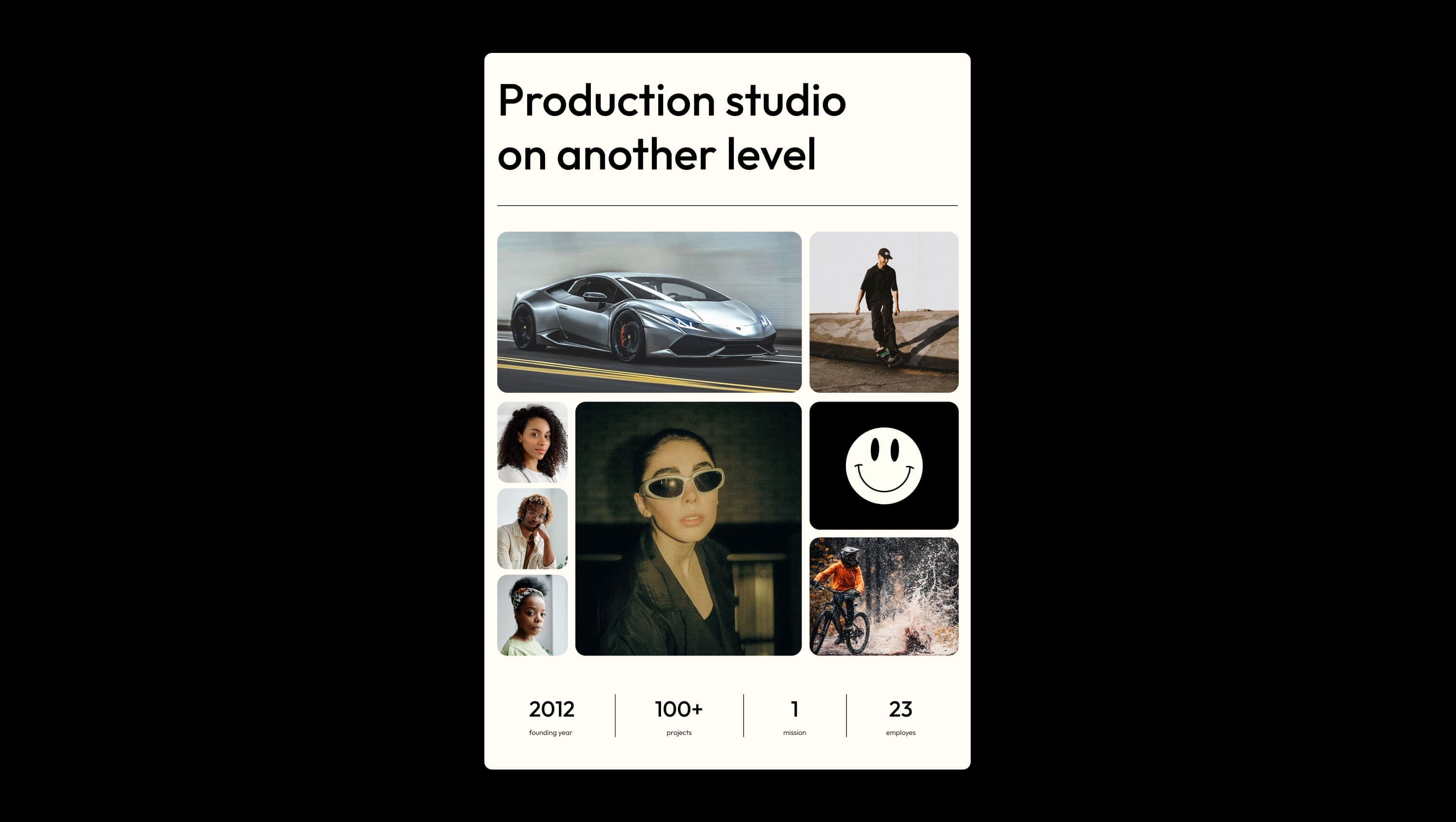
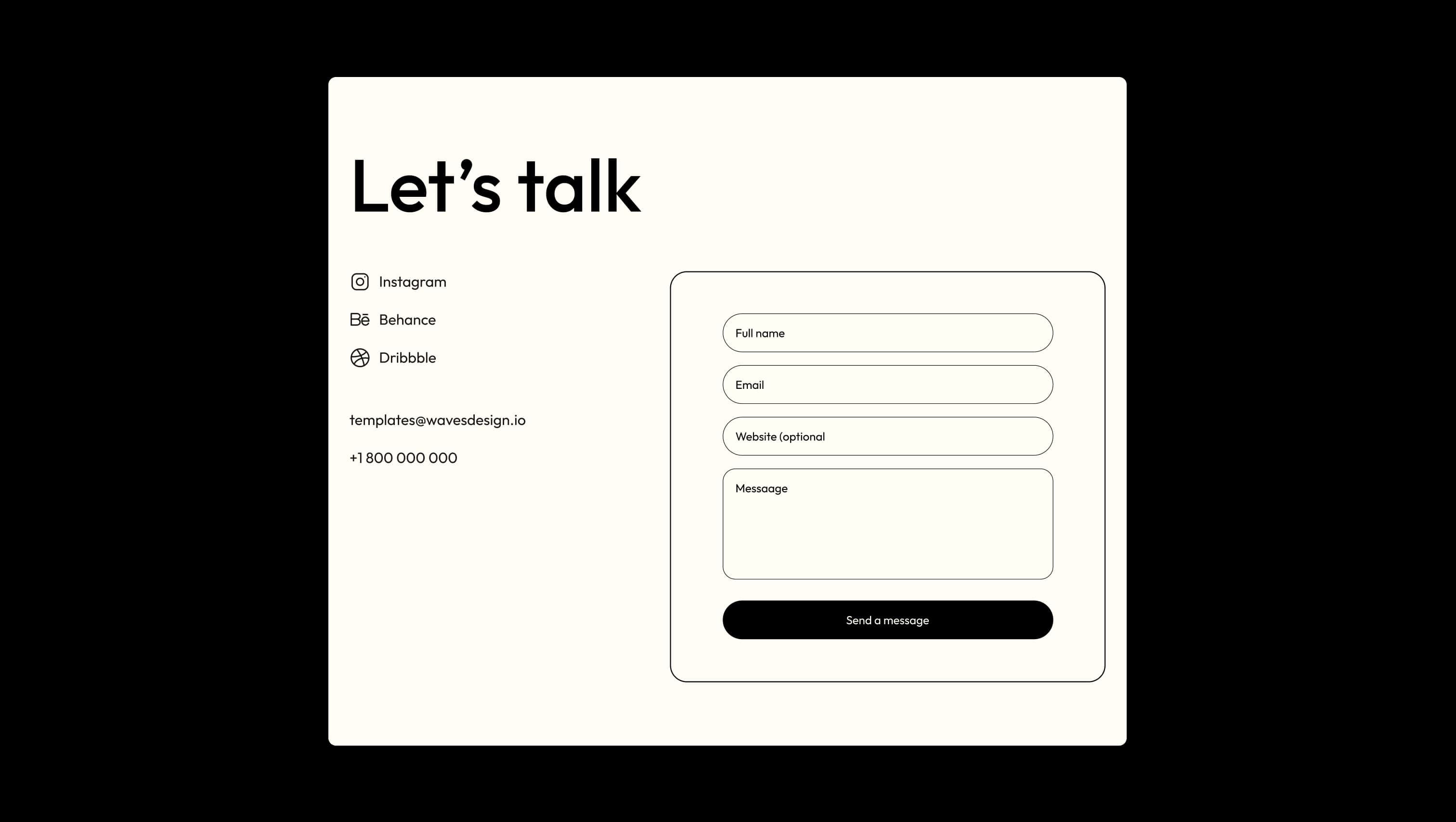
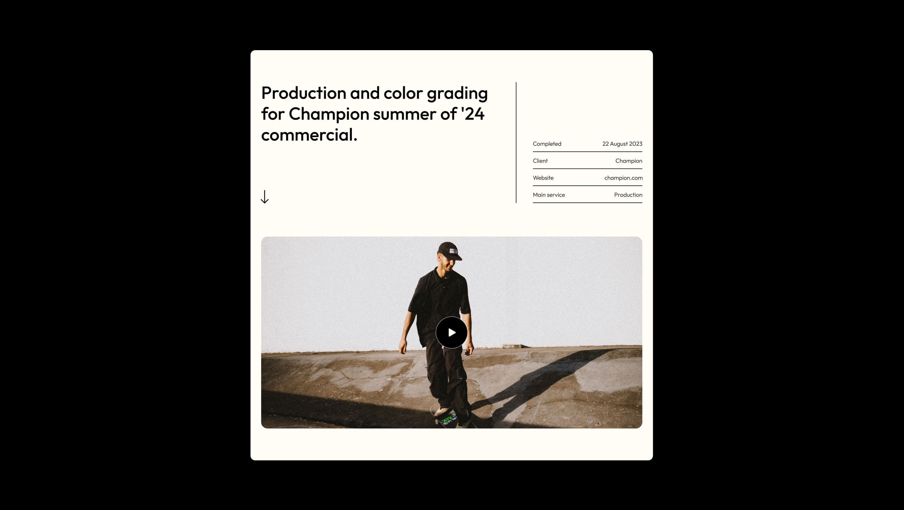
A handful of real sections that ship with this template. Click any card to preview, or explore them all under the Sections tab.
Light button hover wash. Subtle warming of the cream canvas on interactive elements.
Primary canvas. Page background and inverted button fills throughout the site.
Floating navbar fill. A 16%-opacity cream that lets hero imagery bleed through fixed navigation.
Placeholder & muted text. Used at ~60% opacity over cream for input placeholders and de-emphasized labels.
Primary ink & dark surface. Body text, headlines, footer, and dark CTA fills.
Hairline borders on form fields. A softened ink at half-opacity for checkout inputs.
Dark button hover state. Used when dark CTAs are interacted with.
The quick brown fox jumps
Sole typeface — used for headlines, body, navigation, and forms.
spacious1512px80px80px24px4px8px12px16px24px32px40px64px80px120px160px180pxpill70pxtile24pxbuttons70pxcard-top12pxtextarea24pxinput-pill90pxnavigation70pxStep from canvas (level 1) to lifted (level 2) to inset depth (level 3), then invert into the dark levels for full-bleed sections. Hex codes and roles live in the Colors section above; this ladder shows the layering only.
# Design System Guide

> Unlock the template to access the full design system.

## Brand voice

A short paragraph describing the brand voice, mood, and visual
principles that anchor the system. Tone, cadence, and intent.

## Colors

| Token        | Hex      | Role                                  |
| ------------ | -------- | ------------------------------------- |
| canvas-1     | #xxxxxx  | Page background, large surfaces       |
| canvas-2     | #xxxxxx  | Lifted surfaces, cards                |
| canvas-3     | #xxxxxx  | Inset wells, depressed states         |
| ink-1        | #xxxxxx  | Primary body text                     |
| ink-2        | #xxxxxx  | Secondary text, labels                |
| ink-3        | #xxxxxx  | Tertiary text, hints                  |
| accent-1     | #xxxxxx  | Primary brand accent                  |
| accent-2     | #xxxxxx  | Secondary accent                      |
| state-ok     | #xxxxxx  | Success, confirmations                |
| state-warn   | #xxxxxx  | Warnings                              |
| state-err    | #xxxxxx  | Errors, destructive actions           |

## Typography

- **Display** — heading scale, used for hero text and section titles.
- **Body** — primary reading text, optimized for paragraphs.
- **Mono** — code, data, and tabular numerals.

```
display: 32px / 40px / 48px / 64px / 80px
body:    14px / 16px / 18px
mono:    12px / 14px
```

## Spacing & shape

Base unit: 4px. Scale: 4, 8, 12, 16, 24, 32, 48, 64, 96, 128.
Radii: sm (4px), md (8px), lg (12px), xl (20px), full (9999px).

## Surfaces

Layered elevation from canvas → lifted → inset. Surfaces invert in
dark sections for full-bleed contrast.

## Do's and don'ts

- Do use accent-1 sparingly for primary CTAs only.
- Do maintain at least 4.5:1 contrast on body text.
- Don't mix display and body in the same line.
- Don't use state colors for branding.

## Agent prompt guide

Prompts for AI design tools that respect this system.
Includes example prompts for sections, components, and layouts.

# ...
Unlock the full style guide