Design systems, extracted.
Paste any URL to create a design system from it. Open any style for colors, type, spacing, components, and a DESIGN.md or tokens.json your agent can use.
Quickly navigate through the dashboard with your keyboard using the command menu.

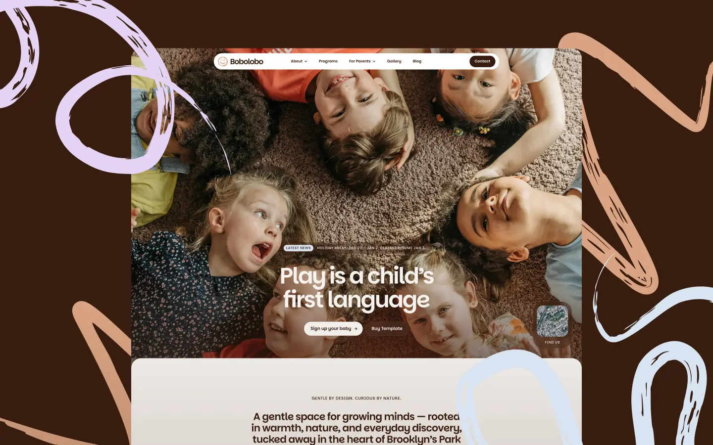
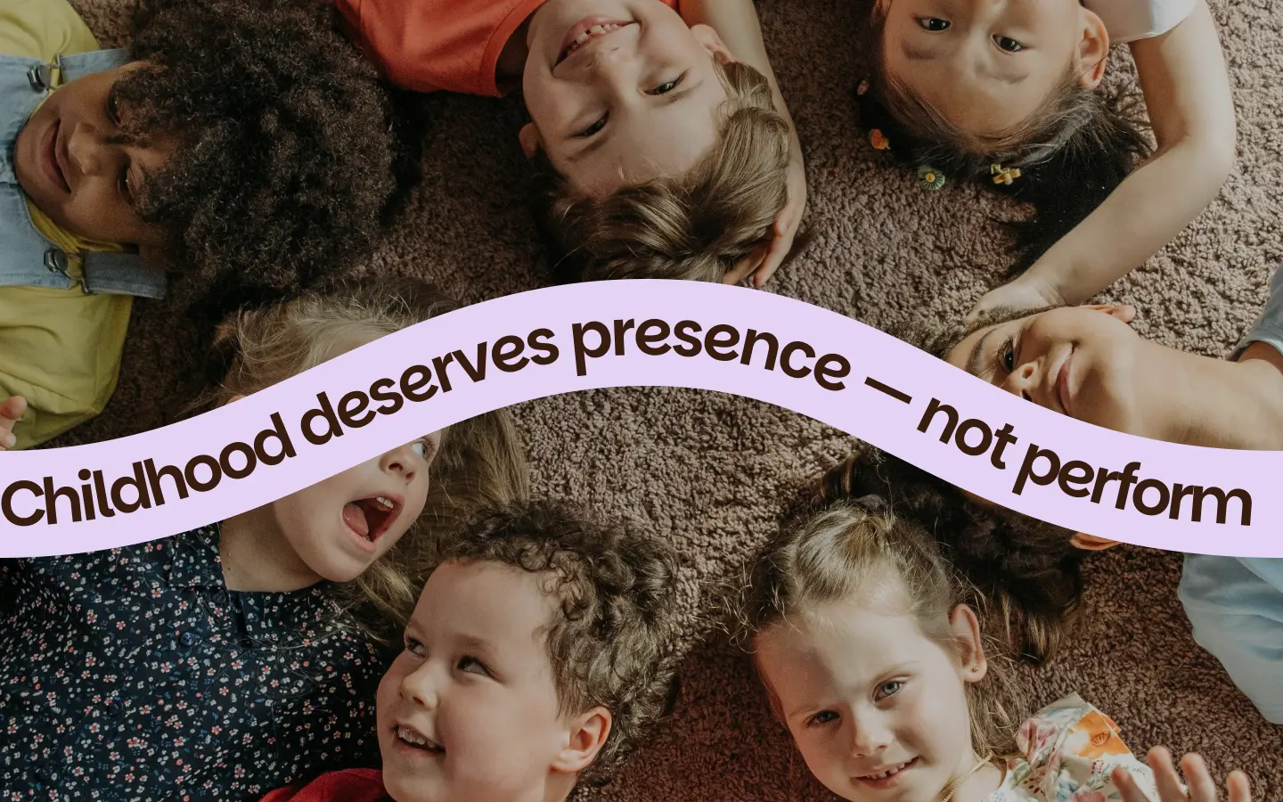
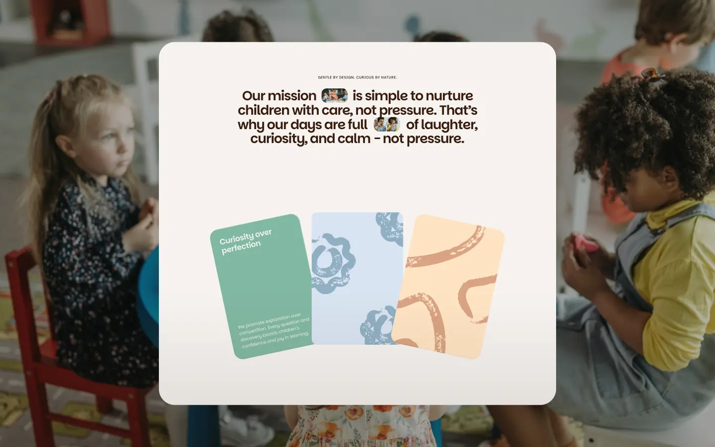
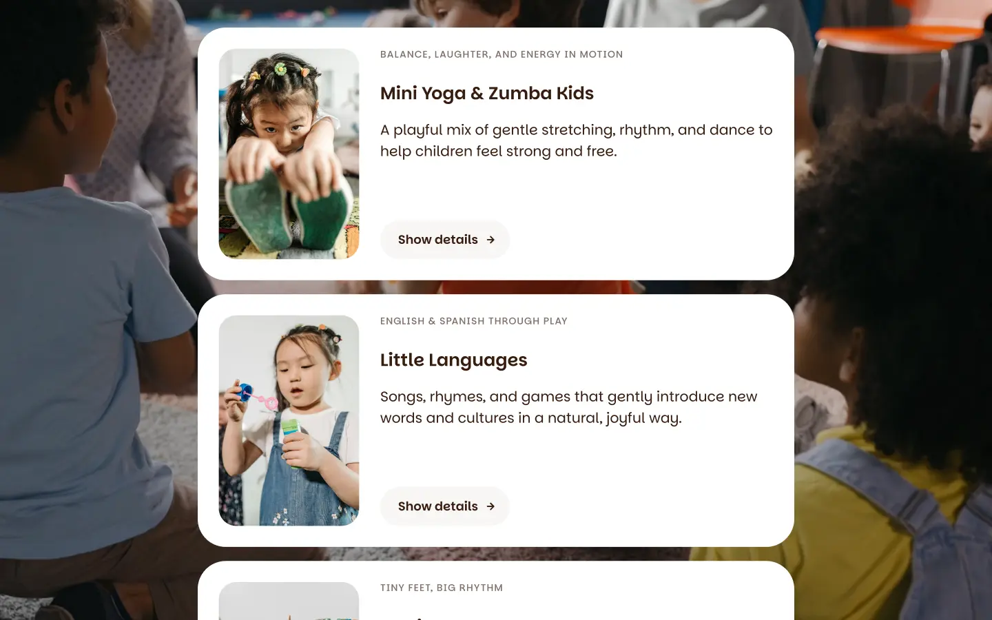
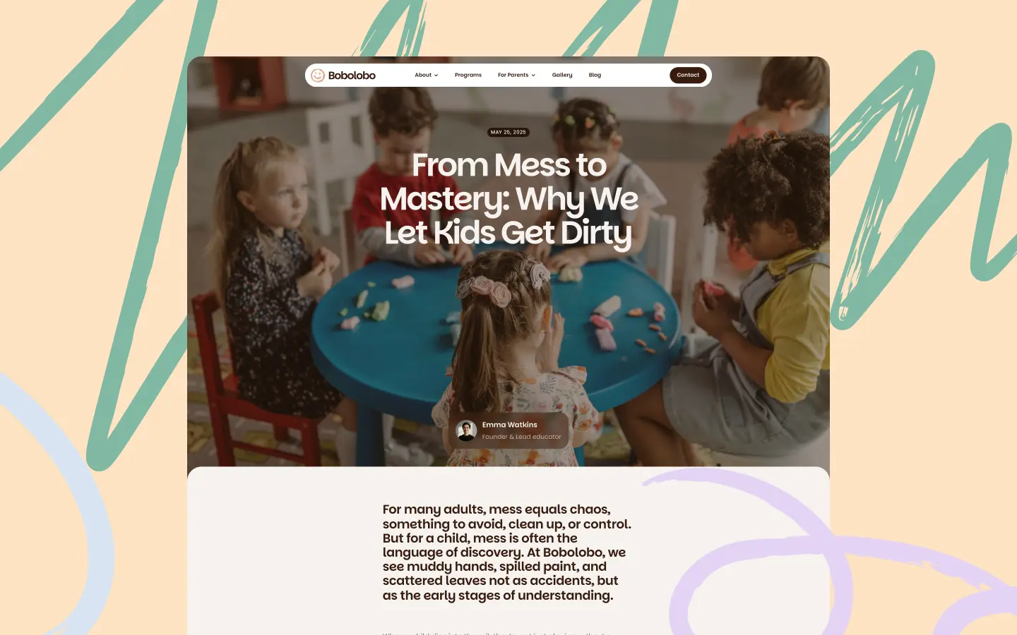
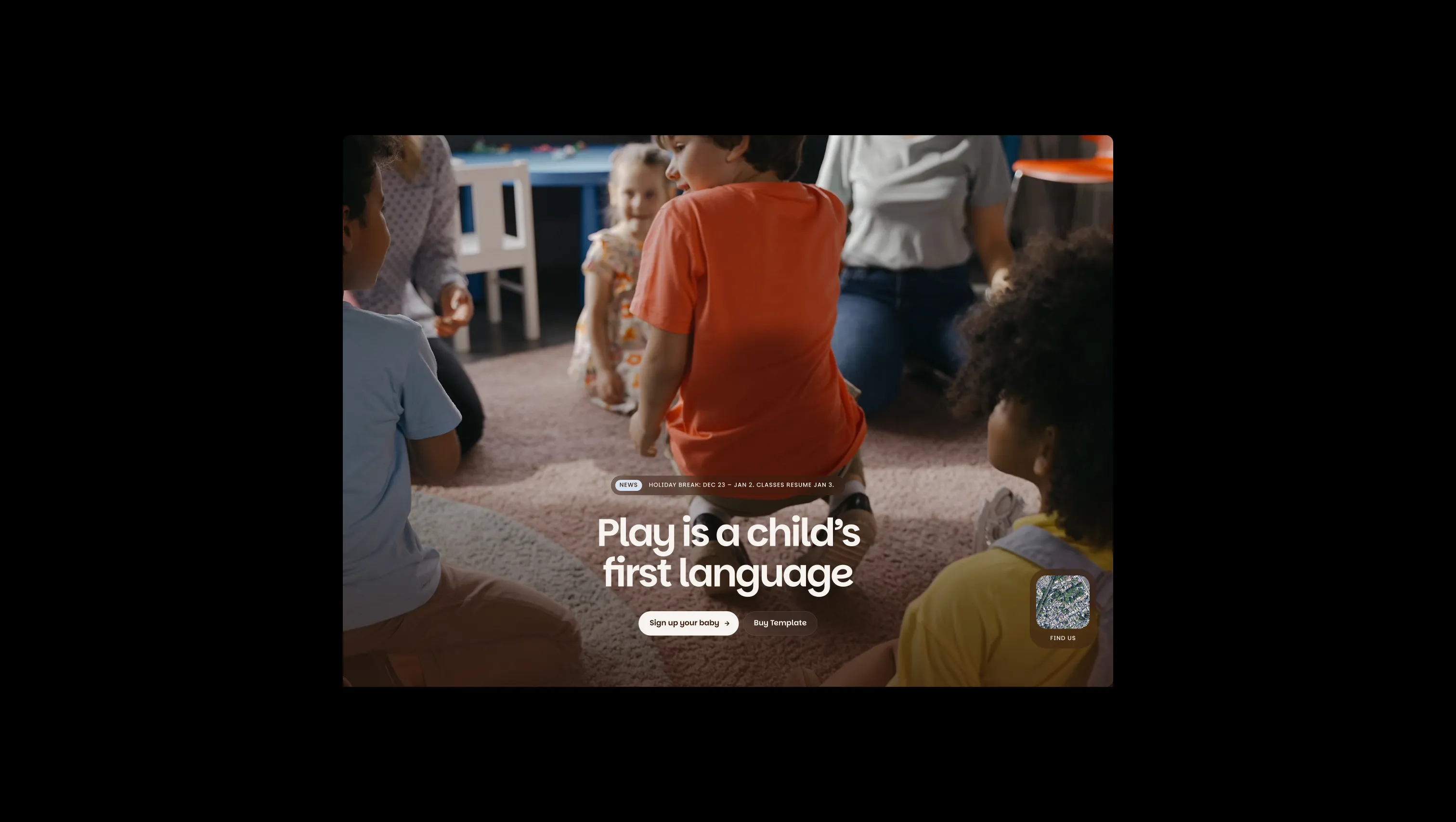
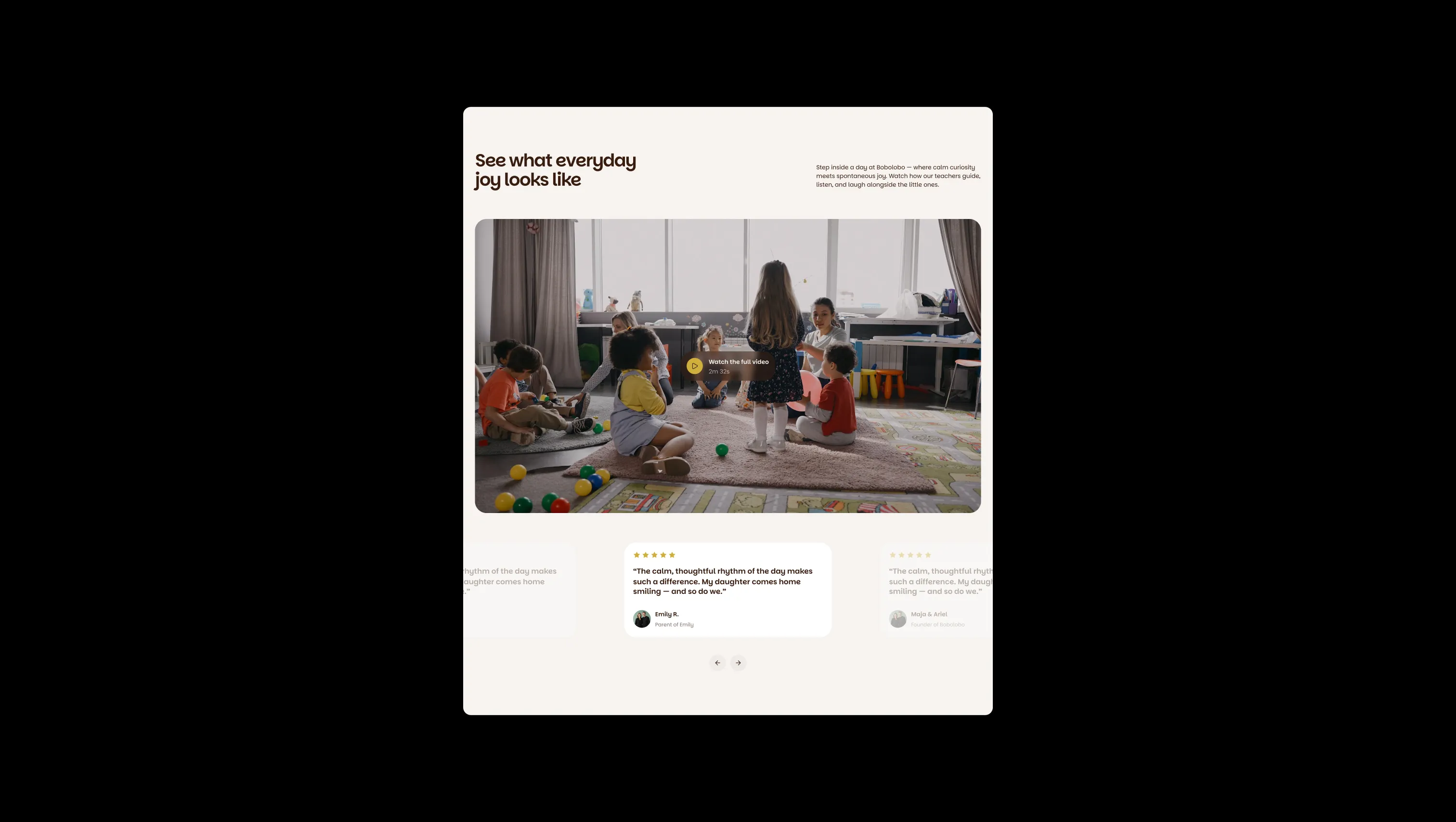
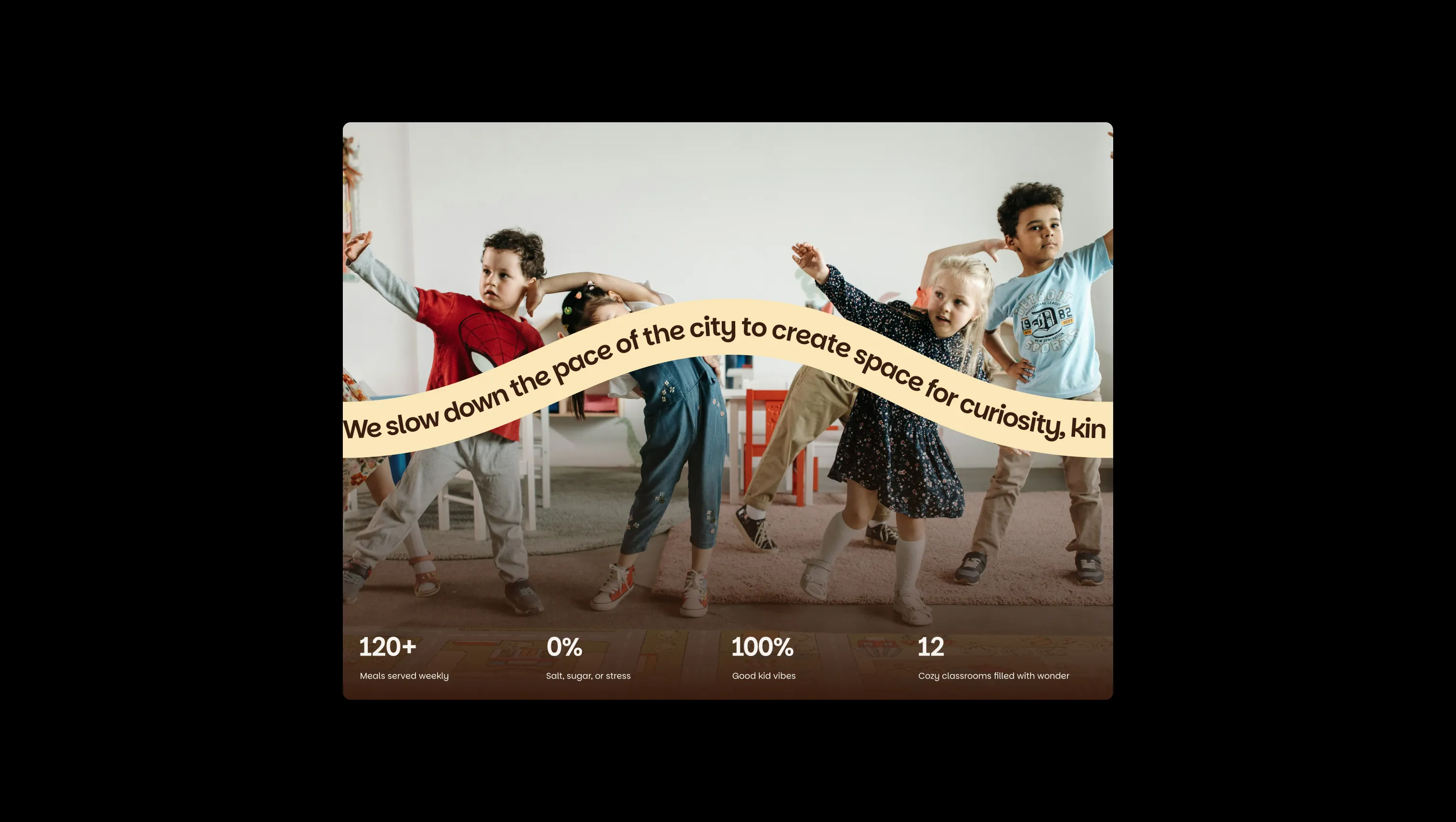
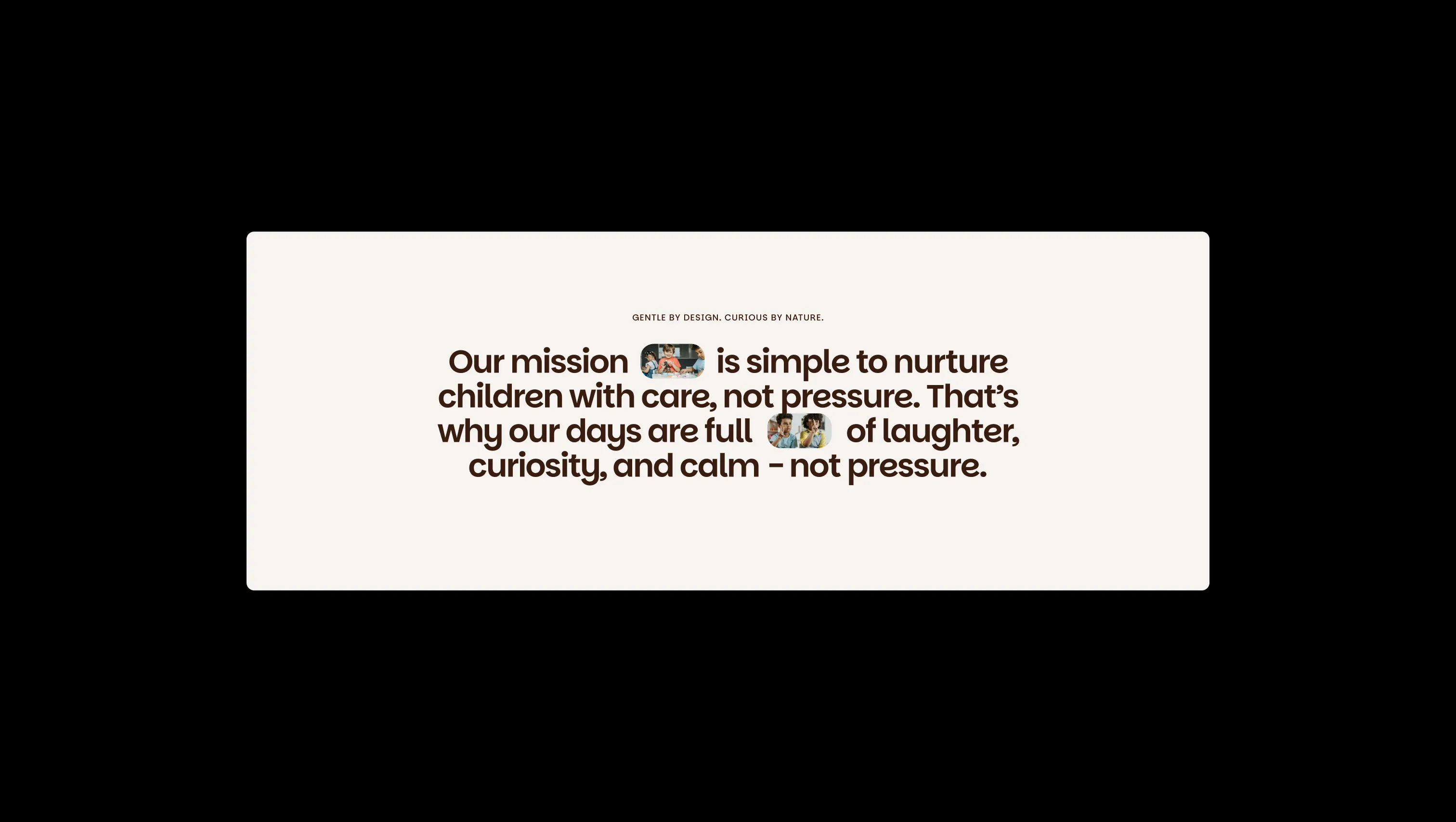
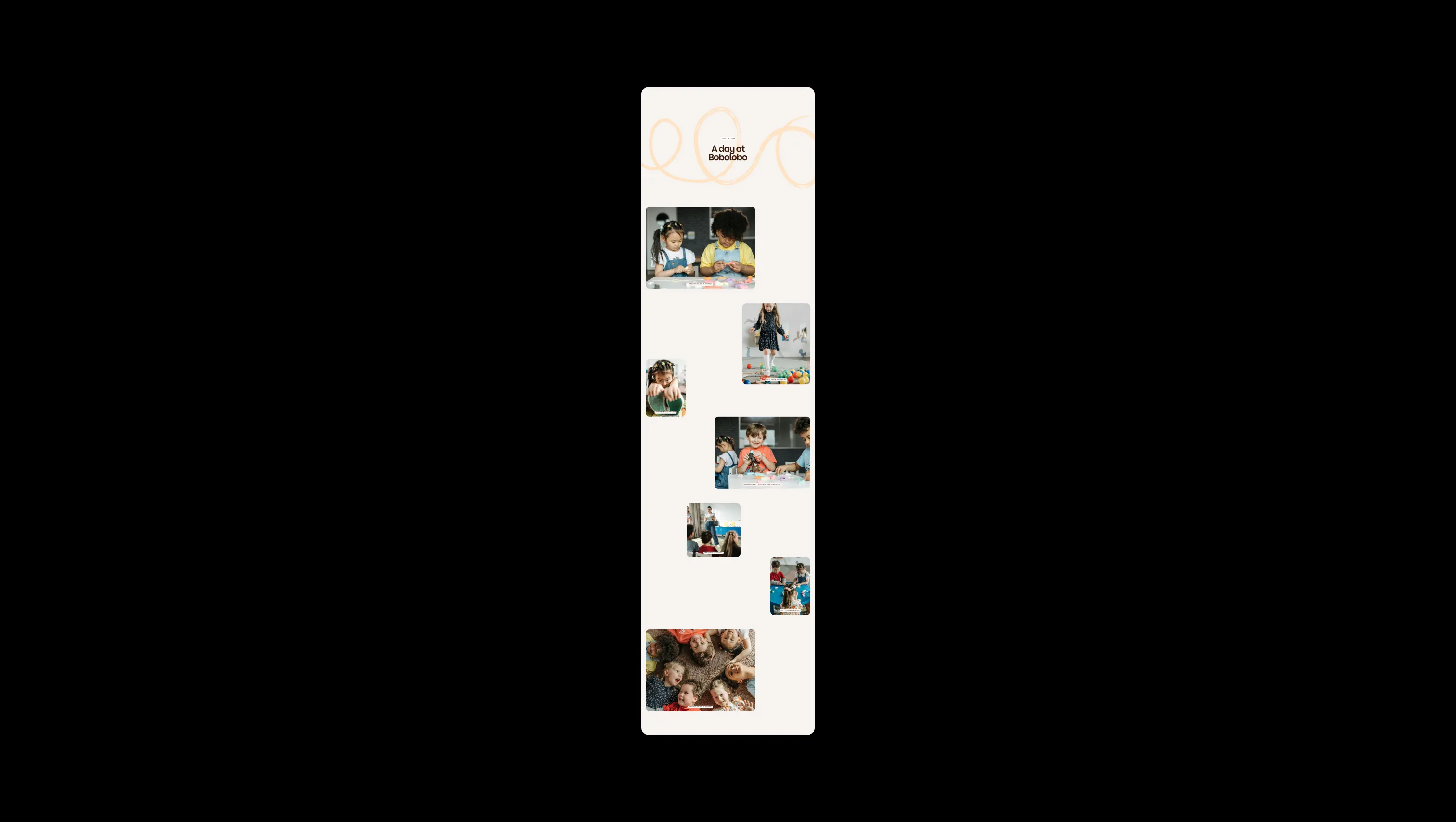
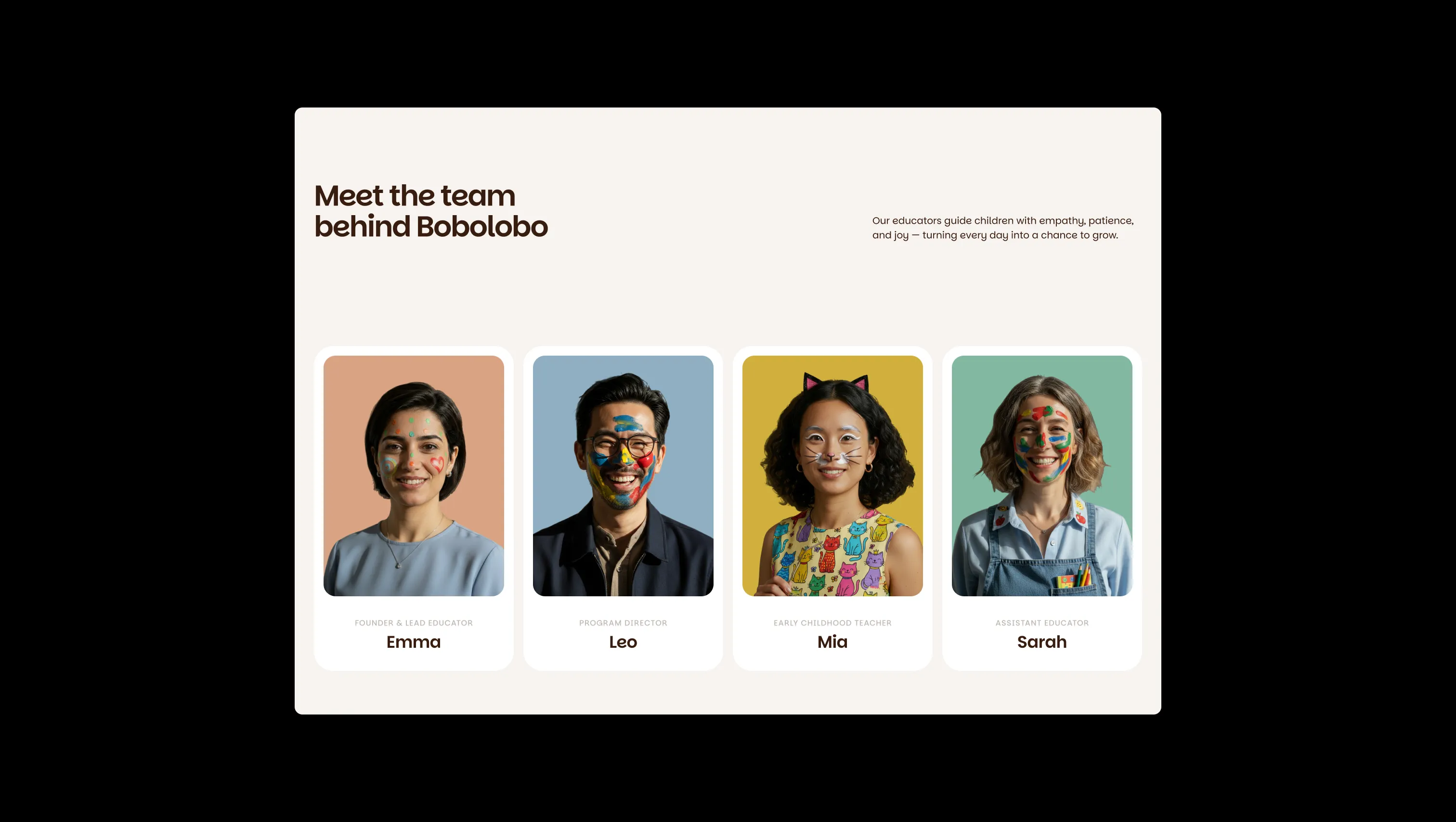
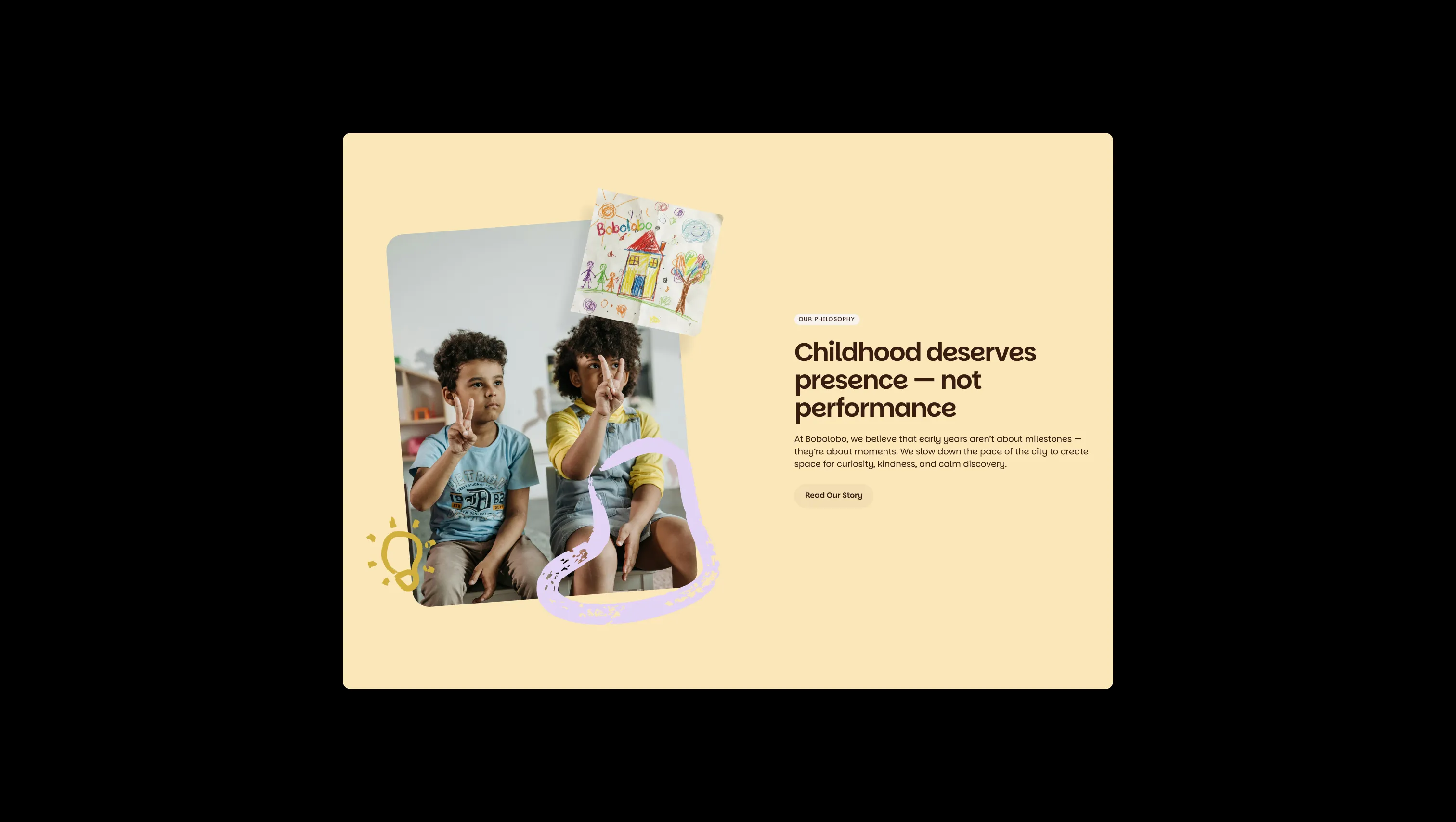
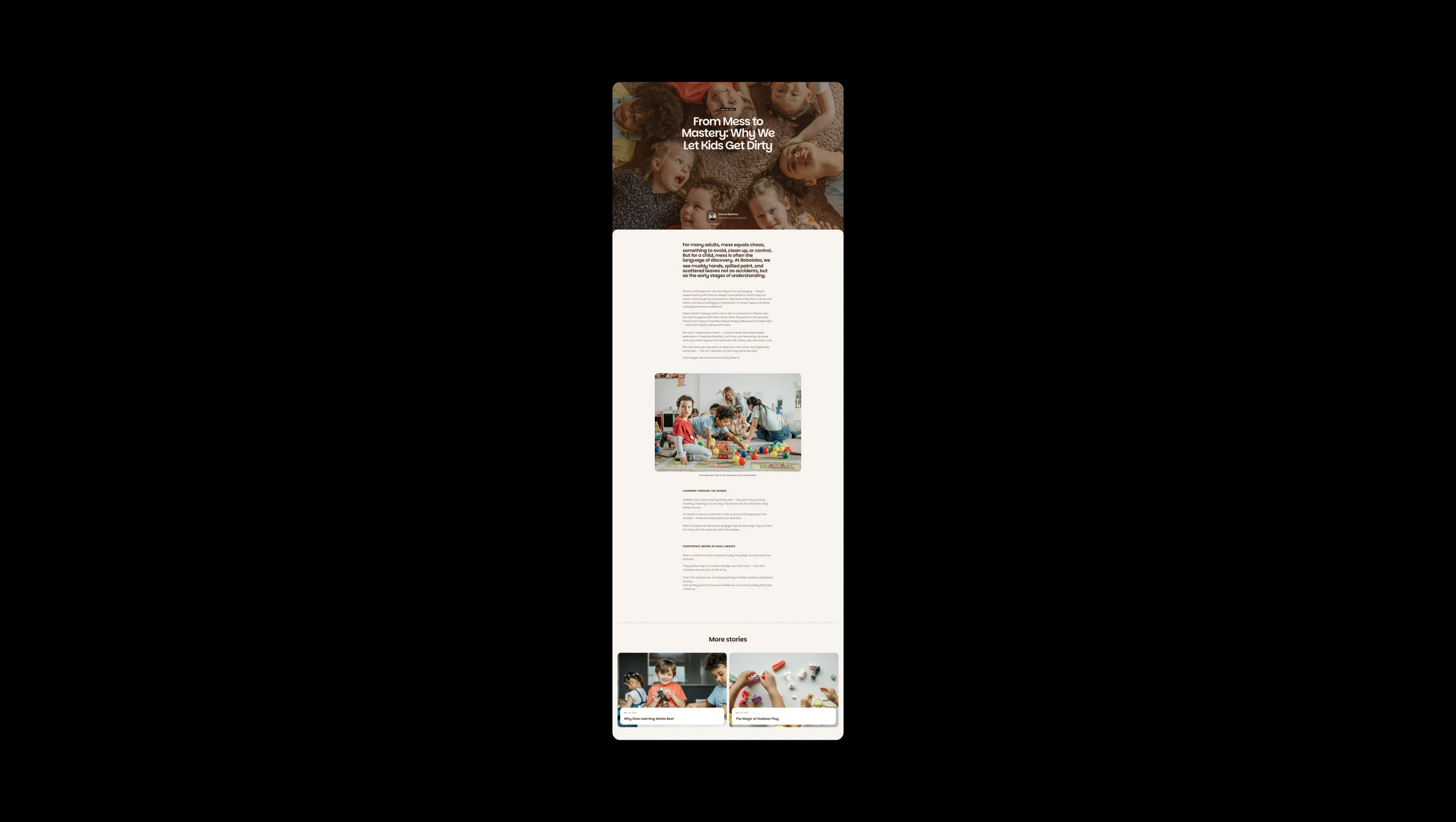
Bobolobo is a warm, story-book brand for early childhood — a Brooklyn nursery rendered in cocoa, cream, and crayon-box pastels. The palette pairs a deep mahogany ink with off-white linen, then sprinkles in mint, lilac, peach, blue, yellow, and clay accents that echo construction-paper collages and finger-painted afternoons. Hand-drawn squiggle illustrations and rounded photo cards live alongside Parkinsans, a soft geometric sans whose generous semi-bold weight feels like the careful printing of a child's first name. The template breathes — sections are tall, radii are large, buttons are pill-shaped, and tags wear blurred glass backgrounds. Imagery centers laughing children at eye-level on textured rugs and floors. Everything is designed to feel safe, slow, and a little playful — never institutional, never busy.
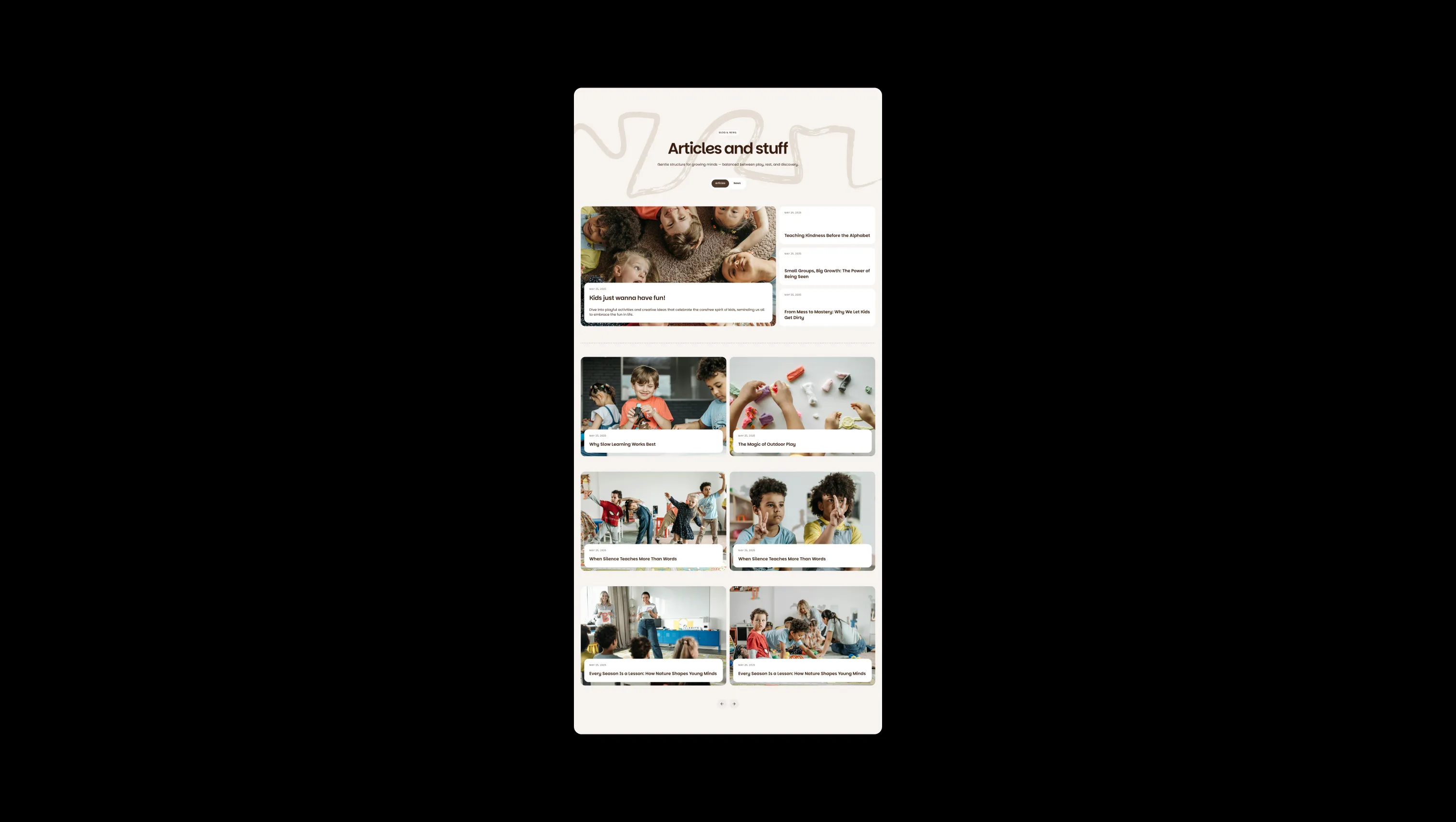
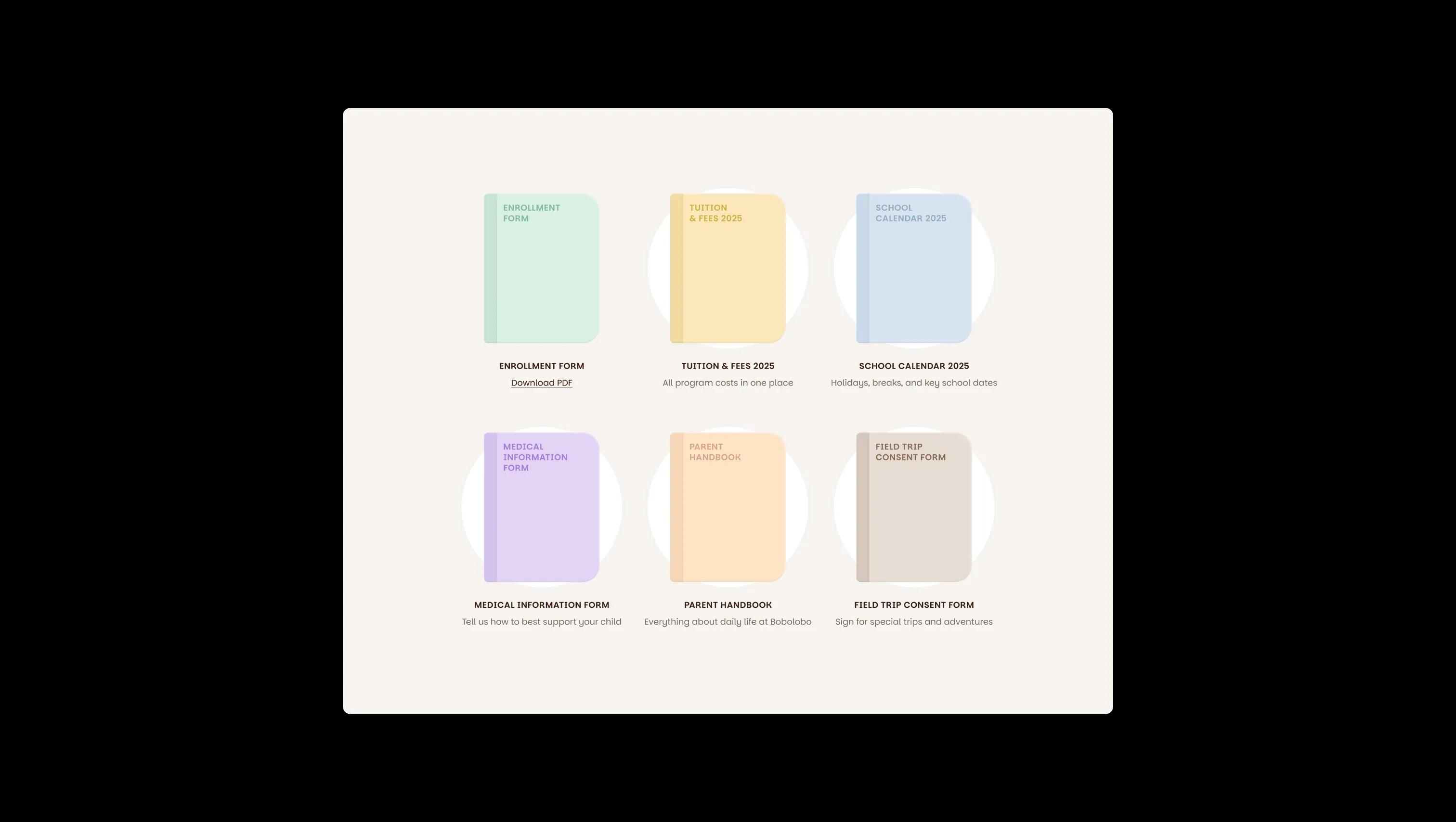
A handful of real sections that ship with this template. Click any card to preview, or explore them all under the Sections tab.
Page canvas. Default warm off-white background for sections, cards, and lifted surfaces in light mode.
Primary text & dark canvas. Headlines, body copy, and the dark mahogany surfaces used in inverted sections.
Lifted dark surface. Used behind dark sections that need a slightly deeper layer than cocoa-ink.
Soft blue surface. Card and tag backgrounds with a calm, watercolor blue feel.
Soft clay surface. Neutral warm backgrounds for forms and contact panels.
Soft lilac surface. Backgrounds for marquee ribbons, callout chips, and scribble illustrations.
Soft peach surface. Warm card backgrounds and decorative panels.
Brand accent. A muted aubergine reserved for select brand moments and decorative accents.
Soft mint surface. Card backgrounds and label tags conveying calm and growth.
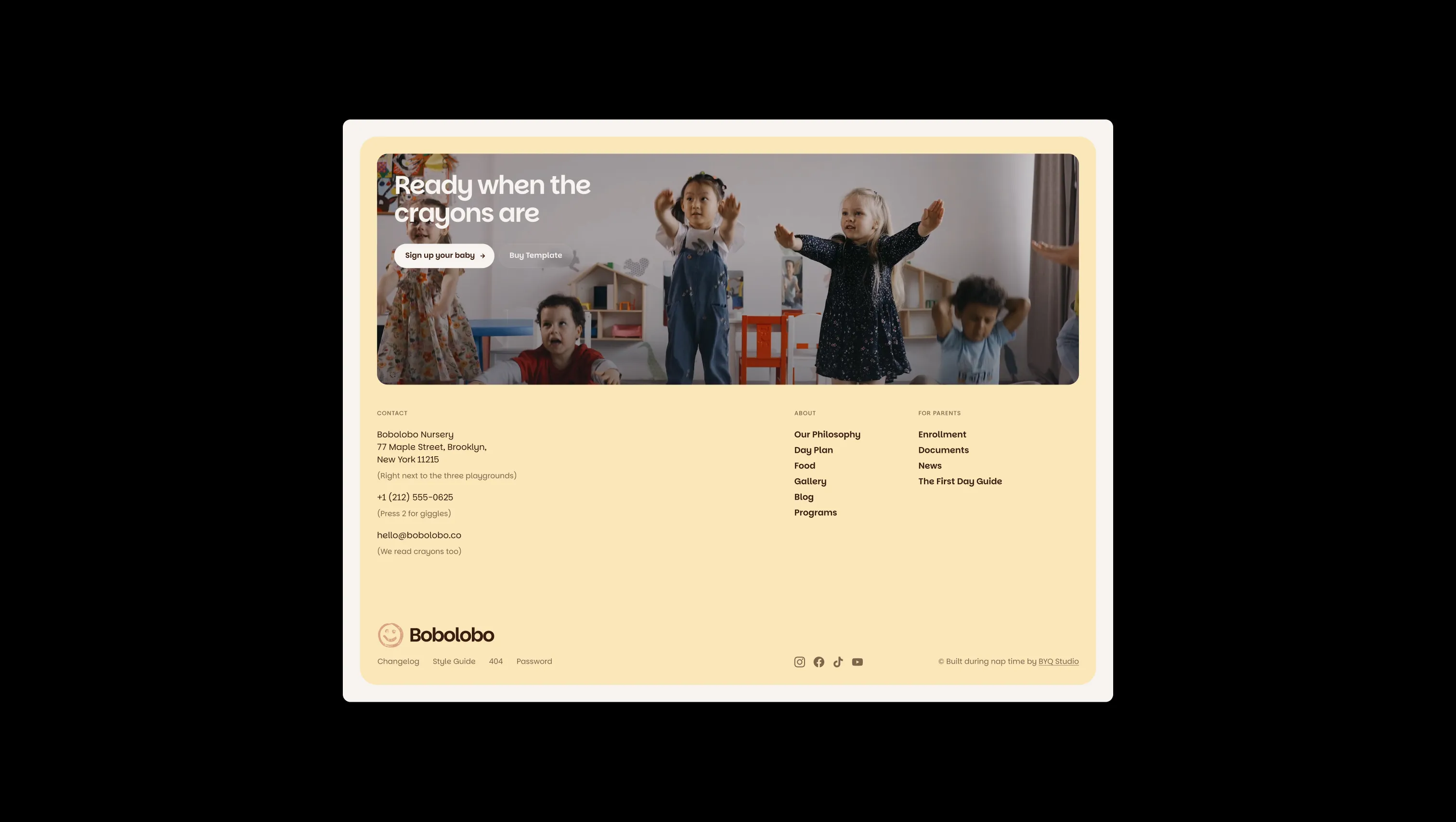
Soft yellow surface. Used for the philosophy and footer panels — bright but never neon.
Error state. Form validation errors and destructive UI cues only.
Success state. Form confirmation and positive UI feedback only.
Warning state. Used only for cautionary UI moments — never decorative.
The quick brown fox jumps
Single-family system. Handles headings, body, labels, and buttons with a warm geometric voice.
spacious1800px120px32px24px0px4px8px12px16px20px24px32px48px64px80px120px160px200pxtag16pxpill9999pxcards32pxinput20pxsmall8pxnavbar24pxbuttons32pxdefault20pxbutton-circle24pxStep from canvas (level 1) to lifted (level 2) to inset depth (level 3), then invert into the dark levels for full-bleed sections. Hex codes and roles live in the Colors section above; this ladder shows the layering only.
# Design System Guide

> Unlock the template to access the full design system.

## Brand voice

A short paragraph describing the brand voice, mood, and visual
principles that anchor the system. Tone, cadence, and intent.

## Colors

| Token        | Hex      | Role                                  |
| ------------ | -------- | ------------------------------------- |
| canvas-1     | #xxxxxx  | Page background, large surfaces       |
| canvas-2     | #xxxxxx  | Lifted surfaces, cards                |
| canvas-3     | #xxxxxx  | Inset wells, depressed states         |
| ink-1        | #xxxxxx  | Primary body text                     |
| ink-2        | #xxxxxx  | Secondary text, labels                |
| ink-3        | #xxxxxx  | Tertiary text, hints                  |
| accent-1     | #xxxxxx  | Primary brand accent                  |
| accent-2     | #xxxxxx  | Secondary accent                      |
| state-ok     | #xxxxxx  | Success, confirmations                |
| state-warn   | #xxxxxx  | Warnings                              |
| state-err    | #xxxxxx  | Errors, destructive actions           |

## Typography

- **Display** — heading scale, used for hero text and section titles.
- **Body** — primary reading text, optimized for paragraphs.
- **Mono** — code, data, and tabular numerals.

```
display: 32px / 40px / 48px / 64px / 80px
body:    14px / 16px / 18px
mono:    12px / 14px
```

## Spacing & shape

Base unit: 4px. Scale: 4, 8, 12, 16, 24, 32, 48, 64, 96, 128.
Radii: sm (4px), md (8px), lg (12px), xl (20px), full (9999px).

## Surfaces

Layered elevation from canvas → lifted → inset. Surfaces invert in
dark sections for full-bleed contrast.

## Do's and don'ts

- Do use accent-1 sparingly for primary CTAs only.
- Do maintain at least 4.5:1 contrast on body text.
- Don't mix display and body in the same line.
- Don't use state colors for branding.

## Agent prompt guide

Prompts for AI design tools that respect this system.
Includes example prompts for sections, components, and layouts.

# ...
Unlock the full style guide