Design systems, extracted.
Paste any URL to create a design system from it. Open any style for colors, type, spacing, components, and a DESIGN.md or tokens.json your agent can use.
Quickly navigate through the dashboard with your keyboard using the command menu.


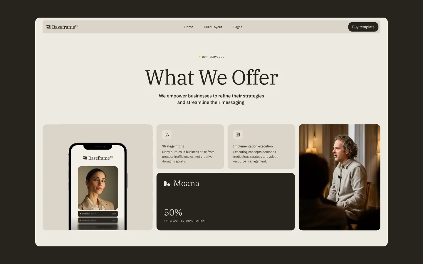
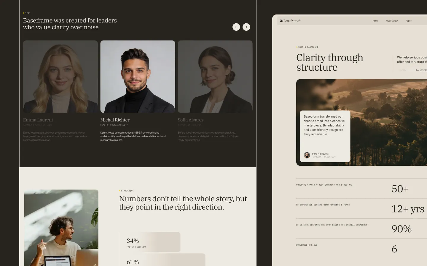
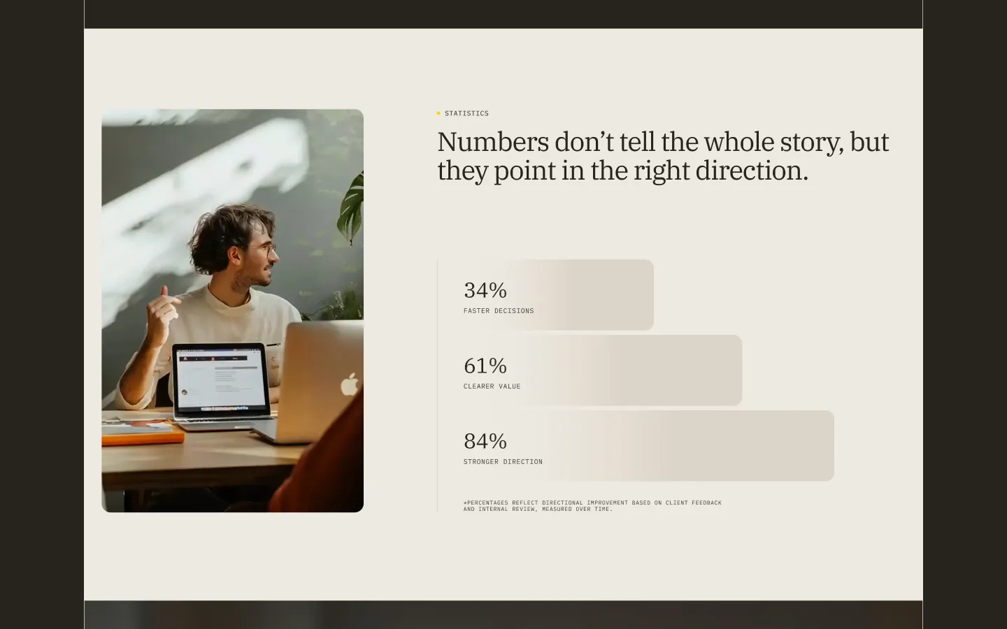
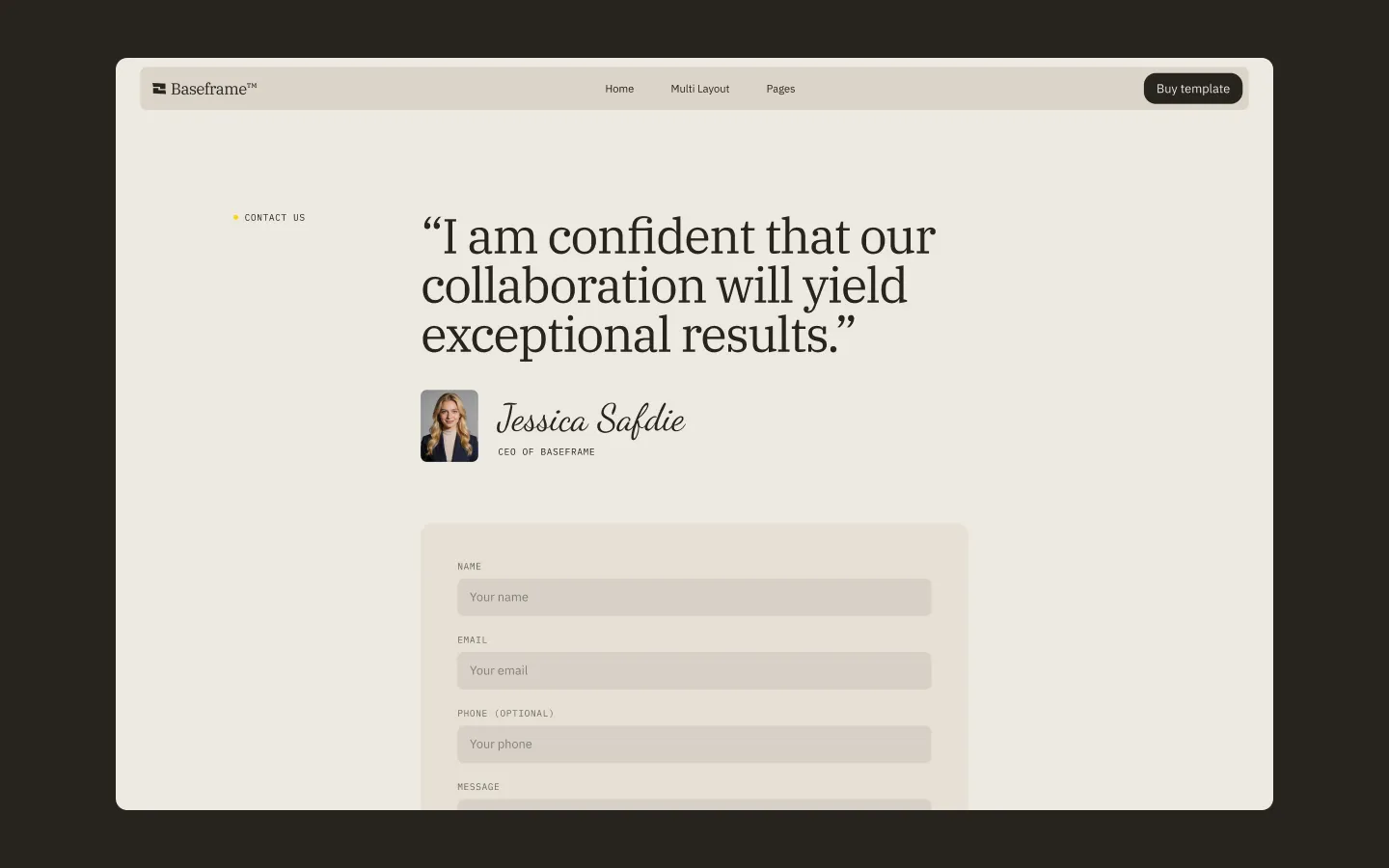
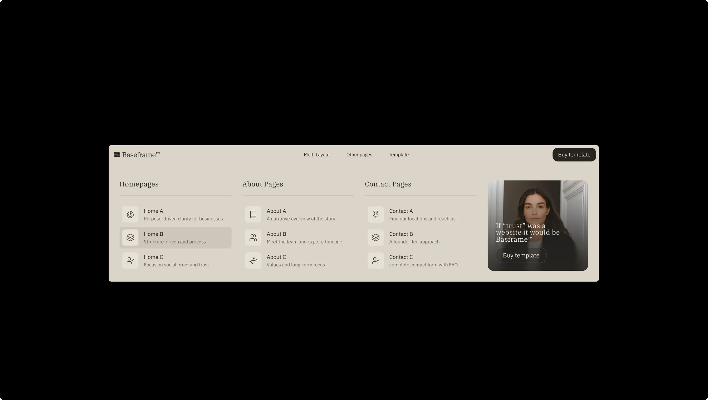
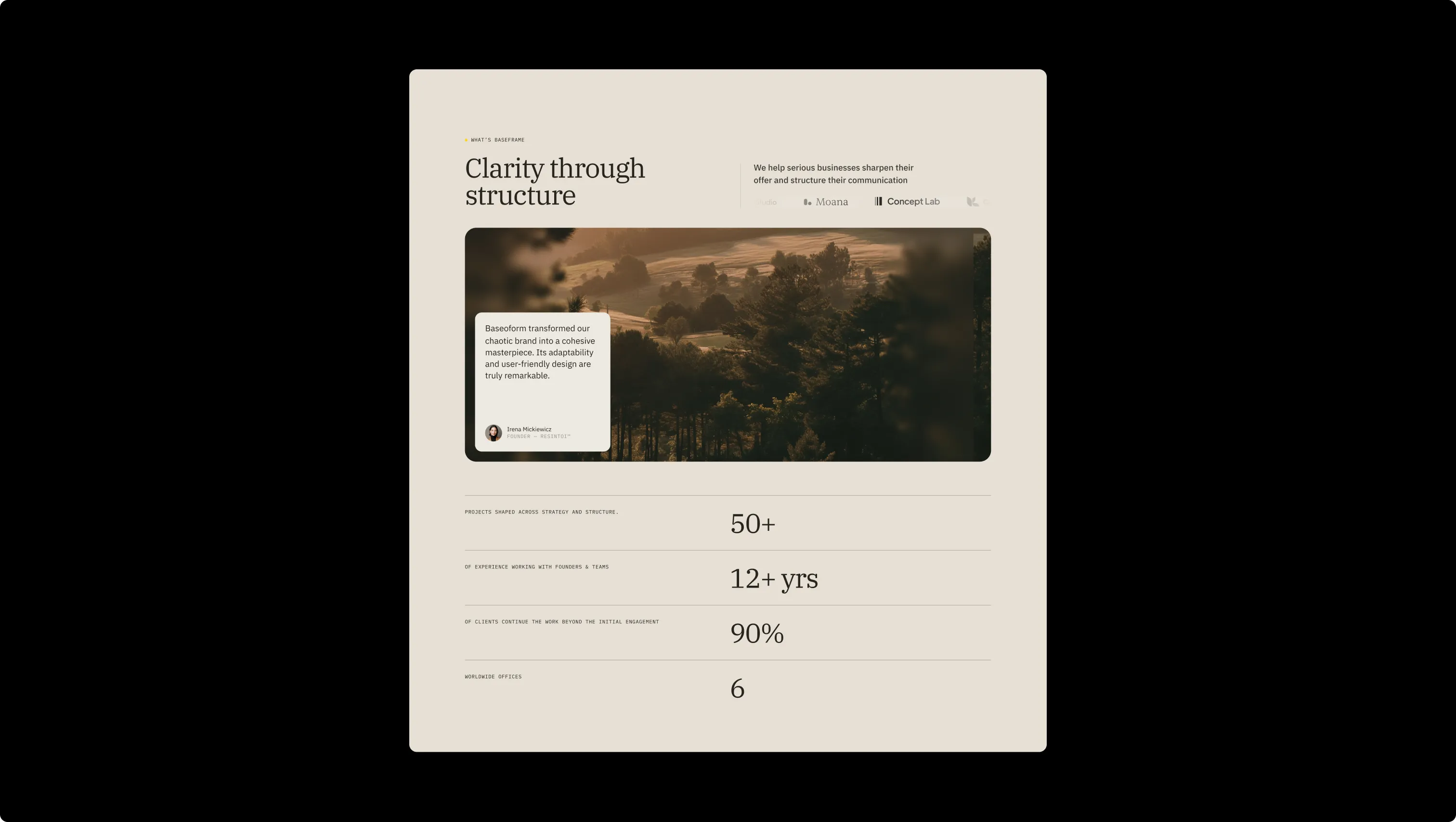
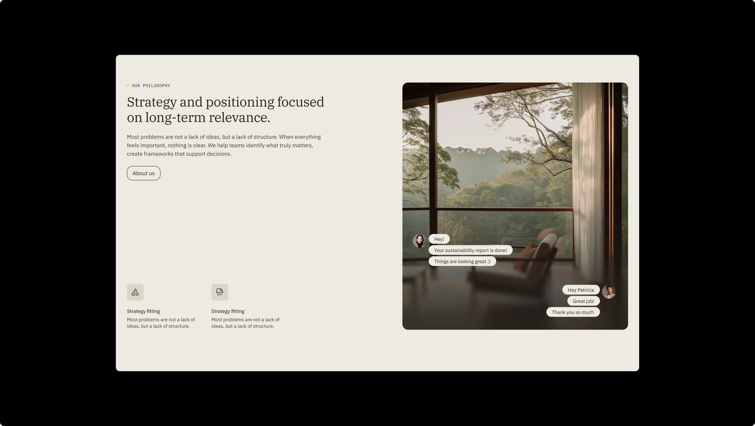
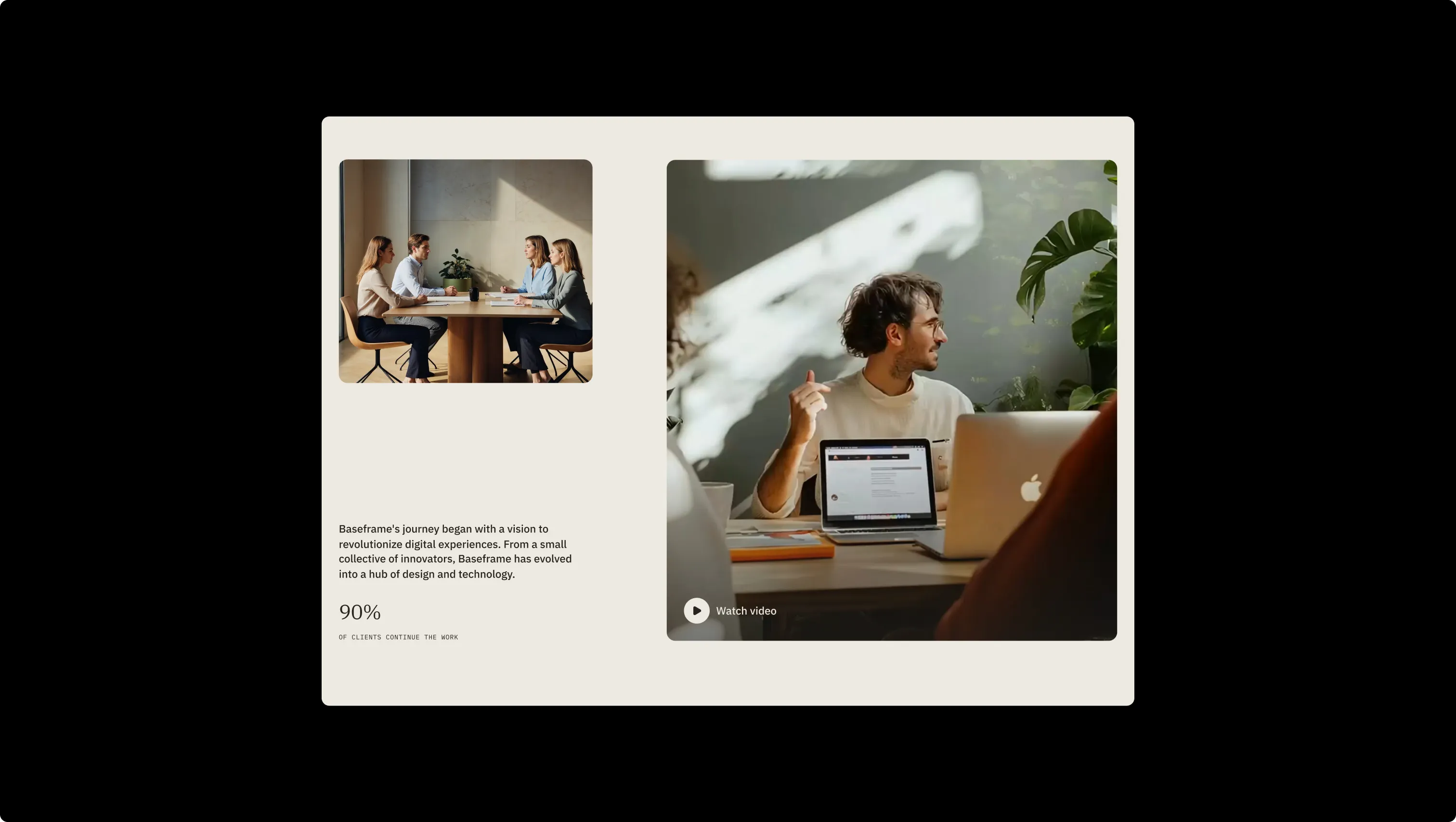
Baseframe™ is a premium consultancy template built for advisory firms and service-driven businesses that prize hierarchy over decoration. Its dual-mode palette — a warm off-white parchment for light sections and a deep charcoal-brown for dark hero and CTA zones — creates a deliberate rhythm of calm and authority across every page. IBM Plex Serif anchors headings with editorial gravitas, while IBM Plex Sans carries body copy with clean neutrality and IBM Plex Mono stamps uppercase labels with precision. A single accent — Sun Yellow — punctuates calls-to-action and section markers without ever becoming decorative noise. Every layout decision reinforces the brand's core message: complexity made legible. Generous section padding, a restrained bento-grid of service cards, and smooth translate-Y entrance animations ensure that ideas land with weight rather than spectacle. The template is built to hold up over time — structured enough to scale, calm enough to trust.
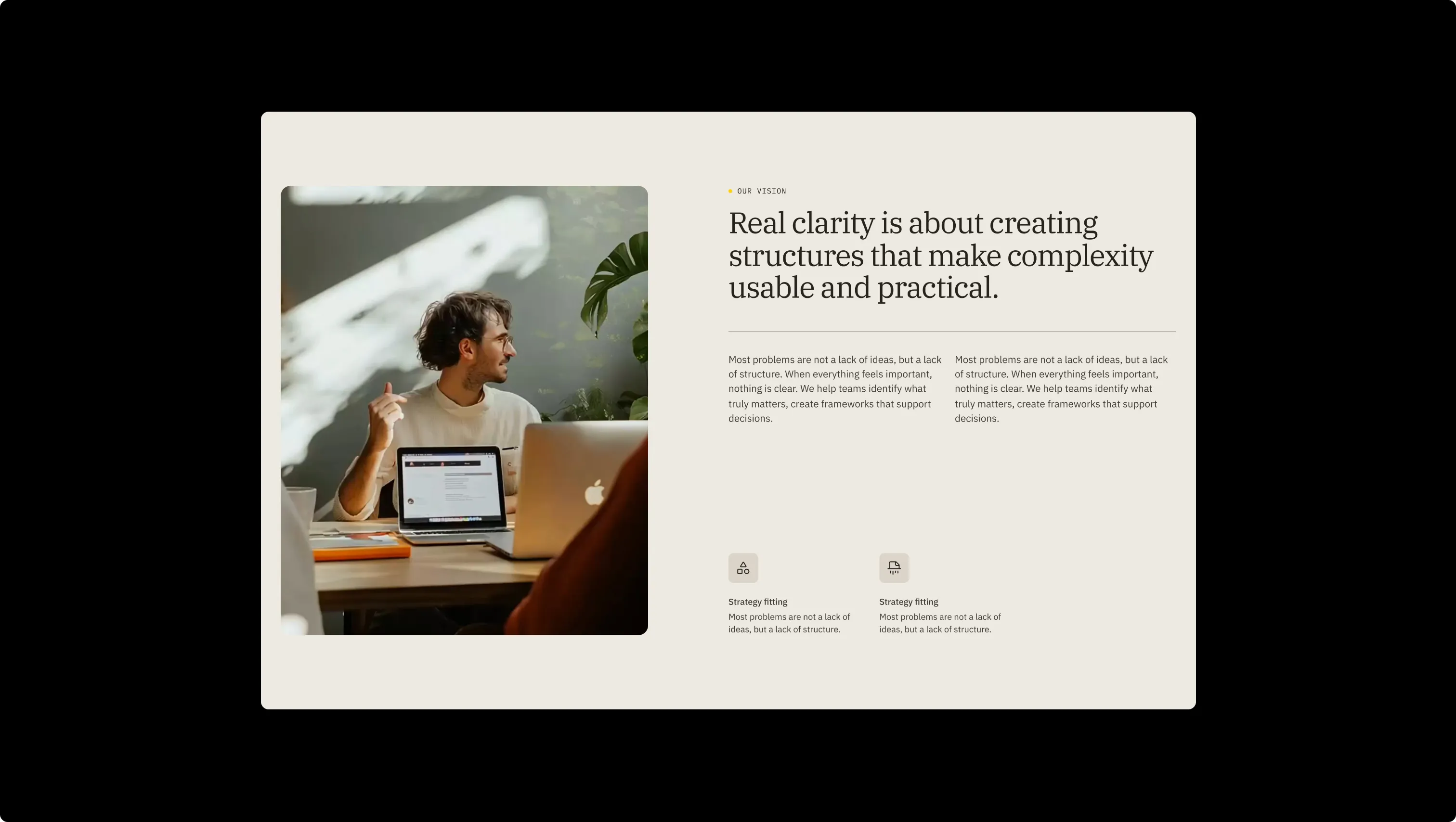
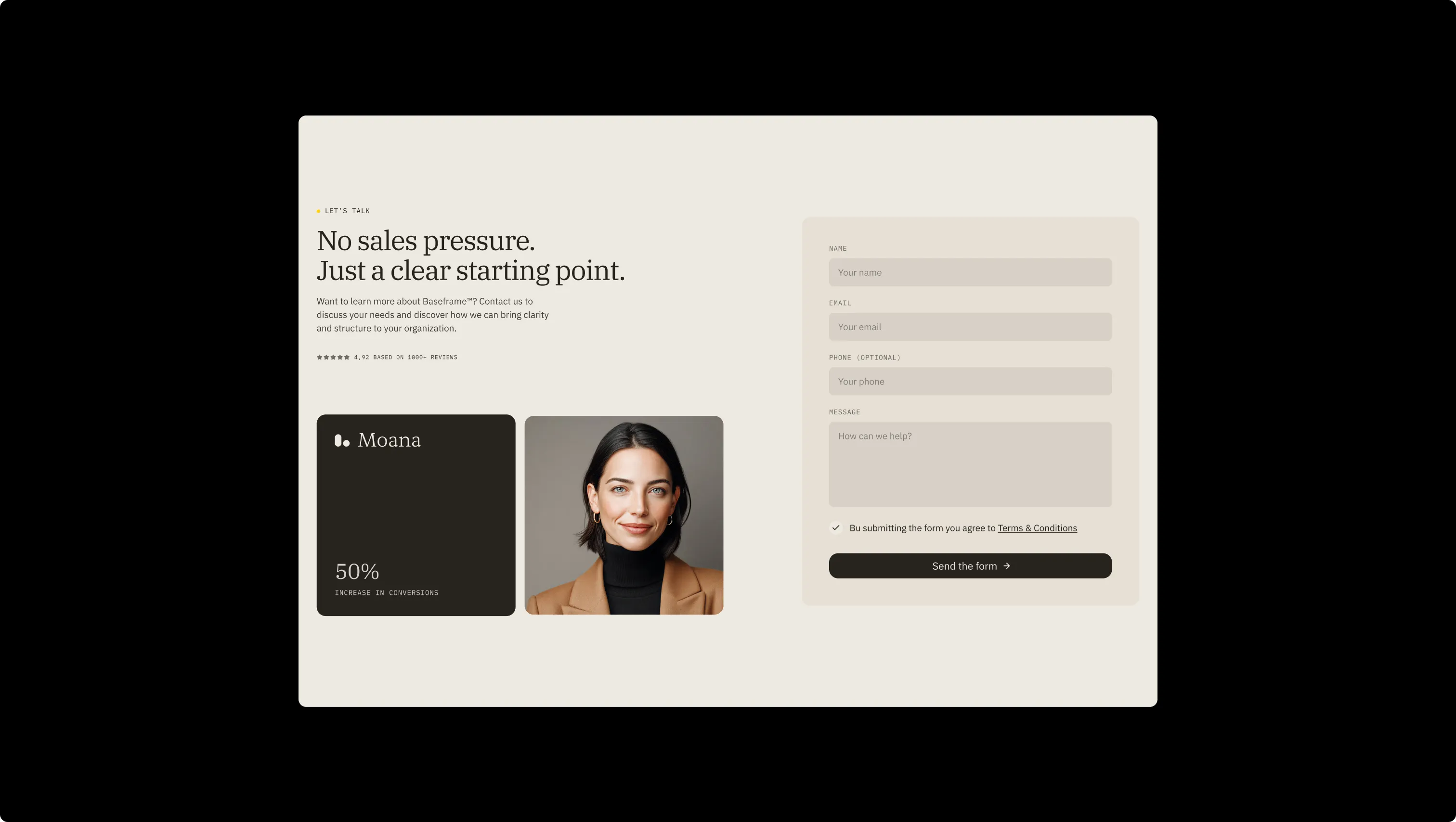
A handful of real sections that ship with this template. Click any card to preview, or explore them all under the Sections tab.

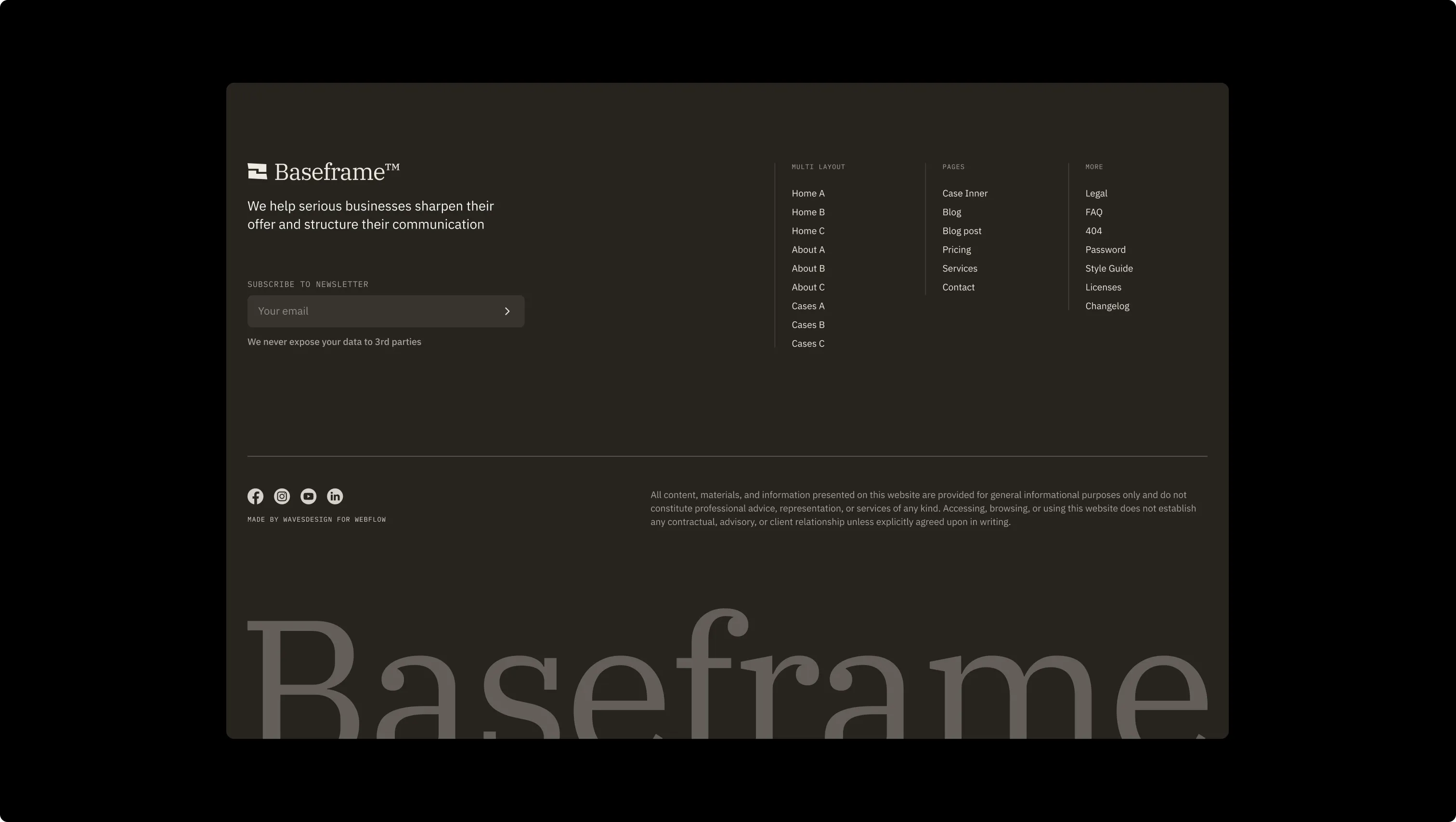
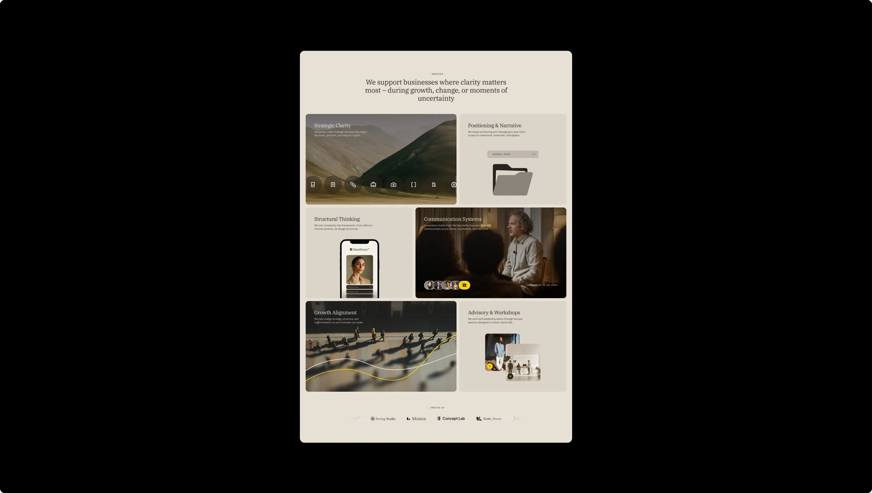
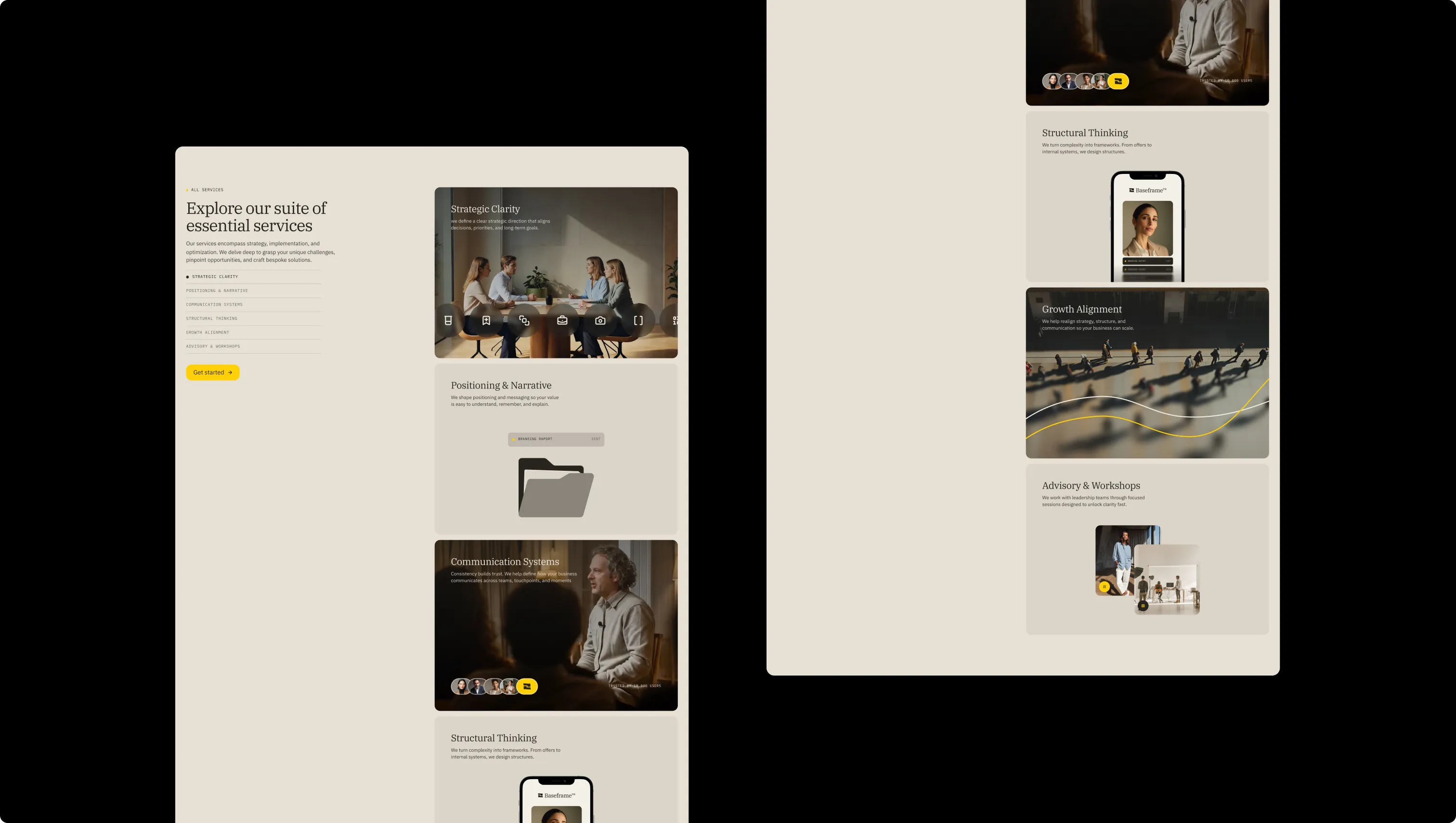
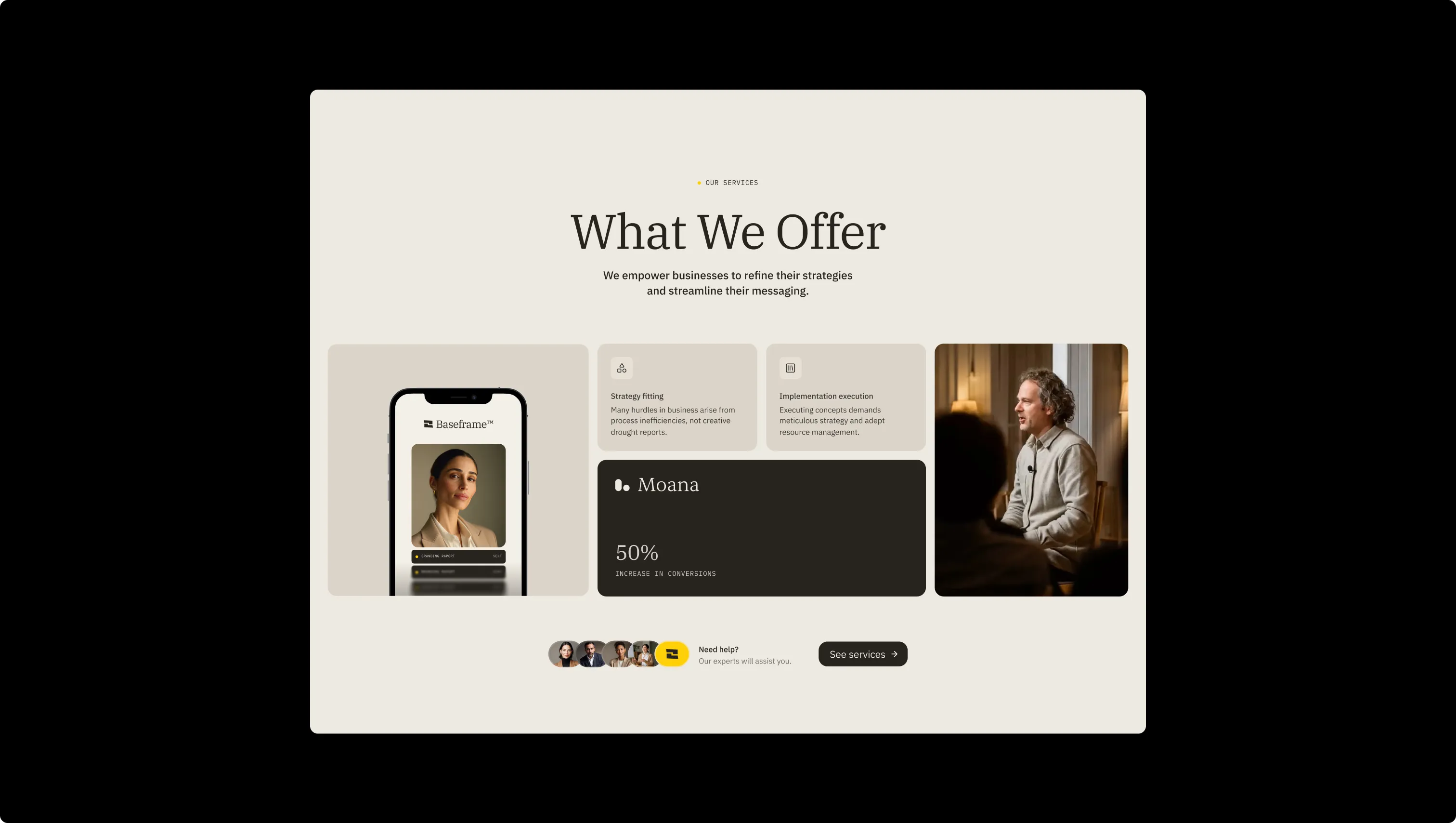

Second-level dark lift. Icon backgrounds and card-detail surfaces on dark sections.
Page canvas base. The lightest background value used beneath content sections.
Dark card lift surface. Inverted contact cards and dark bento tiles.
Lifted card surface & section backgrounds. Used for card fills, nav container, and stats gradient endpoint.
Second-tier lift surface. Deeper card backgrounds and tab-menu fills.
Primary light surface & ink-on-dark. Base page background, footer text, inverted button labels.
Primary dark surface & ink. Hero sections, footer fills, primary button backgrounds, body text.
Brand accent. Accent buttons, section-marker dots, logo fill on dark, rated-badge background.
Success state. Form success indicators and confirmation messages.
Error state. Form validation borders and error messaging only.
The quick brown fox jumps
Labels, tags, and metadata. Always uppercase with wide letter-spacing for categorical precision.
The quick brown fox jumps
Body copy and buttons. Neutral, legible, and scales cleanly from captions to large text.
The quick brown fox jumps
All headings h0–h6. Conveys editorial authority and long-form clarity.
spacious1800px120px32px24px4px8px12px16px20px24px32px48px64px80px120px160px200pxtags16pxcards16pxsmall8pxinputs8pxbuttons16pxfull-pill9999pxcards-large24pxbuttons-circle24pxStep from canvas (level 1) to lifted (level 2) to inset depth (level 3), then invert into the dark levels for full-bleed sections. Hex codes and roles live in the Colors section above; this ladder shows the layering only.
# Design System Guide

> Unlock the template to access the full design system.

## Brand voice

A short paragraph describing the brand voice, mood, and visual
principles that anchor the system. Tone, cadence, and intent.

## Colors

| Token        | Hex      | Role                                  |
| ------------ | -------- | ------------------------------------- |
| canvas-1     | #xxxxxx  | Page background, large surfaces       |
| canvas-2     | #xxxxxx  | Lifted surfaces, cards                |
| canvas-3     | #xxxxxx  | Inset wells, depressed states         |
| ink-1        | #xxxxxx  | Primary body text                     |
| ink-2        | #xxxxxx  | Secondary text, labels                |
| ink-3        | #xxxxxx  | Tertiary text, hints                  |
| accent-1     | #xxxxxx  | Primary brand accent                  |
| accent-2     | #xxxxxx  | Secondary accent                      |
| state-ok     | #xxxxxx  | Success, confirmations                |
| state-warn   | #xxxxxx  | Warnings                              |
| state-err    | #xxxxxx  | Errors, destructive actions           |

## Typography

- **Display** — heading scale, used for hero text and section titles.
- **Body** — primary reading text, optimized for paragraphs.
- **Mono** — code, data, and tabular numerals.

```
display: 32px / 40px / 48px / 64px / 80px
body:    14px / 16px / 18px
mono:    12px / 14px
```

## Spacing & shape

Base unit: 4px. Scale: 4, 8, 12, 16, 24, 32, 48, 64, 96, 128.
Radii: sm (4px), md (8px), lg (12px), xl (20px), full (9999px).

## Surfaces

Layered elevation from canvas → lifted → inset. Surfaces invert in
dark sections for full-bleed contrast.

## Do's and don'ts

- Do use accent-1 sparingly for primary CTAs only.
- Do maintain at least 4.5:1 contrast on body text.
- Don't mix display and body in the same line.
- Don't use state colors for branding.

## Agent prompt guide

Prompts for AI design tools that respect this system.
Includes example prompts for sections, components, and layouts.

# ...
Unlock the full style guide