Design systems, extracted.
Paste any URL to create a design system from it. Open any style for colors, type, spacing, components, and a DESIGN.md or tokens.json your agent can use.
Quickly navigate through the dashboard with your keyboard using the command menu.


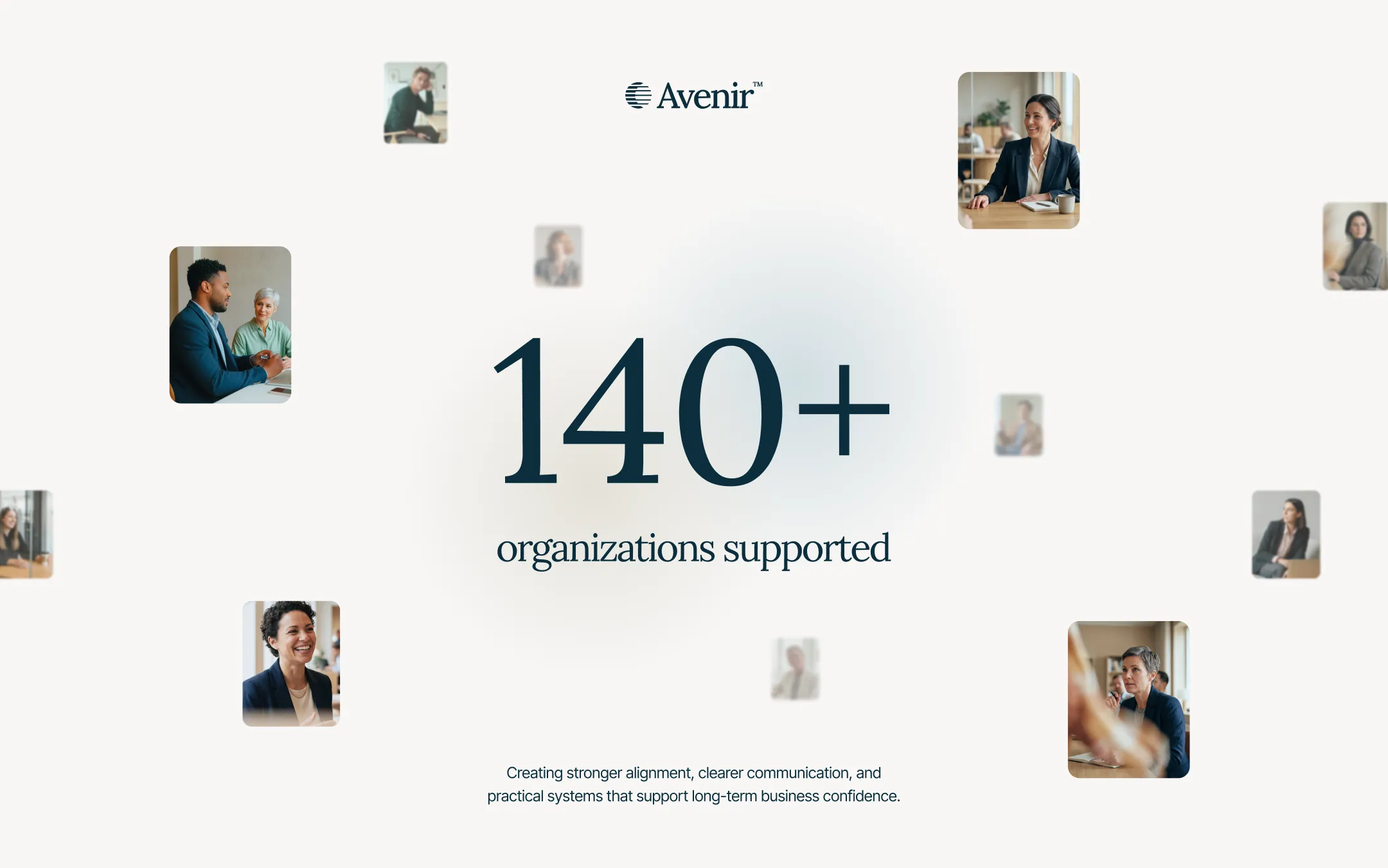
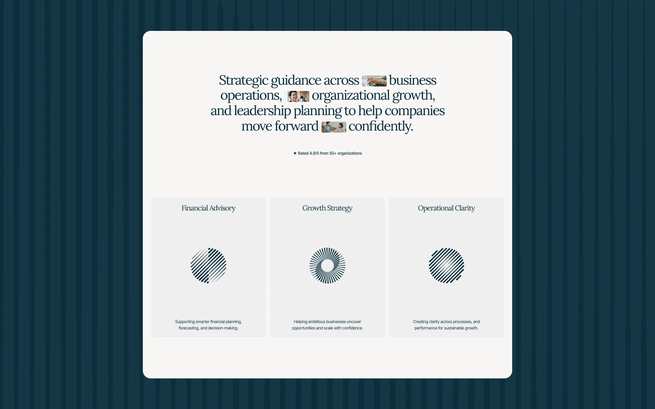
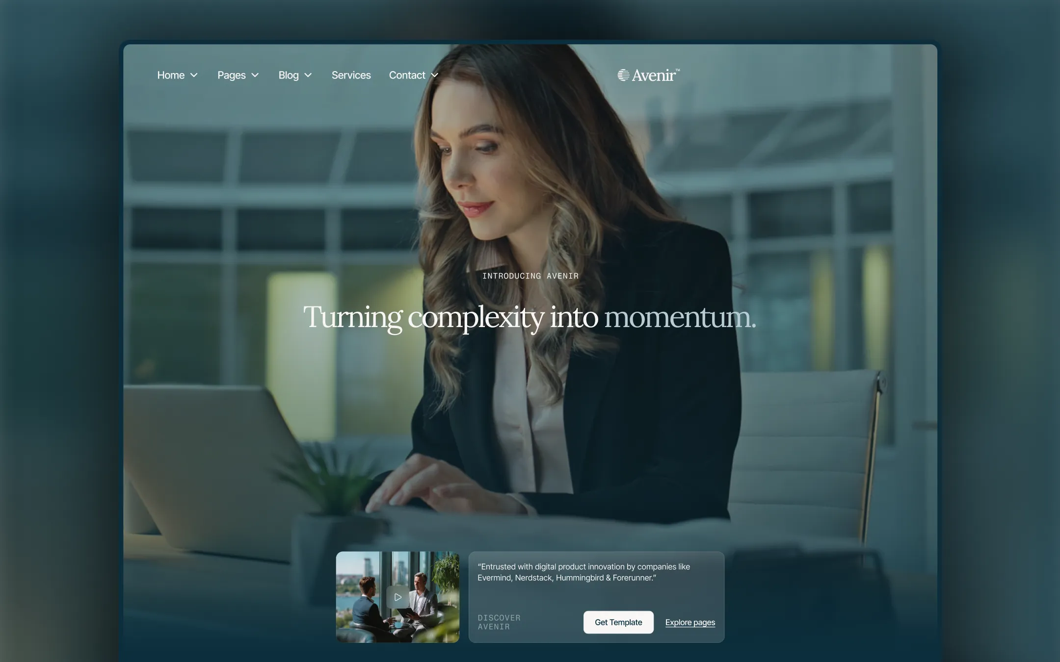
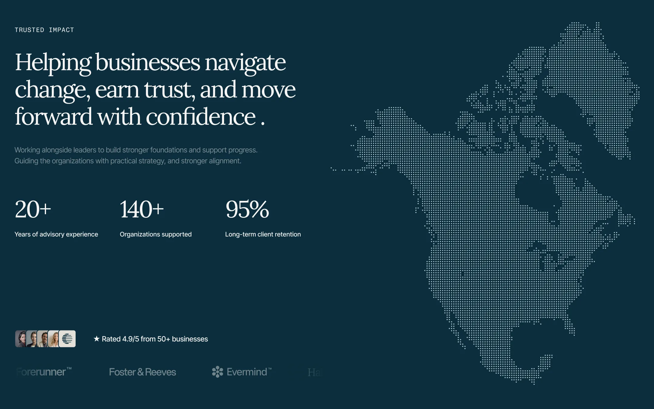
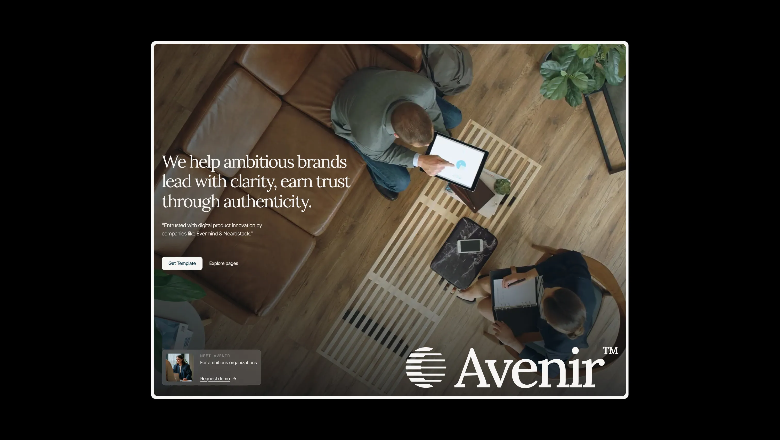
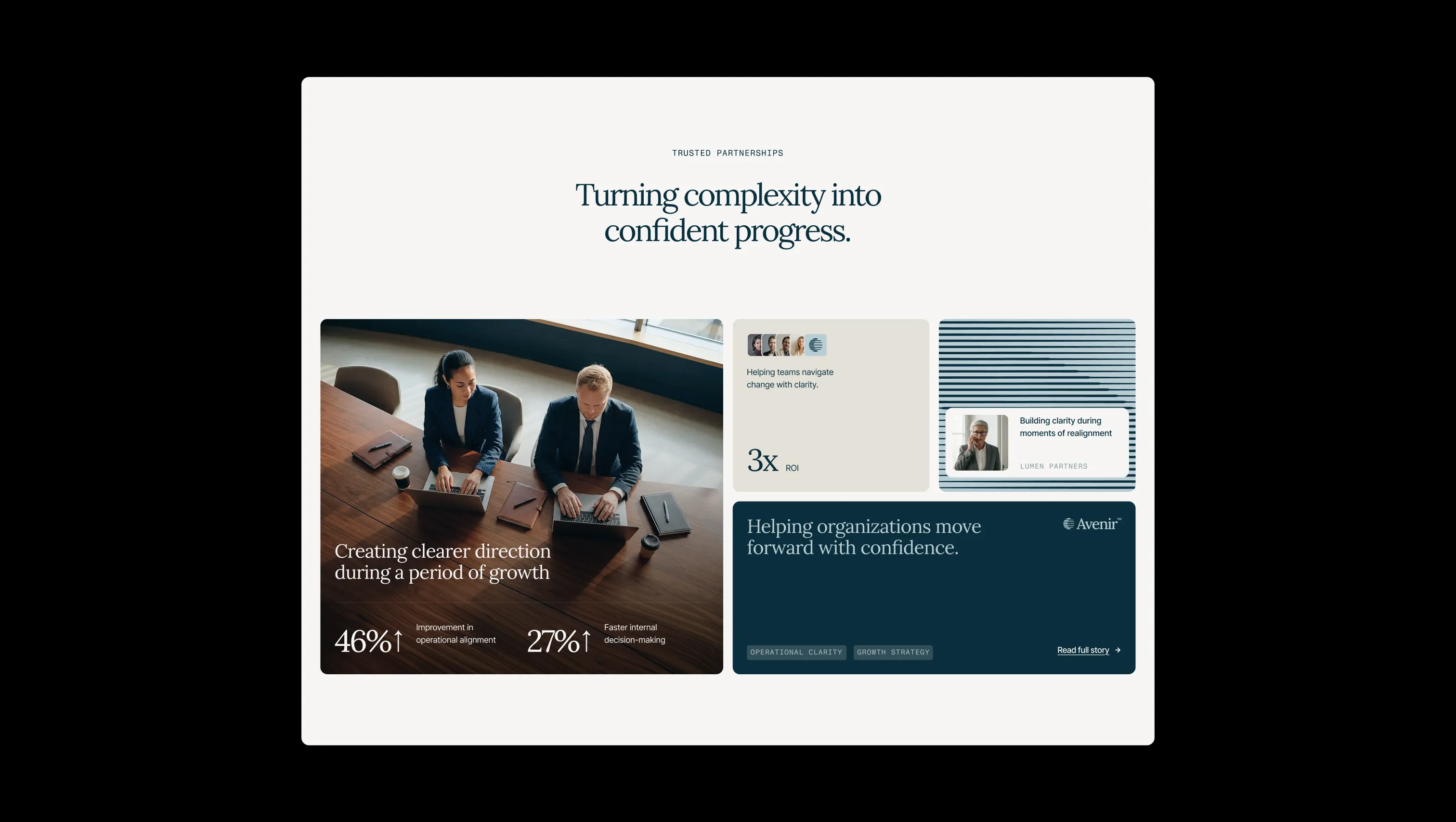
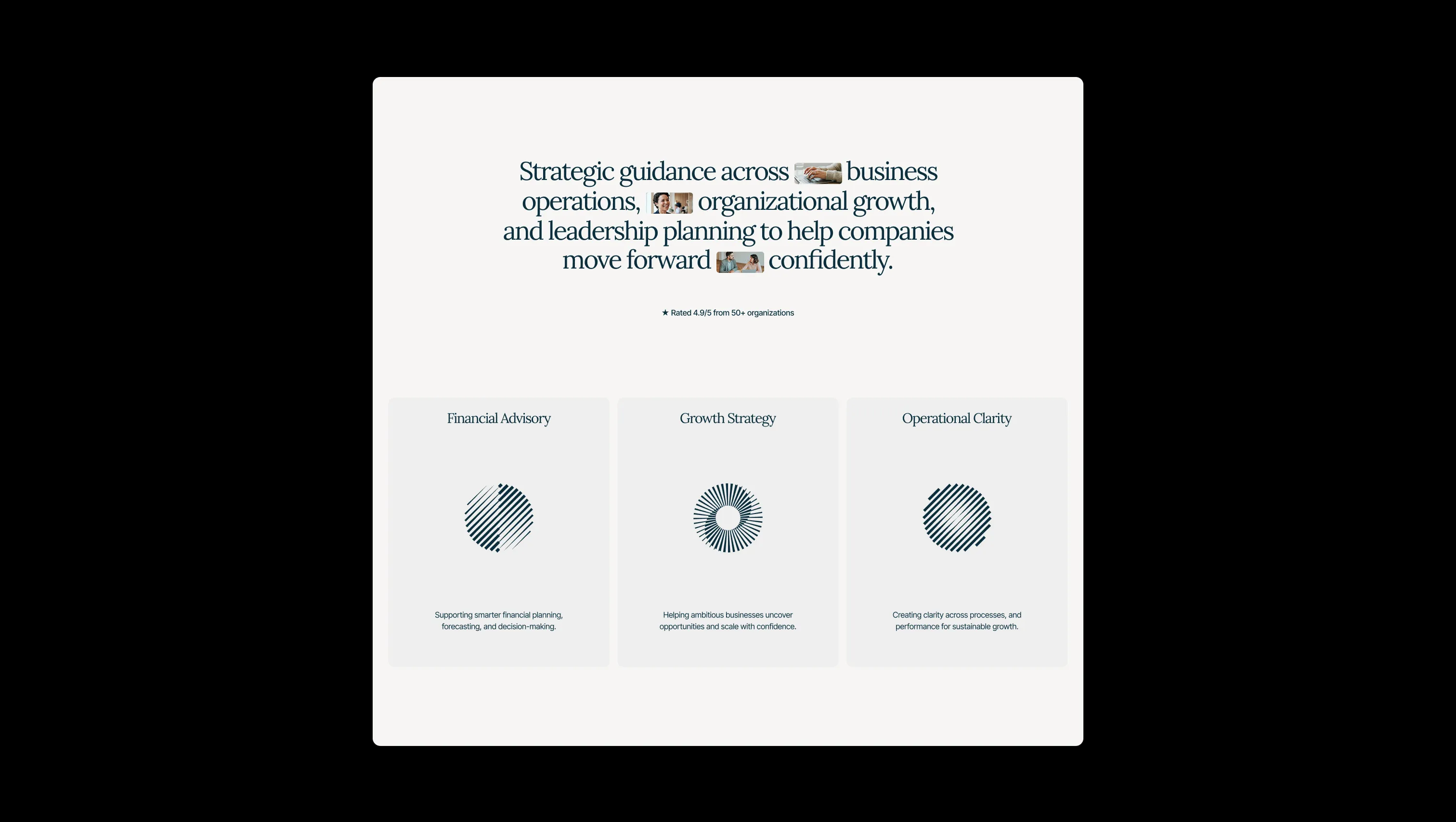
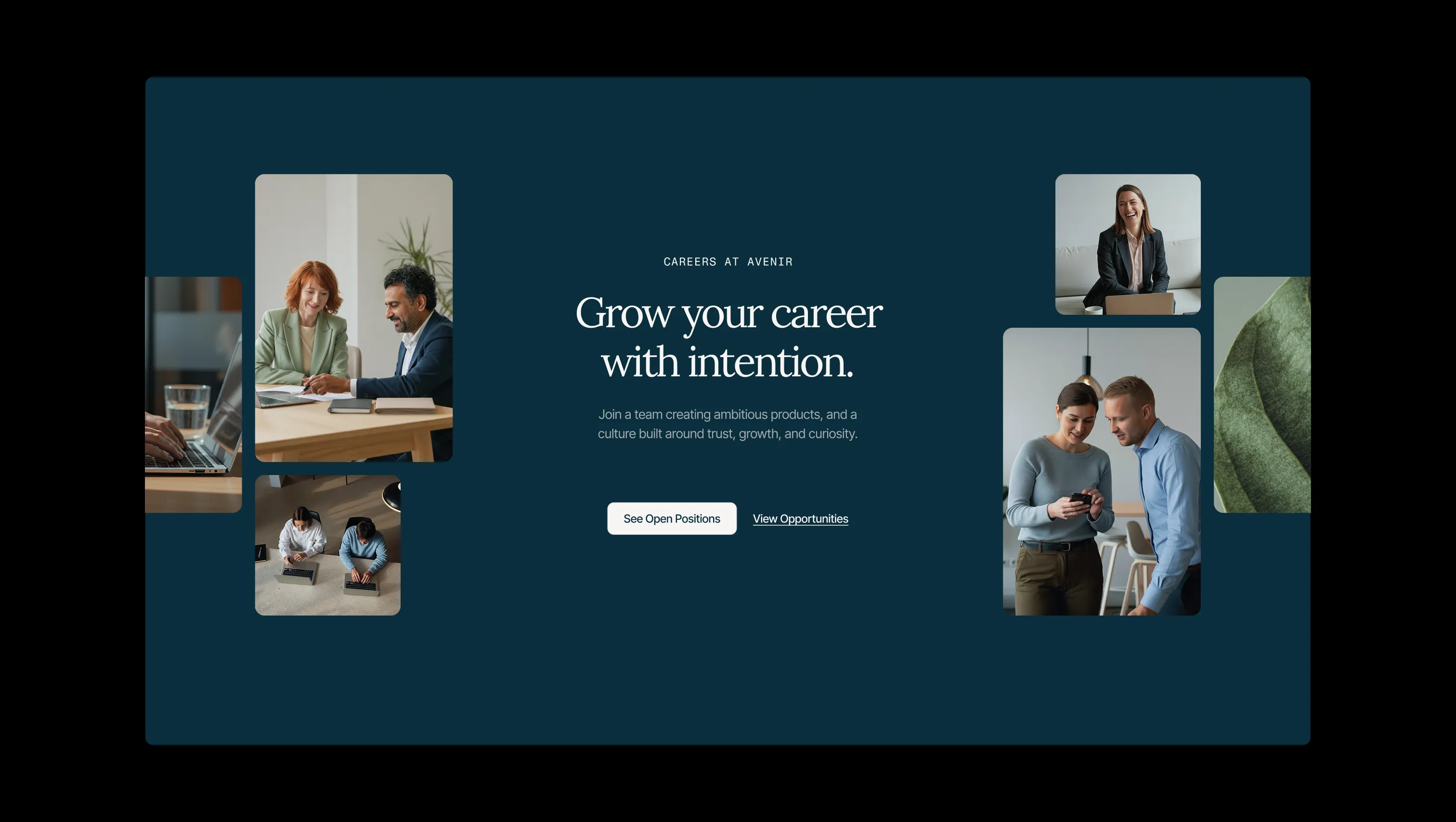
Avenir is a refined professional services template built on a calm navy-and-cream palette that radiates institutional authority without coldness. Every surface breathes — generous whitespace, editorial serif headlines set in Lora, and controlled mono labels from Fragment Mono create a hierarchy that feels curated rather than templated. The dark teal page surrounds and warm off-white card canvases signal depth and lift simultaneously, while a restrained accent yellow punctuates calls-to-action with just enough warmth to feel human. The system is deliberately legible under pressure: proof blocks, case study layouts, and sticky sidebars are all built to earn trust at every scroll position. Typography moves across a wide, coherent scale — from 88px display moments to 12px mono captions — anchored by negative letter-spacing in headings that keeps large text from feeling loose. Motion is subtle and purposeful, never decorative. The overall aesthetic is confident consultancy gravitas expressed through restraint.
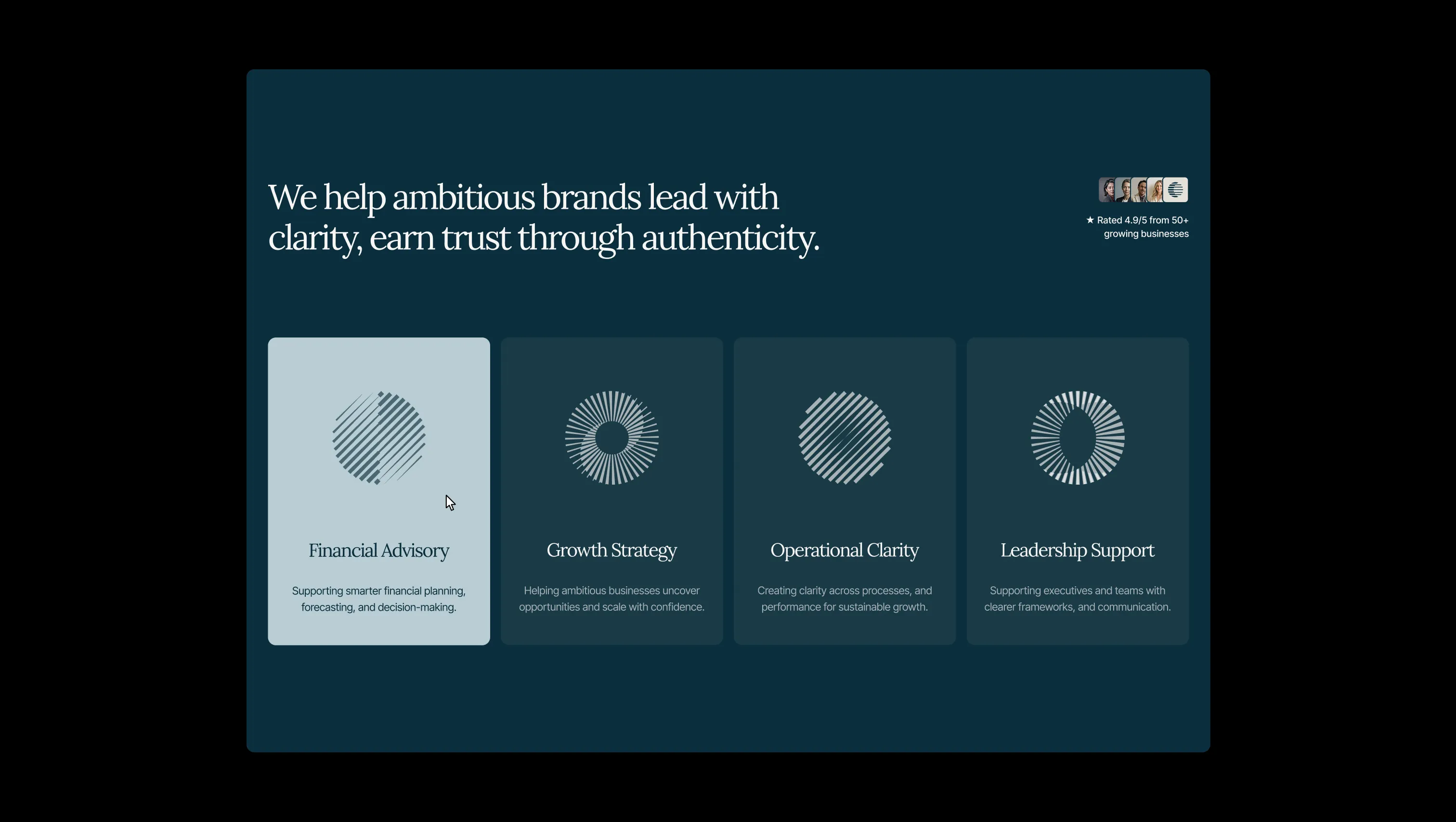
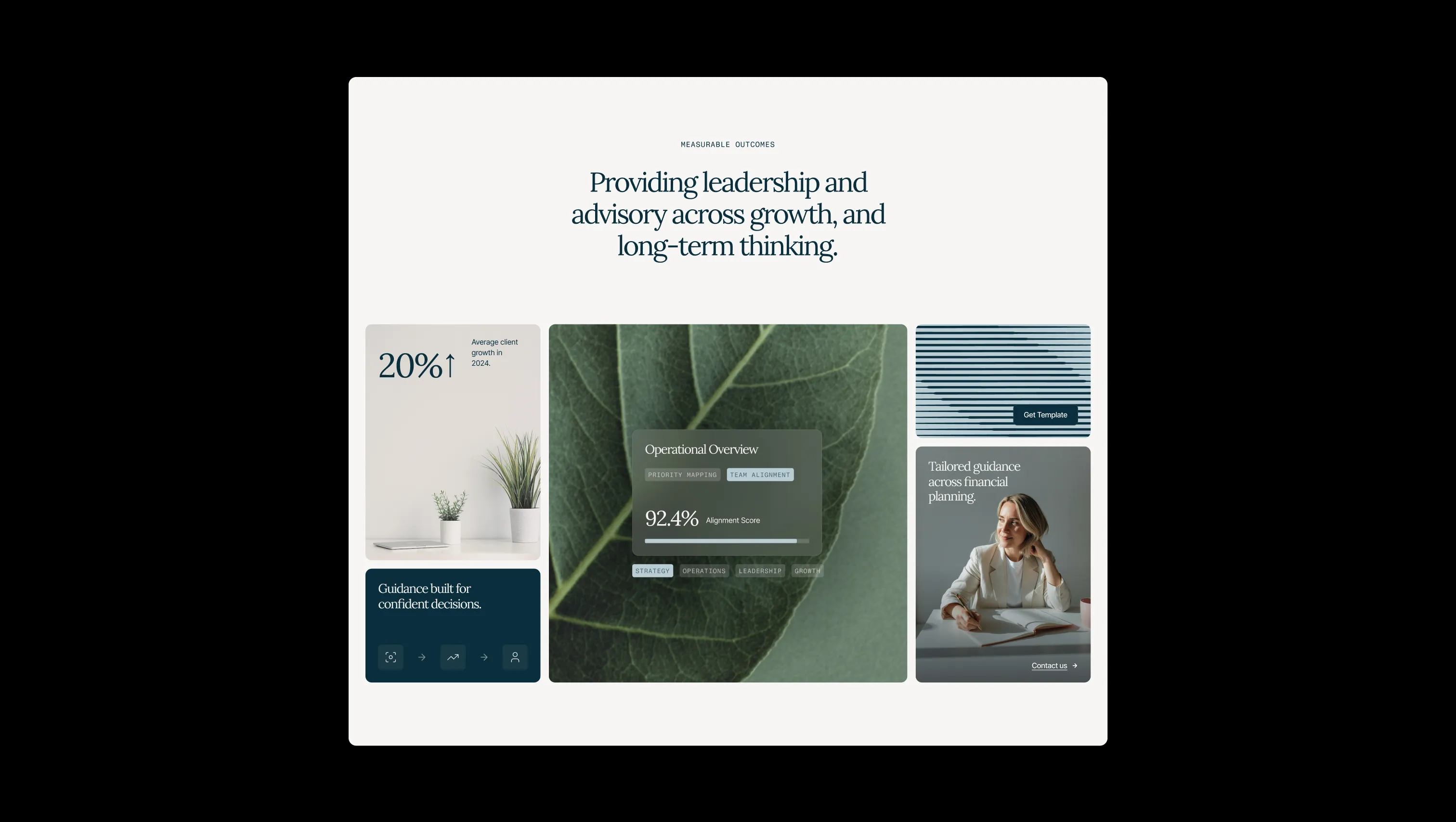
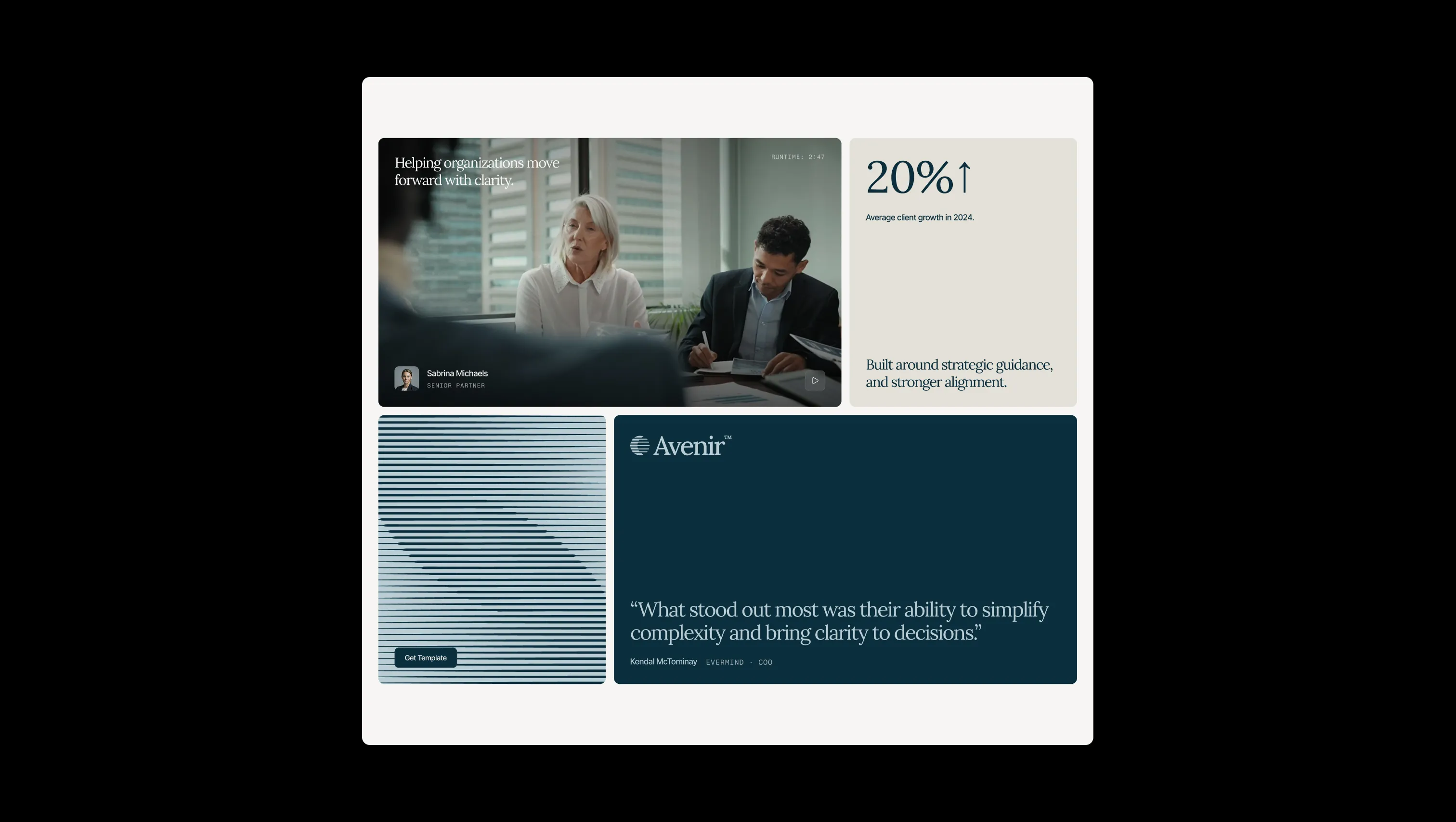
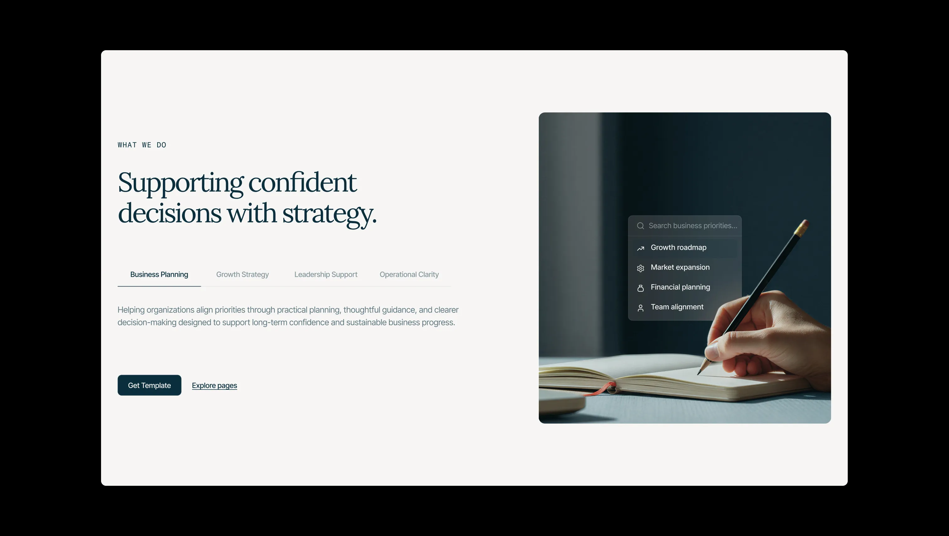
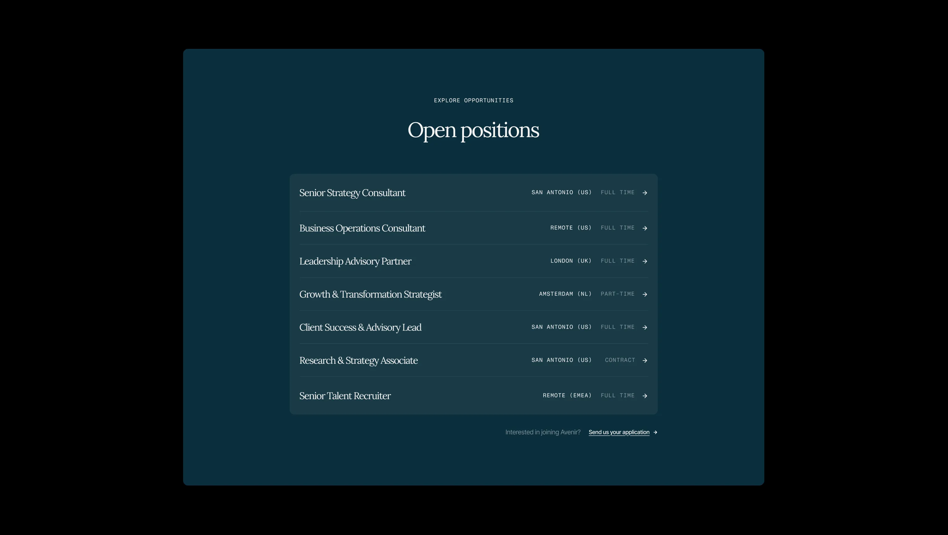
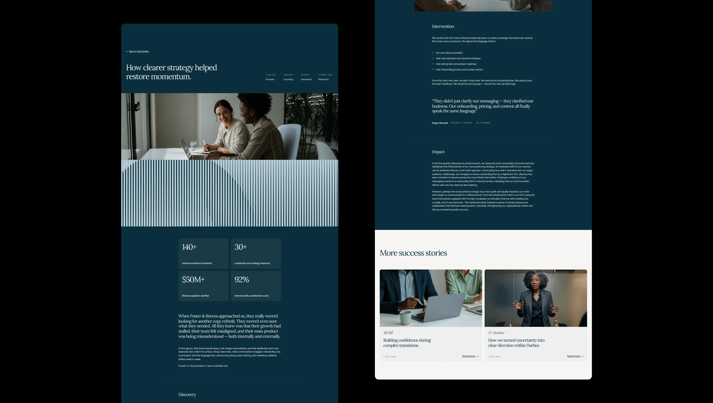
A handful of real sections that ship with this template. Click any card to preview, or explore them all under the Sections tab.
Depth input & inset background. Form fields, inset wells, and subtle section insets to indicate interactive or recessed depth.
Elevated card surface. Pure white used for the highest-lift card and modal surfaces to pop clearly against the warm parchment base.
Section surround & decorative depth. Applied at near-full opacity to outer page wrappers and dark section backgrounds to frame lifted cards.
Page canvas & text-on-dark. The base background color applied to all primary page surfaces and reversed text over dark fills.
Primary ink & dark surface. Headlines, body copy, primary button fills, and the deep section backgrounds that frame content.
Soft accent wash. Hover state backgrounds for primary and secondary buttons, providing a cool transitional tint.
Brand accent & CTA highlight. Accent buttons, circle-button fills, and decorative emphasis that introduces warmth without breaking the calm palette.
Error state. Form validation errors and destructive feedback indicators only — never decorative.
Success state. Positive confirmation messages and success badges only — never decorative.
Warning state. Cautionary alerts and warning indicators only — never decorative.
The quick brown fox jumps
Primary heading typeface. All h0–h6 display and section headings — delivers old-world editorial gravitas that anchors the consultancy aesthetic.
The quick brown fox jumps
Body, buttons, and UI text. Clean modern grotesque that keeps prose and interactive elements precise and readable at all sizes.
The quick brown fox jumps
Labels, tags, and mono annotations. All-caps, tracked mono type used exclusively for category labels and functional metadata.
spacious1800px120px24px16px4px6px8px12px16px20px24px32px40px48px64px80px120px160px200pxtags8pxcards12pxlarge20pxsmall8pxcircle9999pxinputs8pxbuttons8pxStep from canvas (level 1) to lifted (level 2) to inset depth (level 3), then invert into the dark levels for full-bleed sections. Hex codes and roles live in the Colors section above; this ladder shows the layering only.
# Design System Guide

> Unlock the template to access the full design system.

## Brand voice

A short paragraph describing the brand voice, mood, and visual
principles that anchor the system. Tone, cadence, and intent.

## Colors

| Token        | Hex      | Role                                  |
| ------------ | -------- | ------------------------------------- |
| canvas-1     | #xxxxxx  | Page background, large surfaces       |
| canvas-2     | #xxxxxx  | Lifted surfaces, cards                |
| canvas-3     | #xxxxxx  | Inset wells, depressed states         |
| ink-1        | #xxxxxx  | Primary body text                     |
| ink-2        | #xxxxxx  | Secondary text, labels                |
| ink-3        | #xxxxxx  | Tertiary text, hints                  |
| accent-1     | #xxxxxx  | Primary brand accent                  |
| accent-2     | #xxxxxx  | Secondary accent                      |
| state-ok     | #xxxxxx  | Success, confirmations                |
| state-warn   | #xxxxxx  | Warnings                              |
| state-err    | #xxxxxx  | Errors, destructive actions           |

## Typography

- **Display** — heading scale, used for hero text and section titles.
- **Body** — primary reading text, optimized for paragraphs.
- **Mono** — code, data, and tabular numerals.

```
display: 32px / 40px / 48px / 64px / 80px
body:    14px / 16px / 18px
mono:    12px / 14px
```

## Spacing & shape

Base unit: 4px. Scale: 4, 8, 12, 16, 24, 32, 48, 64, 96, 128.
Radii: sm (4px), md (8px), lg (12px), xl (20px), full (9999px).

## Surfaces

Layered elevation from canvas → lifted → inset. Surfaces invert in
dark sections for full-bleed contrast.

## Do's and don'ts

- Do use accent-1 sparingly for primary CTAs only.
- Do maintain at least 4.5:1 contrast on body text.
- Don't mix display and body in the same line.
- Don't use state colors for branding.

## Agent prompt guide

Prompts for AI design tools that respect this system.
Includes example prompts for sections, components, and layouts.

# ...
Unlock the full style guide