Design systems, extracted.
Paste any URL to create a design system from it. Open any style for colors, type, spacing, components, and a DESIGN.md or tokens.json your agent can use.
Quickly navigate through the dashboard with your keyboard using the command menu.
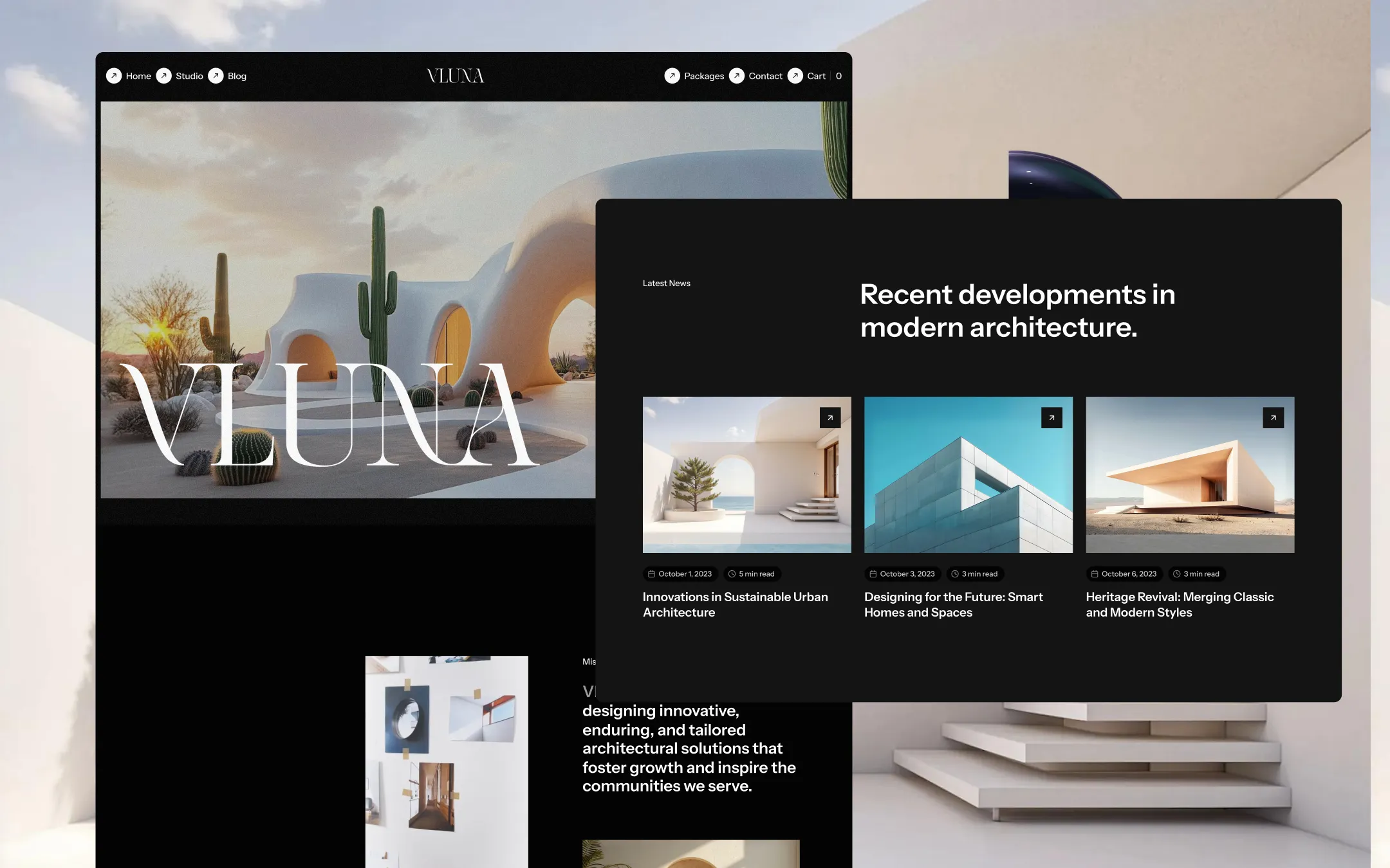
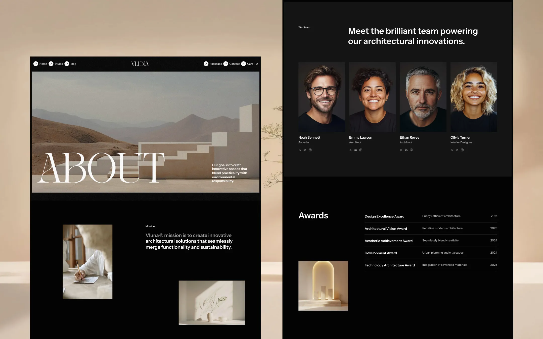
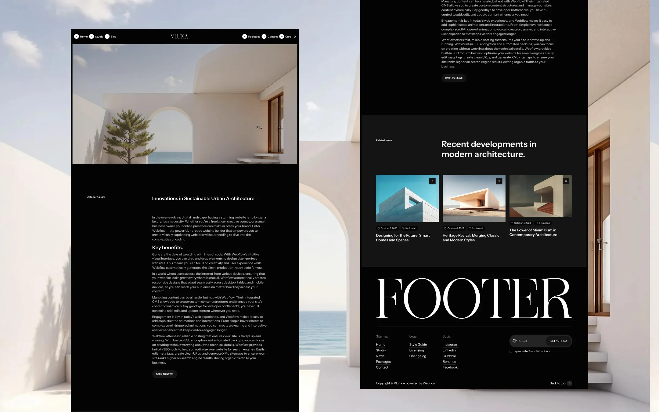
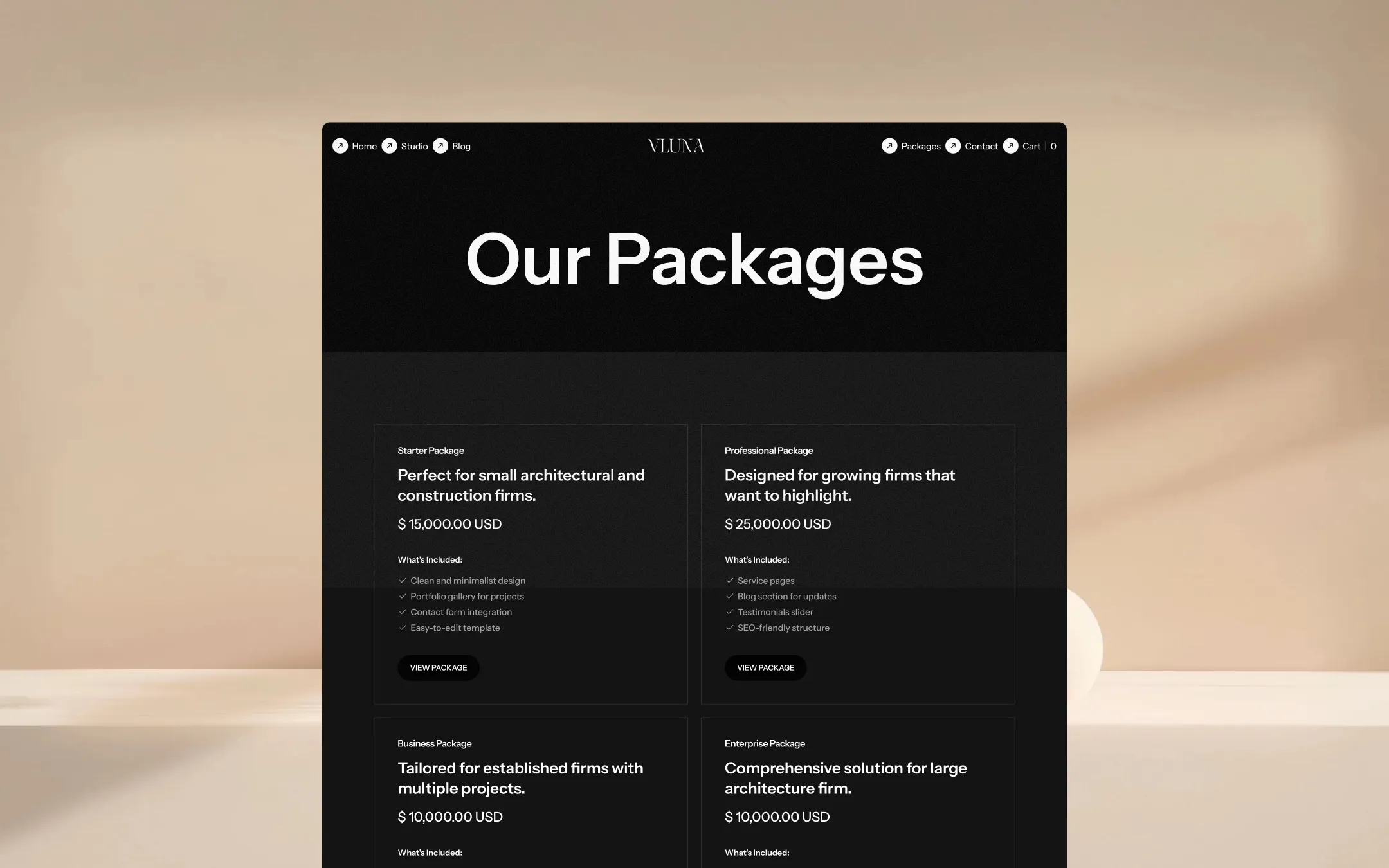
Vluna is a dark-foundation design system built for architecture and design studios whose work speaks in volume, shadow, and light. A near-black canvas (#040404) and a slightly lifted charcoal (#141414) hold every section, letting full-bleed desert and gallery photography — arched interiors, sculptural concrete, sun-bleached sand — carry the emotional weight. Typography does the rest: an oversized Georgia-style serif display for wordmark moments like 'VLUNA', 'ABOUT', and 'FOOTER', paired with a clean, confident Instrument Sans for everything functional, from navigation pills to pricing tables. Color stays disciplined — ink blacks, bone whites, and a single cool indigo accent reserved for interactive states — so the architecture photography itself supplies the warmth: terracotta, sand, and bleached stone. Pill-shaped buttons, circular nav icons, and soft 30px-radius inputs soften an otherwise severe grid, giving the system a gallery-opening hush rather than a corporate starchiness.
Primary page canvas. Base background for every section and the body element.
Hairline dividers on light contexts. Separates form rows and light-mode utility elements.
Lifted surface & secondary sections. Used for 'gray' section variants, cards, inputs, and the testimonial surface.
Secondary body text. Paragraph copy, placeholder text, and subscribe-field accents against dark surfaces.
Primary text & display wordmarks. Headlines, serif display type, icon fills, and button labels on dark grounds.
Border on dark surfaces. Outlines inputs, pricing cards, and the cart container at low opacity.
Architectural warmth accent. Sampled from desert and sandstone photography; used for decorative overlays and imagery framing.
Interactive accent & link hover. Reserved for focus states, checkout CTAs, and subscribe-field iconography.
Warm decorative accent. Evokes the clay archways and canyon tones in hero photography; sparing use in imagery-adjacent graphics.
Error state. Form validation and destructive messaging, sampled from third-party icon sets.
The quick brown fox jumps
Display wordmark and ceremonial headline typeface — hero logotype, section dividers like 'ABOUT' and 'FOOTER'.
The quick brown fox jumps
Primary UI and body typeface — navigation, buttons, forms, paragraph copy.
spacious1240px200px45px24px4px8px12px16px20px24px32px40px60px80px100px140px200px300pxcards7pxpills40pxsmall8pxinputs30pxbuttons50pxtextarea15pxicon-buttons12pxStep from canvas (level 1) to lifted (level 2) to inset depth (level 3), then invert into the dark levels for full-bleed sections. Hex codes and roles live in the Colors section above; this ladder shows the layering only.
# Design System Guide

> Unlock the template to access the full design system.

## Brand voice

A short paragraph describing the brand voice, mood, and visual
principles that anchor the system. Tone, cadence, and intent.

## Colors

| Token        | Hex      | Role                                  |
| ------------ | -------- | ------------------------------------- |
| canvas-1     | #xxxxxx  | Page background, large surfaces       |
| canvas-2     | #xxxxxx  | Lifted surfaces, cards                |
| canvas-3     | #xxxxxx  | Inset wells, depressed states         |
| ink-1        | #xxxxxx  | Primary body text                     |
| ink-2        | #xxxxxx  | Secondary text, labels                |
| ink-3        | #xxxxxx  | Tertiary text, hints                  |
| accent-1     | #xxxxxx  | Primary brand accent                  |
| accent-2     | #xxxxxx  | Secondary accent                      |
| state-ok     | #xxxxxx  | Success, confirmations                |
| state-warn   | #xxxxxx  | Warnings                              |
| state-err    | #xxxxxx  | Errors, destructive actions           |

## Typography

- **Display** — heading scale, used for hero text and section titles.
- **Body** — primary reading text, optimized for paragraphs.
- **Mono** — code, data, and tabular numerals.

```
display: 32px / 40px / 48px / 64px / 80px
body:    14px / 16px / 18px
mono:    12px / 14px
```

## Spacing & shape

Base unit: 4px. Scale: 4, 8, 12, 16, 24, 32, 48, 64, 96, 128.
Radii: sm (4px), md (8px), lg (12px), xl (20px), full (9999px).

## Surfaces

Layered elevation from canvas → lifted → inset. Surfaces invert in
dark sections for full-bleed contrast.

## Do's and don'ts

- Do use accent-1 sparingly for primary CTAs only.
- Do maintain at least 4.5:1 contrast on body text.
- Don't mix display and body in the same line.
- Don't use state colors for branding.

## Agent prompt guide

Prompts for AI design tools that respect this system.
Includes example prompts for sections, components, and layouts.

# ...
Unlock the full style guide