Design systems, extracted.
Paste any URL to create a design system from it. Open any style for colors, type, spacing, components, and a DESIGN.md or tokens.json your agent can use.
Quickly navigate through the dashboard with your keyboard using the command menu.
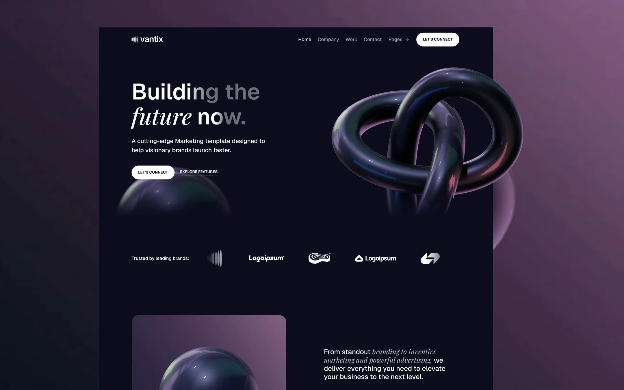
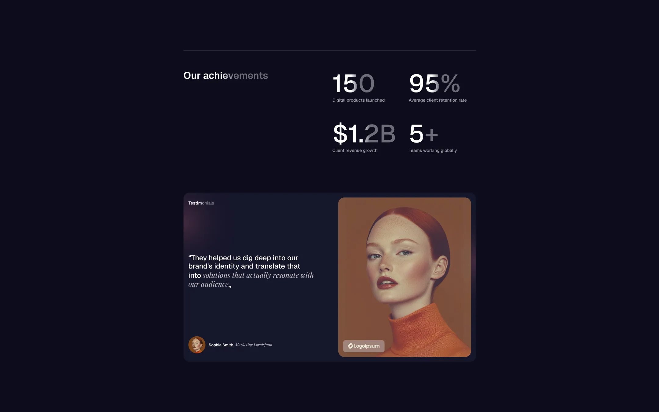
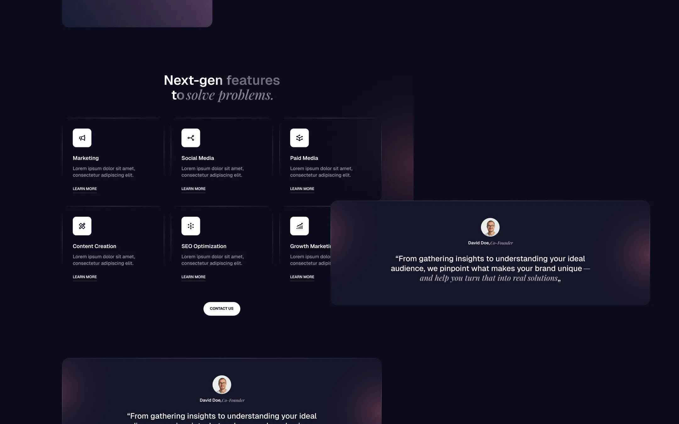
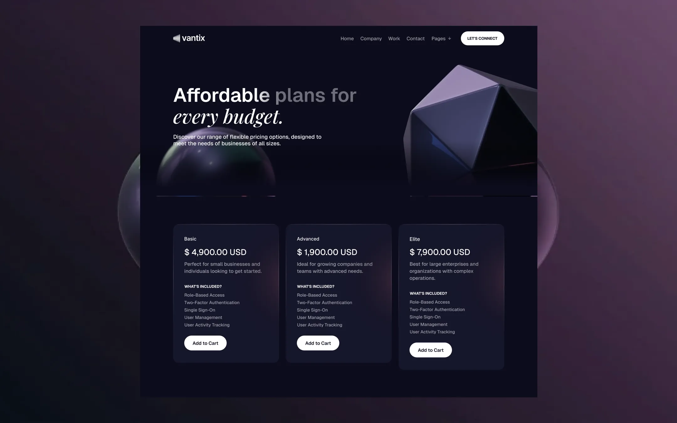
Vantix is a cinematic, atmospheric design system built for agencies who want to feel like the future rather than sell it. Deep navy-black canvases hold glowing holographic 3D chrome forms, looping video textures, and rich editorial portraiture — every surface feels lit from within, like a studio at midnight. Typography leans on a confident geometric sans paired with a flickering italic serif accent, creating a push-pull between corporate precision and creative flourish.
Primary canvas & dark surface. Base background for every section, nav, and footer.
Translucent divider & option background. Option-wrapper fills, hairline borders.
Card & input surface. Pricing cards, inputs, dropdown panels.
Primary text & button fill. Headlines, body copy, pill button backgrounds.
Secondary text & links. Dark-link labels, muted captions, footer link text.
Secondary accent. Button-line hover color, link underline accents.
Tertiary accent. Underline hover border on primary nav-style links.
Primary accent & hover glow. Hero radial gradient, hover states on link buttons.
Utility action hue. Default Webflow commerce buttons and focus outlines.
The quick brown fox jumps
Primary UI and body typeface. Used for nav, body copy, buttons, labels.
The quick brown fox jumps
Pricing and label typeface. Used for product titles and condensed UI labels.
The quick brown fox jumps
Decorative accent typeface. Italic emphasis spans within headings and quotes.
spacious1200px120px40px25px5px10px15px20px25px30px40px50px60px70px100px120pxcards20pxsmall5pxavatar9999pxbuttons40pxpill-input100pxparallax-image25pxStep from canvas (level 1) to lifted (level 2) to inset depth (level 3), then invert into the dark levels for full-bleed sections. Hex codes and roles live in the Colors section above; this ladder shows the layering only.
# Design System Guide

> Unlock the template to access the full design system.

## Brand voice

A short paragraph describing the brand voice, mood, and visual
principles that anchor the system. Tone, cadence, and intent.

## Colors

| Token        | Hex      | Role                                  |
| ------------ | -------- | ------------------------------------- |
| canvas-1     | #xxxxxx  | Page background, large surfaces       |
| canvas-2     | #xxxxxx  | Lifted surfaces, cards                |
| canvas-3     | #xxxxxx  | Inset wells, depressed states         |
| ink-1        | #xxxxxx  | Primary body text                     |
| ink-2        | #xxxxxx  | Secondary text, labels                |
| ink-3        | #xxxxxx  | Tertiary text, hints                  |
| accent-1     | #xxxxxx  | Primary brand accent                  |
| accent-2     | #xxxxxx  | Secondary accent                      |
| state-ok     | #xxxxxx  | Success, confirmations                |
| state-warn   | #xxxxxx  | Warnings                              |
| state-err    | #xxxxxx  | Errors, destructive actions           |

## Typography

- **Display** — heading scale, used for hero text and section titles.
- **Body** — primary reading text, optimized for paragraphs.
- **Mono** — code, data, and tabular numerals.

```
display: 32px / 40px / 48px / 64px / 80px
body:    14px / 16px / 18px
mono:    12px / 14px
```

## Spacing & shape

Base unit: 4px. Scale: 4, 8, 12, 16, 24, 32, 48, 64, 96, 128.
Radii: sm (4px), md (8px), lg (12px), xl (20px), full (9999px).

## Surfaces

Layered elevation from canvas → lifted → inset. Surfaces invert in
dark sections for full-bleed contrast.

## Do's and don'ts

- Do use accent-1 sparingly for primary CTAs only.
- Do maintain at least 4.5:1 contrast on body text.
- Don't mix display and body in the same line.
- Don't use state colors for branding.

## Agent prompt guide

Prompts for AI design tools that respect this system.
Includes example prompts for sections, components, and layouts.

# ...
Unlock the full style guide