Design systems, extracted.
Paste any URL to create a design system from it. Open any style for colors, type, spacing, components, and a DESIGN.md or tokens.json your agent can use.
Quickly navigate through the dashboard with your keyboard using the command menu.
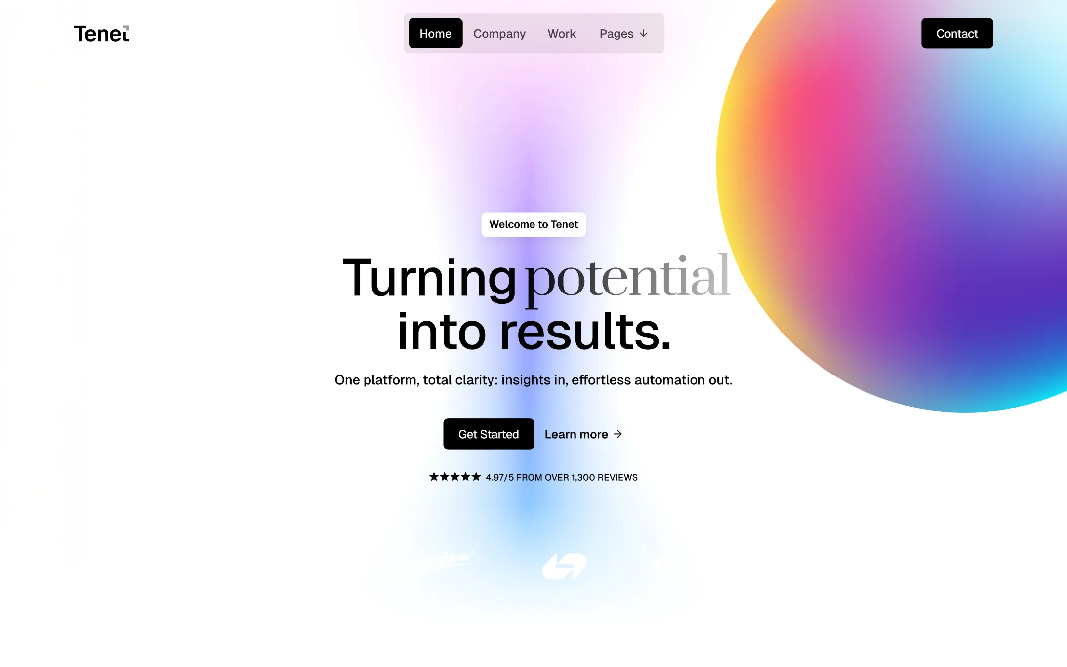
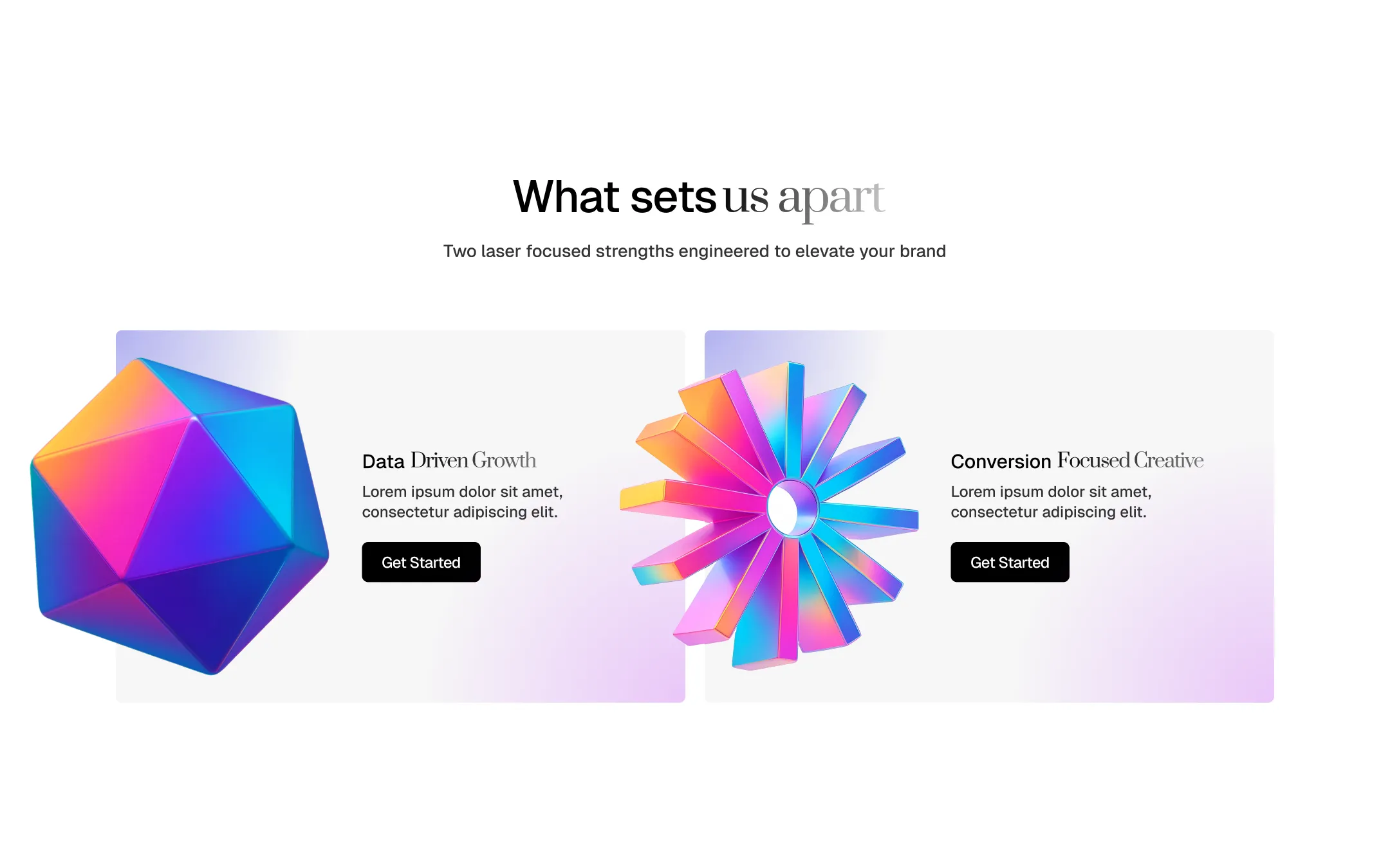
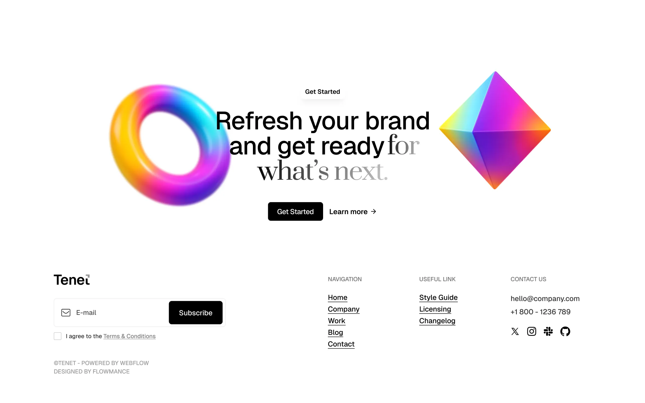
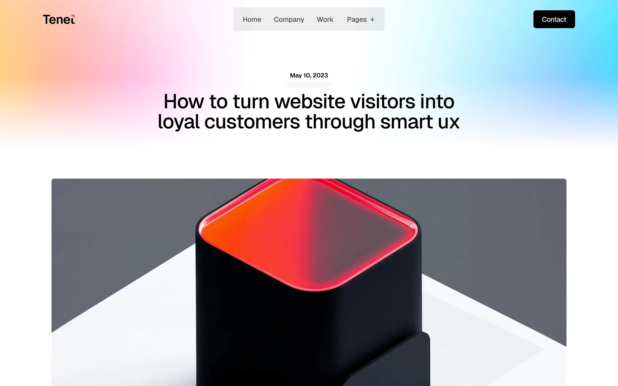
Tenet runs on an almost clinical white canvas, then detonates it with holographic gradient orbs and iridescent 3D brand objects — faceted icosahedrons, diamonds, and turbine shapes rendered in pink, violet, teal, and amber. Typography does the heavy lifting of personality: punchy black Geist sans-serif headlines collide mid-sentence with an elegant italic serif, creating a rhythm of confident statement, then poetic aside. Structural color stays deliberately restrained — near-black ink, a soft paper-gray surface, and pure white — so the gradient spheres and chrome 3D props feel like premium studio lighting rather than noise. This is an agency-positioning system: it wants to look like the team that's already three trends ahead. Cards are low-radius and quiet, buttons are solid black pills, and every page closes on the same gradient-orb CTA, reinforcing a singular, confident visual signature across Home, Company, Work, Blog, and Contact.
Secondary surface. Used for alternating sections, pricing tables, and gray cards.
Primary canvas. Base background for hero, sections, and card foregrounds.
Primary text & dark surface. Headlines, body copy, solid button fills, and dark panels.
Gradient coolness. Balances warm gradient tones in orbs, diamonds, and turbine shapes.
Soft accent button. Default (non-dark) button background for secondary CTAs.
Gradient warmth. Appears in hero sphere and diamond icon gradients for energetic contrast.
Tech accent. Used sparingly in iconography, link hovers, and data-driven UI moments.
Signature gradient hue. Core color in the holographic orbs and 3D brand objects.
Positive state. Reserved for success confirmations and growth-stat highlights.
The quick brown fox jumps
Primary UI and body typeface — headlines, navigation, buttons, paragraphs.
The quick brown fox jumps
Decorative italic accent — single words or clauses inside headlines (e.g. 'potential', 'us apart') for editorial contrast.
spacious1200px120px28px20px4px8px12px16px20px24px32px40px48px64px80px120pxpill30pxcards6pxsmall4pxcircle999pxbuttons6pxdropdown12pxStep from canvas (level 1) to lifted (level 2) to inset depth (level 3), then invert into the dark levels for full-bleed sections. Hex codes and roles live in the Colors section above; this ladder shows the layering only.
# Design System Guide

> Unlock the template to access the full design system.

## Brand voice

A short paragraph describing the brand voice, mood, and visual
principles that anchor the system. Tone, cadence, and intent.

## Colors

| Token        | Hex      | Role                                  |
| ------------ | -------- | ------------------------------------- |
| canvas-1     | #xxxxxx  | Page background, large surfaces       |
| canvas-2     | #xxxxxx  | Lifted surfaces, cards                |
| canvas-3     | #xxxxxx  | Inset wells, depressed states         |
| ink-1        | #xxxxxx  | Primary body text                     |
| ink-2        | #xxxxxx  | Secondary text, labels                |
| ink-3        | #xxxxxx  | Tertiary text, hints                  |
| accent-1     | #xxxxxx  | Primary brand accent                  |
| accent-2     | #xxxxxx  | Secondary accent                      |
| state-ok     | #xxxxxx  | Success, confirmations                |
| state-warn   | #xxxxxx  | Warnings                              |
| state-err    | #xxxxxx  | Errors, destructive actions           |

## Typography

- **Display** — heading scale, used for hero text and section titles.
- **Body** — primary reading text, optimized for paragraphs.
- **Mono** — code, data, and tabular numerals.

```
display: 32px / 40px / 48px / 64px / 80px
body:    14px / 16px / 18px
mono:    12px / 14px
```

## Spacing & shape

Base unit: 4px. Scale: 4, 8, 12, 16, 24, 32, 48, 64, 96, 128.
Radii: sm (4px), md (8px), lg (12px), xl (20px), full (9999px).

## Surfaces

Layered elevation from canvas → lifted → inset. Surfaces invert in
dark sections for full-bleed contrast.

## Do's and don'ts

- Do use accent-1 sparingly for primary CTAs only.
- Do maintain at least 4.5:1 contrast on body text.
- Don't mix display and body in the same line.
- Don't use state colors for branding.

## Agent prompt guide

Prompts for AI design tools that respect this system.
Includes example prompts for sections, components, and layouts.

# ...
Unlock the full style guide