Design systems, extracted.
Paste any URL to create a design system from it. Open any style for colors, type, spacing, components, and a DESIGN.md or tokens.json your agent can use.
Quickly navigate through the dashboard with your keyboard using the command menu.
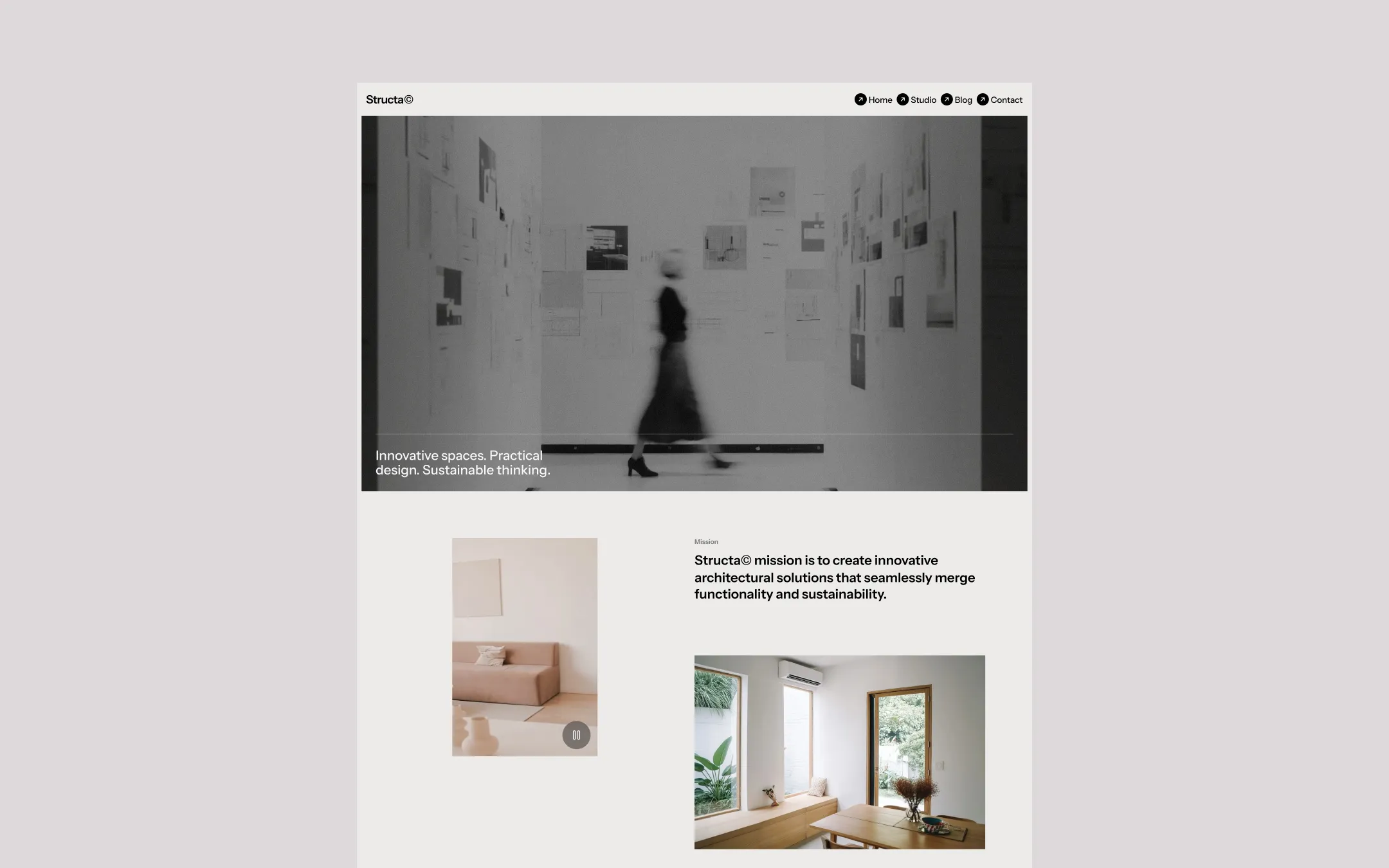
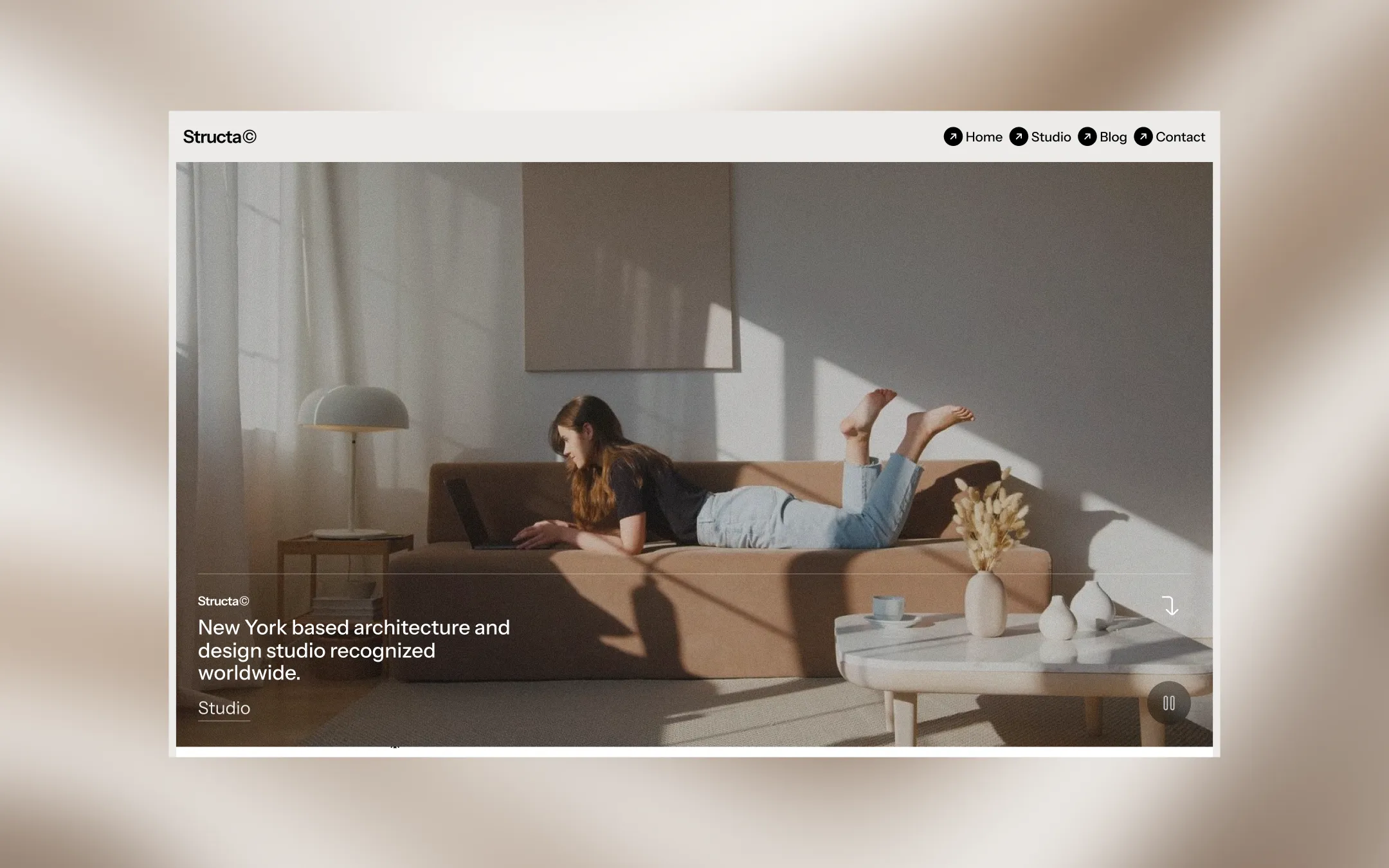
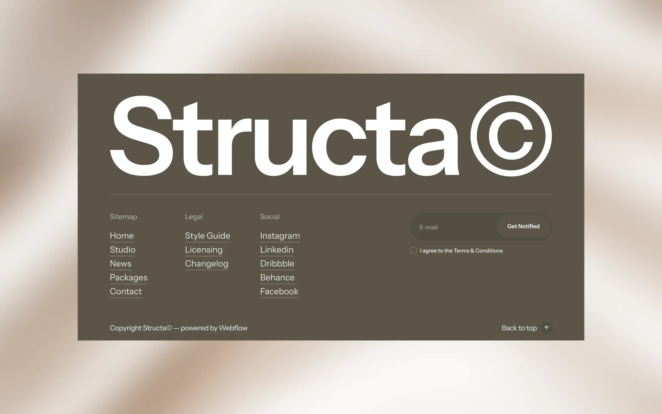
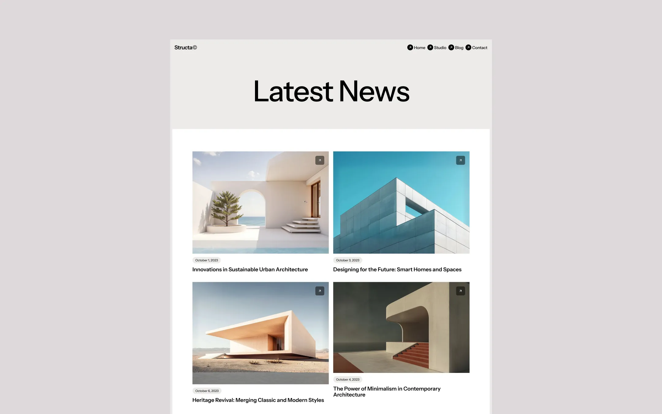
Structa© is a design system built for studios that treat presentation as an extension of the work itself. Warm taupe and umber neutrals ground the palette while crisp off-white canvases and stark white type let full-bleed architectural photography — coastal villas, arched interiors, sun-drenched facades — carry the emotional weight of every page. Typography leans on a confident grotesque for structure and a slender didone serif for editorial accents, producing a tone that is equal parts gallery catalogue and professional dossier. The system favors pill-shaped buttons, generous whitespace, and a sticky horizontal-scroll hero that behaves like a slow architectural walkthrough. A deep bark-brown footer closes every page with an oversized wordmark, acting as a firm, confident signature — deliberate, grounded, and unmistakably built for people who shape the built world.
Footer depth surface. Subscribe field fill and footer input backgrounds.
Lifted surface & reversed text. Cards, form fields, text over imagery.
Hairline separator. Section dividers and subtle rule lines.
Primary page canvas. Backs hero captions, body sections, and light surfaces.
Primary ink & dark surface. Headlines, nav icon circles, dark button fills.
Rare electric accent. Subscribe field text, interactive highlight moments.
Signature brand accent. Buttons, footer background, structural dividers.
Form focus state. Input borders and interactive focus rings.
The quick brown fox jumps
Editorial accent typeface — reserved for occasional expressive titles
The quick brown fox jumps
Primary UI & body typeface — navigation, headings, paragraphs, buttons
spacious1240px100px35px24px4px8px10px16px20px24px30px50px60px100px150pxbadge7pxcards7pxinputs30pxbuttons50pxtextarea15pxicon-circle9999pxStep from canvas (level 1) to lifted (level 2) to inset depth (level 3), then invert into the dark levels for full-bleed sections. Hex codes and roles live in the Colors section above; this ladder shows the layering only.
# Design System Guide

> Unlock the template to access the full design system.

## Brand voice

A short paragraph describing the brand voice, mood, and visual
principles that anchor the system. Tone, cadence, and intent.

## Colors

| Token        | Hex      | Role                                  |
| ------------ | -------- | ------------------------------------- |
| canvas-1     | #xxxxxx  | Page background, large surfaces       |
| canvas-2     | #xxxxxx  | Lifted surfaces, cards                |
| canvas-3     | #xxxxxx  | Inset wells, depressed states         |
| ink-1        | #xxxxxx  | Primary body text                     |
| ink-2        | #xxxxxx  | Secondary text, labels                |
| ink-3        | #xxxxxx  | Tertiary text, hints                  |
| accent-1     | #xxxxxx  | Primary brand accent                  |
| accent-2     | #xxxxxx  | Secondary accent                      |
| state-ok     | #xxxxxx  | Success, confirmations                |
| state-warn   | #xxxxxx  | Warnings                              |
| state-err    | #xxxxxx  | Errors, destructive actions           |

## Typography

- **Display** — heading scale, used for hero text and section titles.
- **Body** — primary reading text, optimized for paragraphs.
- **Mono** — code, data, and tabular numerals.

```
display: 32px / 40px / 48px / 64px / 80px
body:    14px / 16px / 18px
mono:    12px / 14px
```

## Spacing & shape

Base unit: 4px. Scale: 4, 8, 12, 16, 24, 32, 48, 64, 96, 128.
Radii: sm (4px), md (8px), lg (12px), xl (20px), full (9999px).

## Surfaces

Layered elevation from canvas → lifted → inset. Surfaces invert in
dark sections for full-bleed contrast.

## Do's and don'ts

- Do use accent-1 sparingly for primary CTAs only.
- Do maintain at least 4.5:1 contrast on body text.
- Don't mix display and body in the same line.
- Don't use state colors for branding.

## Agent prompt guide

Prompts for AI design tools that respect this system.
Includes example prompts for sections, components, and layouts.

# ...
Unlock the full style guide