Design systems, extracted.
Paste any URL to create a design system from it. Open any style for colors, type, spacing, components, and a DESIGN.md or tokens.json your agent can use.
Quickly navigate through the dashboard with your keyboard using the command menu.
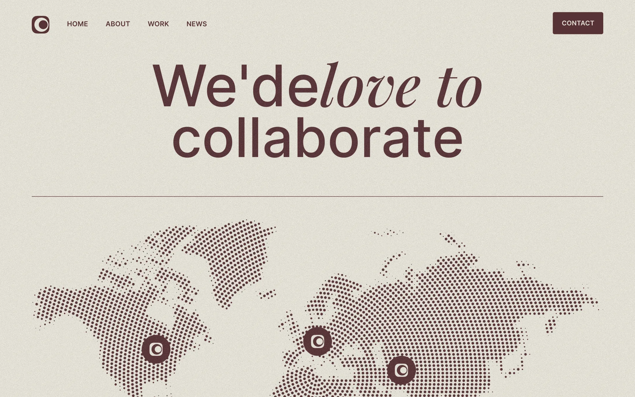
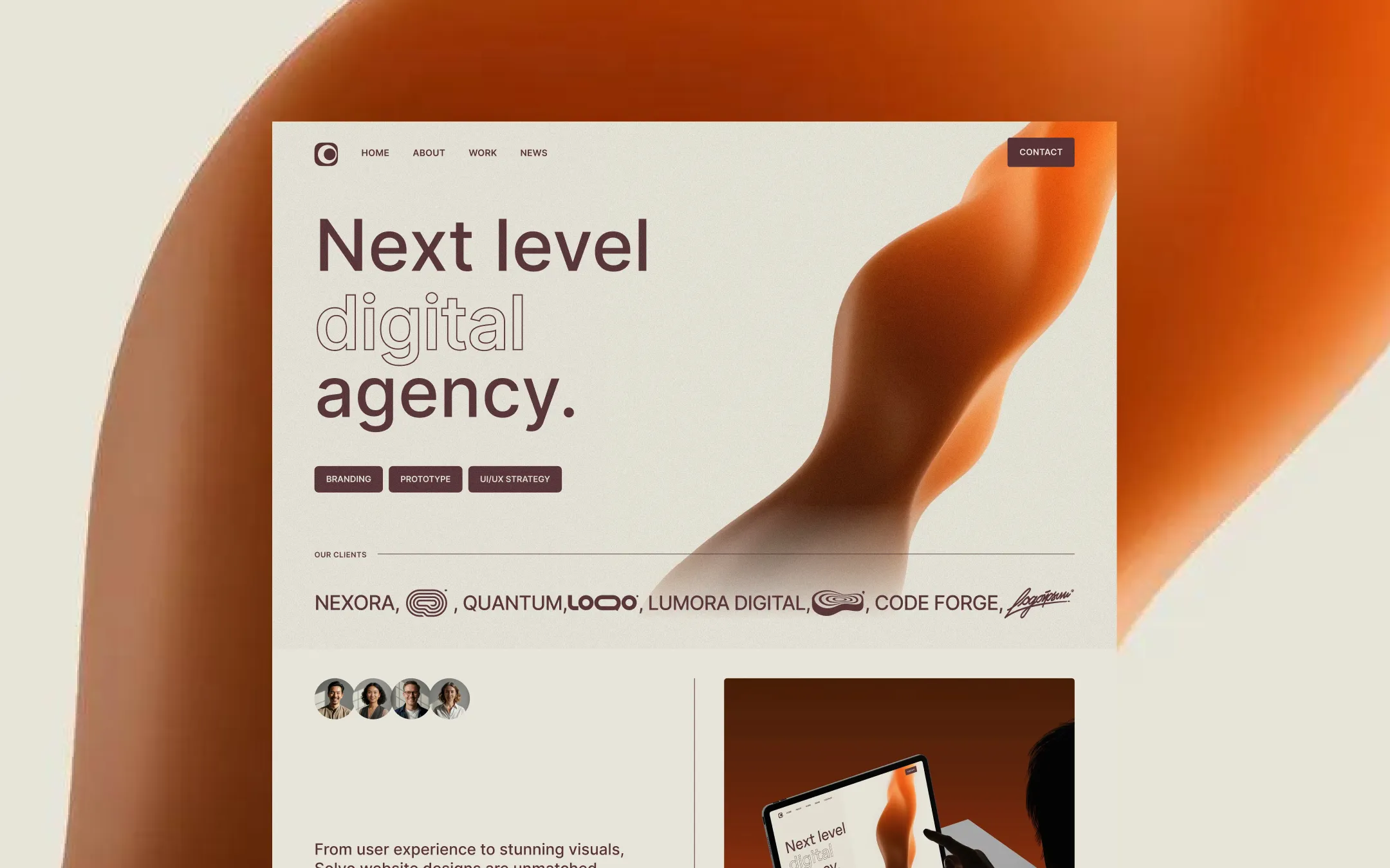
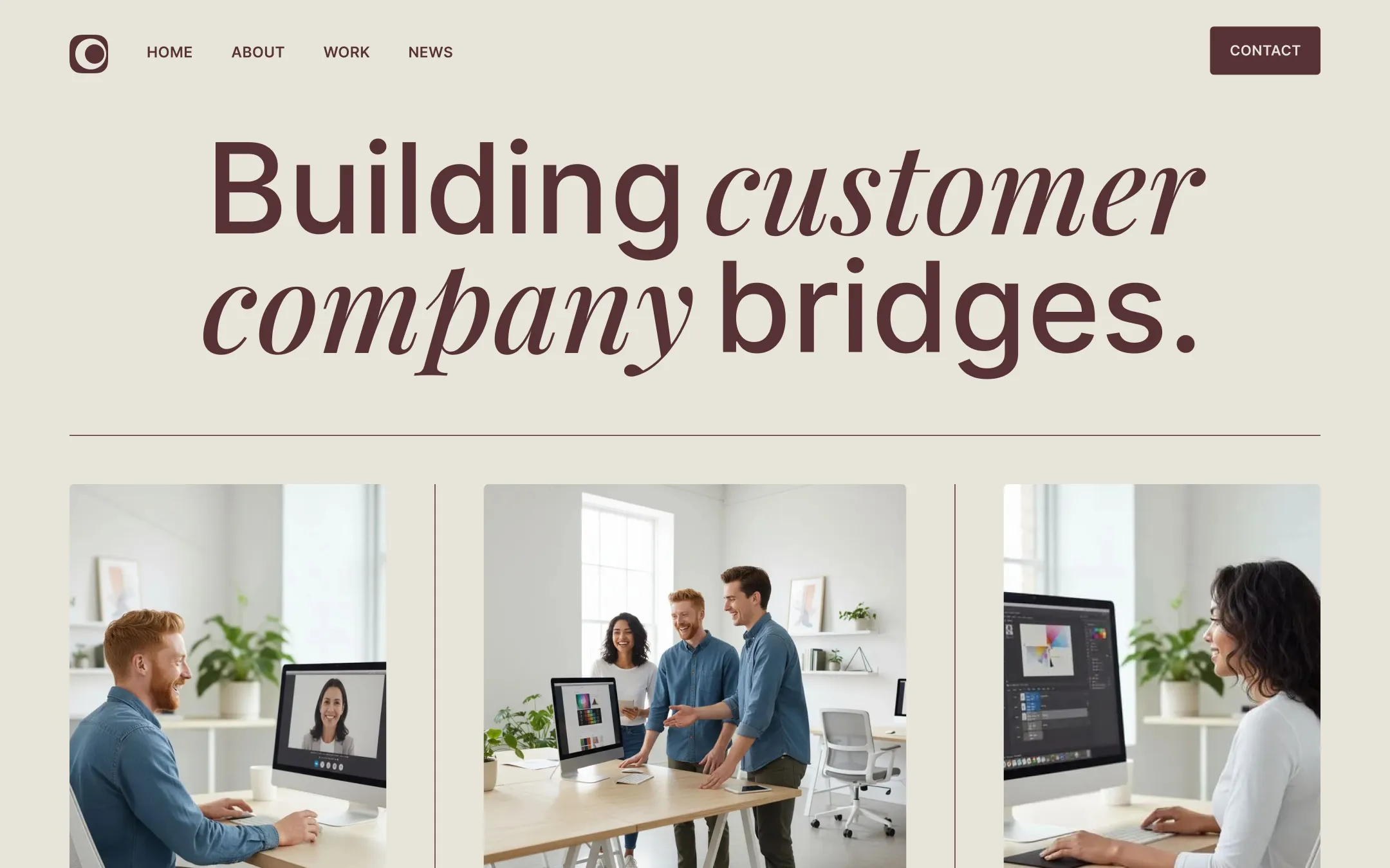
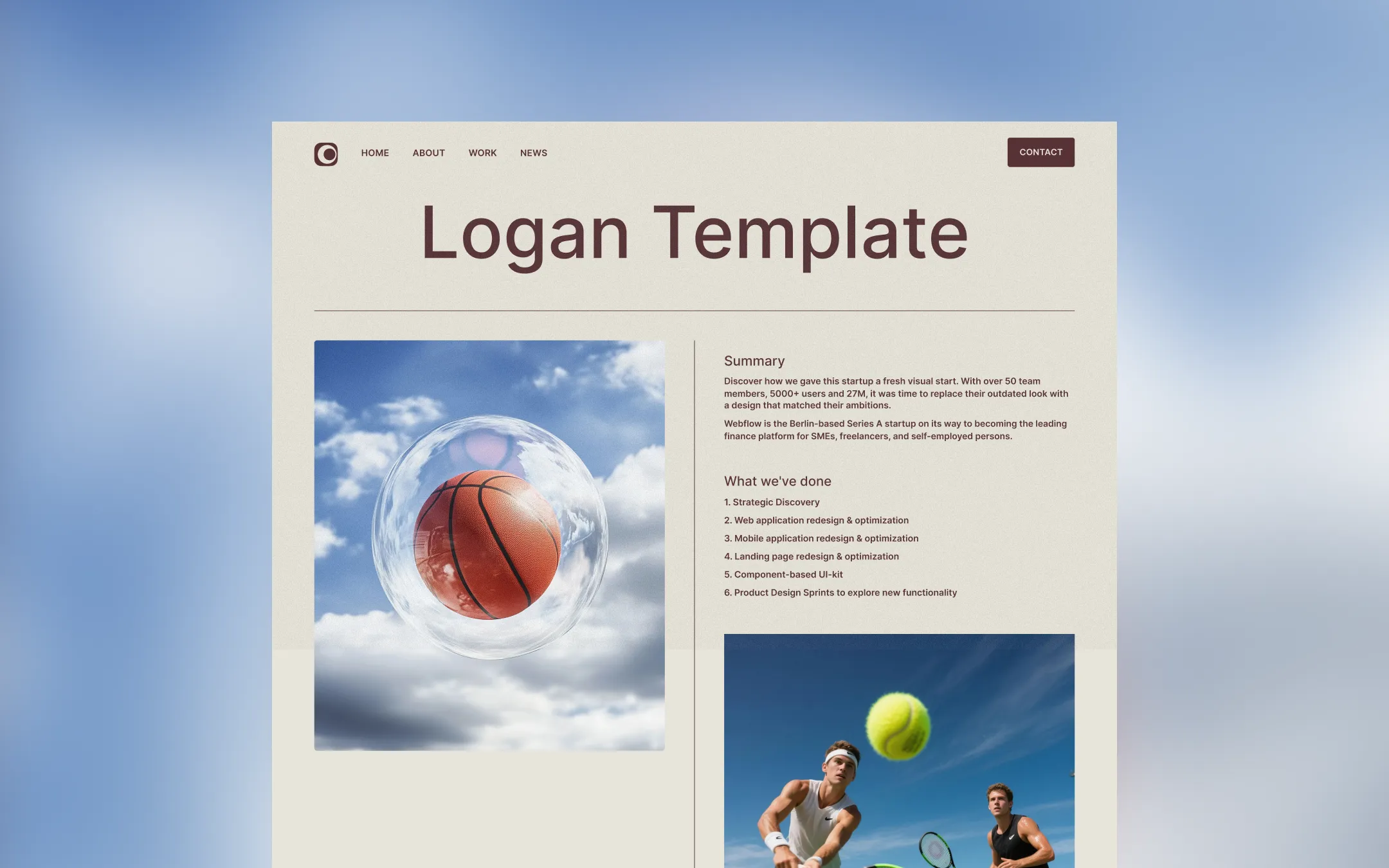
Solvo is a warm, editorial design system for agencies that treat their own site as a flagship portfolio piece. Cream and wheat backgrounds ground every page while deep plum-red ink carries all type, giving the studio a confident, bookish warmth rather than cold corporate neutrality. Display type pairs an upright grotesk with sweeping italic Playfair Display script, so headlines read like a magazine pull-quote — 'We'de *love to* collaborate.' Vivid colour-blocked project imagery in burnt orange, violet, and cobalt punctuates the restrained palette, making the work grid and hero visuals feel curated against the neutral canvas. Thin hairline rules, dotted halftone world maps, and looping video portrait cards add tactile texture without ever breaking the quiet, considered rhythm of the layout.
Cool lifted surface. Occasional light panel and form background contrast.
Primary page background. Used behind nearly every section, nav, and card.
Hover surface. Button hover background, keeping contrast soft against wheat.
Primary text & ink. Headlines, body copy, button fills, borders, and hairline rules.
Muted utility tone. Secondary labels and disabled states.
Deepest ink. Reserved for maximum-contrast overlays and dark UI accents.
Secondary project accent. Alternates with clay and cobalt across work-grid tiles.
Tertiary project accent. Cool counterpoint used in the work grid and badges.
Signature accent. Hero gradients, blob shapes, colour-blocked project thumbnails.
Interaction utility. Cursor-hover badge dot and live-state micro-signals only.
The quick brown fox jumps
Primary UI and body typeface — navigation, paragraphs, labels, buttons.
The quick brown fox jumps
Editorial display accent — italic words inside headlines for warmth and contrast.
comfortable1400px100px40px30px10px20px30px40px50px100pxcards5pxsmall3pxbadges7pxbuttons4pxcircle-button9999pxStep from canvas (level 1) to lifted (level 2) to inset depth (level 3), then invert into the dark levels for full-bleed sections. Hex codes and roles live in the Colors section above; this ladder shows the layering only.
# Design System Guide

> Unlock the template to access the full design system.

## Brand voice

A short paragraph describing the brand voice, mood, and visual
principles that anchor the system. Tone, cadence, and intent.

## Colors

| Token        | Hex      | Role                                  |
| ------------ | -------- | ------------------------------------- |
| canvas-1     | #xxxxxx  | Page background, large surfaces       |
| canvas-2     | #xxxxxx  | Lifted surfaces, cards                |
| canvas-3     | #xxxxxx  | Inset wells, depressed states         |
| ink-1        | #xxxxxx  | Primary body text                     |
| ink-2        | #xxxxxx  | Secondary text, labels                |
| ink-3        | #xxxxxx  | Tertiary text, hints                  |
| accent-1     | #xxxxxx  | Primary brand accent                  |
| accent-2     | #xxxxxx  | Secondary accent                      |
| state-ok     | #xxxxxx  | Success, confirmations                |
| state-warn   | #xxxxxx  | Warnings                              |
| state-err    | #xxxxxx  | Errors, destructive actions           |

## Typography

- **Display** — heading scale, used for hero text and section titles.
- **Body** — primary reading text, optimized for paragraphs.
- **Mono** — code, data, and tabular numerals.

```
display: 32px / 40px / 48px / 64px / 80px
body:    14px / 16px / 18px
mono:    12px / 14px
```

## Spacing & shape

Base unit: 4px. Scale: 4, 8, 12, 16, 24, 32, 48, 64, 96, 128.
Radii: sm (4px), md (8px), lg (12px), xl (20px), full (9999px).

## Surfaces

Layered elevation from canvas → lifted → inset. Surfaces invert in
dark sections for full-bleed contrast.

## Do's and don'ts

- Do use accent-1 sparingly for primary CTAs only.
- Do maintain at least 4.5:1 contrast on body text.
- Don't mix display and body in the same line.
- Don't use state colors for branding.

## Agent prompt guide

Prompts for AI design tools that respect this system.
Includes example prompts for sections, components, and layouts.

# ...
Unlock the full style guide