Design systems, extracted.
Paste any URL to create a design system from it. Open any style for colors, type, spacing, components, and a DESIGN.md or tokens.json your agent can use.
Quickly navigate through the dashboard with your keyboard using the command menu.
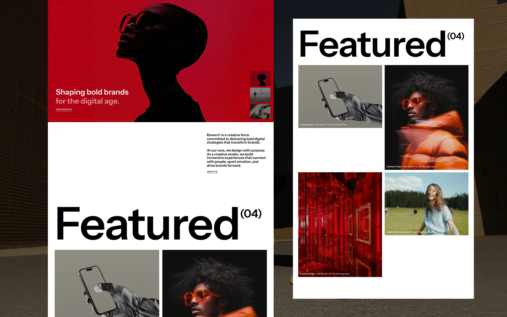
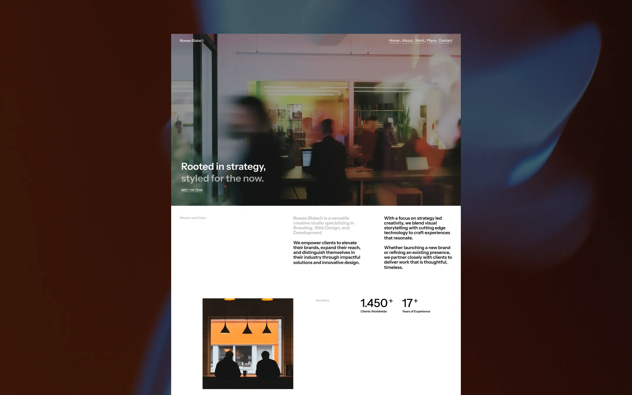
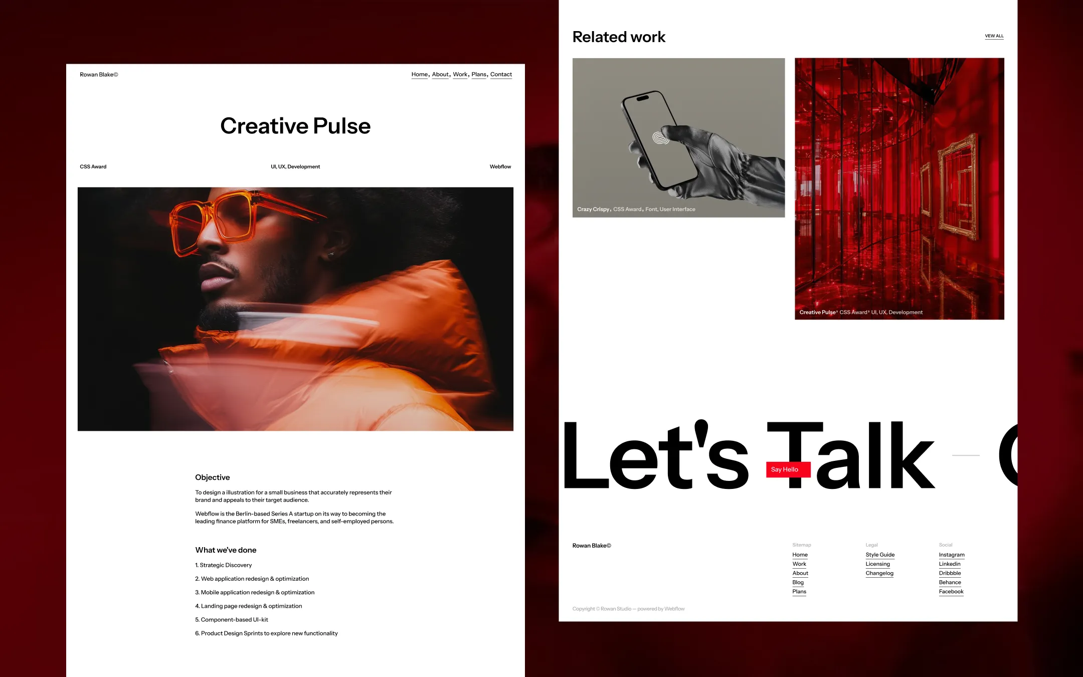
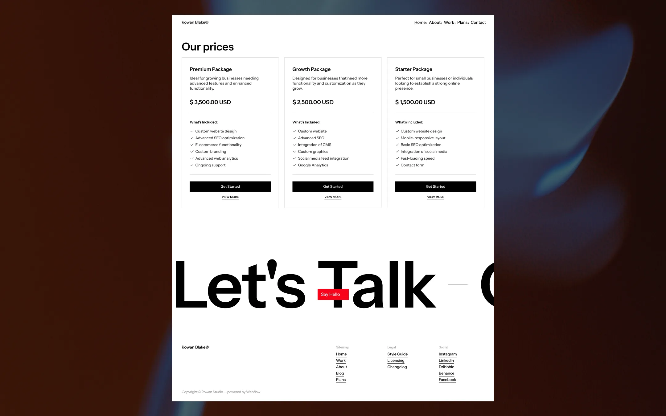
Rowan Blake runs on an unapologetically stark foundation — a white canvas, razor-black uppercase type, and a single signal-red accent that appears only when it matters: hover states, the subscribe button, the 'Say Hello' tab. Every page opens with a full-bleed video or photo hero, letting silhouettes, neon-lit portraits, and motion-blurred fashion do the emotional work while the UI itself stays quiet and structural. The layout leans on oversized display type (the "Featured(04)" treatment) as a graphic device as much as a heading, paired with tight, matter-of-fact body copy and a credibility wall of award-badged project cards. It's a studio-credential aesthetic: confident, monochrome-first, with color used like a signature rather than a palette.
Subtle block headers & card backgrounds
Page canvas
Hairline dividers & borders
Primary text & ink
Muted body text on dark surfaces
Hero image/video darkening overlay
Secondary accent, hover states
Accent & call-to-action punctuation
Imagery-driven warm accent
The quick brown fox jumps
Primary UI, body copy, navigation, forms
The quick brown fox jumps
Oversized display headlines, marquee text, big statement type
comfortable1440px70px35px25px5px10px15px20px25px30px40px50px70px100px120pxcards0pxmedia0pxpills0pxbuttons0pxicon-circle0pxStep from canvas (level 1) to lifted (level 2) to inset depth (level 3), then invert into the dark levels for full-bleed sections. Hex codes and roles live in the Colors section above; this ladder shows the layering only.
# Design System Guide

> Unlock the template to access the full design system.

## Brand voice

A short paragraph describing the brand voice, mood, and visual
principles that anchor the system. Tone, cadence, and intent.

## Colors

| Token        | Hex      | Role                                  |
| ------------ | -------- | ------------------------------------- |
| canvas-1     | #xxxxxx  | Page background, large surfaces       |
| canvas-2     | #xxxxxx  | Lifted surfaces, cards                |
| canvas-3     | #xxxxxx  | Inset wells, depressed states         |
| ink-1        | #xxxxxx  | Primary body text                     |
| ink-2        | #xxxxxx  | Secondary text, labels                |
| ink-3        | #xxxxxx  | Tertiary text, hints                  |
| accent-1     | #xxxxxx  | Primary brand accent                  |
| accent-2     | #xxxxxx  | Secondary accent                      |
| state-ok     | #xxxxxx  | Success, confirmations                |
| state-warn   | #xxxxxx  | Warnings                              |
| state-err    | #xxxxxx  | Errors, destructive actions           |

## Typography

- **Display** — heading scale, used for hero text and section titles.
- **Body** — primary reading text, optimized for paragraphs.
- **Mono** — code, data, and tabular numerals.

```
display: 32px / 40px / 48px / 64px / 80px
body:    14px / 16px / 18px
mono:    12px / 14px
```

## Spacing & shape

Base unit: 4px. Scale: 4, 8, 12, 16, 24, 32, 48, 64, 96, 128.
Radii: sm (4px), md (8px), lg (12px), xl (20px), full (9999px).

## Surfaces

Layered elevation from canvas → lifted → inset. Surfaces invert in
dark sections for full-bleed contrast.

## Do's and don'ts

- Do use accent-1 sparingly for primary CTAs only.
- Do maintain at least 4.5:1 contrast on body text.
- Don't mix display and body in the same line.
- Don't use state colors for branding.

## Agent prompt guide

Prompts for AI design tools that respect this system.
Includes example prompts for sections, components, and layouts.

# ...
Unlock the full style guide