Design systems, extracted.
Paste any URL to create a design system from it. Open any style for colors, type, spacing, components, and a DESIGN.md or tokens.json your agent can use.
Quickly navigate through the dashboard with your keyboard using the command menu.
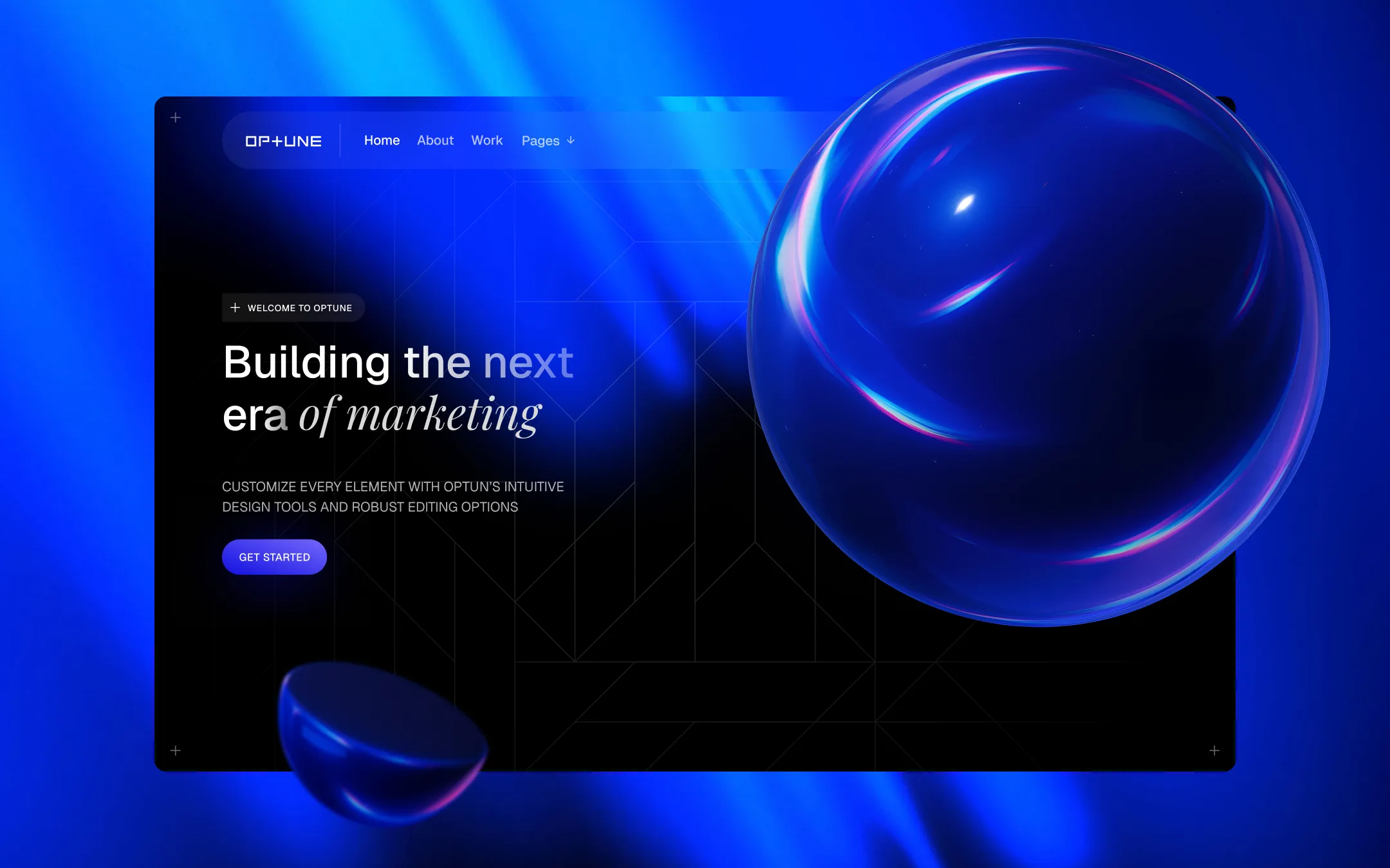
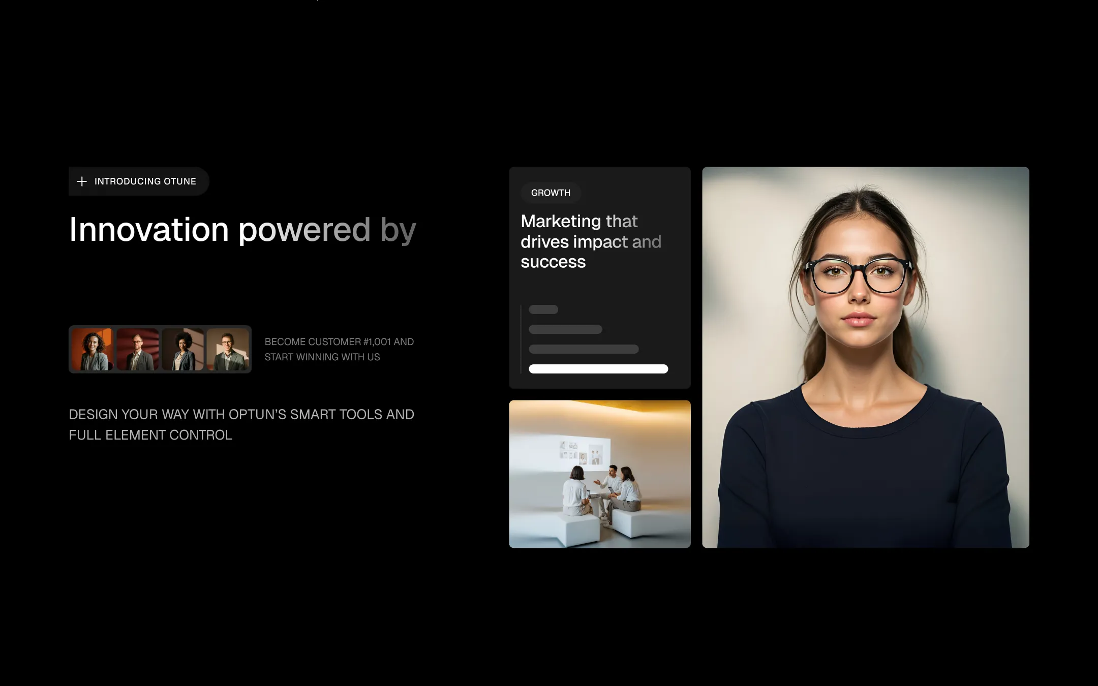
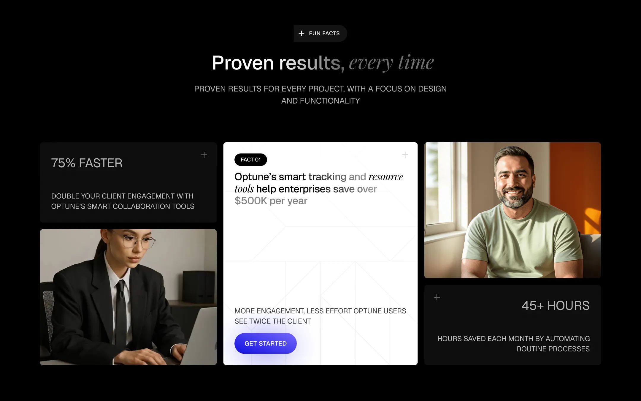
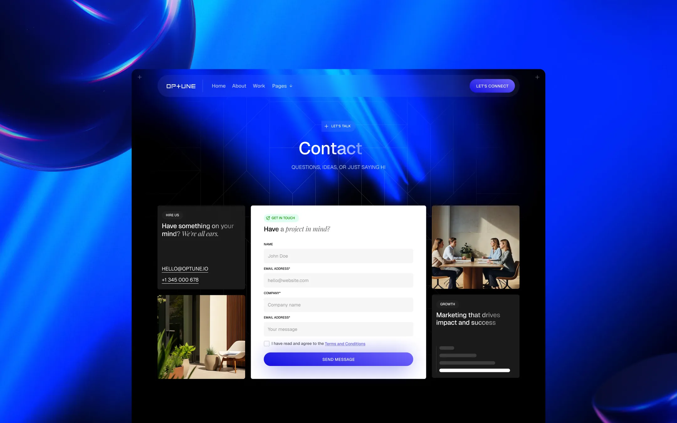
Optune is a deep-space agency template where near-black canvases meet electric cobalt light. Glassmorphic cards hover above a void of ink and indigo, their frosted blur catching glints of blue like light refracted through glass spheres — an aesthetic signature echoed literally in the hero's iridescent orb imagery. Typography pairs a crisp grotesque sans for structure and labels with an elegant italic serif for emotive emphasis, giving every headline a spoken cadence: bold word, soft aside. The system is built for confident, data-forward storytelling — stat cards, glowing pill buttons, and uppercase micro-labels create a dashboard-like rhythm that feels equal parts creative studio and growth platform. White surfaces appear sparingly as high-contrast punctuation (pricing cards, testimonial panels, the final CTA) against an otherwise ink-black, blue-lit world.
Light neutral surface. Alternate pricing card and form field backgrounds.
Primary canvas. Base background for hero, sections, and footer.
Glass surface tint. Backdrop-blur cards, nav pill, and glassmorphic panels over dark backgrounds.
Secondary text. Subheads and supporting copy at reduced opacity on dark surfaces.
Primary text & light surfaces. Headlines, body copy on dark, and lifted white cards.
Secondary accent. Gradient endpoint on primary buttons and hover states.
Primary brand accent. Button gradients, glowing CTA shadows, gradient overlays.
Success state. Positive status indicators and confirmation accents.
The quick brown fox jumps
Primary UI and body typeface. Headlines, labels, navigation, buttons.
The quick brown fox jumps
Emphasis typeface. Italic accent words within headlines for emotive contrast.
comfortable1260px120px30px20px10px15px20px30px40px50px60px70px80px90px100px150px200pxcards6.4pxsmall10pxbadges7pxbuttons50pxnavigation100pxStep from canvas (level 1) to lifted (level 2) to inset depth (level 3), then invert into the dark levels for full-bleed sections. Hex codes and roles live in the Colors section above; this ladder shows the layering only.
# Design System Guide

> Unlock the template to access the full design system.

## Brand voice

A short paragraph describing the brand voice, mood, and visual
principles that anchor the system. Tone, cadence, and intent.

## Colors

| Token        | Hex      | Role                                  |
| ------------ | -------- | ------------------------------------- |
| canvas-1     | #xxxxxx  | Page background, large surfaces       |
| canvas-2     | #xxxxxx  | Lifted surfaces, cards                |
| canvas-3     | #xxxxxx  | Inset wells, depressed states         |
| ink-1        | #xxxxxx  | Primary body text                     |
| ink-2        | #xxxxxx  | Secondary text, labels                |
| ink-3        | #xxxxxx  | Tertiary text, hints                  |
| accent-1     | #xxxxxx  | Primary brand accent                  |
| accent-2     | #xxxxxx  | Secondary accent                      |
| state-ok     | #xxxxxx  | Success, confirmations                |
| state-warn   | #xxxxxx  | Warnings                              |
| state-err    | #xxxxxx  | Errors, destructive actions           |

## Typography

- **Display** — heading scale, used for hero text and section titles.
- **Body** — primary reading text, optimized for paragraphs.
- **Mono** — code, data, and tabular numerals.

```
display: 32px / 40px / 48px / 64px / 80px
body:    14px / 16px / 18px
mono:    12px / 14px
```

## Spacing & shape

Base unit: 4px. Scale: 4, 8, 12, 16, 24, 32, 48, 64, 96, 128.
Radii: sm (4px), md (8px), lg (12px), xl (20px), full (9999px).

## Surfaces

Layered elevation from canvas → lifted → inset. Surfaces invert in
dark sections for full-bleed contrast.

## Do's and don'ts

- Do use accent-1 sparingly for primary CTAs only.
- Do maintain at least 4.5:1 contrast on body text.
- Don't mix display and body in the same line.
- Don't use state colors for branding.

## Agent prompt guide

Prompts for AI design tools that respect this system.
Includes example prompts for sections, components, and layouts.

# ...
Unlock the full style guide