Design systems, extracted.
Paste any URL to create a design system from it. Open any style for colors, type, spacing, components, and a DESIGN.md or tokens.json your agent can use.
Quickly navigate through the dashboard with your keyboard using the command menu.
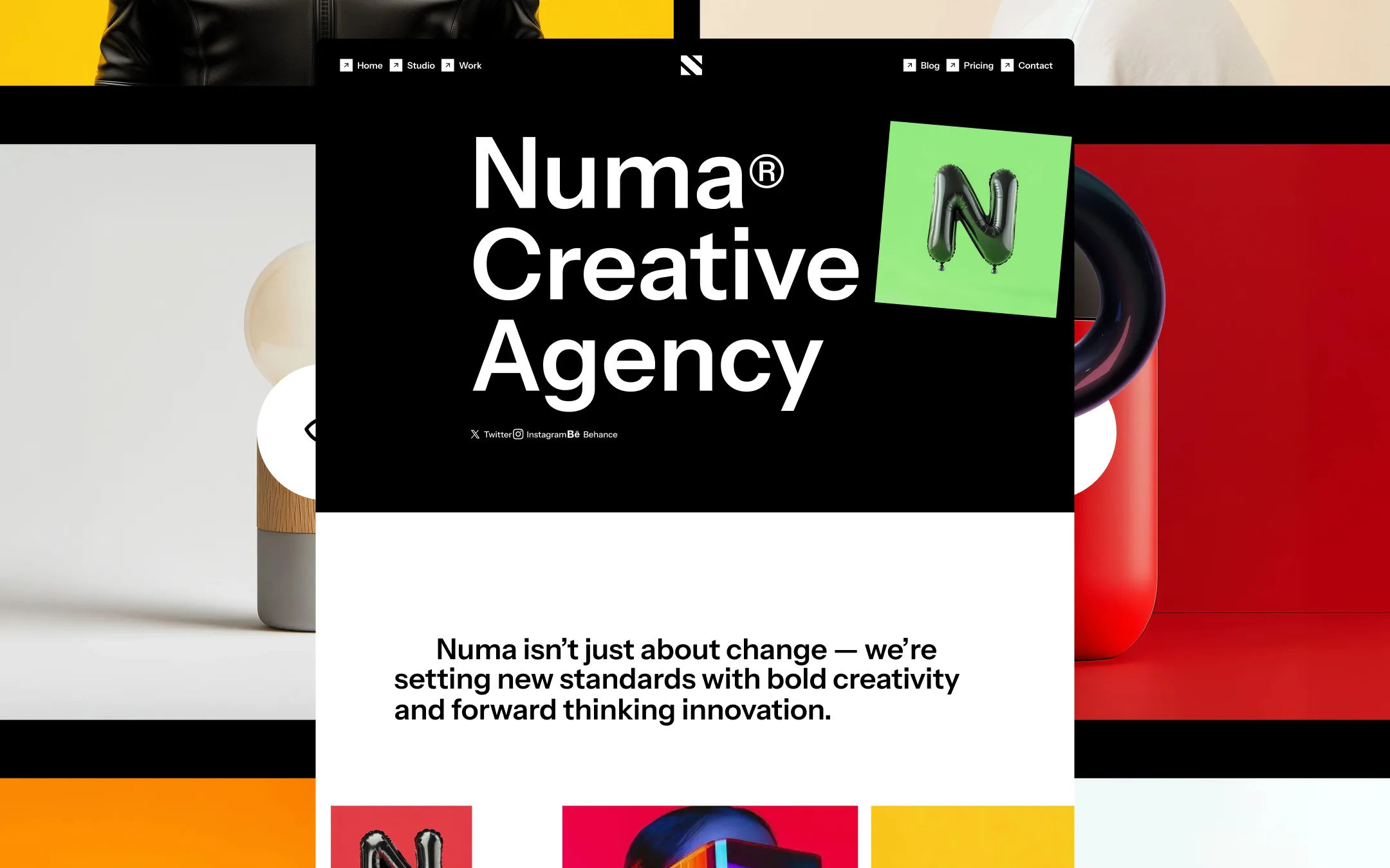
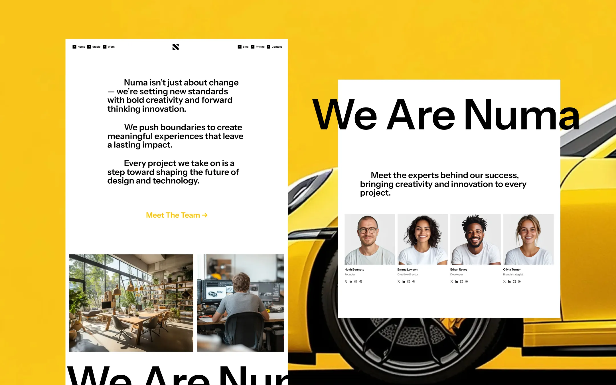
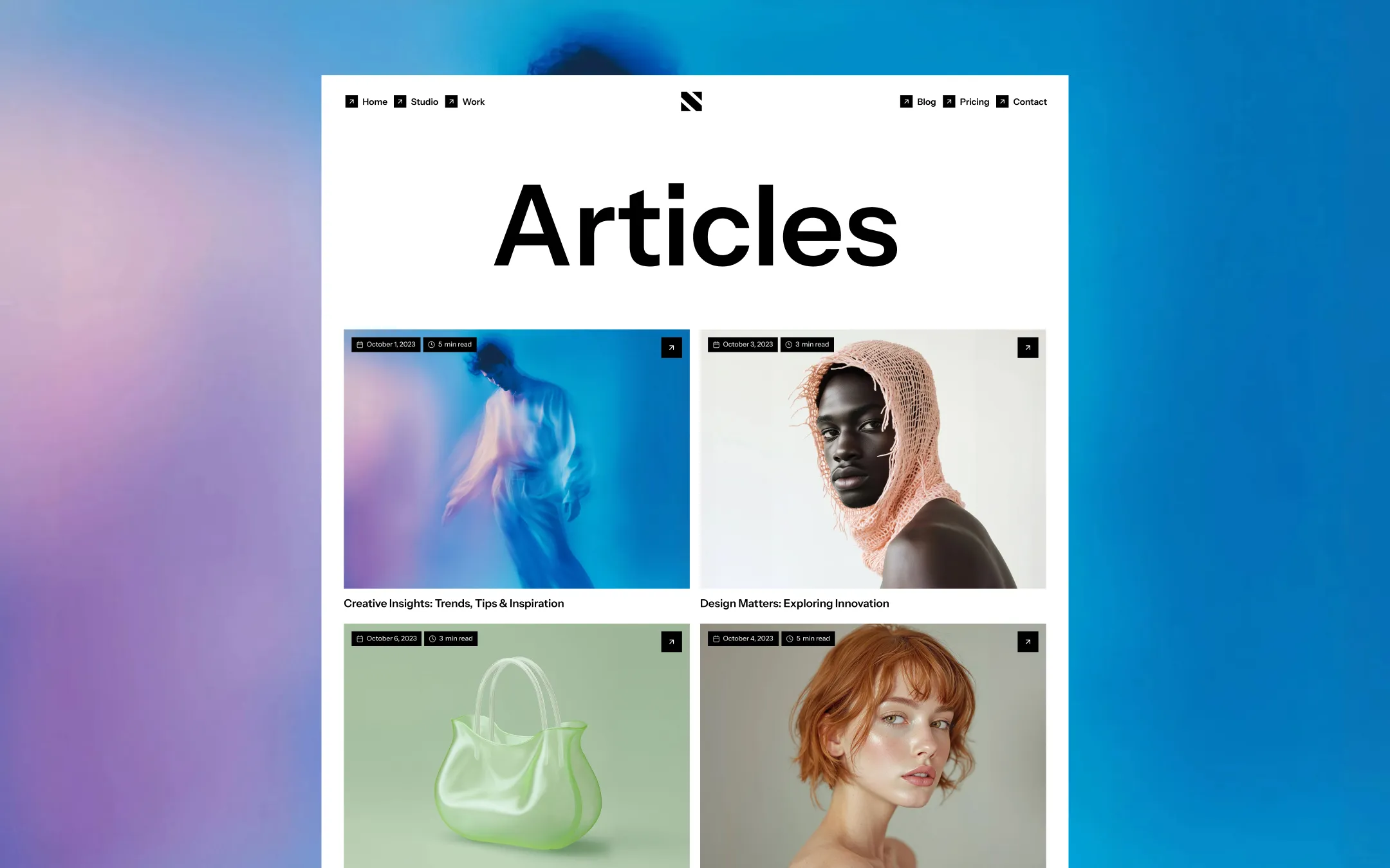
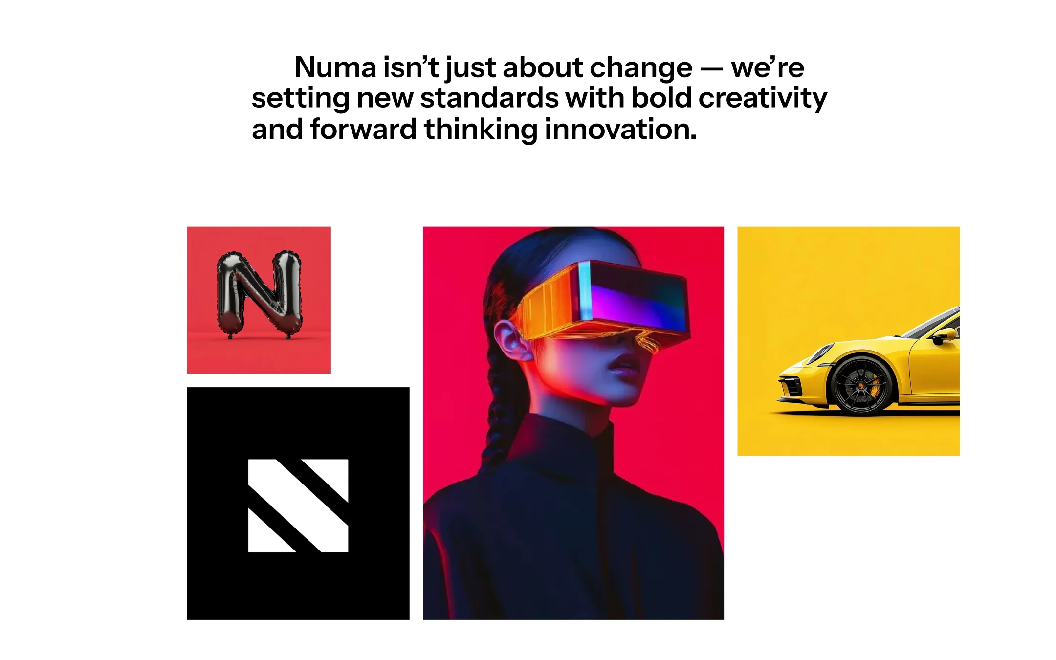
Nord runs on a stark black-and-white foundation that behaves like a gallery wall — pure white sections with heavyweight black type let the work do the shouting, while an inverted black hero and footer bookend each page like velvet curtains. The brand voice is maximalist-minimalist: huge, compressed Instrument Sans display type sits beside tiny uppercase micro-labels, and the only chromatic accent — a hot orange-red — is reserved for interactive cues and CTA text, so it reads as a signature rather than a decoration. Colour in Nord lives almost entirely in the photography and video content (yellow leather, red ceramics, teal gradients) rather than in the UI chrome itself, which stays disciplined in black, white, and warm greys. This restraint is what makes the colour-blocked project imagery explode off the page — the system is a frame built specifically to let bold client work be the loudest thing in the room.
Lifted surface, subtle fills
Base canvas
Dividers and borders
Muted body text on dark surfaces
Primary ink & dark surface
Default button fill
Button hover state
Hover state for lifted surfaces
Interactive accent & link text
The quick brown fox jumps
Primary typeface for all headings, body copy, and UI
The quick brown fox jumps
Rare condensed display use (password/utility screens)
spacious1440px150px35px25px5px10px15px20px25px35px50px70px100px150px220px300pxcards20pxsmall6pxcircle9999pxbuttons10pxwork-cards20pxtestimonials25pxpricing-cards15pxStep from canvas (level 1) to lifted (level 2) to inset depth (level 3), then invert into the dark levels for full-bleed sections. Hex codes and roles live in the Colors section above; this ladder shows the layering only.
# Design System Guide

> Unlock the template to access the full design system.

## Brand voice

A short paragraph describing the brand voice, mood, and visual
principles that anchor the system. Tone, cadence, and intent.

## Colors

| Token        | Hex      | Role                                  |
| ------------ | -------- | ------------------------------------- |
| canvas-1     | #xxxxxx  | Page background, large surfaces       |
| canvas-2     | #xxxxxx  | Lifted surfaces, cards                |
| canvas-3     | #xxxxxx  | Inset wells, depressed states         |
| ink-1        | #xxxxxx  | Primary body text                     |
| ink-2        | #xxxxxx  | Secondary text, labels                |
| ink-3        | #xxxxxx  | Tertiary text, hints                  |
| accent-1     | #xxxxxx  | Primary brand accent                  |
| accent-2     | #xxxxxx  | Secondary accent                      |
| state-ok     | #xxxxxx  | Success, confirmations                |
| state-warn   | #xxxxxx  | Warnings                              |
| state-err    | #xxxxxx  | Errors, destructive actions           |

## Typography

- **Display** — heading scale, used for hero text and section titles.
- **Body** — primary reading text, optimized for paragraphs.
- **Mono** — code, data, and tabular numerals.

```
display: 32px / 40px / 48px / 64px / 80px
body:    14px / 16px / 18px
mono:    12px / 14px
```

## Spacing & shape

Base unit: 4px. Scale: 4, 8, 12, 16, 24, 32, 48, 64, 96, 128.
Radii: sm (4px), md (8px), lg (12px), xl (20px), full (9999px).

## Surfaces

Layered elevation from canvas → lifted → inset. Surfaces invert in
dark sections for full-bleed contrast.

## Do's and don'ts

- Do use accent-1 sparingly for primary CTAs only.
- Do maintain at least 4.5:1 contrast on body text.
- Don't mix display and body in the same line.
- Don't use state colors for branding.

## Agent prompt guide

Prompts for AI design tools that respect this system.
Includes example prompts for sections, components, and layouts.

# ...
Unlock the full style guide