Design systems, extracted.
Paste any URL to create a design system from it. Open any style for colors, type, spacing, components, and a DESIGN.md or tokens.json your agent can use.
Quickly navigate through the dashboard with your keyboard using the command menu.
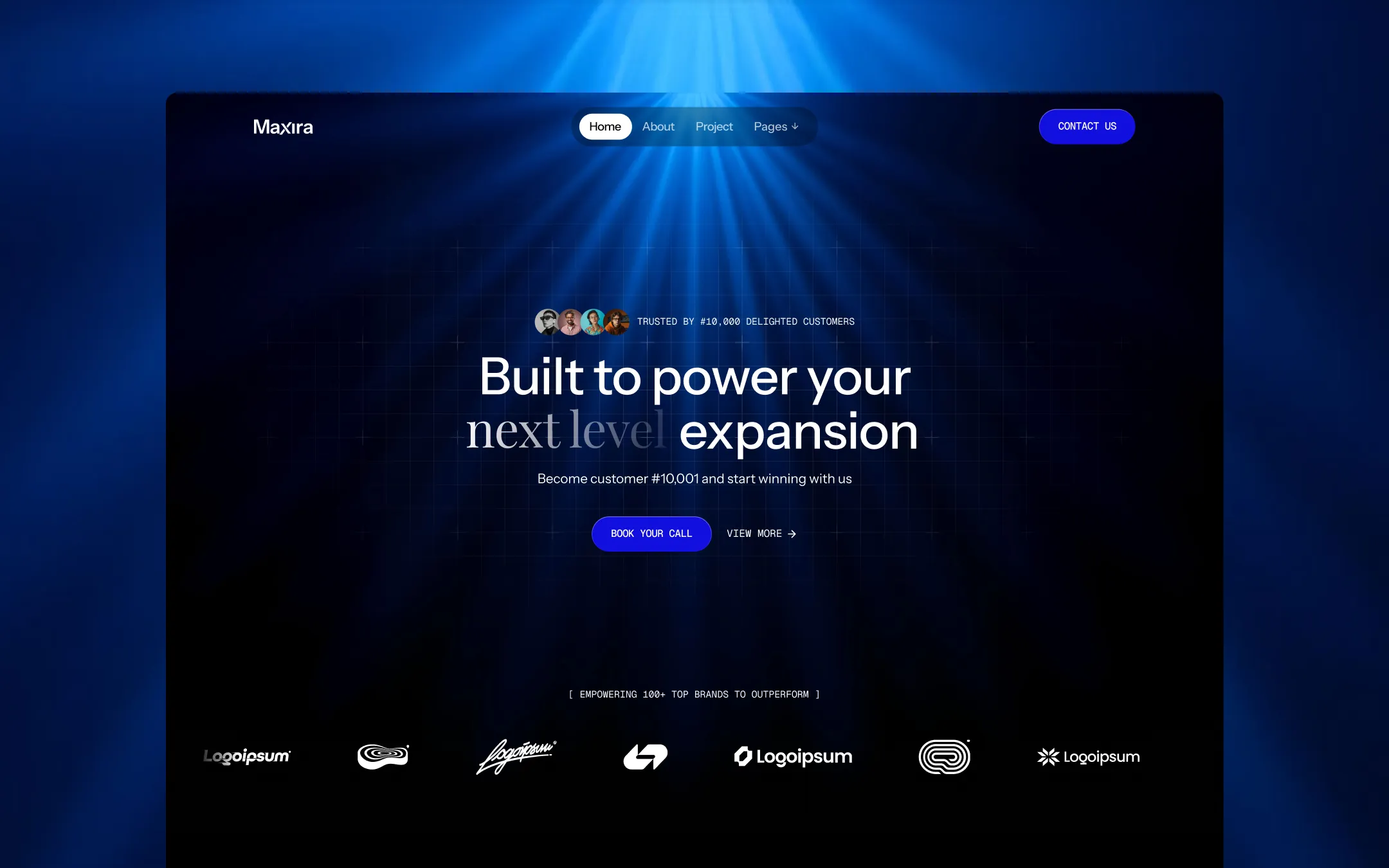
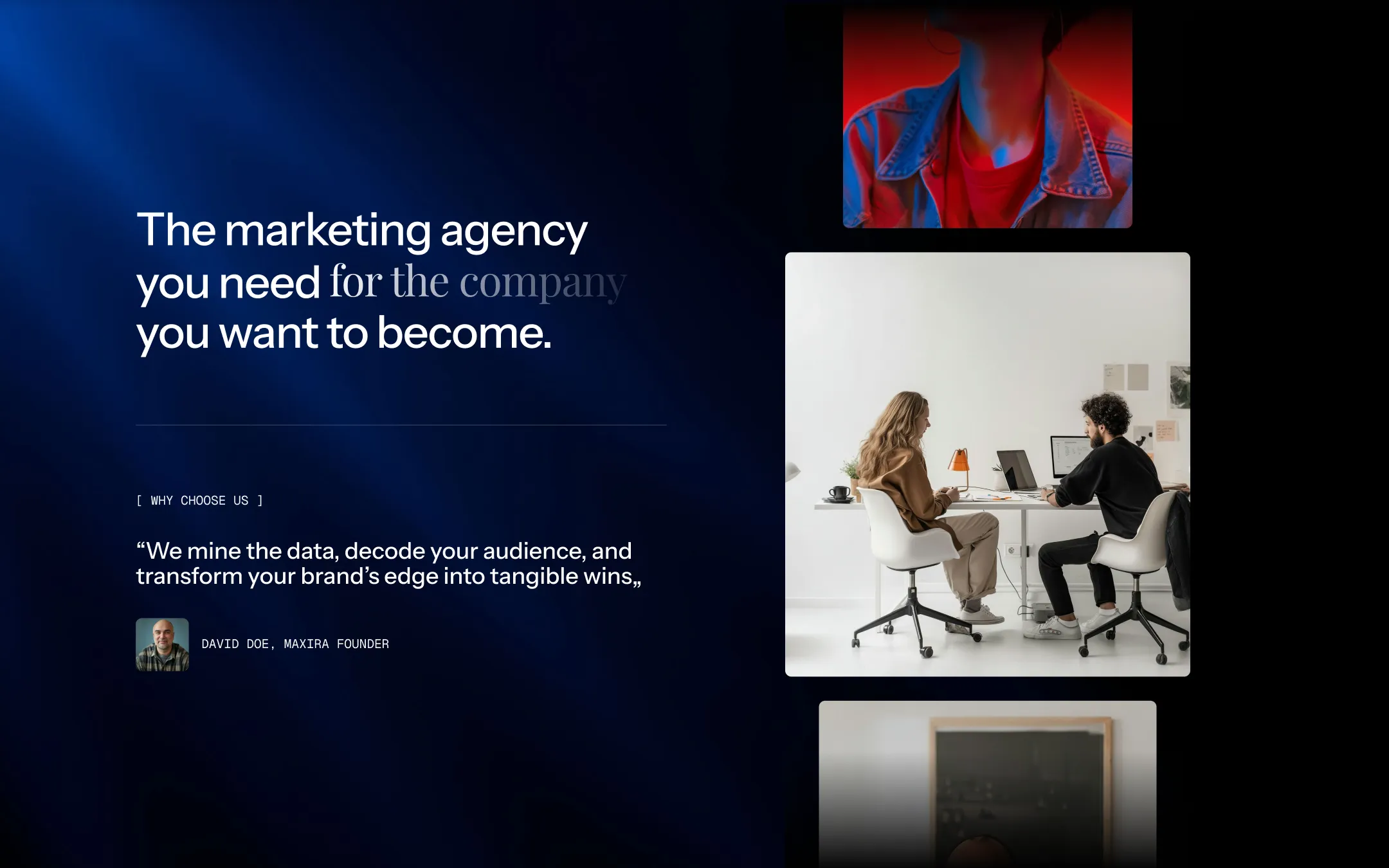
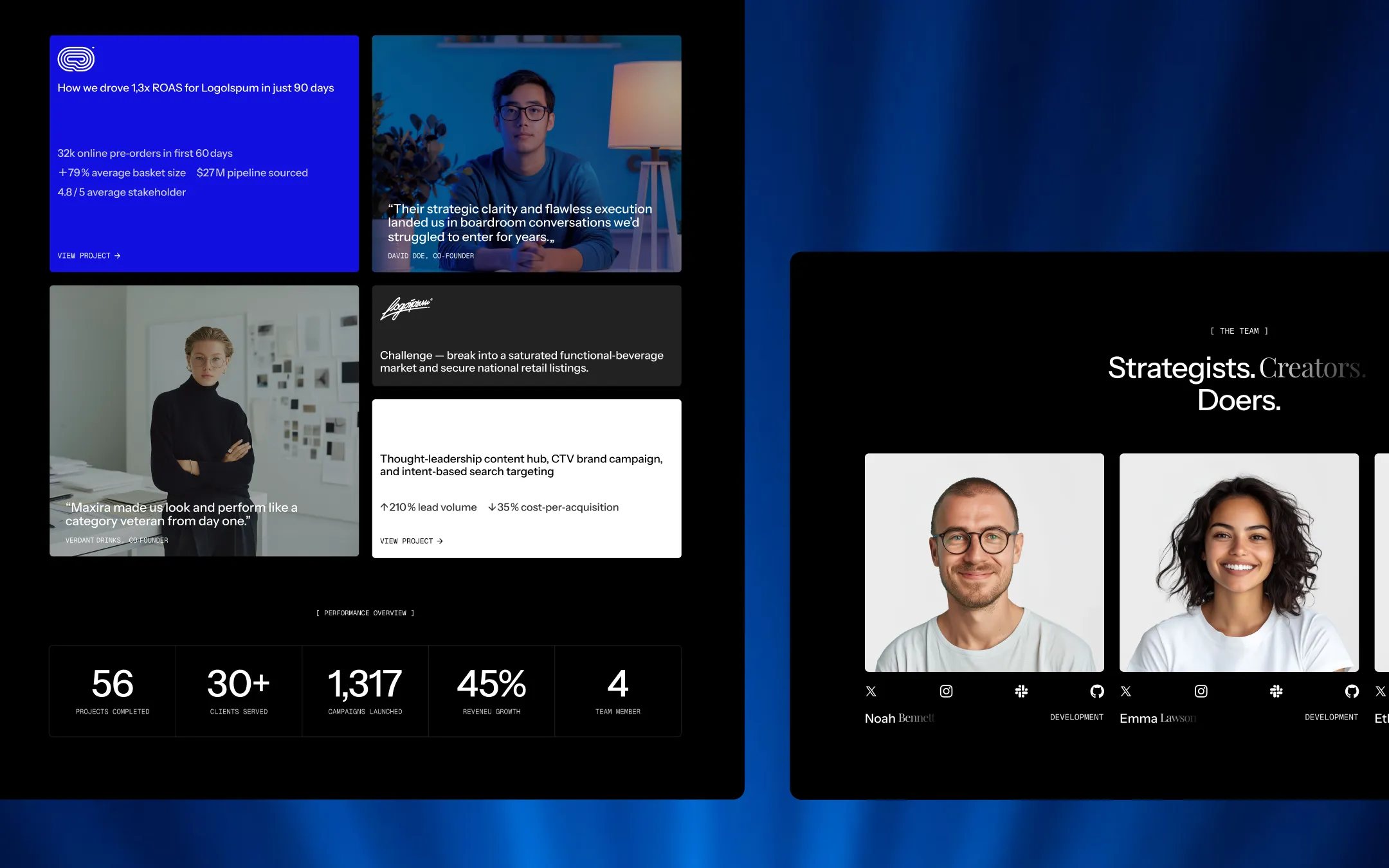
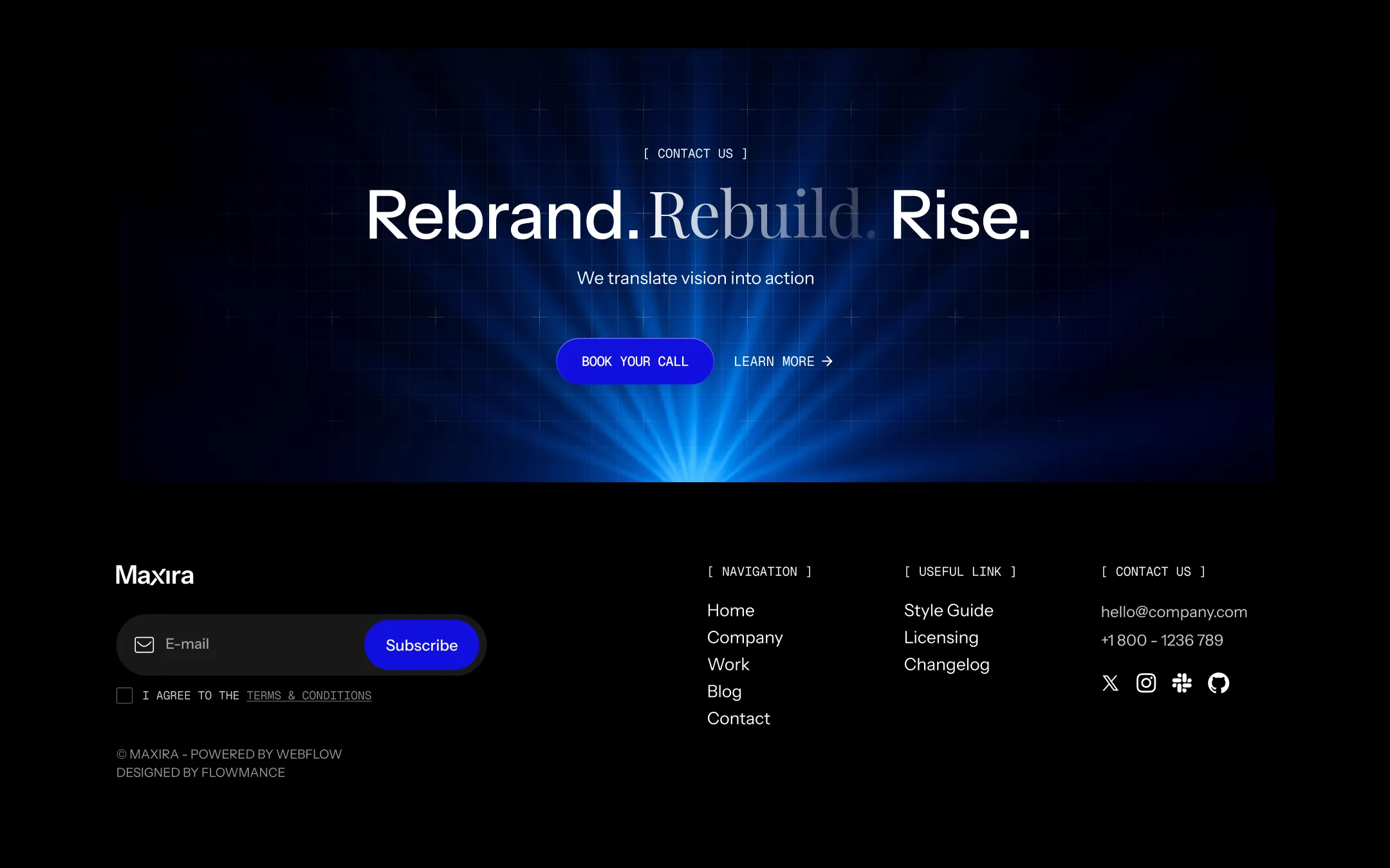
Maxira is a dark, atmospheric design system engineered for marketing agencies that lead with proof. Deep navy and near-black canvases recede into the background while electric blue light floods in from above, casting glowing rays, grid overlays, and diffuse volumetric haze across every hero. Typography pairs a confident grotesque for body copy and UI chrome with a serif italic accent that surfaces mid-headline to soften the system's edge — proof that performance and craft can share a sentence. Every surface is built for conversion: pill-shaped buttons in saturated indigo-blue, uppercase monospace micro-labels bracketed like terminal output ([ WHY CHOOSE US ]), and hard-edged white panels that interrupt the darkness to showcase case-study numbers in stark contrast. The result is an aesthetic equal parts nightclub stage lighting and boardroom dashboard — ambitious, kinetic, and numbers-first.
Light neutral card fill used for feature cards on dark backgrounds.
Primary page canvas
Dark card and secondary button surface, slightly lifted from void black.
Hero and section background gradient base beneath the blue glow
Primary text, inverted panels, light-mode section fills
Secondary/muted body text on dark surfaces.
Hover state for primary buttons and interactive indigo fills.
Primary brand accent. CTA buttons, active nav pill, blue section fills.
Rare decorative accent for gradient glows and image treatments.
Success state and positive-metric highlight accents.
The quick brown fox jumps
UI labels, buttons, data text, monospace-style micro-copy
The quick brown fox jumps
Primary body copy and base document font
The quick brown fox jumps
Italic accent spans within headlines for brand warmth and contrast
spacious1200px120px35px20px4px8px10px15px20px30px40px50px80px100px120pxcards6.4pxsmall6.4pxmedium12pxbuttons100pxnavigation200pxStep from canvas (level 1) to lifted (level 2) to inset depth (level 3), then invert into the dark levels for full-bleed sections. Hex codes and roles live in the Colors section above; this ladder shows the layering only.
# Design System Guide

> Unlock the template to access the full design system.

## Brand voice

A short paragraph describing the brand voice, mood, and visual
principles that anchor the system. Tone, cadence, and intent.

## Colors

| Token        | Hex      | Role                                  |
| ------------ | -------- | ------------------------------------- |
| canvas-1     | #xxxxxx  | Page background, large surfaces       |
| canvas-2     | #xxxxxx  | Lifted surfaces, cards                |
| canvas-3     | #xxxxxx  | Inset wells, depressed states         |
| ink-1        | #xxxxxx  | Primary body text                     |
| ink-2        | #xxxxxx  | Secondary text, labels                |
| ink-3        | #xxxxxx  | Tertiary text, hints                  |
| accent-1     | #xxxxxx  | Primary brand accent                  |
| accent-2     | #xxxxxx  | Secondary accent                      |
| state-ok     | #xxxxxx  | Success, confirmations                |
| state-warn   | #xxxxxx  | Warnings                              |
| state-err    | #xxxxxx  | Errors, destructive actions           |

## Typography

- **Display** — heading scale, used for hero text and section titles.
- **Body** — primary reading text, optimized for paragraphs.
- **Mono** — code, data, and tabular numerals.

```
display: 32px / 40px / 48px / 64px / 80px
body:    14px / 16px / 18px
mono:    12px / 14px
```

## Spacing & shape

Base unit: 4px. Scale: 4, 8, 12, 16, 24, 32, 48, 64, 96, 128.
Radii: sm (4px), md (8px), lg (12px), xl (20px), full (9999px).

## Surfaces

Layered elevation from canvas → lifted → inset. Surfaces invert in
dark sections for full-bleed contrast.

## Do's and don'ts

- Do use accent-1 sparingly for primary CTAs only.
- Do maintain at least 4.5:1 contrast on body text.
- Don't mix display and body in the same line.
- Don't use state colors for branding.

## Agent prompt guide

Prompts for AI design tools that respect this system.
Includes example prompts for sections, components, and layouts.

# ...
Unlock the full style guide