Design systems, extracted.
Paste any URL to create a design system from it. Open any style for colors, type, spacing, components, and a DESIGN.md or tokens.json your agent can use.
Quickly navigate through the dashboard with your keyboard using the command menu.
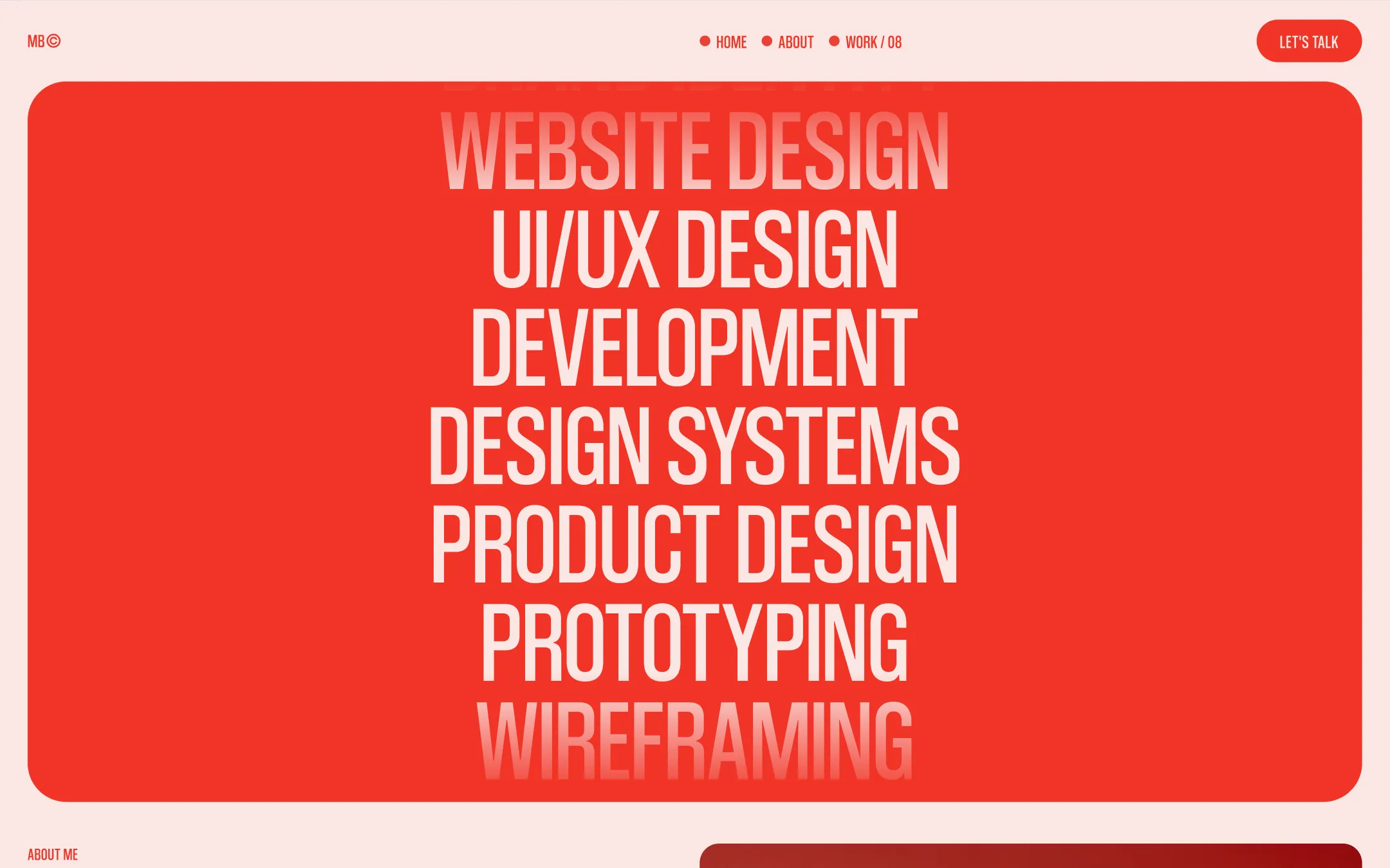
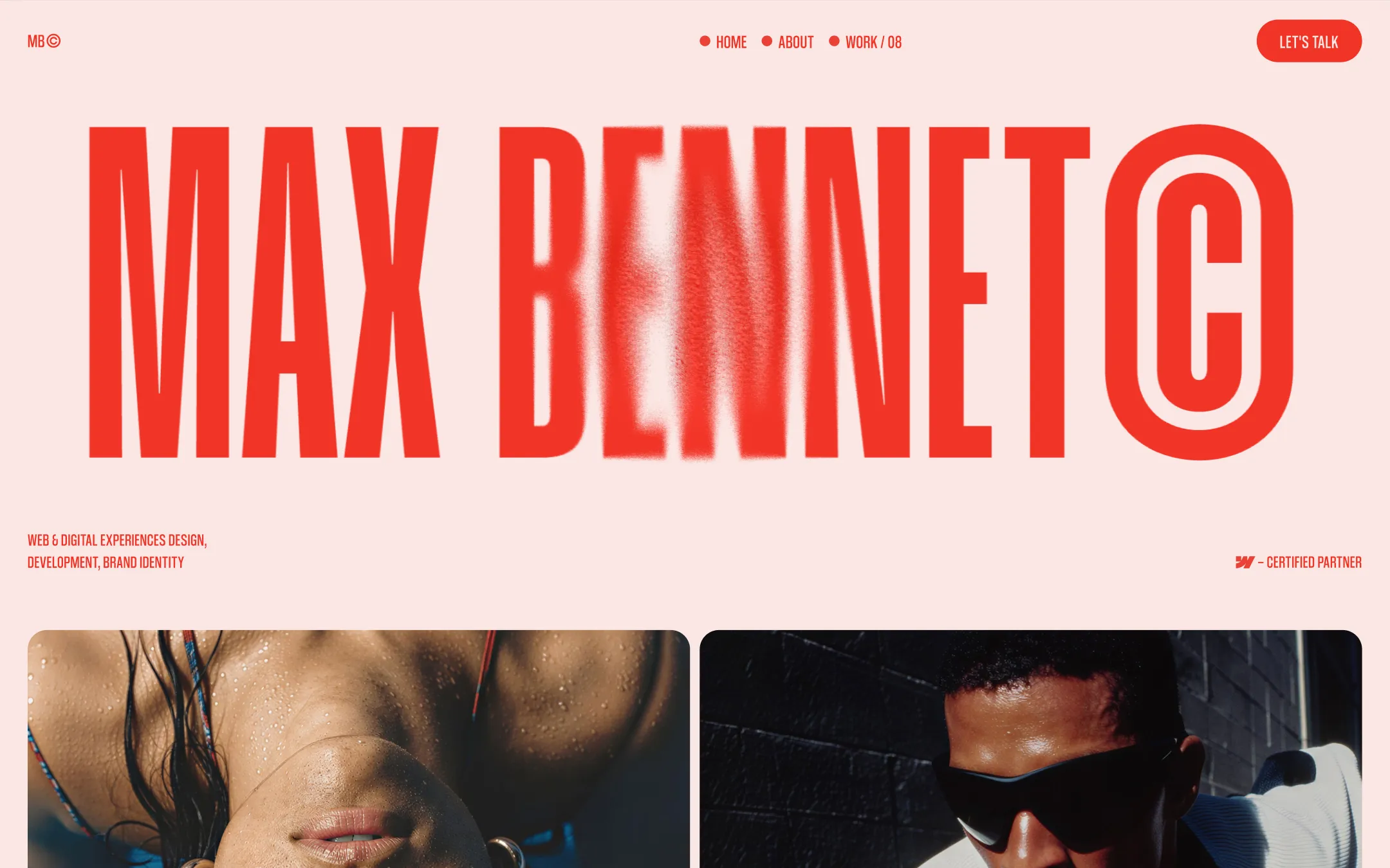
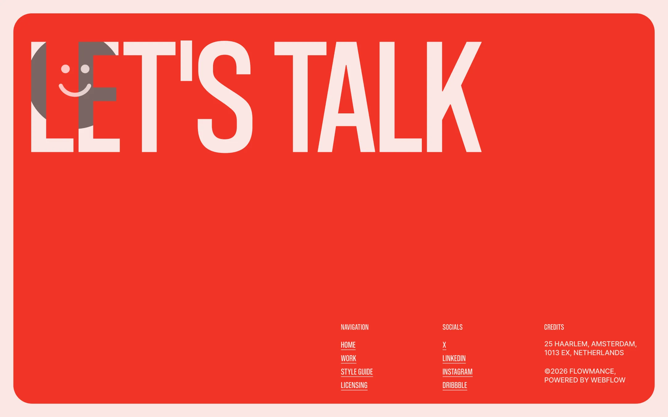
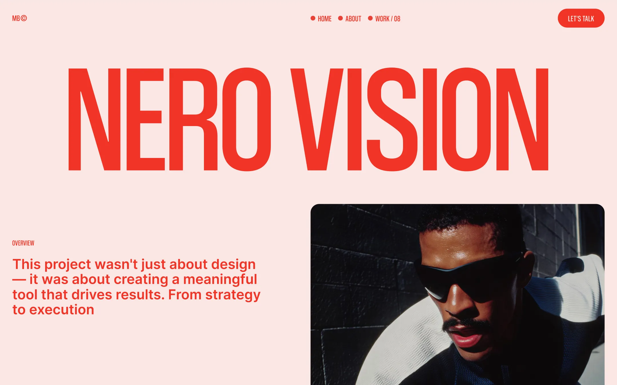
Max Bennet© builds its identity on a single bold decision: saturated vermillion red against warm cream, with nothing in between. Oversized condensed display type collapses navigation, hero statements, and footer CTAs into graphic events rather than ordinary copy — every headline becomes a poster. The system rewards confidence: huge type at negative letter-spacing, pill-shaped buttons, editorial photography cropped tight into masonry work cards, and Japanese character accents dropped into the About page as a cultural wink that most freelance portfolios wouldn't dare. Structurally the template is spacious and unapologetic — full-bleed red section blocks with heavily rounded corners act as giant content containers, sticky footers reveal themselves like a final punchline, and work cards pin and stack as you scroll. It's built for an independent practitioner who wants their site to read like a manifesto, not a brochure.
Primary page background.
Dark utility surface. Pricing links and secondary dark buttons.
Subtle overlay tint. Glass panels and soft dividers over imagery.
Reversed text & button fill. Text on red blocks, button backgrounds.
Muted footer neutral. Secondary footer text and fine print.
Secondary text ink. Body copy and headings on cream surfaces.
Brand accent & ink. Section blocks, headline fills, buttons, nav text on dark grounds.
Hover/transition utility hue. Button transition states and interactive feedback.
The quick brown fox jumps
Body copy & UI text. Paragraphs, nav links, form inputs, footer credits.
The quick brown fox jumps
Display & heading face. Used for hero titles, nav labels, buttons, section headers — the voice of the brand.
spacious1300px250px20px20px10px20px30px50px60px100px120px150px250pxcards20pxsmall7pxbuttons64pxcontainer10pxfooter-block40pxbutton-circle160pxStep from canvas (level 1) to lifted (level 2) to inset depth (level 3), then invert into the dark levels for full-bleed sections. Hex codes and roles live in the Colors section above; this ladder shows the layering only.
# Design System Guide

> Unlock the template to access the full design system.

## Brand voice

A short paragraph describing the brand voice, mood, and visual
principles that anchor the system. Tone, cadence, and intent.

## Colors

| Token        | Hex      | Role                                  |
| ------------ | -------- | ------------------------------------- |
| canvas-1     | #xxxxxx  | Page background, large surfaces       |
| canvas-2     | #xxxxxx  | Lifted surfaces, cards                |
| canvas-3     | #xxxxxx  | Inset wells, depressed states         |
| ink-1        | #xxxxxx  | Primary body text                     |
| ink-2        | #xxxxxx  | Secondary text, labels                |
| ink-3        | #xxxxxx  | Tertiary text, hints                  |
| accent-1     | #xxxxxx  | Primary brand accent                  |
| accent-2     | #xxxxxx  | Secondary accent                      |
| state-ok     | #xxxxxx  | Success, confirmations                |
| state-warn   | #xxxxxx  | Warnings                              |
| state-err    | #xxxxxx  | Errors, destructive actions           |

## Typography

- **Display** — heading scale, used for hero text and section titles.
- **Body** — primary reading text, optimized for paragraphs.
- **Mono** — code, data, and tabular numerals.

```
display: 32px / 40px / 48px / 64px / 80px
body:    14px / 16px / 18px
mono:    12px / 14px
```

## Spacing & shape

Base unit: 4px. Scale: 4, 8, 12, 16, 24, 32, 48, 64, 96, 128.
Radii: sm (4px), md (8px), lg (12px), xl (20px), full (9999px).

## Surfaces

Layered elevation from canvas → lifted → inset. Surfaces invert in
dark sections for full-bleed contrast.

## Do's and don'ts

- Do use accent-1 sparingly for primary CTAs only.
- Do maintain at least 4.5:1 contrast on body text.
- Don't mix display and body in the same line.
- Don't use state colors for branding.

## Agent prompt guide

Prompts for AI design tools that respect this system.
Includes example prompts for sections, components, and layouts.

# ...
Unlock the full style guide