Design systems, extracted.
Paste any URL to create a design system from it. Open any style for colors, type, spacing, components, and a DESIGN.md or tokens.json your agent can use.
Quickly navigate through the dashboard with your keyboard using the command menu.
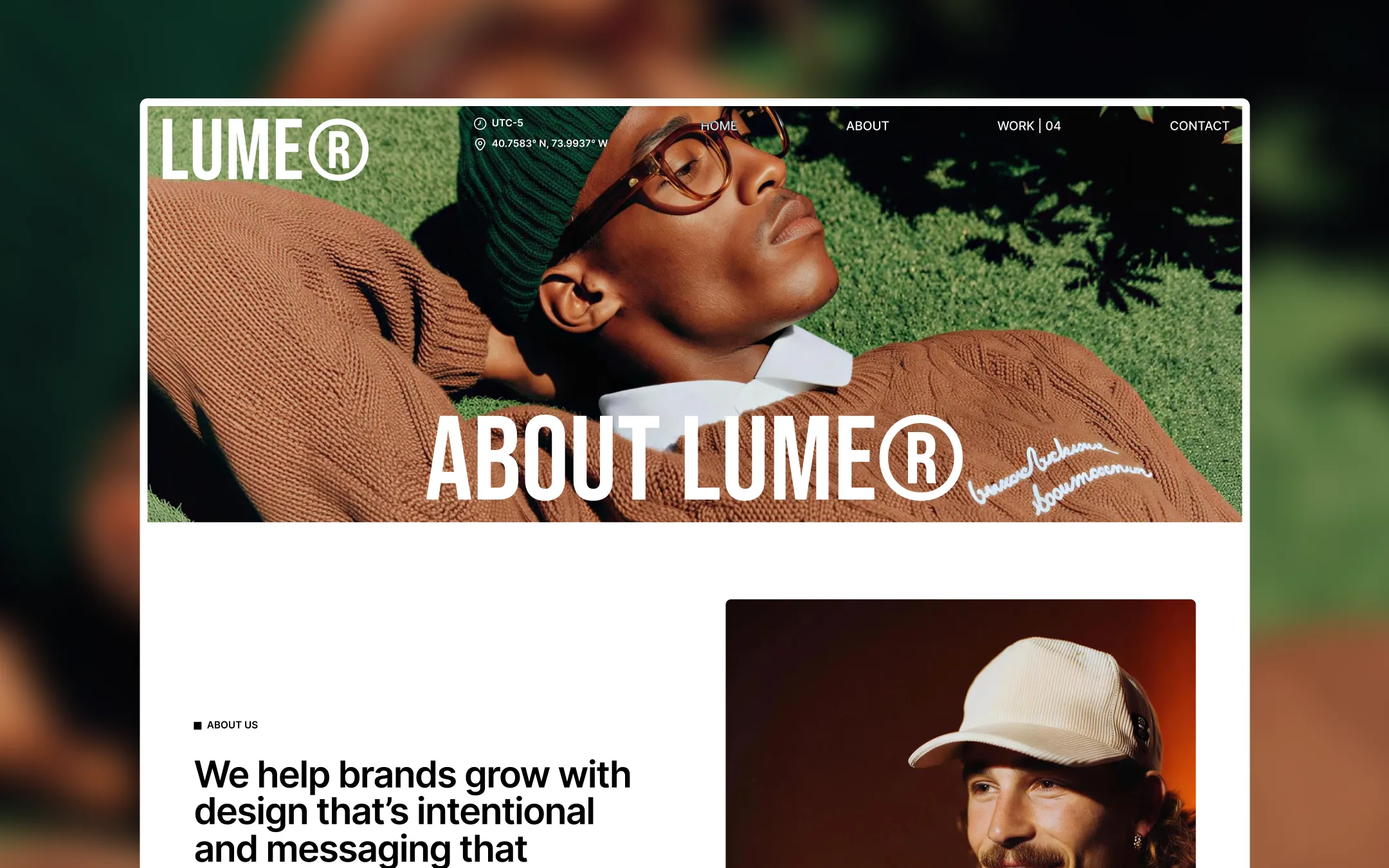
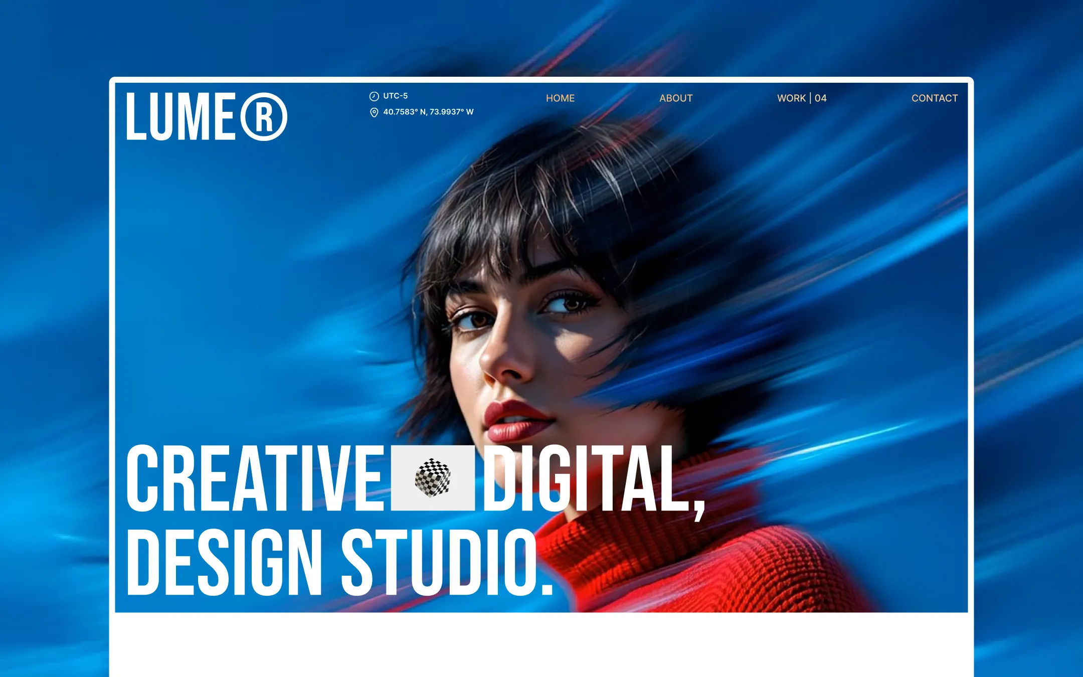
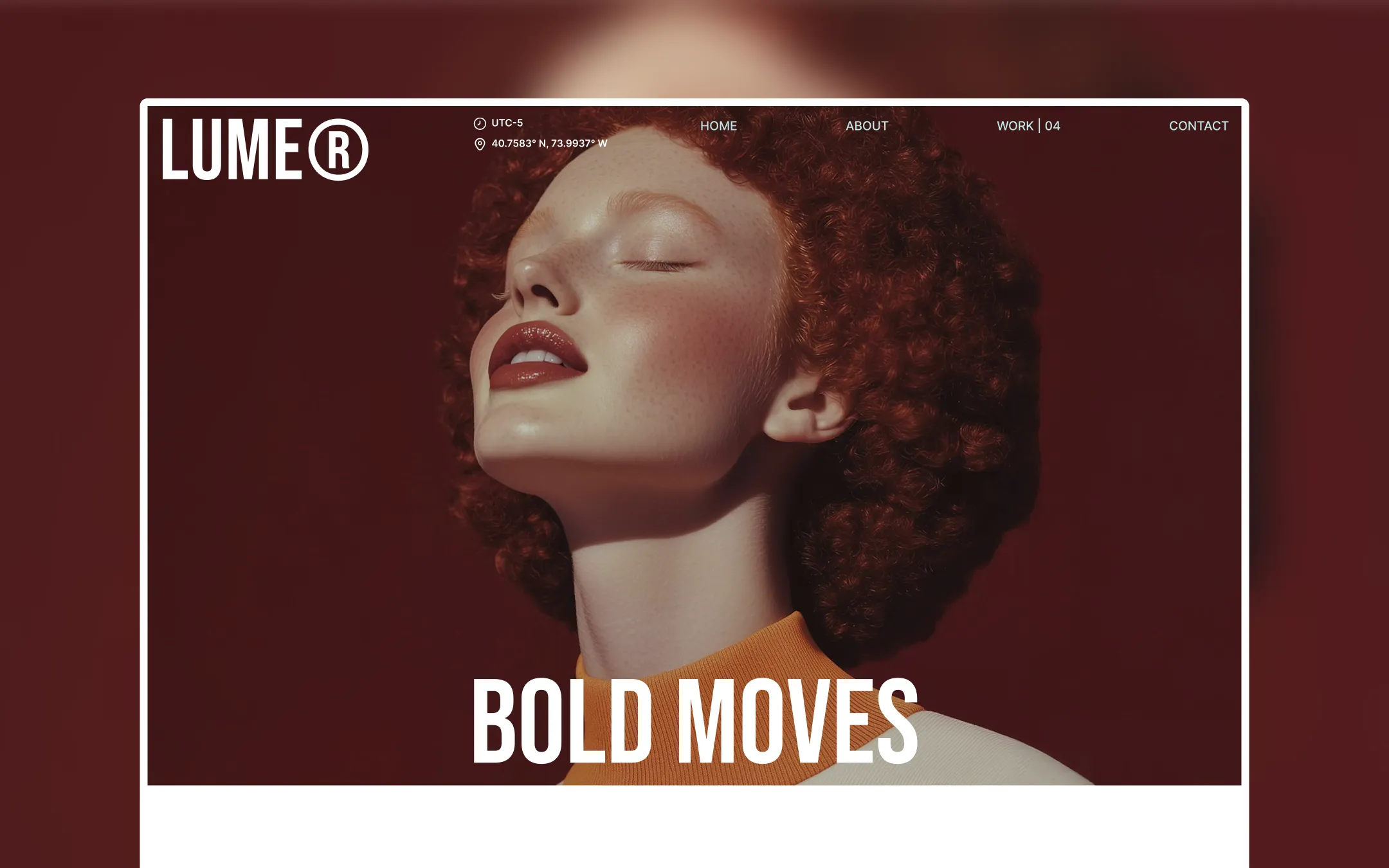
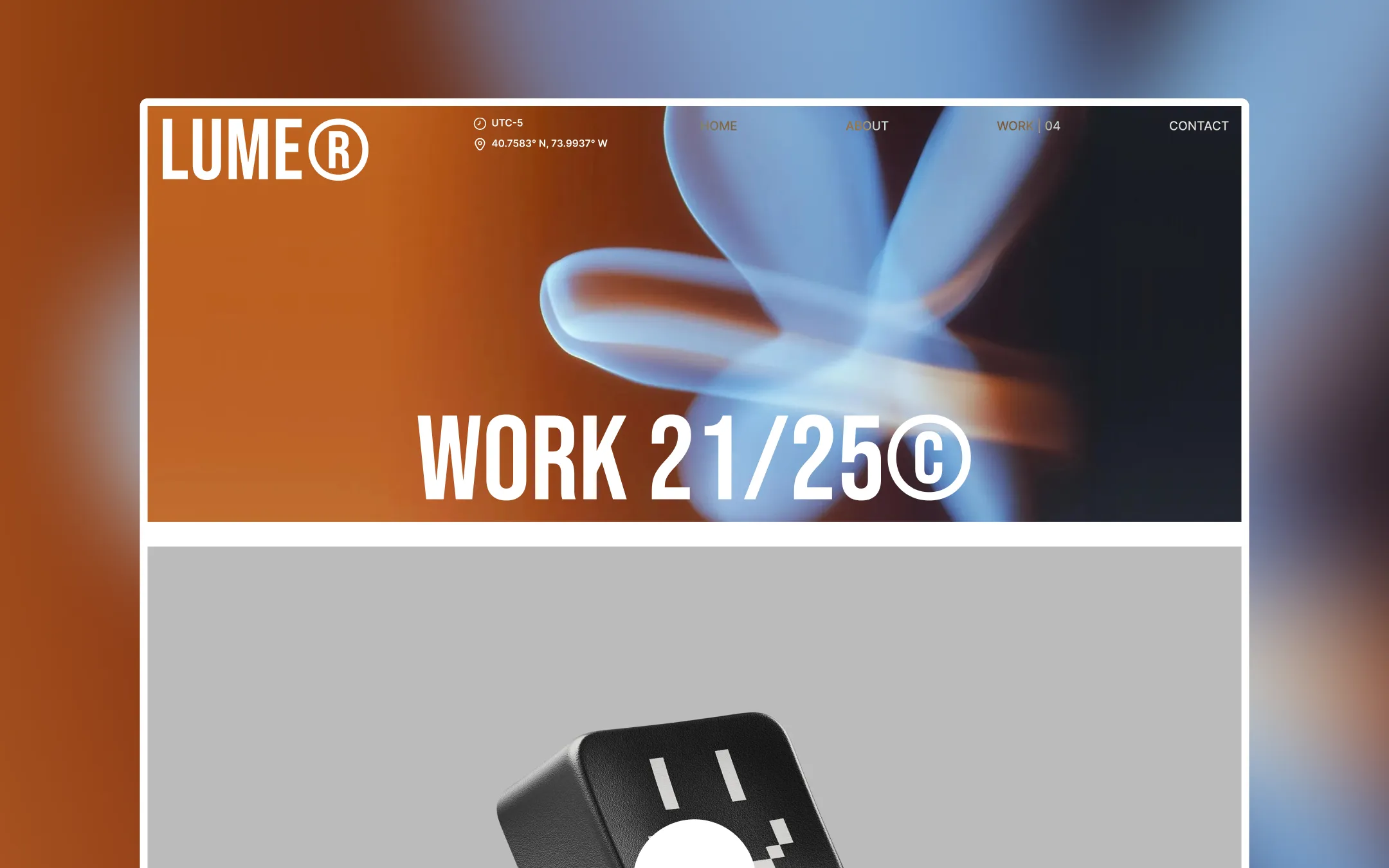
Lume® is a Webflow agency template that treats saturated colour as structural grammar rather than decoration — each hero section swaps between burgundy dusk, electric cobalt, and warm terracotta to mark a new visual chapter, while the surrounding system stays disciplined: stark black ink on gallery white, oversized Bebas Neue display type, and a tight uppercase Inter voice for navigation and labels. The result reads like an editorial fashion portfolio crossed with a creative studio's pitch deck — bold, cinematic hero photography and video loops anchor every page, bracketed by a consistently minimal chrome of pill buttons, hairline dividers, and generous whitespace. Structurally the template is spacious and confident: 150px section rhythm, 1300px content container, pill-shaped buttons, and a sticky wave-animation footer that turns the closing CTA into its own moment. Colour sections are elevated like theatrical backdrops against an otherwise quiet black-and-white foundation, so the brand feels equally at home in monochrome portfolio mode and full-bleed colour-blocked campaign mode.
Lifted section surface. Used for alternating gray sections like FAQ and team blocks.
Page canvas. Base background for content sections and card surfaces.
Primary text & ink. Headlines, body copy, button fills, and footer background.
Secondary warm accent. Complements terracotta in apparel and badge imagery.
Deep hero backdrop. One of the rotating full-bleed colour chapters behind editorial photography.
High-energy hero backdrop. Signals the studio's digital/motion-driven project chapters.
Warm editorial accent. Appears in portrait wardrobe tones and supporting imagery.
Interactive/focus state. Checkbox checked state and focus outlines on form fields.
The quick brown fox jumps
Body copy, navigation, labels, forms, and UI chrome.
The quick brown fox jumps
Display headlines, hero titles, oversized section statements.
spacious1300px150px30px20px5px15px20px30px40px50px60px80px100px150px200pxcards7pxsmall4pxcircle160pxbuttons48pxcontainers9.6pxStep from canvas (level 1) to lifted (level 2) to inset depth (level 3), then invert into the dark levels for full-bleed sections. Hex codes and roles live in the Colors section above; this ladder shows the layering only.
# Design System Guide

> Unlock the template to access the full design system.

## Brand voice

A short paragraph describing the brand voice, mood, and visual
principles that anchor the system. Tone, cadence, and intent.

## Colors

| Token        | Hex      | Role                                  |
| ------------ | -------- | ------------------------------------- |
| canvas-1     | #xxxxxx  | Page background, large surfaces       |
| canvas-2     | #xxxxxx  | Lifted surfaces, cards                |
| canvas-3     | #xxxxxx  | Inset wells, depressed states         |
| ink-1        | #xxxxxx  | Primary body text                     |
| ink-2        | #xxxxxx  | Secondary text, labels                |
| ink-3        | #xxxxxx  | Tertiary text, hints                  |
| accent-1     | #xxxxxx  | Primary brand accent                  |
| accent-2     | #xxxxxx  | Secondary accent                      |
| state-ok     | #xxxxxx  | Success, confirmations                |
| state-warn   | #xxxxxx  | Warnings                              |
| state-err    | #xxxxxx  | Errors, destructive actions           |

## Typography

- **Display** — heading scale, used for hero text and section titles.
- **Body** — primary reading text, optimized for paragraphs.
- **Mono** — code, data, and tabular numerals.

```
display: 32px / 40px / 48px / 64px / 80px
body:    14px / 16px / 18px
mono:    12px / 14px
```

## Spacing & shape

Base unit: 4px. Scale: 4, 8, 12, 16, 24, 32, 48, 64, 96, 128.
Radii: sm (4px), md (8px), lg (12px), xl (20px), full (9999px).

## Surfaces

Layered elevation from canvas → lifted → inset. Surfaces invert in
dark sections for full-bleed contrast.

## Do's and don'ts

- Do use accent-1 sparingly for primary CTAs only.
- Do maintain at least 4.5:1 contrast on body text.
- Don't mix display and body in the same line.
- Don't use state colors for branding.

## Agent prompt guide

Prompts for AI design tools that respect this system.
Includes example prompts for sections, components, and layouts.

# ...
Unlock the full style guide