Design systems, extracted.
Paste any URL to create a design system from it. Open any style for colors, type, spacing, components, and a DESIGN.md or tokens.json your agent can use.
Quickly navigate through the dashboard with your keyboard using the command menu.
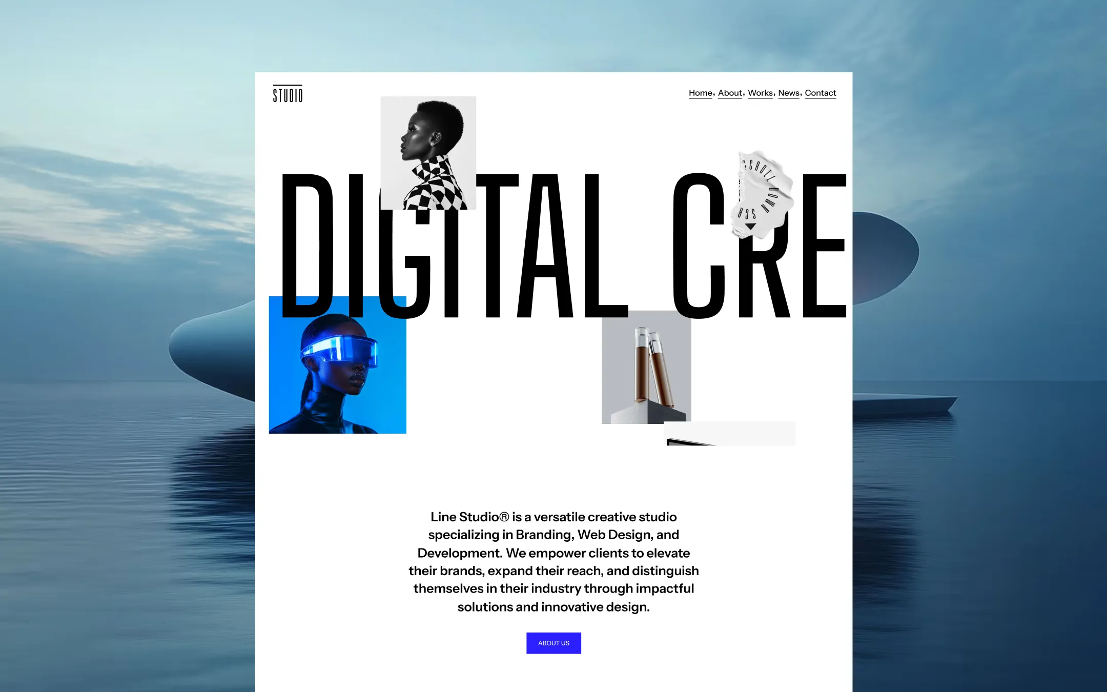
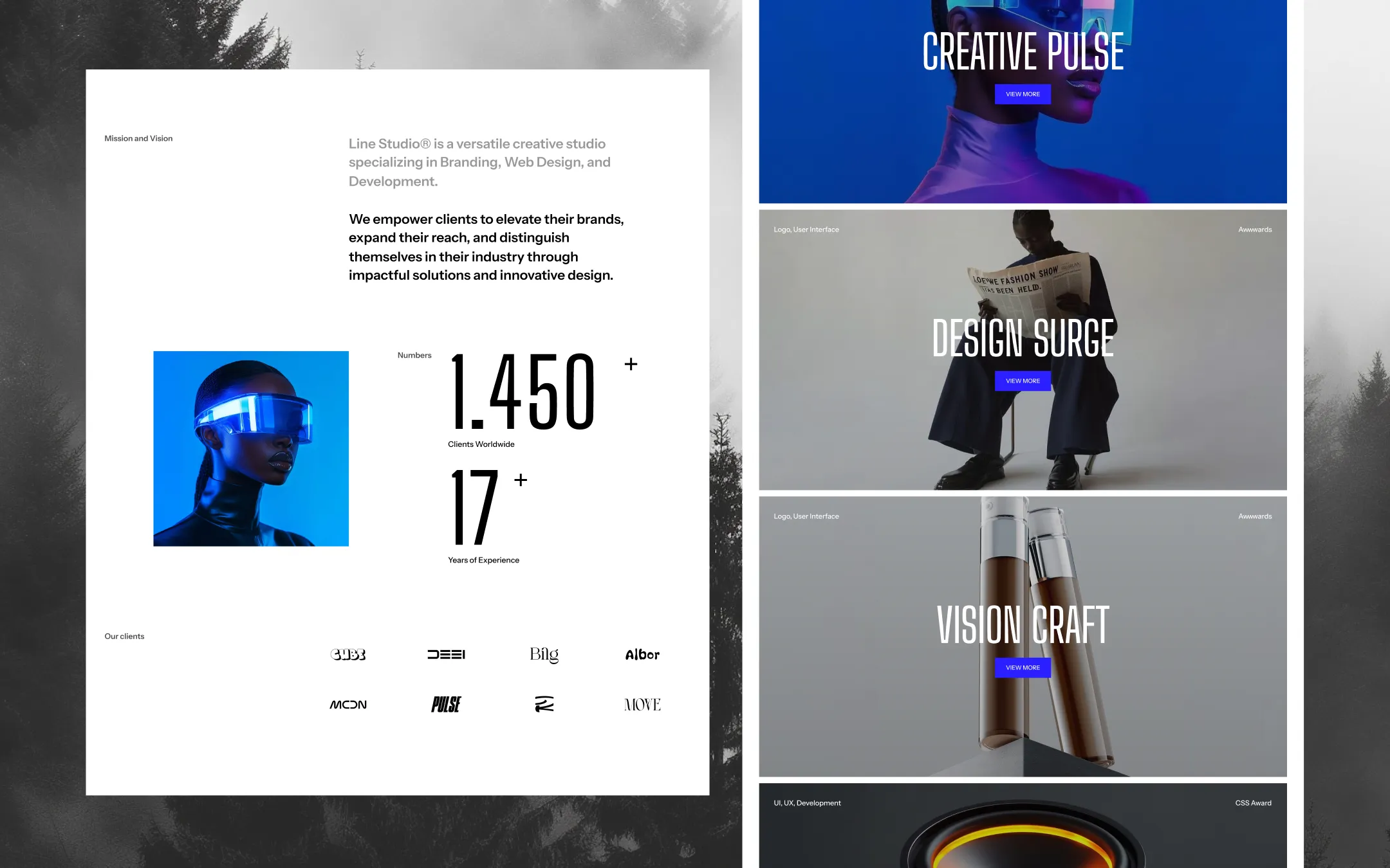
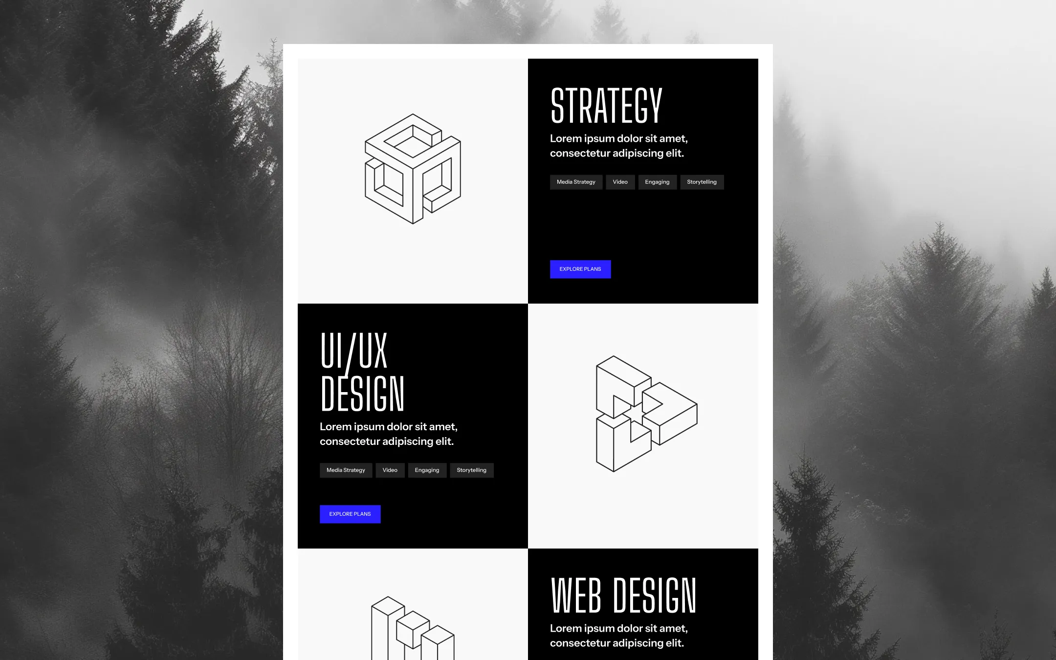
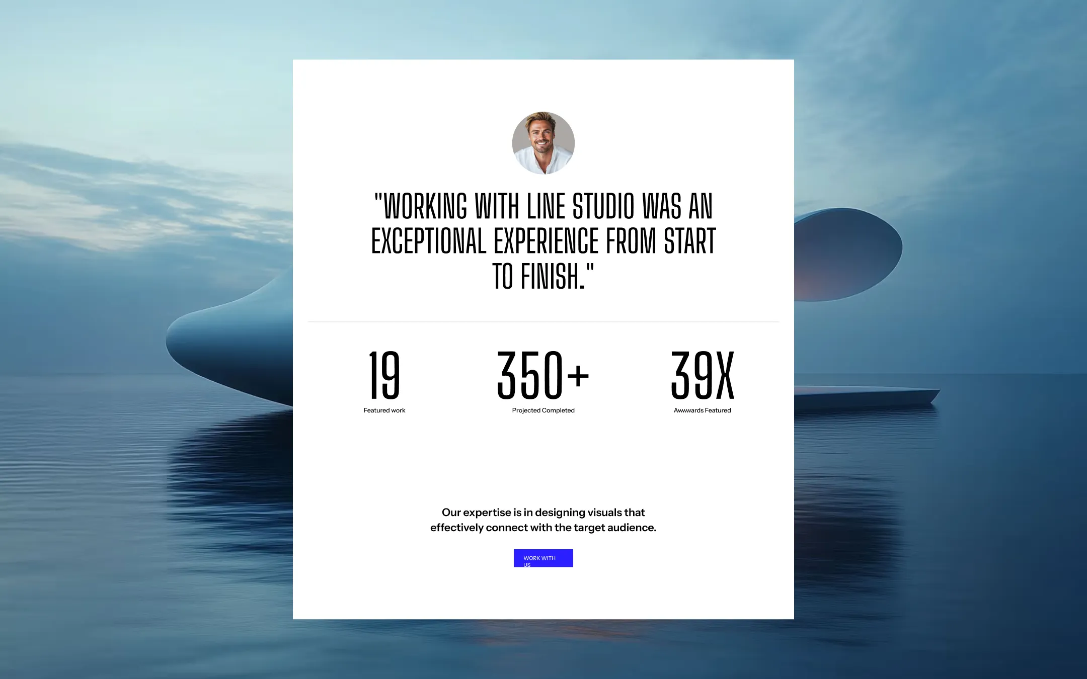
Line Studio® builds its identity on scale contrast — a monumental condensed display face collides with a restrained, highly legible sans for body copy, all set against stark white canvases punctuated by pure black panels and a single electric indigo accent. The system reads as confident editorial-meets-agency: oversized cycling headlines, full-bleed photography with checkerboard-pattern fashion imagery, and isometric wireframe iconography give it a futurist, slightly surreal edge without sacrificing clarity. Structurally the template is unapologetically grid-driven and modular — black-and-white alternating service cards, a client logo marquee, and a looping footer CTA all reinforce rhythm and repetition. The indigo accent is used sparingly but decisively, almost always on buttons and small interactive flourishes, letting the monochrome photography and typography carry the emotional weight.
Lifted surface. Table headers, subtle card backgrounds, block headers.
Primary canvas. Base background for nearly every section and card.
Divider & border. Thin separators between content blocks and form fields.
Deep footer & CTA backdrop. Near-black wrapper behind the rotating text CTA.
Secondary body text on dark surfaces. Footer copy, subdued captions.
Primary text & dark surfaces. Headlines, body copy, footer and dark service-card backgrounds.
Accent hover state. Darker indigo shown on button and link hover.
Primary accent. CTA buttons, active states, highlighted UI chips.
The quick brown fox jumps
Body copy, navigation, buttons, form labels.
The quick brown fox jumps
Display headlines, hero titles, oversized section titles, rotating CTA text.
spacious1440px150px40px25px4px8px12px16px20px24px30px40px50px80px100px150pxcards0pxpills9pxsmall2pxbuttons0pxicon-buttons0pxStep from canvas (level 1) to lifted (level 2) to inset depth (level 3), then invert into the dark levels for full-bleed sections. Hex codes and roles live in the Colors section above; this ladder shows the layering only.
# Design System Guide

> Unlock the template to access the full design system.

## Brand voice

A short paragraph describing the brand voice, mood, and visual
principles that anchor the system. Tone, cadence, and intent.

## Colors

| Token        | Hex      | Role                                  |
| ------------ | -------- | ------------------------------------- |
| canvas-1     | #xxxxxx  | Page background, large surfaces       |
| canvas-2     | #xxxxxx  | Lifted surfaces, cards                |
| canvas-3     | #xxxxxx  | Inset wells, depressed states         |
| ink-1        | #xxxxxx  | Primary body text                     |
| ink-2        | #xxxxxx  | Secondary text, labels                |
| ink-3        | #xxxxxx  | Tertiary text, hints                  |
| accent-1     | #xxxxxx  | Primary brand accent                  |
| accent-2     | #xxxxxx  | Secondary accent                      |
| state-ok     | #xxxxxx  | Success, confirmations                |
| state-warn   | #xxxxxx  | Warnings                              |
| state-err    | #xxxxxx  | Errors, destructive actions           |

## Typography

- **Display** — heading scale, used for hero text and section titles.
- **Body** — primary reading text, optimized for paragraphs.
- **Mono** — code, data, and tabular numerals.

```
display: 32px / 40px / 48px / 64px / 80px
body:    14px / 16px / 18px
mono:    12px / 14px
```

## Spacing & shape

Base unit: 4px. Scale: 4, 8, 12, 16, 24, 32, 48, 64, 96, 128.
Radii: sm (4px), md (8px), lg (12px), xl (20px), full (9999px).

## Surfaces

Layered elevation from canvas → lifted → inset. Surfaces invert in
dark sections for full-bleed contrast.

## Do's and don'ts

- Do use accent-1 sparingly for primary CTAs only.
- Do maintain at least 4.5:1 contrast on body text.
- Don't mix display and body in the same line.
- Don't use state colors for branding.

## Agent prompt guide

Prompts for AI design tools that respect this system.
Includes example prompts for sections, components, and layouts.

# ...
Unlock the full style guide