Design systems, extracted.
Paste any URL to create a design system from it. Open any style for colors, type, spacing, components, and a DESIGN.md or tokens.json your agent can use.
Quickly navigate through the dashboard with your keyboard using the command menu.
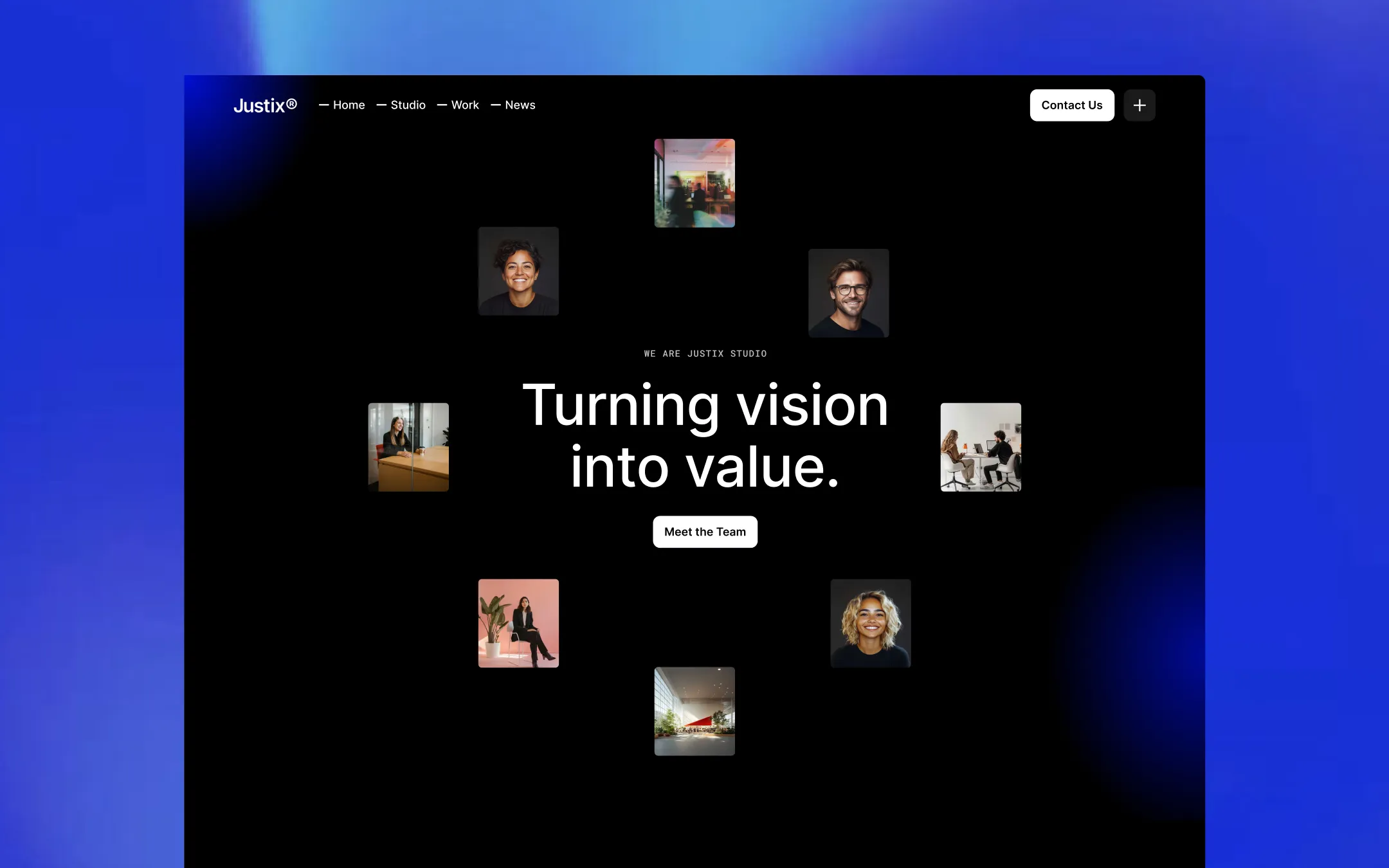
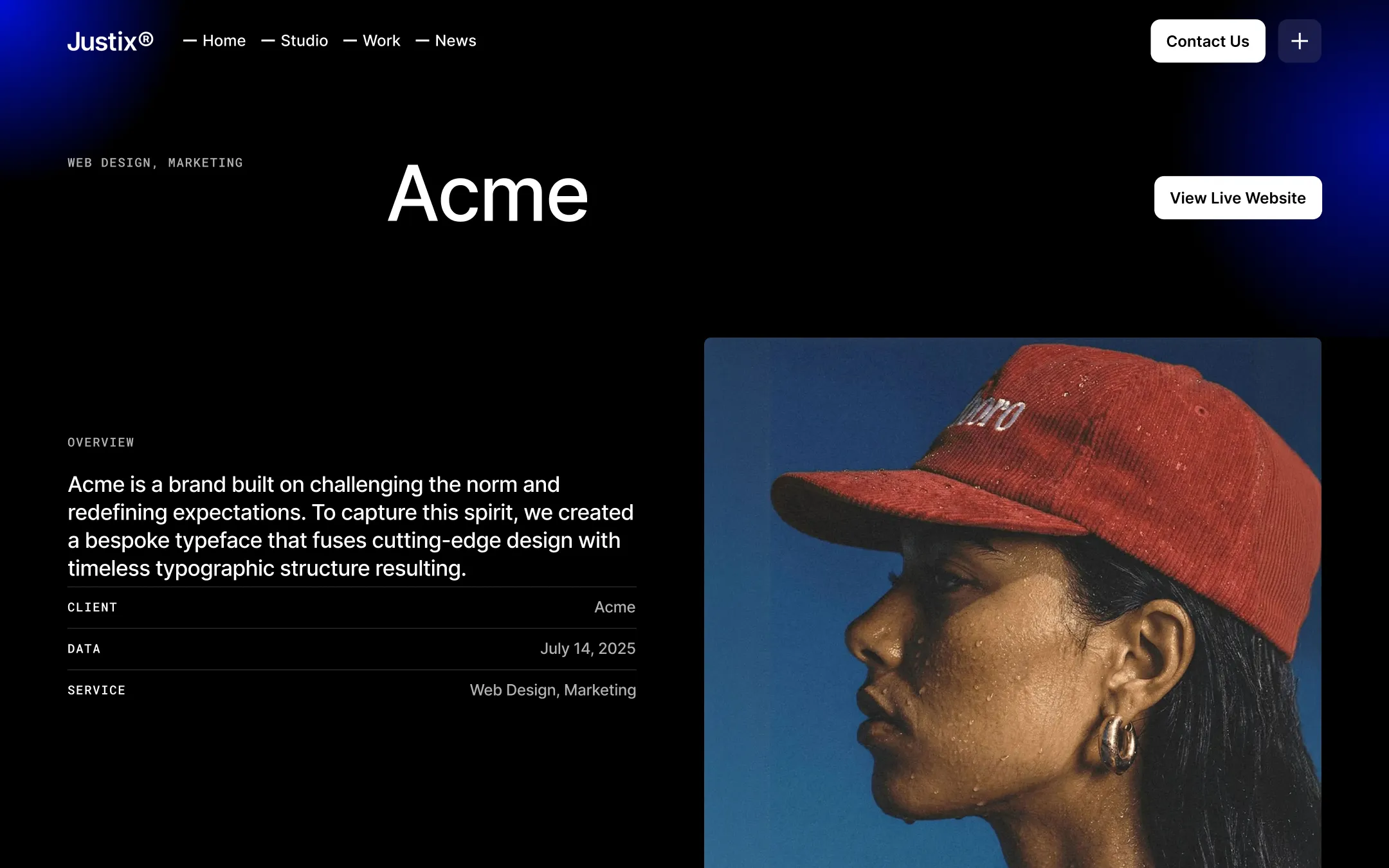
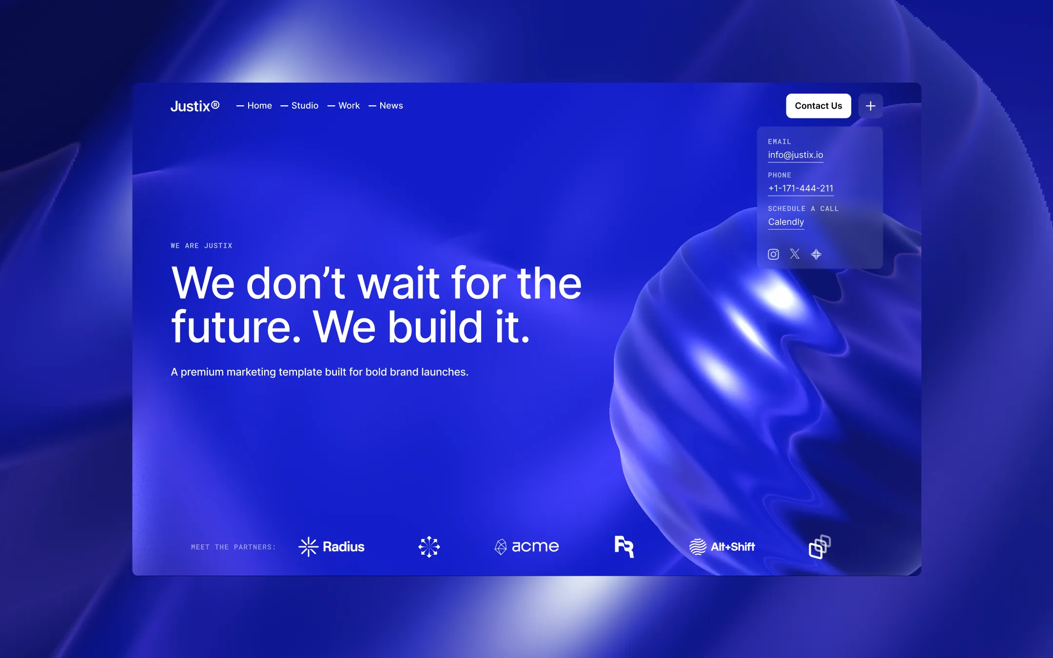
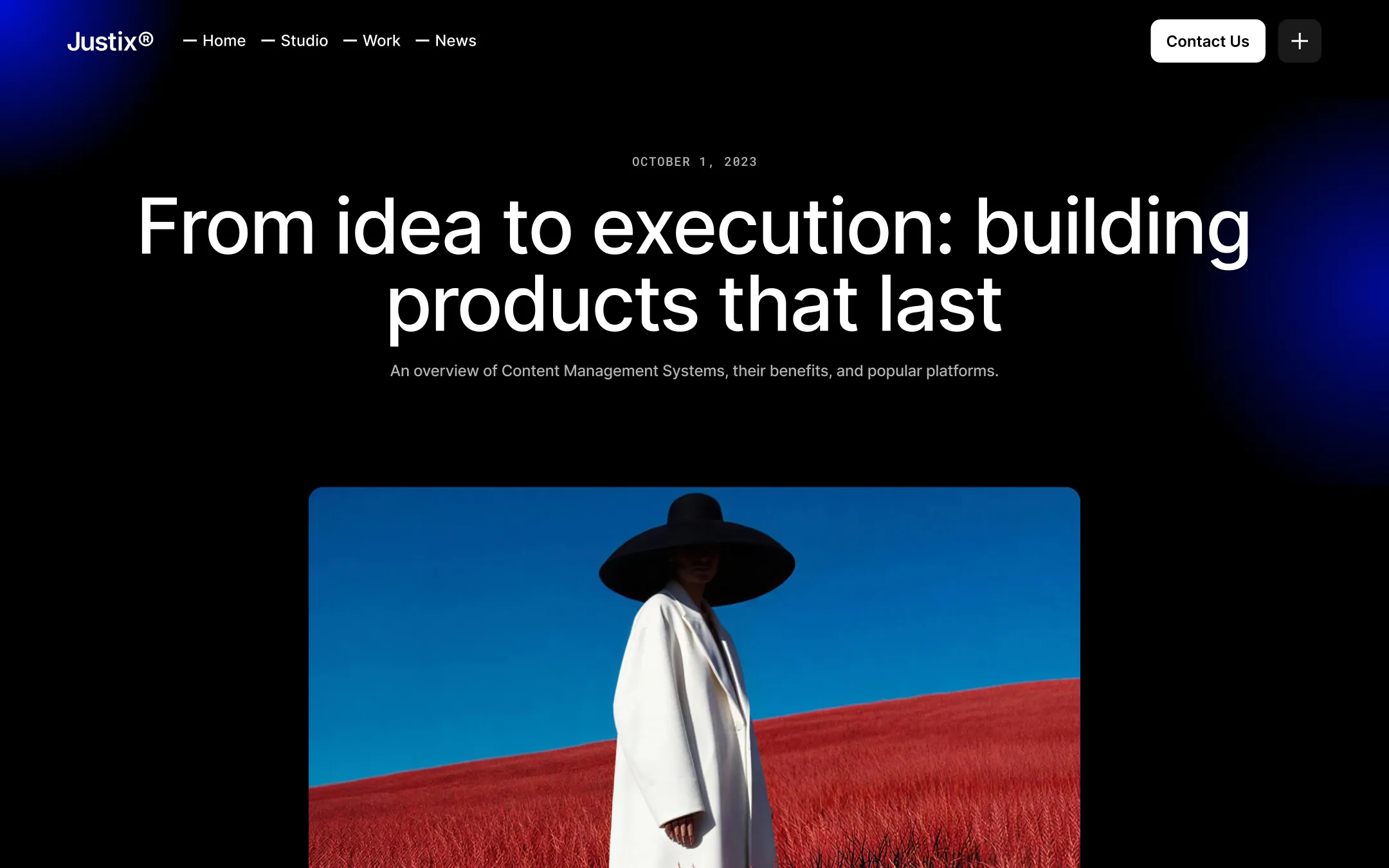
Justix® runs on an unapologetically black canvas where white Inter type, hairline borders, and a single charged accent — Electric Blue — do all the talking. Every surface is built for contrast: pure black backgrounds hold floating photographic grids, radial-gradient feature cards, and pill-shaped buttons that glow faintly blue on hover, giving the whole system a confident, after-dark studio energy. Roboto Mono eyebrow labels in uppercase tracking sit above oversized Inter headlines, while a condensed serif is reserved for emphasis spans and quotation marks — a small editorial flourish inside an otherwise engineered, motion-driven interface. The rhythm is spacious and cinematic: generous 150px+ section padding, sticky testimonial panels, and asymmetric hero grids let bold fashion and lifestyle photography breathe, reinforcing a studio that treats scroll and motion as core brand material rather than decoration.
Page canvas & darkest ink. Base background for every section and body text color inversion.
Lifted surface. Testimonial panels, input fields, and sticky card backgrounds.
Depth surface. Radial-gradient feature cards and inset panel backgrounds.
Footer muted tone. Footer links and tertiary copy against black.
Secondary text. Subheads, descriptive paragraphs, and de-emphasized labels at 70% opacity.
Primary text & button fill. Headlines, body copy, and primary button backgrounds.
Structural border. Hairline strokes around cards, inputs, and panel dividers.
Signature accent. Button glow shadows, gradient overlays, and brand-colored link states.
Accent hover fill. Button transition reveals and light accent chips.
The quick brown fox jumps
Primary workhorse for navigation, body copy, buttons, and most headlines.
The quick brown fox jumps
Uppercase eyebrow labels, section numbering, and small data captions.
The quick brown fox jumps
Condensed serif accent reserved for emphasis spans inside headlines and testimonial quotation marks.
spacious1300px150px40px20px10px20px30px50px60px70px100px150pxcards10pxicons6pxpills160pxinputs7pxbuttons64pxStep from canvas (level 1) to lifted (level 2) to inset depth (level 3), then invert into the dark levels for full-bleed sections. Hex codes and roles live in the Colors section above; this ladder shows the layering only.
# Design System Guide

> Unlock the template to access the full design system.

## Brand voice

A short paragraph describing the brand voice, mood, and visual
principles that anchor the system. Tone, cadence, and intent.

## Colors

| Token        | Hex      | Role                                  |
| ------------ | -------- | ------------------------------------- |
| canvas-1     | #xxxxxx  | Page background, large surfaces       |
| canvas-2     | #xxxxxx  | Lifted surfaces, cards                |
| canvas-3     | #xxxxxx  | Inset wells, depressed states         |
| ink-1        | #xxxxxx  | Primary body text                     |
| ink-2        | #xxxxxx  | Secondary text, labels                |
| ink-3        | #xxxxxx  | Tertiary text, hints                  |
| accent-1     | #xxxxxx  | Primary brand accent                  |
| accent-2     | #xxxxxx  | Secondary accent                      |
| state-ok     | #xxxxxx  | Success, confirmations                |
| state-warn   | #xxxxxx  | Warnings                              |
| state-err    | #xxxxxx  | Errors, destructive actions           |

## Typography

- **Display** — heading scale, used for hero text and section titles.
- **Body** — primary reading text, optimized for paragraphs.
- **Mono** — code, data, and tabular numerals.

```
display: 32px / 40px / 48px / 64px / 80px
body:    14px / 16px / 18px
mono:    12px / 14px
```

## Spacing & shape

Base unit: 4px. Scale: 4, 8, 12, 16, 24, 32, 48, 64, 96, 128.
Radii: sm (4px), md (8px), lg (12px), xl (20px), full (9999px).

## Surfaces

Layered elevation from canvas → lifted → inset. Surfaces invert in
dark sections for full-bleed contrast.

## Do's and don'ts

- Do use accent-1 sparingly for primary CTAs only.
- Do maintain at least 4.5:1 contrast on body text.
- Don't mix display and body in the same line.
- Don't use state colors for branding.

## Agent prompt guide

Prompts for AI design tools that respect this system.
Includes example prompts for sections, components, and layouts.

# ...
Unlock the full style guide