Design systems, extracted.
Paste any URL to create a design system from it. Open any style for colors, type, spacing, components, and a DESIGN.md or tokens.json your agent can use.
Quickly navigate through the dashboard with your keyboard using the command menu.
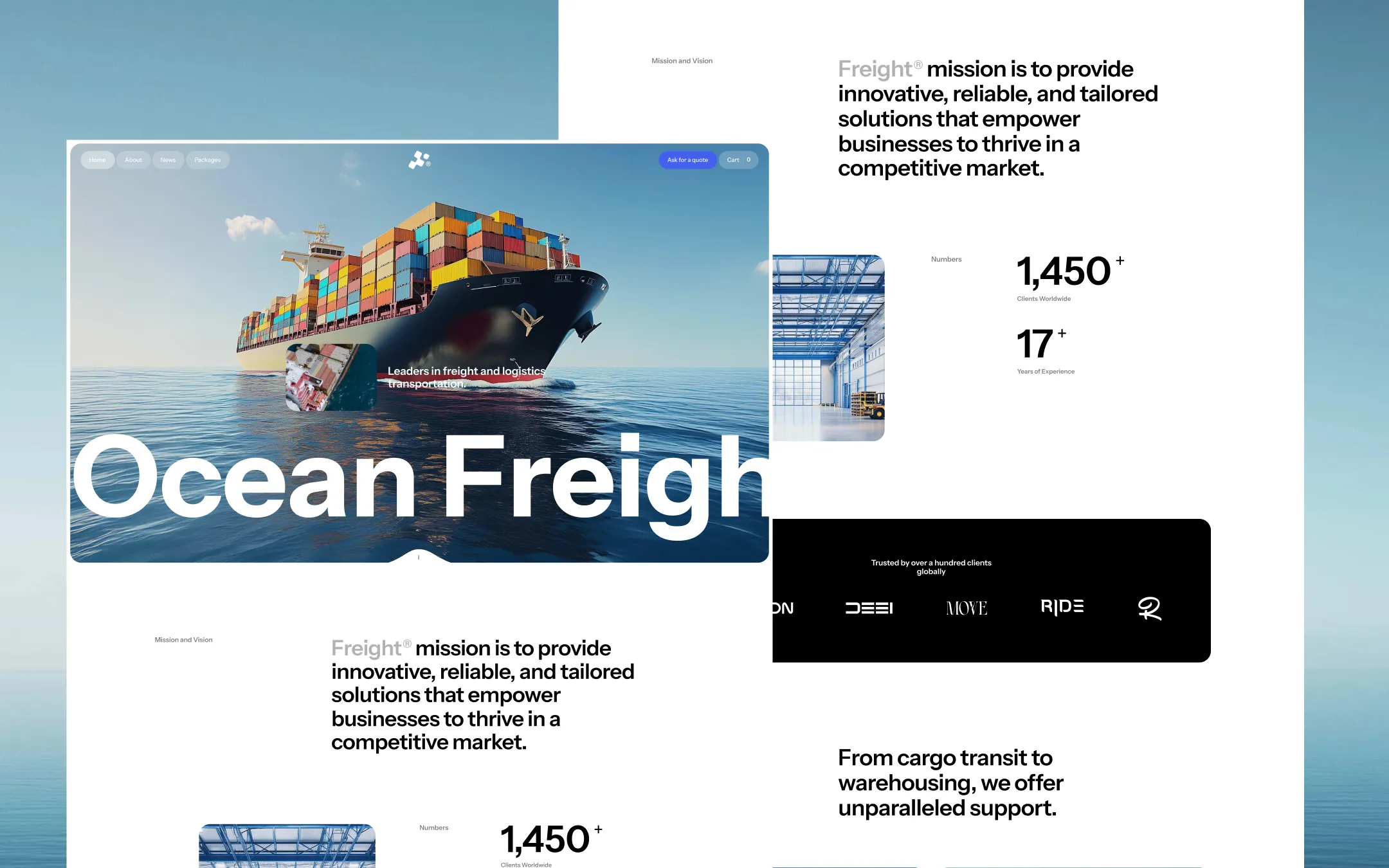
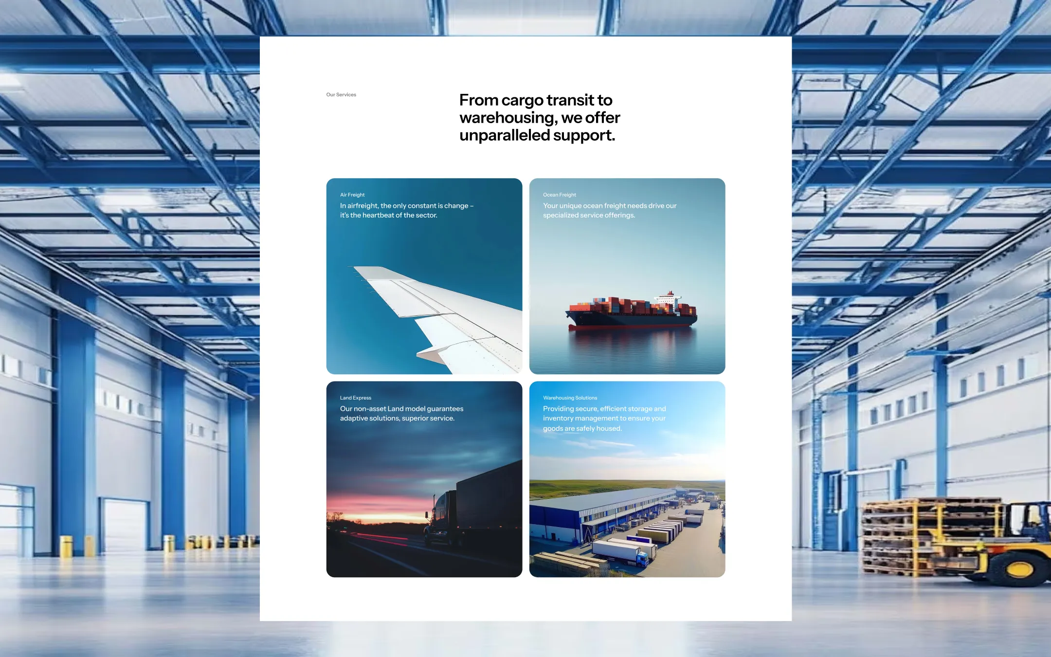
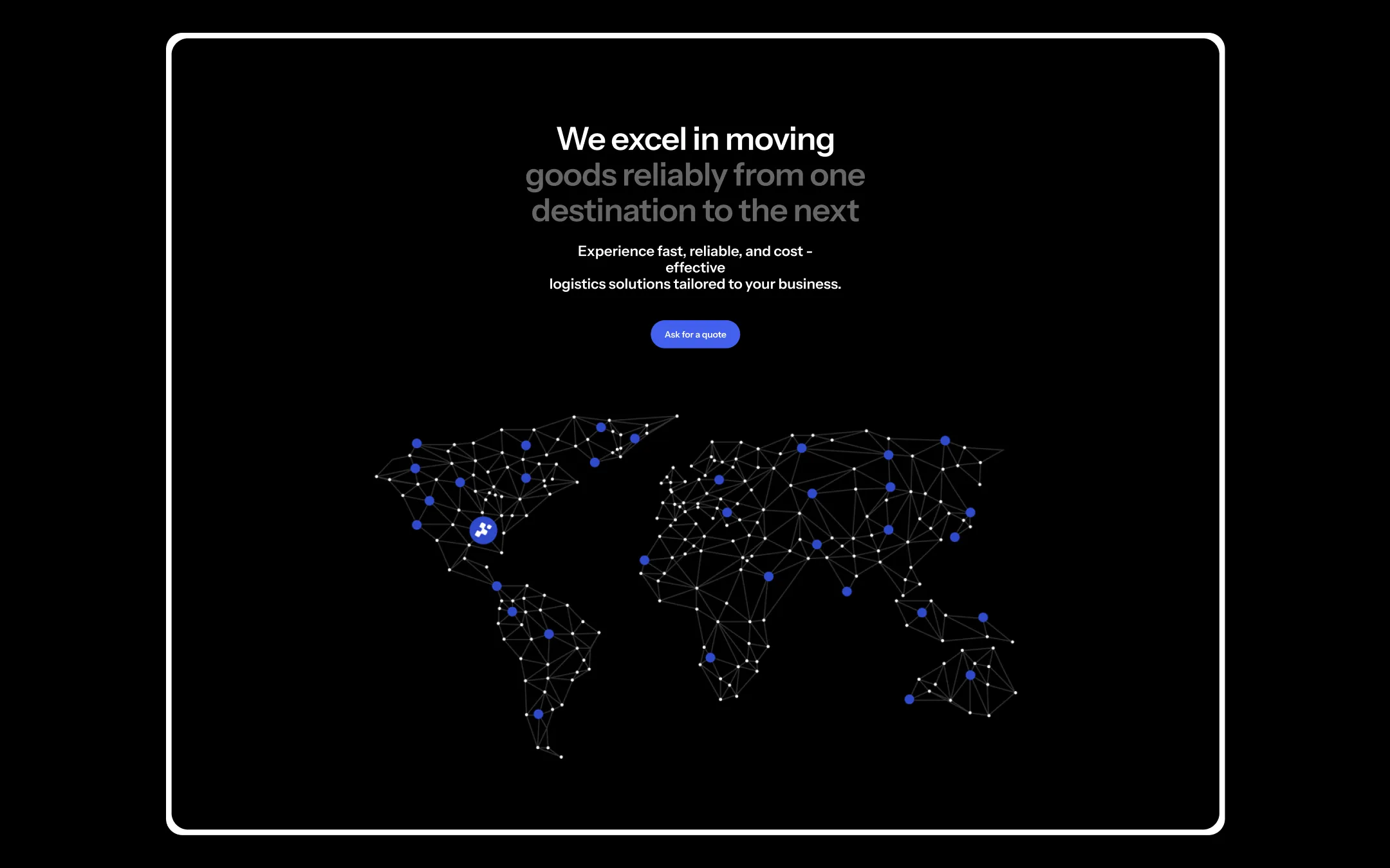
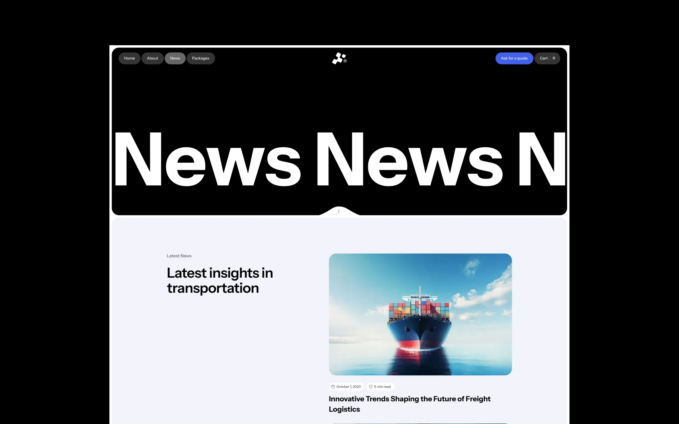
Freight™ is a logistics and transportation design system built to project scale, precision, and global reach. The palette pairs a crisp white canvas with a near-black ink and a deep midnight surface, punctuated by a single electric blue accent that carries every call-to-action, highlighted number, and interactive state across the system. Bold cargo photography — container ships crossing open water, aircraft wings slicing through blue sky, trucks on dusk highways — is treated as the hero content itself, framed in generously rounded 30px containers that soften the industrial subject matter. Typographically the system leans on a single confident sans-serif, Instrument Sans, scaled aggressively from small label text up to oversized 100px display headlines that bleed off the edge of the viewport. Rounded pill buttons, rounded card corners, and a full-bleed dark "network" section with a glowing world map reinforce a brand that feels both operationally serious and quietly futuristic.
Lifted surface tint. Card headers, rounded gray sections, subtle block backgrounds.
Deep hero & network surface. Backdrop for the glowing world-map and trust-bar sections.
Page canvas & card backgrounds. Base surface for nearly all content sections and light cards.
Muted body text on dark surfaces. Secondary copy inside subscribe fields and dark hero sections.
Primary text & dark surfaces. Headlines, body copy, and the full-bleed dark map section background.
Hairline dividers. Borders between content blocks and table rows.
Primary accent & action color. CTA buttons, active nav pills, links, and stat emphasis.
Accent hover state. Lightened blue shown on button and link hover transitions.
Error & destructive state. Form validation errors and cart error messaging.
Warning accent. Reserved for alerts and flagged shipment states, not used decoratively.
The quick brown fox jumps
Sole typeface across the system — labels, body copy, headlines, and display type.
spacious1440px200px45px24px5px10px15px20px24px30px40px45px60px70px100px150px200pxhero30pxcards30pxsmall7pxbadges7pxinputs30pxbuttons30pxtextarea20pxStep from canvas (level 1) to lifted (level 2) to inset depth (level 3), then invert into the dark levels for full-bleed sections. Hex codes and roles live in the Colors section above; this ladder shows the layering only.
# Design System Guide

> Unlock the template to access the full design system.

## Brand voice

A short paragraph describing the brand voice, mood, and visual
principles that anchor the system. Tone, cadence, and intent.

## Colors

| Token        | Hex      | Role                                  |
| ------------ | -------- | ------------------------------------- |
| canvas-1     | #xxxxxx  | Page background, large surfaces       |
| canvas-2     | #xxxxxx  | Lifted surfaces, cards                |
| canvas-3     | #xxxxxx  | Inset wells, depressed states         |
| ink-1        | #xxxxxx  | Primary body text                     |
| ink-2        | #xxxxxx  | Secondary text, labels                |
| ink-3        | #xxxxxx  | Tertiary text, hints                  |
| accent-1     | #xxxxxx  | Primary brand accent                  |
| accent-2     | #xxxxxx  | Secondary accent                      |
| state-ok     | #xxxxxx  | Success, confirmations                |
| state-warn   | #xxxxxx  | Warnings                              |
| state-err    | #xxxxxx  | Errors, destructive actions           |

## Typography

- **Display** — heading scale, used for hero text and section titles.
- **Body** — primary reading text, optimized for paragraphs.
- **Mono** — code, data, and tabular numerals.

```
display: 32px / 40px / 48px / 64px / 80px
body:    14px / 16px / 18px
mono:    12px / 14px
```

## Spacing & shape

Base unit: 4px. Scale: 4, 8, 12, 16, 24, 32, 48, 64, 96, 128.
Radii: sm (4px), md (8px), lg (12px), xl (20px), full (9999px).

## Surfaces

Layered elevation from canvas → lifted → inset. Surfaces invert in
dark sections for full-bleed contrast.

## Do's and don'ts

- Do use accent-1 sparingly for primary CTAs only.
- Do maintain at least 4.5:1 contrast on body text.
- Don't mix display and body in the same line.
- Don't use state colors for branding.

## Agent prompt guide

Prompts for AI design tools that respect this system.
Includes example prompts for sections, components, and layouts.

# ...
Unlock the full style guide