Design systems, extracted.
Paste any URL to create a design system from it. Open any style for colors, type, spacing, components, and a DESIGN.md or tokens.json your agent can use.
Quickly navigate through the dashboard with your keyboard using the command menu.
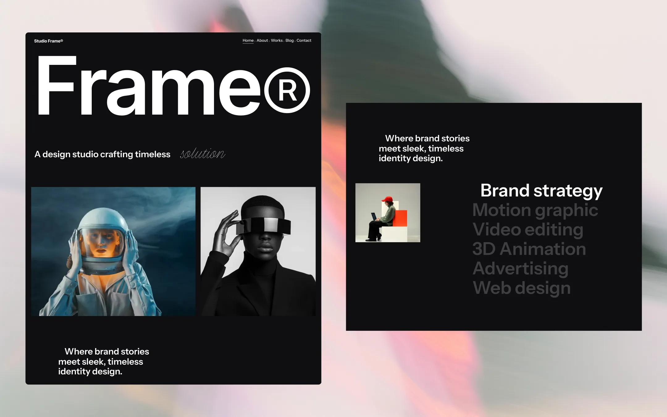
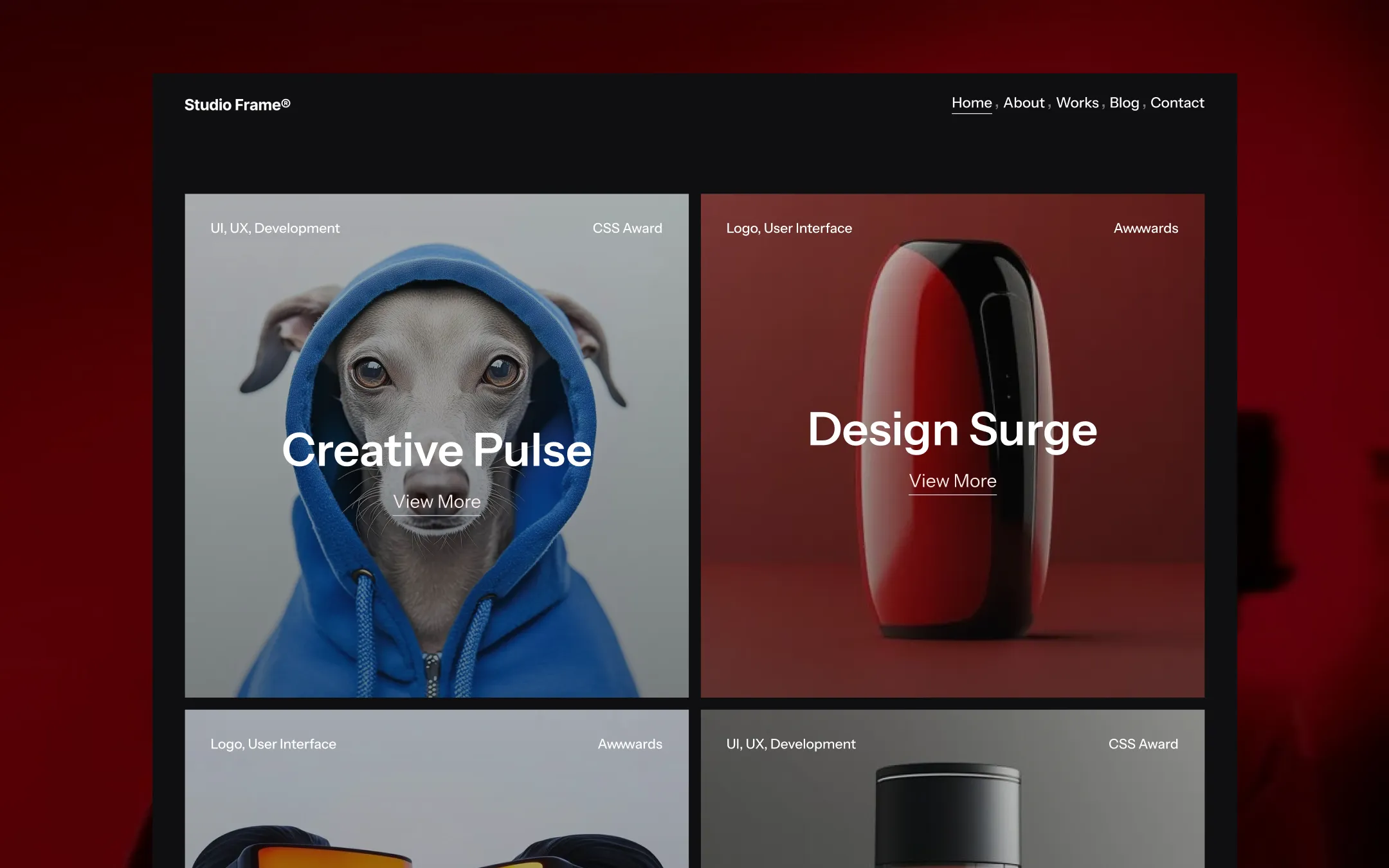
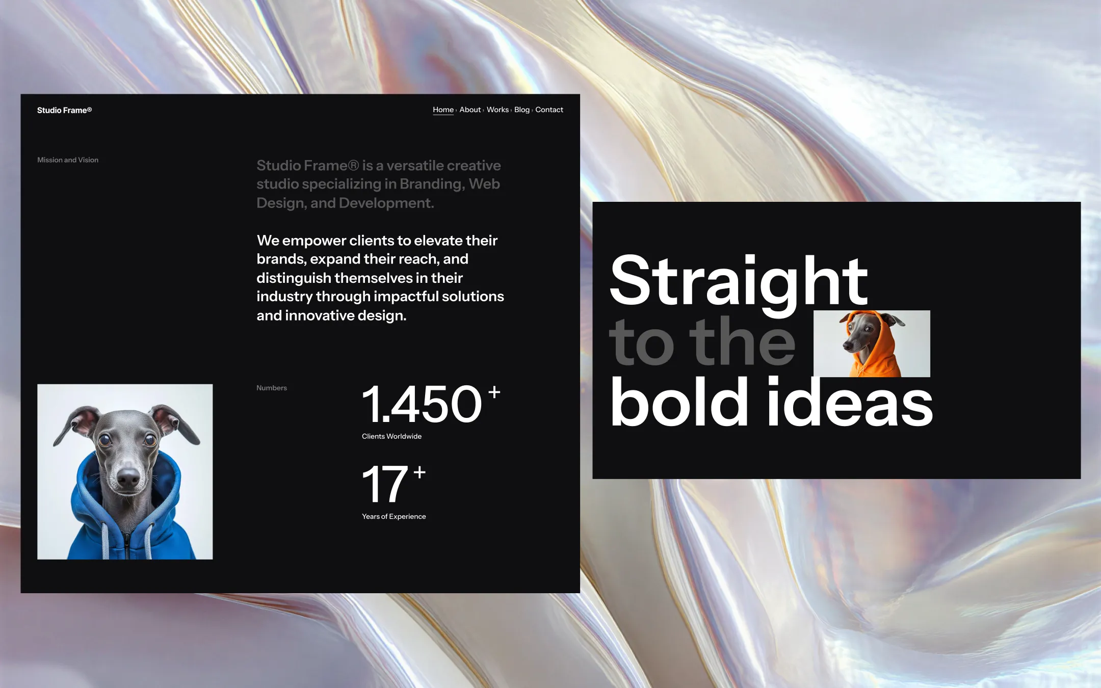
Studio Frame® is a creative agency template built for studios that let the work speak first. The palette stays uncompromisingly dark — near-black canvases layered with soft charcoal surfaces — so that colour-blocked project photography and oversized type can detonate against it without competition. Typography does the heavy lifting: a single confident grotesk scales from whisper-quiet captions to room-filling display headlines that wrap edge to edge, while a cycling italic script adds a handwritten wink to an otherwise severe system. Everything is engineered for kinetic motion — marquee text rotators, parallax imagery, animated name-lists — but the underlying grid is disciplined and quiet: generous black space, thin dividers, and uppercase labels keep the experience feeling considered rather than chaotic. It reads as a studio that has earned its confidence and isn't afraid to let darkness do the framing.
Depth surface. Hover states and block headers set slightly deeper than base.
Primary canvas. Base background for every section, nav, and footer.
Lifted surface. Button fills, pricing cards, and panel backgrounds.
Secondary text & ink. Body copy, footer paragraphs, and muted captions.
Primary ink. Headlines, logo mark, and button text on dark surfaces.
Tertiary accent. Astronaut and portrait imagery tones in featured works.
Secondary accent. Alternating project tiles and award-badge backgrounds.
Primary accent. Hero product imagery and the color-blocked project grid.
Interactive state. Form focus rings, checkbox fills, and link hover cues.
Border & divider utility. Hairlines separating team cards and pricing rows.
The quick brown fox jumps
Primary typeface for all headings, body copy, UI labels, and the oversized hero display.
spacious1440px150px40px25px5px10px15px20px25px30px40px60px80px100px150pxcards0pxpills30pxsmall2pxbadges7pxavatars9999pxbuttons0pxStep from canvas (level 1) to lifted (level 2) to inset depth (level 3), then invert into the dark levels for full-bleed sections. Hex codes and roles live in the Colors section above; this ladder shows the layering only.
# Design System Guide

> Unlock the template to access the full design system.

## Brand voice

A short paragraph describing the brand voice, mood, and visual
principles that anchor the system. Tone, cadence, and intent.

## Colors

| Token        | Hex      | Role                                  |
| ------------ | -------- | ------------------------------------- |
| canvas-1     | #xxxxxx  | Page background, large surfaces       |
| canvas-2     | #xxxxxx  | Lifted surfaces, cards                |
| canvas-3     | #xxxxxx  | Inset wells, depressed states         |
| ink-1        | #xxxxxx  | Primary body text                     |
| ink-2        | #xxxxxx  | Secondary text, labels                |
| ink-3        | #xxxxxx  | Tertiary text, hints                  |
| accent-1     | #xxxxxx  | Primary brand accent                  |
| accent-2     | #xxxxxx  | Secondary accent                      |
| state-ok     | #xxxxxx  | Success, confirmations                |
| state-warn   | #xxxxxx  | Warnings                              |
| state-err    | #xxxxxx  | Errors, destructive actions           |

## Typography

- **Display** — heading scale, used for hero text and section titles.
- **Body** — primary reading text, optimized for paragraphs.
- **Mono** — code, data, and tabular numerals.

```
display: 32px / 40px / 48px / 64px / 80px
body:    14px / 16px / 18px
mono:    12px / 14px
```

## Spacing & shape

Base unit: 4px. Scale: 4, 8, 12, 16, 24, 32, 48, 64, 96, 128.
Radii: sm (4px), md (8px), lg (12px), xl (20px), full (9999px).

## Surfaces

Layered elevation from canvas → lifted → inset. Surfaces invert in
dark sections for full-bleed contrast.

## Do's and don'ts

- Do use accent-1 sparingly for primary CTAs only.
- Do maintain at least 4.5:1 contrast on body text.
- Don't mix display and body in the same line.
- Don't use state colors for branding.

## Agent prompt guide

Prompts for AI design tools that respect this system.
Includes example prompts for sections, components, and layouts.

# ...
Unlock the full style guide