Design systems, extracted.
Paste any URL to create a design system from it. Open any style for colors, type, spacing, components, and a DESIGN.md or tokens.json your agent can use.
Quickly navigate through the dashboard with your keyboard using the command menu.
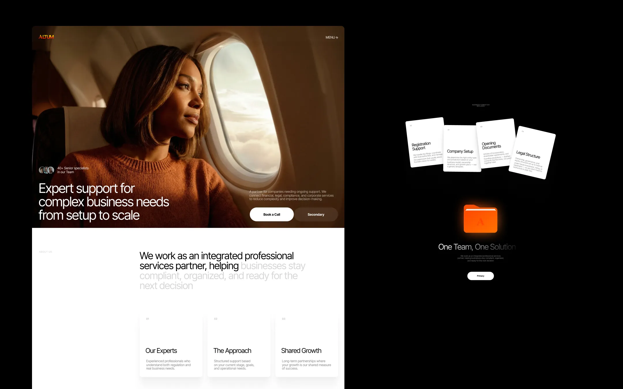
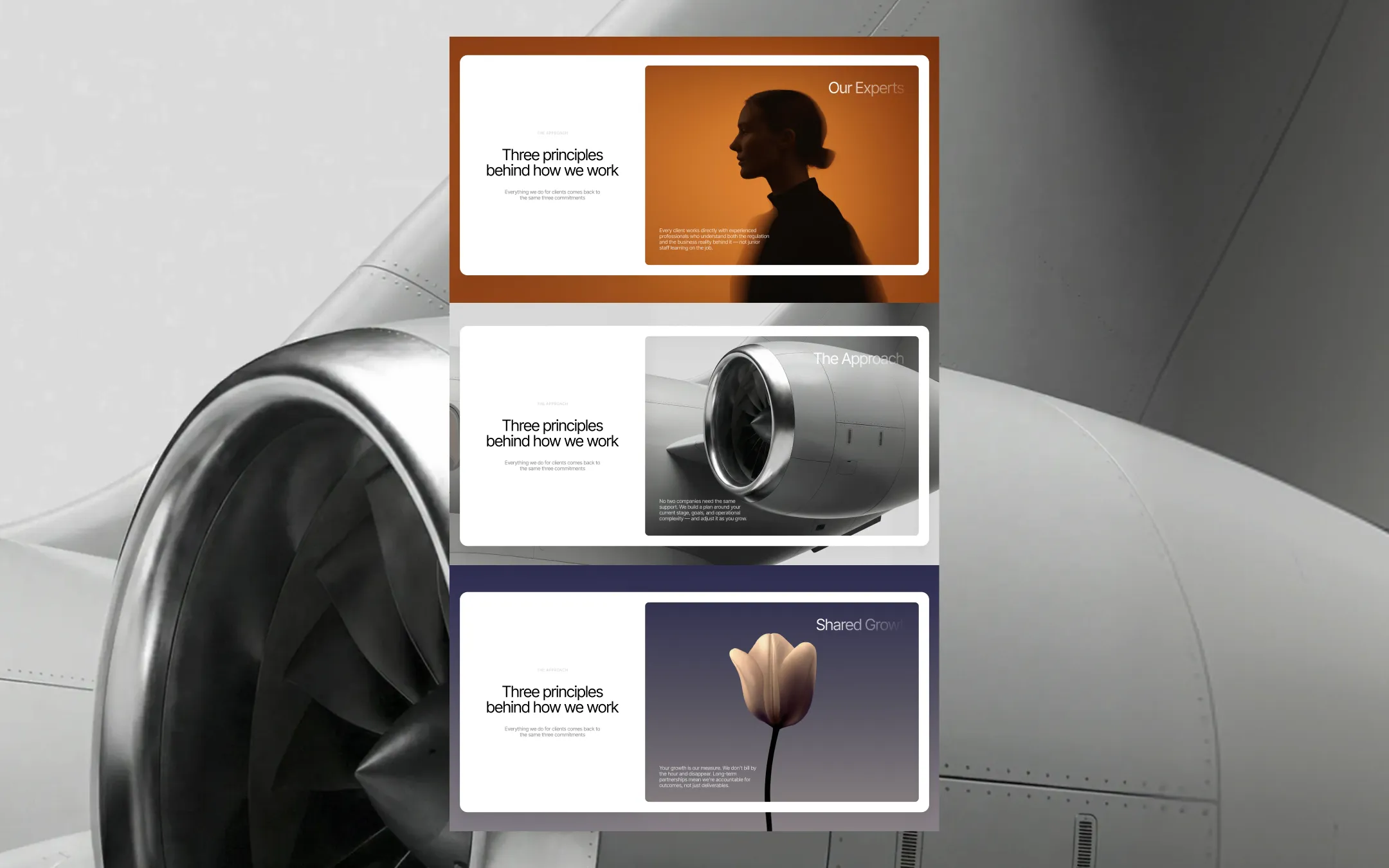
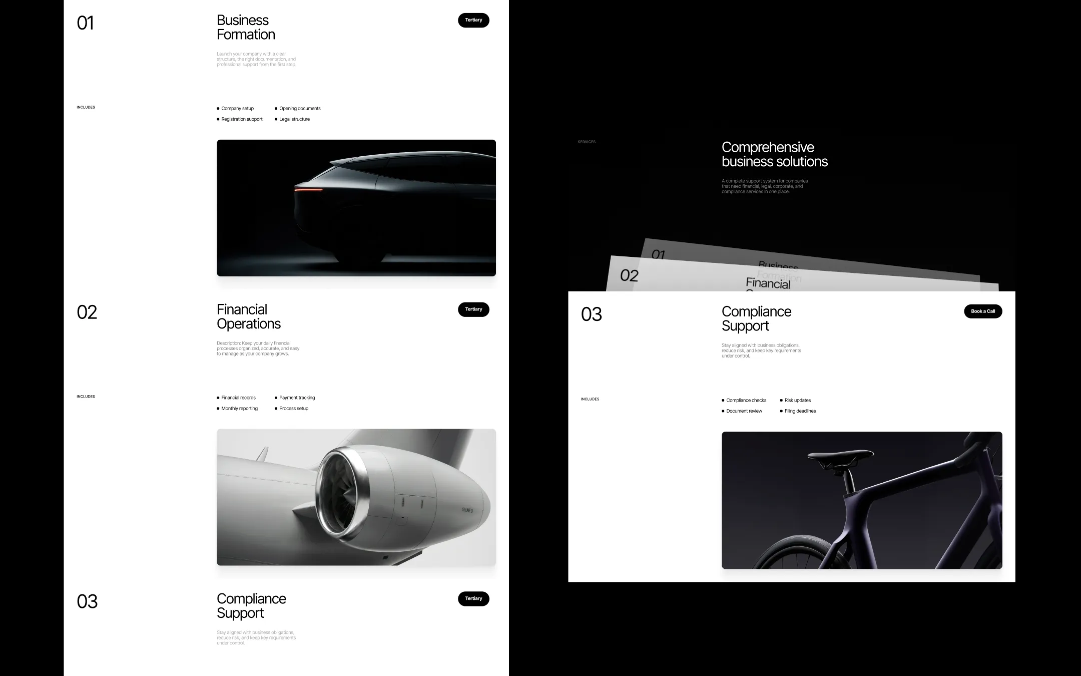
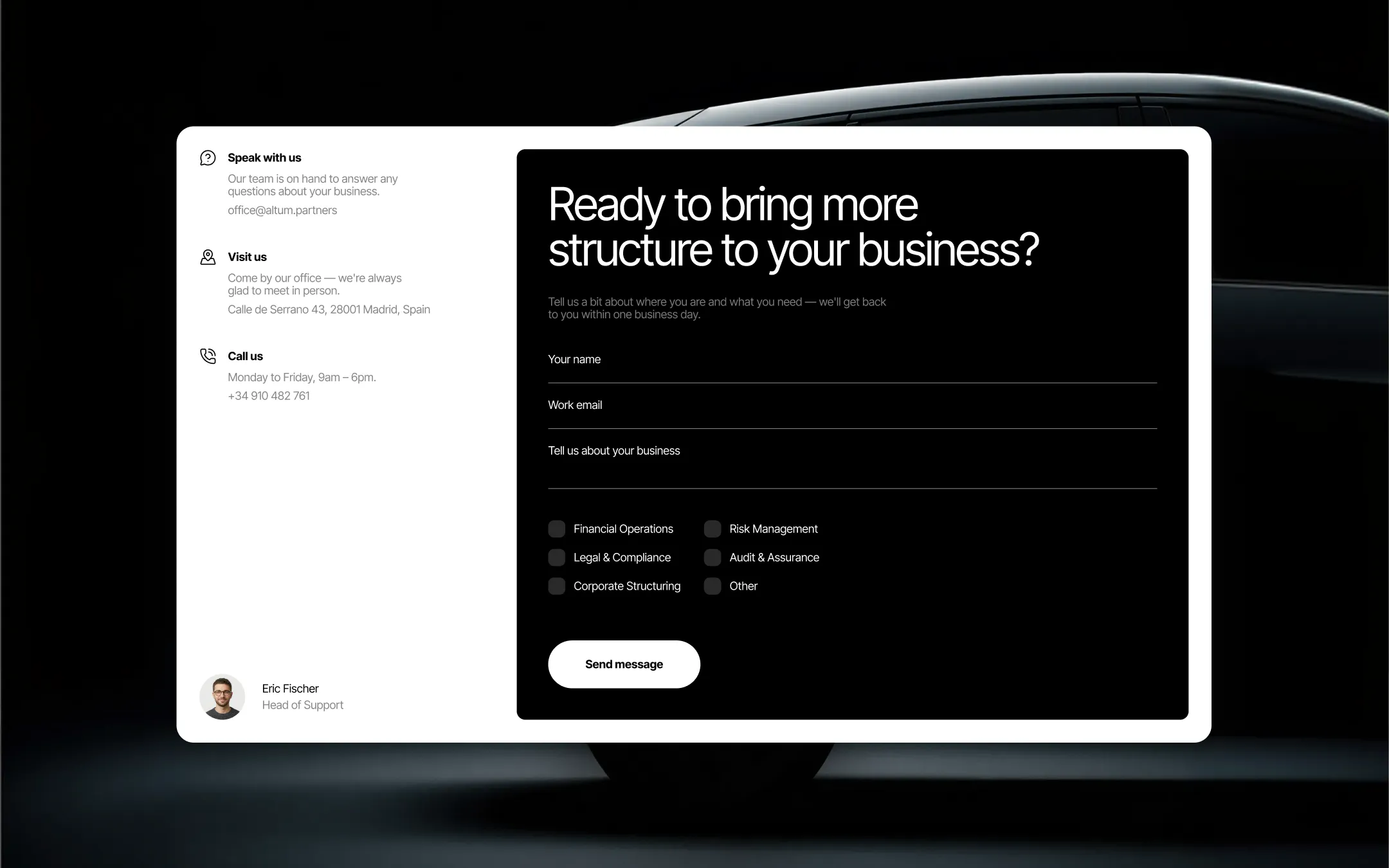
Altum is a professional-services template built for formation and advisory firms that need to look as credible as the counsel they give. The system pairs a near-black ink foundation with a single, confident brand ember — a burnt-orange-to-amber gradient wordmark — and warm, editorial photography of people and machinery that keeps the authority human rather than corporate-cold. Typography runs entirely on Inter Tight at a tight, controlled scale with negative letter-spacing on display sizes, giving headlines a dense, engineered feel that echoes the brand's precision-first positioning. Layout alternates deliberately between stark light sections (white canvas, charcoal ink text) and full-bleed dark sections (near-black backdrops with amber/orange photographic treatments), using pill-shaped buttons, uppercase micro-labels, and floating card collages to keep every scroll moment feeling considered and premium. The result reads like a firm that has already done the hard thinking — structured, warm, and unmistakably serious about growth.
Inset surface. Input field backgrounds and subtly lifted panels within light sections.
Page canvas & primary button text. Base background for light sections and card surfaces.
Primary text & darkest surface. Headlines, body copy, and full-bleed dark section backgrounds.
Soft neutral tag fill. Pills, badges, and quiet decorative blocks against dark backgrounds.
Primary brand accent. Wordmark gradient terminus, key CTAs, highlighted numerals and icons.
Moody secondary accent. Alternate dark-section tints behind portrait and still-life photography.
Secondary accent. Used for the accent button variant and small decorative highlights.
Error state. Form validation failures and destructive-action messaging.
Warning state. Caution banners and pending-review notices.
Success state. Confirmation messaging and completed-step indicators.
The quick brown fox jumps
Sole typeface for display, body, label, and button text across the system.
spacious1440px160px32px24px4px8px12px16px20px24px32px44px48px64px80px100px120px160px200px320pxtag0pxcards20pxinput0pxsmall8pxdefault12pxbutton-circle24pxStep from canvas (level 1) to lifted (level 2) to inset depth (level 3), then invert into the dark levels for full-bleed sections. Hex codes and roles live in the Colors section above; this ladder shows the layering only.
# Design System Guide

> Unlock the template to access the full design system.

## Brand voice

A short paragraph describing the brand voice, mood, and visual
principles that anchor the system. Tone, cadence, and intent.

## Colors

| Token        | Hex      | Role                                  |
| ------------ | -------- | ------------------------------------- |
| canvas-1     | #xxxxxx  | Page background, large surfaces       |
| canvas-2     | #xxxxxx  | Lifted surfaces, cards                |
| canvas-3     | #xxxxxx  | Inset wells, depressed states         |
| ink-1        | #xxxxxx  | Primary body text                     |
| ink-2        | #xxxxxx  | Secondary text, labels                |
| ink-3        | #xxxxxx  | Tertiary text, hints                  |
| accent-1     | #xxxxxx  | Primary brand accent                  |
| accent-2     | #xxxxxx  | Secondary accent                      |
| state-ok     | #xxxxxx  | Success, confirmations                |
| state-warn   | #xxxxxx  | Warnings                              |
| state-err    | #xxxxxx  | Errors, destructive actions           |

## Typography

- **Display** — heading scale, used for hero text and section titles.
- **Body** — primary reading text, optimized for paragraphs.
- **Mono** — code, data, and tabular numerals.

```
display: 32px / 40px / 48px / 64px / 80px
body:    14px / 16px / 18px
mono:    12px / 14px
```

## Spacing & shape

Base unit: 4px. Scale: 4, 8, 12, 16, 24, 32, 48, 64, 96, 128.
Radii: sm (4px), md (8px), lg (12px), xl (20px), full (9999px).

## Surfaces

Layered elevation from canvas → lifted → inset. Surfaces invert in
dark sections for full-bleed contrast.

## Do's and don'ts

- Do use accent-1 sparingly for primary CTAs only.
- Do maintain at least 4.5:1 contrast on body text.
- Don't mix display and body in the same line.
- Don't use state colors for branding.

## Agent prompt guide

Prompts for AI design tools that respect this system.
Includes example prompts for sections, components, and layouts.

# ...
Unlock the full style guide